Update on
the long-term Dollar bear
Here is an extract from commentary
that was posted at www.speculative-investor.com on 13th February 2003.
The Big
Picture
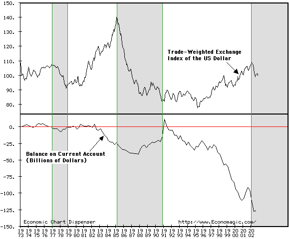
Below is a long-term chart comparing
the US Dollar (represented in this chart by a trade-weighted exchange index
of the US$ relative to other major currencies) with the US quarterly current
account deficit. We originally included this chart in our 16th December
commentary in order to make the point that once a major US$ downtrend gets
underway it continues until the US current account moves into surplus.
The shaded areas on the chart highlight the periods from the start of each
major dollar decline to its conclusion. Obviously, we don't yet know the
date at which the current dollar decline will end, but we can be confident
that this date will be many years into the future since the corrective
process (the process through which the large current account deficit shrinks
and eventually becomes a surplus) has only just begun. As such, there is
probably not going to be any reason to be anything other than long-term
bearish on the US$ for quite some time.
The above may seem overly simplistic,
but we think it is the correct 'big picture' view. Furthermore, this long-term
downward trend for the US$ will, in our opinion, continue to be one of
the most important drivers of the long-term trends in other markets (gold,
stocks, commodities, bonds). For example, the long-term trend towards a
weaker dollar has helped create, or will help create, the following:
a) A long-term bull market in gold
b) A long-term bull market in commodities
c) Relative strength in those sectors
of the stock market that benefit from a weaker dollar (e.g., the stocks
of commodity producers) and relative weakness in those sectors of the market
that benefit from a stronger dollar (e.g., the bank stocks).
d) A long-term bear market in bonds
An argument could be made that the
commodity bull market will only be apparent when commodity prices are measured
in US$ terms, as has been the case over the past 12 months. However, attempts
by central banks throughout the world to reduce the rate of the dollar's
descent by weakening their own currencies will likely result in broadly
weaker fiat currencies relative to commodities.
The Technical
View
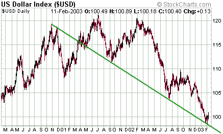
Below are 3-year charts of the Dollar
Index and the S&P500 Index. Both charts show that prices have been
moving lower along well-defined trend-lines in the same way that a ball
might bounce down the side of a hill. Each time the ball (the price) hits
the side of the hill (the trend-line) we get a bounce, a 'rolling over'
as gravity (over-valuation) exerts its influence, and then another plunge.
The S&P500 reached its major peak
well in advance of the Dollar, but the respective downtrend-lines were
hit together in September-2001 and July-2002. Interestingly, the Dollar
recently returned to its major downtrend-line (the point from which substantial
bounces usually begin) while the S&P500 is still well above its own
trend-line. One way to interpret this divergence is that we are currently
seeing a very weak bounce in the Dollar that will be followed by a drop
to the trend-line at a slightly lower level (the mid-90s) during the next
1-2 months. And, that this next low in the Dollar will coincide with the
S&P500 hitting its own trend-line. This is, in fact, how we interpret
the charts because a) gold stocks are yet to signal an intermediate-term
peak in the gold price (gold is likely to reach an intermediate-term peak
at around the same time as, or before, the US$ reaches an intermediate-term
bottom), and b) the Dollar's short-term chart pattern suggests there will
be one final leg down to a lower-low before a substantial multi-month 'bounce'
gets underway.
Regular financial market forecasts
and
analyses are provided at our web site:
http://www.speculative-investor.com/new/index.html
One-month free trial available.

|