| Date posted as sample |
Commentary Excerpt |
| 29-Sep-14 |
From
the 29th September 2014 Weekly Update:
Commodities
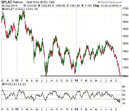
The continuing platinum plunge
Many commodities are immersed in waterfall declines. These declines look
climactic and could be setting the stage for major turns to the upside
in the near future. However, even if their bear markets are not
complete, which is a distinct possibility given the evidence that the
Dollar Index has turned higher on an intermediate-term basis, the extent
to which many commodities are now 'oversold' creates the potential for
sizeable rebounds. The platinum market is a good example.
We mentioned platinum last week and speculated that it would make a
multi-month price bottom at $1290-$1300, an important area of support
defined by last year's low. Platinum's price continued its plunge last
week and is now testing the aforementioned support at a time when its
daily RSI is at a rarely-seen extreme.
There is clearly no evidence that a bottom is in place, but, as we said
above, the action looks climactic.
The uranium divergence just got bigger
Last week we pointed out that the uranium price had just experienced its
best rally in more than three years, whereas URA, a proxy for
uranium-mining equities, looked set to break below support at $14 to a
new multi-year low. This was an interesting, and rather strange,
divergence between the commodity and the stocks of companies that
produce the commodity.
The divergence became more interesting and even stranger last week, as
the uranium price continued its rally and URA broke solidly below $14.
The relevant weekly charts are displayed below. The uranium price is now
up by almost 30% from its low, but it seems that traders of
uranium-mining equities are unaware of this fact.
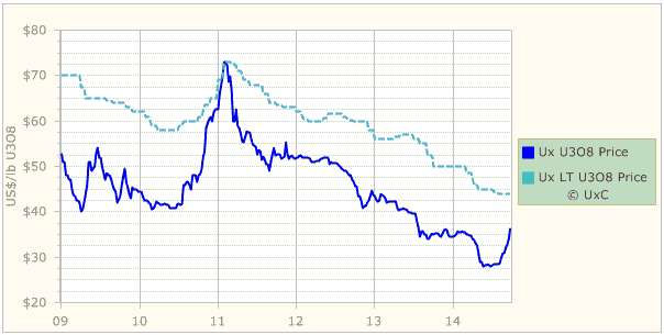
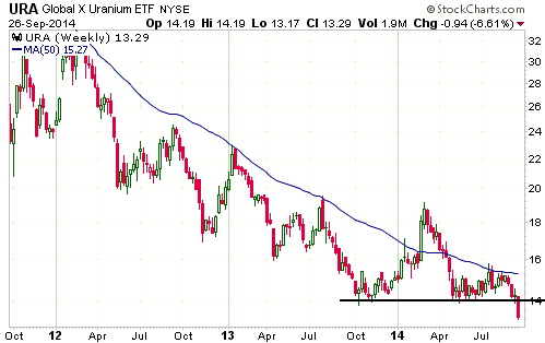
Last week's performance by URA ushers in the possibility that we are
seeing the sort of short-lived break below major support that can mark
the end of a multi-year decline. However, for this to be the case there
will obviously have to be an upward reversal in the near future and a
quick return to above $14.
|
| 15-Sep-14 |
From
the 15th September 2014 Weekly Update:
Gold Stocks
Current Market Situation
The HUI made a new correction low last Thursday before reversing course
and ending the day with a small gain. However, the reversal wasn't
significant as there was no follow-through to the upside on Friday.
Thursday's intra-day low remains the correction low to date, but on a
daily closing basis there was a new correction low on Friday.
On a more up-beat note, a small, but potentially significant, positive
divergence has developed between the HUI and the GDXJ/GDX ratio over the
past 6 trading days. The divergence is indicated on the following chart.
There hasn't yet been sufficient strength in the GDXJ/GDX ratio to
suggest that a tradable rally has begun, but positive divergences
between the HUI and the GDXJ/GDX ratio occurred prior to the starts of
the last two tradable rallies. Last December the positive divergence
began about 2 weeks prior to the start of the rally and in the second
quarter of this year the positive divergence began about 3 weeks prior
to the start of the rally.
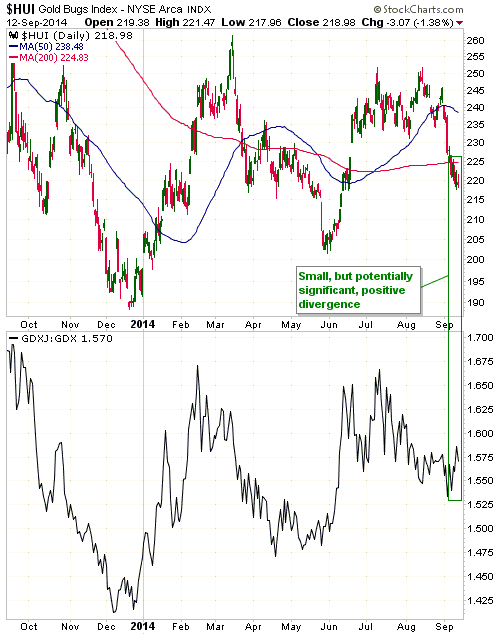
So, the past year's performance of the HUI relative to the GDXJ/GDX
ratio suggests that a tradable rally will begin within the coming
fortnight. A literal comparison with the late-1970s basing pattern also
points to a bottom within the next 2 weeks -- followed by a rally until
mid-November.
MA Crossover Redux
As we've explained in many TSI commentaries over the years, the
conventional interpretation of moving-average (MA) crossovers is wrong.
"Death crosses" (the 50-day MA crossing from above to below the 200-day
MA) are supposed to be bearish, but they usually occur near short-term
bottoms and therefore usually have short-term bullish implications.
"Golden crosses" (the 50-day MA crossing from below to above the 200-day
MA) are supposed to be bullish, but they usually provide no information
about the future except in the case when they happen after a sharp rally
from a price bottom, in which case they usually have short-term bearish
implications.
This year's performance by the HUI provides a good example of how MA
crossovers usually work in reality, as opposed to the way many people
think they work. With reference to the above chart, notice that a) a
"golden cross" occurred near the top of a strong rally in March, b) a
"death cross" occurred near a short-term bottom in May, and c) another
"golden cross" occurred near the top of the June-July rally. |
| 08-Sep-14 |
From
the 8th September 2014 Weekly Update:
The ECB's cunning new plan
Last Thursday (4th September) the ECB introduced a cunning new plan to
spur growth in the euro-zone, the first part of which involves cutting
official interest-rate targets by 0.1%. The benchmark refinancing rate
has been reduced to 0.05%, because 0.15% was obviously too high, and the
deposit rate has gone further into negative territory, because it
obviously wasn't negative enough. The actions have been taken due to
"inflation" and inflation expectations being too low.
Inflation of any kind is the last thing that Europe needs, but from the
Keynesian perspective, which is the perspective of all central bankers,
it is critical that both inflation and inflation expectations are well
above zero. The reason is that in the back-to-front world in which
Keynesians are mired, consumption spending comes first and is the
driving force of the economy. Furthermore, according to Keynesian logic
if people believe that prices are going to be lower in the future they
will put off their spending, which will set in motion a vicious
deflationary spiral of price declines leading to reduced spending,
leading to additional price declines, and so on.
Keynesian logic explains why the computer and smartphone manufacturers
never sell anything. Everyone knows that if they wait a year they will
be able to buy a better smartphone and a better computer at a lower
price, so nobody ever buys these products. As a consequence, the entire
computer and smartphone industries have zero sales year after year.
Getting back to the ECB, a goal of reducing the cost of credit to zero
is to generate some "price inflation", which, according to the theories
that inform the decisions of central bankers, will boost immediate
consumption and cause the economy to grow faster. But if a faster rate
of price inflation is what they want, then what they will have to do is
increase the rate of monetary inflation. In this regard, taking an
overnight interest rate down from 0.15% to 0.05% is probably not going
to do much. If the ECB is serious about generating "inflation" then what
it really needs to do is implement a Fed-style QE program.
Which brings us to the second part of the ECB's cunning new plan. The
ECB announced that it would begin monetising covered bonds and
asset-backed securities (ABS)*, including real-estate-backed securities,
next month, with the details to be announced at next month's ECB
meeting. Depending on its size and mechanics, this asset monetisation
program could certainly cause prices to rise. To the extent that it does
cause prices to rise it will benefit banks and speculators at the
expense of savers, productive businesses and wage earners.
Fortunately or unfortunately, depending on your perspective, due to the
limited availability of eligible collateral the QE program announced by
the ECB last week might be restricted in size to about 200B euros. This
means that it might not be large enough to have much effect on the
euro-zone money supply.
*Banks create asset-backed securities by pooling mortgages and
other loans. Covered bonds are similar, but the underlying assets are
'ring-fenced' on the bank's balance sheet, which means that the assets
are still there if the bank goes bust. |
| 01-Sep-14 |
From
the 27th August 2014 Interim Update:
A reliable recession indicator won't
work next time
There was an inversion of the US yield curve, meaning that short-term
interest rates moved above long-term interest rates, ahead of every
official US recession of the past several decades. Consequently, a
popular assumption is that there will be no need to worry about a future
US recession until after the spread between short-term and long-term
interest rates has shrunk to zero and the yield curve is on the verge of
becoming inverted. In our opinion, this assumption will prove to be
wrong. Due to Zero Interest Rate Policy (ZIRP), the US economy's next
transition from growth to recession will almost certainly occur while
the US yield curve remains positively sloped.
"It's different this time" is usually a dangerous idea, but it really is
different this time. The Fed has recently taken interest-rate
manipulation way beyond anything it has previously attempted. Given this
fact, is it unreasonable to expect that interest-rate relationships that
worked in the past will not work in the future?
When it comes to the ability of the yield curve to forecast recessions,
it is actually more reasonable to expect that the future will be
different from the past than it is to assume that past is prologue. With
the Fed committed to keeping its targeted overnight interest rate at
zero for at least 9 more months and highly likely to move in 'baby
steps' after a rate-hiking program eventually begins, there is almost no
chance of short-term T-Note yields moving above long-term T-Note yields
within the next two years. Moreover, although the Fed's current stance
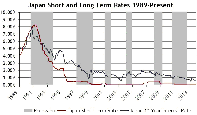
is unprecedented, a precedent is provided by Japan's experience.
A yield-curve inversion was a reliable leading indicator of recession in
Japan until the mid-1990s, when the BOJ embarked on a program involving
near-zero administered interest rates. Since that time, none of Japan's
economic recessions (there have been five of them) have been preceded by
an inverted yield curve. This point is discussed in the article posted
HERE and illustrated by the chart displayed below. With regard to
this chart, Japan's yield curve is considered to be positively sloped
when the black line is above the red line.
In summary, the extreme interest-rate manipulation being conducted by
the Fed makes it very unlikely that the next US recession will be
telegraphed by an inverted yield curve. Regardless of whether the US
economy is growing or shrinking or somewhere in between, it's a good bet
that the US yield curve will remain positively sloped for a very long
time to come. However, it will probably become flatter (less
positively-sloped) ahead of recessions.
|
| 18-Aug-14 |
From
the 13th August 2014 Interim Update:
Gold Stocks
The upper half of the following chart shows that the HUI has moved up to
the top of its major basing pattern. A solid weekly close above 250
would complete the base and provide additional evidence that a new bull
market is underway. Note: We have little doubt that a new cyclical bull
market began last December, but additional evidence to support this view
is always welcome.
The HUI's return to the top of its major basing pattern has been
accompanied by two conflicting signals: a signal that an upside breakout
is imminent and a signal that there will be more consolidation prior to
an upside breakout. The bullish signal is this week's break to a new
high for the year by the HUI/gold ratio, as illustrated by the lower
half of the following chart. The signal pointing to additional
consolidation is the decline in the GDXJ/GDX ratio to a new multi-week
low.
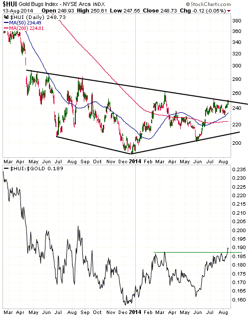
There's no way of knowing which of the aforementioned signals will turn
out to be correct, but in the grand scheme of things it shouldn't make a
difference. Our expectation is that the HUI will either break out to the
upside within the next few days or consolidate for up to two more weeks
before breaking out to the upside.
We continue to think that the HUI will trade at 300 by the end of
September. |
| 04-Aug-14 |
From
the 4th August 2014 Weekly Update:
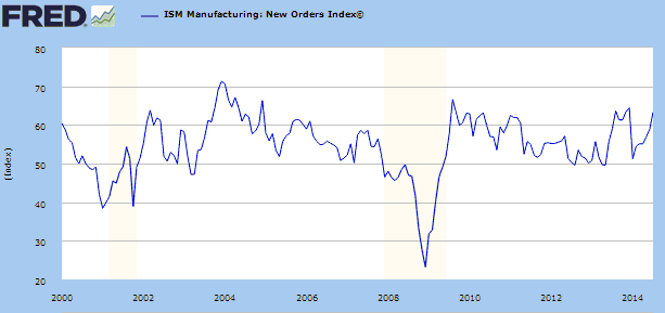
US Economic Numbers Update
The ISM Manufacturing numbers for July were
reported last Friday, and they were strong. Of particular significance,
the following chart shows that the ISM New Orders Index, in our opinion
the single best indicator of the US economy's current and likely
near-term performance, has risen to near its highs of the past few
years.
The latest monthly employment numbers were also reported last Friday.
They were apparently a little weaker than expected, but not by enough to
affect the Fed's actions.
As explained in previous commentaries, the only practical significance
of the employment numbers is the extent to which they influence the Fed.
As indicators of current or future economic performance they are useless
because they are inaccurate and backward-looking. In effect, the
employment numbers provide an inaccurate look at how the economy was
performing a few months ago and provide no information about likely
future economic performance.
From a big picture perspective, the best LEADING indicator of US
economic performance we know of is Real Gross Private Domestic
Investment. This is the blue line on the following chart. If you look
closely at this chart you should be able to see that Real Gross Private
Domestic Investment has reversed downward at least a few months prior to
the start of every official US recession since 1970. The same chart
shows that employment (the red line) never reverses downward until
sometime after an official recession has begun.
Unfortunately, the Real Gross Private Domestic Investment number is only
updated quarterly with a lag of one month, which means that it can be up
to four months out of date. Furthermore, a trend change in this number
will take at least two quarters to unfold. That's why we generally
discuss it at TSI only a couple of times per year.
The Real Gross Private Domestic Investment number for Q1-2014 opened up
the possibility that a downward trend reversal had occurred, but the
number for Q2-2014, which was reported last week, eliminated this
possibility.
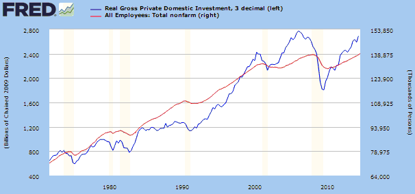
The combination of the ISM New Orders Index and the Real Gross Private
Domestic Investment number tells us that the start of the next official
US recession lies at least 6 months into the future. |
| 28-Jul-14 |
From
the 23rd July 2014 Interim Update:
Gold and Real Interest Rates
The real interest rate is one of the
most important determinants of whether the financial landscape is
bullish or bearish for gold, where the real interest rate is the
default-free nominal interest rate minus the EXPECTED rate of currency
depreciation.
The trouble, for those of us who care about the true fundamental drivers
of the gold price, is that the rate of currency depreciation expected by
the market cannot be accurately measured, which means that the real
interest rate cannot be accurately measured. However, the yields on
Treasury Inflation-Protected Securities (TIPS) are ballpark estimates of
real interest rates and should trend in the same directions as real
interest rates. The following chart of the 10-year TIPS yield therefore
gives a rough indication of the performance of the real US 10-year
interest rate.
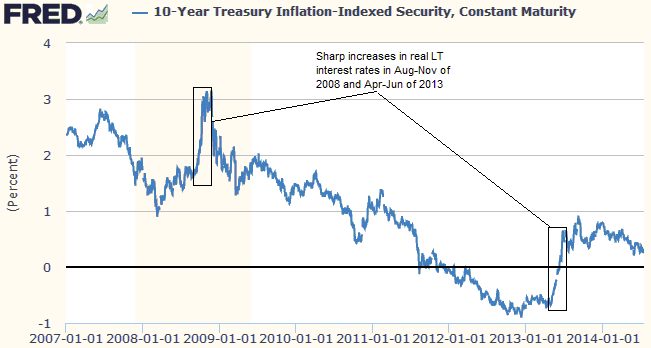
Since the real interest rate is not the only determinant of whether the
financial landscape is bullish or bearish for gold, the gold price
doesn't always trend in the opposite direction to the TIPS yield.
However, note that the two most significant declines in the gold price
over the past 8 years (the price plunges that occurred during Aug-Nov of
2008 and Apr-Jun of 2013) happened concurrently with, and can therefore
be explained by, sharp advances in the 10-year TIPS yield.
The H1-2013 sharp increase in real long-term interest rates was
difficult to anticipate, although gold was acutely vulnerable at the
time due to the fact that other important fundamental drivers (credit
spreads, the yield curve and the BKX/SPX ratio, for example) were
bearish. We should have paid more attention to these other drivers.
The real US long-term interest rate leveled off (that is, stopped
getting more gold-bearish) during the second half of last year and began
to drift downward (that is, started getting more gold-bullish) in
December. The downward drift will probably continue over the next
several months due to a continuing downward trend in the nominal 10-year
T-Note yield and a small increase in inflation expectations.
|
| 21-Jul-14 |
From
the 21st July 2014 Weekly Update:
Goldman's Gold Forecast
Last week, a Goldman Sachs analyst
reiterated his forecast for the gold price to drop to $1050/oz by
the end of this year.
The Goldman Sachs gold-market analysis is much better than the
gold-market analysis of Eric Sprott and many other high-profile gold
bulls, because at least Goldman is looking in the right direction for
clues as to what the future holds in store for gold. Many gold bulls, on
the other hand, haven't the foggiest idea about gold's fundamental
drivers.
Goldman's gold forecast has little chance of being correct, though,
because it is predicated on a strengthening US economy and because
gold's true fundamentals are trending in a bullish direction. Of
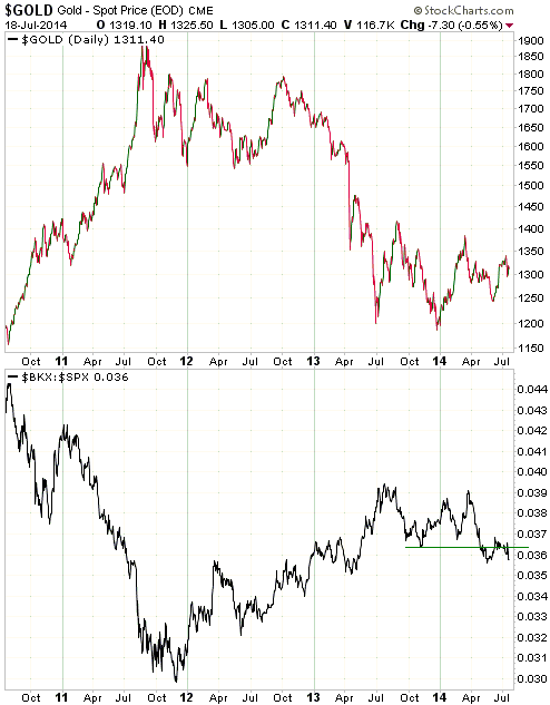
particular importance, we note that:
a) The BKX/SPX ratio, a measure of how the banking sector is performing
relative to the broad US stock market, gradually began to turn
gold-bullish (meaning: bank stocks gradually started to weaken relative
to the overall market) in early-July of last year and turned decisively
gold-bullish in April of this year. This influential ratio will remain
supportive for gold as long as it is making lower highs and lower lows.
Here's a daily chart comparing gold and the BKX/SPX ratio over the past
four years.
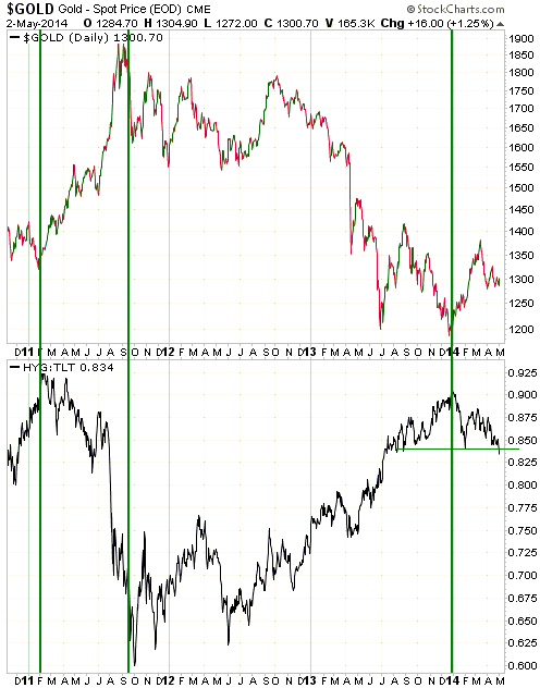
b) The HYG/TLT ratio, a measure of US credit spreads, began to move in
gold's favour (meaning: credit spreads began to widen, causing the HYG/TLT
ratio to decline) at the end of last year and made a new 52-week extreme
last week. As is the case with the BKX/SPX ratio, the HYG/TLT ratio will
remain supportive for gold as long as it is making lower highs and lower
lows.
Here's a daily chart comparing gold and the HYG/TLT ratio over the past
four years.
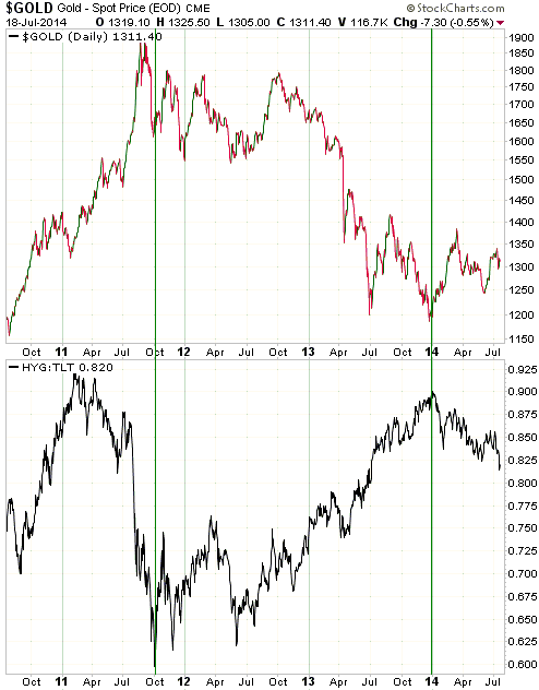
Our guess is that the gold price will end this year in the $1400-$1500
range.
|
| 14-Jul-14 |
From
the 14th July 2014 Weekly Update:
Gold
Speculators versus Commercials
Speculators, not commercial traders, drive price trends in the gold
market. The proof of this is the simple fact that the speculative
net-long position in gold futures almost always trends in the same
direction as the gold price (an increase in the speculative net-long
position almost always accompanies an increase in price and a decrease
in the speculative net-long position almost always accompanies a
decrease in price). It is therefore fair to say that in the gold market,
speculators are price makers and commercials are price takers.
An example is the 2-week period ended 1st July 2014. During this period
a definitive upward reversal in the short-term price trend coincided
with a large increase in the speculative net-long position.
Specifically, the price quickly rose from $1272 to $1328 while the
speculative net-long position in COMEX gold futures jumped by about 80K
contracts.
As dictated by basic arithmetic, the 80K-contract increase in the
speculative net-long position during the 2-week period ended 1st July
went hand-in-hand with an 80K-contract increase in the commercial
net-short position. These changes in the speculative and commercial
positions are two sides of the same coin. One would not be possible
without the other.
In general terms, speculators, as a group, could never increase their
long exposure to gold futures unless commercial traders (primarily
bullion banks), as a group, were prepared to take the other side of the
trade and increase their short exposure to gold futures, and speculators
could never reduce their net-long position (or become net-short) unless
commercials were prepared to reduce their net-short position (or become
net-long). This means that those commentators who rail against the
short-selling of gold futures by bullion banks and other commercial
traders are effectively railing against the buying of gold futures by
speculators.
Moving on, a superficial comparison of the gold price and the commercial
net-position in gold futures could lead to the conclusion that the
commercials are always on the wrong side of the market, except at
short-term price extremes. For example, 'the commercials' were
relentlessly net-long during the final six years of gold's 1980-2001
secular bear market and have been relentlessly net-short since the
beginning of gold's secular bull market. Looking only at futures
positioning could therefore lead to the impression that the commercials
have lost a fortune trading gold, but such an impression would be wrong.
The reality is that the bullion banks (the biggest commercial traders)
generally don't care which way the gold price trends, because they
generally don't make their money by betting on price trends. Instead,
their goal is to make money regardless of price direction by taking
advantage of spreads (for example, spreads between the cash and futures
prices and spreads between different futures contracts) and the charging
of commissions.
Current Market Situation
Gold did enough last week to provide us with more evidence of a major
reversal to the upside. Specifically and as illustrated by the following
chart, it has just achieved a weekly close above its 65-week moving
average (the blue line on the chart) and intermediate-term channel
resistance.
We doubt that this obvious and belated confirmation of strength will
lead to a significant immediate extension of the rally. The reason is
that at this early stage of the new cyclical bull market, gold, silver
and the silver/gold ratio will probably have to 'correct' their
'overbought' conditions before powering higher. That gold and silver are
stretched to the upside on a short-term basis is indicated by the
elevated levels of daily RSIs and the high level -- relative to where it
has been over the past 12 months -- of the speculative net-long position
in COMEX gold futures.
That being said, a substantial correction is unlikely at this time. The
65-week moving average should now provide strong support, which suggests
that gold should remain above $1310 on a weekly closing basis. The
shorter-term moving averages of importance (the 50-day, 150-day and
200-day moving averages) are now either into the $1290s or should move
into the $1290s within the next three weeks, which suggests that the
$1290s is probably now the worst case for an intra-day downward spike.
The bottom line is that some consolidation is likely over the coming 2
weeks, but there remains a good chance that gold will trade in the
$1400s before the end of September. We therefore remain short-term
bullish.
|
| 23-Jun-14 |
From
the 23rd June 2014 Weekly Update:
Gold
Current Market Situation
The gold price broke out to the upside last Thursday, signaling an end
to the correction that began in March. The upward reversal was not
surprising, but its exact timing was unpredictable.
The gold market is likely to test resistance at $1400 within the next
two months and could trade as high as $1500 before year-end, but we have
no opinion on what it will do over the next two weeks. The RSI shown at
the bottom of the following daily chart reveals that the market is now
short-term 'overbought', but this only means that a 1-2 week
consolidation would not be out of the ordinary. It doesn't mean that the
price won't continue to move higher. For example, the gold price
continued to move higher for about three weeks after the daily RSI
reached a similar 'overbought' level in February.
What we can say is that the 50-day and 200-day moving averages, which
are currently in the $1285-$1290 range, should act as a price floor if a
pullback begins in the near future.
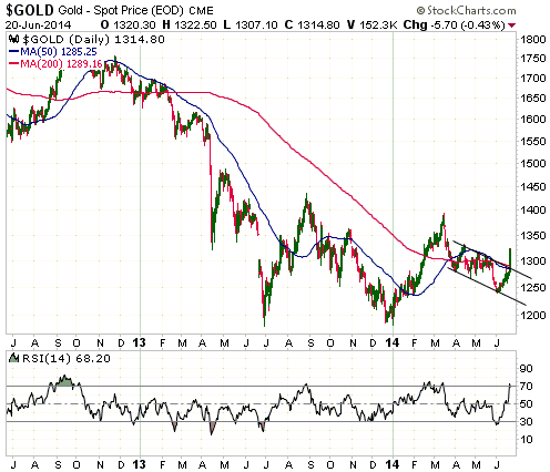
By the way, while the historical record indicated that the so-called
"Golden Cross" (the 50-day MA crossing from below to above the 200-day
MA) that occurred in March would probably mark a short-term price high
and that the so-called "Death Cross" (the 50-day MA crossing from above
to below the 200-day MA) that occurred at the end of May would probably
mark a short-term price low, the next Golden Cross -- which is likely to
occur within the coming month -- will have no predictive value.
The reason for the gold reversal
Despite much press coverage putting last week's sharp rise in the gold
price down to increasing Iraq-related tensions and/or the Fed's
confirmation that official US interest rates would not be raised for a
long time, neither explanation rings true. First, increasing tension in
Iraq would affect the oil market more than the gold market and would
also affect the equity and bond markets, but there were no signs of
heightened concerns about Iraq in any of these markets. Second, the
Fed's plan to keep its targeted interest rate near zero for the
foreseeable future is not news. Everyone was already aware of this.
It could be argued that by emphasising her devotion to hopelessly flawed
Keynesian ideas at a press conference last Wednesday, Janet Yellen gave
a gentle downward push to confidence in the Fed. Given that gold's
perceived value is the reciprocal of confidence in the Fed, this could
have helped to 'get the gold ball rolling'. However, last Thursday's
surge in the gold price had been telegraphed well in advance by the
performance of the gold-mining sector, so we don't think it makes sense
to attribute the rise to any particular piece of recent news.
We think the upward reversal can be adequately explained by the
combination of fundamental drivers and a bullish mismatch between
sentiment and price action (sentiment had become far more bearish than
warranted by the price action). As stated in the 9th June Weekly Update:
"It seems that almost every 'technical analyst' on the planet is
calling for gold and the gold-mining indices to make new lows within the
next few months. The long-term bulls expect a final decline to marginal
new lows prior to the start of a multi-year upward trend, whereas the
long-term bears expect a decline to well below last year's lows as part
of a continuing bear market. Enough strength over the weeks ahead to
confirm that the March-June decline was a correction to a new upward
trend rather than the continuation of the 2011-2013 downward trend would
therefore catch the maximum number of chart-huggers and price-followers
off guard. This doesn't mean that gold is about to reverse course and
prove the majority wrong, but it does mean that there is plenty of
sentiment-related fuel to propel the price upward. As discussed in
previous commentaries, there is also now plenty of fundamentals-related
fuel for a gold rally..."
|
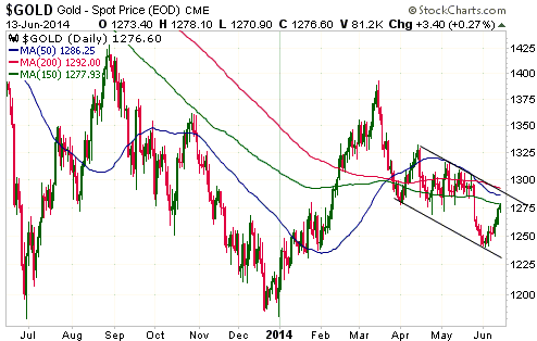
| 16-Jun-14 |
From
the 16th June 2014 Weekly Update:
Gold
We've written that gold needs to get back above $1280 on a daily closing
basis to confirm that the short-term trend has reversed from down to up,
but $1292 is actually a more significant price level. A daily close
above $1292 would break gold above its short-term channel top as well as
its 50-day, 150-day and 200-day moving averages. This is a feat that has
already been accomplished by GDXJ and has almost been accomplished by
the HUI. We expect that it will be accomplished by gold bullion within
the next three weeks, but hopefully not in response to news from Iraq.
When the gold price rose to around $1350 in late February we thought it
was due for a correction that could take it down as far as the $1270s.
The Ukraine drama then began, which quickly pushed the gold price up to
almost $1400 in early March. We said at the time that as is always the
case when gold is bid-up in reaction to international military conflict
or the increasing threat of international military conflict, all the
price gains achieved by gold on the back of the Ukraine news would be
relinquished. This turned out to be so, but with the clarity that only
hindsight can provide we now see that the upward price spike in reaction
to the Ukraine drama had a much larger effect than originally
anticipated. In a financial-market version of Newton's Third Law of
Motion (for every action there is an equal and opposite reaction), the
surge of uninformed gold-buying prompted by the Ukraine news set the
stage for a deeper and longer correction than would otherwise have
happened.
Due to the
latest developments in Iraq, with Sunni jihadist militants have
taken control of the country's second-largest city and a further
escalation of violence seemingly on the cards, understanding how gold
typically responds to increasing geopolitical instability could be of
near-term importance. That's why we just revisited gold's reaction to
the Ukraine drama.
The recent upturn in gold-related investments does not appear to be due
to the latest developments in Iraq, but if gold spikes upward in the
near future in response to a worsening situation in Iraq then the start
of the next multi-month advance in the gold price would likely be
postponed. This is because any Iraq-related gains would subsequently be
given back and because the surge of uninformed buying would weaken the
structure of the market.
Now, if the situation in Iraq were to worsen to the point where it
provoked another large-scale US military intervention, then the backdrop
would become increasingly gold-bullish. This would not be directly due
to the military action itself, but due to the damage to the US economy
inflicted by the government wasting a lot more resources on another
counter-productive escapade. However, history teaches us that even in
this case the initial price gains would likely be given back in full.
|
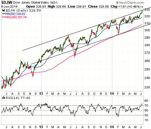
| 09-Jun-14 |
From
the 9th June 2014 Weekly Update:
The Stock Market
...We are surprised that the stock market's upward trend has extended
into June. This opens up the possibility that the overall topping
process could continue into the final quarter of this year, with a
significant decline during the next couple of months followed by a rally
to test the high later in the year.
On a short-term basis, however, the recent price action has only
increased the downside risk, in that the strength that has enabled the
NASDAQ100 Index (NDX) to confirm the new highs in the S&P500 Index (SPX)
has led to the senior stock indices becoming very 'overbought'. As an
example, the Dow Jones World Stock Index (DJW) has risen on 10 of the
past 12 trading days. The daily advances have all been small, but, as
illustrated by the following daily chart, the result is that DJW is now
at the top of its intermediate-term price channel and DJW's daily
RSI(14) is now at a 2-year high.
Also worth noting is that a put/call sell signal was generated at the
end of last week in the US stock market. We define a put/call sell
signal as the 10-day moving average of the equity put/call ratio moving
to the vicinity of its 3-year low concurrently with the 10-day MA of the
OEX (S&P100 Index) put/call ratio moving to the vicinity of its 3-year
high. Such signals usually occur no more than twice per year and are
short-term bearish omens because they indicate a lack of concern about
downside risk on the part of the 'dumb money' (the dominant influence on
equity option volumes) combined with a heightened level of concern about
downside risk on the part of the 'smart money' (the dominant influence
on OEX option volumes).
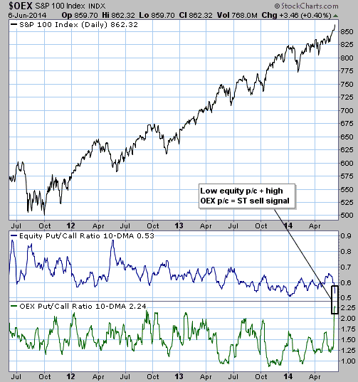
Therefore, although the stock market has defied our expectations over
the past few weeks, this is not a good time to become more short-term
bullish.
|
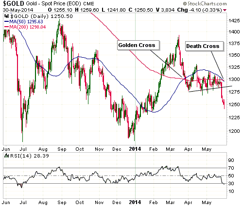
| 02-Jun-14 |
From
the 2nd June 2014 Weekly Update:
Gold
The "Golden Cross" and the "Death Cross"
There was a "Golden Cross" in the gold market during the second half of
March. It worked the way that the historical record indicated it would
work (it marked a high of at least short-term importance), which happens
to be the opposite of the way that most commentators and analysts
believe it is supposed to work. To further explain, here is an excerpt
from our 19th March commentary:
"While on the subject of false beliefs, another one that will soon
come into play in the gold market is the "Golden Cross". A Golden Cross
is defined as a move -- in any market -- by the 50-day MA from below to
above the 200-day MA. Its opposite (a move by the 50-day MA from above
to below the 200-day MA) is often referred to as a Death Cross.
There is widespread belief that Death Crosses are bearish and Golden
Crosses are bullish, but nobody who has bothered to check the historical
record could hold this belief. Here are the facts:
1) A sizeable majority of Death Crosses in major financial markets occur
near lows of at least short-term importance. A Death Cross therefore
tends to be a BULLISH signal.
2) On average, a Golden Cross has no predictive value. The historical
record suggests that it is neither reliably bullish nor reliably
bearish. However, in the gold market a particular type of Golden Cross
has generally occurred near a high of at least short-term importance. We
are referring to the situation where the cross occurs after the 50-day
MA has risen from a long way below the 200-day MA. This is the situation
we will be dealing with if -- as is very likely -- the gold market
achieves a Golden Cross in the near future."
As illustrated by the following daily chart, the gold market's
March-2014 Golden Cross occurred about one week after a multi-month
price high. There has since been sufficient price weakness to pull the
50-day MA below the 200-day MA, creating a so-called Death Cross. The
Death Cross occurred last week. Contrary to popular belief, the
historical record indicates that this is a bullish signal.
|
| 19-May-14 |
From
the 21st May 2014 Interim Update:
Gold Stocks
The HUI is staggering along near its lows of the past two months,
frustrating the bulls by not showing any sign of strength and
frustrating the bears by not accelerating downward. Beneath the surface,
however, there is evidence that the downward correction of the past two
months is about to end. We are referring to the fact that a bullish
divergence has developed between the HUI and the GDXJ/GDX ratio (junior
gold stocks relative to senior gold stocks).
The following chart shows the aforementioned bullish divergence as well
as the bearish divergence that formed during February-March and the
bullish divergence that formed in December. In this case, a bullish
divergence involves lower lows in the HUI in parallel with higher lows
in GDXJ/GDX, while a bearish divergence involves higher highs in the HUI
in parallel with lower highs in GDXJ/GDX.
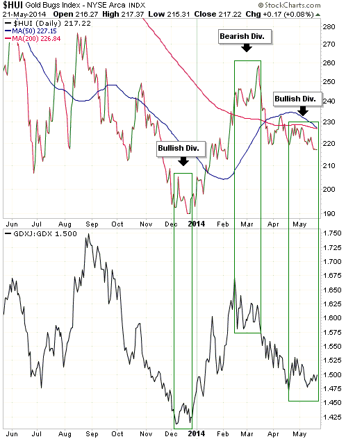
Even if the gold-mining sector is about to begin a new short-term upward
trend (we think it is), a 'cleansing' spike down to 210 could precede a
sustainable upturn.
|
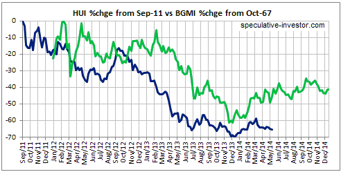
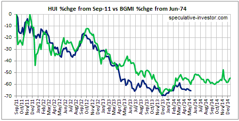
| 19-May-14 |
From
the 19th May 2014 Weekly Update:
Gold Stocks
Updated comparisons with the 1970s
Updated charts comparing the BGMI (Barrons Gold Mining Index) from its
1967 and 1974 peaks with the current HUI are displayed below. The
current price action continues to be most similar to 1977 (the second of
the following charts).
If the current price action continues to follow the 1977 path then an
upward reversal will occur this week, perhaps following a spike to a new
correction low.
|
| 19-May-14 |
From
the 14th May 2014 Interim Update:
Money Velocity, Supply and Demand
"Money Velocity" is NOT a useful concept in economics or
financial-market speculation. The reasons have been discussed numerous
times in TSI commentaries over the years, but in response to some emails
received over the past few weeks it is time for a brief recap.
As is the case with the price of anything, the price of money is
determined by supply and demand. Supply and demand are always equal,
with the price adjusting to maintain the balance. A greater supply will
often lead to a lower price, but it doesn't have to. Whether it does or
not depends on demand. For example, if supply is rising and demand is
attempting to rise even faster, then in order to maintain the
supply-demand balance the price will rise despite the increase in
supply.
When it comes to price, the main difference between money and everything
else is that money doesn't have a single price. Due to the fact that
money is on one side of almost every economic transaction, there will be
many (perhaps millions of) prices for money at any given time. In one
transaction the price of a unit of money could be one potato, whereas in
another transaction happening at the same time the price of a unit of
money could be 1/30,000th of a car. This, by the way, is why all
attempts to come up with a single number -- such as a CPI or PPI -- to
represent the price of money are misguided at best.
To summarise, in the real world there is money supply and there is money
demand; there is no money "velocity". Why, then, do so many economists
and commentators on the economy harp on about the "velocity of money"?
The answer is that the velocity of money is part of the very popular
equation of exchange, which can be expressed as M*V = P*Q where M is the
money supply, V is the velocity of money, Q is the total quantity of
transactions in the economy and P is the average price per transaction.
The equation is a tautology, in that it says nothing other than the
total monetary value of all transactions in the economy equals the total
monetary value of all transactions in the economy. In this
ultra-simplistic tautological equation, V is whatever it needs to be to
make the left hand side equal to the right hand side.
Another way to express the equation of exchange is M*V = nominal GDP, or
V = GDP/M. Whenever you see a chart of V, all you are seeing is a chart
of nominal GDP divided by money supply. That's why a large increase in
the money supply will usually go hand-in-hand with a large decline in V.
In conclusion, V (money velocity) does not exist outside of a
mathematical equation that, due to its simplistic and tautological
nature, cannot explain real-world phenomena.
|
| 05-May-14 |
From
the 5th May 2014 Weekly Update:
Gold fundamentals now bullish
The fundamental backdrop was unequivocally gold-bearish during the first
half of last year. Around the middle of last year it began to shift in
gold's favour with the upside breakout in the US yield-spread (the
difference between 10-year Treasury yields and 2-year Treasury yields)
and the rolling over of the BKX/SPX ratio, but at the beginning of this
year it could best be described as mixed (neither definitively bullish
nor definitively bearish). It remained 'mixed' throughout the first
quarter, but due to two recent developments it is now bullish. One of
these developments is the downside breakout in the BKX/SPX ratio
discussed in last week's Interim Update. The other is the downside
breakout in the HYG/TLT ratio, a credit-spread indicator. HYG/TLT rises
when credit spreads are contracting (indicating rising economic
confidence, which is bearish for gold) and falls when credit spreads are
expanding (indicating declining economic confidence, which is bullish
for gold).
Here is a chart comparing the gold price and the HYG/TLT ratio. The
inverse relationship of the past 3.5 years is clear.
By the way, in addition to being a bullish omen for gold, last week's
downside breakout in the HYG/TLT ratio is a bearish omen for the broad
stock market.
|
| 31-Mar-14 |
From
the 31st March 2014 Weekly Update:
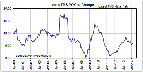
Monetary Inflation Update
The ECB got around to publishing its
money-supply data for February late last week, enabling us to update our
euro and G2 (US plus euro-zone) True Money Supply (TMS) charts.
Our first chart shows the year-over-year (YOY) percentage change in euro
TMS. The ECB is coming under pressure to do more on the monetary
inflation front, but recently it hasn't done much. Over the past two
months the YOY rate of change in euro TMS flatlined at around 6%.
Note that while we have no opinion about the euro's likely performance
on the foreign exchange market over the weeks immediately ahead, we are
intermediate-term bullish on this currency (relative to the US$). The
primary reason is our expectation that the low valuations of European
equities relative to US equities will lead to outperformance by the
former, boosting the investment/speculative demand for the euro. A
secondary reason is that despite the Fed's "tapering" and the apparent
intention of the ECB to do more on the monetary inflation front, the ECB
could end up doing less than needed, in the face of substantial natural
deflationary pressures, to create the sort of "price inflation" that bad
economists and central bankers believe to be beneficial.
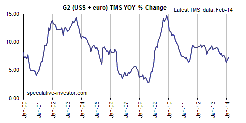
Our second chart shows the YOY percentage change in G2 TMS -- in our
opinion the most useful leading indicator of the global boom-bust
economic cycle. The last two economic busts commenced about 6 months
after the annual growth rate of G2 TMS dropped to 5%. At around 7% the
current growth rate is only slightly above its low of the past 4 years,
but still comfortably above the level that ushered-in the previous two
busts.
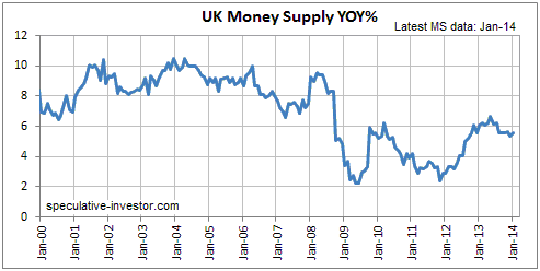
The UK's YOY rate of money-supply growth has been stable at 5.5%-6.5%
for almost 18 months. This is inflationary, but not as inflationary as
the money-supply growth rates in many other countries. Also, the average
rate of increase in the supply of British Pounds was relatively low
during 2009-2012. This goes part of the way towards explaining the
strength in the Pound's exchange rate over the past 12 months and should
continue to create a tail-wind for the Pound over the coming 12 months.
|
| 24-Mar-14 |
From
the 19th March 2014 Interim Update:
Gold
Unfounded Beliefs
In the latest Weekly Update we warned that the Ukraine situation created
near-term downside risk rather than near-term upside potential for gold.
Based on the historical record it was almost inevitable that gold would
fully retrace any gains made in reaction to the heightened threat of
military conflict in Ukraine, with $30/oz being our guess as to the
amount of Ukraine premium in the price as at the end of last week.
When it became apparent at the beginning of this week that the Ukraine
conflict was not going to immediately escalate, the gold price quickly
dropped $30.
The Ukraine-related conflict between Russia and the "West" could
escalate in the future, causing the gold price to surge. If it does, the
same will apply: any price gain made by gold on the back of such news
would almost certainly be retraced in full.
The upshot is that contrary to popular belief, international military
conflict or increasing risk of such conflict never creates a short-term
buying opportunity in the gold market. However, it sometimes creates a
short-term selling opportunity.
While on the subject of false beliefs, another one that will soon come
into play in the gold market is the "Golden Cross". A Golden Cross is
defined as a move -- in any market -- by the 50-day MA from below to
above the 200-day MA. Its opposite (a move by the 50-day MA from above
to below the 200-day MA) is often referred to as a Death Cross.
There is widespread belief that Death Crosses are bearish and Golden
Crosses are bullish, but nobody who has bothered to check the historical
record could hold this belief. Here are the facts:
1) A sizeable majority of Death Crosses in major financial markets occur
near lows of at least short-term importance. A Death Cross therefore
tends to be a BULLISH signal.
2) On average, a Golden Cross has no predictive value. The historical
record suggests that it is neither reliably bullish nor reliably
bearish. However, in the gold market a particular type of Golden Cross
has generally occurred near a high of at least short-term importance. We
are referring to the situation where the cross occurs after the 50-day
MA has risen from a long way below the 200-day MA. This is the situation
we will be dealing with if -- as is very likely -- the gold market
achieves a Golden Cross in the near future.
The 20-year gold-market history of the type of Golden Cross mentioned
above (the type where the cross occurs after the 50-day MA has risen
from a long way below the 200-day MA) contains only five examples. Here
they are:
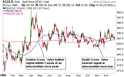
1) In April of 1995, a Golden Cross occurred about one week after an
intermediate-term price high. An intermediate-term price low was then
marked by a Death Cross in October of the same year.
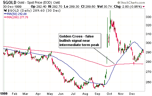
2) In October of 1999, a Golden Cross coincided with an
intermediate-term price peak.
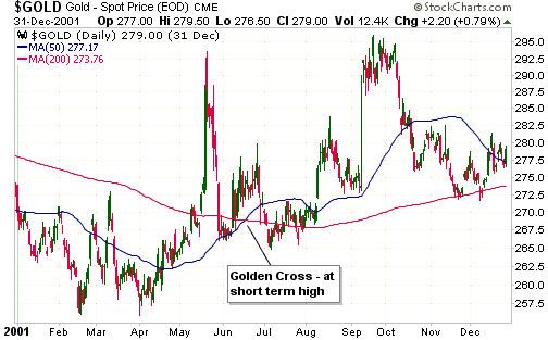
3) In June of 2001, a Golden Cross coincided with a short-term price
peak. If Golden Crosses are supposed to be bullish signals then the
June-2001 cross was the least wrong of our examples.
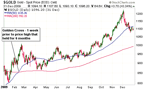
4) In February of 2009, a Golden Cross occurred about one week prior to
a price high that held for 6 months.
5) In September of 2012, a Golden Cross occurred just prior to an
intermediate-term price high. If Golden Crosses are supposed to be
bullish signals then the September-2012 cross was the biggest failure of
the past 20 years due to the fact that it occurred near the beginning of
a large 9-month price decline.

|
| 27-Jan-14 |
From
the 27th January 2014 Weekly Update:
Gold
If we use a magnifying glass we see that gold broke out to the upside
last Friday, but if you have to use a magnifying glass to see a breakout
then a breakout hasn't really happened. The US$ gold price is clearly
very close to providing us with preliminary evidence of an upward trend
reversal by breaking above its channel top and its December-2013 rebound
peak, but some additional strength is required.
A weekly close above $1300 would be conclusive evidence of an upward
trend reversal.
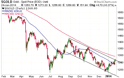
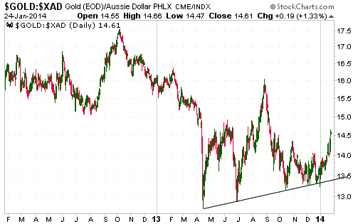
In A$ terms, gold bottomed last April and has since made a sequence of
higher lows. This price action should lead to relatively good results
for gold producers with operations in Australia.
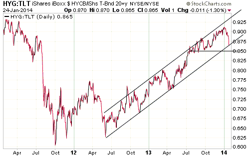
In the 6th January Weekly Update, we wrote:
"Gold's fundamentals turned more bullish in mid-2013 and in our
opinion will become increasingly so over the next 6 months, but right
now the fundamental backdrop for gold can best be described as mixed.
The reason, in a nutshell, is that there is still a lot of economic
optimism and confidence in both the Fed and the ECB. That's why credit
spreads have been relentlessly narrowing since June of 2012 and are now
almost as narrow as they ever get.
The narrowing of credit spreads is indicated on the first of the
following charts by the upward trend in the HYG/TLT ratio (high-yield
bonds relative to Treasury bonds), because HYG outperforms TLT when
investors become less risk averse and bid-up high-yield (junk) bonds
relative to US government bonds. The HYG/TLT ratio probably can't go
much higher, but it needs to start trending lower to become 'gold
bullish'. A break below 0.85 would confirm a downward trend reversal."
The HYG/TLT ratio hasn't yet become 'gold bullish' by confirming a
downward trend reversal, but the following chart shows that it is now
heading in the right direction.
|
| 20-Jan-14 |
From
the 20th January 2014 Weekly Update:
Probably the most important fundamental
[gold] driver right now
Given that gold is widely viewed as a hedge against problems in the
financial system it makes sense that the relative strength of the
banking sector tends to have a significant effect on the gold market.
Over the past few years this effect has been much stronger than usual.
In fact, we noted in a recent commentary that the banking sector's
relative strength, as indicated by the BKX/SPX ratio, currently appears
to be the most influential of gold's fundamental price drivers.
The strong inverse relationship between the US$ gold price and the BKX/SPX
ratio is illustrated below. Notice that the major 2011 high for the gold
price roughly coincided with a major low for the BKX/SPX ratio and that
the late-June bottom for the gold price roughly coincided with a peak
for BKX/SPX. The jury is still out as to whether the June-July 2013
extremes for the gold price and the BKX/SPX ratio were the major
variety.

By the way, gold has tended to lead the BKX/SPX ratio by 1-3 months at
significant turning points over the past three years. We are referring
to the fact that gold turned lower about 3 months before BKX/SPX turned
higher in late-2011, that gold turned higher about 1 month before BKX/SPX
turned lower in mid-2013, and that gold turned lower about 2 months
before BKX/SPX turned higher in Aug-Oct of 2013. At this time we have a
late-December upward reversal in the gold price that should, if it is
genuine, be confirmed by a downward reversal in BKX/SPX by the end of
March.
Always one of the least important fundamental [gold] drivers
As explained in many TSI commentaries over the years, changes in annual
gold production are so unimportant that they can safely be ignored when
considering bullish and bearish influences on the gold price.
The gold market can be likened to a company that increases its share
count by about 1.7% every year. In this analogy, the amount of new
supply added by the mining industry to the aboveground gold inventory
each year is equivalent to our hypothetical company's small annual
addition to its share count. Some years the increase in the share count
could be as high as 1.9% and some years it could be as low as 1.5%, but
in terms of effect on the share price these variations in the number of
new shares will be dwarfed by changes in sentiment, the performance of
the broad stock market, company-specific fundamentals such as earnings,
and economy-wide fundamentals such as monetary policy.
In the gold market, the small annual change in the total aboveground
supply will always be trivial compared to influences such as central
bank monetary machinations and changes in economic confidence. So,
anyone who is currently basing a bullish gold view on the possibility
that gold production will decline is probably going to be right for the
wrong reason.
|
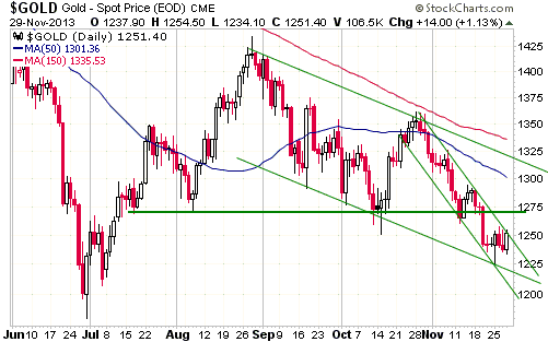
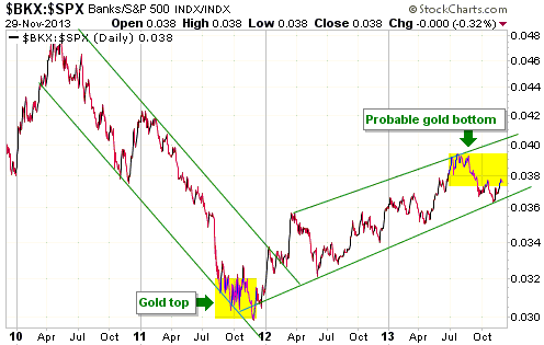
| 02-Dec-13 |
From
the 2nd December 2013 Weekly Update:
Gold
Although the gold price did very little last week, the price action
helped to define the two price channels indicated on the following daily
chart. Notice, in particular, that last week's intra-day low coincided
with the bottom of a channel dating back to the late-August rebound high
and the bottom of a narrower and more steeply-sloped channel dating back
to the October rebound high.
Friday's close coincided with the top of the steeply-sloped channel
dating back to the October high, so any additional price gain from here
would create a minor upside breakout. However, more important resistance
lies in the $1270s. A counter-trend rebound shouldn't do more than test
this resistance, which is why we would interpret consecutive daily
closes above $1280 as confirmation that an important bottom was in
place.
Over the past 5 years, one of the most important gold-market
'fundamentals' has been the relative performance of the US banking
sector as indicated by the BKX/SPX ratio. Gold tends to do well when the
banking sector is weakening relative to the broad stock market and gold
tends to do poorly when the banking sector is strengthening relative to
the broad stock market. The following chart shows the performance of the
BKX/SPX ratio.
There is preliminary evidence in the market action that the BKX/SPX
ratio made a trend reversal of at least intermediate-term significance
at the end of June-2013. Taking out the early-November low would provide
conclusive evidence of such a development and would substantiate the
view that the gold market commenced a major bottoming process in June.
|
| 04-Nov-13 |
From
the 4th November 2013 Weekly Update:
Eric Sprott's Flawed Analysis
Great success in business or investing does not imply great
understanding of macroeconomics or how the gold price is formed. This
has been proved many times in the past by Warren Buffett. Recently, it
has also been proved by Eric Sprott in an
open letter to the World Gold Council (WGC). Sprott criticises the
hopelessly-flawed supply-demand analysis of both the WGC and Gold Fields
Mineral Services (GFMS), but not for the right reasons. He actually uses
the same hopelessly-flawed methodology, the only differences being in
some of the figures that are plugged into the analysis.
Sprott, the WGC and GFMS tally the amounts of gold bought by some parts
of the gold market and call this quantity "demand", and tally the
amounts of gold sold by other parts of the gold market and call this
quantity "supply". They then compare the two tallies to determine
whether the gold price should be rising or falling.
In this method of analysis, the gold-mining industry is by far the
biggest seller. In fact, in this method of analysis the supply side of
the equation is always represented by the 2400-2800 tonnes per year of
gold produced by the mining industry plus the amounts of gold sold by a
few relatively minor players. Over the past year the gold ETFs have
collectively been one of these minor players on the supply side
(physical gold has left the ETFs).
In the real world, however, the supply side of the equation is the total
aboveground gold inventory, which is about 150,000 tonnes. Since all the
gold is always held by someone, demand is also equal to the total
aboveground inventory of (very roughly) 150,000 tonnes. In other words,
at any given time supply equals demand equals 150,000 tonnes.
In the real world, the gold sold by the mining industry is no different
to the gold sold by any of the current holders of gold. For example, if
the gold price reaches a level at which Trader A wants to buy 1,000
ounces of gold, then Trader A's demand can be satisfied by a sale of
gold on the part of any of the current holders of gold, including the
mining industry.
Price is the quantity that changes to keep supply and demand in balance.
If demand increases relative to supply at a certain price, the price
will immediately adjust upward by as much as it takes to re-establish
the balance. By the same token, if demand falls relative to supply at a
certain price then the price will immediately adjust downward by as much
as it takes to re-establish the balance. Price, therefore, is the only
measure of whether the urgency to sell is rising or falling relative to
the urgency to buy.
Here's another way to look at the situation: For every purchase there
must be a sale. That is, the amount of gold sold must always be equal to
the amount of gold bought (another reason, by the way, that it makes no
sense to separately tally sales and purchases as if one could ever be
larger than the other). What causes the price to change, therefore,
isn't a greater volume of selling or buying, it's the relative eagerness
of buyers and sellers. For example, if a large number of eager
get-me-out-at-any-price sellers enter the market then the volume of
trading will increase, meaning that the amount of gold sold and the
amount of gold bought will increase by the same amount, and the price
will fall. Some analysts will look at the increase in buying that
accompanied the price decline and will be nonplussed, because they don't
seem to understand that an increase in buying MUST go hand in hand with
an increase in selling, and that the price decline tells you with 100%
certainty that the sellers were more eager than the buyers.
Over the past six months we've probably devoted too much space in TSI
commentaries to debunking the nonsensical gold supply-demand analysis
that gets put out by GFMS, the WGC, and now Eric Sprott. However, it's
an important issue, because gold bulls (including us) can't learn from
past mistakes unless they understand why they were wrong. If you were
bullish over the past year and you still believe that you were right to
be bullish, then you haven't learned anything and you will almost
certainly make the same mistake again.
|
| 21-Oct-13 |
From
the 16th October 2013 Interim Update:
The China-Gold Myth
Rather than cast doubt on the wrongheaded idea that China's buying is a
cornerstone of the gold bull market, the fact that a major 2-year
correction in gold's bull market has coincided with a large increase in
the amount of gold flowing into China has only served to fuel conspiracy
theories. After all, how could the gold price trend downward in parallel
with a large increase in Chinese demand unless powerful, unnatural
forces were at work?
The gold price is capable of trending downward in parallel with a large
increase in Chinese demand because the change in China's demand for gold
explains very little about past movements in the gold price and says
very little about likely future movements in the gold price. In more
general terms, the amount of gold flowing from one geographic region to
another or from one set of holders to a different set of holders tells
us nothing useful about gold's major price trend. The reason is that the
flow of gold is an indicator of trading volume, which can increase or
decrease in parallel with a rising or a falling price. The market-wide
urgency to buy relative to the market-wide urgency to sell is what
determines the price, and the only reliable indicator of whether buyers
or sellers have greater urgency is the change in the price itself.
By way of further explanation, consider a model of the global gold
market in which there are only two traders: China and the World
Excluding China. We'll refer to China as Trader A and the World
Excluding China as Trader B. Clearly, in order for Trader A to increase
its gold exposure, Trader B must decrease its gold exposure, and vice
versa. To put it another way, for A to be a net-buyer B must be a net
seller, and for B to be a net-buyer A must be a net seller. Price is the
force that keeps the change in A's demand in balance with the change in
B's demand. This means that if B is not prepared to part with enough
gold to satisfy an increase in A's demand at a gold price of X, then the
price will rise to (X+Y) where Y is whatever it needs to be to bring the
market into balance.
Those making the "China's buying is bound to drive the gold price to new
highs" claim are, in effect, only looking at one side of the equation.
They are looking at A's buying and forgetting about B's selling. They
seem to be making the assumption that A is increasing its buying while B
does nothing, but this assumption is patently wrong because A cannot
possibly increase its buying unless B increases its selling. The change
in price is the only valid indicator of which is the more important, A's
buying or B's selling. Moreover, a net flow of gold from A to B or from
B to A could be accompanied by either a rising or a falling gold price.
In fact, not only is a net flow of gold from B (the World ex-China) to A
(China) not inherently bullish, a net flow in the opposite direction
would not be inherently bearish.
Another relevant point is that Trader B (World ex-China) is the
proverbial gorilla in the gold market. To understand why, consider that
in very rough terms there are probably at least 150,000 tonnes of
aboveground gold in the world and probably no more than 10,000 tonnes of
gold in China. This means that when total gold supply is taken into
account, China is probably no more than 6.7% of the global market. This,
in turn, means that it would take a 30% increase in China's gold demand
to offset a 2% decrease in gold demand across the rest of the world. It
is therefore fair to say that if the overall demand for gold outside
China rises by at least a few percent then the gold price is going to
rise, regardless of what's happening in China, and if the overall demand
for gold outside China falls by at least a few percent then the gold
price is going to fall, regardless of what's happening in China.
To sum up, we aren't saying that an increase or a decrease in China's
gold demand is completely irrelevant. We are saying that a) China can
only increase its gold ownership if the World Excluding China decreases
its gold ownership, b) price is the only reliable indicator of the
importance of China's gold demand relative to the gold demand of the
World Excluding China, and c) China's gold demand is dwarfed -- in terms
of effect on the gold price -- by the overall change in gold demand
outside China.
As explained in many previous TSI commentaries, the overall change in
gold demand outside China is largely determined by confidence in the
senior central banks and the stock market's valuation trend.
|