![]()
![]()
![]()
![]()
- Interim Update 1st March 2017
Copyright
Reminder
The commentaries that appear at TSI
may not be distributed, in full or in part, without our written permission.
In particular, please note that the posting of extracts from TSI commentaries
at other web sites or providing links to TSI commentaries at other web
sites (for example, at discussion boards) without our written permission
is prohibited.
We reserve the right to immediately
terminate the subscription of any TSI subscriber who distributes the TSI
commentaries without our written permission.
Charts and Indicators
The "Charts and Indicators"
(C&I) page at the TSI web site has been revamped. We've removed any charts
with information that can be obtained from popular charting services such
as Stockcharts.com and added charts with useful information that might not
otherwise be easy for our readers to access.
The page is now split
into three sections. The first section is called "US Stock Market
Sentiment Indicators" and contains charts of the TSI Index of Bullish
Sentiment (TIBS), the 5-day MA of the equity put/call ratio and the 5-day
MA of the VIX. The second section is called "Global Monetary Indicators"
and contains charts showing the year-over-year rates of change in US True
Money Supply (TMS), euro-zone TMS and G2 TMS. The third section is called
"US Economic Indicators" and contains charts of the Future Inflation Gauge
(FIG), Real Gross Private Domestic Investment (RGPDI), the ISM
Manufacturing New Orders Index and the CPI-Adjusted TMS Growth Rate.
The sentiment charts are updated weekly and most of the other charts
are updated monthly. There is probably no need to check the C&I page more
than twice per month, because even the charts that are updated weekly
won't usually vary by much from one week to the next.
To access the
C&I page, first log into the TSI web site and then click on "Charts and
Indicators" in the menu.
US Recession Watch
The latest iteration of the
monthly ISM Manufacturing New Orders Index (NOI), which is one of the
charts now included in the "Charts and Indicators" page at the TSI web
site, was reported on Wednesday 1st March. This is the most reliable
short-term leading indicator of US recession and is one of the few
economic numbers worthy of our attention.
The latest NOI (the
number for February-2017) was very strong. It is now close to its highs of
the past 10 years and obviously a long way above the level it would have
to drop below (the red line on the following chart) to warn of an imminent
start to a recession. The message is the same as it was a month ago, which
is that the US economy is expanding and will probably keep doing so for at
least a few more months.
To repeat our conclusion from early last
month: The probability of a US recession beginning during the first half
of 2017 is close to zero.

The Stock Market
On 28th February the Dow
Transportation Average (TRAN) finally achieved a monthly close above its
November-2014 high, removing a long-term bearish non-confirmation.
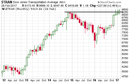
The removal of TRAN's bearish non-confirmation increases the
probability that the long-term bull market is not about to end. At the
same time, the rally has become sufficiently manic to greatly increase the
risk that an intermediate-term correction will soon begin.
Traders
are now taking any development as a reason to buy. The possibility of the
Fed hiking its targeted interest rate in March: a reason to BUY! The
possibility of the Fed holding off on hiking its targeted rate for a while
longer: a reason to BUY! The expectation that Trump will provide details
of a phenomenal tax-cutting plan in his end-February address to Congress:
a reason to BUY! Trump providing no details of his tax-cutting plan and
instead spewing forth a torrent of meaningless platitudes in his
end-February address to Congress: a reason to BUY!
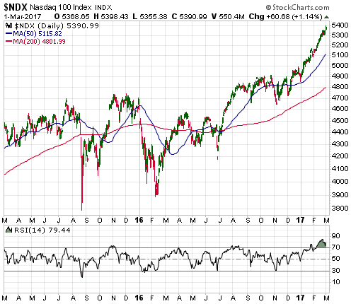
Here is one
picture of the mania in progress. This picture shows the NASDAQ100 Index
(NDX), which is up by around 10% since the beginning of the year.
Here is another picture of the mania in progress. This picture shows
the Dow Industrials Index relative to a 200/12 MA envelope (a 12% envelope
around the 200-day MA). Apart from during the initial rebound from the
2008 crash and during the mania of 1999, at no time over the past 19 years
has the Dow been as stretched to the upside relative to its 200-day MA as
it is right now.
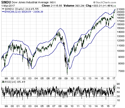
The risk is now extreme, but there is no evidence that the blow-off
has ended. We guess that it will end this month.
Gold and the Dollar
Gold
The gold price versus GLD's gold inventory
The change in the amount of physical gold held by the SPDR Gold Trust
(GLD), the largest of the gold bullion ETFs, is a popular fact among
gold-market analysts. Unfortunately, this particular fact generally has no
predictive value, which is why it rarely gets mentioned at TSI. It has no
predictive value because changes in the GLD inventory usually just follow
the gold price.
In brief, here's how it works: When the gold price
begins to trend upward, traders of GLD shares tend to become more bullish
and buy with sufficient enthusiasm to push GLD's market price above its
net asset value (NAV). This creates the opportunity for GLD's Authorised
Participants (APs) to make a risk-free arbitrage profit that involves
increasing the number of GLD shares and adding physical gold to the fund's
inventory. And when the gold price begins to trend downward, traders of
GLD shares tend to become more bearish and sell with sufficient vigor to
push GLD's market price below its NAV. This creates the opportunity for
GLD's Authorised Participants to make a risk-free arbitrage profit that
involves reducing the number of GLD shares and removing physical gold from
the fund's inventory.
The result, as illustrated by the following
chart, is a physical gold inventory that typically tracks the gold price.
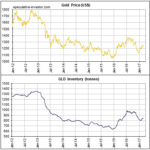
Occasionally there is a divergence between the gold price and the GLD
inventory, but the divergences don't provide consistent messages.
Furthermore, divergences over the past 6 years (the period covered by the
above chart) have tended to be resolved by the GLD inventory moving into
line with the price. For example, in 2012 a downward trend in the gold
price began well before a downward trend in the GLD inventory and in
December-2016 the gold price turned upward about one month ahead of the
GLD inventory.
By the way, a build-up of physical gold in GLD's
inventory does not signify rising demand for physical gold. It signifies
relatively high demand (demand in excess of what would be justified by the
gold price) for GLD shares, which are a form of paper gold.
The
bottom line is that changes in the GLD inventory are usually nothing more
than reactions to changes in the gold price that have already happened.
They generally don't provide useful clues as to what the future holds in
store.
Current Market Situation
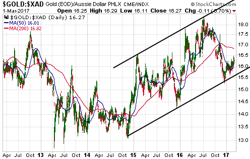
Before considering the recent performance of gold in US$ terms we are
taking a look at gold in A$ (Australian dollar) terms. It's the A$ gold
price (gold/A$), not the US$ gold price, that determines the profitability
of gold mines located in Australia.
For a price channel to be
properly defined it must be defined by at least 5 points -- at least 3
points on one side and at least 2 points on the other side. As illustrated
below, the price channel traced out by gold/A$ over the past 2.5 years is
defined by 6 points. It is therefore a properly-defined channel that can
be used for trading purposes.
Generally, the right approach would
involve being bullish when the price is near the channel bottom and
bearish or cautious when the price is near the channel top. Gold/A$
rebounded from its channel bottom in December and is still in the bottom
quartile of its range.
As long as gold/A$ remains both above and
close to its long-term channel bottom, the stocks of gold-mining companies
operating in Australia will have relatively low risk provided that they
are reasonably valued based on the current gold price. Furthermore,
gold-mining companies operating in Australia will be shielded to some
extent from a large decline in the US$ gold price because substantial
weakness in the US$ gold price would likely be accompanied by substantial
weakness in the A$.
The US$ gold price touched its 200-day MA on Monday 27th February. It
then reversed course, but it hasn't yet generated even a preliminary
signal of a short-term top. A rise to new highs for the year within the
coming week or so would therefore not be surprising.
A preliminary
signal that a short-term top is in place would be a daily close below the
20-day MA, which is presently near $1237. As illustrated by the following
chart, the gold price bounced off its 20-day MA on Wednesday.
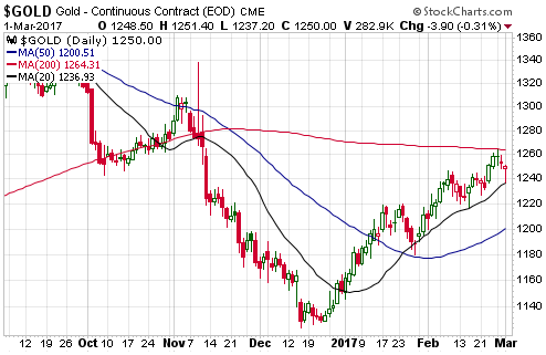
The main reason to expect that a multi-month top will soon be in pace
for the US$ gold price is the evidence that a multi-month top was put in
place in the gold-mining sector more than three weeks ago.
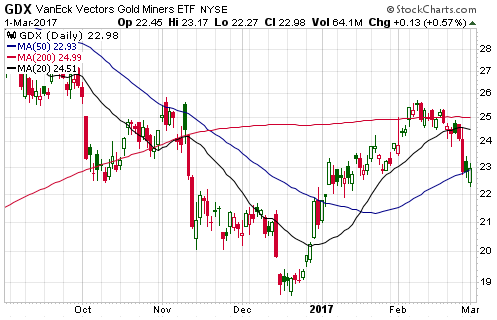
Gold Stocks
Current Market
Situation
The HUI and the XAU have broken below their
respective 50-day MAs, but most of the sector proxies that people actually
trade (nobody buys/sells the HUI or the XAU) have held their 50-day MAs to
date. For example, the following chart shows that GDX traded well below
its 50-day MA on Wednesday but managed to close above it.
The problem for the gold-mining sector isn't its nominal performance
but rather its performance relative to gold. The gold-mining indices and
ETFs began to diverge bearishly from the bullion market during the first
half of February and the divergence became pronounced last week. This has
led to the sort of performance from the HUI/gold ratio and the GDX/GLD
ratio (see chart below) that is normally reserved for important trend
changes from up to down.
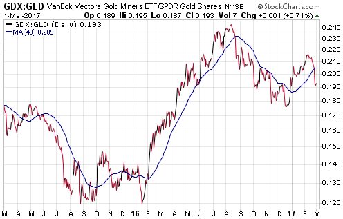
The above chart strongly suggests that the gold-mining sector made a
multi-month price top last month and that the bullion market will soon do
the same.
Taking a very short-term view, there's a good chance that
a 1-2 week rebound will soon begin if it didn't begin on Wednesday. If so,
there will likely be an extension of the bearish
divergence/non-confirmation involving new highs for the year in the gold
price and lower highs for the gold-mining indices.
What to do?
It makes sense to look
for opportunities to buy under-valued and high-potential gold-mining
stocks during weakness, but don't be in a hurry to buy. Instead, gradually
add to existing positions or methodically build-up new positions over
time.
It almost always makes sense to scale in to and out of
positions, especially in those cases when there is likely to be plenty of
time. Now is such a case, because in terms of time the downturn that began
in February is probably not close to being complete. Exactly how much
longer the gold-mining sector will spend in its current corrective or
downward-trending phase is not knowable, but it is likely to be at least 1
month and could be as much as 5 months.
We plan to take advantage
of the downturn by adding at least one and possibly as many as three
gold/silver mining stocks to the TSI List on weakness. For example,
potential additions in response to further significant price weakness are
Gold Road Resources (GOR.AX), a company involved with the development of a
270K-oz/year gold mine in Western Australia, and Golden Arrow Resources
(GRG.V), a company that should soon be producing silver at a project in
Argentina. GOR is presently closer in price to our buy zone and is
discussed below.
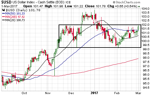
The Currency Market
The
Dollar Index closed above its 50-day MA and made a new multi-week high on
Wednesday 1st March, but it hasn't yet done enough to eliminate the
possibility that it is tracing out the "right shoulder" of a
"head-and-shoulders" topping pattern. To rule out the head-and-shoulders
possibility it needs to close above 102.
While the
head-and-shoulders possibility can't yet be ruled out, a possibility with
a much higher probability is that the Dollar Index is close to completing
a routine short-term correction. In this case, a break above 102 would
likely occur this month and a rise to 108-112 would likely unfold during
the second quarter of this year.
Updates on Stock Selections
Notes: 1) To review the complete list of current TSI stock selections, logon at
http://www.speculative-investor.com/new/market_logon.asp
and then click on "Stock Selections" in the menu. When at the Stock
Selections page, click on a stock's symbol to bring-up an archive of
our comments on the stock in question. 2) The Small Stock Watch List is
located at http://www.speculative-investor.com/new/smallstockwatch.html
![]() Potential
addition to the TSI Stocks List: Gold Road Resources (ASX: GOR). Shares:
871M issued, 883M fully diluted. Recent price: A$0.53
Potential
addition to the TSI Stocks List: Gold Road Resources (ASX: GOR). Shares:
871M issued, 883M fully diluted. Recent price: A$0.53
GOR
controls 6,300 square-kms of land in the Yamarna Gold Belt, Western
Australia, containing one construction-stage project (Gruyere) and two
exploration-stage projects (North Yamarna and South Yamarna). Gruyere is a
50/50 JV with Gold Fields Ltd. (GFI) and is in the process of being
developed into a 270K-oz/year gold mine. South Yamana is a 50/50 JV with
Sumitomo and North Yamarna is 100%-owned by GOR.
North and South
Yamarna are early-stage projects. They have a lot of potential, but aren't
worth much based on the exploration work completed to date. The Gruyere
project is where the bulk of GOR's value rests at this time and is the
reason for our interest in the stock.
As noted above, Gruyere is in
the process of being developed into a 270K-oz/year gold mine. Construction
work has just begun and the initial capex is expected to be about A$510M.
The project's total in-ground resource is 6.6M ounces and the P&P reserve
is 3.5M ounces. The plan is for the first gold pour to occur in Q4-2018.
Based on the FS completed late last year, at a gold price of
A$1600/oz (slightly below the current market price) the Gruyere Project is
estimated to have a post-tax IRR and NPV(8%) of 23.3% and A$424M, resp.
This suggests that GOR's 50% stake in the project is worth about A$212M at
the current gold price. Alternatively, GOR's 50% stake in the project
could reasonably be valued at A$350M, since this is the amount that GFI
agreed to pay GOR last November for the other 50%.
Thanks primarily
to the sale of the 50% Gruyere stake to GFI, GOR had about A$437M of
working capital (and no long-term debt) at the end of December. Only
A$255M of this should be needed to fund GOR's share of the Gruyere
construction cost, so the company is fully funded through to production
with more than enough cash to finance an aggressive multi-year exploration
program.
Our back-of-the-envelope valuation for GOR comprises:
1) A$212M for the Gruyere mine (based on the December-2016 FS).
2) A$397M of working capital (A$437M less estimated CY2017
non-capex-related spending of A$40M).
3) A$50M for exploration
potential.
4) A$10M for the 1.5% Net Smelter Return (NSR) royalty
owned by GOR covering Gruyere production in excess of 2M ounces.
Summing these items gives us a total company value of A$669M, or
A$0.77/share.
If we use A$350M instead of A$212M for the 50%
Gruyere stake, the total estimated value becomes A$0.93/share. However, we
are more comfortable basing our valuation on the economics indicated by
the FS, which means that we are more comfortable with the A$0.77 figure.
Note that GOR does NOT offer substantial leverage to the gold price.
For example, using the "Sensitivity Analysis" included in the FS we
estimate that a change in the gold price of A$100/oz would result in a
change in GOR's per-share value of about A$0.07. It is simply a
gold-mining stock that appears to be significantly under-valued.
The current under-valuation combined with the lack of leverage implies
that GOR is less risky than most development-stage gold mining stocks. On
the other side of the ledger, it doesn't appear to have the multi-bagger
reward potential of some other gold-mining stocks.
GOR is a
reasonable buy at its current price in the low-A$0.50s, but our intention
is to only add it to the TSI List if it trades at A$0.45. A decline to
A$0.45 or lower could happen within the next two months in sympathy with
additional weakness in the gold-mining sector.
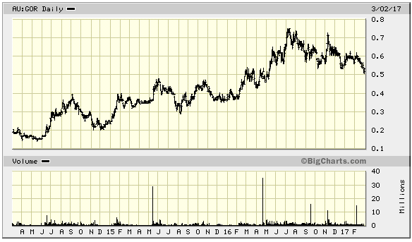
Chart Sources
Charts appearing in today's commentary
are courtesy of:
http://stockcharts.com/index.html
http://bigcharts.marketwatch.com/
![]()