|
- Interim Update 2nd April 2003
The Oil-Euro-Dollar
Link
A hot topic of late has been the idea
that the US invaded Iraq as part of a plan to dissuade OPEC countries from
deciding to price their oil in euros rather than US Dollars. The thinking
is that demand for the US$ gets a significant boost from the fact that
oil is traded in US Dollars and that if other OPEC nations followed Iraq's
lead and decided to sell their oil in euros, the relative value of the
US$ would fall. This would, in turn, create economic problems for the US.
The above-described idea is interesting,
but in our view makes no sense. If the OPEC countries, or any oil-exporting
countries for that matter, decided that they were accumulating too many
US Dollars and that they would prefer some other currency, they could simply
sell their dollars in the foreign exchange market. In fact, this is exactly
what Mexico is doing right now with the 'surplus' dollars accumulated via
oil sales. As far as the relative values of the US$ and the euro are concerned
there is no difference between a) selling the oil for dollars and then
exchanging the dollars for euros in the currency market, or b) selling
the oil in euros in the first place. In other words, if the OPEC countries
desired more euros and less dollars they could be acting on that desire
right now.
Further to the above, the US Dollar's
relative value is not determined by the currency in which oil is priced,
but by the desire of foreign investors to hold dollars or investments
denominated in dollars. And this desire to hold dollars is, in turn, determined
by the expected return on dollar-denominated investments relative
to the expected return on investments denominated in other currencies.
Therefore, if you believe (as we do) that the returns on dollar-denominated
investments over the next year or more will be insufficient to entice the
massive capital in-flows needed to offset the huge US current account out-flows,
you should be bearish on the US$. We are very bearish on the US$ beyond
the next 1-2 months.
So much misinformation is dispersed
by governments and the news media on a daily basis in an attempt to prevent
us from seeing things as they really are that it makes no sense to blindly
accept the official, or widely publicised, explanations for anything. Therefore
when George Bush and Tony Blair state their reasons for invading Iraq,
reasonable people are naturally suspicious. In this case, though, it is
entirely possible that the openly-stated motive for invading Iraq (genuine
security concerns) is the real motive. While it is certainly arguable as
to whether such concerns are justified and, even so, whether invading Iraq
is the right course of action to address these concerns, why search for
an ulterior motive when the openly-stated motive makes the most sense?
Commodities
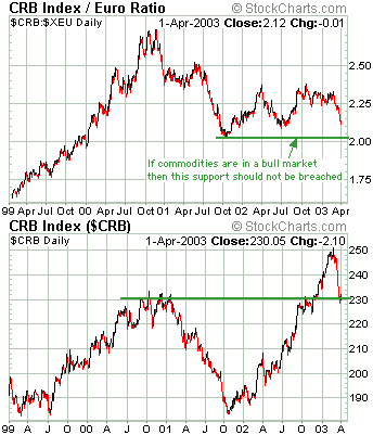
Below are charts of the CRB Index (commodity
prices from a US perspective) and the CRB Index divided by the US$/euro
exchange rate (commodity prices from a European perspective). When these
charts are compared it becomes clear that US$ strength made commodity prices
appear weaker than they really were during 2001 while US$ weakness made
commodity prices appear stronger than they really were during 2002.
When we talk about being bullish on
commodity prices we mean that we expect commodities to become more valuable
relative to the US$. In fact, we expect the US$ to be weak enough over
the next 1-2 years to enable commodity prices to continue trending higher
in US$ terms even if economic growth remains weak. We are much less bullish
on commodity prices in euro terms, although the inflationary policies of
all central banks are likely to result in commodity prices moving higher
in terms of most, if not all, fiat currencies.
Referring to the above charts, the
CRB Index in US$ terms has pulled back to its breakout point. This important
support is holding for now, although the CRB could drop all the way back
to around 210 without doing serious damage to the longer-term bullish case.
The CRB in terms of the euro is, however, in a more precarious position
because it is only about 5% above its October-2001 bottom.
Below is a chart of the Industrial
Metals Index (GYX). The prices of industrial metals tend to be sensitive
to changes in economic growth and currency exchange rates, so it is not
surprising that the GYX has a) tended to move in the same direction as
the stock market (the stock market is also sensitive to economic growth),
and b) been stronger than the stock market since early 2002 (the GYX has
been boosted by US$ weakness). The vertical arrows on the below chart identify
the important turning points for the Dow Industrials since the beginning
of 2000, each of which has corresponded with a turning point in the GYX.
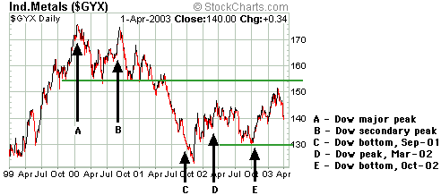
It is interesting that the GYX has
not yet confirmed the latest rally in the stock market. If the stock market
rally that began on 12th March is going to last a few months, rather than
just a few weeks, then the industrial metals prices should soon start moving
briskly higher. Putting this another way, if the prices of industrial metals
such as copper, aluminium and nickel don't start moving higher in the very
near future then we should be even more skeptical than we already are with
regard to the sustainability of the current stock market rally.
The US
Stock Market
Current Market Situation
Our view has been that a 1-2 month
rally began on 12th March and that while we expect the 21st March peak
to be exceeded before the next major decline gets underway, we don't expect
it to be exceeded by a wide margin. The rough targets we've mentioned over
the past few weeks are 9000 for the Dow Industrials, 925-965 for the S&P500
Index, and 1550-1600 for the NASDAQ Composite.
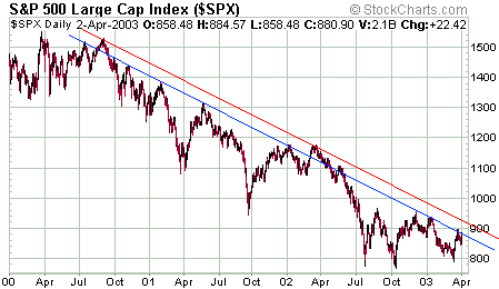
Below is a chart of the S&P500
Index showing the downtrend that has been in force since the first quarter
of 2000. The initial stage of the latest rally ended at the same trend-line
that almost every other rally over the past 3 years has ended (the blue
line on this chart). The market then experienced what appears to be a normal
pullback before once again rising to the blue trend-line during Wednesday's
trading. The red line on the chart identifies the major channel top and
a likely short-term target if the S&P500 can manage a daily close above
895.
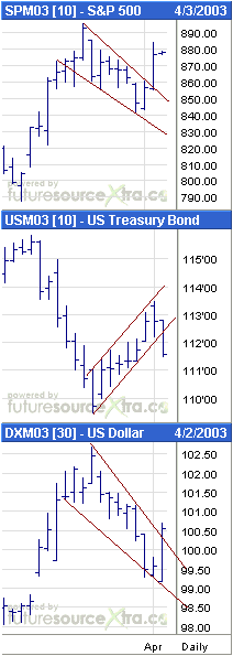
Below are short-term charts of the
S&P500, T-Bond and Dollar Index futures. These charts show that Wednesday's
minor upside breakout in the S&P500 was confirmed by breakouts in bonds
and the Dollar.
Below is a chart showing the NASDAQ100
Index (NDX) and the NASDAQ100 Volatility Index (VXN). It is amazing how
often a market that breaks out of a trend will move back to its previous
trend-line before continuing in the direction of the breakout. This is
exactly what the NDX appears to have just done.
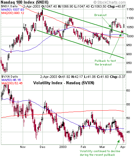
The above charts paint a picture of
a market that has rallied to a logical resistance level, experienced a
normal pullback, and is now on its way to a new recovery high. However,
we included the chart of the VXN above to highlight one of the reasons
why there is little chance of the market making substantial gains from
current levels. Pullbacks within uptrends are necessary to enable the 'wall
of worry' to remain in place and volatility indices such as the VXN are
one measure of how much worry, or fear, there is in the market. Interestingly,
the VXN, which typically moves in the opposite direction to the NDX because
a falling market usually generates fear, actually sunk to lower
levels during the recent market pullback. In other words, traders became
less worried as the market pulled back. Needless to say, this is
not the type of sentiment platform from which major rallies are launched.
The Commitments of Traders Data
In the past two Weekly Updates we noted
the substantial reduction in the net-short position of the commercials
(the 'smart money') in S&P500 futures. This was mentioned as being
a bullish development. However, a few of our readers correctly pointed
out that there has been a huge increase in the net-short position
of the commercials in the E-mini S&P500 contracts (an E-mini contract
is one-fifth the size of the full contract). We don't usually take the
E-mini contracts into consideration, but in this case we will because the
E-mini positions are currently so large. Therefore, in the coming Weekly
Update we'll discuss what story is being told by the commitments' of traders
data when the total positions (full contract + e-mini contract) of the
commercial traders and the small traders are taken into account.
Gold and
the Dollar
Back to the 70s
Throughout the course of last year
we would occasionally show a chart comparing the progress of the Amex Gold
BUGS Index (HUI) since its November-2000 bottom with the progress of gold
stocks from their major bottom in January-1972 (using the Barrons Gold
Mining Index (BGMI) to represent the performance of the gold stocks during
the 1970s). Each time we showed the chart we marveled at how closely the
latest gold-stock bull market was tracking its 1970s' counterpart, although
we never took the chart too seriously because we could never come up with
a good explanation as to why the remarkable similarity should continue
into the future. In other words, we thought the chart comparison was interesting
and that it provided some confirmation that we were witnessing a major
bull market in gold stocks rather than just another bear market rally,
but we doubted that the chart had any predictive ability.
Below is an updated version of the
chart (the blue line on the chart shows the percentage change in the BGMI
from its 1972 bottom while the pink line shows the percentage change in
the HUI from its 2000 bottom). The chart continues to interest us because
although there have been large differences in the magnitudes of the moves
made by the BGMI during the 1970s and the HUI over the past few years,
the correlation between the two sets of data has remained high. Also, the
major turning points have continued to line up extremely well. For example,
the peaks in May of 2001, May of 2002 and January of 2003 occurred within
a few days of corresponding peaks in July of 1972, July of 1973 and February
of 1974. If the major turning points continue to coincide then gold stocks
should be bottoming now and there will be another important peak near the
end of June this year.
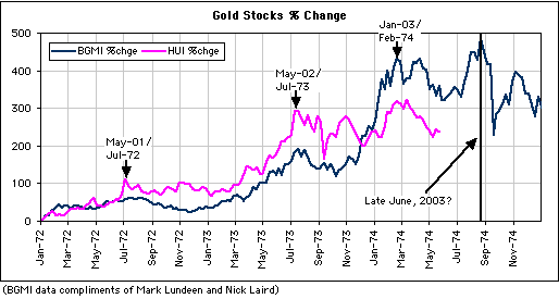
Our other work indicates that the correction
low is in place for the HUI. This means that the pattern is, at this stage,
unfolding as the above chart implies it should.
Current Market Situation
In the latest Weekly Update we said
that it would not be surprising to see the HUI 'back and fill' for 1-3
days following last Friday's surge, but that even if the gold price fell
back to $320 in the short-term the HUI should remain above last Friday's
low. We've now had 3 days of 'backing and filling' and it is certainly
possible that a few more days of consolidation will occur, particularly
if the war news remains positive for the "coalition". However, the price
action in the gold stocks over the past few days has been consistent with
our view that a bottom is in place and that prices will work their way
higher over the next several weeks.
Below is a chart of the HUI/gold ratio.
The HUI/gold ratio bottomed on 12th March and has since moved higher. In
other words, gold stocks have been moving higher relative to the gold price
over the past 3 weeks, which is exactly what should be happening if the
correction low for the HUI was already in place.

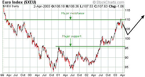
Late last year and early this year
we mentioned the 1.08-1.10 range as a likely place at which the US$/euro
exchange rate would peak during the first quarter of this year. The euro
did pullback after reaching this range and the pullback is probably not
yet complete. It has substantial support in the 0.96-1.01 range which we
expect will hold during any further weakness over the coming 1-2 months.
The below chart shows the major support and resistance levels for the euro
as well as a rough projection of what we think the European currency will
do over the coming few months. A reasonable target for the euro over the
coming 18 months is 1.35 (about 25% above yesterday's closing level).
TSI commentaries
in MS Word format
In addition to being able to access
the commentaries at the web site, paid-up subscribers have the option of
receiving the Weekly and Interim Updates as MS Word documents attached
to e-mails. However, the computer problems that delayed last week's Interim
Update have also forced us to suspend the delivery of the TSI commentaries
in this format. After undergoing the electronic equivalent of a triple
bypass operation our other computer should be back with us tomorrow, so
we should be able to resume sending the commentaries in MS Word format
beginning with the next Weekly Market Update.
Chart Sources
Charts appearing in today's commentary
are courtesy of:
http://stockcharts.com/index.html
http://www.futuresource.com/

|
