|
- Interim Update
2nd April 2014
Copyright
Reminder
The commentaries that appear at TSI
may not be distributed, in full or in part, without our written permission.
In particular, please note that the posting of extracts from TSI commentaries
at other web sites or providing links to TSI commentaries at other web
sites (for example, at discussion boards) without our written permission
is prohibited.
We reserve the right to immediately
terminate the subscription of any TSI subscriber who distributes the TSI
commentaries without our written permission.
High
Frequency Trading (HFT) - another imaginary hobgoblin
To paraphrase H.L.Mencken, HFT is another in the endless series
of imaginary hobgoblins designed to keep the populace alarmed and
hence clamorous to be kept safe by government intervention. In
addition, it seems that HFT is being set up to be a scapegoat --
something to draw attention away from the roles played by central
banks and governments -- during the next financial-market crisis.
HF Traders use powerful computers running sophisticated algorithms
that analyse all existing buy/sell orders and then enter and exit
trades within seconds, or even within fractions of seconds, with the
aim of capturing a tiny (perhaps just a fraction of a cent) profit
on each trade. They rarely hold positions for more than a few
seconds and never hold positions overnight. Consequently, while they
can substantially increase the daily trading volume on an exchange
(it is estimated that about 50% of trading volume on the NYSE stems
from HF trading), they will not affect anyone who is not, himself,
attempting to scalp a cent here or there by rapidly moving in and
out of positions.
As an aside, the fact that about 50% of NYSE trading is now HFT-related
means that high-frequency trading firms will often be on both sides
of a trade. As a result, the fraction of a cent profit made by one
HF trader will often be associated with an equivalent loss by
another HF trader.
The upshot is that long-term investors and the majority of other
market participants need not concern themselves with HFT, except to
the extent that it is used to justify more government involvement in
the markets. This (the potential for it to be used as an excuse for
more regulation) is the real danger posed by HFT.
According to the scaremongers, HFT justifies more government
'regulation' of markets because it gives some traders an unfair
advantage. HFT may well give some day-traders an advantage over
other day-traders, but so what? The first users of a new technology
often gain an advantage over their competitors. This should be the
way of the market world and is not unfair in the proper meaning of
the word. An alternative would be to create a draconian regulatory
structure that prevented anyone from operating more efficiently than
the slowest, dumbest participant.
A point that needs to be understood is that nobody, as a result of
HFT, is forced to buy at a higher price or sell at a lower price
than the price at which they want to trade. If you place a limit
order and your order gets executed then the price you pay or receive
will be your limit price regardless of how much high-frequency
trading is going on at the time. Of course, if you place market
orders instead of limit orders then you are deliberately putting
yourself in a position where you can be taken advantage of by other
traders. Not just high-frequency traders, other traders in general.
Another point worth noting is that high-frequency trading is not, as
some commentators have claimed or implied, an effective license to
print money. Some HF traders have made a lot of money, but others
have gone broke due to the high costs of operating in the space.
Some of the early-movers in the HF trading space had years when they
never had a single losing day, but this competitive advantage was
not sustained and in some cases the relentless winners became
losers. Furthermore, if HF trading continues to remain popular or
gain in popularity then the already-miniscule per-trade profit
margins will shrink as the traders cannibalise each other, causing
the overall business to either die a natural death or, more likely,
become a niche that generates satisfactory returns for only a small
number of firms.
Of far greater importance, the actions over the past few years of
the Fed and other central banks -- organisations that certainly do
have a license to print money -- all but guarantee that another
major financial-market calamity will happen within the next two
years. When it does, look for a finger of blame to be pointed at HFT.
Anything to prevent the masses from identifying the true culprit.
Uranium
Update
The uranium-mining sector, as represented on the
following daily chart by URA, began to strengthen last October and clearly broke
out to the upside from a well-defined channel in February of this year. Although
the channel break provided obvious confirmation of a trend reversal, it led to
URA becoming 'overbought' and an almost-obligatory 'testing' pullback. It's
possible that the pullback ended over the past few days at the 50-day MA, but it
would take a decline to the vicinity of the 200-day MA to get us interested in
new buying.
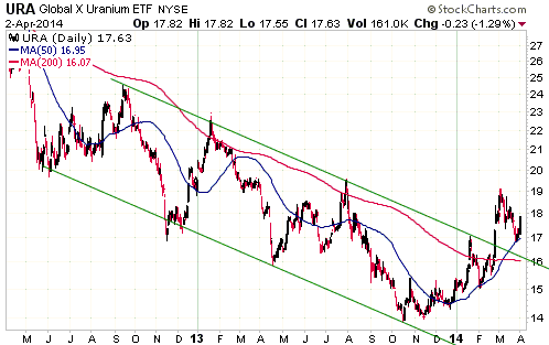
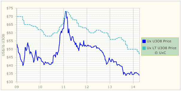
The reason we are currently reticent to increase exposure to uranium-mining
stocks is that the uranium price hasn't yet begun to rally. In fact, over the
past week the uranium price dropped back to last year's low, which means that it
is at its lowest price of the past 8 years.
We think the stock market is right to anticipate a substantial rise in the
uranium price, but we will need to see some evidence that the uranium price has
turned the corner before adding to our uranium-mining exposure.
 The Stock Market
In our 2014 forecast for the US stock market (as represented by
the S&P500 Index) we outlined what we considered to be the two most likely
scenarios. Here is an excerpt from our Yearly Forecast that describes these
scenarios:
"The first scenario is that a major peak is forming right now. Under this
scenario the ultimate price high will occur this month [January], after which
the market will gradually roll over to the downside. Weakness during the first
half of the year will be relatively minor, but downward acceleration will occur
during the second half of the year after it becomes clear that "QE" has failed
to bring about a sustained economic recovery.
This scenario is consistent with a) the extreme optimism reflected by sentiment
indicators over the past month, b) the market's high average valuation, and c)
the past year's decline in the rate of money-supply growth. It is also
consistent with the likelihood of economic data remaining generally supportive
for at least a few more months.
The second scenario involves some 'corrective' activity during the first two
months of the year followed by a final surge to the ultimate high during
April-May. In addition to being consistent with the same influences as the first
scenario, this scenario also meshes with the Presidential Cycle Model [the PC
Model predicts a high during April followed by a downward trend to an October
bottom]."
We then wrote:
"Of our two scenarios, at this time we favour the second. The main reason is
that although the US monetary inflation rate has trended lower over the past
year, it has not yet dropped to levels that preceded the bursting of previous
investment bubbles."
The first scenario was eliminated at the end of February, but the second
scenario is not only still in play it is still, in our opinion, the most likely
outcome.
There are two things that could happen this month to further increase the
probability of a high of at least intermediate-term importance, the first being
a surge by the SPX to near the top of the channel drawn on the following daily
chart (around 1950). Becoming this stretched to the upside would almost
certainly set the scene for a multi-week pullback and the pullback could evolve
into something substantial.
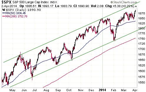
While a surge by the SPX to near its channel top would increase the probability
that a major top was being put in place, it is not a prerequisite for such a
top. However, a divergence between indices and/or relative strength indicators
is a prerequisite for a major top. A significant divergence is therefore the
second thing that could, and SHOULD, happen at around the time of a major top.
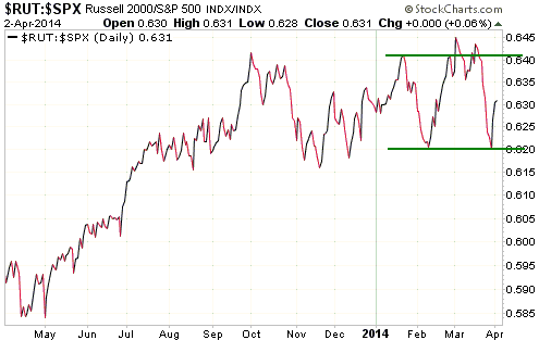
A potential divergence would be a new high for the year in the SPX that isn't
confirmed by a new high for the year in the NASDAQ100 Index (NDX). Another would
be a new high in the SPX that isn't confirmed by a new high in the RUT/SPX ratio
(small-cap stocks relative to large-cap stocks).
The RUT/SPX ratio's current situation is depicted below. The move by the SPX to
a new high at the end of February was confirmed by a marginal new high in the
RUT/SPX ratio, but notice that at this stage the RUT/SPX ratio has fallen well
short of confirming the SPX's latest move to a new high.
Gold and the Dollar
Gold
The following chart compares the daily closing levels of the US$ gold price and
the HUI/gold ratio over the past 6 months. Our reason for including this chart
is to show that there has recently been a bullish divergence and that this
divergence is similar to the one that occurred just prior to the 31st December
bottom in the gold market.
The divergence doesn't imply that the correction is over, but it does imply that
there won't be much additional downside.
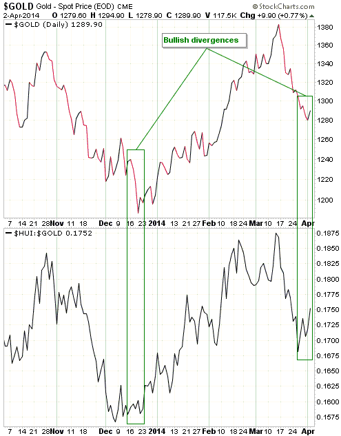
Gold's correction is probably not yet complete. However, the relative strength
in the gold-stock indices over the past 5 trading days suggests that an initial
low is in place and that the completion of the correction will more likely
encompass a successful test of the initial low than a decisive new low. In other
words, the rebound that has just begun will probably be followed by a decline
that results in a successful test of this week's low.
Gold Stocks
Short-term upward trends in the gold-mining sector have been characterised by
relative strength in the juniors, as indicated by a rising GDXJ/GDX ratio, and
short-term downward trends in the gold-mining sector have been characterised by
relative weakness in the juniors, as indicated by a falling GDXJ/GDX ratio. With
this in mind and with the benefit of hindsight, it is clear that the failure of
the GDXJ/GDX ratio to confirm March's upside breakout in the HUI was a bearish
divergence and a warning that the breakout was not going to be sustained.
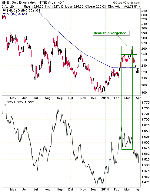
Although the GDXJ/GDX ratio rebounded on Wednesday 2nd April, it made a new low
for the move on the preceding day and has not yet signaled an end to the
correction. However, the recent bullish divergence between the gold-mining
sector and the gold price -- as discussed above -- suggests that there isn't
much additional downside potential. As is the case with gold bullion, the
decline that follows the current rebound is more likely to result in a
successful test of the low than a decisive break to a new low.
We have been frustrated by the recent pullback in the gold-mining sector. Not
because stock prices have fallen too far, but because with one exception (RIOM)
the stocks we wanted to buy haven't fallen far enough. We have several
under-the-market buy orders in place, but up until now only one of these orders
(a small addition to our RIOM position) has been filled. Other buy orders that
are presently under-the-market will possibly be filled if the gold-stock indices
test their lows later this month.
The only gold stocks that we are interested in buying right now are producers
that are profitable at the current gold price (e.g., EDV.TO, EVN.AX, RIOM) and
explorers/developers with strong balance sheets and projects that have
exceptional exploration potential and/or would likely be economically viable at
the current gold price (e.g., AAU, LYD.TO, PG.TO, PLG.TO). We will consider
riskier stocks for new buying after we become confident that the correction is
over.
The Currency Market
Over the past 3 years we have generally been either neutral or bearish on
commodities (as represented by the CCI) and commodity currencies on both short
and intermediate-term bases. However, early this year we started getting more
optimistic in anticipation of intermediate-term rallies. With regard to the
Australian Dollar (A$), an intermediate-term rally probably got underway in
January.
If we are right to assume that gold bottomed in December-2013 then the A$'s
upward reversal in January-2014 continues a lead-lag relationship that has
existed since early last year. We are referring to the fact that over the past
13 months the A$ has followed gold with a delay of between 3 weeks and 7 weeks.
The relationship is illustrated on the chart displayed below. The blue boxes on
the chart show the time from a reversal or a trend acceleration in the gold
market and a similar event in the A$ market.
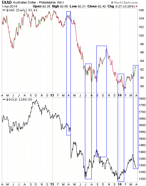
A literal interpretation of the above chart would indicate that a significant A$
pullback lasting at least 1 month (the lagged response to gold's recent
correction) will begin within the next couple of weeks, but the chart's main
message is that if gold goes on to make new highs for the year over the next few
months then it will be reasonable to assume that the A$ remains in an
intermediate-term upward trend.
Updates
on Stock Selections
Notes: 1) To review the complete list of current TSI stock selections, logon at
http://www.speculative-investor.com/new/market_logon.asp
and then click on "Stock Selections" in the menu. When at the Stock
Selections page, click on a stock's symbol to bring-up an archive of
our comments on the stock in question. 2) The Small Stock Watch List is
located at http://www.speculative-investor.com/new/smallstockwatch.html
Chart Sources
Charts appearing in today's commentary
are courtesy of:
http://stockcharts.com/index.html
http://www.uxc.com/

|
