|
- Interim Update 4th May 2011
Copyright
Reminder
The commentaries that appear at TSI
may not be distributed, in full or in part, without our written permission.
In particular, please note that the posting of extracts from TSI commentaries
at other web sites or providing links to TSI commentaries at other web
sites (for example, at discussion boards) without our written permission
is prohibited.
We reserve the right to immediately
terminate the subscription of any TSI subscriber who distributes the TSI
commentaries without our written permission.
The Real Interest Rate
The
following monthly chart provides a good indication of the Fed's
monetary stance (it shows whether the Fed is tight, loose, or somewhere
in between), because it incorporates the Fed Funds Rate (FFR) and the
money supply growth rate. Specifically, it shows the Real FFR, with the
inflation adjustment done by first subtracting the TMS (True Money
Supply) year-over-year growth rate from the nominal FFR and then adding
an allowance for productivity improvement to the result. In effect, the
chart shows the FFR adjusted for both the theoretical depreciation of
the dollar stemming from monetary inflation and the likely increase in
the dollar's purchasing power stemming from productivity growth.
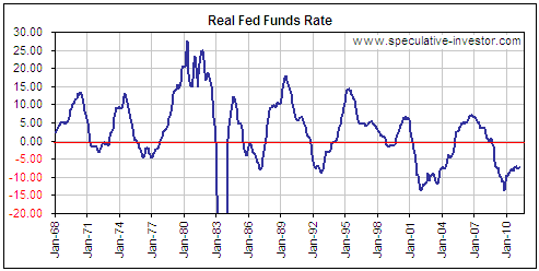
A number of interesting conclusions can be drawn from the above chart.
First, the Fed was generally much 'looser' over the past 10 years than
it was during any earlier 10-year period, although it was fairly
'tight' just prior to the start of the 2007-2009 financial crisis. This
makes sense, because once a boom has been fostered by loose monetary
policy a switch to relatively tight monetary conditions will always
lead to a bust. Note that this doesn't mean that, having fostered the
2003-2007 boom, the Fed could have indefinitely avoided a very bad
economic outcome by perpetuating loose monetary policy. The problem is
that once an inflation-fueled boom occurs the only possible outcomes
are a painful bust, caused by the deliberated or forced tightening of
monetary conditions, or hyperinflation, caused by leaving monetary
conditions loose for years after the signs of an inflation problem
become blatant.
Second, the Real FFR has been peaking at progressively lower levels
during each cycle since 1980. Another way to look at it is that once
the Fed embarks on a monetary tightening campaign it tends to continue
its tightening until something breaks, and the 'something' has broken
at progressively lower levels since 1980. For example, the 'something'
that broke in early 1980 was the precious metals bull market, but it
took a Real FFR of 20% to make it happen. In the most recent tightening
cycle, things started breaking after the Real FFR moved above 5%. The
next time, it might require no more than a move in the Real FFR to
above zero to bring the proverbial chickens home to roost. It is taking
less tightening to end each boom because each boom/bust cycle leaves
the economy in a weaker state.
Third, the Fed's current stance precludes a repeat of the 2007-2009
crisis anytime soon. Note, though, that sizeable intermediate-term
corrections can occur in stocks, commodities and gold in parallel with
loose monetary conditions.
The Stock Market
There
has been an interesting divergence over the past 6 months between the
US stock market and the stock markets of some of the world's most
important "emerging" economies. For example, while the S&P500 Index
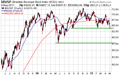
has been trending higher over the past 6 months and made a new
multi-year high at the beginning of this week, the Bovespa Index
(BVSP), the main proxy for Brazil's stock market, has been trending
lower and ended Wednesday at a new 9-month low. The evidence continues
to mount that an equity bear market is underway in Brazil.
There isn't as much
"technical" evidence of a bear market in India as there is of a bear
market in Brazil, but India's Bombay Stock Exchange Index (BSE) appears
to be headed along the same path as Brazil's BVSP. The main difference
is that the BSE hasn't yet broken below its February low.
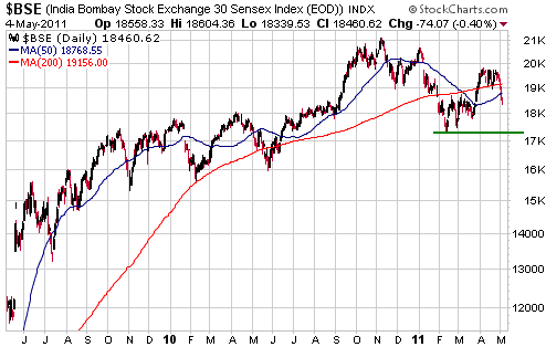
The Brazilian and
Indian stock markets have been struggling because the central banks of
those countries have been raising interest rates to prevent "inflation"
from becoming an even bigger problem. The US stock market is doing
comparatively well, at the moment, because the US central bank is
operated by buffoons who believe that double-digit money-supply growth
helps the economy and that the rate of "price inflation" is too low.
Despite the likelihood that US monetary conditions will remain 'loose'
over the remainder of this year, we suspect that an intermediate-term
peak will be in place in the US stock market by mid July at the latest.
Mid July is when the "Presidential Cycle" stops exerting a positive
influence and June is when "QE2" is scheduled to end. Furthermore, we
won't be surprised if the peak occurs as early as this month, given
this week's clear-cut downward reversal in the silver/gold ratio and
the fact that current market sentiment is consistent with an important
peak.
Gold and
the Dollar
Gold and Silver
From the email alert sent to subscribers following Monday's US trading session:
"We interpret Monday's
sharp decline in the silver/gold ratio as clear-cut evidence that an
intermediate-term peak is now in place for this ratio. If this
interpretation is correct, then the two most likely short-term
scenarios are:
1. Gold and silver will
make lows this week. Both will then strengthen for 2-4 weeks, with gold
moving well above this week's high and silver doing no better than
testing its high. This price action will result in a bearish divergence
between gold and the silver/gold ratio (new highs in gold accompanied
by lower highs in silver/gold) and will be followed by declines in the
prices of both metals to their 200-day moving averages within the
ensuing two months.
2. Gold and silver have
just made intermediate-term peaks and will trend lower to the
vicinities of their respective 200-day moving averages over the next
two months.
We think that the above scenarios have roughly equal probabilities."
Both of the above scenarios remain in play, but due to the breakdowns
in the gold-stock indices we now think that Scenario 2 is the more
likely. Scenario 2 would be confirmed (Scenario 1 would be eliminated
from contention) if the gold price were to close below this week's low
within the next two weeks.
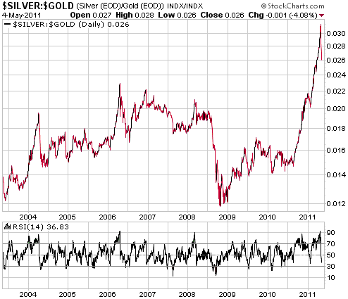
Turning to the charts, the daily silver/gold ratio is shown below with
a Relative Strength Index (RSI). Based on the historical record,
silver/gold won't reach a bottom that will hold for more than a couple
of weeks until after the daily RSI has moved below 30. Also, the
historical record suggests that silver/gold's recent peak will hold for
at least 2 years.
Next up, we see that
the price of silver is falling even faster than it rose (which is
normal, by the way) and that the 50-day moving average was reached on
Wednesday. As mentioned in Monday's email alert, the 200-day moving
average is likely to be reached within the next two months.
Note that the 200-day moving average should be considered the minimum
expectation for silver's downside, in that intermediate-term
corrections in this market usually don't end until after the price has
made a solid break below this moving average.
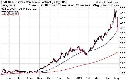
Silver's parabolic rise made a large and sharp decline inevitable, but an increase in margin requirements
for trading of silver futures was the catalyst. Such margin rate hikes
by the commodity futures exchanges are typical responses to the sort of
speculation-driven price advance that was seen in the silver market
over the past few months, but whenever they occur they prompt screams
of "foul!" by some bullish traders. Rather than being shocked and
expressing extreme indignation every time that margin rates are boosted
in response to a rapid price rise, doesn't it make more sense to
prepare for the inevitable?
We took profits on 20% of our SLV put options on Wednesday and plan to
scale out of the remainder of this insurance position into silver
weakness over the next two months.
Gold Stocks
More thoughts on the weakness of gold stocks relative to gold bullion
1. Gold stocks -- especially the mid-tiers and juniors -- generally
out-performed gold bullion during 2009-2010. Relative weakness
commenced in early December of last year, but wasn't particularly
significant until about 4 weeks ago.
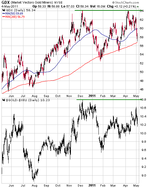
2. The gold sector's performance over the past 6 months looks sub-par
when compared with the US$ gold price, but the following chart -- which
uses GDX as the proxy for the gold sector -- shows that it matches the
euro-denominated gold price quite well.
3. The recent under-performance of the gold stocks is trivial compared with their under-performance during 1977-1979.
4. During the first two months of this year we warned that the deluge
of new shares issued via private placements and IPOs late last year and
early this year would weigh on the mining sector during the second
quarter of this year (following expiry of the mandatory 4-month hold
periods for the new shares). The exact effect of this additional supply
is unknown, but it is undoubtedly responsible for some of the recent
weakness.
5. There will be many times when the markets don't behave in accordance
with your expectations. When it happens, don't look for someone to
blame. Doing so is counter-productive.
On Wednesday there was actually a positive divergence between mining
stocks and the bullion. The divergence was especially noticeable with
respect to silver and the silver-mining stocks, in that silver bullion
fell by 5% while most silver-mining stocks ended the day with gains.
Considering that the bullion markets have only just turned downward it
is too early to be looking for an end to the corrections in the
associated equities, but due to their recent under-performance the
equities could hold up quite well as gold and silver bullion trend
lower over the next couple of months.
Currency Market Update
The downward reversal in the silver/gold ratio prompted us to upgrade
our intermediate-term US$ outlook to "bullish" in Monday's email alert.
If the Dollar Index hasn't already bottomed it will probably do so
within the next month.
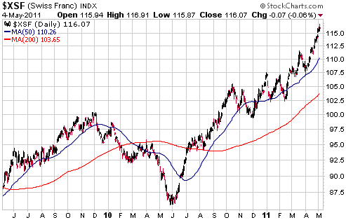
The following daily chart shows that the Swiss Franc (SF) commenced a
powerful upward trend in June of last year. It also shows that the
upward trend accelerated over the past 4 weeks.
Market Vane reports that 94% of traders were bullish on the SF earlier
this week. This level of bullish sentiment doesn't guarantee that a
major top is close at hand, but it is consistent with the sort of
sentiment that would normally be seen in the vicinity of a major top.
Also, the recent acceleration is consistent with the idea that the SF's
upward trend is close to an end (acceleration is something that
typically occurs near the end of a trend).
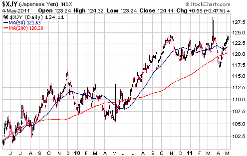
The Yen rocketed
upward in the immediate aftermath of Japan's recent earthquake as the
currency market quickly tried to discount the likely effects of
large-scale Yen repatriation. The Bank of Japan (BOJ) then killed the
rally be creating trillions of new Yen. The BOJ's money-pumping not
only resulted in the Yen losing its earthquake-related gains, it also
pushed the Yen to a 6-month low. The Yen has since rebounded, however,
because the BOJ didn't continue its aggressive money-pumping.
It's possible that a major peak was put in place for the Yen in March,
but a lot will depend on the monetary response in Japan over the
months/quarters ahead. Despite conventional wisdom to the contrary, the
BOJ has actually run a relatively tight monetary policy over the bulk
of the past 2 decades (as evidenced by the consistently slow rate of
Yen-supply growth compared to the growth rates in the supplies of most
other major currencies). This relatively tight monetary policy stood
the Japanese economy in good stead because it meant that an inflation
problem wasn't added to the problems caused by the Japanese
government's Keynesian response to the bursting of the credit bubble.
Unfortunately, whereas the right solution is for the Japanese
government to abandon the destructive Keynesian policies that have
weighed the economy down, there's now a big risk that irresistible
political pressure will soon be brought to bear on the BOJ to change
its ways and go 'full steam ahead' down the inflation path.
Update
on Stock Selections
(Notes: 1) To review the complete list of current TSI stock selections, logon at http://www.speculative-investor.com/new/market_logon.asp
and then click on "Stock Selections" in the menu. When at the Stock
Selections page, click on a stock's symbol to bring-up an archive of
our comments on the stock in question. 2) The Small Stock Watch List is
located at http://www.speculative-investor.com/new/smallstockwatch.html)
 Pretium Resources (TSX: PVG). Shares: 85M issued, 90M fully diluted. Recent price: C$8.87 Pretium Resources (TSX: PVG). Shares: 85M issued, 90M fully diluted. Recent price: C$8.87
We ended our 4th April update on PVG as follows:
"For
investors/speculators with no current exposure to PVG, it would
probably make sense to take an initial position at around C$10 with a
plan to buy more if the price drops back to the low-C$8 area."
The stock became available in the low-C$8 area on Wednesday (actually,
it traded as low as C$7.89), creating an excellent opportunity for new
buying. Near the current price -- and especially in the low-C$8 area --
we think that PVG offers one of the most attractive risk/reward ratios
in the precious metals sector.
If you are interested in PVG and are going to be in New York next week
for the Hard Assets conference (or for some other reason), we suggest
that you attend the private presentation being given by Robert
Quartermain, PVG's CEO, at the Marriott Marquis. Here are the details:
May 9th, 4:00 pm
Gilbert Room (fourth floor)
Marriott Marquis
It is too late to be selling gold and silver shares and probably a
little too soon to be doing much buying, but some buying opportunities
have already begun to emerge, or are now close to emerging, within the
ranks of the best exploration-stage gold mining stocks. PVG (mentioned
above) is one. Three others that are nearing 'buy zones' are:
1. Batero Gold (TSXV: BAT). Recent price: C$3.42
The drilling results announced by Colombia-based BAT over the past
three months have been exceptional. For example: 592m of 0.72-g/t and
460m of 0.70-g/t, with minerlisation beginning at surface. These
drilling results propelled the stock from C$3 to C$6, but the recent
correction has wiped out the bulk of these gains and brought the stock
back to near its pre-drilling-news level.
There should be a lot more drilling news from BAT over the next few months, leading to a resource estimate late in the year.
BAT would be a good candidate for new buying near support at C$3.00.
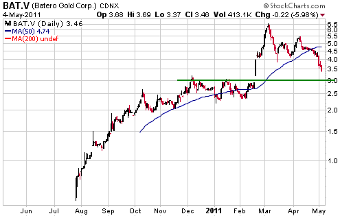
Note that BAT is a member of the TSI Small Stock Watch List.
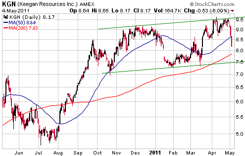
2. Keegan Resources (AMEX and TSX: KGN). Recent price: US$8.17
KGN has about $230M in the bank and owns the 5M-ounce Esaase gold
project in Ghana. The large cash hoard mitigates downside risk and
means that the company will probably never again need to do an equity
financing.
The optimum place for new buying would be just above support at US$7.50.
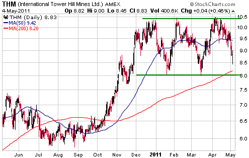
3. International Tower Hill Mines (AMEX: THM, TSX: ITH). Recent price: US$8.83
THM has spent the past 5 months oscillating within the wide horizontal
range indicated on the following chart. This back-and-forth price
action has allowed the stock's 200-day moving average to almost catch
up with the current price.
A break above the top of the 5-month range would create a short-term
chart-based target of US$13. Our intermediate-term valuation-based
target for THM is US$15-$20.
THM would be a good candidate for new buying near the bottom of its range.
Chart Sources
Charts appearing in today's commentary
are courtesy of:
http://stockcharts.com/index.html

|