|
- Interim Update 4th August 2010
Copyright
Reminder
The commentaries that appear at TSI
may not be distributed, in full or in part, without our written permission.
In particular, please note that the posting of extracts from TSI commentaries
at other web sites or providing links to TSI commentaries at other web
sites (for example, at discussion boards) without our written permission
is prohibited.
We reserve the right to immediately
terminate the subscription of any TSI subscriber who distributes the TSI
commentaries without our written permission.
The most common of all investing/speculating errors
Trying
to get rich quick is probably the most common and the most costly of
the errors made by speculators. It is certainly the most important
mistake we made early in our speculating career, pushing us back to
"square one" a few times before we finally woke up. It encompasses the
following:
a) Allocating a large portion of the overall portfolio to high-risk
situations, such as options and early-stage resource stocks. Based on our
experience and observations, the less capital someone has the more
likely they are to take big risks in order to quickly grow their
capital. However, such an approach actually has a high probability of
slowing, or putting into reverse, the capital accumulation process.
b) Short-term trading. Only a tiny percentage of short-term traders end
up doing well over the long-term, one reason being that at least 95% of
the population is psychologically ill-suited to it. Another reason is
that short-term trading is a zero-sum game in which a small number of
players -- for example, the members of Goldman Sach's proprietary
trading team -- have huge advantages in terms of information,
technology and ability.
c) Over-trading. There is a strong temptation to be constantly 'in
there' doing something to make money, but there will be many times when
it will be best to do nothing.
Over-trading leads to money being put at risk in trades where the odds
of success are unacceptably low, and is often associated with the
mistake of watching prices too closely. If you have done the
appropriate amount of planning/preparation then there should be no need
to watch the intra-day price fluctuations.
d) Risking an excessive (relative to overall portfolio size) amount on a single stock or a single short-term market forecast.
e) Not maintaining an adequate cash reserve. To be in a position to
take advantage of the unexpected opportunities that crop-up and in
recognition of the fact that the future is always uncertain, a
substantial cash reserve should be maintained at all times. For
example, the 2008 crash created one of the best buying opportunities
ever in the gold mining sector, but the only people who could take
advantage of it were the ones who had plenty of cash in reserve.
f) Not taking money off the table during periods of extreme strength in the market for fear of missing out on additional gains.
g) Fixating on the upside potential and largely ignoring what could go wrong.
h) Buying stocks on margin. As soon as you begin using margin debt you
become a 'weak hand', that is, you become someone who will likely be
forced to sell at a time when they should probably be doing some buying.
i) 'Doubling up' in an effort to recoup earlier losses.
The Stock Market
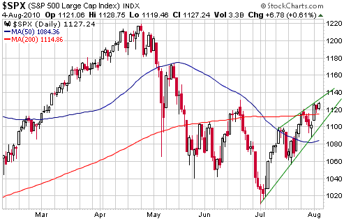
One
interpretation of the S&P500's price action is that it is tracing
out a bearish "rising wedge" pattern. Rising wedges aren't inherently
bearish; rather, they are only confirmed as being bearish if the price
subsequently breaks below the bottom of the wedge. At this time a break
below the bottom of the wedge would require a solid daily close below
1100.
Even if the bearish "rising wedge" interpretation is correct there
could still be another 1-2 weeks of upward drift before a meaningful
decline gets underway.
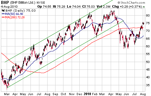
We continue to think
that there is substantial downside risk in the industrial-metal mining
sector of the stock market. We have regularly used FCX (the world's
largest listed copper producer) as a proxy for this sector, but for a
change we will now look at charts of the world's two largest
diversified mining companies: BHP and VALE.
BHP trended higher from March-2009 through to April-2010 within the
confines of a well-defined channel. It broke out of its channel to the
downside in late April and plunged to a short-term bottom in late May.
Our interpretation is that the late-May bottom marked the end of the
first downward leg in an intermediate-term decline, giving way to a
counter-trend rebound. We expect that this rebound will be followed by
another downward leg to a new 52-week low.
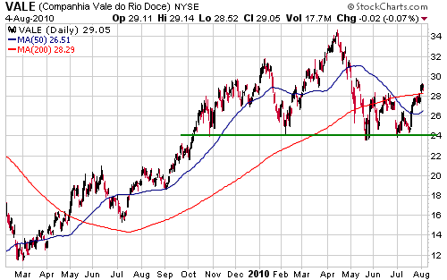
Like BHP, VALE has
been rebounding since reaching a short-term bottom in late May. It has
very clear support at $24, the breaching of which would create a
measured objective of $14. In other words, the chart suggests that VALE
has downside risk of around 50%.
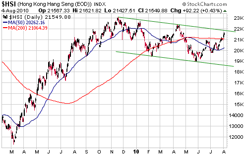
Lastly, let's take a
look at the status of Hong Kong's Hang Seng Index (HSI). The HSI peaked
back in November, meaning that there was a 5-month period when the HSI
diverged bearishly from the US stock market (the US market didn't peak
until April). The jury is still out, though, as to whether the HSI's
decline since its November peak is a routine consolidation within a
bull market or the start of something far more bearish. We suspect the
latter based on fundamentals and long-term cycles, but the chart could
reasonably be interpreted either way.
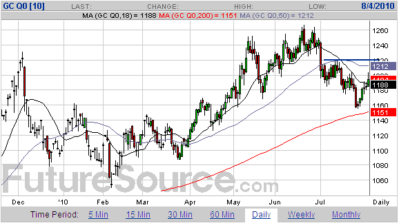
Gold and
the Dollar
Gold
The rebound in the gold market that began on Wednesday 28th July
persisted through to this Wednesday. It could test resistance at
$1220-$1230 before it is over, but we doubt that it will do
significantly better than that.
An October-November correction low remains the most likely outcome.
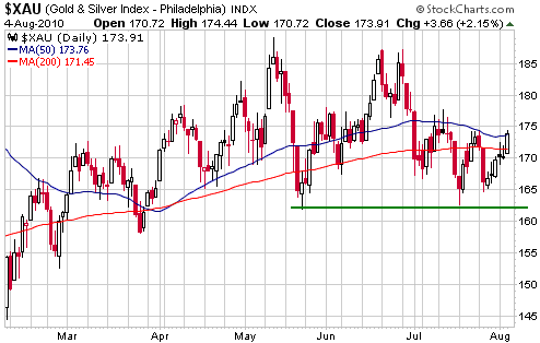
Gold Stocks
The Minyanville article posted HERE
has a couple of interesting charts. We are referring to the long-term
chart of the BGMI/S&P500 ratio, which shows that the gold sector is
still in the bottom quartile of its historical range relative to the
broad stock market, and the chart of gold-related investments as a
percentage of global assets, which shows that the combination of gold
and gold mining was often more than 20% of global assets during
1920-1981 and is now only 0.8%.
In our discussions of the gold sector's short-term price action we
generally include a chart of the HUI, but today we are including a
daily chart of the XAU (see below). This is because the XAU's chart
pattern is a little more clear-cut. In particular, the XAU's downward
spikes in mid July and mid May ended at roughly the same place, thus
creating a distinct level of support in the low-160s. Also, both of the
XAU's prior rebounds over the past month ended at the 50-day moving
average, and its current rebound reached the 50-day moving average on
Wednesday. The current rebound could therefore be almost complete.
Currency Market Update
Early this week an oil analyst commented that oil supply/demand
fundamentals didn't seem to matter anymore because the oil market was
simply following the stock market. His conclusion was that to figure
out the oil market you now had to be a stock market analyst rather than
an oil analyst.
Something similar could be said of the currency market, because what
happens in the currency market these days is mostly a function of what
happens in the stock market. If the stock market is trending upward
then the Dollar Index will almost certainly be trending downward, and
if the stock market is trending downward then the Dollar Index will
almost certainly be trending upward.
The Dollar Index touched its 200-day moving average on Tuesday and
Wednesday of this week. It is probably at or very close to a correction
low, assuming, of course, that the stock market is at or very close to
a correction high.
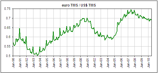
And now for something a little different. The ECB's definitions of
money-supply aggregates are different to those of the Fed, meaning, for
example, that euro M1 has a different composition to US M1. According
to Mike Pollaro,
an authority on money supply, the ECB's method of calculating M1 is
very similar to the way we calculate TMS. In other words, we can use
euro M1 to represent euro TMS.
Based on the assumption that the M1 figures published by the ECB are
equivalent to TMS figures, we created the following chart of the
euroTMS/US$TMS ratio. The line on this chart rises when the total
supply of euros increases relative to the total supply of US dollars.
In other words, a rising line on the chart indicates that the
money-supply backdrop is becoming bullish for the US$.
When we compared the TMS ratio chart with a chart showing the euro/US$
exchange rate we found that there wasn't a consistent lead-lag
relationship, which is actually not surprising given that the time from
a change in money supply to a related change in the general price level
can vary widely. However, it is possible to explain the major trends in
euro/US$ by referring to preceding major trends in the money-supply
ratio. For example, the rise in euro supply relative to US$ supply from
1993 through to 2000 helps explain the 1995-2001 downward trend in the
euro; the 2000-2004 decline in euro supply relative to US$ supply helps
explain the 2002-2007 rise in the euro; and the 2004-2007 rise in euro
supply relative to US$ supply helps explain the 2008-2010 strength in
the US$.
The most recent turning point occurred at the end of 2007, with euro
supply beginning to taper-off relative to US$ supply at that time.
The only conclusion we can draw is that if the money supply trend
hasn't already started to exert significant upward pressure on the
euro, it should begin to do so by early next year. As far as the next
few months are concerned, we expect that the stock market's performance
will dominate long-term money-supply considerations.
Update
on Stock Selections
(Notes: 1) To review the complete list of current TSI stock selections, logon at http://www.speculative-investor.com/new/market_logon.asp
and then click on "Stock Selections" in the menu. When at the Stock
Selections page, click on a stock's symbol to bring-up an archive of
our comments on the stock in question. 2) The Small Stock Watch List is
located at http://www.speculative-investor.com/new/smallstockwatch.html)
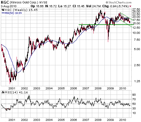
 Kinross Gold (NYSE: KGC, TSX: K). Recent price: US$15.72 Kinross Gold (NYSE: KGC, TSX: K). Recent price: US$15.72
Kinross, a >2M-ounce/year gold producer, is not a TSI stock
selection, but we keep an eye on the stock because the C-Series Kinross
warrants are in the TSI List. The warrants are interesting because they
are a leveraged play on a stock that should do well if the gold price
does what we expect over the next three years (the warrants don't
expire until September-2013). However, if we were going to directly
invest in a senior gold stock it wouldn't be Kinross. The reason is
that the company's management appears to be focused on growth at any
cost and in any location. Consequently, they have overpaid for assets,
and with this week's news that they have agreed to purchase mid-tier
producer Red Back Mining at a very high price they now have a
hotchpotch of projects spanning South America, North America, Russia
and West Africa.
Apart from the high price being paid, what interests us most about the
news that Kinross has agreed to buy Red Back is that part of the
payment to Red Back shareholders will be in the form of a new series of
Kinross warrants. These new warrants will have 4 years of time and an
exercise price of US$21.30, which means they will have a year more time
and be a lot closer to the money than the C-Series warrants.
Depending on the price at which the new warrants trade relative to the
price of Kinross shares, we could be very interested in owning them.
Assuming shareholders of Kinross and Red Back approve the takeover, the
new warrants will probably start trading during the second half of
September or the first half of October.
The following weekly chart shows KGC's progress over the past decade.
Everything that has happened since early 2008 is probably part of a
large bullish basing pattern, but at this stage there is no telling how
long the basing pattern will take to complete. A weekly close above
US$20 would be a clear sign that the basing period had ended and that a
new major up-leg had begun.
Chesapeake Gold (TSXV: CKG). Shares: 38M issued, 45M fully diluted. Recent price: C$7.10
All stocks eventually work their way back to their respective 200-day
moving averages, so when a stock moves a long way above or a long way
below its 200-day moving average the stage has been set for either a
substantial move in the opposite direction or a lengthy sideways
consolidation.
CKG, an exploration-stage gold miner with a massive (24M-oz) gold
deposit in Mexico, moved way above its 200-day moving average during
the first quarter of this year. Despite subsequently announcing
positive results for the Feasibility Study at its flagship project, the
stock has since been drifting downward. As illustrated by the following
chart, this downward drift has just brought CKG back to the vicinity of
its 200-day moving average.
Does this mean that the correction is over?
No. The correction could be over, but it is also possible that the
stock will eventually work its way down to intermediate-term support at
C$6.00. What we know is that CKG has a huge amount of upside potential
courtesy of the low (US$13/oz) valuation currently being assigned by
the stock market to its in-ground gold resource, and that the
correction has completely eliminated the 'overbought' condition.
Gold bulls who don't mind illiquid exploration-stage mining stocks should consider scaling into CKG over the next three months.
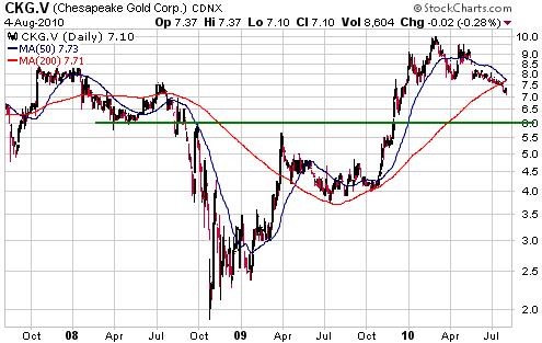
Chart Sources
Charts appearing in today's commentary
are courtesy of:
http://stockcharts.com/index.html
http://www.futuresource.com/

|