|
- Interim Update 4th December 2013
Copyright
Reminder
The commentaries that appear at TSI
may not be distributed, in full or in part, without our written permission.
In particular, please note that the posting of extracts from TSI commentaries
at other web sites or providing links to TSI commentaries at other web
sites (for example, at discussion boards) without our written permission
is prohibited.
We reserve the right to immediately
terminate the subscription of any TSI subscriber who distributes the TSI
commentaries without our written permission.
The most
over-valued and under-valued property markets
We took the following chart from an
article posted at businessinsider.com. The chart shows the
current house rental yield (house-price-to-rent ratio) relative to
the long-term average rental yield for 28 different countries. Based
on this valuation measure, the five countries with the most
expensive residential real estate are Canada, New Zealand, Norway,
Belgium and Australia, while the five countries with the cheapest
residential real estate are Japan, Greece, Germany, Portugal and
Slovenia.
Canada has the dubious distinction of having the most over-valued
residential property, with house prices that are presently 85% above
their long-term average relative to rents. Note, though, that some
locations with very expensive residential real estate were not
included in the comparison. Hong Kong, for example. Canadian real
estate is certainly in bubble territory, but house prices in Canada
could still look cheap to an investor in Hong Kong.
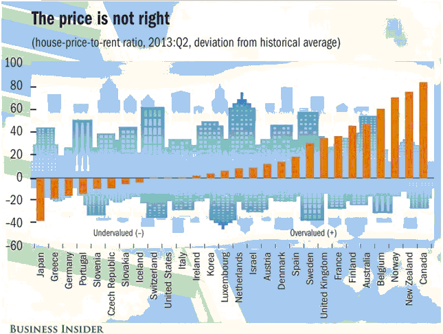
Due to the comparative expensiveness of real estate in Canada and
Australia, there's a good chance that relative weakness in the
residential property markets of these two countries will be part of
the fundamental justification for relative weakness in the
associated currencies over the next two years. The reason is that
bearish trends in house prices will result in relatively easy
monetary policy.
The
illusion of strength
The latest monthly ISM numbers show that US
manufacturing is still going strong. Especially noteworthy is the 2.5-year high
in the ISM New Orders Index in November-2013. Refer to the following chart for
details.
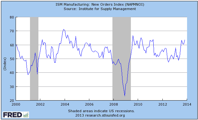
The strength in the US manufacturing sector is undoubtedly a monetary illusion.
What we mean is that the strength is primarily due to activities that have
sprung up on the back of rapid monetary inflation and are not self-sustaining.
These activities waste resources and pave the way for severe future economic
weakness and unemployment, but, as the man who jumped off the Empire State
Building was heard to say as he plummeted past the 50th floor, so far so good.
Additional rapid monetary inflation will be needed to maintain the illusion. As
evidence we cite the fact that the ISM New Orders Index fell below 50 in June of
2012 and remained below 50 during July and August of 2012, signaling that the
manufacturing sector had begun to contract and that the US economy was slipping
into recession. In response, "QE3" was introduced in September of 2012. This
arrested the decline in manufacturing, but in December of 2012 the New Orders
Index again dipped below 50. "QE3" therefore didn't appear to be sufficient to
maintain the illusion, so the 'money pumps' were ramped up a few more notches
via "QE4". The latest QE program ("QE4") got underway during the first quarter
of this year and has met with short-term success, but the long-term cost will be
very high.
One reason that inflating the money supply is a popular policy is that in real
time it will usually be impossible to tell the difference between artificial
strength derived from money pumping and genuine strength derived from increasing
productivity. For example, the US economy seemed to be doing fine in May-2007,
even though it was only six months from commencing its most severe recession
since the 1930s. The 2007-2009 recession was so severe because the superficial
strength of 2003-2007 was largely an artefact of 'monetary accommodation'.
On a related matter, when reading the article "Revolutionary
France's Road to Hyperinflation" we were struck by the similarities between
France's experience with inflation -- and, eventually, hyperinflation -- in the
1790s, and what the US is currently going through. What's now happening in the
US is like a slow-motion version of what happened in France in the 1790s. In
France during the 1790s it took 7 years to go from the first round of
money-pumping to complete destruction of the currency. In the present-day US it
is taking much longer.
The Stock Market
Cracks are beginning to appear in the global stock market rally
and the most significant of these cracks are appearing in Europe. For example,
the top section of the following daily chart shows that the EURO STOXX 50 Index
(STOX5E), a proxy for large-cap European stocks, has broken below short-term
lateral support defined by the lows of the past two months. This suggests that a
decline to intermediate-term support defined by the May and August highs is on
the cards.
The bottom section of the following chart shows that large-cap European stocks
have been weakening relative to large-cap US stocks since mid-October. This has
implications for the currency market as mentioned later in today's report.
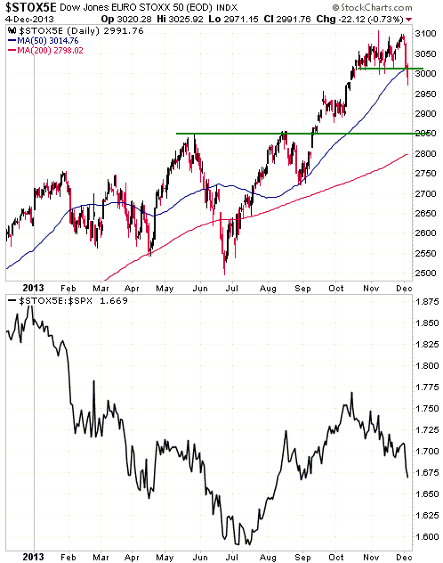
It's way too early to conclude that a reversal of more than short-term
significance has occurred. If we are, in fact, witnessing the reversal of a
long-term trend, the most likely path over the next two months would entail
additional weakness over the next several days followed by a 2-4 week rebound
and then a decline that takes out the December low.
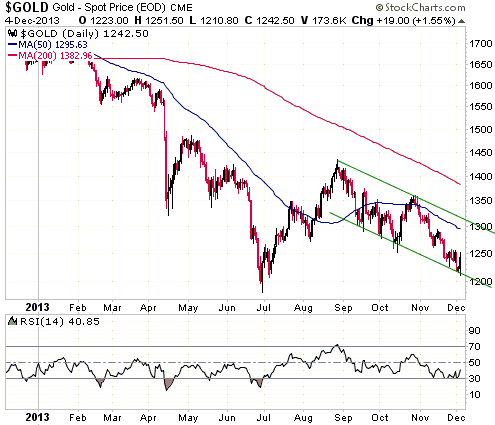
Gold and the Dollar
Gold
As a result of this week's price action, gold's short-term price channel is now
well defined. With reference to the following daily chart, notice that gold
traded slightly below its channel bottom on Wednesday before reversing upward.
It then ran into resistance in the low-$1250s before settling back to around
$1240.
Although the channel top is presently around $1310, we would still interpret a
daily close above $1280 as a clear warning that the trend had reversed from down
to up.
It will be interesting to see how the gold market reacts to the monthly US
employment report on Friday, especially if the report reveals enough improvement
to prompt more predictions of imminent "Fed tapering". A failure of gold to
react negatively to the same old "tapering" talk would be a sign that the bear
market had run its course.
As we've noted many times in the past, a major trend change in the gold market
will not require additional money-pumping. The money-pumping is currently
propping-up the stock market, not the gold market.
A major trend change in the gold market actually won't, in all likelihood, be
marked by anything specific in real time apart from better price action. Like
all such reversals in the financial markets, it will be driven by a subtle
sentiment swing that does not appear to be supported by the news of the day.
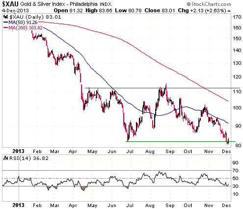
Gold Stocks
The XAU fell into line with the HUI during the first half of this week by
dropping to a new bear-market low. The new low was only marginal (see chart
below), but it eliminated the potential top-bottom symmetry discussed in the
latest Weekly Update.
The cyclical decline in the gold-mining sector is now unprecedented, in that it
has lasted three months longer than the longest decline of the 1960s-1970s
secular gold bull market and has lasted about seven months longer than the first
cyclical decline of the 1980s-1990s secular gold bear market*. That being said,
we are dealing with a very small sample size and we are also dealing with
unprecedented monetary machinations and debt levels. Consequently, while new
multi-year lows for the gold-stock indices in December of 2013 is not something
we would have ever predicted, we are not shocked by this outcome. It's likely
that many financial-market records will be broken on the downside and the upside
in the years ahead.
We won't be certain that the XAU's cyclical bear market is over until
intermediate-term resistance at around 112 is decisively breached, but as a
result of the price action of the past few days we would now view a daily close
above the 50-day MA as clear-cut evidence of a trend reversal.
*There isn't a realistic possibility that gold commenced a
secular bear market in 2011, but it is still worth pointing out that the gold
sector's decline since its 2011 peak is not similar to the decline that followed
the 1980 peak. Despite this week's new lows, the current episode still looks
most similar to the declines of 1968-1970 and 1974-1976.
Currency Market Update
The Dollar Index continues to test short-term support at 80.5. Breaching this
short-term support on a daily closing basis would suggest that major support at
79 was going to be re-tested.

The Dollar Index's momentum, sentiment and price action are neutral and are
therefore give us nothing to go on. However, the recent strength in large-cap US
equities relative to large-cap European equities is an important factor in the
Dollar's favour. As a result of the US stock market's relative strength, the
Dollar Index is probably not going to do any worse over the next few weeks than
fall back to 79.
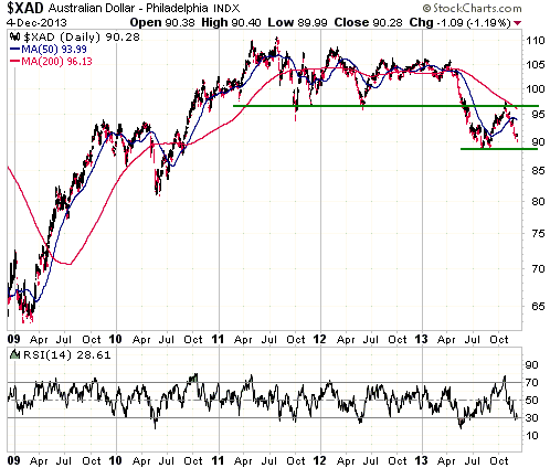
The Australian Dollar (A$) is immersed in a cyclical bear market that probably
has a long way to go. On a purchasing power parity basis, fair value for the A$
is around 0.75.
It is reasonable to expect that the A$ will drop to fair value or lower before
its bear market comes to an end. It is also reasonable to expect that it will
take up to two more years for the A$ to get where it is going. The reason is
that with all G7 central banks implementing ultra-easy monetary policy, the sort
of financial-market liquidity event that happened in 2008 and caused a very
rapid decline in the A$ is currently not a realistic intermediate-term
possibility. The A$'s downward path is therefore likely to be interrupted by
numerous corrections in the forms of counter-trend rebounds or periods of
horizontal range-trading.
The following daily chart shows that:
1. The A$ completed a major topping pattern during the second quarter of this
year when it broke below long-term support at 95-97.
2. Former support at 95-97 acted as resistance and capped the rebound from the
August low.
3. The A$ is now short-term 'oversold' and within a point of its August low.
This sets the stage for another counter-trend rebound.
Update
on Stock Selections
Notes: 1) To review the complete list of current TSI stock selections, logon at
http://www.speculative-investor.com/new/market_logon.asp
and then click on "Stock Selections" in the menu. When at the Stock
Selections page, click on a stock's symbol to bring-up an archive of
our comments on the stock in question. 2) The Small Stock Watch List is
located at http://www.speculative-investor.com/new/smallstockwatch.html
Chart Sources
Charts appearing in today's commentary
are courtesy of:
http://stockcharts.com/index.html
http://research.stlouisfed.org/

|
