![]()
![]()
![]()
![]()
- Interim Update 5th August 2015
Copyright
Reminder
The commentaries that appear at TSI
may not be distributed, in full or in part, without our written permission.
In particular, please note that the posting of extracts from TSI commentaries
at other web sites or providing links to TSI commentaries at other web
sites (for example, at discussion boards) without our written permission
is prohibited.
We reserve the right to immediately
terminate the subscription of any TSI subscriber who distributes the TSI
commentaries without our written permission.
US Recession Update
Real Gross Private Domestic
Investment (RGPDI) is a leading indicator of US recession that has a perfect
record over its 67-year history, meaning that it has never generated any false
positive or false negative signals. It has always reversed its trend from up to
down in advance of a US recession and has otherwise never reversed its trend
from up to down. Strangely, in light of its record, its performance is not
widely followed or reported.
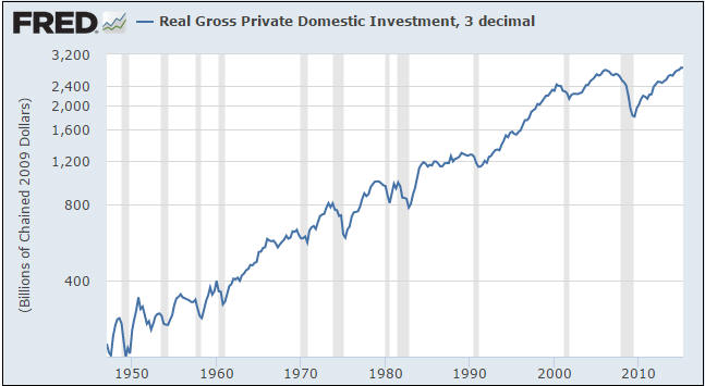
A problem is that RGPDI only gets updated quarterly. For example, prior to last
week the most recent RGPDI data was for the first quarter of this year. However,
given the fact that it usually turns down at least 1-2 quarters prior to the
start of a recession it can still be useful as a leading indicator.
Data released last week showed that RGPDI made a very-marginal new high in its
post-2009 trend (a marginal new all-time high, actually) during the June-2015
quarter, which tells us that the next official US recession is unlikely to start
prior to the final quarter of this year. The starting time could be much later
than that, but will probably not be earlier.
As noted above, RGPDI's drawback is that it only gets updated quarterly. For
example, the next RGPDI update won't happen until late-October. We therefore
need a shorter-term indicator to fill in the gaps, which is where the monthly
ISM (Institute of Supply Management) New Orders Index comes in.
With one exception, the ISM New Orders Index has turned down and broken solidly
below 50 ahead of every US recession of the past 65 years. The one exception was
1973-1974, when this index didn't break solidly below 50 until after the
recession was well underway. As a recession indicator it has therefore generated
only one false negative. However, it does generate the occasional false
positive, meaning that sometimes it breaks solidly below 50 and a recession does
not soon follow. We count 9 such instances in the index's long history.
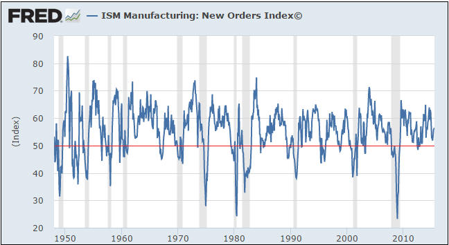
The historical record therefore suggests that a) when the ISM New Orders Index
breaks solidly below 50 (to 48 or lower) there is a better than even-money
chance that the US economy has either just entered a recession or will enter a
recession within the ensuing few months, and b) when the ISM New Orders Index is
comfortably above 50 there is only a small probability that the US economy has
entered or will soon enter recession territory.
The latest monthly ISM data were released early this week and showed that the
New Orders Index ticked up from 56.0 to 56.5 in July. This tells us that the US
economy is not currently in recession and is unlikely to enter a recession in
the near future.
We realise that other economic statistics are at levels that would typically be
associated with a recession and that the US economy is most definitely not doing
well at this time (which is hardly surprising given the Fed's relentless
distortion of interest rates and other price signals). Due to the weakness being
exhibited by other economic indicators we would be willing to discount the
message of the ISM New Orders Index if not for the fact that the New Orders data
are consistent with RGPDI, the most reliable of all recession indicators.
Our conclusion is that the US economy is lacklustre, but is still growing and
probably at least a few months away from entering its next recession.
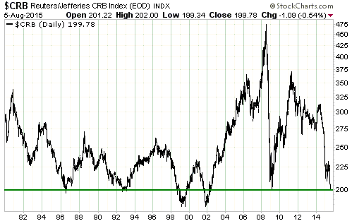
The commodity bust in
two charts
We normally use the Continuous
Commodity Index (CCI) as our proxy for commodity prices in general. The CCI and
the CRB Index data are identical prior to 2005, but in 2005 the CRB's
composition was changed. We prefer the CCI to the CRB simply because the CCI
reflects the price performance of an unchanged basket of commodities.
In the latest Weekly Update we showed that the "inflation"-adjusted CCI had just
fallen to its lowest level since the 1940s. This is bad enough, but the CRB
Index has actually fared even worse. As illustrated below, the CRB Index is not
far from a 30-year low in nominal dollar terms. More specifically, the nominal
(meaning: not adjusted for the effects of inflation) CRB Index is now testing
its 1986, 1992 and 2009 lows and is within 10% of its 1999-2001 low.
Our second commodity-related chart shows that the XAU, an index dominated by a
few large gold-mining stocks and one large copper-mining stock (FCX), is now
below its 1986 and 1998 lows and is within spitting distance of its
November-2000 all-time low.
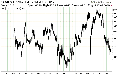
These charts prompt the following comments:
1) In the commodity markets and the gold-mining sector we are getting another
lesson about the weakness of market sentiment as an indicator: when it comes to
sentiment, there are no absolute benchmarks. The related lesson is that the most
extreme monetary intervention in history can lead to new sentiment extremes in
both directions. Does this mean that the flipside of the current situation will
be equivalent extremes in the opposite directions within the coming few years?
Yes, it probably does.
2) There's a high probability that the global consumption of commodities will be
higher in 5 years' time than it is today and there's no chance that the entire
gold-mining industry is heading for the financial scrapheap. Given these
realities and current price levels, does it make more sense to be bullish or
bearish regarding the prospects for commodity and gold-stock prices over the
coming few years?
The Stock Market
The US
We saw the following chart in a
post at Ritholtz.com. It isn't directly related to the stock market, but we
are reproducing it here because a) it is interesting and b) nothing worthy of
comment happened to the senior stock indices over the past few days.
The chart was put together by David Rosenberg using data from the Federal
Reserve's Survey of Consumer Finances (SCF). These data are only published every
three years, which is why the latest bar on the chart is for 2013.
We knew that the stock market's large gain was unrepresentative of the average
American's financial performance, but we were shocked by the magnitude of the
disparity revealed by this chart. The chart shows that in constant dollar terms*
the net worth of the median US household fell by about 40% from 2007 through to
2013 and was a little lower in 2013 than it was way back in 1989. In contrast,
from the end of 1989 through to the end of 2013 the CPI-adjusted S&P500 Index
rose by about 170%.
In other words, the constant-dollar net worth of the median US household fell
slightly over a 24-year period during which the constant-dollar S&P500 gained
about 170%. It takes a lot of monetary meddling to generate a wealth-performance
mismatch of this magnitude. Take a bow, Greenspan, Bernanke and Yellen.
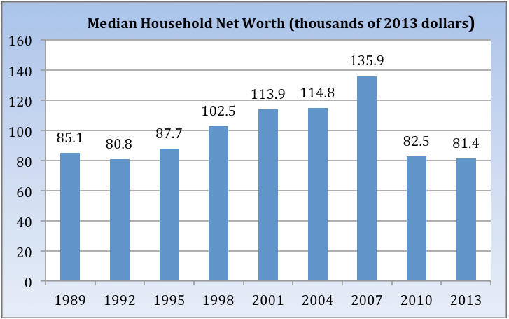
*We assume that the Fed uses the official CPI or something
similar to adjust for "inflation".
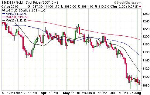
Gold and the Dollar
Gold
The monthly US Employment Report has an effect on the financial markets in
general and the gold market in particular that is way out of proportion to the
usefulness of the information contained in the report. The reason for the
outsized effect is that the economics illiterates who run the Fed place a lot of
importance on the monthly employment data.
The next monthly Employment Report will be published prior to the start of US
trading this Friday. As we've previously mentioned, it's prudent not to have any
leveraged short-term gold positions -- either long positions or short positions
-- when this report is published, because the gold-price action tends to be
volatile and unpredictable in the immediate aftermath of the report.
Having said that, the following table (an update of the table that was presented
and discussed in detail in our 4th May 2015 weekly commentary) shows that the
last four monthly Employment Reports were associated with minimal volatility in
the days leading up to the report and on the day of the report.
| Date of Employment Report | Gold price at end of day before report | Gold price 6 trading days before report | $ difference (neg means fell during 5 days before rpt) | Gold price at end of Empl Rpt day | $ chge on Empl Rpt day |
| 07-Aug-15 | 1087.3 | ||||
| 02-Jul-15 | 1167.8 | 1174.2 | -6.4 | 1165.2 | -2.6 |
| 05-Jun-15 | 1176.4 | 1188.6 | -12.2 | 1171.8 | -4.6 |
| 08-May-15 | 1183.8 | 1183.5 | 0.3 | 1187.2 | 3.4 |
| 03-Apr-15 | 1202.5 | 1203.6 | -1.1 | 1214.5 | 12 |
| 06-Mar-15 | 1197.5 | 1209.3 | -11.8 | 1168.2 | -29.3 |
| 06-Feb-15 | 1265 | 1258.7 | 6.3 | 1233.3 | -31.7 |
| 09-Jan-15 | 1183.2 | 1208.9 | -25.7 | 1223.4 | 40.2 |
| 05-Dec-14 | 1198.1 | 1206 | -7.9 | 1192.6 | -5.5 |
| 07-Nov-14 | 1199 | 1141.3 | 57.7 | 1178.7 | -20.3 |
| 03-Oct-14 | 1222.5 | 1214.8 | 7.7 | 1191.1 | -31.4 |
| 05-Sep-14 | 1290 | 1261.7 | 28.3 | 1269.3 | -20.7 |
| 01-Aug-14 | 1294.2 | 1283.1 | 11.1 | 1295.2 | 1 |
| 03-Jul-14 | 1319.3 | 1328 | -8.7 | 1320.4 | 1.1 |
| 06-Jun-14 | 1254.6 | 1253.2 | 1.4 | 1252.4 | -2.2 |
| 02-May-14 | 1290.6 | 1284.7 | 5.9 | 1300.7 | 10.1 |
| 04-Apr-14 | 1291.3 | 1286.6 | 4.7 | 1302.3 | 11 |
| 07-Mar-14 | 1331.7 | 1350.4 | -18.7 | 1339.9 | 8.2 |
| 07-Feb-14 | 1243.3 | 1258.1 | -14.8 | 1267 | 23.7 |
| 10-Jan-14 | 1222.3 | 1226.8 | -4.5 | 1248.5 | 26.2 |
| 06-Dec-13 | 1237.4 | 1224.3 | 13.1 | 1230 | -7.4 |
| 08-Nov-13 | 1322.5 | 1307.2 | 15.3 | 1289 | -33.5 |
| 22-Oct-13 | 1272.8 | 1315.7 | -42.9 | 1340.3 | 67.5 |
| 06-Sep-13 | 1406.8 | 1367.3 | 39.5 | 1391 | -15.8 |
| 02-Aug-13 | 1333 | 1308.8 | 24.2 | 1312.8 | -20.2 |
| 05-Jul-13 | 1224.3 | 1251.5 | -27.2 | 1212.7 | -11.6 |
| 07-Jun-13 | 1412.7 | 1412.1 | 0.6 | 1384.3 | -28.4 |
| 03-May-13 | 1466.3 | 1467.6 | -1.3 | 1469.9 | 3.6 |
| 05-Apr-13 | 1597.1 | 1553.3 | 43.8 | 1580.8 | -16.3 |
| 08-Mar-13 | 1579.8 | 1577 | 2.8 | 1576.4 | -3.4 |
| 01-Feb-13 | 1667.7 | 1664.7 | 3 | 1557.6 | -110.1 |
| 04-Jan-13 | 1663.8 | 1664 | -0.2 | 1658.4 | -5.4 |
| TOTAL | 82.3 | -192.4 |
There has been minimal volatility in the gold price over the past few days, with
the price oscillating between the low-$1080s and the $1090s. However, this
'coiling' sets the stage for a breakout in one direction or the other in
reaction to the employment data. In fact, strong data could possibly result in
breakouts in both directions -- a downside breakout in a knee-jerk reaction to
the news followed by a reversal and a subsequent upside breakout.
Gold Stocks
Despite the directionless trading in the gold market, the gold-mining indices
extended their declines over the first three days of this week. This is
extraordinary considering the extent to which they were already stretched to the
downside.
Part of the problem is that the senior gold producers continue to report poor
operational performances. The rest of the problem is sentiment. For example,
electric car manufacturer Tesla (TSLA) hemorrhages cash quarter after quarter,
but up until now the stock market has rewarded this company with a very high
valuation because it likes the story. The gold story, on the other hand, is
extremely unpopular at the moment.
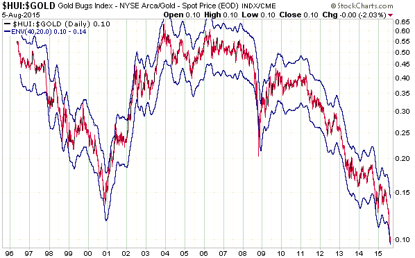
This week's price action has maintained the HUI/gold ratio extreme that we
mentioned in the 27th July Weekly Update. We are referring to the fact that the
HUI/gold is at the bottom of its 40/20 MA envelope (a 20% envelope around the
40-day MA), a very rare occurrence. It happened at the bottom last November and
near important bottoms in 2008, 2002 and 1998. Here's the relevant chart again.
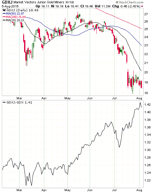
Over the past three months the junior gold stocks have generally held up better
than the senior gold stocks. This has enabled GDXJ to remain above its July low
for now and caused the upward trend in the GDXJ/GDX ratio illustrated by the
bottom section of the following chart. However, relative strength is small
consolation when it involves substantial absolute weakness.
Although it could happen, we do not expect to see a bullish divergence between
the gold-mining indices and gold bullion prior to an important price low.
Bullish divergences, entailing the gold-stock indices making higher lows while
the gold price makes a new low, tend to occur around short-term or
intermediate-term correction lows within cyclical bull markets. At major lows
the gold-stock indices tend to be relatively weak until the day of the final
bottom, at which point they become relatively strong. For example, based on the
performance of the HUI/gold ratio the outlook for gold-mining looked dismal the
day before the major bottom in November-2000.
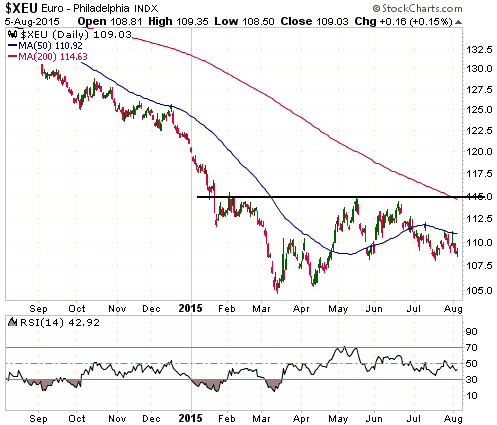
The Currency Market
Not much has happened of late in the currency market. The euro, for example,
continues to chop around just above its lows of the past three months. It needs
to close above 111 or below 107.5 to signal the most likely direction of its
next multi-week move.
Updates on Stock Selections
Notes: 1) To review the complete list of current TSI stock selections, logon at
http://www.speculative-investor.com/new/market_logon.asp
and then click on "Stock Selections" in the menu. When at the Stock
Selections page, click on a stock's symbol to bring-up an archive of
our comments on the stock in question. 2) The Small Stock Watch List is
located at http://www.speculative-investor.com/new/smallstockwatch.html
Chart Sources
Charts appearing in today's commentary
are courtesy of:
http://stockcharts.com/index.html
http://research.stlouisfed.org/
![]()