|
- Interim Update 6th February 2013
Copyright
Reminder
The commentaries that appear at TSI
may not be distributed, in full or in part, without our written permission.
In particular, please note that the posting of extracts from TSI commentaries
at other web sites or providing links to TSI commentaries at other web
sites (for example, at discussion boards) without our written permission
is prohibited.
We reserve the right to immediately
terminate the subscription of any TSI subscriber who distributes the TSI
commentaries without our written permission.
The
"Great Deleveraging"
One of the strangest ideas to take root over the past few years
is that the US economy is immersed in a "great deleveraging", where
deleveraging refers to a reduction in the amount of debt. This is a
strange idea because not only has there not been a 'great'
deleveraging, on an economy-wide basis there has been no
deleveraging whatsoever. In fact, the US economy is more leveraged
today than it was at the beginning of the 2007-2008 global financial
crisis.
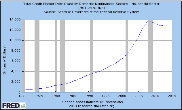
The "great deleveraging" myth has undoubtedly been spawned by the
modestly successful efforts of the US Household Sector to reduce its
indebtedness. These efforts led to the roughly $1T (7%) decline
since 2007 in the total debt owed by this sector of the economy.
Refer to the following chart for details. It could be argued that a
7% decline in outstanding debt doesn't constitute a 'great'
deleveraging, but it could also be argued that the 'great' label
applies since we are dealing with the first household deleveraging
in generations and a major trend change.
What cannot be argued, at least not with a straight face, is that
there has been an economy-wide deleveraging (great or otherwise).
The following chart shows that the total debt owed by US
non-financial sectors has risen from around $32T to around $39T (a
roughly 22% increase) since the beginning of the 2007-2008 crisis.
Not only hasn't there been a trend change, there hasn't even been a
meaningful slowing in the rate of ascent.
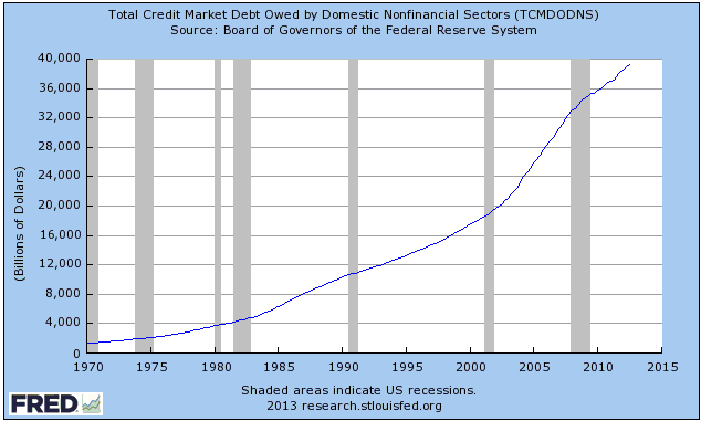
An implication is that a great economy-wide deleveraging still lies
ahead and will possibly be ushered-in by the next financial crisis.
Every new financial crisis turns out to be very different from the
most recent preceding crisis. One reason is that a crisis
necessarily involves the vast majority of people being taken by
surprise, but for many years after a crisis the average
financial-market participant will be on guard against a recurrence.
Another reason is that central planners invariably address the
superficial characteristics of the most recent crisis while ignoring
its root cause, thus ensuring that the next crisis will have
different characteristics while doing nothing to make the financial
system more robust. Therefore, something that we can be fairly
certain of is that the next financial crisis will look very
different from the 2007-2008 episode.
The focal point of the 2007-2008 crisis was private mortgage debt.
When the markets for mortgage debt and all the associated
derivatives began to crumble, there was a mad scramble for cash. For
several months this created the impression that deflation was
happening, because even though the supply of money was growing the
demand for money within the private sector was growing much faster.
It's an open question as to what will be the focal point of the next
crisis, but one of the most likely candidates is government debt. If
the focal point does turn out to be government debt then the safest
place to be during the last crisis will be the most dangerous place
to be during the next crisis.
This leads us to our final point, which is that when a private debt
market implodes the participants in the market have no choice other
than to retrench. Their desperate need for more cash requires them
to sell whatever they can, which causes prices to fall. However,
when a government debt market implodes the government in question
has a choice. The choice occurs because modern governments, via
their central banks, have unlimited access to money. To put it
another way, a government that has its own central bank can only
ever run short of money by choice. When placed in a desperate
situation it could opt to make a drastic retrenchment and set in
motion a truly great deleveraging, or it could opt to run the
virtual printing presses even faster. The former leads to deflation,
the latter leads to hyperinflation.
The Stock Market
The following chart shows the TSI Index of Bullish Sentiment (TIBS).
We calculate TIBS at the end of every week based on the results of four stock
market sentiment surveys, the 5-day moving average of the equity put/call ratio
and the 5-day moving average of the VIX.
TIBS is presently at an 18-month high, but note that it was slightly higher in
early 2011. The early-2011 sentiment extreme turned out to be very important, in
that it occurred just prior to a peak in the Dow Jones World Stock Index (DJW)
that is yet to be decisively breached. The 2011 sentiment extreme also occurred
just prior to the start of a 20% downward correction in the US stock market.
The point is that while sentiment could become a little more extended into
optimistic territory, there doesn't appear to be much additional scope for the
conversion of equity bears to equity bulls.

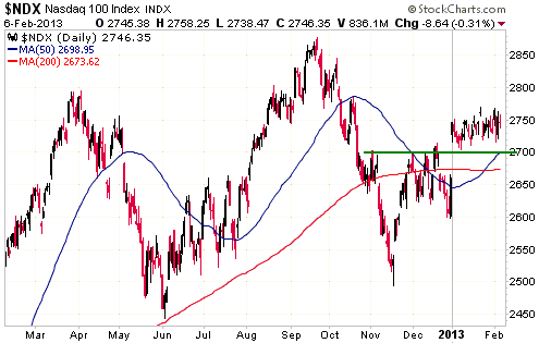
We continue to fixate on the NASDAQ100 Index (NDX) due to its divergence from
the other senior US stock indices and its unusually narrow short-term trading
range. The narrow range dates back to the second trading day of this year. On
the first trading day of the year (2nd January) the NDX was sharply higher in
reaction to the "fiscal cliff" news. It closed that day at 2746, which is
exactly where it closed on Wednesday 6th February.
A daily close below 2700 would be evidence that a short-term top was in place
and that a significant decline had begun.
Gold and the Dollar
Gold and Silver
On each of the past six trading days, the US$ gold price rose to its 50-day
moving average (the blue line on the following daily chart) and then pulled
back. The top of gold's short-term price channel lies just above the 50-day MA.
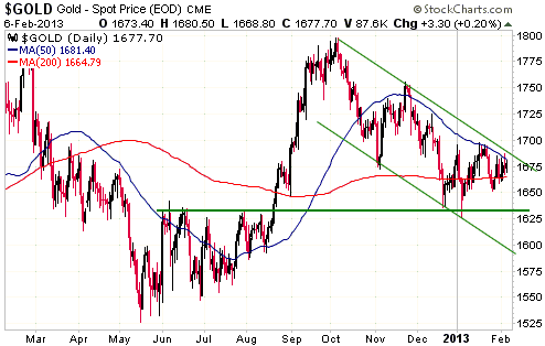
The most important nearby support is in the low-$1630s, but there is also
significant short-term support at around $1650. A daily close below $1650 would
suggest that gold was on the way down to its channel bottom at around $1600.
That's one possible outcome over the next couple of weeks.
A more likely outcome is that gold breaks out to the upside from its short-term
channel and begins to make its way to major resistance at $1800.
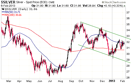
The daily silver chart displayed below looks similar to the daily gold chart
displayed above, except that silver's price swings have been larger. If gold
breaks upward from its short-term channel then silver will do the same, but
silver's short-term upside potential appears to be greater than gold's.
Silver has been stronger than gold over the past 6 months and this relative
strength is likely to persist until after it becomes clear that the broad stock
market has commenced an intermediate-term decline (silver usually outperforms
gold when the broad stock market is in a rising trend). Note that major stock
market peaks are usually tested, so even if the senior stock indices are now
very close to major peaks they are probably still a few months away from
commencing downward trends. The price action between the ultimate peak and the
start of a downward trend would likely involve a 5%-10% decline followed by a
rebound to test the peak.
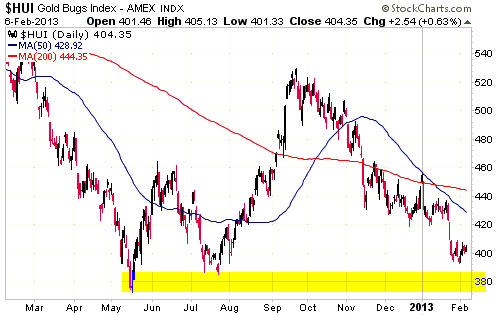
Gold Stocks
Recent price action has been tedious, but the tedium should soon end. It's
likely that the gold sector will soon commence a strong multi-week rally,
although there remains a possibility that the HUI will spike down to
intermediate-term support at 375-385 (the shaded area on the following daily
chart) before a tradable rally gets underway.
Currency Market Update
Over the past month we've devoted an unusual amount of commentary space to the
Yen. We are now going to devote some more. After all, it isn't every day that a
major currency reaches its most 'oversold' extreme in decades. When something
like this happens it is appropriate to fully consider the implications,
especially when there isn't much else happening.
As well as being significant in its own right, it is becoming increasingly
apparent that the recent relentless decline in the Yen is linked to the recent
relentless advance in equities. This could be the result of the infamous Yen
carry trade (in this case, borrowing Yen to finance long positions in equities)
making a big comeback, or it could be due to 'black box' traders buying equity
index futures whenever the Yen declines and selling equity index futures
whenever the Yen rallies. Either way, there's a good chance that important
reversals in the Yen and the stock market (up for the Yen, down for the stock
market) will roughly coincide with each other.
Having begun this week at what was by some measures its most 'oversold' extreme
in more than two decades, the Yen bounced a little on Monday (as the stock
market pulled back), made another new low for the move on Tuesday (as the stock
market rallied), and then essentially went nowhere on Wednesday (as the stock
market moved sideways). Tuesday's price action had the effect of pushing Market
Vane's Yen bullish percentage to 14 (meaning: only 14% of traders surveyed by
Market Vane were bullish on the Yen following the price action of Tuesday 5th
February). This is not only the lowest Yen bullish percentage recorded by Market
Vane in at least a decade, it is also close to the lowest bullish percentage
recorded by Market Vane for any major currency in at least a decade (our Market
Vane data doesn't go back any further than that).
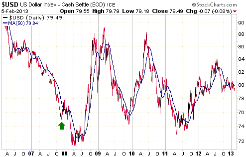
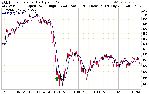
We could only find two other examples over the past 10 years of a major currency
achieving such a low level of bullish sentiment. We are referring to the 13%
bullish percentage achieved by the Dollar Index in November of 2007 and the 15%
bullish percentage achieved by the British Pound in November of 2008. It is
worth reviewing what happened in each of these cases.
The sentiment extremes mentioned above are indicated with green arrows on the
following charts of the Dollar Index and the British Pound. Notice that in both
cases there was a quick rebound up to or above the 50-day moving average (the
blue line on the chart) and then a decline to a new low, with the ultimate
bottom being put in place 4-5 months after the sentiment extreme. Also notice
that in both cases the price was much higher 12 months after the unusually
depressed sentiment was recorded.
Here is a similar chart of the Yen.
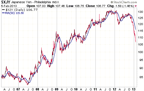
Based on the Yen's history and the performances of other major currencies
following extremely low levels of bullish sentiment, we arrive at the following
conclusions:
1) The Yen probably hasn't reached its ultimate bear-market bottom.
2) A rebound in Yen futures to at least as high as the 50-day moving average
(presently at 115, but in a steep decline) and possibly as high as the 70-week
moving average (presently in the low-120s) will probably soon begin.
3) The Yen will probably trade at least 10% above its current level during the
second half of this year.
A few weeks ago we shifted about 10% of our cash reserve into Yen. Given that
Yen futures have since plunged from 116 to 106, our timing was bad. However, the
position is relatively small and totally non-levered (just a change in the
currency in which part of our cash reserve is denominated). With the Yen's
long-term fundamentals remaining more bullish than those of its main fiat
currency competitors (the US$ and the euro), we are prepared to be patient and
wait-out a recovery. We might even double the position a few months from now if
the Yen appears to be following the bottoming patterns of the Dollar Index
during 2007-2008 and the Pound during 2008-2009.
Update
on Stock Selections
Notes: 1) To review the complete list of current TSI stock selections, logon at
http://www.speculative-investor.com/new/market_logon.asp
and then click on "Stock Selections" in the menu. When at the Stock
Selections page, click on a stock's symbol to bring-up an archive of
our comments on the stock in question. 2) The Small Stock Watch List is
located at http://www.speculative-investor.com/new/smallstockwatch.html
Chart Sources
Charts appearing in today's commentary
are courtesy of:
http://stockcharts.com/index.html
http://stlouisfed.org

|
