|
- Interim Update 6th August 2003
Economic
Thoughts
The economy and the stock market
In the latest Weekly Update we explained
that the US Government can, and routinely does, dramatically improve the
'headline' GDP growth figures by under-estimating the effects of inflation.
In fact, by assuming a price deflator of only 1% in the second quarter
compared to the 2.4% deflator used in the first quarter's calculations
a drop in the nominal GDP growth rate between the first and second
quarters was transformed into an increase in the reported 'real' GDP growth
rate.
The official GDP growth figures for
the first and second quarters of this year are 1.4% and 2.4% respectively,
but if more realistic estimates of the effects of inflation had been used
in the calculations the figures would have been much lower. Actually, we
don't believe there is any way that the US economy really grew during the
first half of this year. For one thing, the economy has just experienced
its 6th consecutive month of job losses. Now, we realise that the employment
statistics are lagging indicators, but since records began in 1939 the
US economy has never before experienced more than 4 consecutive months
of job losses during an economic expansion (source: www.theliscioreport.com).
So either it is different this time or the economy has not really been
expanding.
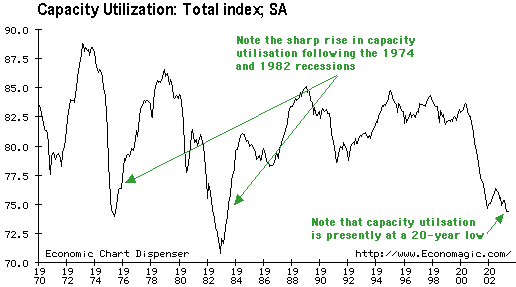
For another thing, capacity utilisation
remains near its lowest level in 20 years. However, in the early stages
of the recoveries following the 1974 and 1982 recessions the capacity utilisation
rate improved dramatically (see chart below). There wasn't such a sharp
improvement following the 1990 recession, but during that period the capacity
utilisation rate was rebounding from a much higher base.
Real growth in the US economy was clearly
non-existent during the first half of this year, but as discussed in a
previous commentary one of the most reliable leading indicators of economic
growth - the CPI-adjusted M2 growth rate - is projecting reasonable growth
for the second half of this year. That is, the 'second half rebound story'
that was so popular during the first halves of 2001 and 2002, but failed
to materialise, is probably going to come true this year. This, however,
is not a reason to expect a strong stock market during the second half.
Companies are able to increase their
profits at a faster rate when the economy is stronger so it seems reasonable
to assume that a stronger economy will coincide with a stronger stock market.
In reality, though, there is no positive correlation between the average
earnings growth achieved by S&P500 companies during a particular quarter
and the performance of the S&P500 Index during that quarter. In actual
fact, Victor Niederhoffer shows via scatter diagrams in his book "Practical
Speculation" that there is a slight negative correlation (above
average earnings growth in a quarter will tend to be associated with a
below average performance by the S&P500 Index during that quarter).
This is not as strange as it might first appear because the stock market
attempts to discount the future, so periods of above average earnings growth
tend to be preceded by periods of above average stock-price performance.
In other words, the surge in stock prices over the past few months is probably
forecasting stronger economic and profit growth during the second half
of the year, but if anything this improved profit growth is likely to be
associated with a weaker stock market. In fact, the stock market
could be substantially weaker because it appears to be discounting far
more profit growth than is feasible in the current environment.
Bonds and the economy
Below is a chart comparing the M2 year-over-year
growth rate with the yield on the 30-year T-Bond. Note that the scale on
the yield chart is inverted so the line on the chart rises when the bond
yield falls. The vertical green lines on the chart mark the times when
there was a change in the direction of the bond-yield's intermediate-term
trend.
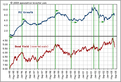
Since 1995, the important trend changes
in the money supply growth rate have followed trend changes in the
bond yield with remarkable consistency. This correlation can be explained
by the fact that each significant downturn in long-term interest rates
over the past 8 years has spurred another period of rapid growth in the
total amount of housing-mortgage debt. Interestingly, though, this relationship
hasn't worked as well over the past year as it did during the 7 years before
that, perhaps indicating that US home owners/buyers are, as a group, approaching
the limits of their capacity to take on more debt.
Excluding the recent upward reversal
in the bond yield (shown as a downward reversal on the chart) there have
been seven important trend changes in the bond yield since the beginning
of 1995. On five of these occasions the money supply growth rate followed
suit within three months whereas on 2 occasions the lag was about 6 months.
So, if it hasn't already done so we should expect the M2 growth rate to
begin trending lower within the next few months. This, in turn, suggests
that 2004 is going to be a very difficult year for the US economy.
The US
Stock Market
Current Market Situation
After doing nothing for 2 months the
US stock market is finally starting to make some progress.
First, the most important of the bearish
early warning signals listed in the 14th July Weekly Market Update was
'triggered' yesterday when the NASDAQ100/Dow ratio closed below its 70-day
moving average (see chart below). Provided the ratio is still below its
70-DMA at the end of this week we will have a strong indication that a
major peak is in place for the NASDAQ100 Index.
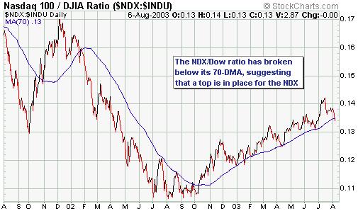
Second, the above-mentioned breakdown
in the NDX/Dow ratio means that the two most important early warning signals
of an approaching major decline are in place because number two on the
list - an upside breakout by the AMEX Gold BUGS Index - occurred about
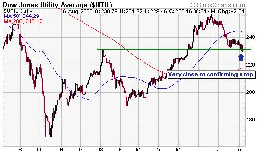
2 weeks ago. The third most important early warning signal - a daily close
in the Dow Utilities Index below 230 - has not yet occurred, but it appears
to very close to occurring (see chart below). The Utilities Index traded
below 230 at one point during Wednesday's session, but the strong rebound
in the bond market was enough to prevent it from closing below support.
We expect that 230 will soon be broken on a daily closing basis.
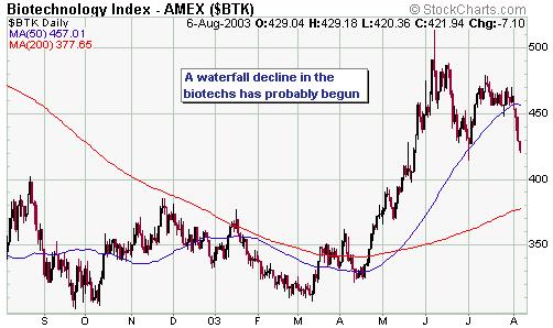
Third, in the 21st July Weekly Update
we said that regardless of what happens in the major stock indices over
the next few months the Biotech Index (BTK) had most likely peaked and
appeared to be setting itself up for a crash. A crash in the biotechs now
appears to be underway.
So, assuming we don't get a sharp rebound
in the tech stocks over the next 2 days we will have some strong evidence
that the post-October-2002 rally in the NDX has peaked and that another
downward leg in its bear market has begun. But this doesn't mean that the
Dow Industrials Index and perhaps even the S&P500 Index won't move
to new recovery highs over the coming few months. For example, when the
NDX/Dow ratio broke down in January 2002 it confirmed that the NDX had
peaked back in December of 2001. However, the Dow still managed to make
a new high in March of 2002. In fact, one possibility we've been contemplating
over the past few weeks goes something like this: If the lengthy period
of consolidation that began in June were to end in a downside breakout
(as now appears to be the case), then an August low could be followed by
a rally into October. Such a rally would most likely be spurred by a recovery
in the bond market and be led by the commodity-cyclical stocks, resulting
in the Dow making a higher high while the NDX makes a lower high.
The bottom line is that if this week's
closing prices confirm the breakdown in the NDX/Dow ratio then a major
decline in the overall market has probably either already begun or will
begin following a divergent peak (some indices making new highs, others
not) in October.
Gold and
the Dollar
Market deception
When discussing the recent action in
the gold and currency markets we made the comment, in the latest Weekly
Market Update, that the market was trying to deceive us. This is because
the weight of evidence suggested that another large decline in the US$
had just begun, but the gold market action last Friday was suggesting something
totally different. The inverse relationship between gold and the US$ has
NEVER worked well on a day to day basis, but because gold tends to lead
the dollar a sharp drop in the gold price was not something we would expect
to see on the first day of a large dollar decline. Therefore, one
of the markets was creating the wrong impression (one of the markets was
being deceptive).
In any case, because we received an
e-mail from one of our subscribers questioning our use of the word "deceive"
in the above-mentioned context we thought it would be appropriate to provide
a more detailed explanation of what we mean when we refer to market deception.
We'll do this by giving some examples. First, though, here's the response
we sent to our subscriber:
"The market is often deceptive because
things have to happen in a way that keeps the most people off balance most
of the time. This doesn't occur as a result of manipulation, although manipulation
can certainly play a part from time to time, it's just the way all financial
markets always work. In fact, deception is everywhere, not just in the
markets. When we play sports or board games or card games, deception is
usually an important aspect. Animals use deception all the time in their
attempts to protect themselves from their predators. Why should the financial
markets be any different? Is it reasonable to expect the markets to clearly
telegraph every move they are going to make so that all traders can happily
get on board at the optimum time?"
Some general examples of market deceptions
are:
a) Creating a false sense of dread.
For example, just prior to a large advance getting underway the market
experiences a sharp downward reversal that convinces the majority that
a big decline is about to begin. Or, just prior to the start of a major
uptrend the market breaks below a level that is widely considered to represent
important support, causing many traders to liquidate their long positions
at exactly the wrong time.
b) Creating a false sense of security.
For example, the market experiences several sharp downward reversals in
a row with each downward reversal being followed, soon after, by a rally
to a new high. This behaviour causes most traders to believe that the next
time a downward reversal occurs it will simply be another opportunity to
buy. When the next downward reversal does occur many traders calmly buy,
but rather than immediately rebounding as it had done in the past the market
plunges.
c) Creating a false sense of confidence
in a particular indicator. For example, for several weeks the market dutifully
reverses lower every time a certain technical indicator moves to an 'overbought'
level and then reverses higher every time it moves to an 'oversold' level,
convincing many traders that they can rely on this indicator. At some point
the indicator stops working, trapping those traders who confidently bet
on a reversal that never happened.
Here are two specific examples of market
deceptions from recent trading action:
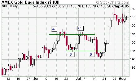
a) Below is a chart of the AMEX Gold
BUGS Index (HUI) covering the past 3 months. At point A the HUI moved to
a new 6-year high, convincing many traders that a major upside breakout
had occurred. It then pulled back a bit (to point B) before once again
moving up to near its multi-year high (point C). However, it failed to
make a new high and promptly dropped back. At point D the HUI had just
broken below its prior pullback low and this, along with the fact that
the preceding bounce had failed right at resistance, caused many traders
to liquidate their gold-stock positions. However, the break below support
(point D) was quickly followed by an almost straight-up move to a new 6-year
high.
b) Below is a chart of the S&P500
Index covering the period from the beginning of March through to the end
of June this year. The S&P500 bottomed in mid-March, rallied sharply
to a peak at point A, and then pulled back for a week or so before rallying
again. In early April the S&P500 made a new intra-day high for the
move (point B) before experiencing a spectacular single-day reversal. This
reversal looked like it could be important at the time, but it just led
to a modest 2-day pullback which was, in turn, followed by a rally to much
higher levels. Over the past 4 months the S&P500 has, in fact, made
a few reversals that looked promising but turned out to be meaningless,
thus creating the false sense of security described in general example
b) above.
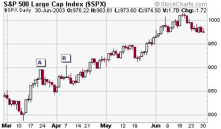
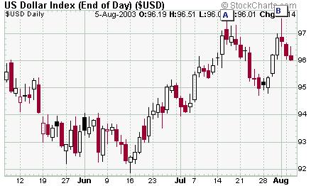
With the above chart of the S&P500
Index in mind, take a look at the below chart of the Dollar Index. Notice
the remarkable similarities between points A and B on both charts? In order
to figure out whether point B on the Dollar chart will more likely be followed
by a short-lived pullback, as per point B on the S&P500 chart, or a
major decline, we need to look at more than just the Dollar chart. Most
importantly, we need some confirmation from the gold market. At this stage,
though, the gold price has NOT confirmed last Friday's downward reversal
in the US$ (see below for further details).
Hopefully, the above gives you an idea
of what we mean when we talk about a market deception or state that the
market might be trying to deceive us.
Current Market Situation
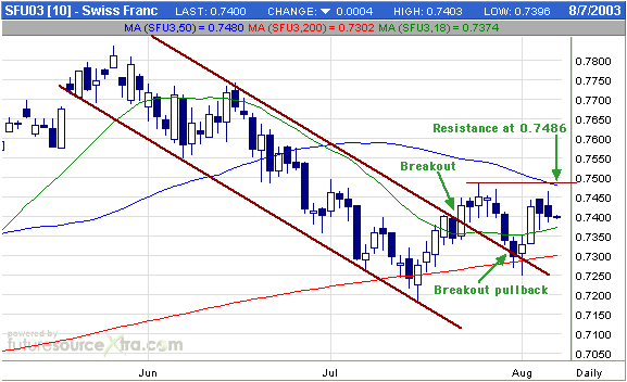
Below is a short-term daily chart of
September Swiss Franc futures. The SF broke out of a short-term downtrend
in mid-July, pulled back as part of an almost obligatory 'test' of the
breakout, and then moved higher. It now needs to move above its late-July
peak (0.7486) to provide us with the next piece of evidence that the correction
that began in May has ended.
Below is a daily chart of August gold
futures. Not surprisingly, the below gold chart looks quite similar to
the above SF chart. While the SF needs to move above its late-July peak
in order to confirm that a correction low is in place, the gold price needs
to complete consecutive daily closes above its 18-day moving average to
do the same. If gold can do this it will not only suggest that the pullback
from the late-July peak is complete it will also indicate that last Friday's
downward reversal in the US$ signaled the start of a large dollar decline.
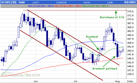
At this stage gold's rebound over the
past few days is not significant (as mentioned in the latest Weekly Update,
a rebound was to be expected following last week's sharp decline). A move
back above the 18-day moving average would suggest that the low is 'in',
but we would not be surprised to see gold spike below $340 before the next
advance gets underway. As noted in the past, a move BELOW the 200-day moving
average in a bull market tends to result in a good buying opportunity because
such an event typically happens near the end of a correction.
Gold stocks continue to perform very
well, both in absolute terms and relative to the gold price. This suggests
that the gold price is headed much higher over the next several months,
but doesn't preclude the dip below $340 mentioned above.
In the coming Weekly Market Update
there will be an updated version of the junior gold stock valuation comparison
originally included in our 25th June commentary. The updated version will
be expanded to cover 21 stocks (the original comparison covered 15 stocks).
Update
on Stock Selections
 Golden
Star Resources (AMEX: GSS) had planned on buying Resolute's 4% stake in
Red Back Mining (ASX: RBK). However, RBK chose not to approve the sale,
so the transaction is not going ahead. Clearly, RBK's management is not
interested in putting the company on the market at this time. Instead,
they are arranging financing for mine construction and are looking into
the possibility of listing RBK in the US or Canada. In other words, they
seem to think the company will ultimately be worth a lot more than they
could get for it in the current market. Golden
Star Resources (AMEX: GSS) had planned on buying Resolute's 4% stake in
Red Back Mining (ASX: RBK). However, RBK chose not to approve the sale,
so the transaction is not going ahead. Clearly, RBK's management is not
interested in putting the company on the market at this time. Instead,
they are arranging financing for mine construction and are looking into
the possibility of listing RBK in the US or Canada. In other words, they
seem to think the company will ultimately be worth a lot more than they
could get for it in the current market.
At a $350 gold price we think RBK would
be fairly priced at around A$0.70/share, versus the current price of A$0.40,
and that every $50 increase in the gold price would add at least A$0.40
in value assuming no increase in reserves. That is, at a gold price of
$450 we think RBK would be worth a minimum of A$1.50. Note that this level
of leverage to the gold price is not uncommon amongst the juniors.
After
the close of trading on Tuesday Aquiline Resources (TSXV: AQI) announced
more good drill results from its Calcatreu gold project in Argentina. These
results, combined with the initial set of results released a few weeks
ago, indicate that the deposit is probably much larger than the 500K ounce
resource calculated by the project's previous owner.
AQI expects to announce its initial
resource calculations by mid-September and a large-scale drilling program
is scheduled to begin in October with a view to being in a position to
make a production decision by early 2004.
Although the AQI stock price has moved
up a lot since it was added to the Stocks List in April we are not interested
in taking any profits at this stage. In fact, those who don't already own
the stock could consider taking an initial position at around Wednesday's
closing price. AQI appears to be executing well and remains under-valued.
From
a technical perspective one of the most interesting stocks in the TSI List
at this time is Golden Phoenix (OTC BB: GPXM). GPXM has been consolidating
for the past 2 months and is now showing signs that it is about to move
higher.
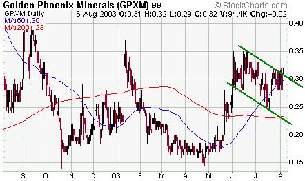
Chart Sources
Charts appearing in today's commentary
are courtesy of:
http://stockcharts.com/index.html
http://www.futuresource.com/

|
