|
- Interim Update
6th August 2014
Copyright
Reminder
The commentaries that appear at TSI
may not be distributed, in full or in part, without our written permission.
In particular, please note that the posting of extracts from TSI commentaries
at other web sites or providing links to TSI commentaries at other web
sites (for example, at discussion boards) without our written permission
is prohibited.
We reserve the right to immediately
terminate the subscription of any TSI subscriber who distributes the TSI
commentaries without our written permission.
An
update on future "inflation" and the Fed's madness
Prior to 2002 the Fed would tighten monetary policy in reaction
to outward signs of rising "price inflation" and loosen monetary
policy in reaction to outward signs of falling "price inflation",
but beginning in 2002 the Fed became far more biased towards loose
monetary policy. This bias is now so great that it seems as if the
Fed has become permanently loose.
The following chart comparing the Fed Funds Rate (FFR) target set by
the Fed with the Future Inflation Gauge (FIG) clearly illustrates
the change in the Fed's tactics over the past two decades. The
Future Inflation Gauge is calculated monthly by the Economic Cycle
Research Institute (ECRI) and should really be called the Future CPI
Gauge, because it is designed to lead the CPI by about 11 months.
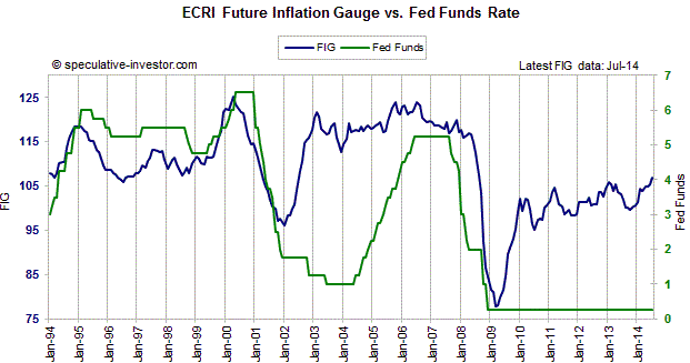
The chart shows that prior to 2002 the FFR tended to follow the FIG.
After the FIG warned of rising "price pressures" the Fed would start
hiking the FFR, and after the FIG started signaling reduced upward
pressure on the CPI the Fed would start cutting the FFR. (Note: Our
chart begins in 1994, but the relationship between the FFR and the
FIG that we just described goes back much further.) During
2002-2004, however, the Fed not only didn't hike its targeted
interest rate in response to a sharp increase in the FIG, it
continued to cut the FFR.
The Fed's decision to maintain an ultra-loose stance during
2002-2004 was the fuel for the real estate investment bubble and set
the stage for the collapse of 2007-2009.
There was a lesson to be learned from what happened during
2002-2007, but the Fed clearly learned the wrong lesson. The lesson
that should have been learned was: Don't provide monetary fuel for
bubble activities, because the eventual economic fallout will be
devastating. Unfortunately, the lesson that was actually learned by
the Fed was: An economic bust can be avoided forever by keeping
monetary policy loose forever. The result is that the divergence
between the FFR and the FIG that arose during the first half of the
last decade is nothing compared to the divergence that is now in
progress. The FIG has been working its way higher since early-2009
and just hit a 5-year high, while the Fed's ZIRP (Zero Interest Rate
Policy) remains firmly entrenched.
Zooming in on the shorter-term fluctuations, last year's small
decline in the FIG suggested that there wouldn't be a significant
increase in the CPI's growth rate until at least the final few
months of this year, while the rise in the FIG that began late last
year suggests that "price inflation" will start to become apparent
in the CPI during the final quarter of this year and could be
perceived as a serious problem during the first half of next year.
This probably means that by early next year the T-Bond bears will
start to look correct and the Fed will start to feel irresistible
pressure to begin a rate-hiking program. Unfortunately, the US
economy is now so rife with 'bubble activities' (businesses,
projects, investments and speculations that are only viable due to
artificially low interest rates and a rapid stream of new money)
that a severe downturn is likely to follow an attempt by the Fed to
'normalise' its monetary policy.
By ignoring investment bubbles and erring far more in favour of
"inflation" than it has ever done in the past, the Fed has set the
stage for the mother-of-all economic busts. If the bust doesn't
begin earlier it is likely to begin soon after the Fed starts to
raise its targeted interest rate.
Ocean freight rates have collapsed,
again
Up until a few years ago we used the Baltic Dry
Index (BDI), an index of international ocean-going shipping rates, as an
indicator of global trade and US$ turning points, but by early 2011 it had
become apparent to us that the BDI's trends were being determined to a far
greater extent by changes in the supply of shipping capacity than changes in the
volume of international trade. We therefore didn't interpret last year's surge
in the BDI as evidence that the demand for shipping was rising sharply in
reaction to a sudden increase in global trade and we don't interpret this year's
plunge in the BDI to the vicinity of its 2008 low as evidence of a sharp
shrinkage in the volume of international trade.
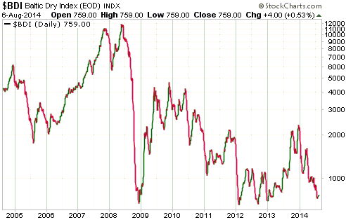
The BDI's current depressed level isn't just due to an abundance of supply. It's
also due to the fact that the increasing use of very large container ships has
substantially reduced the average cost of transporting containers across the
oceans. In other words, the supply is not only greater, but also more efficient.The Stock Market
The following chart shows that the S&P500 Index has important
support at 1890-1900. This support will probably be breached on a daily closing
basis within the coming two weeks IF the decline from the July peak is either
the initial decline within a crash pattern or the first decline in a cyclical
bear market. If a crash pattern is unfolding, a 2-4 week rebound will begin
shortly after the aforementioned support is breached.
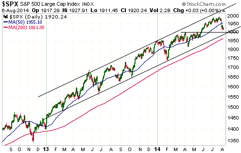
The downside risk is high, because there have been more than enough divergences
over the past few months to suggest that a substantial downturn is in the works.
However, a daily close below 1890 would be the first clear evidence in the SPX's
price action that something more than a routine bull-market pullback was
underway.
Gold and the Dollar
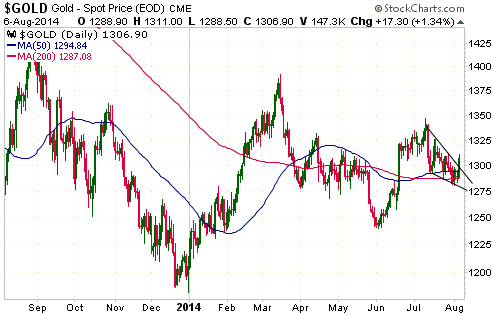
Gold
The gold price needs to close above $1312 to signal an end to the correction of
the past few weeks, but it will probably turn out that this Tuesday's return to
the low-$1280s marked the end.
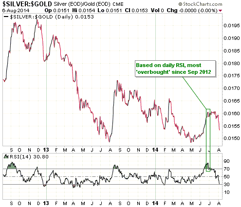
In late June of this year the silver/gold ratio's daily RSI, a short-term
overbought/oversold indicator, was at its highest level since September of 2012.
Although it doesn't constitute evidence that the correction is already over, the
elimination of this short-term 'overbought' condition, and ideally but not
necessarily its replacement with a short-term 'oversold' condition, was
something that almost had to happen before the gold and silver corrections
ended. As illustrated by the daily chart displayed below, this has happened.
The following chart from Kitco.com shows how gold traded during each of the past
three 24-hour periods. The green line shows the 6th August trading and is the
line in which we are interested.
Notice the near-vertical surge beginning at 8.00am NY Time on 6th August. This
represents a sudden increase in buying from 'out of the blue'.
When this type of price action happens in the opposite direction, that is, when
a sudden increase in selling pressure causes a near-vertical price drop, it is
always cited by some commentators as evidence of manipulation, but when the
sudden price change or price acceleration is to the upside it is never cited as
evidence of manipulation. Instead, it is supposedly due to gold's bullish
fundamentals coming to the fore. The logic (using the word very loosely) goes
something like this:
1. Markets that are free of manipulation always move in synch with the
fundamentals. (TSI: No, they don't.)
2. Gold's fundamentals are always bullish. (TSI: No, they aren't. For example,
gold's fundamentals were bearish from mid-2012 through to mid-2013 and only
turned unequivocally bullish in April-2014.)
3. Therefore, whenever the gold price falls it must be due to manipulation. (TSI:
Two wrongs don't make a right.)
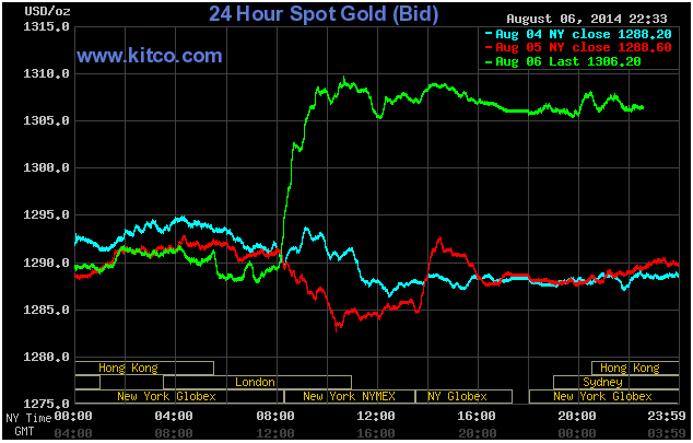
The fact is that there are just as many sudden, 'inexplicable' price rises in
the gold market as there are sudden, 'inexplicable' price declines, but the
manipulation-centric bloggers and newsletter writers only tell you about the
latter. Also, experienced traders know that these sudden and often-unpredictable
price moves happen in ALL commodity futures markets.
Gold Stocks
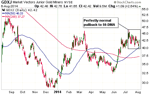
Our opinion about the gold-mining sector's current situation is the same as our
opinion about gold's current situation. Additional price strength is needed over
the days ahead to confirm an end to the correction, but time will probably tell
that the correction ended on Tuesday 5th August.
With regard to GDXJ (see chart below), the price action during the first two
days of this week resulted in a touch of the 50-day MA. Many individual gold
stocks did something similar.
A decline to the 50-day MA is typical for a correction within an
intermediate-term upward trend and is not something to get 'all jittery' about.
The Currency Market
There are signs that the German economy, the 'engine' of euro-zone economic
growth, is sliding into recession. For example, a report publish earlier this
week showed that German manufacturing orders fell 3.2% in June, which is the
largest decline since September-2011. The year-over-year rate fell to -2.4%.
Manufacturing orders are a leading indicator, so the weak Q2 performance for the
German economy will probably be followed by an even weaker Q3 performance.
Furthermore, the economic weakness that was already baked into the cake will be
exacerbated by Russia's retaliation against the idiotic Ukraine-related economic
sanctions currently being imposed upon it.
Mounting evidence of economic weakness in the euro-zone and the burgeoning trade
war sparked by the economic sanctions against Russia are creating a negative
sentiment backdrop for the euro. Moreover, the following chart shows that the
euro's recent break below support at 135 has just been confirmed by the EURO
STOXX Banks Index (SX7E) breaking below support at 140. The chart-based targets
stemming from these breakdowns are 130 for the euro and 120 for the SX7E.
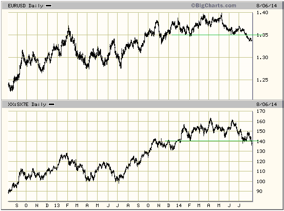
The euro is very 'oversold' and could soon rebound to at least 135, but we see
no good reason to bet that a sustainable low is in place.
Updates
on Stock Selections
Notes: 1) To review the complete list of current TSI stock selections, logon at
http://www.speculative-investor.com/new/market_logon.asp
and then click on "Stock Selections" in the menu. When at the Stock
Selections page, click on a stock's symbol to bring-up an archive of
our comments on the stock in question. 2) The Small Stock Watch List is
located at http://www.speculative-investor.com/new/smallstockwatch.html
 Speculators
who want some exposure to Rare Earth Elements (REE) and are willing to deal in
illiquid microcaps should consider buying some Geomega Resources (GMA.V) near
its current price in the low-C$0.20s. Over the past 6 months the stock has
collapsed from around C$1.00 to just above support at C$0.20 due to an absence
of news rather than negative news. Speculators
who want some exposure to Rare Earth Elements (REE) and are willing to deal in
illiquid microcaps should consider buying some Geomega Resources (GMA.V) near
its current price in the low-C$0.20s. Over the past 6 months the stock has
collapsed from around C$1.00 to just above support at C$0.20 due to an absence
of news rather than negative news.
GMA should soon have some news in the form of an updated resource estimate for
its huge and potentially-economic Montviel REE project in Quebec. The delay in
the completion of this resource update (it was supposed to have been completed a
few months ago) is part of the reason for the stock's recent dismal performance.
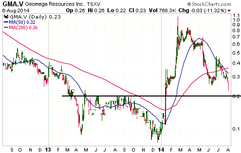
GMA has been briefly discussed in previous TSI commentaries and is a member of
the Small
Stocks Watch List, but is not a formal stock selection and is therefore not
followed closely at TSI.
Chart Sources
Charts appearing in today's commentary
are courtesy of:
http://stockcharts.com/index.html
http://bigcharts.marketwatch.com/
http://www.kitco.com/

|
