|
- 07 August, 2002
What's
the Fed going to do?
A few prominent analysts have recently
(this week) forecast that the Fed will make further substantial rate cuts
over the remainder of this year. In fact, a consensus seems to be building
that the Fed Funds Rate (FFR) is headed from its current level of 1.75%
down to 1%.
Any additional cuts in the FFR would
be very bearish for the US$ and for US bonds and very bullish for gold
because the real returns on US$-denominated investments would be reduced
and fears of inflation would be increased. So, if the Fed does do what
Wall St is now suggesting they will do then the probability of our current
forecasts coming to fruition will be improved. However, although we think
it is highly unlikely that the Fed will raise rates as long as the stock
market is in such a pickle, at this stage we don't expect them to cut rates.
One reason we think this way is that we don't see how additional Fed rate
cuts could possibly be beneficial. Consumer spending and hence the US economy
has held up as well as it has because real estate prices have continued
to rise and the mortgage-finance industry has continued to boom. The real
estate market and the associated mortgage financing are sensitive to long-term
interest rates, not short-term interest rates, so the Fed really needs
to be careful not to do anything that will cause long-term interest rates
to rise.
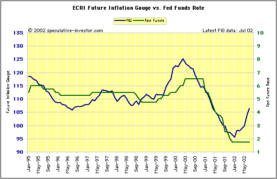
Another reason we currently don't expect
additional rate cuts is illustrated by the following chart showing the
ECRI's Future Inflation Gauge (in blue) versus the Fed Funds Rate (in green).
Note that a more appropriate name for the Future Inflation Gauge would
be the Future CPI Gauge since it is designed to lead changes in the CPI,
not changes in the inflation rate. In any case, Greenspan watches the Future
Inflation Gauge (FIG) closely (Geoffrey Moore, the ECRI's founder, was
Greenspan's mentor) and since he took on the top job at the Fed all changes
in monetary policy have followed changes in the FIG's trend. With the FIG
having turned sharply higher during the first 7 months of this year it
would be a major departure from previous practice if the Fed were to cut
interest rates in the near future.
The US
Stock Market
Sentiment
In the latest Weekly Update we said
"we
are surprised, to say the least, that the decline has not, to date, provoked
outright panic and hence created a better buying opportunity". Actually,
"surprised" is too mild a term. "Stunned" would be more appropriate.
The market's 'sentiment problem' is
encapsulated by the following chart showing the net-position of small traders
(the 'dumb money') in S&P500 futures contracts. The chart, which is
provided courtesy of Nick Laird at www.sharelynx.net, was included in the
29th July Weekly Update but it is worth reviewing again because its implications
are dramatic.
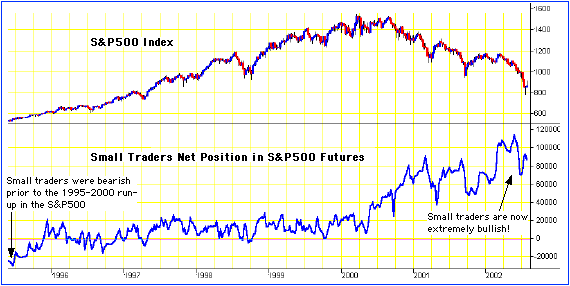
The small traders - the ones who are
most often wrong and who were, as a group, bearish on the market
in early-1995 (just prior to the blast-off) - have become progressively
more bullish over the past 2 years as the market has fallen. We
can't over-emphasise how unusual this is. Small traders, as a group, almost
always become more bullish as prices rise and more bearish as prices fall.
As such, they will tend to reach their maximum long position near major
market tops and reach their maximum short position near major market bottoms.
We are not aware of any prior situation in any market in which a large
and prolonged decline was met with persistent buying on the part of the
small traders.
The commitments of traders data only
goes back to the 1980s and therefore it does not reveal how traders have
behaved, in the past, during a secular trend change (the same secular trends
- down for commodities, interest rates and gold and up for stocks - remained
in force throughout the 1980s and 1990s). However, the recent persistent
bullishness of the small traders in the face of a major decline is probably
indicative of what happens when a secular bull market metamorphoses into
a secular bear market. Initially, the masses do not recognise that the
long-term trend has changed and they try to resist it. They have been taught
to buy the dips and to have faith in the long-term up-trend by the fact
that the market has, during the past 10-20 years, always recovered to new
highs within a reasonable time period.
It is important to note that while
the long-term up-trend was in place the small traders tended NOT to buy
the dips. It took 20 years of the market making higher highs and higher
lows to convince them that buying during periods of extreme weakness would
put them on the road to riches. As is invariably the case, as soon as the
vast majority of traders became absolutely convinced of the longevity of
existing trend, the trend changed.
The main implication of the above chart
is that we are still in the denial stage of this bear market. This, in
turn, means that our original target of 800 for the S&P500, a target
that most people would have considered to be overly pessimistic just 6
months ago, is not even going to be in the same ballpark as the ultimate
bear-market low. The S&P500 has already traded below 800 yet 'the herd'
still doesn't believe that the long-term trend has changed. First of all
the market will have to fall far enough to convince the majority of people
that we are not just experiencing a correction within a long-term bull
trend. Only then will the capitulation phase of the bear market begin.
Unfortunately, based on what has happened over the past 6 months it appears
that the capitulation phase won't even start until the S&P500
has fallen well below 800.
We will explore this further in the
Weekly Update and try to come up with a more realistic target for the S&P500.
However, it is highly probable that the market is going MUCH lower, with
the only question being when. Outside of gold and silver stocks an investor's
exposure to the stock market should therefore be kept small in relation
to their net-worth.
Current Market Situation
As things currently stand we don't
think the risk/reward looks attractive for going 'short' or going 'long'
as far as the major stock indices are concerned. There hasn't been sufficient
panic to create a great buying opportunity and the market is still too
oversold to warrant the purchase of put options. Ideally, the choppy recovery
in the S&P500 and the Dow Industrials that began on 23rd July will
extend for at least another 2 weeks and the beaten down tech/telecom stocks
will also experience a good bounce. If the Dow is able to rally back into
the 9000-9500 range over the next few weeks we will probably take the opportunity
to buy some put options in preparation for the next decline and to exit
the recently-purchased trading position in Nortel.
Accounting for stock options
From a Reuters Business Report: "Intel
Corp. will announce on Thursday that it will not account for stock options
as an expense, joining a growing list of high-technology firms that are
bucking a growing trend among U.S. companies, a source familiar with the
matter said.
Intel will announce its intent not
to account stock options as an expense in a Securities and Exchange Commission
filing to be made public on Thursday, according to the source who knows
about the planned filing."
The truth of the matter is, Intel already
accounts for stock options as an expense, that is, in its filings with
the IRS stock options are already considered to be an expense. What Intel
and other companies don't do is report their financial results to the market
as though stock options were an expense. This will change. As the bear
market drags on more and more companies will yield to investor pressure
to correctly report stock options as an expense until eventually they will
all be forced to do it.
Gold and
the Dollar
A Comparison of Gold Stock Valuations
Below is an updated version of the
table that originally appeared in our 12th June commentary. It is
a rough valuation comparison of eight of the world's largest gold producers,
ranked in order of PE ratio (lowest to highest). The figures have been
updated, wherever applicable, based on the June-Quarter reports that have
been issued by all the companies over the past few weeks.
Note that:
a) Estimates of annual production,
revenue and earnings are based on information provided by the companies
or have been calculated by annualising the results from the June quarterly
reports.
b) The figures for Kinross Gold assume
that the takeovers of TVX, TVX Newmont and Echo Bay have already been completed,
that is, we've assumed that TVX and Echo Bay will make a full year's contribution
to KGC's results.
c) We calculate a mining company's
cost to produce an ounce of gold as follows: We subtract reported earnings
from reported revenue to get a total, all-in cost figure. We then divide
this total cost by the number of ounces produced to get a cost per ounce.
This is a much fairer way to do a cost comparison than using the cash costs
or production costs reported by the mining companies.
| Name |
Symbol |
Recent Price (US$) |
Market Cap (US$M) |
Annual Prod (Koz) |
Annual Rev ($M) |
Annual Earnings ($M) |
Cost per oz prod (US$) |
Reserves (M oz) |
Mkt Cap $ per oz reserves |
Price/ Sales |
Price/ Earnings |
| Harmony Gold |
HGMCY |
11.97 |
2,109 |
3,100 |
960 |
256 |
227 |
49 |
43 |
2.2 |
8.2 |
| Gold Fields |
GFI |
10.62 |
4,991 |
4,636 |
1,488 |
448 |
224 |
83 |
60 |
3.4 |
11.1 |
| Anglogold |
AU |
21.88 |
4,726 |
5,600 |
1,736 |
348 |
248 |
59 |
80 |
2.7 |
13.6 |
| Kinross Gold |
KGC |
1.80 |
1,631 |
2,000 |
620 |
80 |
270 |
19 |
86 |
2.6 |
20.4 |
| Goldcorp |
GG |
8.70 |
1,792 |
500 |
160 |
65 |
190 |
5 |
358 |
11.2 |
27.6 |
| Barrick Gold |
ABX |
15.25 |
8,266 |
5,700 |
2,000 |
240 |
309 |
82 |
87 |
4.1 |
34.4 |
| Newmont |
NEM |
24.95 |
9,980 |
7,500 |
2,588 |
260 |
310 |
97 |
103 |
3.9 |
38.4 |
| Agnico Eagle |
AEM |
12.50 |
1,006 |
320 |
124 |
14 |
344 |
4 |
252 |
8.1 |
71.9 |
Below is the same comparison, but this
time the estimates have been based on a gold price of $400. Once again
the companies have been ranked in order of PE ratio. Note that we haven't
accounted for the adverse effects that hedging will have on the earnings
of ABX, AU and NEM if the gold price rises to $400. We also haven't accounted
for exchange rate changes (at a gold price of US$400 the SA Rand would
likely be stronger than it is today).
| Name |
Symbol |
Recent Price (US$) |
Market Cap (US$M) |
Annual Prod (Koz) |
Annual Rev ($M) |
Annual Earnings ($M) |
Cost per oz prod (US$) |
Reserves (M oz) |
Mkt Cap $ per oz reserves |
Price/ Sales |
Price/ Earnings |
| Harmony Gold |
HGMCY |
11.97 |
2,109 |
3,100 |
1,277 |
478 |
|
|
|
1.7 |
4.4 |
| Gold Fields |
GFI |
10.62 |
4,991 |
4,636 |
1,979 |
792 |
|
|
|
2.5 |
6.3 |
| Anglogold |
AU |
21.88 |
4,726 |
5,600 |
2,309 |
749 |
|
|
|
2.0 |
6.3 |
| Kinross Gold |
KGC |
1.80 |
1,631 |
2,000 |
825 |
223 |
|
|
|
2.0 |
7.3 |
| Newmont |
NEM |
24.95 |
9,980 |
7,500 |
3,442 |
858 |
|
|
|
2.9 |
11.6 |
| Barrick Gold |
ABX |
15.25 |
8,266 |
5,700 |
2,660 |
702 |
|
|
|
3.1 |
11.8 |
| Goldcorp |
GG |
8.70 |
1,792 |
500 |
213 |
102 |
|
|
|
8.4 |
17.6 |
| Agnico Eagle |
AEM |
12.50 |
1,006 |
320 |
165 |
43 |
|
|
|
6.1 |
23.6 |
The above 'back of the envelope' comparison
highlights why we are prepared to put up with a significant amount of political
risk when it comes to investing in South African gold producers. The SA
gold producers are far more attractively priced, which means that investors
in these stocks are being well paid to take on some additional political
risk. To emphasis this point let's do a quick comparison of Harmony Gold
Mining (HGMCY), our favourite SA gold stock investment, and Goldcorp (GG),
everyone's favourite NA gold stock investment.
Firstly, GG is 3 times more expensive
than HGMCY on a price/earnings basis. Secondly, a buyer of HGMCY is paying
$43/ounce for gold reserves whereas a buyer of GG is paying $358/ounce
for gold reserves. GG's gold-in-the-ground deserves to sell at a premium
to Harmony's gold because it is located in Canada and because it can be
extracted at a lower cost, but a 730% premium seems more than a little
excessive. Thirdly, a buyer of HGMCY is getting considerably more leverage
to the spot gold price than a buyer of GG. For example, a $100 rise in
the gold price would increase Harmony's revenue by an amount equal to approximately
15% of its current market cap whereas the same gold price rise would increase
GG's revenue by an amount equal to only about 3% of its current market
cap.
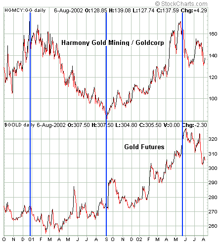
The greater leverage to the spot gold
price provided by Harmony relative to Goldcorp is illustrated by the following
chart. The chart compares the ratio of HGMCY and GG (the line rises when
HGMCY is out-performing GG) with the gold price since October of 2000.
Note that when the gold price is rising, and in particular when the enthusiasm
for gold is rising, HGMCY out-performs GG. However, during those times
when the gold price is flat or falling GG tends to out-perform HGMCY.
We are confident that Harmony will
out-perform Goldcorp by a wide margin during any substantial rally in the
gold price ("substantial rally" meaning a gain of at least $50). So, those
who are very bullish on gold should over-weight Harmony (and the other
major SA producers) relative to Goldcorp (and the other major NA gold producers).
Of the major NA gold producers the
one that offers the greatest leverage to the spot gold price is the new
Kinross Gold (KGC), a recent addition to the TSI Portfolio. At current
share prices the new KGC's market cap will be about 10% below that of Goldcorp
yet it will have 4-times the production and more than 4-times the reserves
of Goldcorp.
There are always trade-offs in the
investment world and, as is often said, leverage is a double-edged sword.
Those who pile into the stocks that offer the most leverage to the spot
gold price will achieve greater profits during a gold rally but will suffer
greater losses if gold does not rally. Goldcorp does not offer anywhere
near as much leverage to the spot gold price as KGC, but it appears to
have better management, higher quality assets and less downside risk than
KGC. Harmony offers enormous leverage and superb management, but investors
have to accept significant and somewhat unquantifiable political risk.
If all of Harmony's assets were located in North America the stock would
be trading at $35 or higher, so investors need to decide for themselves
whether the huge discount adequately compensates them for the risk.
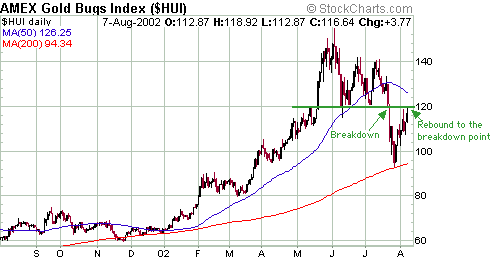
Current Market Situation
Wednesday was one of those strange
days when there was a lot of action but nothing meaningful actually happened.
There was a large (almost $9) jump in the gold price, but the jump didn't
change the short-term trend and it wasn't confirmed by the gold shares.
The gold shares were moderately strong early in the day, although not as
strong as would normally be the case with gold up $7. They then weakened
to close only marginally higher on the day despite the gold price remaining
strong and closing near its high. All in all, not a bullish day but not
a particularly bearish one either since the HUI is just below a level (120)
that should act as strong resistance.
Below is a chart of the Amex Gold BUGS
Index (HUI). The previous breakdown area for the HUI was around 120 and
yesterday's high was 118.92, so the initial rebound from the 26th July
panic low has probably ended. If the HUI continues to advance over the
next few days and closes decisively above 120 then we have something unusual
on our hands. We will deal with that if it happens.
Below is a daily chart of December
gold futures. The short-term trend is still down and a trend change won't
be confirmed until we get a daily close above the July peak. However, the
price action of gold stocks relative to the bullion is more important to
us than the price action in gold itself. We expect to see persistent strength
in gold (and silver) stocks prior to the next sustainable surge in the
bullion price.
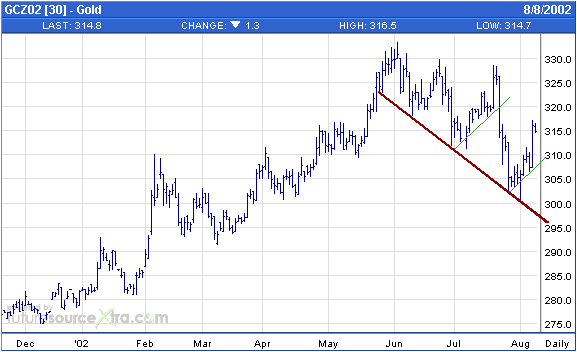
Chart Sources
Charts used in today's commentary were
taken from the following web sites:
http://stockcharts.com/index.html
http://www.futuresource.com/

|
