|
- Interim Update 8th December 2010
Copyright
Reminder
The commentaries that appear at TSI
may not be distributed, in full or in part, without our written permission.
In particular, please note that the posting of extracts from TSI commentaries
at other web sites or providing links to TSI commentaries at other web
sites (for example, at discussion boards) without our written permission
is prohibited.
We reserve the right to immediately
terminate the subscription of any TSI subscriber who distributes the TSI
commentaries without our written permission.
The difference between money and debt
In
today's monetary system, money and debt are closely related and it is
not always easy to tell the difference between the two. For example,
money is usually borrowed into existence (new money is created when a
bank makes a loan) and some debt securities are so liquid it seems that
they are, for all intents and purposes, money. Consequently, some
analysts no longer distinguish between money and debt. Unfortunately,
this leads to analytical errors.
Before we briefly address two of these errors, let's define our terms.
Although today's monetary system blurs the distinction between money
and debt, debt is not money (and vice versa). Money is the general
medium of exchange, whereas monetary debt is a promise to pay money.
This means that money can generally be used to buy things, whereas debt
cannot. For example, a 3-month Treasury bill is the most liquid form of
debt in the US economy today, but you cannot take a T-bill to the
supermarket and use it to buy groceries. This is because a T-bill isn't
money. If you want to buy something and all you have is a T-bill, you
will first have to sell the T-bill for "money" in order to make your
purchase. But what if you hold T-bills indirectly via a money-market
fund (MMF) that you can write checks on? If you pay for your groceries
by writing a check on your MMF, aren't you using T-bills as if they
were money? The answer is no. In this case there is an intermediary
(the MMF) that sells the T-bill in order to obtain the money needed to
make your purchase. This, by the way, is why MMFs shouldn't be counted
in the money supply. MMF accounts don't hold money; they hold highly
liquid investments that are sold -- in order to obtain money -- when
MMF units are redeemed.
An important ramification of the aforementioned difference between
money and debt is that a change in the supply of debt cannot bring
about a sustained (meaning: long-term) change in the purchasing power
of money unless the change in debt causes a change in the money supply.
This doesn't mean that an overall assessment of the financial/economic
landscape should ignore changes in debt levels. Clearly, large changes
in debt levels will often have important economic effects. What it
means is that when assessing whether an economy is experiencing
inflation or deflation, we need only consider changes in the money
supply.
Having defined our terms, we'll return to the errors stemming from a failure to distinguish between money and debt.
The first error involves interpreting the Fed's purchases of government
debt under its QE program as non-inflationary on the basis that it
effectively amounts to an exchange of existing money (T-bills, T-notes)
for new money (dollars). The reality is that when the Fed uses new
money to purchase anything, it either adds to the economy's total money
supply or adds to bank reserves. To be more specific, if the Fed uses
newly-created money to buy treasury debt directly from the government
or from a non-bank entity, the US money supply will immediately be
boosted by the dollar value of the transaction. Alternatively, if the
Fed buys treasury debt from a bank and the bank keeps the proceeds of
the sale in reserve then the money supply won't immediately be
affected, but the stage will be set for higher monetary inflation in
the future (the additional bank reserves WILL support future
money-supply growth). Actually, depending on the mechanics of the
process, the latter of the aforementioned scenarios could also result
in an immediate boost to the money supply. Consider, for example, the
case of a bank using part of its reserves to purchase debt securities
from the US government and then selling these securities to the Fed. In
this case, money gets transferred from the bank's reserves to the
economy via government spending (because the government spends all the
money it borrows) and the Fed then replaces the bank's reserves.
In other words, the Fed's QE program either immediately results in
monetary inflation or paves the way for future monetary inflation. It
is not inflation-neutral by any stretch of the imagination.
The second error involves thinking that a decline in debt can offset,
or completely negate, a rise in money supply. Corollaries to this
fallacious line of thought are that monetary inflation can be
successfully used to counteract the perceived negative effects of an
economy-wide reduction in the quantity of debt, and that monetary
inflation doesn't matter as long as the quantity of debt is contracting
at least as fast as the quantity of money is rising. The fact is that
regardless of whether or not the economy-wide quantity of debt happens
to be rising or falling, creating money out of nothing will a) promote
unproductive investment by distorting relative prices, and b) lead to a
reduction in the purchasing power of money. A debt contraction can
temporarily mask the bad effects of monetary inflation, but these
effects will eventually come out into the open.
Consequently, attempting to offset what is sometimes referred to as
"debt deflation" via monetary inflation will only make matters worse.
Can charts be likened to maps?
If
charts can be likened to maps, then they are maps that only show you
where you have been. In a situation where it isn't possible to go
backwards, what use is a map that only shows you how you got to where
you are and tells you nothing about where you are going?
Despite what some commentators claim, the price charts used by
speculators and analysts are not really akin to maps. They don't
indicate what lies ahead or the path to take. They are, purely and
simply, a way of displaying historical data. History contains clues
about what we can expect to happen in the future, and, therefore, so do
charts, but the clues are almost always vague and never amount to
anything that could reasonably be construed as a map.
We rely mostly on fundamental analysis in our own speculating, but we
use charts to help with timing and the determining of buy/sell levels.
The Stock Market
The
US stock market, as represented by the S&P500 Index, made a
marginal new high for the year during the first half of this week. At
the same time, the Hong Kong stock market, as represented by the Hang
Seng Index (HSI), remained well below its early-November peak. The HSI
tends to lead at important turning points, so in the HSI's recent
relative weakness we could be witnessing the birth of a meaningful
bearish divergence. However, it's early days and divergences such as
this sometimes develop for months before the lagging market (the US
stock market, in this case) reverses course.
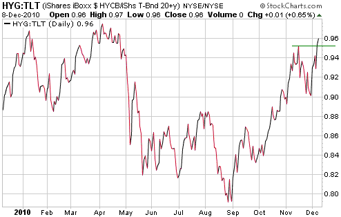
Of more immediate significance, the following chart shows that the
HYG/TLT ratio made a new 6-month high on Wednesday. A rise in HYG/TLT
indicates a contraction in credit spreads, which is generally bullish
for risk assets such as equities.
HYG/TLT's new multi-month high suggests that the US stock market's
rally is not yet complete. In other words, any pullback from the
current level will probably be followed by a rise to a new 52-week high.
Gold and
the Dollar
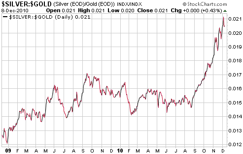
Gold and Silver
The silver/gold ratio remains our primary short-term indicator of the
health of the precious metals upward trend. The ratio became extremely
extended to the upside in early November, but it has continued to rise
and won't signal a problem until it either makes a clear-cut downward
reversal or fails to confirm new highs in gold and silver prices.
Silver fell by more than gold on Tuesday, but the resultant drop in the
ratio wasn't large enough to signal a trend change, and there was no
follow-through to the downside on Wednesday (gold and silver both
declined on Wednesday, but the ratio didn't). At this stage, then, the
most reasonable expectation is that gold and silver are experiencing
routine short-term pullbacks that will be followed by moves to new
52-week highs.
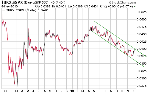
A secondary indicator
worth keeping a close eye on right now is the BKX/SPX ratio (the Bank
Index divided by the S&P500 Index). Weakness in the banking sector
relative to the broad stock market, as indicated by a downward trend in
the BKX/SPX ratio, is bullish for gold, which means that the BKX/SPX
ratio has been a positive influence on the gold market over the past 5
months. This positive influence could be about to disappear, though,
because BKX/SPX recently began to rise and is now testing the top of
its downward-sloping channel.
Gold Stocks
In the latest Weekly Update we mentioned that the HUI had just risen
for 5 days in a row and that if it rose again on Monday it would stand
a good chance of consolidating over the remainder of the week. It did
rise again on Monday, extending the unbroken sequence of up-days to 6.
It then spiked higher at the start of trading on Tuesday, before
reversing course and commencing a consolidation/correction.
Note that when the HUI reversed downward and moved into negative
territory on Tuesday morning, both gold and silver bullion were still
well into positive territory on the day. Following the extended
sequence of up-days, this bearish divergence was a very clear signal
that a downward correction had begun or was about to begin.
In the Weekly Update we said that a near-term pullback shouldn't do
much more than take the HUI down to around 560. The HUI dropped to
around 560 on Wednesday, so does this mean that the correction is
already complete?
Our guess is that the correction is close to being complete in terms of
price, but that the gold sector might have to spend at least a few more
days in 'consolidation mode' before a rally to new highs gets started.
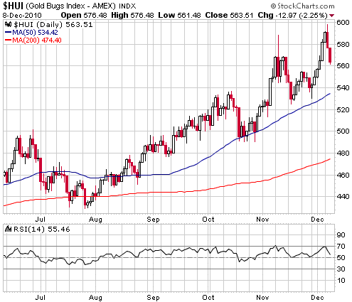
It is unlikely that
the gold sector has just made a peak of the intermediate-term variety,
because there were no meaningful divergences when the HUI reached its
daily closing high on Monday. However, it isn't completely out of the
question that an intermediate-term top has just been put in place. If
it has then there will be significant additional downside over the next
1-2 weeks, most likely followed by a multi-week rebound to a lower
peak.
Whatever the current situation, it's important to understand that when
an intermediate-term peak is put in place, nobody will know it for
certain in real time. Some people will get lucky and guess correctly,
but a good speculating approach doesn't rely on getting lucky. If you
methodically build up positions during periods of weakness and scale
out into strength, you aren't relying on being able to predict turning
points. You aren't even relying on being able to identify them in real
time.
Currency Market Update
John Mauldin's latest "Outside the Box" letter
includes a short essay by Dylan Grice that's definitely worth reading.
Grice explains that policy-makers generally go through three stages of
denial during a financial crisis. In the first stage they deny that
there is a problem. In the second stage they admit that there is a
problem, but deny that it's a big problem (they claim that the
situation is "contained"). In the third stage, after it becomes
blatantly obvious to every man and his dog that there is a big problem,
they deny that the problem has anything to do with them. With regard to
the government debt crisis currently bubbling away in Europe, the
leaders of the European Union are mostly in the second stage of denial.
This is a sign that the crisis is a long way from being over.
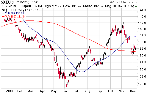
The euro zone debt crisis is very likely going to worsen from here and
could well be the catalyst for a large decline in the euro over the
coming 6-12 months, but we suspect that the euro will rebound to a
higher level before resuming its intermediate-term downward trend. 1.37
looks like a reasonable target for a rebound, because lateral
resistance and the 50-day moving average coincide at this level.
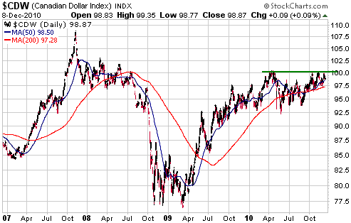
Of the major
currencies, from a short-term perspective the Canadian Dollar's chart
pattern looks the most bullish. The chart suggests to us that the C$
has been consolidating over the past 8 months and is almost ready to
resume its advance. A solid break above 100 would point to a test of
the 2007 major peak.
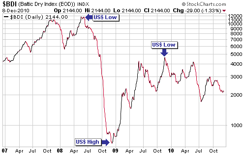
The next chart shows
the Baltic Dry Index (BDI), an index of ocean-going freight rates. We
occasionally include a chart of the BDI in the currency section of
these reports because important BDI turning points tend to coincide
with important currency-market turning points (BDI highs tend to
coincide with US$ lows and BDI lows with US$ highs).
As an indicator, the BDI hasn't been useful to us this year because it
hasn't trended consistently in either direction. However, we are
continuing to track it.
It would be consistent with our overall 6-12 month outlook if the BDI's next consistent trend were to the downside.
Update
on Stock Selections
(Notes: 1) To review the complete list of current TSI stock selections, logon at http://www.speculative-investor.com/new/market_logon.asp
and then click on "Stock Selections" in the menu. When at the Stock
Selections page, click on a stock's symbol to bring-up an archive of
our comments on the stock in question. 2) The Small Stock Watch List is
located at http://www.speculative-investor.com/new/smallstockwatch.html)
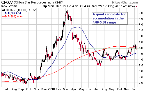
 Clifton Star Resources (TSXV: CFO). Shares: 33M issued, 39M fully diluted. Recent price: C$4.92 Clifton Star Resources (TSXV: CFO). Shares: 33M issued, 39M fully diluted. Recent price: C$4.92
CFO issued two press releases on Monday 6th December. One of these
press releases reported some good drilling results and was therefore
significant, but the other one was more significant. The other press
release advised that Osisko (TSX: OSK), CFO's JV partner, was planning
to do 130,000m of drilling and some metallurgical testing on the
Duparquet project (the subject of the OSK-CFO JV) in 2011 at a cost of
$16.6M.
We can now be sure that OSK plans to proceed with the Duparquet JV,
which is important because OSK probably wouldn't be making such plans
-- and preparing to spend aggressively in order to earn its 50% share
-- unless it perceived strong potential for the project to hold at
least 10M ounces of gold and eventually be developed into a profitable
mine.
Although it is a gold stock, CFO tends to trade independently of the
gold sector. For example, it doubled during the three months following
the HUI's December-2009 intermediate-term peak (that is, it doubled
while the gold-stock indices were in correction mode) and has pretty
much 'sat out' the rally of the past few months. In other words, it
shouldn't be bought or sold based on a short-term outlook for the
gold-stock indices.
We suspect that CFO will do well over the next 6 months, almost regardless of what happens to the HUI.
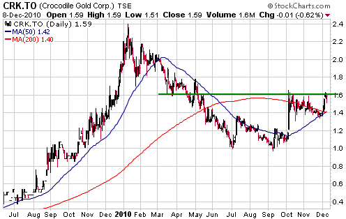
Crocodile Gold (TSX: CRK). Shares: 228M issued, 260M fully diluted. Recent price: C$1.59
CRK has been a laggard over the past couple of months, almost certainly
because of the equity financing that was announced on 2nd November.
This financing is now complete and there is evidence in the recent
price action that demand for the stock is beginning to overwhelm supply.
The stock is challenging resistance at C$1.60. A solid break above this
resistance would create a short-term chart-based target of C$2.00-$2.20.
Chart Sources
Charts appearing in today's commentary
are courtesy of:
http://stockcharts.com/index.html

|