|
- Interim Update 9th April 2008
Copyright
Reminder
The commentaries that appear at TSI
may not be distributed, in full or in part, without our written permission.
In particular, please note that the posting of extracts from TSI commentaries
at other web sites or providing links to TSI commentaries at other web
sites (for example, at discussion boards) without our written permission
is prohibited.
We reserve the right to immediately
terminate the subscription of any TSI subscriber who distributes the TSI
commentaries without our written permission.
What is the best measure of money suppy?
It is difficult to discuss a topic as dry as "money supply aggregates"
in a stimulating way, so we apologise, in advance, if the following
discussion proves to be less captivating than watching grass grow.
As our recent run-in with Gary North clearly demonstrated, there is
considerable disagreement about how the supply of money should be
measured. This is especially relevant at the moment in that some of the
narrowest measures of money supply are revealing no growth in supply,
or even outright contraction (deflation), while broader measures are
increasing at rapid rates.
We'll start by saying that it's a lot easier to figure out which of the
readily available measures of money supply NOT to use than to determine
the most appropriate measure (or measures) to use. In particular, it is
clear that the Monetary Base (MB) is not a good indicator of monetary
conditions, for two reasons:
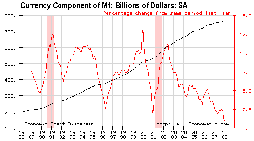
First, by far the biggest component of the MB is physical currency
(notes and coins), but growth in the amount of physical currency
appears to be in a long-term decline due to the increasing popularity
of electronic methods of payment. This, we think, explains the downward
trend in the red line shown on the following chart (the red line
represents the year-over-year percentage growth in currency).
Second, the other
significant component of the MB is bank reserves, but, as explained in
previous commentaries, since 1994 banks have been able to substantially
reduce the amount of reserves they hold at the Fed via the practice
known as "sweeping". Thanks mostly to the advent of "sweeping", bank
reserves are now much lower than they were 20 years ago even though the
money supply is vastly bigger today than it was back then. In other
words, there is no longer a meaningful link between money supply and
bank reserves.
It is also clear that M1 is a poor indicator of monetary conditions.
Like the MB, M1 has been substantially altered by "sweeping" (we
estimate that M1 would be about 50% higher than its current level if
not for the ability of the banking establishment to minimise reserves
held at the Fed by "sweeping" money between demand deposits and savings
deposits). However, this is not M1's only drawback. It also has the
disadvantages of excluding demand deposits held by the US Treasury,
which are certainly part of the money supply, and including traveler's
checks, which are not part of the money supply.
We can therefore eliminate M1 and the Monetary Base. But what, then, should we use?
Unfortunately, we don't think the answer to that question is 'cut and
dried'. Even amongst members of the "Austrian" school of economics
there is dissension about what should be included in a money supply
estimate. For example, Mike "Mish" Shedlock and Frank Shostak argue
against including savings deposits in the money supply on the basis
that these deposits are credit transactions (when you put money into a
savings deposit you are lending money to the bank). Mish outlines his
reasoning at http://globaleconomicanalysis.blogspot.com/2007/01/money-supply-and-recessions.html.
However, the great Austrian economist Murray Rothbard argued that
savings deposits SHOULD be included in the money supply. Furthermore,
the True Money Supply (TMS) charted at the Mises.org web site -- the internet home of Austrian economics -- includes savings deposits.
TMS does not include Money Market Mutual Funds (MMMFs) because to do
otherwise would be to double count. By way of explanation, consider the
following hypothetical situation: Bill removes $10,000 from his bank
and deposits the money into XYZ Money Fund (he purchases units of XYZ).
XYZ then uses Bill's money to purchase $10,000 of short-term
income-producing securities from Fred, who promptly deposits the
proceeds of the sale into his bank account. The net effect of these
transactions is that $10,000 has been transferred from Bill's bank
account to Fred's bank account, with XYZ acting as an intermediary. But
if we now count Bill's MMMF investment as money then the transaction
will have added $10,000 to the money supply. This is why, unlike M2 and
M3, TMS does not include MMMFs.
Despite the above, a case can be made that retail MMMFs should be included in the money supply. Here's why.
According to Rothbard's 1978 article on money supply,
it is the SUBJECTIVE assessment of people that determines whether
something should, or should not, be included in the money supply. For
example, the fact that people generally believe savings deposits to be
redeemable in standard money on demand, and therefore treat them as
equivalent to cash, means that these deposits should be included in the
money supply.
The argument made by Rothbard for the inclusion of savings deposits
could also be made regarding retail MMMFs. Rothbard didn't specifically
mention MMMFs in the above-linked article, no doubt because they barely
existed at the time the article was written, but if we fully understand
what he is saying then retail MMMF's should be included because almost
everyone who deposits money into a MMMF has the belief that they can
withdraw their money at par at any time (most people treat MMMF
holdings as if they were cash deposits, even though they are, in
actuality, credit transactions).
There is no question that including MMMFs in the money supply
calculation results in double-counting, but if almost every individual
that holds a money market deposit believes the deposit to be a cash
surrogate -- always convertible on demand into cash at par -- then a
reasonable argument can be made for including these deposits in the
money supply.
On a related matter, Rothbard doesn't mention MMMFs in the above-linked
article but he does specifically state that small time deposits SHOULD
be included in the money supply (at a discount to reflect the penalty
for early withdrawal). In our opinion it would be inconsistent to argue
that time deposits, which are clearly credit transactions, should be
included in the money supply while MMMFs should not. In fact, we think
that a consistent approach to money supply estimation would include
savings deposits, small time deposits AND retail MMMFs, or none of them.
As we said, the answer to the money supply question is not cut and dried. Moreover, there may not be a single right answer.
Over the years we've tended to rely most heavily on M2, which includes
currency, checkable deposits, savings deposits, small time deposits and
retail (non-institutional) money-market mutual funds, but omits
government-owned deposits. Thanks to the Mises.org web site we also now
have ready access to TMS, which includes government deposits and,
rightly or wrongly, excludes all money-market funds and time deposits.
Then there is MZM (Money with Zero Maturity), and, of course, M3 (the
broadest monetary aggregate).
Our inclination is to pay close attention to TMS, MZM and M2. These
three monetary measures will often move together, but will occasionally
diverge quite markedly. For example, the following chart shows that
there was a large divergence between the yearly rates of change of TMS
(the blue line on the chart) and M2 during the first half of the 1990s.
In this case, TMS's message appeared to be the more accurate given the
strong performance of the US stock market at the time (financial assets
such as equities are often initial beneficiaries of money-supply
growth). During those periods when the aforementioned monetary measures
diverge we will try to uncover the reason(s) and the implications for
the markets we follow.
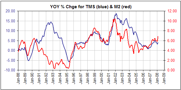
A significant
divergence exists at present, with MZM expanding rapidly (around
15%/year), M2 expanding moderately (around 7%/year), and TMS expanding
slowly (around 4%/year). In other words, whichever way we look at it we
see that inflation is occurring, but different monetary aggregates
imply very different rates of inflation.
We plan to say more about the current monetary situation in another commentary within the coming fortnight.
Commodities: the topping process continues
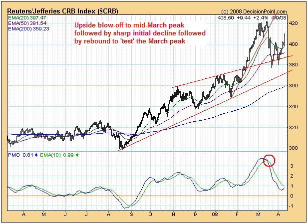
The daily CRB Index chart displayed below reveals an upside blow-off
leading to a mid-March peak, followed by a sharp decline and then a
rebound. If we are correct to view the March peak as the
intermediate-term variety then the current rebound should lead to a
secondary (lower) high within the next couple of weeks and then a
decline to a new multi-month low.
The CRB's topping process is associated with the US dollar's bottoming
process, so as the CRB rebounds to test its March peak the Dollar Index
is dropping back to test its March bottom. The following chart shows
the Dollar Index's current situation. The pullback by the Dollar Index
to test its March low will likely be accompanied by a spike to new
highs by the euro, but most of the dollar's competitors should make
lower highs.

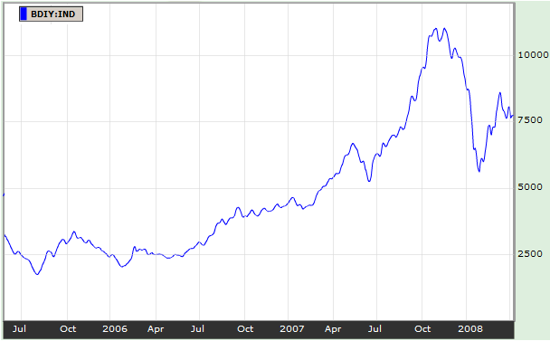
The US$-BDI relationship can be described as follows: Over the past 20
years, important turning points in the BDI have usually coincided with
important turning points in the currency market, with peaks in freight
rates coinciding with bottoms in the Dollar Index and bottoms in
freight rates coinciding with peaks in the Dollar Index.
The following chart of the BDI reveals an intermediate-term topping
process (a peak last November followed by an initial sharp decline and
then the obligatory rebound) and therefore supports our view that the
US$ is bottoming. This, in turn, supports our view that the commodity
world is in the early stages of an intermediate-term correction (a
multi-month downturn within a bull market).
It is clear that the November-2007 peak in the BDI did not coincide
with the ultimate low for the Dollar Index, but it did mark
intermediate-term bottoms for the US$ relative to the Canadian Dollar
and the British Pound.
The Stock Market
Current Market Situation
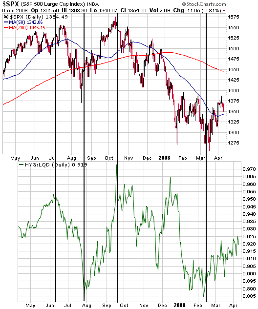
Below is a chart comparison we've shown many times in commentaries over
the past 9 months. The comparison is between the S&P500 Index and
the HYG/LQD ratio, a measure of how high-yield debt is performing
relative to investment-grade debt. In effect, HYG/LQD is a proxy for
the amount of stress in the credit markets, with the ratio rising as
stress decreases and falling as stress increases. Note that the charts
have been offset by about three weeks to show that HYG/LQD has been
leading the US stock market at significant turning points.
There is almost no chance that the problems inflicting the credit
markets have been solved or will be solved in the near future, so we
are certainly not expecting HYG/LQD to move back to near last year's
highs. However, it is clear that credit-related tensions became
temporarily 'overdone' during the first quarter of this year and that
these tensions have begun to abate. This has alleviated the downward
pressure on the stock market.
We continue to
believe that the US stock market and most other stock markets around
the globe are in the early stages of multi-month rebounds.
Credit-related concerns most likely peaked with the Bear Stearns fiasco
in mid March, and even if the US stock market is in the midst of a
cyclical decline (we think it is) a rally is needed to create more of a
balance between bulls and bears. There are simply way too many bears
right now.
Some analysts have opined that the "double bottom" hypothesis (the view
that the January and March lows constitute a double bottom) is too
popular, but if most market participants really do believe that a
double bottom is in place then why do sentiment indicators continue to
reveal such negativity? Even the fairly minor declines of the past two
days provoked sufficient concern to push the equity put/call ratio to
around 0.9.
As we noted in last week's Interim Update, the biggest near-term risk
is the potential for a sustained break to new highs by the oil price.
Gold and
the Dollar
Gold Stocks
As a result of the market action over the past few weeks, support at
420 for the HUI has become very important. This support is evident on
the following daily chart.
The chart also shows that the HUI/gold ratio remains near the bottom of
its range, which means that the HUI would probably provide good
leverage to gains in the gold price IF the gold price rallied to new
highs over the next few weeks. The risk is that gold is now rebounding
within the context of a downward trend and that the HUI is currently
forming the right shoulder of a head-and-shoulders top. If this were
the case then some additional strength over the coming week or so would
be followed by a sharp decline to a May-June correction low. The stage
would then be set for a major multi-month advance.
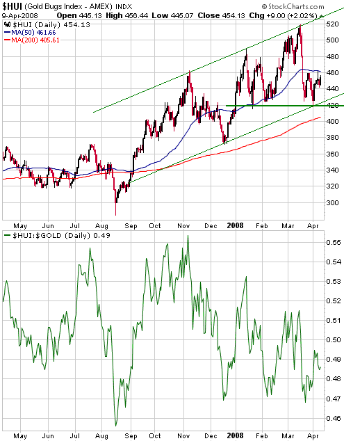
The present situation
is very interesting because there will very likely be a sharp move in
one direction or the other over the next 6 weeks. A sharp decline in
gold-related investments would mesh with our short-term views on the US
stock market and the US dollar, but with oil and the euro having just
moved back to their March highs there is clearly the potential for a
fast move in the opposite direction.
The plan we have with respect to our own portfolio is to do a small
amount of selling and/or buy some insurance in the form of GDX put
options if the HUI trades up to around 480 at some point over the
coming 2 weeks. We would then get rid of the insurance if the HUI
continued its rally to new highs.
Silver and Silver Stocks
We've been told that there's a shortage of silver at coin dealers in
North America. This is obviously not bearish, but neither is it
necessarily bullish. One reason is that the current price factors in
everything that's known about the supply/demand situation. In other
words, if there is a shortage then the market has already done its best
to discount the effects of the shortage in the current price. Another
reason is that a physical shortage of a commodity such as silver will
most often occur in the vicinity of a price top and will never occur in
the vicinity of a price bottom. A shortage of physical silver at coin
and bullion dealers would imply that the public had been buying
aggressively, something it usually only does after price has already
moved up substantially.
In our opinion, the only thing that anecdotal evidence of shortage tells you is that we are nowhere near a price low.
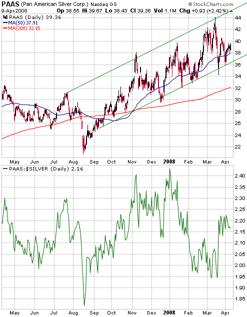
The top section of the following chart shows the performance of Pan
American Silver (NASDAQ: PAAS), one of the largest primary silver
producers, and the bottom section shows the PAAS/silver ratio.
PAAS/silver can be a useful leading indicator because it tends to peak
and begin trending lower well in advance of peaks in the prices of
either PAAS or silver bullion. It was the sharp downturn in this ratio
from its early-January peak that prompted us to write, in the 27th
February Interim Update, that "if the pattern of the past several years repeats then silver is within 6 weeks of an intermediate-term peak." As things turned out, silver probably reached an intermediate-term peak in mid March (three weeks later).
We used the word "probably" in the above sentence because PAAS hasn't
yet confirmed an intermediate-term peak by breaking below its channel
bottom. A daily close below $36 would be confirmation.
Despite the market
risk, many junior silver stocks are currently at levels where they
should be bought rather than sold. However, it is reasonable to expect
that they will get even cheaper if larger-cap silver stocks such as
PAAS breakout to the downside.
Those who feel the need to hedge their exposure to the juniors should
consider buying some PAAS put options into strength over the coming
week.
Update
on Stock Selections
(Note: To review the complete list of current TSI stock selections, logon at http://www.speculative-investor.com/new/market_logon.asp
and then click on "Stock Selections" in the menu. When at the Stock
Selections page, click on a stock's symbol to bring-up an archive of our comments on the stock in question)
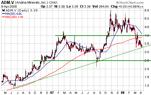
 Andina Minerals (TSXV: ADM). Shares: 64M issued, 81M fully diluted. Recent price: C$3.39 Andina Minerals (TSXV: ADM). Shares: 64M issued, 81M fully diluted. Recent price: C$3.39
Like Keegan Resources (TSXV: KGN), ADM is an exploration-stage gold
stock that has the right attributes to be a core holding. In
particular, the company has its hands around a large high-quality gold
deposit in a reasonable location and is making rapid progress. Also
like KGN, it is currently in what we refer to as the "sweet spot" --
the time when almost all news on the exploration front will be good
news. But unlike KGN, ADM's shares haven't performed well over the past
few months. It was this poor performance that gave us the opportunity
to introduce the stock last month at the bargain-basement price of
C$3.66. The stock has since fallen to an even lower price and therefore
now offers even better value.
Apart from the general lethargy in the market for exploration-stage
resource stocks, the reason for the weakness in ADM's stock price is
probably the downward pressure exerted by this month's expiration of
about 8M low-priced warrants. We anticipated this when we wrote the
following in our 12th March commentary: "Our
suggestion is that investors with a 1-2 year time horizon use the
current warrant-related weakness, and any additional such weakness over
the next month, to average into a position in ADM."
The worst that we could envisage happening to ADM in the short-term
would be a drop to support at C$2.50 (see chart below) due to the
combination of a sector-wide downturn and the above-mentioned
warrant-related selling. However, we certainly wouldn't rely on being
able to buy the stock that cheaply. It would be a gift if it occurred,
but a more likely outcome is that the stock bottoms not far from its
current price.
New Selection: Great Basin Gold warrants (TSX: GBG.WT). Recent price: C$0.72
Due to our uncertain short-term outlook for gold we almost decided not
to add the GBG warrants to the TSI Stocks List. However, regardless of
our overall sector view these warrants appear to be a good speculation
near their current price, because:
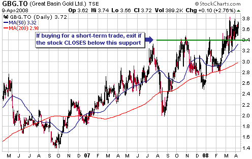
a) Great Basin Gold (TSX: GBG, AMEX: GBN) looks attractive from both
fundamental and technical perspectives. In particular, at current metal
prices we can easily justify a valuation of $5/share. Also, the
following chart shows that although the stock has been quite strong, it
is not overbought (it has recently been consolidating above former
resistance at C$3.40-3.50).
b) At Wednesday's closing prices, the warrants are slightly under-valued relative to the stock.
c) If the gold sector were to move sharply higher over the next several
weeks then GBG would probably be a relative strength leader and the
warrants would take-off. On the other hand, if the sector were to
reverse lower in the near future and head down to a May-June correction
low then the warrants would initially fare poorly, but even in this
case we expect that they would ultimately yield a good return as long
as GBG's management executed its business plan.
The GBG warrants have an exercise price of C$3.50 and an expiry date of 20th April 2009.
Chart Sources
Charts appearing in today's commentary
are courtesy of:
http://stockcharts.com/index.html
http://www.decisionpoint.com/
http://www.bloomberg.com/
http://www.economagic.com/

|