|
- Interim Update
11th March 2015
Copyright
Reminder
The commentaries that appear at TSI
may not be distributed, in full or in part, without our written permission.
In particular, please note that the posting of extracts from TSI commentaries
at other web sites or providing links to TSI commentaries at other web
sites (for example, at discussion boards) without our written permission
is prohibited.
We reserve the right to immediately
terminate the subscription of any TSI subscriber who distributes the TSI
commentaries without our written permission.
Interesting Quotes
"There will never be a Grexit. The country is and will remain
a member of monetary union. A Greek withdrawal would lead to an
irreparable loss of global prestige for the whole EU."
- Jean-Claude Junker, March-2015
"When it becomes serious, you have to lie."
- Jean-Claude Junker, 2011
China
and Japan Monetary Inflation Update
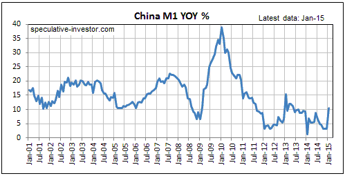
China's central bank doesn't provide enough
information to enable the calculation of True Money Supply (TMS), so we use M1.
In China's case, M1 appears to be a reasonable proxy for TMS.
The following chart shows the year-over-year (YOY) rate of change in China's M1
money supply since the beginning of 2001. The chart suggests that over recent
years China's monetary authorities have been making an effort to curb the
rampant monetary inflation that led to the greatest mal-investment since the
days of the Egyptian pharaohs. Whereas the YOY M1 growth rate almost never went
below 10% prior to mid-2011, over the past four years it has mostly oscillated
in the 3%-10% range.
It looks like the decline in China's monetary inflation rate has caused that
country's real estate bubble to burst, although the bursting is happening in
slow motion. This is largely because China's banks are allowed to pretend that
they have almost no non-performing loans, even though they are inundated with
them.
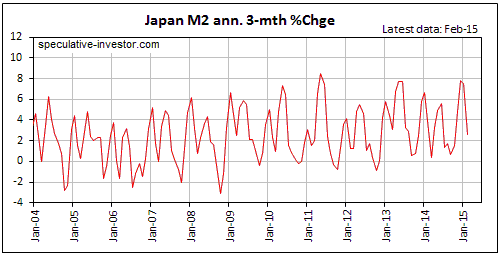
For Japan we use M2 as our TMS proxy. This is not because the BOJ doesn't
provide enough information to enable the calculation of TMS, but because in
Japan the M2 rate of change closely tracks the TMS rate of change.
Monetary inflation in Japan is highly seasonal, meaning that there are certain
periods of the year when the money supply almost always grows relatively quickly
and other periods when the money supply almost always grows relatively slowly.
This is the case regardless of what the BOJ happens to be doing on the QE front.
The strong seasonality of Japan's monetary inflation is evident on the following
chart of the annualised 3-month rate of change in M2 money supply. Specifically,
there are usually short-term money-supply growth peaks in January and May-June
and there are usually short-term growth troughs in March and September-October,
with the high for the year usually occurring in May-June and the low for the
year almost always occurring in September-October.
Interestingly, the chart shows that the spectacular QE program introduced by the
BOJ in 2013 has, to date, had a fairly minor effect on Japan's monetary
inflation. The effect has been a small upward shift in the range in which the
annualised 3-month rate of M2 growth oscillates. For example, rather than
bottoming just below zero, which is what was happening prior to 2013, the
annualised 3-month rate of change in Japan's M2 now tends to bottom just above
zero.
Hardly the inflationary conflagration that poorly-informed analysts continue to
claim is happening in Japan.
The Stock Market
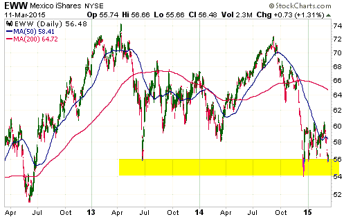
Mexico: Another "Peso Problem" could be on the way
The following daily chart shows the performance over the past three years of
Mexico's stock market in US$ terms. This chart is a picture of a market that is
short-term 'oversold' and could soon bounce.
If we take a long-term view, however, the picture appears to be of a market in
the process of completing a major topping pattern, that is, a picture of a
market with substantial downside potential.
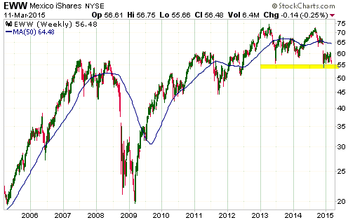
When a stock market makes the sort of massive percentage gains that were made by
Mexico's market during 2009-2013, it is a sign of rampant monetary inflation.
More accurately, it is a sign of an unstable economic boom fueled by a huge
increase in the supply of money. It is unequivocally not a sign of economic
progress.
When (not if) Mexico's inflation-fueled boom rolls over into the inevitable bust
phase, most of the US$-denominated gains achieved by the stock market during the
boom phase will be given back. This is likely to happen within the next two
years, but the precise timing is unknowable.
Due to its large downside potential it could be worth taking a bearish (that is,
short or put-option) position in Mexico iShares (EWW), especially if there's a
near-term rebound to the vicinity of the 50-day MA ($58-$59). However, we aren't
going to make any formal recommendation. This is just an idea presented for your
consideration/interest/amusement.
The US
A strong jobs growth number was reported last Friday. However, a weak ISM
Manufacturing report was published last Monday and, as noted in a
ZeroHedge.com article, the wholesale inventory/sales ratio is at its highest
level since the middle of the last recession and over the past 12 months there
has been no growth in wholesale trade and factory orders (the volume of factory
orders has actually contracted). A mixed picture, indeed.
The recent price action of the S&P500 Index (SPX) is potentially ominous. As
illustrated by the following daily chart, there was a clear-cut break to a new
high and then a sharp pullback that negated the breakout.
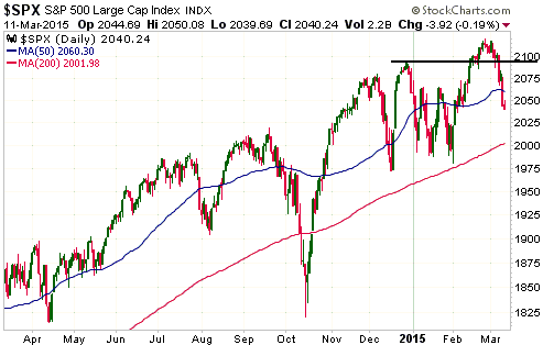
The current chart pattern is potentially ominous for two reasons. First, false
upside breakouts are reliable bearish signals. Second, there is an eerie
similarity between the current pattern and the major topping patterns of 2000
and 2007. To show what we mean, here is a chart of the NYSE Composite Index (NYA)
during 2000 and a chart of the SPX during 2007. It's also worth pointing out
that the 20% stock market plunge of 1998 began soon after a clear-cut upside
breakout to a new high.
On a side note, we obviously have a bearish bias towards the US stock market
that should be taken into account. As a result of this bias, we've called eleven
of the past two bear markets. However, we are undaunted and will continue to
call it as we see it.

With the benefit of hindsight it is obvious that the ultimate price high was the
optimum place to have established a bearish position in 2000 and 2007, but when
trading in real time we never have the benefit of hindsight. That's why the
notes on the above charts say that the optimum place to have 'gone short' was
near the top of the rebound that followed the initial decline from the ultimate
price high. This was the optimum place to establish a bearish position because
it was the place at which it would have taken only a small amount of additional
strength to invalidate the trading idea. More specifically, it was the place at
which a position could have been taken in anticipation of a substantial decline
with the intention of quickly exiting at a small loss if the market invalidated
the basis of the trade by making a new high.
Unfortunately, if an intermediate-term decline is now getting underway there is
no certainty of a rebound that facilitates the establishment of a bearish
position at slightly below the recent peak. Another possibility is that the SPX
will drop to the vicinity of its 200-day MA over the days immediately ahead
before beginning to rebound, which would likely result in a rebound that ends at
or below the 50-day MA.
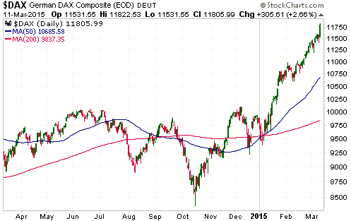
Europe
The downside blow-off in the euro is occurring in parallel with an upside
blow-off in European equities, led by Germany's DAX Index. The index
representing Europe's largest stock market is up by 25% since early-January.
This is an annualised increase of 130%.
It's just as well that deflation is such a threat in Europe, because imagine how
rapidly the DAX would be advancing if there were actually some inflation
happening there.
Gold and the Dollar
Gold
The US$ gold price has just declined for 8 days in a row, although the decline
has been more like water torture than a waterfall as 7 of the 8 daily declines
were small. The exception was the plunge last Friday in reaction to the US
employment data. In any case, a result of the 8-day decline is a market that is
short-term 'oversold' and not far from major support defined by last year's low.
Wednesday's upward reversal in the gold-mining sector indicates that the support
will probably hold for now, but there is definitely a risk that it will be
breached during the second quarter after an intervening multi-week rebound.
Gold's performance relative to the Dollar Index has been more than a little
interesting over the past four months. This is illustrated by the following
chart.
When gold was bottoming in the $1130s in early-November of last year, the Dollar
Index was at 88. When the Dollar Index came very close to touching 100 on
Wednesday of this week, the US$ gold price was still above its November-2014
bottom. In other words, from early-November through to this Wednesday there was
a 12-point rally in the Dollar Index with no new low in the US$ gold price. This
is remarkable, considering that the other fundamental gold drivers were not
unanimously bullish during the period.
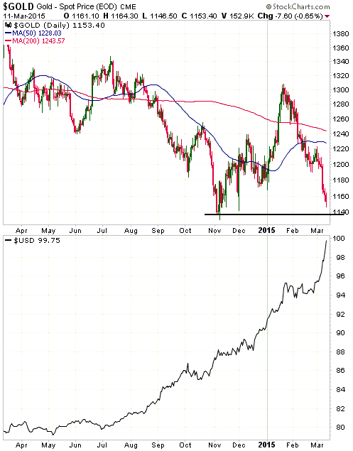
The most simple way we can explain gold's ability to hold its ground in the face
of a 12-point gain in the Dollar Index is that the strengthening US$ only has
only been a bearish force over the past 8 trading days. During November and
December, and especially during the first three weeks of January, gold was being
helped by the same force that was elevating the Dollar Index: growing fear about
the stability of Europe's monetary union. When this fear peaked during 22nd-26th
January, the Dollar Index began to trade sideways and gold began to 'correct'.
This correction seemed to be running a fairly normal course until last week,
when the view that the US economy was doing well enough to prompt an early start
to the Fed's rate-hiking campaign began to gain in popularity.
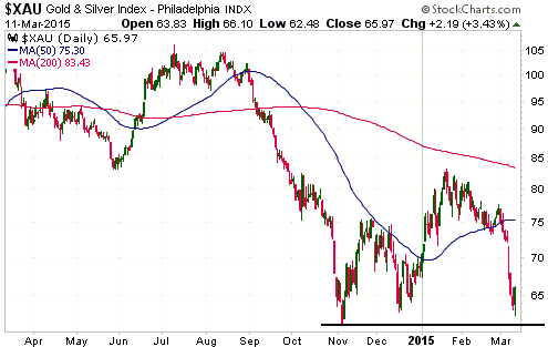
Gold Stocks
The XAU, which has been weaker than the HUI since the November-2014 bottom, came
close to its 2014 low before reversing upward on Wednesday 11th March.
The upward reversal from just above major support following seven consecutive
down days and with no help from the bullion market (the gold price was down on
the day) suggests that a multi-week bottom is now in place. However, the
short-term outlook isn't as clear as it was after the first up-day in
early-November.
Perhaps the situation will become clearer over the final two days of this
trading week.
The Currency Market
Here is an update of the chart that we've been using to illustrate the extent to
which the Dollar Index is stretched to the upside.
Thanks to this week's continuing surge to near the 'magical' 100 level, the
Dollar Index's 250-day rate-of-change (ROC) has exceeded its 2008 peak. This
means that the current 250-day ROC is second only to the early-1985 extreme.
Therefore, in terms of position relative to MA envelope (the top section of the
chart) the Dollar Index is now at its most 'overbought' level ever and in terms
of 250-day ROC (the bottom section of the chart) the Dollar Index is now at its
second-most 'overbought' level ever.
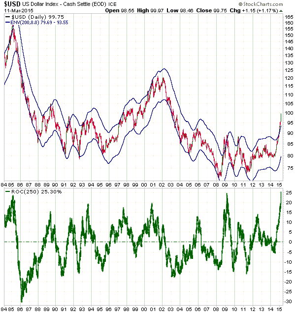
As mentioned in the latest Weekly Update, the historical record tells us to
expect the Dollar Index to suffer a 1-2 month decline of at least 10% after the
current blow-off runs out of steam.
Updates
on Stock Selections
Notes: 1) To review the complete list of current TSI stock selections, logon at
http://www.speculative-investor.com/new/market_logon.asp
and then click on "Stock Selections" in the menu. When at the Stock
Selections page, click on a stock's symbol to bring-up an archive of
our comments on the stock in question. 2) The Small Stock Watch List is
located at http://www.speculative-investor.com/new/smallstockwatch.html
 In
the latest Weekly Update, we wrote: In
the latest Weekly Update, we wrote:
"...if there is significant sector-wide follow-through to the downside then
better buying opportunities [than the ones listed in the "candidates for new
buying" section] could arise elsewhere. In particular, be on the lookout for
opportunities to buy Dalradian Resources (DNA.TO) in the low-C$0.80s, McEwen
Mining (MUX) in the low-US$0.90s, Premier Gold (PG.TO) in the C$2.00-$2.20 range
and Pretium Resources (PVG) at around US$4.80."
Of these stocks, only DNA.TO held up well enough over the first three trading
days of this week to avoid creating the buying opportunity mentioned above. With
regard to the other stocks, MUX traded as low as US$0.90 and in so doing tested
its 2014 low (refer to the chart below), PG.TO traded as low as C$2.20 and PVG
traded as low as US$4.85.
MUX was the only stock we bought this week. Specifically, we doubled our
position in the stock when a below-the-market buy order at US$0.92 was filled on
Tuesday. We still have only two-thirds of what we consider a full position and
are in no hurry to buy the final third. We had orders in place to buy a few
other stocks and expected that some of these orders would be filled on
Wednesday, but the sector-wide upward reversal prevented that from happening.
Timmins Gold (TGD) was the weakest stock in the TSI List over the first three
days of this week as the market continues to punish it for the ill-conceived
decision to acquire Newstrike Capital (NES.V). As well as destroying per-share
value and increasing risk, this acquisition boosted TGD's leverage to the spot
gold price. The leverage will be a positive influence during the next
substantial gold rally, but at the moment it is adding to the downward pressure.
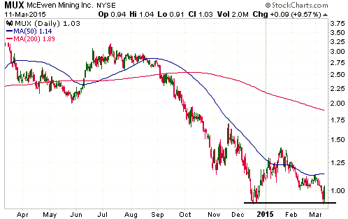
Chart Sources
Charts appearing in today's commentary
are courtesy of:
http://stockcharts.com/index.html

|
