![]()
![]()
![]()
![]()
- Interim Update 13th May 2020
Copyright
Reminder
The commentaries that appear at TSI
may not be distributed, in full or in part, without our written permission.
In particular, please note that the posting of extracts from TSI commentaries
at other web sites or providing links to TSI commentaries at other web
sites (for example, at discussion boards) without our written permission
is prohibited.
We reserve the right to immediately
terminate the subscription of any TSI subscriber who distributes the TSI
commentaries without our written permission.
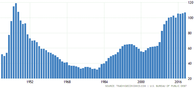
The government debt
explosion
In its efforts to minimise the
short-term pain stemming from its own tactics in the war against a flu
virus, the US government is spending and borrowing as if there were no
tomorrow. A consequence is that by the middle of this year the
government-debt/GDP ratio in the US will be around 125%. The US was
lumbered with a similar government debt burden at the end of World War II
and the economy was very strong over the ensuing several years, so this
situation is not totally unprecedented and by itself does not portend a
bad economic outcome. However, there are reasons to expect that the US
economy's performance during the years following the "coronacrisis" will
be nothing like (meaning: much worse) than its performance following WWII.
Before we get to these reasons, here is a chart showing the annual
government-debt/GDP ratio from 1940 to 2019. The peak level of around 120%
was in 1946, at which point a generational decline got underway. The
decline was driven initially by the elimination of war-related government
spending and subsequently by strong growth in the economy.
The reasons that the post-"coronacrisis" economic performance won't
resemble the positive post-WWII economic performance are associated with
major differences between the current situation and the situation in
1945-1946. Here are some of these differences:
1) At the end of
WWII, the personal savings rate was high and private sector (household and
corporate) debt levels were low. This set the stage for a long-term
expansion of private-sector credit, a substantial portion of which was
used for productive purposes. Currently, the private sector's ability to
take on new debt appears to be almost exhausted.
2) A related
point is that commercial bank leverage was low in the mid-1940s. As a
result, the commercial banks were in a good position to provide loans to
businesses. Today the banking industry may be less leveraged than it was
in 2007 (at the start of the last financial crisis), but over the years
ahead it will be hampered by widespread loan defaults and consequently
will be more risk averse than usual when lending money. There already is
evidence of this, in that the US banking industry just
tightened credit at the
fastest pace in at least 30 years.
3) Although the Fed
engineered a large increase in the US money supply during 1941-1945 to
assist with financing the government's war efforts, it didn't shower the
private sector with cheap credit. Today the Fed is going all-out to
prevent the liquidation of bad investments, thus ensuring that well after
the "coronacrisis" has run its course there will be countless 'zombie
companies' consuming resources.
4) Immediately after WWII the
government began rapidly scaling back its economic interventionism, that
is, the government got out of the way. In addition to the large reduction
in government spending due to the cessation of hostilities, this involved
the elimination of some of the "New Deal" programs that had prolonged the
Great Depression. In essence, the economy was freed up. While there is no
good reason that the same couldn't happen over the next few years, it is
extremely unlikely regardless of the November-2020 election outcome.
5) Thanks to 15 years of dismal or lacklustre stock market
performance, equity valuations generally were low at the end of WWII. This
set the stage for a long-term stock bull market that enabled many
businesses to be funded by issuing equity. Today, valuations are higher
than they have ever been.
One similarity between then and now is
that interest rates were near a secular low then and appear to be near a
secular low now. However, it's unlikely that this similarity will make up
for the huge differences.
In conclusion, the high and rapidly
rising government-debt/GDP ratio isn't really the problem. The problem is
the massive increase in government spending/borrowing COMBINED with
everything else. Taking into account the complete picture, the current
situation looks a lot more like 1930 than 1945-1946. However, even this
comparison is far from ideal due to the difference in the monetary system.
Whereas there was massive monetary deflation during the early-1930s (there
was a peak-to-trough decline of about 30% in the supply of US dollars
during 1929-1933), there is now massive monetary inflation. The most
likely result is an "inflationary" depression.
The Stock Market
Intermediate-term risk
is ramping up
At the SPX's top in February of this year
the US stock market was as expensive as it had ever been. The only time in
history when it may have been more expensive was at/near the bubble peak
in 1999-2000. The SPX is now about 17% below its February-2020 all-time
high, but it is much more expensive now than it was then due to the
long-term damage that has been done to the economy by the virus-related
lockdowns.
Prior to the past two weeks the risk was already high
due to the combination of a high average valuation and the economic damage
wrought by the lockdowns, but the US government seems determined to
further increase the risk by picking this moment to intensify its conflict
with China's government. Due to the general perception of China in some
Western countries including the US, this could well be a smart move
politically. However, from an economics perspective it is stupid. It
brings to mind the saying "adding insult to injury".
Current Market Situation
Up until the past two trading
days the US stock market's bearish fundamentals and other
intermediate-term considerations were being offset by short-term
positives, the most important of which were sentiment, April's McClellan
Oscillator (MO) surge and short-term trend indicators. However, these
short-term factors are becoming less supportive.
First, a month has
transpired since the MO surge, which probably means that its influence is
beginning to wane.
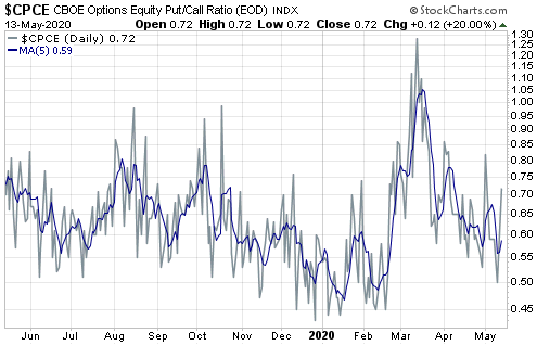
Second, sentiment became dicey early this week
due to a plunge in the equity put/call ratio to 0.50 on Monday (see chart
below) and due to the TSI Put/Call Indicator, which is calculated by
dividing the 10-day MA of the equity put/call ratio by the 10-day MA of
the OEX put/call ratio, dropping into sell territory on Tuesday.
Third, there was preliminary evidence in the price action on
Tuesday-Wednesday of this week that the SPX's short-term trend has turned
down. The evidence is the SPX's break below its channel bottom and 20-day
MA. Refer to the following daily chart for the details.
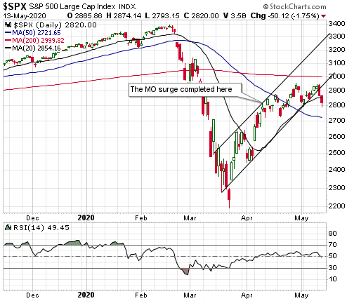
The most important nearby support for the SPX's short-term upward
trend lies at 2800. This support survived a test on Wednesday 13th May, so
there remains a chance that the SPX could rise to its 200-day MA near 3000
before commencing a short-term downward trend.
If support at 2800
holds for now and there's a rebound over the next several days, this
rebound should be viewed as another opportunity to establish bearish
speculations or hedges. It's especially important for anyone with
substantial exposure to oil-and-gas (O&G) stocks to hedge, because these
stocks will be acutely vulnerable until the broad stock market makes an
intermediate-term bottom.
We suspect that the SPX's next short-term
downward trend will retrace no more than half of the rebound from the
March low. The reasons are that central banks will become even more
aggressive in their support efforts in reaction to a new bout of stock
market weakness (regardless of how much the monetary central planners have
done, they can always do more) and that sentiment probably will become
very negative (meaning supportive) very quickly. However, we certainly
can't rule out the possibility that the next downward trend will result in
a test of the March low, because intermediate-term indicators remain
decidedly bearish.
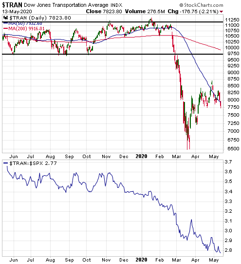
One of the aforementioned intermediate-term
indicators is the SPX's position relative to its 200-day MA. Two others
are illustrated by the following daily charts, which show that the
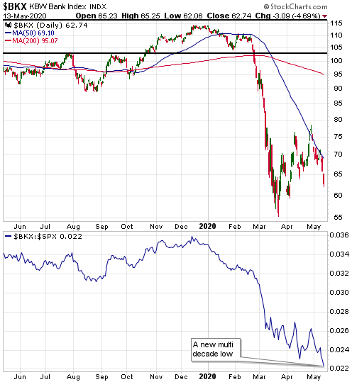
transportation sector and the banking sector have just made new lows for
the year relative to the SPX. For the banking sector (represented by the
BKX) it is actually a multi-decade low in relative terms. This tells us
that an intermediate-term trend reversal to the upside did not occur after
the March-2020 bottom.
The message of the above two charts is emphasised by the next chart,
which shows the HUI/SPX ratio. Not only are cyclical sectors such as
transportation and banking relatively weak, but also the counter-cyclical
gold mining sector is relatively strong.
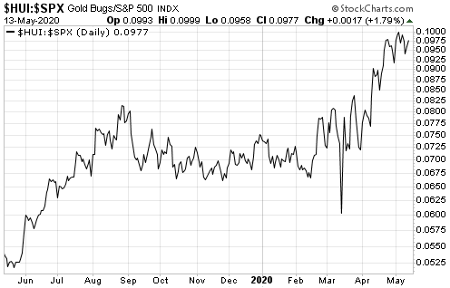
The above three charts, taken together, are not indicative of a
healthy stock market. At best, they are indicative of a stock market that
hasn't yet reached its correction low.
Gold and the Dollar
Gold
As
evidenced on the following daily chart by the narrow trading range since
the end of April, the gold market has been very calm of late. This should
prove to be the calm before the storm.
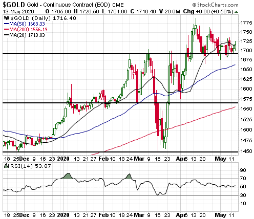
It's a good bet that the period of low-volatility range-trading will
be followed by a quick move of $100 or more, but from our perspective the
direction of the coming move is a coin toss. Fundamentals continue to
point upward, but sentiment suggests the potential for a significant price
decline driven by speculator long liquidation if technical support gives
way.
Support lies at $1690, but for daily closes we'd allow a few
dollars of leeway. As mentioned in the latest Weekly Update, we think that
a downside breakout would be signalled by a daily close below $1680 or a
weekly close below $1690.
Silver
Last
Thursday the US$ silver price finally broke above its 50-day MA. This
breakout suggested a near-term target of $16.50-$17.00.
For silver
to reach the aforementioned upside target, gold probably will have to
break upward from its recent range. If, instead, gold soon breaks out to
the downside, then silver probably will trade below $14.00 before it
trades near $16.50.
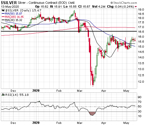
At the current gold/silver ratio, silver's long-term risk/reward is
vastly superior to gold's. However, despite silver's relative cheapness we
think that its short-term risk/reward is worse than gold's. This is
because the gold/silver ratio, like the gold/GNX ratio, is inversely
correlated with inflation expectations.
Within the next few years
there is a very good chance of a strong rise in inflation expectations,
but in the short-term there is a much better chance of a surge in
deflation fear (as people realise that the economic damage caused by the
lockdowns will take many years to repair) than a meaningful rise in
inflation expectations. That's especially so because most people in the
West now associate economic weakness with declining "inflation", even
though economic theory, history and a broader perspective indicate that
economic weakness can go hand-in-hand with rising "inflation".
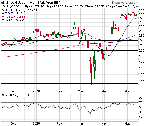
Gold Stocks
M&A activity is heating up in the gold
mining sector, with several takeovers having been announced over just the
past two weeks. However, for all intents and purposes the HUI has marked
time over the past three weeks.
As previously advised, important
nearby support for the HUI lies at 260 and resistance is defined by the
2016 top at 286. A breakout from this range would signal the likely
direction of the next multi-week move, although we think that buying in
reaction to an upside breakout in the near future would be risky. It would
be much better to buy a pullback to the 50-day MA.
The Currency Market
The Dollar Index (DX) is
about as neutral as it gets. The fundamentals are in neutral territory and
have been since early last year, sentiment is neutral and the price is
oscillating within a contracting range that could end via either an upside
breakout or a downside breakout.
There is the potential for a 2-4
point move in the direction of the DX's breakout from its contracting
range, so if you think you know the direction of the coming breakout you
could bet accordingly.
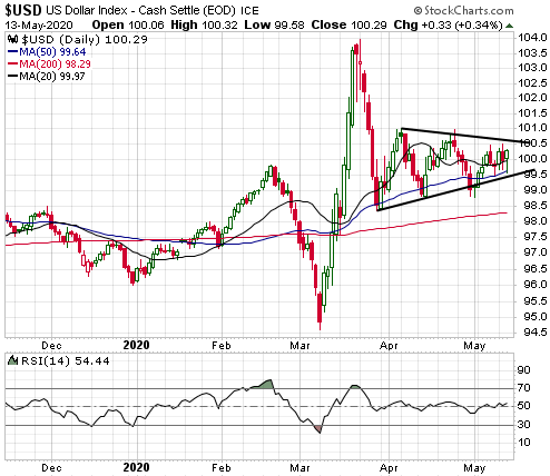
We expect that the DX's next intermediate-term trend will be to the
downside, but this isn't the right time to risk significant money on that
possibility. Before speculating/investing based on a multi-quarter US$
downward trend we would prefer to see a meaningful fundamental shift away
from the dollar. Such a shift would be indicated by relative strength in
European equities relative to US equities.
Updates on Stock Selections
Notes: 1) To review the complete list of current TSI stock selections, logon at
http://www.speculative-investor.com/new/market_logon.asp
and then click on "Stock Selections" in the menu. When at the Stock
Selections page, click on a stock's symbol to bring-up an archive of
our comments on the stock in question. 2) The Small Stock Watch List is
located at http://www.speculative-investor.com/new/smallstockwatch.html
Chart Sources
Charts appearing in today's commentary
are courtesy of:
https://stockcharts.com/
https://tradingeconomics.com/
![]()