|
- Interim Update 14th January 2004
Copyright
Reminder
The commentaries that appear at TSI
may not be distributed, in full or in part, without our written permission.
In particular, please note that the posting of extracts from TSI commentaries
at other web sites or providing links to TSI commentaries at other web
sites (for example, at discussion boards) without our written permission
is prohibited.
We reserve the right to immediately
terminate the subscription of any TSI subscriber who distributes the TSI
commentaries without our written permission.
Forecasting
January is generally perceived to be
some sort of 'starting point' for the markets and many investors measure
their performance on a calendar-year basis. However, market trends don't
start or stop simply because one year ends and the next one begins, so
in that respect there is nothing especially significant about January as
far as forecasting is concerned. And forecasting is, itself, a generally
over-rated art. For instance, the accuracy of any 12-month forecasts we
make at the start of a year or at any other time should have little bearing
on how much money we end up making over that 12-month period. Instead,
the amount of money we make will mostly be determined by how well we analyse
the new evidence that is continually becoming available and adjust our
positions in accordance with this new evidence. After all, even when you
start off on the right track the markets have a way of throwing you enough
curve balls over any 6-12 month period to shake your conviction and, perhaps,
cause you to change your strategy and blow any advantage you might have
originally had. On the other hand, having started off on the wrong track
you might recognise that things aren't falling into place as you originally
expected and make some appropriate and timely adjustments to your strategy.
In other words, real-time analysis has a far greater effect on our performance
than any forecasts we might concoct at the start of a year (or at any other
time).
When we analyse the markets a result
is that we arrive at expectations of what will happen in the future. These
expectations can, in turn, be presented as forecasts. The way we think
of forecasts, though, is as starting points that are subject to constant
review, and possibly change, as more evidence becomes available. They are
never fixed in stone and, as discussed above, they don't -- or, at least,
shouldn't -- determine how much money we end up making.
As far as financial-newsletter writers
are concerned a correct forecast offers the benefit of 'bragging rights'.
For example, a forecast that proves to be correct can be used to promote
the newsletter with the aim of drawing-in more subscribers. It should be
noted, though, that anyone who makes a lot of forecasts over a long period
of time will end up with a lot of correct forecasts as a result of chance
alone, so by cherry-picking the ones that proved to be correct it would
be possible for almost anyone to promote themselves as being a great forecaster.
Cherry-picking the good forecasts is
just one of many tricks used by newsletter writers to portray themselves
as great forecasters. Another is to word forecasts in such a way that the
forecast will appear to be right regardless of what actually transpires
(for example, the classic "if the market moves above price-level 'A' it
will move higher but if it moves below price-level 'B' it will move lower").
We are not trying to denigrate the
newsletter-writing industry. We are, after all, part of that industry.
Furthermore, because the newsletters that are 100% supported by their subscribers
(the ones that don't rely on any advertising revenue or payment from anyone
other than their subscribers) provide independent analysis they can be
the best source of information for investors. What people should understand,
though, is that notwithstanding the promotional efforts of some newsletter-writers
genuine forecasting accuracy over a long period of time is not achievable.
What is achievable is accurate risk-versus-reward analysis.
As far as this year is concerned, our
'starting points' for some of the markets we follow can be summarised as
follows:
- The stock market will roll
over during the first half of 2004 and embark on a large decline lasting
at least 12 months. Recent price action has, however, muddied the waters
as to whether a major peak will occur very early in the year or following
some additional upside over the coming months.
- Bonds will move substantially
lower over the next 12-18 months, but we are fuzzy on whether a major decline
will begin almost immediately or following a few more months of consolidation.
- Gold and the US$ will reach
intermediate-term extremes during the first half of this year, most likely
at around 460 for the gold price and 80 for the Dollar Index. Lengthy (6
months or longer) corrections will then occur.
We have good reason to expect that
the above forecasts will prove to be close to the mark because they've
been arrived at following a careful weighing of the fundamental, technical
and sentiment evidence. More importantly, though, based on our past performance
we have good reason to expect that we will make money this year regardless
of how well these initial forecasts pan out.
The Money
Supply Mystery
When long-term interest rates bottomed
in June of 2003 and then moved sharply higher, mortgage-refinancing activity
slowed dramatically. Since mortgage refinancing has been the main engine
of money-supply growth in the US over the past 8 years the sharp decline
in mortgage refinancing resulted in a sharp decline in the money-supply
growth rate. There is no mystery here.
Substantial changes in the year-over-year
money-supply growth rate have tended to impact the economy with a lag of
at least two quarters, so the economy should not be expected to show significant
weakness in response to the recent downturn in money-supply growth until
the second quarter of this year. Once again, there is no mystery here.
Where the mystery does lie is in the
fact that the pace of mortgage refinancing has continued to slow over the
past 4 months despite a moderate decline in long-term interest rates. This
is a mystery in the sense that it is a pronounced divergence from what
has tended to happen over the past few years. What does it mean? Probably
that most people who could be enticed to refinance their home have already
done so and that new lows in long-term interest rates (new highs in bond
prices) will be necessary in order generate a substantial increase in mortgage
refinancing activity and money-supply growth.
The US
Stock Market
The Big Picture
In the latest Weekly Update we changed
our 'big picture view' for the US stock market; we went from forecasting
a drop to a major bottom (well below the October-2002 low) in 2004 to forecasting
a test of the October-2002 low during 2005. In an attempt to explain this
change we are going to use the below long-term chart of Japan's Nikkei225
Index.
There are so many important differences
between Japan in the 1990s and the US today that using the performance
of the Nikkei as a model for the US market would seem to be inappropriate
to say the least. Furthermore, 4 years after its major peak the US market
is clearly a lot stronger than was the Japanese stock market at an equivalent
distance from its own major peak. There is, however, one very important
market-moving similarity between post-bubble Japan and the current situation
in the US (note that we can't refer to the current US situation as being
"post-bubble" because the US credit bubble is much bigger now than it was
4 years ago). That similarity is the aggressive attempts of policy-makers
to prevent the stock market from falling to a genuine bottom. In Japan
these attempts revolved around massive deficit-spending and direct intervention
in the stock market, while policy-makers in the US have used massive deficit-spending
combined with tax cuts, war, and enormous monetary stimulus. Obviously,
if the goal was to boost asset prices then US policy-makers have out-performed
their Japanese counterparts.
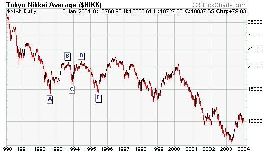
The first major decline of the Nikkei's
long-term bear market ended during the 3rd quarter of 1992 at point A on
the above chart. The Nikkei then rallied into the 4th quarter of 1993 (point
B), experienced a short and sharp pullback to point C, rallied to a new
recovery high (point D), and then declined for about 12 months to the vicinity
of its 1992 bottom (point E). Our contention is that it was government
meddling that prevented the Japanese market from plunging well below its
1992 low during 1995 (point E) and throughout the remainder of the 1990s.
This meddling, in its various forms, only had the long-term effect of delaying
the collapse, but it does show that postponement is possible. And given
what the US Administration and the Fed have already done in the name of
propping up the stock market and giving the economy a short-term boost
we are wondering whether a multi-year period of range-trading might lie
in front of the US stock market. This is why our revised 'big picture view'
mentions a test of the 2002 low during 2005 rather than a drop to a new
low. Whether or not there is a drop to a new low during 2005 could, we
think, be determined by the amount of government-sponsored market support
that materialises at the time.
After having already done so much to
prop-up the stock market the question is: what else could the US government
do? After all, a lot of the monetary fuel appears to have been spent and
there are practical limits on deficit spending. One big card that is yet
to be played by the US, though, involves the investment of Social Security
money in the stock market. This idea was floated during the Clinton Administration
and never received much support, but at that time there was no real political
need to pass the required legislation. However, under more dire circumstances
the political will needed to create such a change might exist.
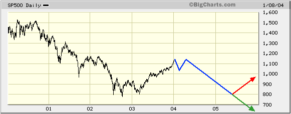
The below chart illustrates our current
expectations for the S&P500 Index as far as the next two years are
concerned. The red line on the chart represents the 'with intervention'
scenario and the green line represents the 'without intervention' scenario.
Also, because there is no technical evidence that the market is presently
close to its ultimate recovery high the second of the peaks shown occurring
in the first half of 2004 will probably be the higher of the two. The current
situation in the US market could therefore be likened to point B on the
above Nikkei chart, although we doubt that the coming pullback in the US
market will be anywhere near as large as the Nikkei's B-C pullback in late
1993.
Current Market Situation
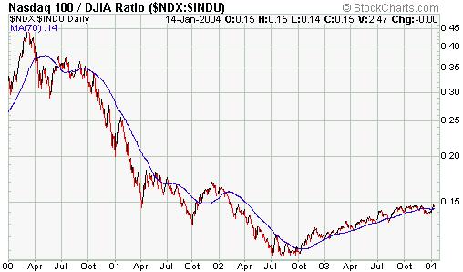
Below is a chart of the NDX/Dow ratio
from the beginning of 2000 to the present day. We are including this chart
to illustrate that every significant decline in the market over the past
4 years has been characterised by weakness in the NDX relative to the Dow
while every significant rally has been characterised by strength in the
NDX relative to the Dow. Furthermore, although the NDX/Dow ratio has tended
to roll-over prior to important market peaks over the past few years there
was one occasion -- March 2000 -- when the peak in NDX/Dow coincided with
the peak in the market. In fact, NDX/Dow rocketed higher during the two
months leading up to the major market peak in March of 2000.
It is very unlikely that we will see
the same frenetic activity in the tech and telecom stocks this year as
we saw during the first quarter of 2000. Actually, it is probably going
to be decades before another tech-stock mania becomes possible. We therefore
don't expect to see a sharp upward move in NDX/Dow just prior to this year's
peak. Instead, it is much more likely that NDX/Dow will roll over before
the Dow reaches its ultimate recovery high.
In any case, regardless of whether
an NDX/Dow peak precedes or coincides with the next major peak in the overall
market, there is a high probability that the early stages of the next major
decline will be characterised by pronounced weakness in the NDX relative
to the Dow. By the same token, it will make sense to assume that any market
decline that is not characterised be relative weakness in the NDX will
turn out to be a correction within an on-going upward trend.
Based on the price action during much
of November and December it appeared as though the market was heading for
an important peak in January, but the performances of the stock indices
since mid-December indicate that we are probably still a few months away
from the ultimate peak.
We expect that a sharp pullback will
soon get underway, but the odds are now in favour of this pullback being
followed by a rally to a new recovery high. Therefore, the USPIX position
that we currently hold will probably be exited within the next month or
so.
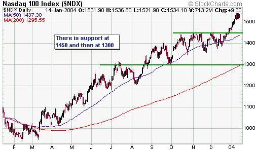
As far as the next 4-6 weeks are concerned,
a reasonable downside target for the NDX is 1300 (see chart below). 1300
coincides with good support and a drop to this level would represent a
retracing of slightly less than 50% of the gains achieved since the March-2003
bottom.
The way things are currently shaping
up any pullback in the stock market over the next month will most likely
occur in parallel with a rebound in the US$ and a drop in the bond market.
This, in turn, might mean that the Dow Industrials Index drops by a greater
percentage than the NASDAQ100 Index. To ensure that we are covered against
this possibility we are going to add a position in Dow (DJX) put options
to the Stocks List. Specifically, we'll add the DJX June-2004 $96 puts
(DJVRR) to the Stocks List using yesterday's closing price of $1.50 for
record purposes.
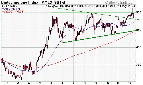
The chart pattern of the Biotech Index
(BTK) continues to show considerable upside potential (see chart below).
If the BTK drops back to around 450 we will seriously consider adding some
BTK call options and/or a biotech fund to the Stocks List.
Gold and
the Dollar
Gold Stocks
Newmont Mining (NYSE: NEM) has broken
below the bottom of the price channel that has defined its trend since
March of last year. A reasonable target for NEM over the next few weeks
is support in the $37-$40 range.
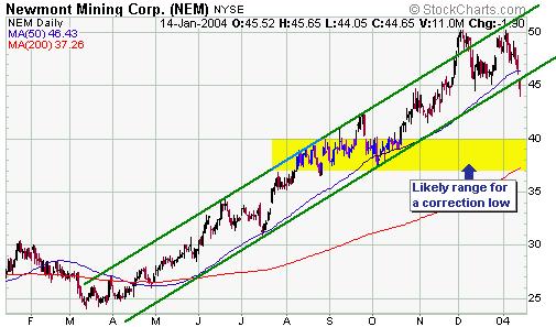
A drop to $37 by NEM would represent
a fall of about 17% from its current level and 26% from its December peak.
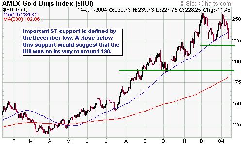
If we apply the same percentages to the AMEX Gold BUGS Index (HUI) we arrive
at a value of 190, which happens to correspond with a support level (see
chart below). In other words, 190 looks like a reasonable downside target
for the HUI over the next few weeks.
Our expectation is that the current
correction in the gold sector will be followed by a strong rally over the
ensuing 4 months or so. However, we doubt that this year's highs in the
popular gold-stock indices such as the HUI and the XAU will exceed last
December's peaks by a wide margin. In fact, we wouldn't be surprised if
the indices made lower highs. As discussed in previous commentaries, the
stocks that are likely to move well above last year's highs over the next
several months will mostly be the exploration/development-stage stocks
as well as the majors that didn't really participate in last year's rally
(for example, HMY, GFI, KGC).
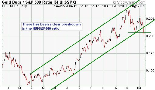
Even if the HUI does move to a new
high following the completion of the current correction, the recent breakdown
in the HUI/S&P500 ratio (see chart below) indicates that it might have
already peaked relative to the S&P500 Index.
Current Market Situation
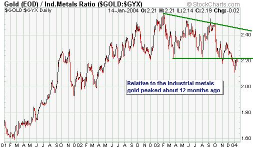
The below chart shows the current situation
for the gold/GYX ratio (GYX is an index of industrial metals prices). We
think gold has less short-term downside risk than the industrial metals,
but the chart is beginning to take on a longer-term bearish appearance
(bullish for the industrial metals relative to gold).
The 3-month gold interest rate is currently
0.07% (0.21% annualised), an absurdly low rate. In fact, no one in their
right mind would make a commercial decision to lend their gold bullion
for a 0.21% per year return unless earning an appropriate return wasn't
their main reason for lending the gold.
The lenders of gold bullion are the
central banks and the only reason why central banks would lend gold at
such low interest rates would be to put downward pressure on the gold price.
The problem they face with this strategy is that when gold is in a bull
market it makes no sense for anyone to borrow gold even if the interest
rate is zero percent. This is because a 0% gold loan would only be attractive
if there was good reason to be sure that the gold price was not going to
rise by more than a few percent over the term of the loan.
In any case, the central banks are
obviously making an effort to cap the gold price, just as they have done
for many decades and will no doubt continue to do for as long as the current
monetary system remains in place. We don't, however, spend any time worrying
about central bank intervention in the gold market because as long as the
interest rate and currency market trends remain gold-bullish the interventionist
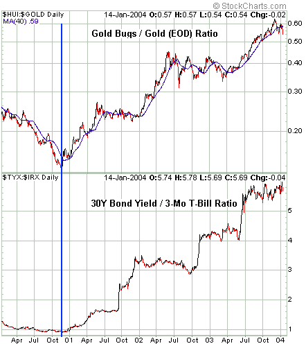
efforts of the CBs are just 'noise'. For example, take a look at the below
chart comparison of the HUI/gold ratio and the yield-spread (the yield
on the 30-year bond divided by the yield on the 3-month bill). In spite
of whatever attempts the CBs have made over the past few years to stem
the tide, as soon as the yield-spread began trending higher in November
of 2000 the trend for gold turned positive (as confirmed by an upturn in
the HUI/gold ratio).
As long as the yield-spread is trending
higher there won't be much danger of anything other than normal corrections
in the gold market. By the same token, anyone who thinks the gold price
is going to keep trending higher after the Fed eventually moves to reduce
the yield-spread (by forcing short-term rates higher relative to long-term
rates) is living in a fantasy world.
Below is a daily chart of February
gold futures. A daily close below the 18-day moving average (currently
at 418.50) would confirm that a correction was underway.

Update
on Stock Selections
 As
per the e-mail sent to subscribers during the early hours of Wednesday
morning (US time) we took a profit of 108% on North American Palladium
and a loss of 9% on the Kinross Gold warrants (refer to http://www.speculative-investor.com/new/stockemail.asp
for details) As
per the e-mail sent to subscribers during the early hours of Wednesday
morning (US time) we took a profit of 108% on North American Palladium
and a loss of 9% on the Kinross Gold warrants (refer to http://www.speculative-investor.com/new/stockemail.asp
for details)
Corvis
Corp. (NASDAQ: CORV) would probably turn out to be a fine long-term investment,
but we recommended the stock as a short-term trade at the end of last year
because it was a likely candidate to do well during any "January effect"
rally. At yesterday's closing price of $2.80 the stock has provided us
with a nice gain of 73% in less than 3 weeks. More upside is possible in
the short-term, but we are going to take our money off the table now.
There
is still significant short-term downside risk in the gold sector. Therefore,
although some good buying opportunities are already emerging we are going
to wait until we see some evidence that the correction is over before suggesting
any new gold stocks or reiterating buy recommendations on existing stock
selections.
The
Aflease stock price (Pink Sheets: AFKDY, JSE: AFL) has perked up over the
past few days, most likely because the company's uranium assets are starting
to get some attention. This stock should do extremely well once there is
some certainty with regard to the company's up-coming financing.
Chart Sources
Charts appearing in today's commentary
are courtesy of:
http://stockcharts.com/index.html
http://www.futuresource.com/
http://bigcharts.marketwatch.com/

|
