![]()
![]()
![]()
![]()
- Interim Update 16th August 2017
Copyright
Reminder
The commentaries that appear at TSI
may not be distributed, in full or in part, without our written permission.
In particular, please note that the posting of extracts from TSI commentaries
at other web sites or providing links to TSI commentaries at other web
sites (for example, at discussion boards) without our written permission
is prohibited.
We reserve the right to immediately
terminate the subscription of any TSI subscriber who distributes the TSI
commentaries without our written permission.
Commodities
Commodity Prices and the
War Cycle
Over the past few hundred years there has been a
relationship between the extent of global military conflict and secular
trends in commodity prices, with secular upward trends in commodity prices
coinciding with increases in both the frequency and amplitude of military
conflict. We've covered this topic in the past, but not recently. With the
North Korea drama at centre stage, this is a good time to revisit it.
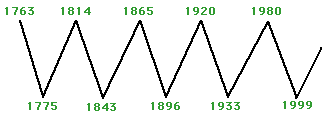
In his book "War Cycles Peace Cycles", Richard Kelly Hoskins discussed
the aforementioned relationship and presented a chart, similar to the one
displayed below, depicting the secular trends in commodity prices over the
past 250 years. He explained that most of the important military conflicts
occurred during the 'up phases' on the chart, and therefore referred to
the secular commodity-price uptrends as "war cycles". The secular
commodity-price downtrends were termed "peace cycles".
A plausible explanation for why long-term advances in commodity prices
are accompanied by a general increase in military conflict is that war
often entails rapid rates of monetary inflation and resource wastage --
the perfect recipe for higher commodity prices. There is also a feedback
mechanism whereby military conflict and the associated monetary inflation
bring about higher commodity prices, while higher commodity prices add to
international tensions and increase the probability of military conflict.
A new "war cycle" began with the secular low for commodity prices in
1999 and has been marked, to date, by the 9/11 terrorist attacks, the
Afghanistan and Iraq Wars, the nebulous "War on Terror", tensions
regarding Iran's (nonexistent) nuclear program, the "Arab Spring"
uprisings, the overthrow of Libya's government and that country's descent
into chaos, the rise of ISIS, heightened tensions between "the West" and
Russia initially stemming from conflict in Ukraine, a seemingly
never-ending war in Syria, China's provocative expansion in the South
China Sea, a host of minor conflicts and now the escalating threats of
aggressive military force that are emanating from the US and North Korea.
At this stage the current "war cycle" has lasted about 18 years, which
is 4 years shorter than the shortest one of the past 250 years. The
average length is 33 years, so the historical record suggests that we can
'look forward' to another 5-15 years of rising commodity prices and
increasing geopolitical instability.
Note, however, that
multi-decade cycles are mainly of academic interest. The reason is that
while they can provide an investor with a glimpse of what the future could
hold in store, they can't be traded. This is not only because they exceed
a normal investment timeframe by a great distance, but also because they
contain multi-year counter-trends that are big enough to make the
multi-decade trend irrelevant. The obvious example is that regardless of
the ultra-long-term bullish possibilities, it was costly to be heavily
exposed to commodity-related investments during the bulk of 2012-2015.
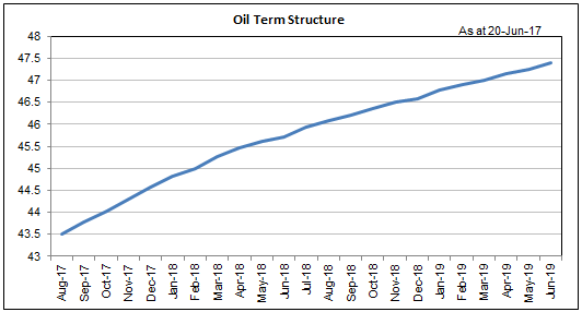
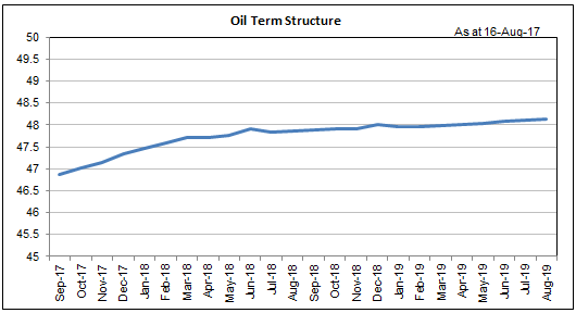
Oil's term structure is getting more bullish
For an industrial commodity with a large and liquid futures market, the
"term structure" in the futures market (a.k.a. the futures curve) is the
only reliable indicator of the supply-demand situation. It takes into
account reported inventories, unreported inventories, current production
and consumption, and estimated future production and consumption.
Generally speaking, an upward-sloping futures curve indicates a
well-supplied market and is the normal state of affairs, while a
downward-sloping futures curve indicates tightness of supply and is less
common.
As evidenced by the following two charts, over the past two
months there has been a bullish shift in oil's term structure (the charts
show the situation at 20th June and 16th August). The futures curve still
has an upward slope, but it is now flatter. This implies that oil's supply
situation has become a little tighter.
We are expecting an
intermediate-term rally in the oil price from whatever low is made over
the next three months.
The strange market for
junior resource stocks
It has been a strange market
environment for junior resource stocks over the past few months. In
general, companies that reported production problems or reduced their
production guidance were crushed in the stock market, even if the problems
appeared to be manageable. Also, in most cases the stocks of junior
producers that reported solid results have done no better than hold their
ground. At the same time, exploration-stage companies that reported good
exploration news have been rewarded in spectacular fashion.
The
best example in the last category is Novo Resources (NVO.V), which is yet
to discover anything of real economic value but is now being valued by the
stock market at around C$600M -- up from about C$100M just a few weeks ago
-- based on sampling results suggesting that it just might be on the verge
of a lucrative gold discovery. Another example is Camino Minerals (COR.V),
the stock price of which rocketed from C$0.30 to C$2.10 (a gain of 600%)
within the space of a few days in April in reaction to drilling results
that hinted at a significant copper discovery. It then gave back almost
all of this incredible gain in reaction to subsequent drilling results
that injected a dose of reality. A third example is Regulus Resources
(REG.V). REG's stock price gained 60% on Tuesday of this week in reaction
to a single drill hole with an impressive copper-gold intercept.
The highest-profile example in the first category is Asanko Gold (AKG),
which, despite the impression created by the collapse in its stock price,
has announced nothing more negative up until now than a 10% downward
revision to its 2017 guidance. Another example is Pretium Resource (PVG),
which has come under pressure not because of any reported production
issues but because it will need to raise some additional money in the near
future.
Two more examples in the first category that are worth
mentioning are Red Eagle Mining (R.TO) and TMAC Resources (TMR.TO), charts
of which are displayed below. The stocks of these junior gold producers
were pummeled within the past two months because they ran into unexpected
obstacles shortly after starting production. The obstacles may not be
serious and may be overcome within the next several months, but the real
problem is that they were encountered at a time when financial resources
were stretched. Red Eagle solved the problem by doing a dilutive equity
financing that greatly reduced the per-share value, whereas TMAC hasn't
yet solved the problem.
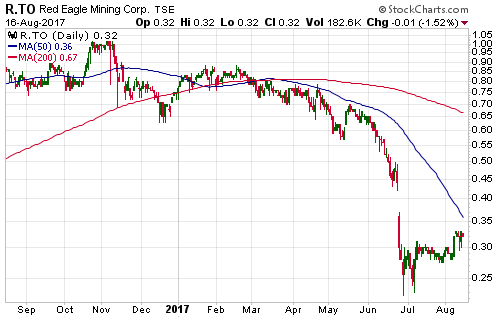
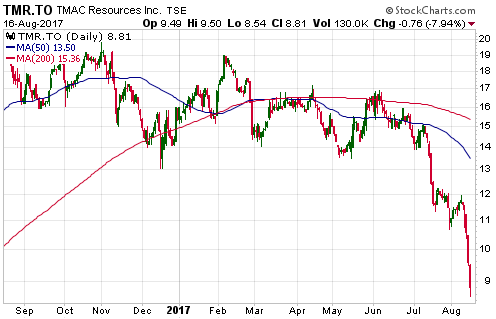
Exposure to the Red Eagle and TMAC sell-offs could have been avoided
by paying attention to each company's balance sheet. In general, it is not
a good idea to own the stock of a single-project mining company during the
months immediately after the project has been put into production IF the
company in question does not have a solid working-capital position.
Looking ahead, if explorers continue to get full value (and then some)
for positive drilling news it could be very good for US Gold Corp. (USAU),
the latest addition to the TSI Stocks List, because this company will
start reporting drilling results from its Keystone property before
year-end. Also, it will be even more important than usual to avoid the
stocks of construction-stage or production-stage companies with weak
balance sheets.
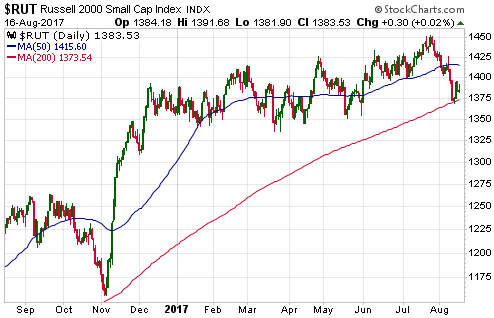
The Stock Market
The senior US stock indices are
yet to show any signs of weakness, but our short-term bearish outlook is
receiving encouragement from market internals, which have been
deteriorating, and signs of weakness in some of the lower-profile stock
indices. One of these lower-profile indices is the Russell2000 SmallCap
Index (RUT).
The RUT rocketed upward for about four weeks after the
Presidential election in early-November of last year, but for all intents
and purposes it has since traded sideways. It is now slightly lower than
it was at the peak of its post-election surge last December.
The
RUT pulled back quite sharply over the past 3-4 weeks, but began to
rebound after touching its 200-day MA late last week. It must close below
its 200-day MA to signal that something more serious than a routine
correction is happening.
Gold and the Dollar
Gold
In
the latest Weekly Update we guessed that a 1-2 week peak in the US$ gold
price had been put in place on Friday 11th August with the test of
resistance near $1300 or would be put in place during the first half of
this week via a short-lived spike above $1300. We don't yet know if this
guess was correct, because although the gold price dropped back to the
$1270s during the first two days of the week it returned to the $1290s on
Wednesday.
Due to the 2-day pullback, if gold were to now break
above $1300 the breakout would have a better chance of sticking.
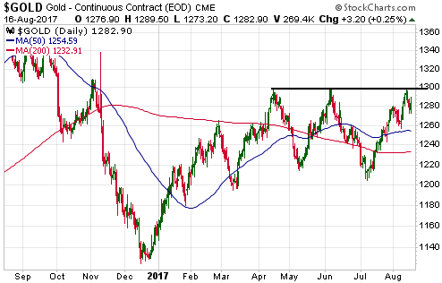
A sustained break above $1300 would create a chart-based target of
about $1400. This upside target looks realistic to us and could be
achieved as soon as October, but only if the S&P500 Index cooperates by
trending downward.
Gold Stocks
We are
becoming increasingly bullish about the short-term prospects for
gold-mining stocks. The gold-mining indices and ETFs have been oscillating
within narrowing ranges for more than 6 months, which suggests that
breakouts, when they finally happen, will have substantial follow-though.
There's still a risk that the breakouts will be to the downside, but
gold's price action and fundamentals suggest that upside breakouts are
more likely.
Within the narrowing ranges of the past 6+ months a
cyclical pattern has emerged. The best-defined aspect of this pattern
involves a short-term low every two months. These cycle lows are marked
with vertical black lines on the following daily chart of the HUI.
The next short-term cycle low is due in the first week of September.
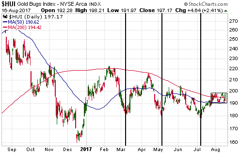
The cyclical pattern involving a short-term low every two months will
not continue indefinitely. In fact, it may no longer be in operation.
Fortunately, we should know within the next few days whether the cycle is
still in effect.
Over the past three weeks the HUI has oscillated
within a narrow horizontal range in the 190s. If it breaks downward from
this range -- by closing below 190 -- within the next few days then it
will be reasonable to assume that the cyclical pattern of the past 6
months remains in effect and that the gold sector is headed for an
early-September short-term low. Alternatively, if the HUI breaks upward
from this range -- by closing above 200 -- within the next few days then
it will be reasonable to assume that the cyclical pattern of the past 6
months has ended and that a rally to a new high for the year is underway.
In summary, we suspect that a rally by the HUI to a new high for
the year will begin following a decline to an early-September low or is
already underway.
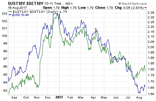
The Currency Market
The
euro and the Dollar Index (DX) are still primarily being driven by the
Germany-US interest-rate differential, with the difference between the
yield on the 10-year US T-Note and the yield on the 10-year German Bund
having the strongest influence. This is illustrated below.
The
following chart shows the strong positive correlation over the past year
between the DX (the blue line) and the US-Germany 10-year bond yield
differential (the green line). Notice that this year's only significant
divergence occurred during the second half of July, when the DX extended
its steep decline despite the bond-yield differential having turned in its
favour.
We expect both US government and German government bond yields to
trend upward over the coming 6-12 months. As far as these things go,
that's a high-confidence view. However, we are having a harder time
getting a handle on which yields will rise the fastest.
Updates on Stock Selections
Notes: 1) To review the complete list of current TSI stock selections, logon at
http://www.speculative-investor.com/new/market_logon.asp
and then click on "Stock Selections" in the menu. When at the Stock
Selections page, click on a stock's symbol to bring-up an archive of
our comments on the stock in question. 2) The Small Stock Watch List is
located at http://www.speculative-investor.com/new/smallstockwatch.html
![]() Quick
note on Artemis Resources (ARV.AX)
Quick
note on Artemis Resources (ARV.AX)
We introduced ARV in
last week's Interim Update as a way to participate in the recent potential
discovery by Novo Resources (NVO.V) without 'paying through the nose'. The
ARV stock price has since gained only 57%. We say "only" because NVO has
since gained 78%. ARV's upside may have been limited by the
option-exercise issue mentioned in our initial write-up (about 68M 2c
company options are due to expire at the end of September).
The
main reason for revisiting ARV at this time is to point out that the final
terms of the deal regarding the NVO-ARV joint venture, which were
announced by the companies during the first three days of this week, are
significantly better for ARV than the terms in the preliminary agreement.
Previously, NVO had to fund A$2M of spending to get a 50% stake in the
mineral prospects associated with the deal, but now it has to fund $2M of
spending and issue 4M of its shares to ARV. Based on the current NVO share
price, this means that the cost of NVO's participation in ARV's Karratha
prospects has risen from A$2M to A$22M. It also means that ARV now has
some exposure to any success NVO may have in the exploration it does
outside of the partnership with ARV.
Chart Sources
Charts appearing in today's commentary
are courtesy of:
http://stockcharts.com/index.html
![]()