|
- Interim Update 18th December 2013
Copyright
Reminder
The commentaries that appear at TSI
may not be distributed, in full or in part, without our written permission.
In particular, please note that the posting of extracts from TSI commentaries
at other web sites or providing links to TSI commentaries at other web
sites (for example, at discussion boards) without our written permission
is prohibited.
We reserve the right to immediately
terminate the subscription of any TSI subscriber who distributes the TSI
commentaries without our written permission.
Xmas and
New Year Schedule
We will be taking a break over the Christmas and New-Year
period. A Weekly Market Update will be published this coming Sunday
(22nd December), after which there will be no Weekly or Interim
Updates until the Weekly Update on 5th January. In other words, we
will be skipping three of our regular commentaries over the Holiday
period. We will, as usual, send out an email alert if something
dramatically unexpected happens in the markets and/or if we think
that immediate action is required with any of our positions.
What a
bubble looks like (and why gold's price action wasn't bubble-like)
One characteristic of an investment bubble is
dramatic upward price acceleration during the final 6-12 months of a long-term
advance, followed by a price collapse. Beware, however, that it is possible for
a price chart to create the impression of dramatic upward price acceleration
even though nothing of the sort actually occurred. The reason is that a
long-term advance at a steady annual percentage rate will look parabolic if
plotted using a linear scale.
Let's take the example of gold. The following long-term chart creates the
impression of dramatic upward acceleration into the 2011 price peak. It also
creates the impression of a price collapse following the 2011 peak. But this
impression is false, because it is solely due to the use of a linear scale for
the Y-axis. With this linear scale, a 10% rise in the gold price from $1500 to
$1650 looks five times bigger than a 10% rise in the gold price from $300 to
$330. The rise is of course five times bigger in nominal dollar terms, but it is
the percentage change that matters. Regardless of whether an investor buys gold
at $1500 and sells at $1650 or buys gold at $300 and sells at $330, he achieves
a 10% profit.
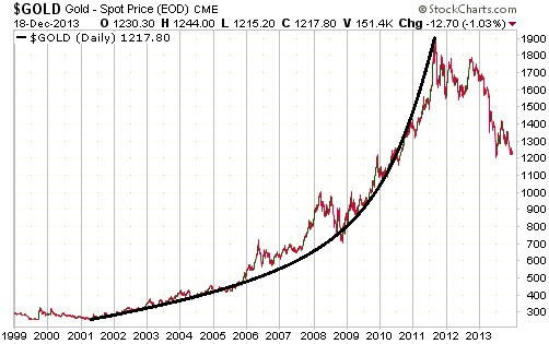
The above chart disguises the fact that the US$ gold price increased at a fairly
consistent annual rate from 2001 through to 2011 and has since experienced a
multi-year correction (as opposed to a collapse). The chart displayed below uses
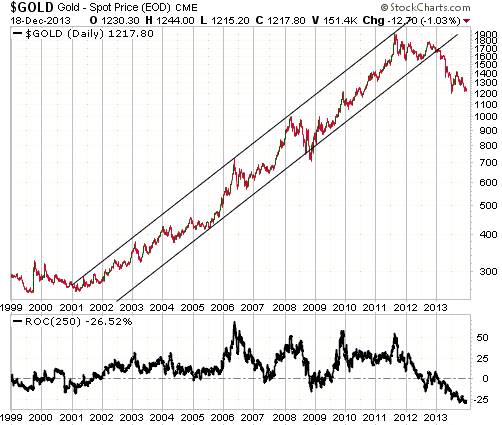
a log scale for the Y-axis and is a more accurate reflection of gold's long-term
performance, the reason being that with the log scale a 10% rise or fall from
one price will look the same as a 10% rise or fall from any other price.
Using the proper scaling technique we see that the gold price was extended to
the upside at its 2011 peak, but no more extended than it was at the 2008 peak
or the 2006 peak. In fact, the 250-day rate-of-change (ROC) included at the
bottom of the chart suggests that gold was slightly less 'overbought' at its
2011 peak than at its 2006 peak. It was a lot more expensive at the 2011 peak
than at earlier peaks, which is why the ensuing correction has been more
substantial, but there is no evidence of the dramatic upward price acceleration
typically seen during the final year of an investment bubble.
The next chart provides a clear contrast between gold's bubble-like performance
leading up to its 1980 peak and gold's non-bubble-like performance leading up to
its 2011 peak. The chart shows year-over-year percentage change.

While gold's price action hasn't provided evidence of a bubble at any time over
the past 10 years, the same cannot be said about oil. The following log-scaled
long-term chart reveals that oil's price action definitely displayed bubble-like
attributes during 2007-2009. First, there was dramatic upward price acceleration
during the final 12 months of a long-term advance, with the price more than
doubling and moving well above the top of both the very long-term upward-sloping
channel and the steeper/shorter-term upward-sloping channel on the log-scaled
chart. (Note: In response to the price action and the extremely high level of
the oil price relative to almost everything, we wrote in mid-2008 that in
inflation-adjusted terms the oil price was probably making a secular peak.)
Second, the 2008 price peak was followed by a spectacular collapse.
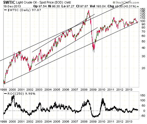
In conclusion, gold's price action leading up to its 1980 peak could reasonably
be interpreted as evidence of an investment bubble, as could oil's price action
leading up to its 2008 peak. However, to argue that gold's price action leading
up to its 2011 peak was evidence of a bubble an analyst would have to make the
basic mistake of ignoring percentage change.
The Stock Market
The Fed announced on Wednesday 18th December that it would begin
to "taper" the pace of its bond monetisation in January. The planned reduction
is from $85B/month to $75B/month.
The US stock market initially fell in reaction to the Fed news, but then moved
sharply higher due to the removal of uncertainty and the realisation that
"tapering" does not constitute tightening. After all, $75B/month of bond
monetisation is still a lot. $65B/month would also still be a lot, as would
$55B/month and $45B/month. We suspect that the Fed's "tapering" plans will be
short-circuited by blatant signs of economic weakness, but it's fair to say that
the Fed will be pumping money at a fast pace for many months to come even if the
January reduction in the pace of its money-pumping turns out to be the first of
many such reductions.
While it isn't reasonable to characterise a small reduction in the rate of Fed
money-pumping as tightening, it's possible that there will be a meaningful
tightening of US monetary conditions during the first half of next year IF the
Fed "tapers" AND the non-Fed monetary trends of the past several months persist
(the monetary trends we are referring to were discussed in the latest Weekly
Update). By way of further explanation, we point out that if all else remained
the same then every $10B/month reduction in the rate of the Fed's money-pumping
would, over the course of a year, reduce the year-over-year TMS (True Money
Supply) growth rate by around 1%. The year-over-year TMS growth rate was 7.9% at
the end of November and in a downward trend despite the Fed's $85B/month of new
money creation, which means that monetary conditions could become genuinely
tight -- in the context of a 'bubble economy' that now needs regular large doses
of new money in the same way that a heroin addict needs a regular fix -- by the
middle of next year.
Getting back to the stock market, the S&P500 Index (SPX) tested support at 1775
last week and spiked below this support in the immediate aftermath of the Fed
news before -- as noted above -- moving sharply higher. It is now testing its
high for the year.
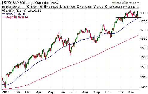
We will be very interested to see if the stock market can hold onto Wednesday's
gains over the remainder of this week. If it can do so it will mean that the
strong seasonal tail-wind is overcoming any bearish influences and that the
upward trend will probably continue until January.
At this time it would be premature to draw any conclusions from Wednesday's
price action.
Gold and the Dollar
Gold
Gold took the Fed news in stride on Wednesday 18th December, but then fell back
to near its low of the past three weeks in reaction to strength in the broad
stock market. There is a lot of economic optimism at the moment, with even the
Fed starting to believe that the bond monetisation has generated real,
self-sustaining growth.
Gold wasn't helped by the aggressive 'monetary accommodation' of the past 12
months and is unlikely to be hurt by whatever "tapering" occurs over the next
several months. In fact, the extent to which the gold market is now out of
favour paves the way for this market to rally as the Fed attempts to scale back
its money-pumping. That being said, the rally that takes gold to new highs will
probably be driven by the future monetary easing (QE5?) prompted by fear that
the economy is falling, or has fallen, back into recession.
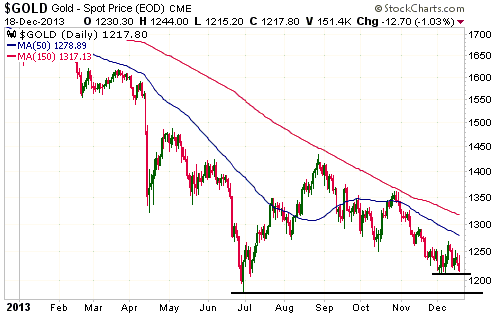
With regard to the very short-term outlook (the next couple of weeks), a
successful test of the June low remains likely. A break below the lows of the
past three weeks ($1210) would suggest that such a test was about to happen.
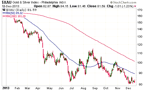
Gold Stocks
The XAU still hasn't closed below its 6th December low. The possibility that the
bear-market bottom will coincide with the 3-year anniversary of the bull-market
top is therefore still alive. However, there is nothing in the price action to
suggest that a sustainable upward reversal has occurred (a sustainable upward
reversal will probably be indicated by a sudden burst of strength), so the
ultimate low probably isn't yet in place.
From a long-term bull's perspective, the ideal price action would involve a
short-lived spike to a new low within the next two weeks.
Currency Market Update
The Dollar Index traded in a wide range in reaction to Wednesday's Fed news, but
ended up going nowhere. In the end it was a remarkable non-reaction to news that
was not widely expected.
Recent price action has helped to define a multi-month channel for the Dollar
Index that could be useful in assessing the short-term trend. The channel is
drawn on the following daily chart. Notice that the top of Wednesday's wide
trading range was slightly above the channel top and that a daily close above
80.7 would be an upside breakout.
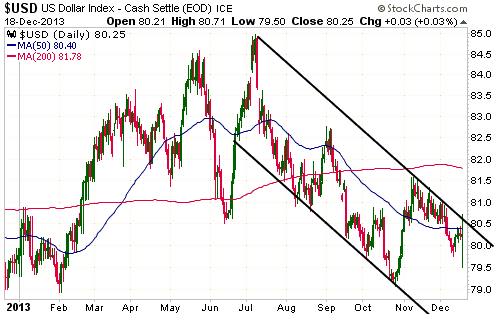
Most indicators of the Dollar Index's short-term risk/reward are neutral, but we
are short-term bullish due to the recent strength in large-cap US equities
relative to large-cap European equities. This short-term bullish view will now
be 'stopped out' if the Dollar Index closes below 79.5 (Wednesday's intra-day
low).
On an intermediate-term basis we remain "neutral". We plan to revisit our
intermediate-term outlook for the Dollar Index in the coming Weekly Update.
Update
on Stock Selections
Notes: 1) To review the complete list of current TSI stock selections, logon at
http://www.speculative-investor.com/new/market_logon.asp
and then click on "Stock Selections" in the menu. When at the Stock
Selections page, click on a stock's symbol to bring-up an archive of
our comments on the stock in question. 2) The Small Stock Watch List is
located at http://www.speculative-investor.com/new/smallstockwatch.html
Chart Sources
Charts appearing in today's commentary
are courtesy of:
http://stockcharts.com/index.html

|
