|
- Interim Update 20th November 2013
Copyright
Reminder
The commentaries that appear at TSI
may not be distributed, in full or in part, without our written permission.
In particular, please note that the posting of extracts from TSI commentaries
at other web sites or providing links to TSI commentaries at other web
sites (for example, at discussion boards) without our written permission
is prohibited.
We reserve the right to immediately
terminate the subscription of any TSI subscriber who distributes the TSI
commentaries without our written permission.
Inflation Expectations
The following chart shows a version of what we refer to as the
"Expected CPI". The chart shows the yield on the 10-year T-Note
minus the yield on the 10-year TIPS (Treasury Inflation-Protected
Security). In effect, the chart indicates the average rate of CPI
increase that the market expects the government to report over the
next several years. This is different from the expected rate of
currency depreciation, because most market participants aren't
gullible enough to believe that the change in the CPI is an accurate
reflection of the change in the dollar's purchasing power. However,
the direction of the Expected CPI's trend is probably a true
reflection of the direction in which the market's inflation
expectations are moving.
Despite the Fed's blatantly inflationary actions, the market's
inflation expectations fell during the first half of this year. We
confess to being puzzled by why this happened. Perhaps the average
market participant is more gullible than we thought. Inflation
expectations have since stabilised at a relatively low level.
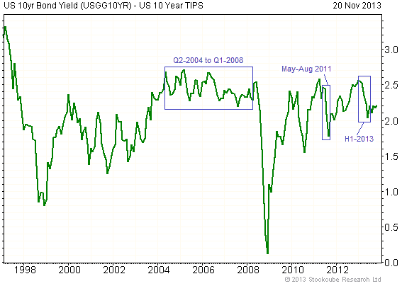
Chart Source:
www.fullermoney.com
This year's decline in inflation expectations was not the reason for
the sharp decline in the gold price, at least not the direct reason.
To back-up this comment we point out that the "Expected CPI" moved
in a narrow range with a slight downward bias from the second
quarter of 2004 through to the first quarter of 2008, a period
during which the gold market was in a major upward trend, and that
the moonshot in the gold price during May-August of 2011 occurred in
parallel with a plunge in the Expected CPI. However, gold was
indirectly hurt by this year's decline in the Expected CPI and the
subsequent stabilisation of inflation expectations, in that the
absence of both inflation and deflation fear points to widespread
confidence that central banks are providing just the right amount of
monetary accommodation.
This confidence is totally misplaced, because there is no 'right'
amount of monetary accommodation that can be applied to create a
sustainably stronger economy. The greater the amount of so-called
accommodation, the greater the resultant distortions and the more
severe the eventual economic downturn.
Industrial Metals Update
The following daily chart of the Industrial
Metals Index (GYX) attempts to illustrate that this index's price action since
June-2013 is a smaller-scale version of its price action from August-2012
through to March-2013. If the similarities persist, there will be a sharp
decline in GYX over the next three months.
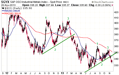
GYX's cyclical bear market is now almost three years old. It is therefore 'long
in the tooth' and probably not far from completion in terms of time, but the
price action suggests the potential for at least one more downward leg.
With the last two short-term rallies in GYX ending at or just below the 200-day
moving average, we would now consider a solid daily close above this moving
average as a clear sign that a bottom of intermediate-term importance was in
place.
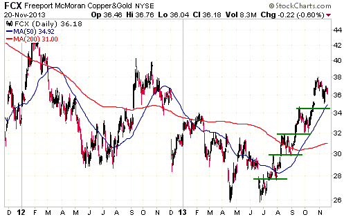
Despite the recent downside breakouts in GYX and the copper price, senior copper
producer Freeport McMoran (FCX) remains near its high for the year and has not
yet done anything to prove that its multi-month stair-step advance has ended.
The result is a large gap between FCX's stock price and the price of FCX's
product. This gap will have to be closed via either an upward reversal and rally
in the copper market or a substantial decline in the price of FCX shares. As
mentioned in last week's Interim Update, this makes a bearish FCX speculation
look interesting.
Note that a daily close by FCX below $34.50 would break the stair-step pattern
of the past 5 months and constitute evidence that something more than a routine
short-term pullback had begun.
 The Stock Market
The US
Recent price action has created a divergence that could be significant. We are
referring to the bearish divergence between the Russell2000 Small Cap Index
(RUT) and RUT's relative strength as measured by the RUT/SPX ratio.
As illustrated below, the RUT's most recent new high was not confirmed by the
RUT/SPX ratio. This is similar to what happened during the first quarter of
2012, just prior to the start of a 10% correction.
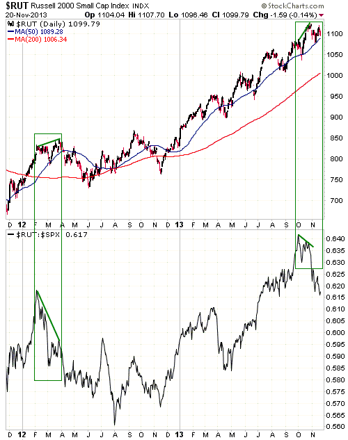
The US stock market remains in upside blow-off mode within the context of an
unusually long upward trend, but there isn't yet any clear-cut evidence of a
trend reversal; just a couple of warning signs such as the divergence noted
above.
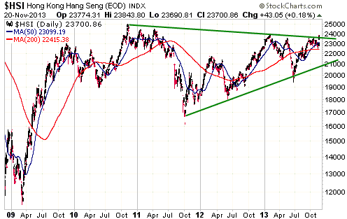
Hong Kong and China
Hong Kong's stock market, which is represented on the following daily chart by
the Hang Seng Index (HSI), has essentially gone nowhere since late-2009. The
price action could reasonably be interpreted as a 4-year flat consolidation.
There is now an early sign that this multi-year consolidation has ended. We are
referring to this week's move above a downward-sloping trend-line that dates
back to the final quarter of 2010. A weekly close above 24,000 would be a more
definitive sign that the HSI's major trend has shifted from sideways to up.
Whereas the HSI has gone nowhere since late-2009, China's stock market, as
represented by the Shanghai Stock Exchange Composite Index (SSEC), has trended
downward. Furthermore, this 4-year cyclical decline has been well-defined since
late-2010 by the channel lines drawn on the following daily chart. The SSEC is
presently testing the top of this channel.
A daily close of around 2300 would be evidence that an important trend change
had occurred.
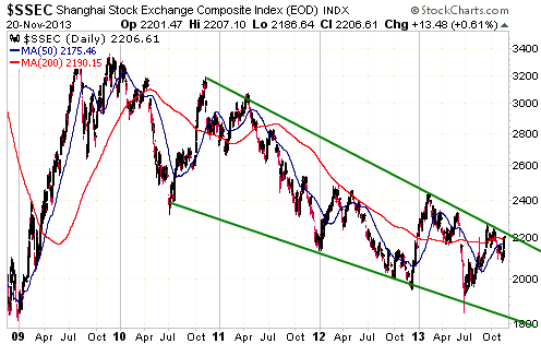
Due to the close economic ties between Hong Kong and China, it is almost
certainly not a coincidence that the HSI is showing early indications of
breaking out to the upside from a multi-year flat consolidation at the same time
as the SSEC is threatening to break out to the upside from a multi-year downward
trend.
A challenge is created by the fact that the US stock market is extremely
over-valued and in upside blow-off mode within the context of an old bull market
at the same time as some other important equity markets are showing early
indications of having just completed long-term consolidations or declines. It is
hard for us to imagine how the Hong Kong stock market could trend higher over
the next 12 months while the US stock market suffered a serious decline, but one
possible resolution would be for the Hong Kong market to trend higher while the
US market became directionless.
Gold and the Dollar
Gold and Silver
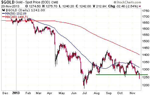
Gold's price action over the first three days of this week simplified and
clarified the situation, for two reasons. First, Wednesday's close below $1270
means that it is very likely that the gold price will drop to the vicinity of
its June low ($1150-$1200) within the next few weeks. Second, if the gold price
now does the unexpected and quickly moves decisively back above $1270 it will
mean that Wednesday's downside breakout was false. False downside breakouts are
reliable bullish signals, especially when they are preceded by lengthy declines.
To be more specific, it is reasonable to assume that gold is headed for a test
of its June low. However, this assumption would be proven wrong by consecutive
daily closes above $1280. In other words, as a result of this week's market
action the price level at which an upward trend reversal would be confirmed is a
lot lower than it was at the end of last week.
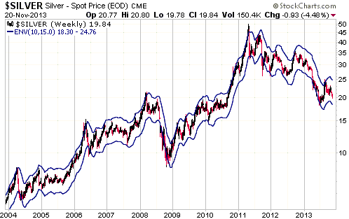
Below is a weekly silver chart with a 10/15 moving-average envelope (a 15%
envelope around the 10-week moving average). We've found this moving average
helpful in identifying short-term buying and selling opportunities in the silver
market. The reason is that except when silver is immersed in a crash or a major
upside blow-off, it usually reverses direction shortly after reaching the top or
the bottom of this envelope.
The bottom of the envelope is presently at $18.30 and will get a bit lower each
day. Our current plan is therefore to buy some silver bullion if we get the
opportunity to do so in the low-$18s within the next few weeks.
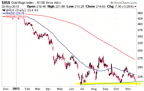
Gold Stocks
As we've mentioned many times, there has been a tendency for the gold sector to
turn higher or lower on an intermediate-term basis during the October-November
period. For a while it looked like we were going to get an October low this
year, but this week's break below support by gold bullion means that the
gold-stock indices are probably yet to make their ultimate lows. A downward
spike to the ultimate low is likely within the next few weeks.
If there is immediate follow-through to the downside in reaction to Wednesday's
breach of support by gold bullion then the gold-stock indices could bottom
within the next four trading days, creating another important extreme in the
traditional October-November turning-point window. However, some consolidation
or a small rebound over the next few days would probably push the final low into
December or early January.
In other words, we are close, but we are not there yet.
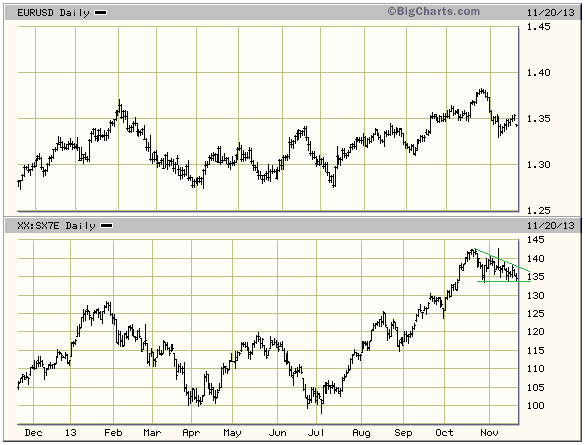
Currency Market Update
Short-term trends in the euro over the past three years have mostly been
determined by two factors: the performance of large-cap European stocks relative
to large-cap US stock and the absolute performance of the European banking
sector. The second of these relationships is charted below, with SX7E (the EURO
STOXX Banks Index) acting as our proxy for European bank stocks.
The recent pullback in the euro has gone with what could be either a short-term
consolidation or a topping pattern in the SX7E. A daily close by SX7E above 138
would suggest the former and imply that the euro was probably also experiencing
nothing more than a short-term consolidation, whereas a daily close by SX7E
below 132 would suggest the latter and imply that the euro had probably
commenced a multi-month decline.
Update
on Stock Selections
Notes: 1) To review the complete list of current TSI stock selections, logon at
http://www.speculative-investor.com/new/market_logon.asp
and then click on "Stock Selections" in the menu. When at the Stock
Selections page, click on a stock's symbol to bring-up an archive of
our comments on the stock in question. 2) The Small Stock Watch List is
located at http://www.speculative-investor.com/new/smallstockwatch.html
Chart Sources
Charts appearing in today's commentary
are courtesy of:
http://stockcharts.com/index.html
http://bigcharts.marketwatch.com/
http://www.fullermoney.com/

|
