|
- Interim Update 22nd March 2006
Copyright
Reminder
The commentaries that appear at TSI
may not be distributed, in full or in part, without our written permission.
In particular, please note that the posting of extracts from TSI commentaries
at other web sites or providing links to TSI commentaries at other web
sites (for example, at discussion boards) without our written permission
is prohibited.
We reserve the right to immediately
terminate the subscription of any TSI subscriber who distributes the TSI
commentaries without our written permission.
Notes
1. On the right-hand side of the TSI Home Page (www.speculative-investor.com)
is a box that notes the date at which each part of the web site -- the
Weekly Market Update, the Interim Update, the Stock Selections page,
etc. -- was last updated. Therefore, one question a subscriber should
never have to ask us is: "Has there been a commentary since
such-and-such date?"
2. Most people have been forced by the proliferation of junk e-mail to
take steps to prevent their inbox from becoming cluttered with unwanted
mail. These steps, however, will sometimes result in the non-receipt of
legitimate e-mails.
Please note that if you don't receive a TSI e-mail notifying you that a
commentary has been posted at the web site you can still access the
commentary at any time by logging on at http://www.speculative-investor.com/new/market_logon.asp
The Stock Market
How prescient is the stock market?
...the
stock market is like a manic-depressive 600-pound gorilla; you really
don't want to get in its way when it is on the rampage, but you
shouldn't automatically assume that its chosen path will prove to be
prescient.
The way some analysts talk you'd think the stock market was all-knowing
and all-seeing. However, while the performance of the stock market can
provide us with clues as to future fundamental developments, a lot of
the time the market is wrong. What we mean is that the market spends a
lot of its time being either very under-valued or very over-valued.
This is why the stock market's history involves huge rallies followed
by huge declines (the market moves a long way in one direction,
realises it has gone way too far, and then moves in the opposite
direction until once again it figures out that it has gone way too far,
and so on). It is also why Warren Buffett was able to amass such a huge
fortune (Buffett got rich by exploiting the stock market's tendency to
be wrong about companies' future prospects).
For example, at the 'bubble peak' in 2000 the stock market's assessment
of the future was so bright that it was prepared to assign a multiple
of 40 -- almost 3-times the long-term average -- to the 12-month
trailing earnings generated by S&P500 companies. However, rather
than earnings growing rapidly to justify stock prices, stock prices
ended up plunging in response to falling growth and the gradual
recognition that valuation levels were ridiculously high.
Our view is that the stock market is like a manic-depressive 600-pound
gorilla; you really don't want to get in its way when it is on the
rampage, but you shouldn't automatically assume that its chosen path
will prove to be prescient. We think it is appropriate to look to stock
market action for information on such things as whether investors are
becoming more or less risk averse and other changes in investor
attitudes/preferences, but we don't think it makes sense to defer to
the stock market when trying to forecast what the business environment
is going to look like in the future.
A major trend change in the works?
...the focus of investment demand might actually be in the process of shifting from the oil sector to the airline sector.
We've previously referred to the AMEX Airline Index (XAL) as the
"anti-oil index" because airline stocks usually trend in the opposite
direction to the oil price almost regardless of what else is happening
in the financial world. With this in mind, it is not surprising that
the powerful upward trend in the oil price over the past 2 years has
been accompanied by weakness in the XAL in absolute terms and extreme
weakness in the XAL relative to the AMEX Oil Index (XOI). Furthermore,
it would not be surprising if these trends continued for many years to
come because, as everyone knows, the long-term outlook for oil stocks
is incredibly bullish whereas the long-term outlook for airline stocks
is incredibly bearish.
What everyone knows is often not worth knowing, however, and the
following charts show that the focus of investment demand might
actually be in the process of shifting from the oil sector to the
airline sector. To be specific, the first chart shows that the XAL --
the "anti-oil index" -- is close to breaking upward from a 2-year
consolidation, while the second chart shows that it wouldn't take much
additional weakness in the XOI relative to the XAL to signal an end to
the major upward trend that began during the second half of 2003.
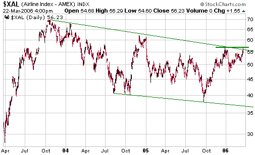
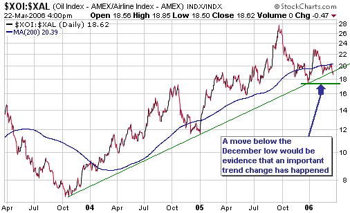
We would interpret a
break below the December-2005 low by the XOI/XAL ratio as an indication
that oil stocks were probably going to under-perform airline stocks for
an additional 3-6 months. However, if oil is in a secular bull market
-- we are confident that it is -- then the downward move in XOI/XAL
that began last September will prove to be a correction within a
longer-term upward trend.
Current Market Situation
...a peak is likely to soon occur, but a downward trend in the broad market has clearly not yet begun.
The NDX/Dow ratio is a reliable leading indicator of the overall US
stock market, and it turned down in January. Downward reversals in the
NDX/Dow's intermediate-term trend usually lead downward reversals in
the overall market by 1-3 months, so the January downturn in this ratio
projected a top for the S&P500 Index during March or April. Due to
the tendency for important turning points to occur in March, we are
presently within the most likely timeframe for a peak.
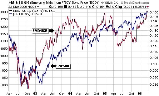
The EMD/USB ratio -- the price of the Emerging Market Income Fund
divided by the US Treasury Bond price -- is a reliable coincident
indicator of the US stock market, and it has just hit new multi-year
highs. The following chart illustrates the relationship between the
S&P500 Index (shown in blue) and EMD/USB. (EMD/USB is, in effect, a
way of measuring emerging market credit spreads. When confidence is
rising the investment demand for emerging market bonds tends to
increase relative to the investment demand for US T-Bonds, causing the
EMD/USB ratio to move higher.)
The bottom line is that a peak is likely to soon occur, but a downward
trend in the broad market has clearly not yet begun. When an
intermediate-term decline does begin it should be accompanied by a fall
in the EMD/USB ratio.
There's some additional discussion on the stock market outlook in the
"Updates on Stock Selections" section of today's commentary.
Gold and
the Dollar
Gold and Silver
Gold has been consolidating since early February and has, we think,
about $40 of short-term downside risk. A drop below $520 would create a
short-term buying opportunity.
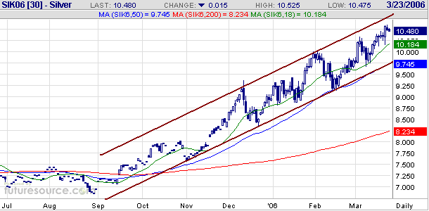
Silver continues to grind higher within the price channel that began to
form last September (refer to the following daily chart of May silver
futures for details). It was very strong on Tuesday on the back of news
that the Barclay's silver ETF is probably going to become a reality,
but while making it easier for investors to obtain exposure to silver
is a long-term bullish development for the metal we don't see it as a
bullish development in the short-term. For one thing, the fact that the
SEC appears ready to approve the silver ETF suggests that the managers
of the ETF have been able to obtain a substantial amount of physical
silver which may not have previously been available to the market to
satisfy investment demand.
If/when the silver ETF begins trading we think it will make more sense
for investors to accumulate the ETF rather than shares of companies
such as Pan American Silver, Silver Standard Resources and Silver
Wheaton. The reason is that physical silver stands a good chance of
out-performing the larger-cap silver stocks over the next several years
for the same reasons (discussed in previous commentaries) that physical
gold stands a good chance of out-performing the larger-cap gold stocks.
The stocks of junior gold/silver producers and exploration-stage
companies are a different 'kettle of fish' and should be accumulated on
weakness.
Also, bear in mind that if a silver ETF begins to trade in the US then
the premium over net asset value at which Central Fund of Canada (AMEX:
CEF) currently trades will probably drop to almost zero. This means
that the listing of the new silver ETF could lead to a fall of around
9% (the current CEF premium) in the price of CEF assuming no change in
the silver price.
Gold Stocks
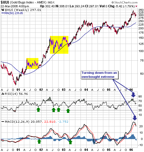
The correction in the gold sector that began at the end of January can,
we think, be likened to the intermediate-term corrections that began in
May of 2001 and June of 2002 (the highlighted areas on the following
weekly chart of the HUI). These previous corrections didn't end until
after the weekly RSI had dropped to 40-45 and the weekly MACD had
dropped to around zero (the RSI and the MACD are shown at the bottom of
the chart, with green arrows pointing to the oversold extremes). It is
reasonable to expect that the aforementioned momentum indicators will
reach similar levels before the current correction comes to an end.
As mentioned in a previous commentary, we think the current correction
requires additional time more than additional price deterioration (we
think the HUI's short- and intermediate-term downside risk from its
current level is around 10%). Sentiment towards the gold sector just
isn't bullish enough for there to be a major liquidation.
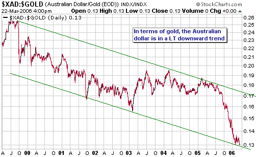
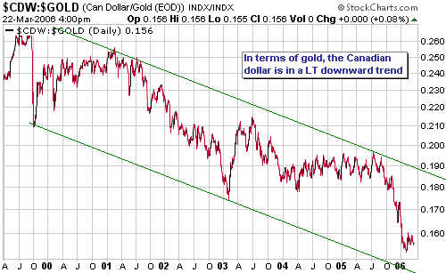
Currency Market Update
Over the past two years the Canadian dollar has been very strong
relative to the Australian dollar and for the two years before that the
A$ was very strong relative to the C$. However, the following charts
show that both currencies are in long-term declines relative to gold.
Both currencies are weak, but there are periods when the A$ is weaker
than the C$ and other periods when the C$ is weaker than the A$.
Over the next 6 months we think the C$ will be significantly weaker
than the A$, for two reasons. First, in gold terms the A$ has just
reached the bottom of its long-term downward-sloping channel whereas
the C% is still about 10% below the bottom of its channel. Second, we
think oil will, at best, keep pace with the CRB Index over the
remainder of this year, and as explained in the latest Weekly Update
the C$'s relative strength over the past two years has coincided with
strength in oil relative to the CRB Index.
Update
on Stock Selections
 For
those who are interested in buying put options in order to speculate on
a sizeable correction in the US stock market over the coming two
quarters, our suggestions are to accumulate the DJX (Dow Industrials
Index) Dec-06 $108 put options (DJVXD) and the QQQQ (an ETF that tracks
the NASDAQ100 Index) Jan-07 $42 put options (VCQMP). The aforementioned
QQQQ puts are already in the TSI Stocks List and we will now add the
aforementioned DJX puts to the List at Wednesday's closing price of
$2.40. Note that the DJX Dec-06 $104 puts are already in the List, but
the $108 puts look like better buys at this time. For
those who are interested in buying put options in order to speculate on
a sizeable correction in the US stock market over the coming two
quarters, our suggestions are to accumulate the DJX (Dow Industrials
Index) Dec-06 $108 put options (DJVXD) and the QQQQ (an ETF that tracks
the NASDAQ100 Index) Jan-07 $42 put options (VCQMP). The aforementioned
QQQQ puts are already in the TSI Stocks List and we will now add the
aforementioned DJX puts to the List at Wednesday's closing price of
$2.40. Note that the DJX Dec-06 $104 puts are already in the List, but
the $108 puts look like better buys at this time.
We think it's good to hold a mixture of QQQQ and DJX puts because the
NASDAQ100 Index tends to be the weakest of the major US stock indices
in the early stages of an intermediate-term decline whereas the Dow
Industrials Index tends to be the weakest index near the end of a
decline. In other words, the Dow tends to lag the NDX and then make a
catch-up move. This also tends to happen during intermediate-term
rallies, which is why we have recently seen the Dow making new
multi-year highs while the NDX languishes well below its January peak.
We caution now, as we've done many times in the past, that there is
invariably a lot of risk associated with speculations in
out-of-the-money options (most of the time the options expire
worthless). As a consequence, we always limit the MAXIMUM amount of
money we have at risk across ALL option speculations to the maximum
amount we could write-off in full without losing any sleep. For us,
this amount is about 5% of total portfolio value.
To give you an idea of how we view the situation, the current allocation across our own accounts is roughly as follows:
- commodity-related stocks and stock warrants (primarily exploration-stage gold and silver stocks): 40-45%
- other stocks: 5-10%
- cash (primarily US$): 40-45%
- gold bullion: 5%
- options (primarily DJX and QQQQ put options): 3%
Note that the above allocation is not a recommendation and is not
necessarily (is probably not, actually) the best way for YOU to be
positioned.
We might boost our put option exposure a bit over the next couple of
weeks, but as long as we maintain a sizeable core holding of gold and
commodity stocks we will be at risk of experiencing a significant
draw-down in portfolio value if the broad stock market tanks because
gold and commodity stocks, having rallied with the broad market over
the past 10 months, would most likely be taken down in a broad-based
decline. However, this is a risk we can't avoid if we want to remain in
synch with the secular upward trends. An alternative would be to
dramatically reduce our core investment position in gold stocks, but in
our opinion this would expose us to a much greater risk. Another
alternative would be to build-up a much larger put-option position, but
then we would have a big problem if the market did NOT drop.
As things stand, we expect that the put options we own will partially
offset losses elsewhere in our portfolio in the case of a large stock
market decline. The effect on our portfolio of such an outcome will
also be mitigated by our cash position. On the other hand, if a large
stock market decline does not materialise it will probably be because
central banks back away from their monetary tightening programs and
facilitate another deluge of liquidity. In this case we would have to
write-off our put options, but in such circumstances the gold price
would probably move well above $600 and our exploration-stage gold
stocks would go berserk; that is, profits on the gold stocks would
probably be many times the losses on the put options. The point is,
someone who has a substantial core position in gold stocks and who is
also making a modest bet against the stock market need not be concerned
that they will be wrong about a stock market decline.
Our current plan is to reduce our cash position and correspondingly
increase our gold bullion and exploration-stage gold stock exposure
over the coming 6 months. Over the coming 12 months we will also likely
change the make-up of our cash position (we expect to greatly reduce
US$ exposure in favour of the Yen and the A$).
Obviously, we are not big fans of diversification (in the usual meaning of the word).
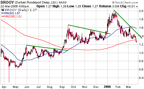
A few weeks ago we mentioned that the US$1.20s would be a reasonable
price-area to accumulate DRDGold (NASDAQ: DROOY). The stock has reached
our suggested buy area so investors could consider doing some buying
right now. Traders, however, might want to hold-off on buying until
there is a break of the downward-sloping trend-line drawn on the
following chart. A break of this trend-line would be evidence that a
correction low was in place.
DROOY is very under-valued relative to the average mid-tier gold stock
and sells at a large discount to Harmony Gold, the company with the
most comparable set of assets.
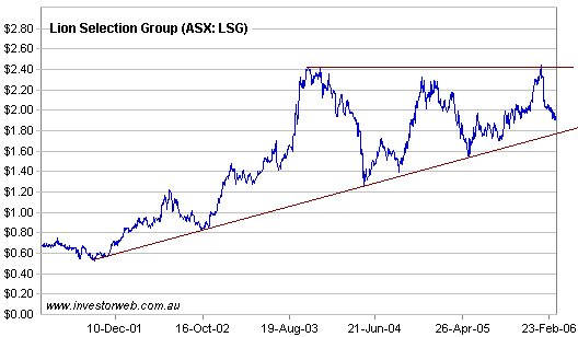
In a previous commentary we said we would add Australian-listed Lion
Selection Group (ASX: LSG) to the TSI Stocks List if it traded at
A$1.85. This price was chosen because it is just above long-term
support (see chart below) and was therefore a likely place at which an
intermediate-term correction would bottom. The stock traded as low as
A$1.88 today and closed at A$1.90, which is close enough to our
suggested buy price. LSG has therefore been added to the Stocks List at
today's closing price.
Just to recap, LSG is effectively an exchange-traded fund that invests
in Australian-based exploration-stage metal (primarily gold) stocks.
The company typically makes its investments in junior miners by
providing financing in exchange for equity.
By our reckoning, LSG is currently trading at around a 10% discount to its net asset value.
Chart Sources
Charts appearing in today's commentary
are courtesy of:
http://stockcharts.com/index.html
http://www.futuresource.com/

|