|
- Interim Update
22nd October 2014
Copyright
Reminder
The commentaries that appear at TSI
may not be distributed, in full or in part, without our written permission.
In particular, please note that the posting of extracts from TSI commentaries
at other web sites or providing links to TSI commentaries at other web
sites (for example, at discussion boards) without our written permission
is prohibited.
We reserve the right to immediately
terminate the subscription of any TSI subscriber who distributes the TSI
commentaries without our written permission.
Global
Monetary Inflation Update
On an economy-wide basis there can
never be a sustained shortage of money, because the purchasing power
of money adjusts to whatever the supply happens to be. Furthermore,
any supply of money is just as good as any other supply of money. In
other words, there is no correct supply of money, there is no need
for the supply of money to grow with the economy and/or the
population, and there is never any benefit to be gained by
increasing the money supply. Problems, however, will often arise due
to rapid changes in the supply of money. Over the past 6 years there
has been substantial growth in the global supply of money, which is
part of the explanation for why a sustained improvement in global
economic growth has been so elusive.
The reason that there has been rapid growth in the global supply of
money is that all central banks are run by people who believe that a
weak economy can be strengthened by pumping in more money. This
belief is so ingrained that it hasn't been even slightly dented by
consistent failure. Instead, the failures are taken as evidence that
even more money needs to be injected. The result is that in the face
of sluggish economic performance, almost every central bank in the
world is either maintaining or attempting to create 'ultra-easy'
monetary conditions. The following charts show the effects of these
efforts on the money supplies of the US, Japan, Australia, Canada
and Hong Kong. The euro-zone's monetary situation will be dealt with
separately after the ECB publishes its September data late this
month.
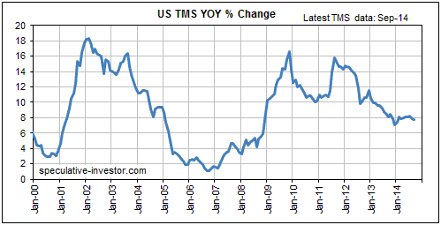
Our first chart shows the year-over-year (YOY) percentage change in
US True Money Supply (TMS). The growth rate in US TMS was 7.7% at
the end of September, which is up from 7.0% in January.
This year's increase in the pace of US monetary inflation is due to
faster money creation by US-based commercial banks more than
offsetting slower money creation by the Fed, but it should be
understood that the changes have been small. In effect, the US
monetary inflation rate has flat-lined over the past 12 months at a
rate that is above the long-term average, but well below the highs
of the early-2000s and 2009-2012.
It's possible, but by no means certain, that the TMS growth rate has
fallen far enough to usher-in the inevitable period when the
mal-investments of the boom years are exposed for all to see.
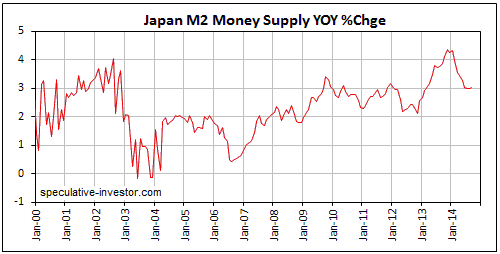
Our second chart shows the YOY percentage change in Japan's M2 money
supply. The growth rate in Japan's M2 has fallen from around 4.3% to
3.0% over the course of this year to date and looks set to move a
little lower over the next couple of months. This means that despite
popular opinion to the contrary, Japan continues to have the world's
lowest monetary inflation rate. Unfortunately, the BOJ is trying
hard to eliminate the saving grace of low "inflation", and Japan's
government, despite a 20-year record unblemished by success,
continues to apply the same old Keynesian 'remedy' that involves
piling more debt onto a mountain of existing debt.
Our third chart shows the YOY rate of supply growth in the
Australian Dollar, one of the world's two main "commodity
currencies".
Australia's TMS growth rate is now at 13.3%, which is its highest
level since Q3-2008. The difference is that in Q3-2008 the TMS
growth rate was in the midst of a steep decline from a 2007 high of
more than 25%, whereas it is currently in an upward trend.
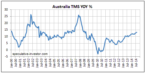
The most obvious sign of Australia's high average rate of monetary
inflation is the country's residential property bubble. Another sign
is the high and quickly-rising cost of living. However, the
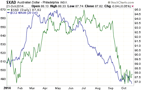
following chart comparing the year-to-date performances of the CCI
(in blue) and the A$ (in green) shows that the commodity price trend
is still having a much greater influence on the A$'s exchange rate
than the long-term fundamental negatives linked to rapid monetary
inflation. This means that when the commodity price trend next
reverses course and begins trending upward, the A$ will probably
follow.
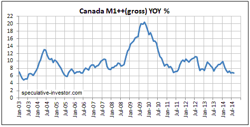
Our fourth money-supply chart shows the YOY rate of supply growth in
the Canadian Dollar, the other main "commodity currency". Canada's
monetary inflation rate has oscillated less wildly than the monetary
inflation rates of most countries over the past several years.
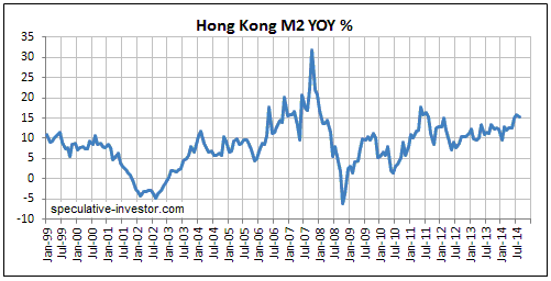
Our final chart shows the YOY percentage change in Hong Kong's M2
money supply. The monetary situation depicted by this chart is, we
think, part of the explanation for the widespread discontent that
prompted hundreds of thousands of Hong Kong residents to take to the
streets in protest. The primary grievances of the protestors are
political, not economic, but the problems caused by the high average
rate of monetary inflation over many years have almost certainly
magnified the political grievances. The problems we are referring to
are the ridiculously high cost of housing (to buy or to rent) and
the generally high cost of living. Unfortunately, we doubt that even
one in one-thousand of the protestors understands the underlying
cause of these problems.
With Hong Kong's money supply having grown by 15% over the past 12
months, bigger problems lie ahead.
The Stock Market
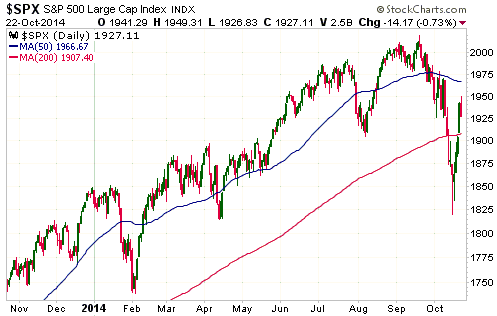
Our view was (and is) that the S&P500 Index (SPX) made a
multi-week low last week and would probably retrace 50%-100% of the initial
decline from its September peak before resuming its downward trend. This implied
an expected rebound target of anywhere from 1920 to the low-2000s.
With the first part of the rebound from last week's low having made it as high
as 1949 on Wednesday 22nd October, an eventual move up to around 2000 is
certainly possible before the resumption of the downward trend. However, there
is a risk that the rebound will end sooner than expected. That's why, in a blog
post prior to the start of US trading on Tuesday, we said that we would probably
start establishing a new SSO (Ultra S&P500 ETF) put-option position if the stock
market opened strongly on Tuesday. As it turned out, we placed an order for some
SSO puts after the market opened strongly on Tuesday, but the below-the-market
order didn't get filled until the early-going on Wednesday.
We therefore have a new 'starter position' in SSO put options. Since the purpose
of this starter position is to provide coverage in case the market immediately
reverses downward, we went for January-2015 rather than January-2016 puts. Our
intention is to buy the longer-dated (January-2016) SSO puts if the overall
rebound extends into early-November, which currently looks likely. Note that
this is what we are doing with regard to our own money management and is not a
TSI recommendation.
It isn't obvious when looking at the following daily chart, but important
resistance for the SPX lies at 1972. The reason is that 1972 was the September
closing level. Even if the overall rebound is destined to take the SPX back to
around 2000, the October close needs to be below 1972 in order to establish
consecutive down months for the first time in more than two years. This is
another way that the decline from the September peak could differentiate itself
from a routine bull-market pullback. In other words, to provide further
validation of our bearish outlook the SPX must be lower than 1972 at the end of
next week.
Gold and the Dollar
Gold
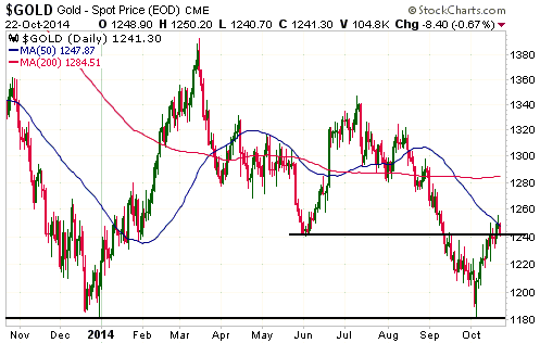
The US$ gold price broke above important lateral resistance in the low-$1240s on
Monday and then pulled back to test the breakout on Wednesday.
The upside breakout by gold bullion is suspect because it hasn't been confirmed
by either silver or the gold-mining indices. Silver would have to close above
$17.70 and the HUI would have to close above 202 to confirm the recent strength
in gold.
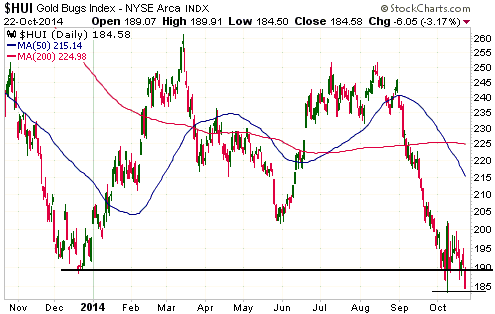
Gold Stocks
An early bout of tax-loss selling
This has been a dismal week for the gold-mining sector, especially considering
that gold bullion broke above resistance in the low-$1240s on Monday. Wednesday
in particular was bad, with several junior gold-mining stocks that had
previously held up quite well suddenly falling sharply. In fact, Wednesday 22nd
October was one of the worst days of the past 12 months for the junior gold
stocks that we follow and own. Many were down by 5%-10%, for no fundamental
reason that we could determine (the small increase in the gold price over the
preceding two days actually meant that the fundamental backdrop for gold mining
improved a little). Furthermore, some stocks (AAU and TGM.V) fell sharply on
Wednesday after announcing positive news the preceding day.
Wednesday's substantial and indiscriminate weakness at the junior end of the
gold-mining sector is probably the result of tax-loss selling.
Tax-loss-selling's effect on small-cap stocks is usually most evident during
December due to retail investors exiting losing positions before the end of
their financial year (31st December in the US and Canada), but it can also have
a significant effect in mid-to-late October due to the actions of hedge and
mutual funds. This is because 31st October is the financial year-end for many
funds.
Current Market Situation
The HUI dropped back to its 8th October low (its low of the year) on Wednesday
22nd October. This could turn out to be a successful test of the low, but it's
just as likely that there will be some additional downside prior to a sustained
reversal.
This excerpt from the latest Weekly Update remains applicable:
"We continue to believe that even if gold bullion is destined to make a
short-lived move below its $1180 triple bottom during the first half of next
year (anything more than a short-lived move below $1180 is unlikely), the
gold-mining sector is in the process of bottoming now. The sentiment-depressing
downward drift could continue for a few more weeks or it could end this week.
Either way, purchases made near current levels are likely to be in profit within
three months."
Mining stocks affected by the Ebola outbreak
There have been isolated cases of Ebola reported in several countries, including
the US. However, at this stage only three West African countries have enough
reported cases to warrant the term "outbreak". The countries are Liberia, Guinea
and Sierra Leone, with Liberia being the worst affected.
We have no current interests in any mining companies operating in the
aforementioned three countries, but some of the companies in the TSI Stocks List
operate in other West African countries. Specifically, Asanko Gold (AKG),
Endeavour Mining (EDV.TO), Golden Star Resources (GSS), True Gold Mining (TGM.V)
and Resolute Mining (RSG.AX). The operations of these companies have not yet
been affected by Ebola and the risk that they will be affected is small, but
even if the companies' operations aren't adversely affected it's possible that
Ebola-related fear will lead to further declines in their stock prices.
It's difficult to tell if any of the above-mentioned stocks have been affected
to date by Ebola-related selling pressure because the entire gold-mining sector
is 'down in the dumps', and these stocks, as a group, haven't fared worse than
the overall sector. Having said that, the relatively poor performance of RSG.AX
over the past few weeks could be related to Ebola. RSG's most important asset is
located in Mali, which, as illustrated by the following map, shares a border
with Guinea (one of the three worst-affected countries). Also, even though it
hasn't underperformed, the stock price of EDV.TO could have been held back by
Ebola-related fear. One of EDV's four mines is located in Mali, which borders
Guinea, and another is located in Cote d'Ivoire, which borders Liberia and
Guinea. The assets of the other companies mentioned above are located in Ghana
and Burkina Faso, which means that they are further removed from the current
outbreak.

At this time we have no plans to make any changes to the TSI Stocks List or to
the West Africa exposure in our own accounts as a result of the Ebola situation,
because we don't think the associated risk to mining operations warrants a
change. However, if EDV's geographical proximity to the Ebola-affected countries
concerns you and you don't want to reduce your overall exposure to the gold
sector at today's depressed prices, you could switch from EDV.TO to Evolution
Mining (EVN.AX). EDV.TO and EVN.AX are similar-sized gold-mining companies with
similar valuations, but all of EVN's mines are located in Australia. Prior to
the Ebola outbreak Australia was already the lowest-risk country for mining. Due
to its geographical remoteness and low population density, the Ebola situation
makes it even better from a relative risk perspective.
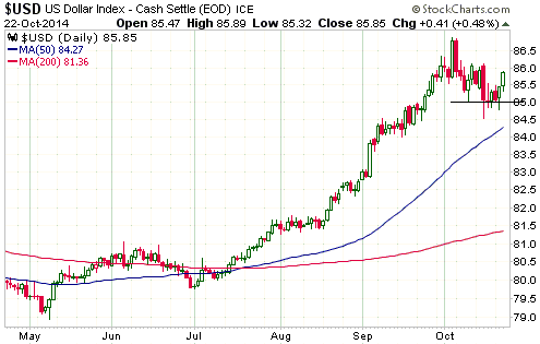
Currency Market Update
In the latest Weekly Update, we wrote: "Although we suspect that a short-term
top was put in place on 3rd October as a result of the upward surge catalysed by
irrelevant employment data, the Dollar's ability to hold above 85 leaves open
the possibility that it will make a marginal new high before the short-term
upward trend expires." We also wrote: "The bottom, to date, for European
equities relative to US equities occurred on 8th October. If that low holds then
a short-term bottom for the euro and a short-term top for the Dollar Index are
almost certainly in place."
The Dollar Index tested support at 85 again on Monday and Tuesday of this week
before gaining some ground, and our measure of European equities relative to US
equities has moved back to its 8th October low. This price action increases the
probability that the Dollar Index will make a marginal new high (in the 87-88
range during the first half of November) before its short-term upward trend
comes to an end.
Updates
on Stock Selections
Notes: 1) To review the complete list of current TSI stock selections, logon at
http://www.speculative-investor.com/new/market_logon.asp
and then click on "Stock Selections" in the menu. When at the Stock
Selections page, click on a stock's symbol to bring-up an archive of
our comments on the stock in question. 2) The Small Stock Watch List is
located at http://www.speculative-investor.com/new/smallstockwatch.html
Chart Sources
Charts appearing in today's commentary
are courtesy of:
http://stockcharts.com/index.html

|
