![]()
![]()
![]()
![]()
- Interim Update 23rd August 2017
Copyright
Reminder
The commentaries that appear at TSI
may not be distributed, in full or in part, without our written permission.
In particular, please note that the posting of extracts from TSI commentaries
at other web sites or providing links to TSI commentaries at other web
sites (for example, at discussion boards) without our written permission
is prohibited.
We reserve the right to immediately
terminate the subscription of any TSI subscriber who distributes the TSI
commentaries without our written permission.
Industrial metals
short-term overshoot
In the past we've explained that
the prices of industrial metals, as a group, tend to rise relative to gold
when long-term interest rates are rising and fall relative to gold when
long-term interest rates are falling. This relationship is evident on the
following chart comparison of the 10-year T-Note yield (TNX) and the
GYX/gold ratio (the Industrial Metals Index divided by the US$ gold
price). Also evident on the following chart is a divergence since the end
of last month.
The recent divergence involves an extension to
GYX/gold's rally in the face of a declining 10-year bond yield. The gold
price has gained about $20 during this period, which means that the
divergence is due to strength in the industrial metals rather than
weakness in gold.
It's possible that the divergence will be closed
within the next few weeks via a rise in the 10-year bond yield, but we
think that it is due to an overshoot by the industrial metals group and
will be closed by relative weakness in this group.
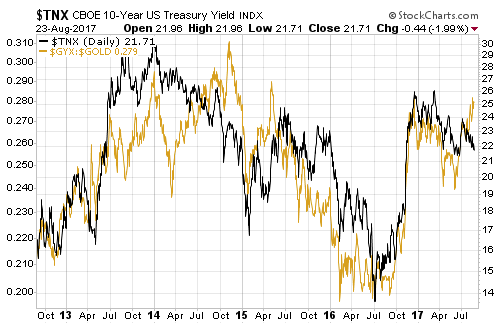
We expect the short-term overshoot in the industrial metals to be
corrected via relative strength in gold in the near future. However, due
to our view that long-term interest rates will trend upward over the
coming 12 months we expect additional strength in the industrial metals
relative to gold beyond the short-term.
The Stock Market
The Dow Transportation Average
(TRAN) broke below its 200-day MA last week. During the first three days
of this week it rebounded to its 200-day MA and then dropped back to the
vicinity of last week's low. In fact, on Wednesday 23rd August it traded
at its lowest price since late-May.
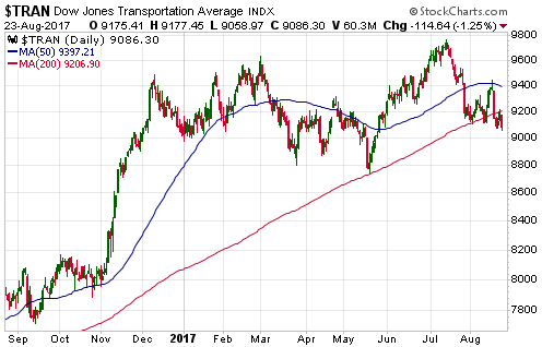
It's therefore fair to say that the TRAN is behaving the way it should
if our short-term bearish outlook is correct. At the same time, the senior
US stock indices are yet to do anything particularly bearish.
By
reversing course shortly after making a new high in July the NASDAQ100
Index (NDX) opened up the possibility that it had completed a
reliably-bearish false upside breakout, but at this stage the ensuing
choppy decline looks more like a bullish consolidation than the start of a
downward trend.
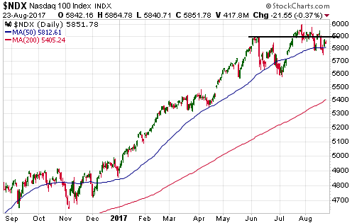
We've reached the point where the senior US stock indices (the SPX,
the NDX and the Dow Industrials Index) will soon have to accelerate
downward to keep our short-term bearish view alive. Alternatively, an
extension of the downward drift of the past four weeks would indicate that
we are dealing with something more benign than the anticipated 10%-20%
correction, as would a daily close above the high of the past fortnight.
Gold and the Dollar
Gold
More misinformation about gold demand
The article "You
Are Being Lied To About "Low" Gold Demand" purports to show that
reports of low gold demand are fictitious and that, far from being low,
gold demand has been unusually high over this year to date. Unfortunately,
this article adds to the massive pile of misinformation about gold demand.
The article linked above can be put into the "not even wrong"
category. To explain, when something is wrong it can be shown to be wrong
using logic or empirical evidence, but when something is "not even wrong"
it is so jumbled and/or based on such absurd premises that it defies
dispute via reasoned counter-argument.
As an example of what we
mean, not long ago a Keynesian central banker (is there any other kind?)
used a car metaphor to describe the economy. Within the context of this
metaphor, the central bank's job is to operate the gas pedal and the brake
to move the economy forward at the optimum speed*. This metaphor paints
such a fantastical picture of the world it is difficult to argue against
it.
In more general terms, it is somewhere been very difficult and
impossible to logically argue against a proposition or piece of analysis
that is based on a ridiculous premise. With Keynesian economics, for
instance, the problem isn't so much that the logic is wrong; the problem
is that the premises upon which the logic is based are completely out of
touch with reality. In fact, if you accept the absurd premises underlying
the theory then the logically-deduced policy recommendations make sense.
Returning to the above-linked article, the author attempts to
prove that gold demand has been very strong over the course of this year
by citing Exchange-Traded Product (ETP) in-flows. Specifically, he shows
that "net in-flows" into gold ETPs such as the SPDR Gold Shares ETF (GLD),
measured in dollars, were much higher than average during the first 6
months of this year.
For ease of reference, here is the relevant
chart from the article:
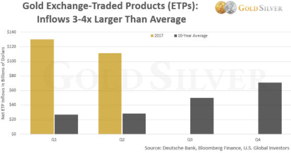
But what does "net in-flow" even mean? Every transaction involves a
purchase and a sale, with money being transferred from the buyer to the
seller. There is never any net flow of investment into an ETP.
The
only way that "net in-flow" makes any sense in this context is if it is
alluding to an increase in the amount of physical gold held by ETPs. The
fact is that when traders bid up the price of an ETF such as GLD beyond
its net asset value the ETF's Authorised Participants scalp an arbitrage
profit via a process that involves the creation of new ETF shares and the
addition of gold bullion to the ETF's assets. However, the quantity of
gold that moves into and out of ETF inventories is tiny compared to the
"net in-flow" figures indicated on the above chart.
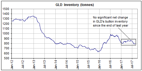
As evidence we
point out that the "net in-flow" figures for the first half of this year
indicated on the above chart equate to about 6,500 tonnes of gold, but the
following chart shows that a) the TOTAL amount of gold held by GLD, by far
the largest of the gold ETFs, is only about 800 tonnes, and b) the amount
of gold held by GLD is roughly the same now as it was at the end of last
year. Actually, it's about 20 tonnes less.
We therefore can't fathom the "net in-flow" figures cited in the
article, but that's not why we say that the article is "not even wrong".
The main problem with articles such as this and pretty much all of the
gold demand analysis spewed out by the World Gold Council is that the
underlying premise is nonsensical. The underlying premise is that shifts
in gold demand can be determined independently of price -- by taking into
account the quantities of gold flowing from one part of the market to
another or one geographical region to another. However, none of these
flows results in any change whatsoever in the total demand for gold
because every so-called 'flow' involves an increase in demand on the part
of the buyer and an exactly offsetting decrease in demand on the part of
the seller.
In any market that clears, including the gold market,
the total demand is always equal to the total supply. Furthermore, for all
intents and purposes in gold's case the total supply is constant (the
total aboveground supply of gold increases by about 1.5% every year),
which means that the total demand for gold is effectively constant. What
changes is the relative intensity of buying and selling. When buyers
become more motivated than sellers at a particular price then the price
will rise to maintain the supply-demand equilibrium. When sellers become
more motivated than buyers at a particular price then the price will fall
to maintain the supply-demand equilibrium. The price can therefore be
defined as the thing that changes in order to maintain the supply-demand
balance.
Consequently, price is the ONLY reliable indicator that
the demand for gold has risen or fallen, or, to put it more accurately,
the change in price during a period is the ONLY reliable indicator of
whether the buyers or the sellers were more motivated during the period.
At the end of last year the gold price was US$1152 and at the time of
writing it is in the US$1290s. We therefore know that gold demand amongst
traders/investors who price their gold in US dollars has attempted to
increase since the end of last year, with the price having risen by about
US$140 to maintain the supply-demand balance. Unfortunately, this fact
tells us nothing about what will happen to the gold price in the future.
What happens to the gold price in the future will be determined by
the relative motivations of buyers and sellers in the future, which will
be influenced by central-bank actions, government actions, economic
expectations and what's happening in other markets.
*In April-2017, Janet Yellen said: "Before, we had to press down on
the gas pedal trying to give the economy all of the oomph that we possibly
could," and [the Fed is now trying to] "give it some gas, but not so much
that we're pushing down hard on the accelerator."
Current Market Situation
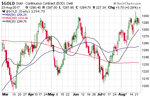
There was
a potentially-significant downward reversal in the US$ gold price last
Friday, but at this stage there has been no follow-through to the
downside. Instead, over the first three days of this week the price
essentially traded sideways in the $1290s.
Sentiment is neither a
headwind nor a tailwind for the gold price at the moment, while the
fundamental backdrop is bullish. As long as the fundamental backdrop
remains supportive and sentiment is no worse than neutral it will be
reasonable to expect that near-term pullbacks will be minor and that a
solid break above $1300 is coming.
With reference to the following
daily chart, there is technical support at the 20-day MA (the rising black
line, currently at $1281) and then in the low-$1260s. For a pullback to be
defined as "minor" it would have to avoid a daily close below $1260.
Gold Stocks
The HUI traded sideways in a
narrow range over the first three days of this week. As illustrated below,
it remains near the top of a wide, downward-sloping wedge that began to
form about 6.5 months ago.
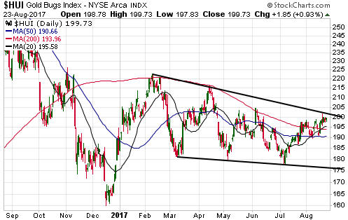
There is still a chance that the pattern drawn on the above chart will
end via a downside breakout, but the longer it continues the more likely
it will end via an upside breakout. At this time an upside breakout
followed by a rise to a new 12-month high is the most likely outcome,
although, as mentioned in recent commentaries, the gold-mining sector is
due for a short-term cycle low in early-September. Ideally, then, there
will be a pullback over the next couple of weeks followed by a tradable
rally.
Updates on Stock Selections
Notes: 1) To review the complete list of current TSI stock selections, logon at
http://www.speculative-investor.com/new/market_logon.asp
and then click on "Stock Selections" in the menu. When at the Stock
Selections page, click on a stock's symbol to bring-up an archive of
our comments on the stock in question. 2) The Small Stock Watch List is
located at http://www.speculative-investor.com/new/smallstockwatch.html
![]() Revisiting
Nevsun Resources (NSU). Recent price: US$2.12
Revisiting
Nevsun Resources (NSU). Recent price: US$2.12
It is never
a good idea to let a failed short-term trade become a long-term
investment. In NSU's case, however, the same news that caused the failure
of our short-to-medium-term trade has increased the long-term
attractiveness of the stock.
To explain, poorer-than-expected
performance at the Bisha zinc-copper mine in Eritrea prompted NSU's new
CEO to come up with a revised strategy that involves a smaller open pit
with a 4-year life (previously the Bisha mine was expected to have a
remaining life of 8 years). Cutting Bisha's remaining life in half was a
shock to the market and was responsible for the bulk of the recent
stock-price plunge (see chart below), but the positive aspect of this
change of plan is that it results in a further shift in the company's
focus/emphasis to the Timok copper-gold project in Serbia. In effect, the
new plan involves milking Bisha for all it's worth in the next 4 years and
investing the proceeds in the development of Timok. We view this as a
prudent move because capital should be directed, to the greatest extent
possible, towards the lower-risk/higher-quality project.
If the
strength in the zinc market proves to be sustainable (we think it will)
then Bisha, with its 200M+ pounds of annual zinc production, could throw
off a lot of cash over the next four years. So much so that between now
and mid-2021 NSU may be able to build the Timok mine (current capex
estimate: US$213M), fund an aggressive exploration program at Timok and
pay a dividend without raising any additional money.
At today's
metal prices we estimate that fair value for NSU is around US$4.00/share,
or almost double the current price. Furthermore, if copper and zinc prices
perform in line with our expectations then a year from now the 'fair
value' could be much higher.
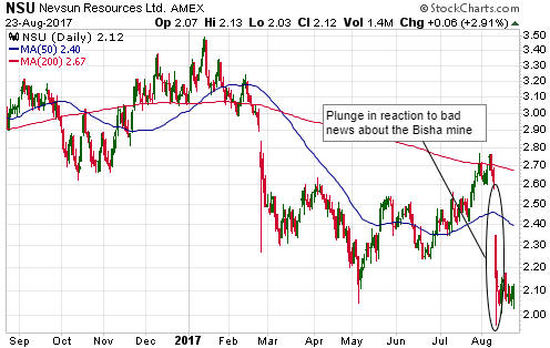
Chart Sources
Charts appearing in today's commentary
are courtesy of:
http://stockcharts.com/index.html
![]()