![]()
![]()
![]()
![]()
- Interim Update 23rd September 2015
Copyright
Reminder
The commentaries that appear at TSI
may not be distributed, in full or in part, without our written permission.
In particular, please note that the posting of extracts from TSI commentaries
at other web sites or providing links to TSI commentaries at other web
sites (for example, at discussion boards) without our written permission
is prohibited.
We reserve the right to immediately
terminate the subscription of any TSI subscriber who distributes the TSI
commentaries without our written permission.
Unintended Consequences
Whenever the government
intervenes in the economy in order to bring about what it deems to be a more
beneficial outcome than would have occurred in the absence of intervention,
there will be winners and losers but the overall economy will invariably end up
being worse off. Moreover, it is not uncommon for one of the long-term results
of the intervention to be the diametric opposite of the intended result.
A great example of the actual result of government intervention being the
opposite of the intended result is contained in a chart that formed part of a
recent article at ZeroHedge.com. The chart, which is displayed below, shows
the home ownership rate in the US.
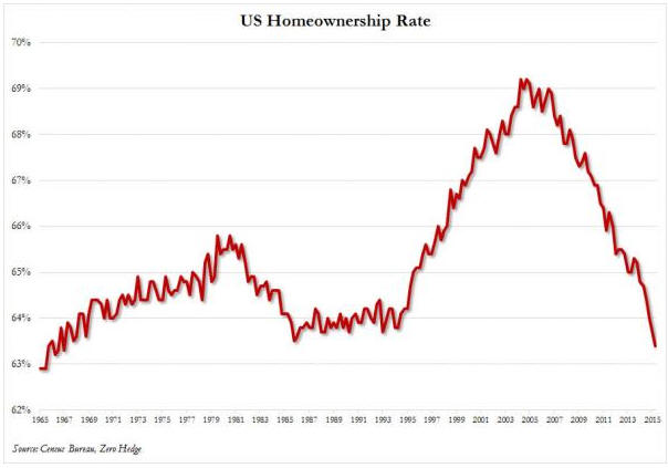
Here, in brief, is the story behind the above chart.
During the Clinton (1993-2000) and Bush (2001-2008) administrations the US
Federal Government decided that it would be beneficial if a larger number and a
broader range of people were home-owners. The government therefore began making
a concerted effort to not only increase the US home-ownership rate, but also to
make home loans easier to obtain for less-qualified buyers.
This was achieved in part by the more aggressive implementation, beginning in
1993, of the Community Reinvestment Act (CRA) of 1977. Under the cover of the
CRA, banks were forced to reduce their lending standards for lower-income groups
in general and 'minorities' in particular. For example, government regulations
created during the 1990s set bank loan-approval criteria and quotas with the aim
of increasing loan quantities, and even went so far as to require the use of
"innovative or flexible" lending practices to address the credit needs of
low-and-moderate-income (LMI) borrowers. Of course, banks that are forced by the
government to lower their standards when assessing the loan applications of
less-qualified borrowers must also lower their standards for other borrowers,
because they can't reasonably approve an application from one customer and then
reject an application from a better-qualified customer.
An increase in the home-ownership rate was also achieved by assigning an
"affordable housing mission" to the government-sponsored enterprises (Fannie Mae
and Freddie Mac). To make it possible for Fannie and Freddie to achieve this
mission their automated underwriting systems were modified to accept loans with
characteristics that would previously have been rejected. In addition, Fannie
and Freddie cited the new "mission" as a reason that their mortgage portfolios
should not be constrained.
At this point we would be remiss not to mention the helping hand provided by the
Fed. Without the Fed's aggressive money-pumping and lowering of interest rates
during 2001-2003 there would have been less credit and less money available to
the buyers of homes. The Fed's actions ensured that there would be a credit
bubble, while the government's actions ensured that the residential housing
market would be the focal point of the bubble.
The above chart shows that the government was initially -- and predictably --
successful in its endeavours. The home-ownership rate sky-rocketed as it became
possible for almost anyone to borrow money to buy a house. The chart also shows
that the home-ownership rate has since collapsed to its lowest level since the
1960s. This collapse was a natural consequence of the credit bubble, in that
household balance-sheets were drastically weakened by the taking-on of
debt-based leverage during the bubble and the post-bubble plunge in asset
prices.
The bottom line is that the interventions designed to increase home ownership
ultimately contributed to the home-ownership rate falling to the point where it
is now at a multi-generational low. Not just an unintended consequence, but the
opposite of the intended consequence.
The Stock Market
The US
Overview
In terms of price, a significant extension of the decline in the US stock market
is likely prior to a short-term bottom. It is especially worth noting that, as
was the case in August, there is the potential for a sudden and rapid downward
acceleration prior to a meaningful low. In terms of time, however, a short-term
bottom is probably not far away.
As we've consistently maintained over the past couple of months, the first half
of October is the most likely time for a short-term bottom regardless of whether
the decline from the mid-July peak is a bull-market correction or the first leg
of a new cyclical bear market. October gets underway during the second half of
next week, so we are only one week away from entering the most likely 2-week
time-window for a short-term bottom.
For short-term traders (not long-term investors), it will be worth participating
in the rally that follows the coming short-term bottom. Therefore, while it
makes sense right now to continue leaning towards the bearish side, traders
should be ready to shift the other way in the near future.
The Price Action
The following chart of the Bank Index (BKX) is one of several reasons to suspect
that while a multi-month bottom is likely within the coming three weeks, the
decline from the May-July peak in the US stock market was just the first leg of
a 1-2 year cyclical bearish trend. The chart shows that the BKX had been working
its way upward within a channel since late-2011 and broke decisively below the
bottom of this channel last month.
It looks like the BKX has been tracing out a long-term topping pattern since
early last year. Completion of the major top would be signaled by a weekly close
below lateral support at 65-66. We doubt that this will happen within the next
couple of months, but a test of this support is likely prior to a short-term
bottom.

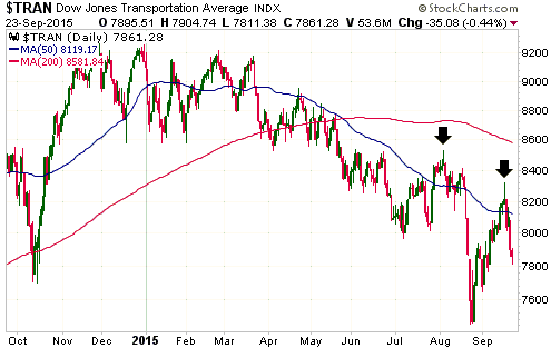
Over the past two weeks the Dow Transportation Average broke above its 50-day
MA, gained some additional ground and then reversed downward. This is similar to
the way an interim peak was put in place in early-August -- just prior to the
start of a steep 3-week decline.
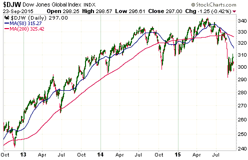
The World
The following chart shows that the Dow Jones World Index (DJW) is close to a
2-year low. Like the S&P500 Index, it broke out to the upside last week and then
almost immediately reversed downward.
A breach of the August low is likely prior to a short-term bottom.
Gold and the Dollar
Gold
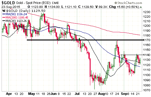
In the email alert sent to subscribers in response to Tuesday's market action we
wrote that, as expected, the 20-day MA was acting as near-term support for the
US$ gold price. With the support having been successfully tested on Tuesday, we
concluded: "What gold has done over the first two days of this week currently
looks like a 'pause for breath' within a short-term upward trend. If so, the
rally should resume in the next day or so."
The rally resumed on Wednesday, but to maintain its short-term upward bias gold
must continue to hold above the 20-day MA on a daily closing basis.
As illustrated by the following daily chart, the US$ gold price has minor
lateral resistance at $1140 and more important lateral resistance at $1170. The
200-day MA, which is presently near $1180, could also prove to be an obstacle.
In other words, there is strong resistance at $1170-$1180. In the absence of a
dramatic news-related catalyst, this resistance range probably defines gold's
maximum upside potential over the weeks immediately ahead.
Gold Stocks
The HUI's rebound from its early-August low immediately ended after reaching the
50-day MA. Last week's rally did exactly the same. A shallow pullback during the
first half of this week would have been neither surprising nor bearish, but the
quick return to the lows of the past 2 months suggests that there will be a new
low prior to the start of a multi-month rally.
Rather than showing a chart of the HUI, today we are showing a chart of the XAU.
The reason is that the XAU's chart pattern is clearer.
The top half of the following chart shows that the XAU has been tracing out a
declining wedge pattern since early-August, with sequences of declining tops and
marginal new lows. The bottom half of the chart shows that there is presently no
sign of strength in the XAU relative to gold, which is to be expected given that
the XAU is close to its bear-market low. As previously explained, there is
generally no bullish divergence between the gold-mining indices and gold bullion
at a major bottom. Instead, the gold-mining indices lose value relative to gold
until the day of the major price bottom, at which point they suddenly become
relatively strong.
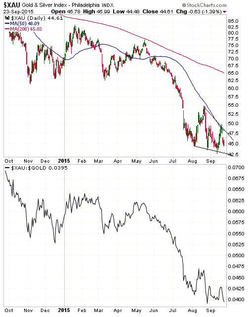
We interpret the declining wedge as a bottoming pattern. As a consequence, we
expect that any new low in the near future will be marginal. That's an opinion
that could obviously be wrong, but it's the most realistic view given the extent
of the price decline to date and the almost-palpable bearishness about the
prospects for gold-mining stocks.
That being said, if you are a short-term trader you don't need to have an
opinion about the XAU's (and the HUI's) additional downside potential,
especially if you are anticipating a rally and looking for an opportunity to
speculate on the long side. The reason is that after the gold-mining indices
commence an intermediate-term rally or a new bull market, the initial rise from
the bottom invariably breaks above the 50-day MA in quick time and then moves
far enough above this MA so that it can act as support during the first
significant correction. Furthermore, the initial 4-8 week advance in a new
intermediate-term upward trend or bull market invariably takes the price at
least 40% above its low. With the 50-day MA for both the XAU and the HUI only
about 8% above the current price, a reasonable plan could involve 'going long'
as soon as these indices closed above their respective 50-day MAs.
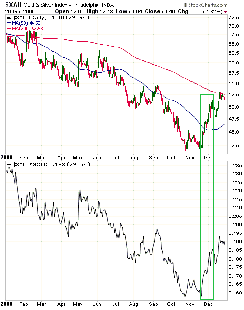
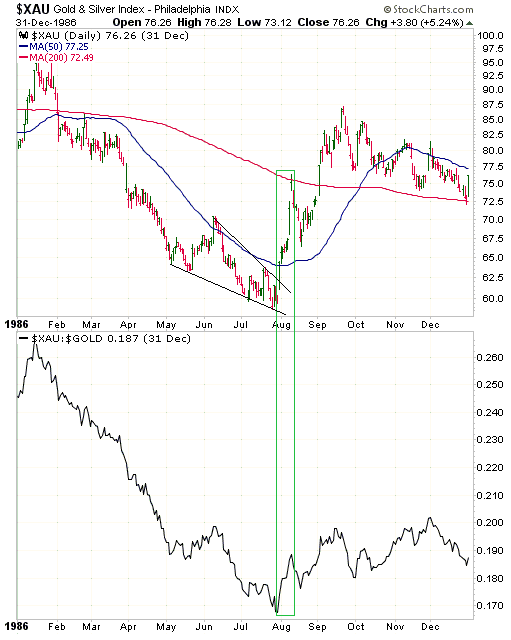
Here are two XAU and XAU/gold charts showing examples of intermediate-term
bottoms in the gold-mining sector. The first chart covers the intermediate-term
(and major) bottom of November-2000. The second chart covers the
intermediate-term bottom of August-1986, which currently looks more similar to
the recent price action. Notice the speed of the initial rally in both cases.
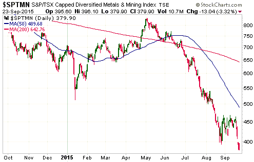
Sentiment is the main reason that the gold-mining indices and ETFs haven't yet
been able to sustain an advance. The US$ gold price has shown some modest signs
of strength, but the popular view is that the gold price will eventually drop to
new lows. Furthermore, gold-mining stocks are being affected by the on-going
weakness in other mining stocks. For example, the HUI's flat performance since
early-August is disappointing, but it is much better than the performance of
SPTMN (the Diversified Metals and Mining Index). SPTMN has lost 25% of its value
over the same period.
The Currency Market
The lines we've drawn on the following daily chart show that the Dollar Index's
performance since its March peak has taken the form of a contracting range.
Although the US$ was sufficiently stretched to the upside to set in place a
major peak in March-2015, the price action since the top looks more like an
intermediate-term consolidation than the start of a long-term decline.
The positions of the lines are somewhat arbitrary, but if the contracting-range
interpretation is correct then there is important resistance at around 97.5 and
important support at 93.5-94.0.
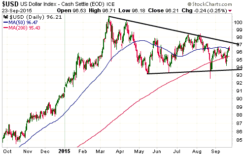
We had thought that the Dollar Index would drop to its 24th August spike low
(92.5) or a little lower if the SPX did the same, but we now suspect that the
dollar's near-term downside will be limited by support at 93.5-94.0. This is not
only because of the trend-line drawn on the above chart but also because there
has been evidence in the recent price action that the euro is no longer
benefiting from stock-market weakness. This could mean that the 'hot money' that
used borrowed euros to fund equity speculations has exited the bulk of its
positions.
Updates on Stock Selections
Notes: 1) To review the complete list of current TSI stock selections, logon at
http://www.speculative-investor.com/new/market_logon.asp
and then click on "Stock Selections" in the menu. When at the Stock
Selections page, click on a stock's symbol to bring-up an archive of
our comments on the stock in question. 2) The Small Stock Watch List is
located at http://www.speculative-investor.com/new/smallstockwatch.html
Chart Sources
Charts appearing in today's commentary
are courtesy of:
http://stockcharts.com/index.html
![]()