|
- Interim Update 24th July 2012
Copyright
Reminder
The commentaries that appear at TSI
may not be distributed, in full or in part, without our written permission.
In particular, please note that the posting of extracts from TSI commentaries
at other web sites or providing links to TSI commentaries at other web
sites (for example, at discussion boards) without our written permission
is prohibited.
We reserve the right to immediately
terminate the subscription of any TSI subscriber who distributes the TSI
commentaries without our written permission.
TSI Schedule
Change
Early Thursday morning our time (early Wednesday evening US EST), we'll be heading off to Sarawak State in Malaysian Borneo. That's why this week's Interim Update has been posted about 24 hours earlier than usual.
Sarawak is next to Sabah, the other state of Malaysian Borneo and our home base. Check out the following map for details.

Because we will be spending the next week or so traveling around Sarawak, our commentary publishing schedule will be disrupted. There will be a cut-to-the-bones Weekly Update on Sunday 29th July (no charts, just brief comments on the latest market action and company-specific news) and no Interim Update next week. The next full TSI commentary will therefore be the Weekly Update on Sunday 5th August.
We should have internet access throughout our journey (we'll be staying in towns, not jungles), so we will be able to send out a Market Alert email if something unexpectedly dramatic or dramatically unexpected happens while we are
away.
Empirical
evidence confirms "Austrian" logic
Objective non-"Austrian" economists have come up with data-based research that confirms what economists of the Austrian school figured out 100 years ago
via logical deduction, which is that fiscal and monetary 'stimulus' policies lead to a weaker economy. The latest edition of John Mauldin's free "Outside the Box" letter contains an
article by Hoisington and Hunt
that reviews some of this research. Here's part of the article's conclusion:
"In the eleven quarters of this expansion, the growth of real per capita GDP was the lowest for all of the comparable post-WWII business cycle expansions. Real per capita disposable personal income has risen by a scant 0.1% annual rate, remarkably weak when compared with the 2.9% post-war average. It is often said that economic conditions would have been much worse if the government had not run massive budget deficits and the Fed had not implemented extraordinary policies. This whole premise is wrong. In all likelihood the governmental measures made conditions worse, and the poor results reflect the counterproductive nature of fiscal and monetary policies. None of these numerous actions produced anything more than transitory improvement in economic conditions, followed by a quick retreat to a faltering pattern while leaving the economy saddled with even greater indebtedness. The diminutive gain in this expansion is clearly consistent with the view that government actions have hurt, rather than helped, economic performance."
In addition to citing empirical evidence that supports our view of the counterproductive nature of the various stimulus programs, the article also cites empirical evidence that questions the validity of our long-term bearish stance on US Treasury Bonds. This is something we'll come back to in another commentary within the next two weeks.The Stock Market
The Euro Zone
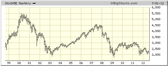
The EURO STOXX 50 Index (SX5E) is the euro-zone equivalent of the Dow Industrials Index, except that it comprises 50 rather than 30 blue-chip stocks. The following monthly chart shows that the SX5E is not far above last year's low, which, in turn, wasn't far above the March-2009 and March-2003 lows.
As dismal as the SX5E's performance has been, it has performed better than the EURO STOXX Banks Index (SX7E). The following monthly chart shows that the SX7E is below its March-2009 low. In fact, it is now trading at its lowest level in more than 13 years.
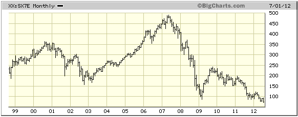
The past performances of the SX5E and SX7E are so bad that future performance will almost have to be better. To put things into perspective, the Banks Index is down by about 85% in nominal terms and by more than 90% in real terms since its 2007 peak, which compares to a peak-to-trough real loss of about 70% for the Dow Industrials Index during the 1929-1932 collapse.
The stocks of many European banks will end up going to zero, but the index won't go to zero. The risk for the eurozone's economy is that the ECB will destroy plenty of good non-bank businesses in its efforts to keep insolvent banks afloat.
The US
The top section of the following daily chart shows that the S&P500 Index (SPX) has just declined to its 50-day moving average. There's nothing in the SPX's price action to suggest that this decline is anything more than a routine correction within a short-term upward trend.
On the other hand, the bottom section of the following chart is a cause for some concern. It shows that the RUT/SPX ratio (small-cap stocks relative to large-cap stocks) has just fallen back to near its low for the year and is in a similar position to where it was at this time last year. At this time last year the stock market was about to commence a 2-week mini-crash.
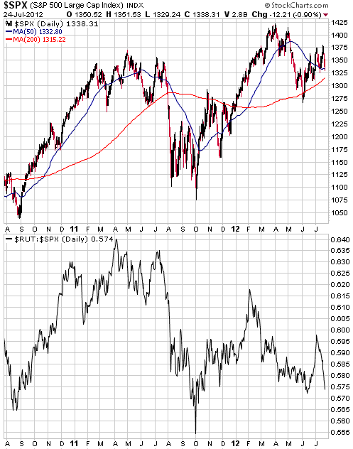
The probability that the stock market is about to do what it did at the same time last year isn't high. In fact, that a mini-crash began at around this time last year reduces, rather than increases, the probability that a sharp 2-week decline lies immediately ahead. However, the RUT/SPX's recent performance is a good reason to be wary.
If the US stock market does accelerate downward over the days ahead it could scare the Fed into doing something stupid next week (there's an FOMC meeting on Tue-Wed of next week), such as decide to implement another asset monetisation program.
Gold and the Dollar
Gold
In US$ terms, gold has been chopping back and forth within the bottom half of its short-term range. There now appears to be strong support at $1560.
In euro terms, gold is now less than 1% from an upside breakout. A daily chart of the euro-denominated gold price is displayed below.
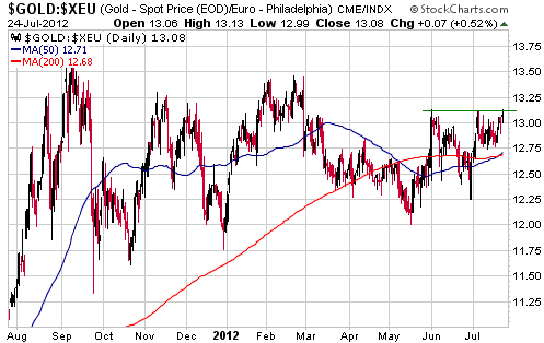
It may well be the case that nobody outside the economic backwater known as Europe cares about the euro-denominated gold price, but the fact is that important turning points in euro-gold tend to lead important turning points in US$-gold. Therefore, if euro-gold manages to break out to the upside it will be a bullish omen for US$-gold.
Gold Stocks
Gold stocks versus the broad stock market
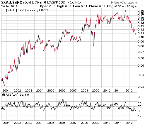
The following weekly chart shows that the XAU/SPX ratio has clearly broken below its May low. This means that the current situation is unprecedented within the context of the long-term gold bull market of the past 12 years. Never before during the current long-term gold bull market has the XAU/SPX ratio reached an 'oversold' extreme such as occurred in May, rebounded for a few weeks, and then declined to a new 52-week low. Previously, the weakest performance by XAU/SPX after reaching an 'oversold' extreme occurred in 2004. In that case the ratio trended upward for about 6 months before rolling over and declining to a marginal new low in 2005.
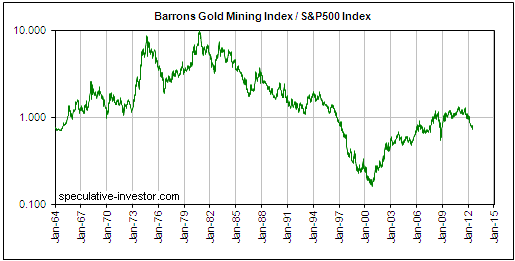
This doesn't indicate that the bull market is over, but it does indicate that we are now suffering through the worst performance by gold stocks relative to the broad stock market since the current bull market's beginning. Not surprisingly, relative performance was much worse during parts of the long-term bear market of 1980-2000, especially during the last 5 years of the bear market. Of greater interest, however, is that it was also much worse during parts of the long-term bull market of the 1960s and 1970s. This is evidenced by the following weekly chart of the BGMI/SPX ratio (the Barrons Gold Mining Index relative to the S&P500 Index), which shows dismal relative performance by the gold sector during 1968-1972 and 1974-1976. We don't expect the current bout of relative weakness to become anywhere near as extreme as the 1974-1976 episode, but it's fair to say that 2012's weakness has already gone well beyond what we expected.
Current Market Situation
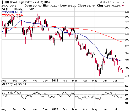
There has been no significant change over the two trading days since publication of the Weekly Update. We believe that the HUI is in the process of completing a successful test of the May low, but we obviously can't rule out a more bearish short-term scenario.
A more bearish short-term scenario would effectively be ruled out by a daily close above 425.
Currency Market Update
In the 4th June Weekly Update, we wrote:
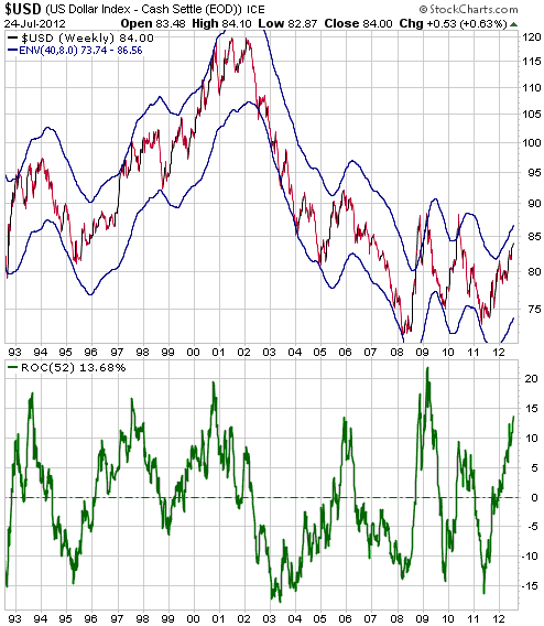
"The following weekly chart of the Dollar Index includes the 40/8 moving average (MA) envelope (an 8% envelope around the 40-week MA) and the 52-week rate of change (ROC). This is one of our favourite charts, but we don't show it very often because it only becomes useful near intermediate-term extremes. In early May of last year we used it to make the case that the Dollar Index was at or near an intermediate-term bottom. We are now using it to make the case that the Dollar Index is approaching the opposite intermediate-term extreme (a high, that is).
The Dollar Index is always close to an intermediate-term high when it is at the top of its MA envelope and its 52-week ROC is greater than 13%. At least, it is always close to an intermediate-term high in terms of time. In terms of price, spikes above what normally constitutes an extreme occurred near the peak of the global financial crisis in 2008 and during the first phase of the euro-zone debt crisis in 2010. With another phase of the euro-zone crisis seemingly headed towards a crescendo within the next two months we should allow for the possibility of a brief Dollar Index spike through the top of its envelope. If this is going to happen there will likely be a 2-3 week consolidation followed by a final US$ surge."
Below is an updated version of the chart discussed in the above excerpt. The chart shows that the Dollar Index's 52-week ROC has moved up to 13.7% (it was 12.3% when we wrote our 4th June commentary), a level that has, in the past, only ever been reached when the Dollar Index has been within a few weeks of an intermediate-term peak. Note, though, that the top of the MA envelope has risen to around 87, which leaves open the possibility that there will be a quick additional gain of 2-3 points prior to an intermediate-term peak being set.
Update
on Stock Selections
Notes: 1) To review the complete list of current TSI stock selections, logon at
http://www.speculative-investor.com/new/market_logon.asp
and then click on "Stock Selections" in the menu. When at the Stock
Selections page, click on a stock's symbol to bring-up an archive of
our comments on the stock in question. 2) The Small Stock Watch List is
located at http://www.speculative-investor.com/new/smallstockwatch.html
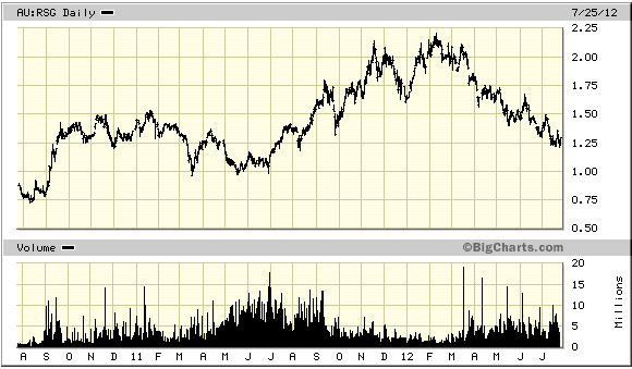
 Resolute Mining (ASX: RSG). Shares: 634M issued, 643M fully diluted. Recent price: A$1.30 Resolute Mining (ASX: RSG). Shares: 634M issued, 643M fully diluted. Recent price: A$1.30
We have previously mentioned an intermediate-term price target of A$2.50/share for RSG, a gold miner with operations in Mali, Tanzania and Australia. With the company having just reported its latest quarterly results and updated production guidance, and with the stock price having dropped back from around A$2.00 early this year to the current level of around A$1.30, it is appropriate to review our valuation to see if the price target still makes sense.
During the latest quarter RSG sold 105K ounces of gold at an average price of $1593/oz. The reported cash cost was $802/oz, so RSG's cash margin was $791. If this entire margin had been converted to operational cash flow then the latest quarter's cash flow would have been $83M, but the reported cash flow was only $63M. The difference is due to the costs that mining companies fail to include in their reported "cash cost". For example, royalties and overhead costs at the mine sites. Based on the latest quarter's results it seems that RSG converts about 76% of its cash margin to operational cash flow, but to be conservative we will assume 70% going forward.
Guidance for the financial year beginning 1st July 2012 is 415K ounces of gold at a cash cost of $830/oz. Assuming an average gold price of $1500/oz we come up with an annual cash flow forecast of $195M (415K ounces * $670/oz cash margin * 70%). Applying an eight multiple to this cash flow leads us to an estimated value of $1560M for RSG's mining operations. With 634M shares outstanding, this is equivalent to $2.46/share.
Accounting for the not-yet-complete $20M purchase by RSG of Endeavour Mining's stake in the Mali-based Finkolo project, RSG has net cash (cash minus debt) of about $100M. This $100M plus $140M of future cash flow will be used over the coming two years to fund a pit expansion and oxide circuit at the Mali-based Syama project, so we won't include it in our valuation.
The upshot is that our $2.50/share valuation continues to look reasonable. It is based on conservative assumptions, such as a significantly lower average gold price than we think is likely.
RSG's current market price is very low considering the company's size, profitability and strong balance sheet. Even taking into account the lousy overall market environment for gold mining equities, RSG should probably be priced at a minimum of A$1.70/share just to bring it into line with other profitable miners with at least 200K ounces/year of production. The most likely reason for the discount is concern about political instability in Mali, the country in which RSG's most important asset is located.
Quick comment on Jaguar Mining (JAG)
JAG continues to slide. At some point it is going to rebound strongly, but even at its current ultra-depressed price it is risky due to its weak balance sheet (read: high debt relative to cash). Its upside potential is a lot greater than its remaining downside potential, but for new buying we would much prefer the stocks of companies with strong balance sheets given that many of these relatively low-risk stocks are also trading at huge discounts to fair value. Most gold stocks are dirt cheap right now, regardless of whether they are the stocks of well managed companies with strong balance sheets or poorly managed companies with weak balance sheets.
Chart Sources
Charts appearing in today's commentary
are courtesy of:
http://stockcharts.com/index.html
http://bigcharts.marketwatch.com/

|
