|
- Interim Update 25th April 2012
Copyright
Reminder
The commentaries that appear at TSI
may not be distributed, in full or in part, without our written permission.
In particular, please note that the posting of extracts from TSI commentaries
at other web sites or providing links to TSI commentaries at other web
sites (for example, at discussion boards) without our written permission
is prohibited.
We reserve the right to immediately
terminate the subscription of any TSI subscriber who distributes the TSI
commentaries without our written permission.
One way to use
"Technical Analysis"
"Technical Analysis" (TA) is the practice of using the previous behaviour of price and volume to ascertain when to buy and sell. It can be useful, although in our opinion its usefulness is far more limited than most of its practitioners believe.
Of particular relevance, a price chart provides a lot of information about the past and almost no information about the future. It is, in effect, a road map that ends where you are right now. Traders often look at these 'maps' and make assumptions like "the 'road' will continue in its current direction" or "the 'road' is about to change direction", but such assumptions are just as likely to be wrong as right. The cold hard reality is that a bullish (as per standard TA principles) chart pattern has just as much chance of evolving bearishly as bullishly, and a bearish chart pattern has just as much chance of evolving bullishly as bearishly. This must be so because a) millions of traders around the world look at the same charts and see the same patterns, and b) a trader cannot gain an advantage by seeing the same thing that millions of other traders are seeing at the same time.
This doesn't mean that pattern-recognition cannot be effectively employed when trading in the markets. Some traders can make effective use of chart patterns, but only by managing risk such that the losses realised during the (approximately) 50% of the time when the chart provides them with misleading information are less than the gains realised when the chart leads them in the right direction.
Our view is that TA can be useful even though price charts are unreliable forecasters of future price direction. This is because successful speculating has nothing to do with accurately forecasting the directions of short-term price moves. Instead, successful speculating is about keeping the odds in your favour by buying when prices are extended to the downside and selling when prices are extended to the upside. TA is useful in that it can help a speculator determine when prices are overly extended in one direction or the other.
Another way of saying the above is that the market behaves like a pendulum and TA can help a speculator determine when the pendulum has swung enough in one direction to put the odds firmly in favour of a particular action (buying or selling, depending on the direction of the swing). Unlike a real pendulum, the market swings in an irregular manner and there is never any way of knowing how far it will swing in one direction before reversing. But as we said, the idea is to keep the odds in your favour rather than rely on accurately predicting the future.
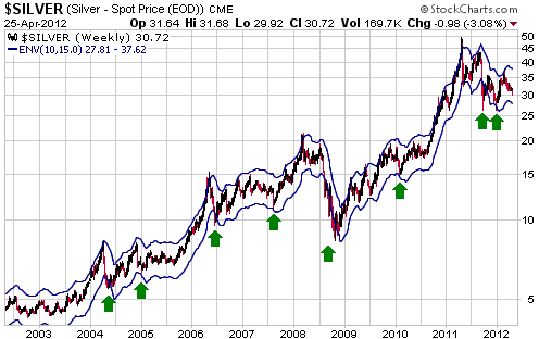
The simplest way for us to further explain what we are talking about is with a real-world example. We'll use the silver market. Silver's performance over the past 10 years is a good example because in addition to clearly illustrating the above-mentioned pendulum principle it also shows why the market's long-term trend should be taken into account when applying certain technical indicators.
The following weekly silver chart contains a 15% envelope around the 10-week moving average (MA). The MA envelope is one of our favourite ways of telling when a market has swung far enough in one direction to skew the odds decidedly towards a particular action (buying or selling, as the case may be).
It is evident from the chart that with one exception (August-2008), buying silver as soon as it dropped to the bottom of its 10-week/15% MA envelope worked well over the past 10 years. Buying silver as soon as it dropped to the bottom of its 10-week/15% MA envelope in August of 2008 didn't work, but this just proves that having the odds in your favour won't translate into success every time. This uncertainty about the future should be acknowledged and accounted for when deciding how much money to put at risk.
It is also evident from the chart that over the past 10 years it was generally not a good idea to sell silver as soon as it rose to the top of its 10-week/15% MA envelope. This is why we say that the market's long-term trend should be taken into account when applying technical indicators. During bull markets, buying at 'oversold' extremes works better than selling at 'overbought' extremes. It's the opposite during bear markets.
Here are a couple of clarifying notes before we sum up. First, the MA envelope is a TA tool that can be used to identify when the market pendulum is nearing an extreme, but it isn't the only such tool. Second, in addition to overbought/oversold indicators such as the MA envelope, we pay attention to lateral support and resistance levels. Breaches of obvious support and resistance levels do not provide reliable information about the future, but such levels can be used to good effect when placing above-the-market sell orders or below-the-market buy orders.
In summary, price/volume action and technical indicators (Technical Analysis) can contribute to a sensible buy-low/sell-high strategy, but you can't reasonably expect to gain an advantage by seeing the same chart patterns that millions of other traders are seeing. Gaining an advantage involves moving in the opposite direction to the crowd after the crowd becomes convinced that a high-priced asset is bound to get even more expensive or a low-priced asset is bound to get even cheaper. It also involves acknowledgement, in the way that money is put at risk, of the fact that the future is always uncertain.
The Stock Market
Current Market Situation
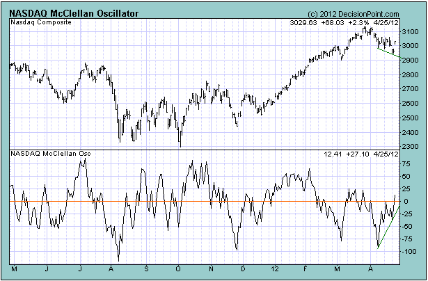
The NASDAQ completed what we define as a McClellan Oscillator (MO) buy signal during the first half of this week. Such a signal results from the following sequence:
1. The stock market (represented in this case by the NASDAQ Composite Index) declines and the NASDAQ's MO falls to near the bottom of its 3-year range.
2. Both the NASDAQ Composite Index and the NASDAQ's MO rebound.
3. 2-6 weeks after the initial bottom (step 1 in the sequence), the NASDAQ Composite Index makes a lower low while the NASDAQ's MO makes a higher low. This is a bullish divergence that usually only occurs near a short-term bottom.
The most recent bullish divergence is clearly evident on the following chart. Note, though, that step 3 in the above sequence might not be complete, meaning that while it looks like a bullish divergence is unfolding there could still be a decline to a lower low in the NASDAQ Composite Index over the next week to complete the set-up.
Moving from the US to Europe, the following daily charts show that the French and German stock markets have pulled back sharply since mid March. The French stock market has been particularly weak and probably peaked on an intermediate-term basis last month. On a short-term basis both markets look 'oversold', although neither appears to reflect the reality that most of Europe's national economies are in recession.
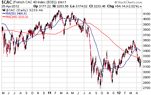
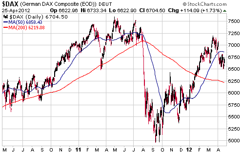
The unfolding bullish divergence between the NASDAQ and its MO implies that a short-term bottom for the US stock market was either put in place on Tuesday of this week or will be put in place next week. At the same time, many other stock markets are sufficiently 'oversold' to enable multi-week rallies. Our short-term stock market outlook has therefore shifted from "bearish" to "neutral".
Dreaming of Fed support
There still appears to be an undercurrent of hope that the Fed will soon commence a new monetary stimulus program. This hope is unrealistic.
It is a given that the Fed will create another flood of money in the future, because the Fed is run by people who are either too stupid to know any better or smart enough to know better but prepared to do more long-term damage to the economy to achieve short-term objectives. However, it is not reasonable to expect that we can go directly from where we are today, with the senior US stock indices near multi-year highs and the price of gasoline high enough to be an election issue, to the point where the Fed is, again, aggressively pumping money. There will have to be an intervening period of substantial weakness in the US stock market and economy.
Gold and the Dollar
Gold
Does gold really benefit from economic weakness?
Gold is a counter-cyclical investment, meaning that it tends to do relatively well when the economy is weak. However, it would be a mistake to conclude that economic weakness CAUSES gold to perform well. In fact, in the absence of counter-cyclical monetary policy gold would tend to perform worse than cash during periods of economic weakness. It is the policy response to economic weakness rather than the economic weakness itself that leads to gold's strength during times when the broad economy is struggling.
Due to fractional reserve lending going into reverse, periods of economic weakness would typically be associated with monetary deflation if the central bank let nature take its course. This is because the economic weakness would lead to loan defaults and general de-leveraging via loan repayments, the combination of which would reduce the quantity of bank deposits. Also, there would be a reduction in bank reserves as people throughout the economy fled to the perceived safety of cash. The result would be a significant decline in the supply of money and a significant rise in the purchasing power of money. In such an environment the price of gold would likely fall, albeit by a lesser percentage than the prices of most industrial commodities.
However, the actions of the central bank prevent the above-described deflationary process from happening. The central bank not only stands ready to meet any increased demand for cash with injections of new bank reserves, it will, if deemed necessary to counteract a deflationary threat, boost bank reserves by a lot more than required to meet the heightened demand for cash. It will also push the price of short-term credit well below where it would otherwise be, and ensure that the effect of de-leveraging on the total quantity of money deposited in banks is more than offset by the creation of new deposits.
The net effect of these actions is that rather than the economic weakness being accompanied by monetary deflation and relatively high real interest rates, it is accompanied by rapid monetary inflation and relatively low real interest rates. This neither helps the economy nor reduces the general desire for more savings and less debt, but it does force people to consider alternatives to cash savings.
In other words, the central bank concocts a bullish environment for gold via its reaction to economic weakness.
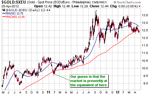
Current Market Situation
Some of the best times to buy gold over the past 10 years were the times when the euro-denominated gold price (gold/euro) was near its 200-day moving average, which is where it is right now.
PSLV's premium finally returns to Earth
In the 22nd February Interim Update we wrote the following regarding the Sprott Physical Silver Trust (PSLV):
"PSLV will be a reasonable way to obtain exposure to silver bullion when (not if) its premium to NAV falls below 5%."
PSLV's premium
was less than 5% at the close of trading on Friday of last week and Monday of this week, before edging a little higher. It ended yesterday's trading session at 5.21%. Recall that it was routinely above 20% last year and at times rose above 30%. In fact, it was above 30% as recently as January of this year.
Large premiums always evaporate. It's just a matter of time.
Gold Stocks
The HUI ended last week at 442. It spiked down to 423 on Monday and then rebounded by enough to end Wednesday's session at 443, which means that it is back to where it began the week. Monday's reversal wasn't definitive, but, on the positive side of the ledger, Monday's intra-day low for the HUI was within a few points of the bottom of the MA envelope that we have been using to determine downside potential.
By its nature, the MA envelope generates a moving target for maximum downside potential. The envelope will turn higher during the next multi-week rally in the gold sector, but currently it is declining at the rate of 1-2 points per day.
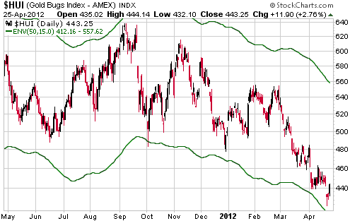
As mentioned in the latest Weekly Update, we are about to enter a time window when intermediate-term gold sector turning points have tended to occur in the past. This certainly doesn't guarantee that an intermediate-term reversal is about to happen, but if a reversal does happen over the next couple of weeks the timing will shorten the odds of it being the intermediate-term variety.
Currency Market Update
We don't pay much attention to the inflation statistics (CPIs, PPIs, price deflators, etc.) reported by governments. It's not just that governments can't be trusted; it's also that the concept behind these statistics is wrong (you can't determine the change in the purchasing power of money by taking an average of the prices of disparate items). Due to the wrongness of the underlying concept, even the most honest and rigorous attempt to come up with a single number that accurately reflects "inflation" will fail.
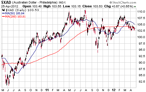
That being said, the official "inflation" statistics are relevant to the extent that they affect market sentiment and central-bank policy. For example, news released early this week that the year-over-year increase in Australia's CPI had fallen to only 1.6% had an effect on the currency market and will likely have an effect on the actions of the RBA (Australia's central bank).
Prior to this week's CPI data the RBA was already planning to reduce its targeted short-term interest rate, which is presently set at 4.25%. However, the unexpectedly low CPI makes it likely that the RBA will cut its interest rate target by a greater amount than would otherwise have been the case. After all, any economist who believes that the CPI is a realistic measure of "inflation" will likely conclude that the RBA's real interest rate (4.25% - 1.6%) is now way too high.
Some cutting of Australia's official interest rate has already been discounted by the currency market, but if the CPI stays low and the economy weakens over the months ahead then the reduction in Australia's official interest rate will be much more substantial than presently expected. This will put irresistible downward pressure on the A$ relative to the US$ given that there is little scope for the Fed to become 'easier'.
We continue to perceive a lot of downside risk in the A$, but we aren't convinced that a large decline has begun. One realistic possibility is that the A$'s positive correlation with global equities will enable it to test last year's peak during the next multi-week stock market rally. If this happens we will most likely view it as an invitation to buy FXA put options to hedge our A$ exposure.
Update
on Stock Selections
Notes: 1) To review the complete list of current TSI stock selections, logon at
http://www.speculative-investor.com/new/market_logon.asp
and then click on "Stock Selections" in the menu. When at the Stock
Selections page, click on a stock's symbol to bring-up an archive of
our comments on the stock in question. 2) The Small Stock Watch List is
located at http://www.speculative-investor.com/new/smallstockwatch.html
 Fairborne Energy (TSX: FEL). Shares: 102M issued, 109M fully diluted. Recent price: C$1.80 Fairborne Energy (TSX: FEL). Shares: 102M issued, 109M fully diluted. Recent price: C$1.80
There was strange price action in mid-tier natural gas producer FEL during the first half of this week. On Monday morning the stock plunged from the C1.70s to the C$1.30s and then recovered most of its losses. This happened on low volume, so it appears to have been due to an absence of bids rather than aggressive selling.
Like many other North American companies that are focused on the production of dry natural gas, FEL will go broke if the NG price stays at its current low level for long enough. However, going broke doesn't look like a short-term threat, especially with the $80M sale of some assets announced last week. Moreover, the price at which the recent asset sale was done implies that FEL is worth more than three times its current enterprise value.
In anticipation of either a takeover bid for the company or a rebound to a more realistic valuation, FEL is a good candidate for accumulation during this period of dramatic weakness.
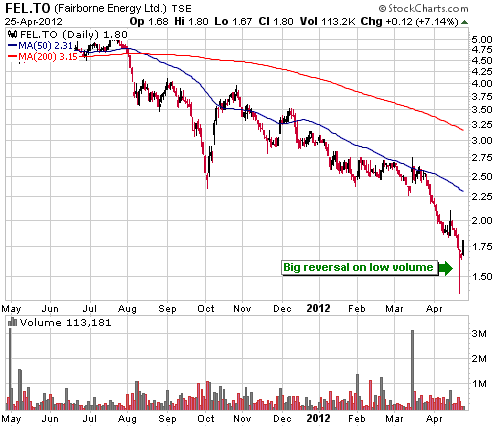
Chart Sources
Charts appearing in today's commentary
are courtesy of:
http://stockcharts.com/index.html
http://www.decisionpoint.com/

|
