|
- Interim Update 25th May 2011
Copyright
Reminder
The commentaries that appear at TSI
may not be distributed, in full or in part, without our written permission.
In particular, please note that the posting of extracts from TSI commentaries
at other web sites or providing links to TSI commentaries at other web
sites (for example, at discussion boards) without our written permission
is prohibited.
We reserve the right to immediately
terminate the subscription of any TSI subscriber who distributes the TSI
commentaries without our written permission.
Using the same data to support opposing ideas
In
the latest Weekly Update we wrote a piece about how, in the field of
economics, it was often possible to interpret data in multiple ways
such that the same data could be used to support conflicting theories.
When we wrote this piece we had in mind the case where a
pro-free-market economist enlists data to show that a government
"stimulus" program didn't work as advertised, and where a "Keynesian"
fires back with an argument along the lines of "it didn't seem to work
because it wasn't implemented aggressively enough" or "things would
have been even worse if not for the stimulus". We have been prompted to
write again on this topic by an article that we came across while
catching up on our reading earlier this week. We are referring to the March 3rd article
by Robert Murphy, which cites the example of high-profile economist
Paul Krugman using the same unemployment data to support two completely
contradictory positions within the space of a fortnight.
In the above-linked article, Murphy describes how Krugman argued in one
blog post that the different unemployment rates between US states were
an illusion, and then in another blog post just two weeks later that
the different unemployment rates between US states were significant
because they proved that government stimulus spending is effective. In
his second blog post he latched onto the fact that the states that had
received the higher per-capita stimulus payments now had lower
unemployment rates, on average.
As an aside, the lower unemployment rates in the states in question
could possibly be explained by these states generally having smaller
governments, but a big government advocate such as Krugman would
obviously want to ignore such a possibility. In any case, it wouldn't
exactly be a shock if greater government "stimulus" led to lower
unemployment for a while. After all, if the government paid half the
unemployed to dig holes and the other half to fill them in then it
could temporarily eliminate all unemployment...at the same time as it
was destroying wealth and weakening the economy by wasting resources.
This gets back to one of the main differences between a bad economist
and a good economist, which is that a bad economist looks only at the
short-term effects of a policy whereas a good economist looks at both
the short- and long-term effects. As far as we know, nobody within the
pro-free-market "Austrian" school is arguing that the government, by
ramping up its spending, can't make things look better in the
short-term.
In the above-linked article, Murphy also notes that Krugman, in the
first of the contradictory blog posts, argued that while it didn't make
sense to contrast the unemployment rates in different US states, it
would make sense to contrast the unemployment rates in Germany and
Spain given that they are both European countries with large economies.
Murphy then points out that the country that runs a relatively small
budget deficit and has a reputation as being tightfisted has an
unemployment rate of only 6.6%, whereas the country that runs a large
budget deficit and was President Obama's role model for government
"green-jobs" investment has an unemployment rate of 20.2%. He probably
should also have mentioned that the country now suffering from
Great-Depression-like unemployment is the one that experienced a
massive credit expansion fueled by artificially low interest rates.
We have no doubt that Krugman could find a way to interpret the
unemployment data of Germany and Spain -- data that seem to be at odds
with the Keynesian view of the world -- so that the numbers weren't in
conflict with his dearly-held theories. But heavens above, you need to
be incredibly creative and flexible in order to continually make the
real world data fit the economic theories put forward by Keynes. It's a
lot easier to begin with theories that actually make sense.
In conclusion, we present the Conclusion from Murphy's article:
"One of the biggest
problems in the social sciences is that we can't run controlled
experiments. That's why Keynesians and Austrians can cling to such
vastly different policy conclusions, despite decades of experience and
mounds of data. Just because unemployment "unexpectedly" shot way up
after passage of the Obama stimulus package, doesn't mean it was a bad
idea. The Keynesians are right: it's possible that unemployment would
have been even worse in the absence of massive deficit spending. This
is why it's so important to have sound theoretical views, which we then
use to sift the data and make sense of things.
Paul Krugman's recent
blog posts on state-level unemployment show just how easy it is for
economists to protect their views from counterevidence. There are
always arguments floating about that can take empirical evidence that
was initially a liability and flip it around into a strength."
The Stock Market
Measuring QE2's Success
When the central bank creates new money out of nothing it is, in
effect, counterfeiting money, which is a form of theft. An eventual
result of this money creation will be a reduction in the purchasing
power of money, but the depreciation of money is really a side issue.
The main issue is the theft.
Consider the case of a private counterfeiter operating out of his
basement. If he is very productive and if the money he produces is
indistinguishable from the official variety then his actions will
eventually put some upward pressure on prices within the economy, but
most people will appreciate that the longer-term potential effect on
prices is not the main issue. Most people will, or at least should,
correctly perceive the main issue to be the undeserved transfer of
wealth to the printer of the new money.
It's the same situation when the central bank creates new money, except
that the central bank doesn't have total control over who benefits from
the theft.
Further to the above, there is no economic situation under which the
creation of money 'out of thin air' is justifiable. It is always
unethical and it always weakens the economy by bringing about the
undeserved transfer of wealth from some people to others. There are no
exceptions.
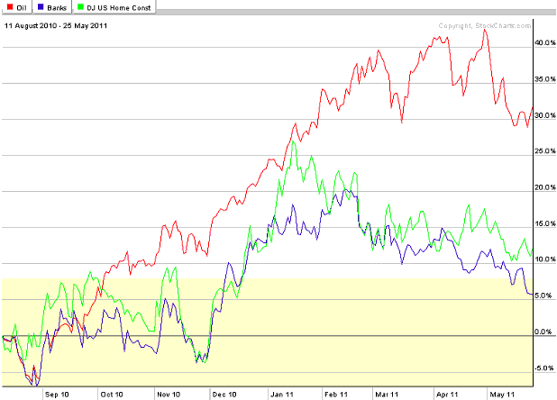
A point we want to make today relates to the central bank's inability
to exercise total control over exactly who benefits from its monetary
inflation, using the financial-market response to "QE2" as an example.
We suspect that if Bernanke had been asked last August (the time when
the markets began to respond to the Fed's promise of more "quantitative
easing") to list economic sectors in order from most to least preferred
beneficiary of QE2, the banking and home-building sectors would have
been near the top of his list and the oil sector would have been near
the bottom. And yet, the following performance chart shows that the oil
sector of the stock market greatly out-performed the banking and
home-building sectors in response to QE2. This suggests that even by
the Fed's own unethical and destructive standards QE2 wasn't as
successful as hoped.
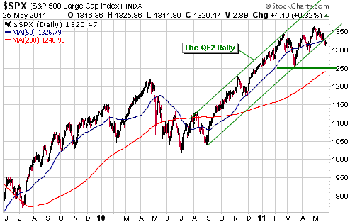
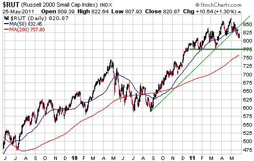
Early signs of a trend reversal
The following charts show that the S&P500 Index, a proxy for
large-cap US stocks, and the Russell2000 Index, a proxy for small-cap
US stocks, have edged below the upward-sloping trend-lines that
originated at the August-2010 start of the QE2 rally. These could be
early warning signs that the trend has changed. More conclusive
evidence of trend reversals would be provided by daily closes below the
March lows (1250 for the S&P500 and 775 for the Russell2000).
The next chart illustrates the blatant recent weakness in the Shanghai stock market.
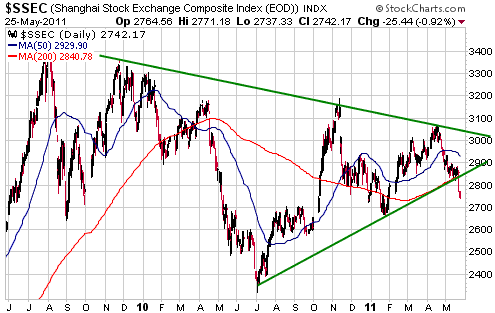
There is a reasonable
chance that intermediate-term peaks are in place for most of the
world's stock markets, but even if this is the case there will probably
be tests of the peaks before large declines get underway. This is
because the major stock indices tend to peak gradually over several
months. Commodities, on the other hand, often make spike tops.
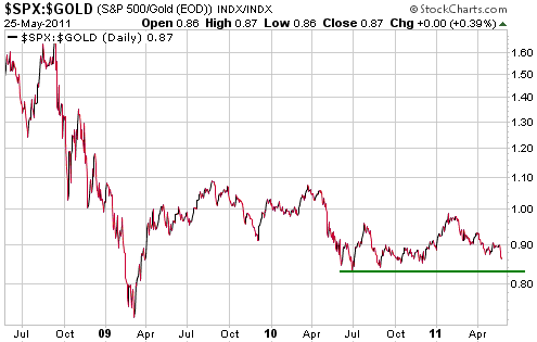
In gold terms
The first of the following charts shows that in gold terms the US stock
market has essentially gone sideways over the past 2 years. A solid
break below the June-2010 low would be a clear sign that it had
commenced a new downward leg in its secular bear market relative to
gold.
Our view is that the S&P500 will eventually trade a long way below
its March-2009 low in gold terms, but will probably never trade below
its March-2009 low in nominal terms.
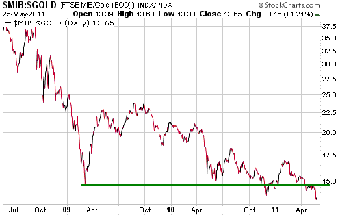
The second of the following charts shows that the Italian stock market
has broken to a new secular bear market low in gold terms. This
performance reflects the likelihood that Italy's economy has slid back
into recession and implies that the probability of additional ECB rate
hikes is plummeting.
Gold and
the Dollar
Gold
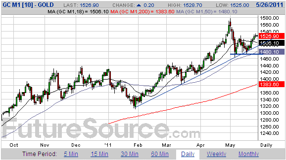
Current Market Situation (US$ gold)
There were no significant new developments in the gold market over the
first three days of this week. The rebound from the early-May low has
continued and our guess is that this will prove to be a counter-trend
move within a multi-month correction, but the price action leaves open
the possibility that there will soon be a final surge to a new high to
create an intermediate-term peak. This possibility will remain open
until/unless the nearest gold futures contract closes below $1470.
Note that a daily close below $1490 could now be considered an early warning signal that an intermediate-term peak is in place.
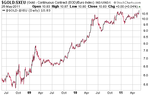
Gold in terms of 'other' currencies
The first of the following daily charts shows that gold has just made a
marginal new high in euro terms. If the euro-denominated gold price
were to move further into new-high territory while the US$-denominated
gold price remained below its early-May peak it would be a bullish
divergence of indeterminate significance with regard to timing, meaning
that it would point to eventual new highs in the US$ gold price without
telling us when the new highs were likely to occur.
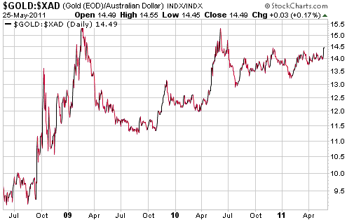
The second of the following charts shows that in A$ terms the gold
price has been consolidating since early 2009. It also shows that
gold/A$ has been gradually building up strength, having made a sequence
of higher lows since October of 2009.
We expect that gold/A$ will move to a new all-time high during the
second half of this year, most likely due to gold holding its ground in
US$ terms while the A$ trends downward.
Note on SLV put options
We previously mentioned that we planned to buy some SLV July put
options (to partially replace the puts on which profits were taken
during silver's crash) if silver futures rebounded to around $42. This
is no longer our plan. Silver could still make it to the low-$40s
before resuming its intermediate-term decline, but one possibility is
that it will wait until early June before doing so and this wouldn't
leave us with sufficient time on our options. Therefore, if we decide
to buy some more SLV put options in the near future to hedge our
exposure to gold- and silver-related investments we will choose options
that expire in October.
Gold Stocks
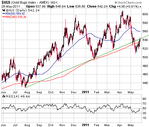
As illustrated by the following daily chart, the HUI has rebounded to
the trend line it broke below during the first half of this month and
the HUI's RSI (the bottom section of the chart) has rebounded to 50.
This means that the HUI has now achieved the minimum that would be
expected from a routine counter-trend rebound. We won't be surprised if
the rebound extends to the 50-day moving average at around 560, but we
will be surprised if the HUI manages to close above 570 anytime soon.
In our opinion, there's a good chance that the HUI will break below its
May low before the overall correction comes to an end. As mentioned in
earlier commentaries, 475 is a realistic target for a correction low.
That being said, it never makes sense to trade based on anyone's
short-term forecasts. Instead, it generally makes sense to accumulate
high-potential stocks during periods of extreme weakness, and the
weakness in some gold stocks has certainly been extreme enough in the
recent past to create buying opportunities.
Currency Market Update
The June A$ futures contract has been peppering away at the short-term
support that lies at 1.05. A solid break below this support would
project a decline to longer-term support at 1.00-1.01. This longer-term
support probably defines the downside risk as far as the next few weeks
are concerned.
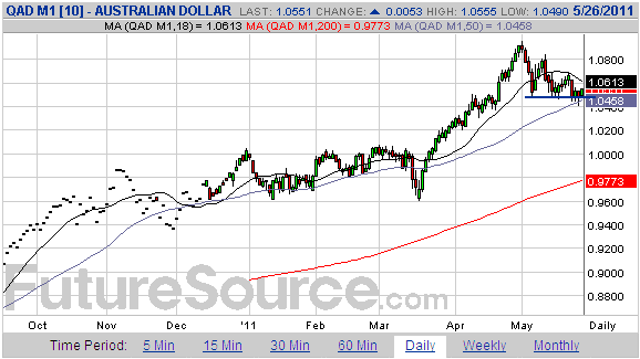
The A$ generally
trends in the same direction as the world's major stock markets, so to
get a large decline in the A$ there will probably have to be a large
stock market decline. We view a large stock market decline as a
reasonable prospect for H2-2011 and therefore perceive substantial
intermediate-term downside risk in the A$.
As things stand today, there is no evidence that the A$ has made a peak
of significance. As long as 1.05 continues to hold on a daily closing
basis it will be reasonable to assume that at least one more rally to a
new high lies in store, but if 1.05 gives way and there is some
follow-through to the downside then it will be reasonable to assume
that any subsequent rally will do no better than test the early-May
peak.
Update
on Stock Selections
(Notes: 1) To review the complete list of current TSI stock selections, logon at http://www.speculative-investor.com/new/market_logon.asp
and then click on "Stock Selections" in the menu. When at the Stock
Selections page, click on a stock's symbol to bring-up an archive of
our comments on the stock in question. 2) The Small Stock Watch List is
located at http://www.speculative-investor.com/new/smallstockwatch.html)
 As per Stock Selection Update #66,
which was emailed to subscribers on 25th May, we have removed the
Franco Nevada warrants from the TSI Stocks List and recorded a profit
of 35%. As per Stock Selection Update #66,
which was emailed to subscribers on 25th May, we have removed the
Franco Nevada warrants from the TSI Stocks List and recorded a profit
of 35%.
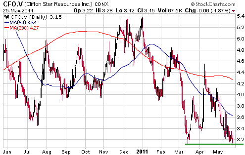
Clifton Star Resources (TSXV: CFO). Shares: 35M issued, 40M fully diluted. Recent price: C$3.15
It's been more of the same with Quebec-based junior gold explorer CFO,
in that there has been an almost complete absence of news despite the
reasonable expectation that there would be plenty of market-moving
news. This is a function of the news flow being controlled by Osisko
(OSK), the JV partner from hell.
The lack of news has prompted steady selling from frustrated
shareholders and made sure that new buying interest has been kept to a
minimum, the result being that CFO's stock price has drifted back to
its 52-week low. It's a buy near the current price, but only for
speculators with a lot of patience.
Chart Sources
Charts appearing in today's commentary
are courtesy of:
http://stockcharts.com/index.html
http://www.futuresource.com/

|