|
- 28 August, 2002
The US
Stock Market
Another look at market sentiment
As well as looking at the absolute
levels of sentiment indicators as part of our market analysis, we pay attention
to how the indicators move relative to the stock indices. For example,
a 10% drop in a volatility index that occurs in parallel with a 10% rise
in the associated stock index has a very different meaning to a 10% drop
in a volatility index that happens in parallel with a 1% rise in the associated
stock index. Volatility usually declines as the market rallies, but in
the latter case the drop in volatility was disproportionately large. Such
an occurrence is a sign that traders are becoming more bullish than is
warranted by the price action and, therefore, that the potential for further
upside is minimal. Another way of looking at this is in terms of the old
saying that bull markets climb a wall of worry. If the rate at which the
'worry wall' is disintegrating is fast compared to the rate at which the
market is climbing, then the market will quickly run out of wall.
Despite what would appear to be a glut
of things to worry about, market participants have lately been surprisingly
quick to embrace the idea that the worst is over for the stock market.
Evidence that this is the case is provided by the plunges in put/call ratios
and volatility indices over the past few weeks. For example, in last week's
Interim Update we included a chart showing that the QQQ Volatility Index
(QQV) had dropped to the same level reached last December when the QQQ
was hitting an intermediate-term peak. Also, a chart included in the latest
Weekly Update showed that the 10-day moving-average of the equity put/call
ratio had dropped to near its lowest levels of the past 2 years. What is
truly remarkable is that these sharp declines in put/call ratios and volatility
indices have occurred in response to mere 20% bounce in the major stock
indices. This tells us that a strong bullish bias remains in place. The
market can trend relentlessly lower for months on end, but when prices
rebound for just a few weeks from oversold extremes and retrace just a
small portion of their preceding declines the 'worry wall' suddenly disappears.
We are going to further emphasise (labour?)
the point we are trying to make by taking a close look, via the below chart,
at the performance of the NASDAQ100 Volatility Index (VXN) relative to
the performance of the NASDAQ100 Index (NDX) since last September's bottom.
Note that the scale on the VXN part of the chart is reversed so that a
rising line on the chart indicates falling volatility.
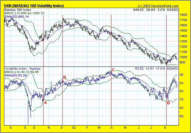
The VXN spiked to over 90 at the bottom
last September. A month later (point A on the chart) the NDX had rallied
by around 20% while the VXN had fallen by around 20%. At this point the
VXN was still very high, indicating that fear remained the dominant emotion
in the market despite the good bounce in the NASDAQ100. The NDX subsequently
peaked in early-December with the VXN at around 47 (point B on the chart).
Then something unusual happened - volatility continued to decline (traders
continued to become more complacent) even though the NDX had rolled over
and had begun to trend lower. The VXN actually bottomed in late-March of
this year (point C on the chart), a time when the NDX was already down
by more than 10% from its December peak. This mismatch between sentiment
and price action was a clear warning sign that the next decline in the
market was going to be substantial. The next decline was substantial
and a bottom was reached in early-August (point D on the chart). However,
despite the fact that this bottom was way below the September-2001 bottom,
the decline ended without a large spike in volatility.
The NDX gained about 20% from its early-August
bottom to last week's peak. Over the same period the VXN fell by around
35% and actually moved below the level it had reached when the NDX was
peaking last December. Note the enormous difference in the behaviour of
the VXN during the September-December rally last year and the current rally.
After a 20% rally last September/October the VXN was around 70, whereas
the recent 20% bounce - a bounce that has not yet even taken the NDX above
last September's low - has resulted in the VXN falling to 45.
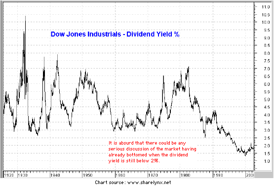
The performances of short-term sentiment
indicators such as the VXN and put/call ratios suggest that the next bear-market
leg will begin sooner rather than later, while sentiment indicators such
as the Dow dividend yield (see chart below) simply tell us that bullish
sentiment still dominates the long-term thinking of market participants
and that the major indices will eventually trade much lower. The
dividend yield is traditionally used as a measure of valuation, not sentiment,
but we think it is a good long-term sentiment indicator. This is because,
at a genuine bear-market bottom, the majority of investors will have very
low expectations regarding the capital gains they are likely to achieve
through investing in the stock market. As such, they will demand that companies
pay out most of their earnings as dividends in the expectation that dividends
will make up most, if not all, of the returns on equity-market investments.
Therefore, the fact that the Dow's dividend yield is still very close to
an all-time low not only reflects a valuation problem, but also a sentiment
problem. The average stock market investor is still very optimistic (he/she
is clearly anticipating significant capital gains).
The above chart illustrates the dividend-yield
problem from a macro perspective, but the present situation of one particular
company - Microsoft - highlights the dividend problem (or valuation problem
or sentiment problem) from a micro perspective. MSFT does not pay a dividend,
yet if any company was in the right financial shape to pay a dividend it
would be this one. MSFT is very profitable, it has no debt, and has $40B
of cash. Furthermore, its days of rapid growth are in the past. So, why
doesn't MSFT pay a dividend? The reason is that the stock market makes
no demands on it to pay a dividend. What we mean by this is that investors
in the current environment are still prepared to pay 10-times sales for
this technology behemoth even though its growth-rate has slowed to a crawl
and it pays no dividend. Anyone who is prepared to buy or hold MSFT at
its current price - and there are a lot of people amongst the general public
and the professional investment community who are - cannot possibly be
bearish. In fact, they must be raging bulls, not only on the prospects
for MSFT but on the prospects for the computer industry, the technology
business in general, and the global economy.
Current Market Situation
Coming into this week we had little
doubt that the market had reached a short-term peak and that a pullback
was about to ensue. The question we were wrestling with, however, was whether
a) this week's pullback would evolve into another major decline that would
take the stock indices well below July's lows, or b) this week's pullback
would be followed by another rally to new recovery highs prior to the next
major decline getting underway.
In the latest Weekly Update we listed
3 reasons why we thought it was more likely that this week's pullback would
be followed by a rally to new recovery highs. A fourth factor supporting
this short-term bullish view is that the Dollar Index appears to be consolidating
prior to another up-move that should take it to the 111-112 range. Since
the US$ has tended to move in the same direction as the US stock market
(both the Dollar and the stock market reversed higher during the second
half of July), the Dollar's relatively bullish price action is a short-term
positive for the stock market.
On the bearish side of the ledger we
have:
a) Sentiment. While sentiment indicators
have revealed a marked increase in fear over the past 4 trading sessions
(a short-term positive), as discussed earlier in today's commentary sentiment
is, on the whole, a major negative for the stock market. The overall sentiment
picture is consistent with last week's peak being THE peak of the post-23rd-July
recovery rally.
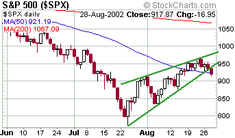
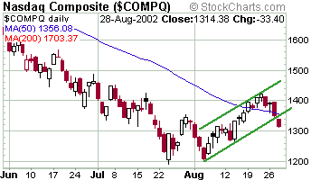
b) The major stock indices have broken
their short-term up-trends. Two examples - the S&P500 Index and the
NASDAQ Composite Index - are shown below.
c) We are now into "pre-announcement
season", a period that occurs every quarter when companies announce changes
to their previous financial guidance. During the great bull market of the
1990s this was often a good time for the market because most of the pre-announcements
were positive, but over the past 2 years the vast majority have been negative.
The "pre-announcement season" got into full swing after the close of trading
on Tuesday when Nortel (NT) announced that its Q3 revenue was going to
be 10% less than previously forecast. Nortel's pre-announcement was quite
extraordinary in that its previous forecast was made as recently as 18th
July, that is, the business environment in the telecommunications sector
appears, from the viewpoint of Nortel management, to be considerably worse
now than it was just 6 weeks ago. This, in turn, suggests that Nortel's
negative 'surprise' is likely to be the first of many amongst the telecom/tech
companies. (The market's response to the Nortel news was, by the way, rather
subdued. NT fell 15% but closed above where it opened. Also, the volume
of shares traded yesterday was less than the average daily trading volume.
So, although the news was very negative the market's reaction to the news
was a marginal positive.)
The bottom line is that we expect the
stock market to drop below the July lows prior to the end of this year,
but we are still unsure as to whether or not last week's highs will be
exceeded prior to the start of a major decline.
Gold and
the Dollar
Gold stocks versus the stock market
In the 29th April Weekly Update we
included the below chart of the S&P500/XAU ratio and said "...the
S&P500/XAU ratio has shown a propensity, over the past 5 years, to
peak during the July-August period every year and to bottom during the
September-October period. The only exception to this cyclical behaviour
occurred in 2000 when the cycle inverted (a peak occurred where a trough
would normally have been expected)". The grey arrows on the chart identify
the Jul-Aug peaks and the blue arrows identify the Sep-Oct bottoms.
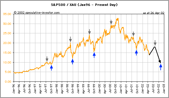
We went on to say "The above chart
does not have much practical value right now, but it may do at some point
over the next few months. If the S&P500/XAU ratio does move higher
into Jul-Aug and then starts to roll over we will know that the cyclical
pattern of the past few years is still in effect and that we should prepare
ourselves for gold stocks to dramatically out-perform the stock market
over the ensuing 2 months."
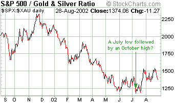
Below is a 1-year chart of the S&P500/XAU
ratio showing that rather than make a high during the Jul-Aug period of
this year as would have been expected based on the cyclical pattern of
the past few years, the ratio made a low during this period. This indicates
that the cyclical pattern might be inverting this year and that the ratio
will make a peak during the Sep-Oct period (probably during October). If
this is the case it doesn't necessarily follow that gold stocks will fall
and the general stock market will rise over the next 6 weeks. A rise in
the ratio would also come about if both the XAU and the S&P500 fell
with the XAU falling faster, or if both indices rose with the S&P500
rising faster.
Current Market Situation
In the latest Weekly Update we included
a chart of the gold price that showed projections of what we considered
to be the 2 most likely outcomes over the remainder of this year. We noted
that we would know which of the two projections was playing out by the
end of this week. Based on what has happened over the first 3 days of this
week it seems that the gold price is following the projection shown in
red. The 'red projection' was for a rally into early September, a decline
into early October, and then a rally into year-end. From a 6-9 month perspective
the 'red projection' was the more bullish of the two. Note that the red
line on the chart is also consistent with the cycle inversion that the
S&P500/XAU chart suggests might be occurring.
Further to the above we expect a rally
in the gold price to 320-325 over the next week or so followed by a 4-6
week pullback.
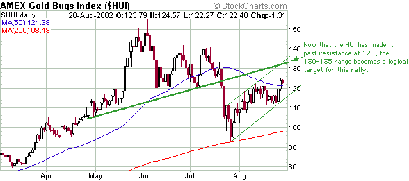
Below is a 6-month chart of the Amex
Gold BUGS Index (HUI). The HUI's price action confirms the near-term bullish
outlook for the gold price.
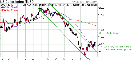
Below is a 1-year chart of the Dollar
Index. For the reasons outlined in last week's Interim Update we expect
the Dollar Index to rally to 111-112 prior to embarking on the next major
decline in a bear market that we expect to last well into next year.
The upshot of the above is that a move
in the gold price to above 320 or a move in the HUI to above 130 during
the next week would, in our view, present traders of gold and silver stocks
with a reasonable short-term selling opportunity. Investors should just
continue to hold in anticipation of much higher prices over the coming
6-9 months, provided they are not currently over-committed to gold/silver
stocks. For a definition of "over-committed" refer to the section entitled
"The 1970s road map re-visited" in the 3rd July Interim Update.
What is bullish for gold?
Over the medium-to-long-term gold moves
inversely to the US$. As confidence in the US$ falls, the investment demand
for gold tends to rise. So, what is bearish for the US$ is bullish for
gold. Also, what is not bearish for the US$ is probably not bullish for
gold.
Bearish factors, as far as the US$
is concerned, would include things like:
a) Major problems within the US banking
system
b) US$ inflation, to the extent that
the effects of the inflation are seen in commodity prices and interest
rates
c) A drop in the expected real returns
on US$-denominated assets and debt
d) Evidence of widespread corruption
within the US private and/or public sectors
e) A large US current account deficit
A US attack on Iraq would not necessarily
be bearish for the US$ and, therefore, would not necessarily result in
a substantial rise in the gold price. The effects on the currency and gold
markets of a war against Iraq would be very different depending on whether
the financial markets perceived that the war would be won quickly and efficiently
by the US or whether a difficult and drawn-out campaign was anticipated.
Contrary to popular opinion a rise
in the oil price is not bullish for gold. In the past, gold and oil have
had a strong positive correlation during some periods and have had an inverse
correlation during others. It all depends on what factors are driving the
oil price. For example, if the oil price is rising due to US$ inflation
then it is likely that a rising oil price will be accompanied by a rising
gold price. However, if the oil price is rising due to a reduction in oil
supply (for example), there is no reason why such a rise would be bullish
for gold.
In summary, gold is a form of money
that competes with the US$ in particular and the paper currencies of the
world in general. Figuring out what is bullish for gold involves figuring
out what is bearish for fiat currency.
Chart Sources
Charts used in today's commentary were
taken from the following web sites:
http://stockcharts.com/index.html
http://www.decisionpoint.com/
http://www.sharelynx.net/

|
