|
- Interim Update 29th July 2009
Copyright
Reminder
The commentaries that appear at TSI
may not be distributed, in full or in part, without our written permission.
In particular, please note that the posting of extracts from TSI commentaries
at other web sites or providing links to TSI commentaries at other web
sites (for example, at discussion boards) without our written permission
is prohibited.
We reserve the right to immediately
terminate the subscription of any TSI subscriber who distributes the TSI
commentaries without our written permission.
Getting some things straight regarding China
The
conventional wisdom has it that the massive foreign currency reserve
held by China's government is primarily due to the US trade deficit,
and that the US economy will be in big trouble should China ever decide
to stop financing the trade deficit. As is often the case, this piece
of conventional wisdom is wrong.
Here are the facts. First, the US economy is in big trouble, but the
trouble has nothing to do with the trade deficit or the possibility
that China's government will dump some of its US$ holdings (the causes
of the US economic malaise have been detailed in previous TSI
commentaries). Second, China does not "finance" the US trade deficit.
What happens is that Chinese producers willingly send goods to the US
in exchange for dollars. If the manufacturers of Chinese goods are
dissatisfied with this arrangement then they have the choice of finding
other customers or stopping production. Third, the extraordinary size
of China's official foreign currency reserve ($2.1 trillion and
growing, about 70% of which is US$-denominated) stems from the efforts
that have been made over the years by China's government to 'manage'
the Yuan's foreign exchange value. It works like this: A Chinese
company exports some stuff to the US and receives dollars in return,
but most of the company's costs are Yuan-denominated so the company
trades these dollars for the local currency. When this is done on a
large scale it puts upward pressure on the Yuan relative to the US$,
which the Chinese Government wants to resist. The government therefore
buys the dollars using newly-created Yuan, thus offsetting the upward
pressure on the Yuan. In other words, to keep the Yuan/USD rate at a
certain level the government of China adds to its USD reserves and
simultaneously increases the Yuan supply. This not only has the effect
of reducing the Yuan/USD rate to below where it would otherwise be, it
also boosts prices within China. Fortunately or unfortunately,
depending on how you look at it (Keynesians and Monetarists would say
"fortunately" whereas members of the Austrian School would say
"unfortunately"), the prices that have been affected to the greatest
extent to date are the prices of investments (stocks, real estate and
capital goods).
In summary, the huge currency reserve amassed by China's government is
not a function of the US trade deficit; rather, it is a function of
China's efforts to prevent the trade situation from increasing the
relative value of the Yuan.
The conventional wisdom also has it that the economic stimulus program
implemented by China's government has worked, as evidenced by data
showing that its economy is again growing at a rapid pace.
The fact is that China's government has been able to create the
ILLUSION of success by setting in motion a dramatic expansion of the
money and credit supplies via the government-controlled banking system.
Bad loans are being piled on top of bad loans and new mal-investments
are being piled on top of earlier mal-investments, thus creating even
more distortions within an economy that is already labouring under the
distortions created by previous rampant credit expansion.
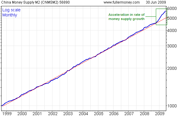
The following chart of China's M2 money supply tells an important part
of the story. The chart has a semi-log scale, so a straight line on the
chart would indicate a constant percentage rate of change. Notice that
over the 9-year period leading up to the final quarter of last year the
blue line representing M2 never deviated far from its long-term trend
line (drawn in red), meaning that the M2 growth rate remained fairly
constant throughout this period. Notice, as well, that the blue line
has since moved well above its long-term trend. The slope of the red
line represents annual growth of 16%-17%, which is very high but pales
in comparison with the current annual growth rate of 28%.
A sustainable
increase in consumption must be preceded by an increase in production
(it is production, not consumption, that drives real economic growth),
but the corollary is not true in the situation where the government
encourages the economy to produce more of something for which there is
no end market. When increased production is prompted by government
directives and/or the creation of money/credit out of nothing, the
thing that will end up being consumed is the invested capital.
By throwing huge sums of money around and by forcing banks to lend as
if there were no tomorrow, China's government has stimulated investment
in factories, real estate and the stock market at a time when existing
factories are shutting down in droves, rental yields are very low and
the development of new real-estate projects is running well ahead of
sustainable demand, and the stock market is priced for perfection. We
can be sure that this story will end very badly, we just don't know
when.
The Stock Market
Comparisons with previous post-crash rebounds
The 1929 stock market collapse took the Dow Industrials Index from 380
down to 200. The ensuing rebound last about 5 months and took the Dow
back to 295, so in this instance the post-crash rebound retraced a
little more than 50% of the preceding decline.
The 1937-1938 stock market collapse was of similar magnitude to the
1929 event, but it stretched over a much longer period. The Dow went
from 195 down to 100, after which there was a rebound lasting about 7
months that took the Dow back to around 160. In this instance the
post-crash rebound retraced about 60% of the preceding decline.
The 2007-2009 stock market collapse took the S&P500 Index (SPX)
from 1565 down to 677. IF the ensuing rebound lasts 5-7 months and ends
up retracing 50% of the preceding decline then the SPX will peak at
around 1120 some time during August-October.
One of the confusing aspects of the current post-crash rebound is that
different indices bottomed at very different times. For example, the
SPX and the Dow bottomed in March of 2009, but the NASDAQ100 and a
number of important non-US indices bottomed in November of 2008. Given
that most senior indices around the globe made new post-crash highs
last week it looks like the stock market is 'keying off' the March low.
Putting it another way, it looks like the post-crash rebound's clock
started to tick in March.
Current Market Situation
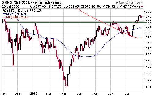
The stock market moved higher in a straight line during the 2-week
period ending last Friday, making it likely that there would be some
sort of consolidation or pullback. So far, the pullback has been small.
With reference to the following daily S&P500 chart, former
resistance at 945 is now support. The 50-day moving average lies about
20 points lower at around 925.
Our guess is that the current pullback/consolidation will do no worse than take the S&P500 down to 925-945.
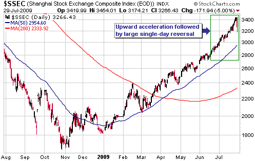
This week's
performance of China's stock casino, as represented by the Shanghai
Stock Exchange Composite Index (SSEC), has been interesting. As
illustrated by the following chart, the SSEC accelerated upward over
the past 5 weeks or so and then reversed sharply lower on Wednesday.
This is the form that an important top in a highly speculative market
will often take, but the downward reversal could also be marking a peak
of only minor significance.
If an important peak has just been put in place then we would expect to see the following sequence over the next 3-6 weeks:
1. An initial decline to around the 50-day moving average
2. A rebound to a lower peak
3. A second decline
4. A break below the low of the initial decline
Step 4 in the sequence would be a clear sign that the SSEC's post-crash rebound had ended.
Gold and
the Dollar
Gold
Since reaching a short-term peak in February of this year the gold
market has been shifting back and forth within what could turn out to
be a contracting triangular consolidation. There has been no meaningful
follow-through in either direction. The most recent action fits the
pattern in that more than half the gain achieved during the fortnight
ending last Friday has already been given back.
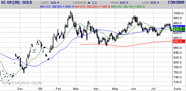
The following daily chart shows that August gold ended Wednesday's
session below its 50-day and 18-day moving averages (the blue and green
lines on the chart), and is now back to near the middle of its 6-month
price range. The short-term price action is neutral and sentiment is
slightly bearish.
Gold Stocks
We doubt that the overall correction in the gold sector will end prior
to October of this year. Furthermore, we won't be surprised if the
correction extends into 2010. Within this corrective process there
will, of course, be short-term rallies and declines, with some
individual gold stocks making new highs for the year during the
rallies.
If the gold sector follows its seasonal pattern then the short-term
rally that began earlier this month should continue into the first half
of September. However, for this to remain the most likely outcome the
gold-stock indices shouldn't retrace much more than half of their
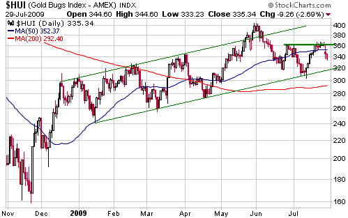
recent gains before resuming their upward trends. In the HUI's case,
this means that the pullback should now be almost complete because at
Wednesday's closing price of 335 the HUI had retraced half of its
preceding 2-week advance. A pullback low could therefore be at hand,
although the following chart shows that there is a well-defined
trend-line at around 320 that could act as a magnet over the coming
days.
As an aside, lines on charts don't determine trends, and being able to
do what most primary school kids are capable of doing (drawing straight
lines between points on a chart, that is) won't enable you to
consistently make money in the financial markets. The markets just
aren't that simple. However, nowadays so many people pay attention to
trend lines that the lines can exert a short-term effect. It's a form
of self-fulfilling prophecy.
We think investors
should be looking for opportunities to accumulate gold stocks on
weakness, keeping in mind that there is no urgency.
Currency Market Update
A daily chart of the September euro is displayed below. The chart shows
that the euro began the week by re-testing intermediate-term resistance
at 1.43 and then reversed sharply lower on Wednesday.
The euro's Wednesday reversal followed on the heals of the downward
reversal in China's stock market mentioned earlier in today's report
and occurred in parallel with sharp declines in the prices of many
commodities. The moves in these different markets are linked in that
there has been a strong positive correlation between the euro and all
the growth-oriented markets over the past year. Another way to put it
is that there has been a strong inverse relationship between the US$
and the growth-oriented markets.
China is widely perceive to be the main driver of 'growth', so the
sharp decline in China's stock market during Asian trading on Wednesday
was probably the main cause of the commodity and currency market action
during the US trading session. However, news that the US government is
moving ahead with its plan to impose stricter limits on commodity
speculators undoubtedly helped things along.
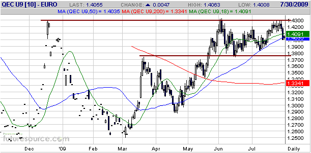
This week's action
gives the euro's chart a more bearish look, but we continue to believe
that the stock market's performance is the key to whether the euro has
already topped on an intermediate-term basis or will make some
additional gains before topping out. In particular, if we are seeing
nothing more serious than a 1-3 week correction in the stock market
then the euro will probably break above 1.43 within the coming month or
two.
Update
on Stock Selections
(Note: To review the complete list of current TSI stock selections, logon at http://www.speculative-investor.com/new/market_logon.asp
and then click on "Stock Selections" in the menu. When at the Stock
Selections page, click on a stock's symbol to bring-up an archive of our comments on the stock in question)
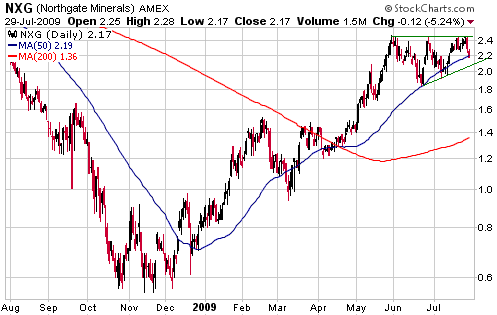
 Northgate Minerals (AMEX: NXG). Recent price: US$2.17 Northgate Minerals (AMEX: NXG). Recent price: US$2.17
Taking into account both chart pattern and valuation, at current prices
NXG is probably the best of the bunch of larger-scale junior gold
producers (gold miners with production in the 100K-400K range) that we
follow. It is trading at less than half our assessment of its fair
value, and the price action of the past two months looks more like a
bullish consolidation than a topping pattern.
Further to the note in the latest Weekly Update, it would be reasonable
to take a trading position in the stock near the current price and to
place an initial stop at US$1.95 (effective on a daily closing basis).
Also, for those who don't have a position it would make sense to do
some buying near the current price for longer-term investment purposes
as part of a methodical scaling-in process.
Franco Nevada Warrants (TSX: FNV.WT). Recent price: C$4.40
FNV.WT is one of the most interesting of the currently available
gold-stock warrants. It has an exercise price of C$32.00 and an expiry
date of March-2012.
A chart of the underlying stock (Franco Nevada, a royalty company that
generates about 70% of its revenue from gold royalties and the
remaining 30% from oil/gas royalties) is shown below. We won't be
surprised if FNV works its way down to near support at C$22.00 within
the next three months, pushing the price of the aforementioned warrants
down to the low-C$3 area. If this were to happen then we would almost
certainly add the warrants to the TSI Stocks List.
When adding to or removing from the TSI Stocks List we have to pick our
spot, but when managing our own money we typically average into and out
of positions over time. So, although we are hoping for a better
opportunity to add FNV.WT to the TSI List, we have begun to average
into these warrants in our own account. The reality is that the
warrants now offer reasonable value relative to the stock (our main
concern is that the stock hasn't completed its correction) and that if
FNV rallies to C$50 or higher at any time over the next 2.5 years it
won't matter a great deal whether we originally paid C$4.40 or C$3.20
for the warrants.
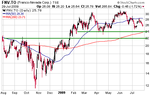
Chart Sources
Charts appearing in today's commentary
are courtesy of:
http://stockcharts.com/index.html
http://www.futuresource.com/
http://www.fullermoney.com/

|
