![]()
![]()
![]()
![]()
- Interim Update 29th August 2018
Copyright
Reminder
The commentaries that appear at TSI
may not be distributed, in full or in part, without our written permission.
In particular, please note that the posting of extracts from TSI commentaries
at other web sites or providing links to TSI commentaries at other web
sites (for example, at discussion boards) without our written permission
is prohibited.
We reserve the right to immediately
terminate the subscription of any TSI subscriber who distributes the TSI
commentaries without our written permission.
There will be warnings!
If you rely on the mainstream
financial press for your information then you could be forgiven for
believing that financial crises happen with no warning. However, there are
always warnings if you know where to look.
Here are four leading
indicators of financial stress and/or economic confidence that are both
easy to monitor and worth monitoring. It's likely that all four of these
indicators will issue timely warnings prior to the next financial crisis
and a virtual certainty that at least two of them will.
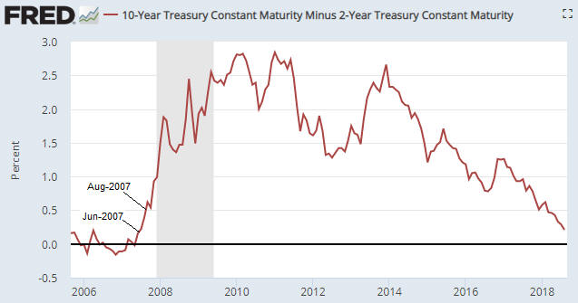
1) The
yield curve, as depicted on the following chart by the 10yr-2yr yield
spread.
As explained in many previous commentaries, the yield curve
'flattening' to an extreme and then beginning to steepen warns that an
inflation-fueled boom has begun to unravel. For example, the yield curve
reached its maximum 'flatness' in November-2006 and provided clear
evidence of a reversal in June-2007. That was the financial crisis
warning. By August of 2007 the 'steepening' trend was accelerating.
The yield curve's current situation looks more like Q4-2006 than
Q3-2007. It is nothing like 2008.
2) Credit spreads, as depicted on the following chart by the
difference between the Merrill Lynch US High Yield Master II Effective
Yield and the yield on the 10-Year T-Note.
Credit spreads start to
widen, indicating a decline in economic confidence and/or a rise in the
perceived risk of default at the junk end of the debt market, well before
a recession or crisis. For example, evidence of a new widening trend in
credit spreads emerged in July-2007 and by November-2007 it was very
obvious that trouble was brewing.
Note that when it comes to
warning of a coming crisis, credit spreads are far more likely to generate
a false positive signal than a false negative signal, that is, they are
far more likely to cry wolf when there's no wolf than to remain silent
when there is a wolf.
Right now they are silent.

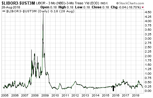
3) The short-term interest rate at which banks lend to other banks
versus the equivalent interest rate at which the US federal government
borrows money, as depicted on the following chart by the LIBOR-UST3M
spread.
When trouble begins to brew in parts of the banking system
it gets reflected by higher interest rates being charged for short-term
inter-bank loans well before it becomes common knowledge. This causes the
spread between 3-month LIBOR (the average 3-month interbank lending rate)
and the 3-month T-Bill yield to increase. For example, the LIBOR-UST3M
spread was languishing at around 0.20% in early-2007, indicating minimal
fear within the banking system, but then began to rise steadily and
reached 0.75% in June-2007. This was an early warning sign of trouble. The
spread then pulled back into July-2007 before rocketing up to 2.25% in
August-2007. This constituted a very loud warning. After that the spread
became very volatile and moved as high as 4.5% at the peak of the Global
Financial Crisis in October-2008.
At the moment the LIBOR-UST3M
spread is languishing at around 0.20%.
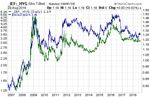
4) The gold price relative to industrial metals prices, as depicted on
the following chart by the gold/GYX ratio (the US$ gold price divided by
the Industrial Metals Index).
The gold/GYX ratio acts like a credit
spread. This is because gold's performance relative to the industrial
metals sector tends to go in the same direction as economic confidence. In
particular, when confidence begins to decline in the late stage of a boom
or the early stage of a bust, the gold/GYX ratio begins to trend upward.
The following chart illustrates the long-term positive correlation
between gold/GYX and a credit spread indicator in the form of the IEF/HYG
ratio.
The gold/GYX ratio recently bounced from the bottom of its
7-year range. If the bounce continues and gold/GYX exceeds its early-2018
high it would be the first sign of a declining trend in economic
confidence.
Currently, none of the above indicators is warning that a financial
crisis is imminent or even that a financial crisis is starting to develop.
The probability could change as new information becomes available, but
based on the present values of the best leading indicators there is almost
no chance that a financial crisis will erupt within the next three months.
A stock market crash is a different 'kettle of fish', because while a
financial crisis always will be accompanied by a large decline in the
stock market it is possible for a large decline in the stock market to
occur in the absence of a financial crisis. The 1987 stock market crash is
an excellent example.
While the four indicators mentioned above
should issue timely warnings prior to a financial crisis, they may not
warn of a stock market crash that isn't part of a broader crisis. As is
the case with a financial crisis, though, a stock market crash won't
happen 'out of the blue'. In particular, the stock market won't make a new
all-time high one day and crash the next. This is because it takes time
from the ultimate price high to create the sentiment backdrop that makes a
crash possible. The amount of time is generally at least two months and
involves an initial decline, a rebound that retraces 50%-100% of the
initial decline and then a second decline that turns into a crash when the
initial low is breached. It's likely that until the low of the initial
decline is breached the price action will have the look of a routine
correction.
In summary, short-term stock market risk is high, but
there are no warning signs that a financial crisis is brewing or that a
stock market crash (as opposed to, say, a 10% correction) is a realistic
short-term possibility.
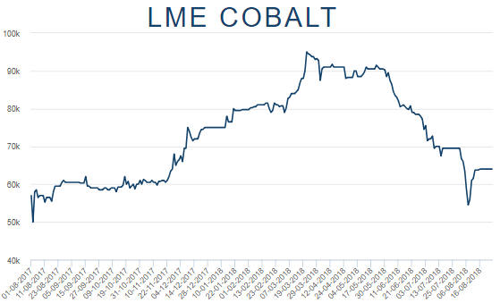
The cobalt
correction may be complete
The cobalt market's downward
price correction probably ended on 7th August at $54,500/tonne
($24.80/pound). The price rebounded quickly to about $63,000/tonne and has
since stabilised at $64,000-$65,000/tonne (about $29/pound), indicating
that supply is no longer overwhelming demand.
If the metal's price
correction ended earlier this month then the more severe corrections in
the stock prices of cobalt-focused companies also should be over, although
the initial price rebounds in these stocks could be followed by tests of
the August lows.
The Stock Market
Analysts at major banks and
brokerages have begun to compete to see
who can come up with the highest price targets for popular stocks such
as AMZN and GOOGL. This is a sign of dangerously optimistic sentiment.
However, it would be an understatement to say that there are no signs of
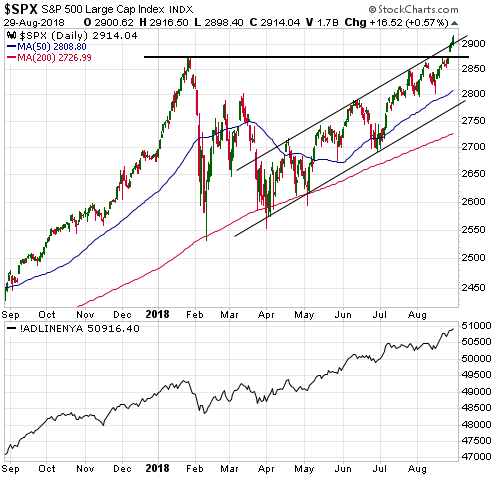
weakness in the price action at this time. On the contrary, the following
chart shows that the SPX has not only broken decisively above its
January-2018 high, but also broken above the top of its upward-sloping
channel. Furthermore, the chart shows that the strength has been confirmed
by the NYSE Advance-Decline Line.
This price action opens up the
possibility that there will be an upside blow-off over the next 2-4 weeks
-- along similar lines to what happened during the first three weeks of
January this year.
Note that the January-2018 high near 2870 is now
important support. This support should hold during any near-term pullback
to keep intact the potential for an upside blow-off.
The blow-off move that ended in January took QQQ (the NASDAQ100 ETF)
to the top of the channel drawn on the following daily chart. A similar
outcome over the coming few weeks would take QQQ up to around $195, or
about 5% above the 29th August close.
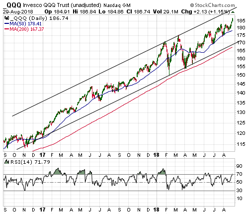
We won't attempt a new bearish speculation until there is either a
sign of weakness, such as the SPX breaking below 2870, or a sign of
extreme strength, such as the QQQ reaching its channel top.
Gold and the Dollar
Gold
By
moving up to around $1220 during the first half of this week and then
pulling back, the US$ gold price has defined a channel dating back to the
start of the short-term downward trend in April. The most important nearby
resistance lies at $1240, but closing above $1220 would now constitute a
significant breakout.
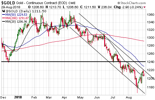
The gold market provided preliminary evidence of a short-term bottom
at the end of last week, with preliminary being the operative word. Until
there is a solid break above $1240 the risk of a plunge to new lows will
remain.
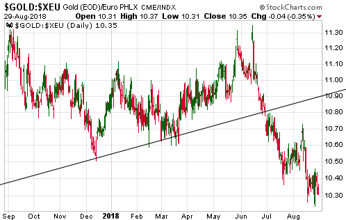
It's worth mentioning that in euro terms the gold price has
stopped falling, but is yet to show any sign of strength. This is
illustrated by the following daily chart of the euro-denominated gold
price (gold/euro). The line drawn on this chart is the bottom of the
long-term upward-sloping channel that contained the price from late-2013
to June of this year.
When gold is genuinely strong it will be
strong in terms of all major currencies.
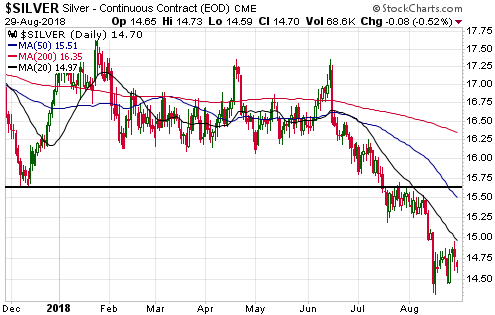
Silver
Silver is yet to provide even
preliminary evidence that a short-term bottom is in place. Such evidence
would be a daily close above the 20-day MA, which is currently near
$15.00.
A solid break above resistance in the low-$15.60s would be
conclusive evidence of a silver reversal.
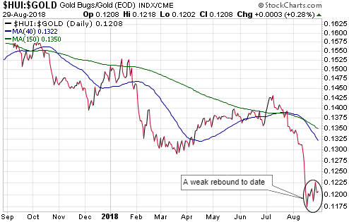
Gold Stocks
The gold-mining indices and ETFs
are in similar positions to silver in that they are yet to provide even
preliminary evidence that short-term bottoms are in place.
For GDX
(see chart below), the important resistance is at $21.00. This is too far
above the current price to be of use at the moment. It's a similar story
for the HUI. Consequently, for the gold-mining sector we must key-off the
bullion market. After all, it's reasonable to assume that if the gold
price embarks on a short-term upward trend then the gold-mining indices
and ETFs will do the same.

When an intermediate-term gold-mining rally eventually gets underway
it will be indicated early on by substantial strength in the gold-mining
indices/ETFs relative to gold. In particular, in its early stage there
will be a sharp rise in the HUI/gold ratio. On the other hand, a slow and
choppy rise in the HUI/gold rally, such as occurred between mid-March and
early-July of this year, will be suggestive of a counter-trend move.
As illustrated by the following chart, HUI/gold's rebound from its
mid-August low has been slow and choppy to date. This is evidence that we
are NOT dealing with the start of an intermediate-term rally.
In one respect the broad US stock market and the gold-mining sector
are in similar positions. They are both extended in one direction and have
the potential to make substantial moves in the opposite direction over the
months ahead, but reversals have not been signaled.
The
Currency Market
Below is an update of a chart that we
first showed about three months ago to make the point that the euro had to
achieve a weekly and monthly close below 1.156 to indicate that its 2017
rally was the bear-market variety. The euro made a weekly close below this
demarcation level on 10th August, but unless there is a sharp decline over
the final two trading days of this week it will avoid the confirming
monthly close for now.

Regardless of whether it ends 31st August above or below 1.156, we
suspect that the euro will rise to at least 1.20 within the next few
weeks. This is based on sentiment and the chart pattern.
Updates on Stock Selections
Notes: 1) To review the complete list of current TSI stock selections, logon at
http://www.speculative-investor.com/new/market_logon.asp
and then click on "Stock Selections" in the menu. When at the Stock
Selections page, click on a stock's symbol to bring-up an archive of
our comments on the stock in question. 2) The Small Stock Watch List is
located at http://www.speculative-investor.com/new/smallstockwatch.html
Chart Sources
Charts appearing in today's commentary
are courtesy of:
https://stockcharts.com/
https://www.lme.com/
https://research.stlouisfed.org/
![]()