|
- Interim Update 30th July 2003
The Long-Term
Gold Bull
Below is the long-term chart of the
Swiss Franc that was included in the 16th April Interim Update. We haven't
bothered to update the chart because the current picture looks very much
the same as it did back in April.
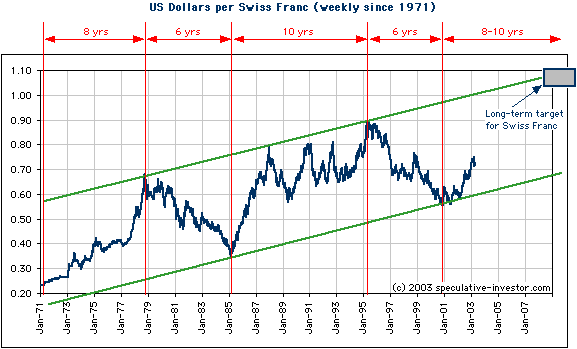
We used the above chart in the earlier
commentary to come up with a rough target, in terms of both time and price,
for the bull market in the SF that began in October of 2000. Our reasoning
was simply that the SF has been in a long-term up-trend since the early
1970s, but within that long-term up-trend there have been two (completed)
cyclical bull markets and two cyclical bear markets. Each of the cyclical
bull markets reached the top of the long-term upward-sloping channel and
lasted 8-10 years while each of the cyclical bear markets ended at the
channel bottom and lasted 6 years. If we assume that this cyclical behaviour
is going to continue, an assumption that seems reasonable given the price
action of the past 3 years and the dollar's poor fundamentals, then the
SF will peak in the 2008-2010 period at a SF/US$ rate of greater than 1.
In other words, we think the bear market in the US$, relative to the SF,
is presently less than half over in terms of both time and price.
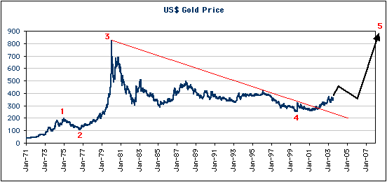
Now, as we've explained on many occasions
in the past, there is a high positive correlation between the gold price
and the SF. We expect this positive correlation to continue, so on this
basis it is probable that the long-term trend for gold will remain bullish
until 2008-2010.
Despite the high positive correlation
between gold and the SF which has, by the way, been as strong over the
past 2 years as it has been at any time over the past 30 years, the long-term
gold chart looks different from the long-term SF chart shown above. This
is perhaps because gold is a less-liquid market and therefore tends to
make larger moves in both directions. In any case, the below chart shows
that gold, like the SF, has been in a long-term bull market against the
US$ since the early 1970s and that another leg in gold's long-term bull
market began over the past 3 years. As opposed to a steady progression
within an upward-sloping channel, as has been the case with the SF, gold's
long-term chart can best be described as a 5-wave structure. The way we
see it, Wave 3 was complete at the 1980 blow-off top, Wave 4 was complete
at the 1999 bottom, and Wave 5 to a new all-time high is currently underway.
It is important to keep the above 'big
picture' views in mind at all times and to continue checking the evidence
against these views to make sure they remain valid. However, it really
isn't enough to simply understand that the gold price is probably going
to reach a long-term peak in 5-7 years time. This is because at some point
there is probably going to be a large counter-trend move lasting 1-3 years,
which, unless you are a masochist, you will want to avoid. For example,
the SF rose strongly during the 1972-1975 period, but then spent 2-3 years
trading sideways before rocketing higher to its major peak. And, during
this period of currency market stability that occurred between the two
big dollar declines of the 1970s the gold price fell by around 50% and
the average gold stock fell by around 70%. If you are an investor in gold
and gold stocks at the present time it is therefore important to understand
what could bring about a multi-year period of stability in the currency
market.
In the latest Weekly Update we discussed
the role that the Fed will potentially play in bringing about a lengthy
period of currency market stability. The driving force behind gold's bull
market is falling confidence in the US$ in particular and fiat currency
in general, but no market moves from the point of maximum confidence to
the point of minimum confidence in a straight line. We are therefore anticipating
that a substantial counter-trend move in 'dollar confidence' will begin
at some point over the next 12 months. As discussed in the Weekly Update,
such a period is likely to begin when the markets come to believe that
the Fed has a handle on the inflation problem.
The US
Stock Market
The 1987 Comparison
There are some striking similarities
between the current market environment and the environment during the months
leading up to the 1987 stock market crash. However, there are also enough
important differences to all but guarantee that what happens in the markets
over the next 6-12 months will be very different to what happened during
1987-1988. We don't have time to go into any detail on this topic now,
but we'll cover it in the next Weekly Market Update.
Current Market Situation
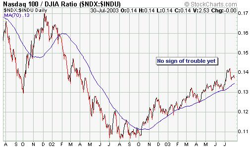
We expect that the NASDAQ100/Dow ratio
will drop below its 70-day moving average during the early stages of the
next MAJOR decline. Conversely, any decline that does NOT result in the
NDX/Dow ratio moving below its 70-day MA will probably not evolve into
anything more serious than a correction within an on-going up-trend. The
below 2-year chart of the NASDAQ100/Dow ratio indicates that there is not,
as yet, any reason to get excited about the prospect of a major decline.
The below chart shows that the Dow
Industrials Index has now been trading sideways for about 2 months. When
a market trends strongly in one direction and then becomes essentially
trendless for an extended period, the next big move is usually in the direction
of the preceding trend. In the Dow's case this would mean that the next
big move would be to the upside.
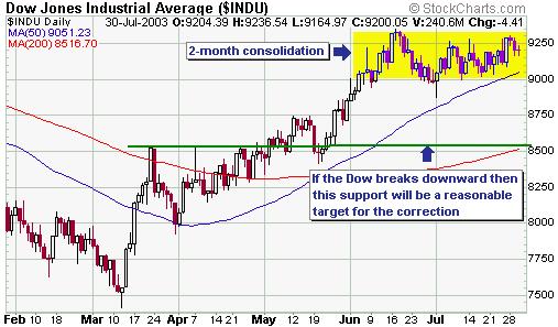
As has been the case now for 2-3 months,
sentiment indicators are consistent with a major peak being close at hand.
Price action, however, indicates that one final upward burst is probably
going to occur BEFORE a major peak is in place. If the Dow breaks out to
the upside in the near future then a major peak would probably be in place
before the end of August. However, a downside breakout from the recent
consolidation would potentially extend the overall advance by a couple
of months. In either case we expect that the market will be trading well
below its current level by the end of the year.
Bonds
After a market reaches a long-term
peak it is normal for the initial sharp decline to be followed by a substantial
rebound before a long and relentless downtrend gets underway. Our view
is that bonds reached a long-term peak in mid-June and that the drop, to
date, has been the initial sharp decline mentioned above. The initial decline
following a major peak often ends about 2 months after the peak, so it
is possible that the first important bottom in the bond bear market won't
occur until around mid-August. In terms of price, though, the initial bond
market decline has already exceeded our expectations.
The below chart shows the yield on
the 30-year T-Bond, which is effectively the inverse of the bond price
(whereas the bond price experienced an upside blow-off during May-June,
the bond yield experienced a downside blow-off). The chart shows a rough
projection of what we expect to happen in the future based on the typical
post-major-peak pattern described above and the tendency of bond yields
to reach a low during the final quarter of the year.
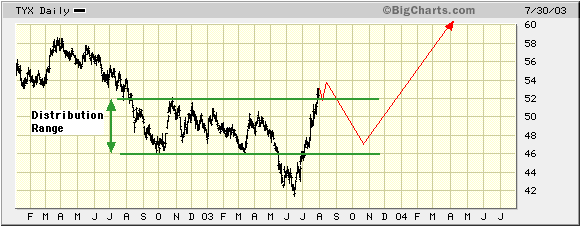
On the above chart we've allowed for
one final upward spike in the bond yield (downward spike in the bond price)
into mid-August prior to a substantial correction getting underway. However,
given that the bond yield has exceeded the most likely upside targets for
its initial advance there's a reasonable chance that an intermediate-term
peak is already in place. The stock market certainly seems to be operating
under the assumption that a yield peak is close at hand because the interest
rate sensitive stocks have performed quite well over the past week. For
example, the S&P Homebuilding Index bottomed more than one week ago,
Real Estate iShares made a new 52-week high on Wednesday, and the Dow Utilities
Index has held above the important support that exists at 231.
Gold and
the Dollar
Gold Stocks
In the latest Weekly Update we said
that a move above 0.50 by the HUI/gold ratio would be a warning sign that
risk in the gold sector was approaching a dangerous level and, therefore,
that it would be time to start lightening-up on gold stocks. The ratio
hit a peak of 0.47 on Monday and is likely to move higher after the current
correction is complete. However, even at 0.47 the ratio is at a level where
it is not reasonable to expect much additional upside in the MAJOR gold
stocks RELATIVE TO the gold price. For example, based on technical considerations
we think Newmont Mining (NYSE: NEM) will trade at $40 before the end of
this year and $50 within 12 months, but such gains from its current price
of around $35 will probably require roughly-equivalent percentage gains
in the gold price. Another way of putting this is that the major gold stocks
such as NEM currently don't offer much leverage to the gold price because
the leverage they did have has been priced out.
The high prices of the major North
American gold stocks relative to the gold price has been a consistent problem
for more than 12 months now and is one of the main reasons we chose to
focus on the junior gold companies. Unlike the NA majors, many of the NA
juniors offer huge leverage to the spot gold price.
If you feel uncomfortable investing
in the junior gold stocks then you should perhaps consider buying physical
gold rather than investing in the major gold stocks. This is because the
percentage gains achieved by the bullion will probably be only slightly
less if gold's uptrend continues, while the downside risk is much lower
than it is with the gold stocks.
Current Market Situation
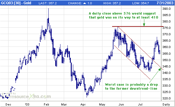
Below is a daily chart of August gold
futures. In the e-mail alert sent to subscribers following Monday's trading
action we said that a short-term peak had probably just been put in place
in the gold market and that a drop to around $355 was likely over the next
1-3 weeks. As noted on the below chart we don't think there is substantial
downside risk in the gold price from its current level, but suspect that
more time will have to elapse before the next sizeable advance gets underway.
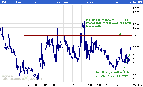
In the above-mentioned e-mail alert
we also said: "Silver broke above the important resistance at 4.90 last
week and has just surged above last year's peak. In doing so it has probably
also created a short-term peak. Obvious upside breakouts are often followed
by pullbacks of sufficient magnitude to punish the 'buy the breakouts'
crowd. In silver's case a pullback over the next few weeks to 4.90, or
perhaps a bit lower, would be normal."
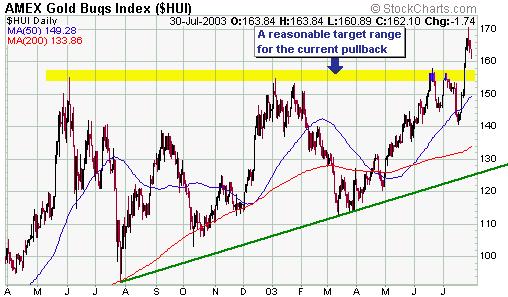
With regard to the AMEX Gold BUGS Index
(HUI), a pullback to the former resistance in the 154-157 range would be
normal.
Our view is that the recovery rally
in the Dollar Index peaked about 2 weeks ago and that the rebound that
has occurred over the past few days will, at best, result in a test of
the peak reached earlier this month. A daily close below $350 in August
gold would, however, cause us to re-think this view.
Update
on Stock Selections
 Below
are charts of the three stocks added to the Stocks List at the beginning
of this week. Our reasons for adding these stocks were summarised in Stock
Selection Update #1, which was e-mailed to paid-up subscribers prior to
the start of trading on Monday and has now been archived at http://www.speculative-investor.com/new/stockemail.asp. Below
are charts of the three stocks added to the Stocks List at the beginning
of this week. Our reasons for adding these stocks were summarised in Stock
Selection Update #1, which was e-mailed to paid-up subscribers prior to
the start of trading on Monday and has now been archived at http://www.speculative-investor.com/new/stockemail.asp.
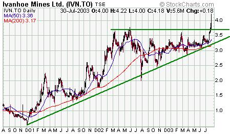
Below is a 3-year daily chart of Ivanhoe
Mines (TSX: IVN). IVN has been trending higher for a few years but had
been in a consolidation range for much of the past 18 months. We generally
prefer NOT to buy after a stock has just moved up to near important resistance,
which was where Ivanhoe's stock price was situated at the end of last week,
but we thought the risk of an upside breakout from its long-term consolidation
was high enough to warrant taking at least an initial position in the stock
at around C$3.70. The stock subsequently did breakout to the upside and
is now likely to hold above 3.70 during future pullbacks.
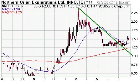
Below is a 1-year chart of Northern
Orion Resources (TSX: NNO). The massive stock dilution that occurred a
couple of months ago has now been mostly factored into the market and the
NNO stock price appears to be on its way to higher levels. There might
be some downward pressure over the next week or so because the shares that
were issued to finance the purchase of a 12.5% stake in Alumbrera are now
able to be traded, but any weakness should be considered as a buying opportunity.
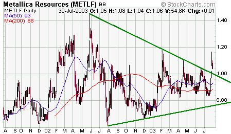
Below is a 2-year chart of Metallica
Resources (OTC BB: METLF, TSX: MR). METLF has spent much of the past 18
months oscillating within the 0.80-1.20 range, although it moved above
trend-line resistance earlier this week. In the absence of any market-moving
news from the company we would expect the stock to hold in the 0.95-1.00
range during the current pullback. The biggest risk with this stock, though,
is that the company will almost certainly raise about US$40M via the issue
of new equity at some point over the next several months in order to finance
the construction of a mine. Ideally, the equity-financing won't be done
until after the stock price has moved considerably higher. However, if
the stock is still around current levels when the financing is done then
the total number of outstanding shares in the company would more than double
and this, in turn, would send the share price down to a much lower level.
Our guess is that the stock would trade down to around 0.75 if the equity
raising were done now. This would, though, create a wonderful and probably
short-lived buying opportunity because the stock represents excellent value
at its current price of around US$1.06. Our approach would be to take an
initial position now and to buy more after the financing is announced.
As an aside, shareholders in small
mining companies sometimes complain when a company in which they own shares
does a private placement of new equity, that is, when the company issues
a bunch of new shares in order to raise money. However, people should understand
that the ONLY way most exploration and development stage companies can
obtain additional funds is to issue additional equity. Companies that don't
yet have operational mines have no revenue, so debt-financing is usually
not possible and nor would it be advisable even if it were possible. The
best that the management of these companies can do is to time any private
placements to coincide with periods of stock-price strength.
We expect that almost all the junior
gold/silver companies in the TSI Stocks List will do a private placement
of new equity over the next 12 months and some of the companies will do
multiple placements. If all goes according to plan then each new placement
will be done at a significantly higher price than the previous placement.
For example, Aquiline Resources did a placement at C$0.25/share in April.
It has recently announced a placement at C$0.65/share and the NEXT placement
will hopefully be done at more than C$1.00/share.
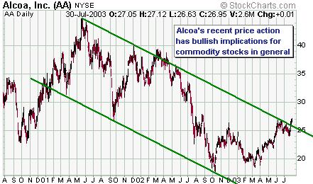
Below
is a chart of Alcoa (NYSE: AA). AA was stopped out of the TSI Stocks List
a couple of weeks ago, but the recent price action in AA and a few other
large-cap commodity-cyclical stocks prompted us to add copper plays IVN
and NNO to the List. A surge in the commodity-cyclicals over the next few
months looks likely.
Below
is a chart of International Paper (NYSE: IP). A close above $40 would decisively
break a 3.5-year downtrend in this stock and suggest that a large rally
was underway. We've previously added the IP January-2004 $50 call options
(IPAJ) to the Stocks List as a speculation that IP would manage to break
out and move sharply higher. These options, which last traded at $0.10,
are still a reasonable speculation, as are the IP January-2004 $45 call
options which last traded at $0.40. As previously advised, any money risked
in purchasing out-of-the-money options should be money that can be written
off without losing a minute's sleep.
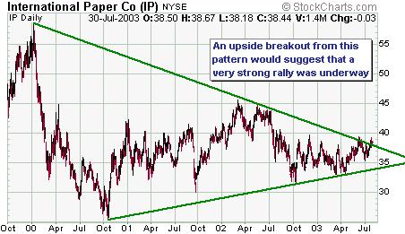
Chart Sources
Charts appearing in today's commentary
are courtesy of:
http://stockcharts.com/index.html
http://www.futuresource.com/
http://bigcharts.marketwatch.com/

|
