|
-- Weekly Market Update for the Week Commencing 1st June 2009
Big Picture
View
Here is a summary of our big picture
view of the markets. Note that our short-term views may differ from our
big picture view.
In nominal dollar terms, the BULL market in US Treasury Bonds
that began in the early 1980s will end by mid-2010. In real (gold)
terms, bonds commenced a secular BEAR market in 2001 that will continue
until 2014-2020. (Last
update: 09 February 2009)
The stock market, as represented by the S&P500 Index, commenced
a secular BEAR market during the first quarter of 2000, where "secular
bear market" is defined as a long-term downward trend in valuations
(P/E ratios, etc.) and gold-denominated prices. This secular trend will bottom sometime between 2014 and 2020. (Last update: 22 October 2007)
A secular BEAR market in the Dollar
began during the final quarter of 2000 and ended in July of 2008. This
secular bear market will be followed by a multi-year period of range
trading. (Last
update: 09 February 2009)
Gold commenced a
secular bull market relative to all fiat currencies, the CRB Index,
bonds and most stock market indices during 1999-2001. This secular trend will peak sometime between 2014 and 2020. (Last update: 22 October 2007)
Commodities,
as represented by the Continuous Commodity Index (CCI), commenced a
secular BULL market in 2001 in nominal dollar terms. The first major
upward leg in this bull market ended during the first half of 2008, but
a long-term peak won't occur until 2014-2020. In real (gold) terms,
commodities commenced a secular BEAR market in 2001 that will continue
until 2014-2020. (Last
update: 09 February 2009)
Copyright
Reminder
The commentaries that appear at TSI
may not be distributed, in full or in part, without our written permission.
In particular, please note that the posting of extracts from TSI commentaries
at other web sites or providing links to TSI commentaries at other web
sites (for example, at discussion boards) without our written permission
is prohibited.
We reserve the right to immediately
terminate the subscription of any TSI subscriber who distributes the TSI
commentaries without our written permission.
Outlook Summary
Market
|
Short-Term
(0-3 month)
|
Intermediate-Term
(3-12 month)
|
Long-Term
(1-5 Year)
|
Gold
|
Neutral
(25-May-09)
|
Bullish
(12-May-08)
|
Bullish
|
US$ (Dollar Index)
|
Bullish
(25-May-09)
| Bullish
(25-May-09)
|
Neutral
(19-Sep-07)
|
Bonds (US T-Bond)
|
Bearish
(06-Apr-09)
|
Neutral
(01-Jun-09)
|
Bearish
|
Stock Market (S&P500)
|
Neutral
(01-Jun-09)
|
Bearish
(11-May-09)
|
Bearish
|
Gold Stocks (HUI)
|
Neutral
(20-May-09)
|
Neutral
(01-Jun-09)
|
Bullish
|
| Oil | Neutral
(11-May-09)
| Bearish
(25-May-09)
| Bullish
|
Industrial Metals (GYX)
| Neutral
(27-Apr-09)
| Bearish
(25-May-09)
| Bullish
|
Notes:
1. In those cases where we have been able to identify the commentary in
which the most recent outlook change occurred we've put the date of the
commentary below the current outlook.
2. "Neutral", in the above table, means that we either don't have a
firm opinion or that we think risk and reward are roughly in balance with respect to the timeframe in question.
3. Long-term views are determined almost completely by fundamentals,
intermediate-term views by giving an approximately equal weighting to
fundmental and technical factors, and short-term views almost
completely by technicals.
Inflation Update
Money Confusion
The total supply of US dollars, as measured by TMS, is about 10% higher
now than it was a year ago. Also, the total amount of credit within the
US economy is higher now than it was a year ago thanks to the
government's yeoman-like efforts to replace the bursting private-sector
credit bubble with a public-sector credit bubble. With the supply of
money and credit continuing to expand -- at an accelerated pace, in the
case of the money supply -- you have to be inventive in order to make
an argument that the US is experiencing deflation. You must either
argue that non-monetary quantities such as collateralised debt
securities and other derivatives form part of the money supply, which
is the tack taken by the author of the article posted HERE,
or argue that a decline in the combined market value of debt counts as
deflation, which is what Mike Shedlock routinely does at his web site. Neither argument is valid, in our opinion.
The idea that collateralised debt and other products of the "shadow
banking system" constitute money holds no water because you can't use
these things to buy goods and services. If you don't believe us, try
handing an ABS (Asset Backed Security) to the person at the Walmart
checkout and see how far you get. Securities of various types can be
posted as collateral when purchasing other investments, but that just
means they have perceived value, not that they are money. Money is the
general medium of exchange.
The idea that a decline in the market value of debt constitutes
deflation boils down to defining deflation in terms of prices (the
price of debt, in this case). However, the market values of debt and
other investments rise and fall for many reasons, some of which are
related to inflation/deflation and some of which aren't. The point is
that a decline in the market value of anything (including debt) does
not, in and of itself, constitute deflation.
What we have observed in the financial world over the past year are the
symptoms of a bursting credit bubble. Such an event creates an enormous
deflationary bias, but up until now this bias has been more than offset
by the inflationary biases built into today's monetary and political
systems.
Rising Fear of Inflation
Suddenly, the financial world is again fretting about inflation. Or, to
put it more aptly, the financial world is again becoming excited by the
prospect of rising prices (most people believe that inflation is
equivalent to rising prices and that rising prices are good).
One of the strange things about the way the financial world tends to
work these days is that the general level of fear/excitement about
inflation moves inversely to the actual rate of monetary inflation.
This happens because a) very few people understand what inflation is,
and b) the monetary authorities react to the lagged effects of
inflation rather than the inflation itself. To be more specific,
economic weakness and/or rapid declines in asset prices cause almost
everyone (the public, professional money managers, economists, most
journalists and newsletter writers, the central bank and the
government) to become concerned about deflation, which prompts policies
designed to rapidly increase the money supply. Due to the normal
lead-lag relationship between changes in the money supply and changes
in prices, the initial phase of this rapid monetary inflation is
usually accompanied by a further reduction in prices, which leads to
heightened fear of deflation. Some time later the INEVITABLE effects of
the money-supply growth begin to emerge, but by then the rate of
monetary inflation has tapered off. As time goes by the increasingly
blatant effects of the preceding money-supply growth lead to the
widespread perception of an inflation problem and to more restrictive
monetary policies, even while the actual inflation (money-supply
growth) rate shifts to a relatively low level.
The inverse relationship described above is exemplified by last year's
events. Recall that 12 months ago the fear of inflation was palpable.
This fear was a reaction to the combination of rising bond yields, a
falling US$, a very strong oil market and sharp rises in goods/services
prices, but it was occurring at a time when the rate of monetary
inflation was low and had been low for quite a while. Our view at the
time was that the stark mismatch between inflation reality and
inflation perception created substantial downside risk for commodities
and the potential for multi-month rallies in the bond market and the
US$. Moreover, by July-August of last year we were talking about the
likelihood of a deflation scare. But despite our concerns at the time,
it turned out that we were actually UNDER-estimating the downside risk
in commodities and the speed with which fear of inflation would
transmogrify into fear of deflation.
Naturally, the fear of deflation that overtook the financial world last
September-December provoked a massive inflationary response from the
central banking community, leading, as usual, to the fear of deflation
peaking at around the same time as the rate of monetary inflation was
probing its highs of the past 20 years.
Equally naturally, the effects of the September-December monetary binge
have recently started to become evident in some prices, causing the
public's attention to shift from the so-called deflation monster to the
potential for an inflation problem. And this is going on even though
the rate of monetary inflation has since tapered off (M2 money supply
has expanded by 2% -- equivalent to a relatively modest 5.2% annualised
growth rate -- since the beginning of this year, and has not expanded
at all over the past two months).
In 2008 the perceived inflation threat continued to grow until July,
thanks largely to a relentless upward trend in the oil price. Perhaps
it will do the same again this year, but it would be risky to bet on it
given the remarkable speed with which financial-market sentiment is now
swinging from one extreme to the other.
Our view is that a major inflation problem is growing like a cancer
within the US and global economies, but another deflation scare is
likely during the second half of this year in response to another round
of asset price declines and de-leveraging.
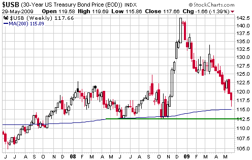
Bonds
A weekly chart of the US T-Bond futures and a monthly chart of German
Bund futures are displayed below. The monthly Bund chart has been
included to show that the recent plunge in government bond prices is
not just a US phenomenon.
The T-Bond has declined on 9 of the past 10 weeks and is now very
'oversold'. It is probably within a few weeks of an intermediate-term
bottom, but hasn't yet reached the most likely level for a bottom. The
most likely level for a bottom is lateral support at 112.5, but the
200-week moving average (currently at 115) is also a potential
bottoming area. The correction lows of 2008 and the sharp decline of
June-August 2003 ended at the 200-week moving average.
Also of consideration is that the Commitments of Traders data are now very bullish for the combination of T-Bonds and T-Notes.
Based on the way the
bond market has behaved at previous intermediate-term bottoms, the
coming bottom is likely to be a 2-month process involving at least one
test of the low.
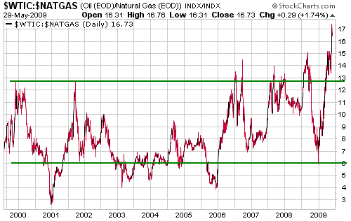
Natural Gas
The following chart
shows that the oil price (per barrel) now trades at around 17-times the
natural gas price (per MMBtu). This is much higher than it has been at
any other time over the past 10 years, and could be an all-time high.
Moreover, if oil and natural gas were trading at energy-equivalent
levels then the oil/NG ratio would be around 6, meaning that oil is
currently almost three-times as expensive as natural gas on an
energy-equivalent basis. By the way, the price of Liquefied Natural Gas
(LNG) is typically based on BOE
(Barrel of Oil Equivalent), so there won't be much LNG coming into the
US this year unless the NG price quickly gains a huge amount relative
to the oil price.
Despite the strong
recovery of the past two months the stocks of most natural gas
producers remain a long way below last year's highs in US$ terms.
However, the next chart shows that the AMEX Natural Gas Index (XNG) has
reached a stratospheric level relative to the underlying commodity.
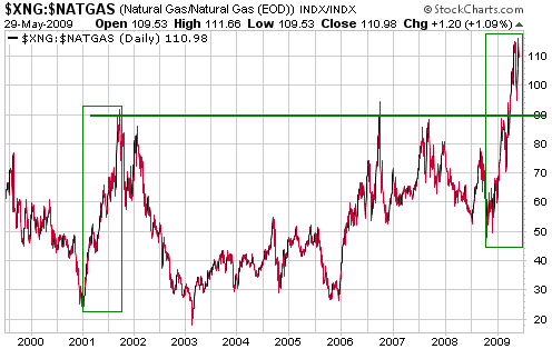
It's important to take both of the above charts into account because
sense could be made of one or the other, but not both together. For
example, if it is reasonable for the market to price oil at 17-times
natural gas, then why has the market been aggressively bidding up the
prices of natural gas equities?
Our conclusion is that over the next 12 months there will be a large
rise in the price of natural gas relative to the prices of natural gas
equities and oil. This could occur via a large rise in the price of
natural gas or via large declines in the prices of natural gas equities
and oil. We therefore believe that natural gas (the commodity) has a
lot more intermediate-term upside potential, and a lot less
intermediate-term downside risk, than either oil or the average natural
gas stock.
Further to the above we would like to purchase direct exposure to the
spot natural gas price, but, unfortunately, we don't know of a
convenient and efficient way to do this. There is an ETF called the
United States Natural Gas Fund (UNG), but this fund operates by
purchasing the nearest futures contract and then rolling into the next
contract over a predetermined period each month. This causes it to
under-perform the underlying commodity whenever the market is in
contango (whenever the later-dated contracts are more expensive than
the nearer-dated contracts) because it will continually be selling the
cheaper contract and buying the more expensive contract. Due to the
almost constant state of contango in the NG market over the past two
years, UNG has been in a relentless downward trend relative to natural
gas (see chart below). As an aside, the United States Oil Fund (USO)
has the same problem.
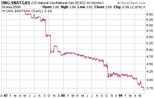
In our own accounts we can manage upside and downside risk by scaling
into and out of positions over time. To put it another way, we view
money management as an analogue process and do not believe in
whole-scale buy/sell signals. However, when adding to or removing from
the TSI Stock Selections List we don't have the ability to scale in/out
over time. Rather, we must pick a spot. Unless the supply/demand
situation in the NG market turns around sooner than expected then a
sizeable contango will remain and UNG will probably make new lows over
the months ahead even if the NG price has bottomed. As a result, we
aren't yet ready to add UNG to the TSI List.
The Stock
Market
Current Market Situation
The financial world loves a weak US dollar. What we mean is that the
investment demand for growth-oriented investments such as equities has
tended to rise in parallel with a weakening dollar and fall in parallel
with a strengthening dollar. This is clearly evident on the following
chart comparison of the S&P500 Index (SPX) and the Dollar Index.
Notice that important peaks and troughs in the US$ over the past year
have invariably coincided with important troughs and peaks in the SPX.
It's very likely that the start of the next multi-month stock market
decline will coincide with the start of the next multi-month US$ rally.
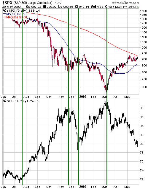
Even though the SPX
and the Dow are yet to exceed their early May highs, it is beginning to
look like a significant top is not yet in place. Here's why:
1. The NDX has been the leading senior stock index over the past
several months and the NDX ended last week at a marginal new 6-month
high
2. The Dollar Index made a new low for the year on Friday
3. Gold has not yet begun to strengthen relative to industrial commodities
4. The price patterns for both the SPX and the Dow now look more like short-term consolidations than short-term tops
If the SPX and the Dow soon confirm the NDX's recent move to a new
multi-month high then there will probably be a minimum of 2-3 weeks of
additional upside in store for the overall market. Alternatively, a
daily close below 880 by the SPX would indicate that a short-term, and
possibly an intermediate-term, top is in place.
In light of the above, we have upgraded our short-term stock market outlook from "bearish" to "neutral".
This week's
important US economic events
| Date |
Description |
Monday Jun 01
| ISM Manufacturing Index
Personal Income and Spending
Construction Spending
| | Tuesday Jun 02 | Pending Home Sales
| | Wednesday Jun 03
| Factory Orders
ISM Non-Manufacturing Index
| | Thursday Jun 04
| Q1 Productivity and Costs (revised)
| | Friday Jun 05
| Monthly Employment Report
Consumer Credit
|
Gold and
the Dollar
Gold and Silver
The Yield-Spread and the Boom/Bust Cycle
For some reason many analysts view a widening yield-spread (a
steepening yield curve) as bullish and a contracting yield-spread (a
flattening yield curve) as bearish, but it's actually the other way
around. Specifically, a widening trend for the yield spread (long-term
interest rates rising relative to short-term interest rates) tends to
be associated with the bust phase of the central-bank-created boom/bust
cycle, whereas a narrowing trend for the yield spread (short-term
interest rates rising relative to long-term interest rates) tends to be
associated with the boom phase.
In the following chart the yield-spread is represented by the TYX/FVX
ratio (the 30-year T-Bond yield divided by the 5-year T-Note yield).
The vertical lines on the chart mark the boom-bust transitions.
Strangely, most of today's economists and market analysts see nothing
inherently wrong with the huge oscillations in the yield-spread
depicted below. It doesn't occur to them that under a stable monetary
system there would never be much difference between the risk-free
short-term interest rate and the risk-free long-term interest
rate.
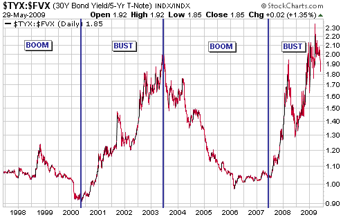
Gold performs well
relative to industrial commodities during the bust phase of the cycle
and relatively poorly during the boom phase. A sort of 'mini boom' has
been in progress since March, with the yield-spread contracting and
gold under-performing most other commodities.
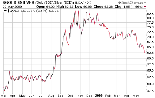
Current Market Situation
As the investing community becomes increasingly confident that the
economy will enter a new growth phase during the second half of this
year, gold is losing its appeal relative to most other commodities. For
example, the following chart shows that gold is in a downward trend
relative to silver.
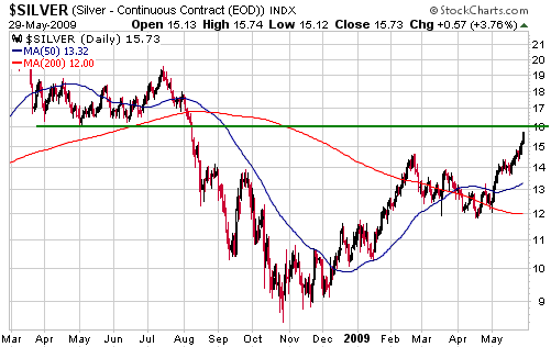
The next chart shows that silver is approaching intermediate-term resistance at US$16.
If our economic
outlook is close to the mark then silver should now be close to an
intermediate-term peak in both gold and US$ terms. There is no evidence
yet that the recent trends are complete, but in our opinion the current
environment is providing a good opportunity for investors to shift from
silver into gold.
The June gold futures contract broke above short-term resistance at
$960 last week and appears to be headed for a test of its February peak
(just above $1000). The possibility that gold is about to make a
sustained break above $1000 is generating considerable excitement and
has resulted in the speculative net-long position in COMEX gold futures
rising to a new high for the year. At the same time, though, gold is
doing nothing in real terms (relative to other commodities, that is)
and very little in euro terms. For example, the following chart of
gold/euro does not look particularly bullish.
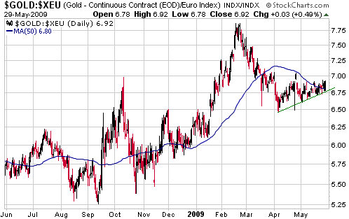
Gold is actually
doing exactly what it should be doing given the overall sentiment
backdrop. Optimism about economic prospects has been increasing, so the
US$ gold price has been doing little more than reflecting the decline
in the Dollar Index.
We think gold will do extremely well over the next year, and over the
next 2 years, and over the next three years, relative to pretty much
everything, but in the short-term we don't see a good reason to expect
it to do much more than test its February peak.
Gold Stocks
Changes in the real gold price drive profit margins in the gold mining
business and therefore have a much greater influence on gold stock
prices over the long-term than do changes in the nominal gold price.
However, changes in the nominal gold price are much more important in
the short-term.
The top section of the following monthly DecisionPoint.com
XAU chart shows that the XAU ended last week at long-term resistance.
The middle section of the chart shows that the monthly Price Momentum
Oscillator (PMO) is in the process of turning upward. And the bottom
section of the chart shows that the XAU is still at a low level
relative to the gold price.

Last week's upward
acceleration in the gold sector has resulted in the AMEX Gold BUGS
Index (HUI) moving to near its highs of the past decade RELATIVE TO its
50-day moving average (it ended last week 22% above this moving
average). This increases the risk that an intermediate-term peak is
close at hand, especially considering that we are still within the May
turning-point window (since the beginning of the long-term bull market
there have been several important gold-sector turning points between
the first week of May and the first 2 trading days of June).
Consequently, we have downgraded our intermediate-term outlook from
"bullish" to "neutral".
The most plausible intermediate-term bearish scenario goes something
like this: The rally that began in mid April is the final leg of the
intermediate-term advance that began last October. This rally, which is
now close to an end, will be followed by a correction that will most
likely bottom during October-November of this year in the vicinity of
the HUI's 200-day moving average.
Alternatively, it is possible that the sideways movement in the HUI
between mid-December and mid-April effectively reset the clock, meaning
that the rally of the past 6 weeks is just the first upward leg of a
NEW intermediate-term advance.
Due to last week's upward acceleration we think the odds are now
slightly in favour of the intermediate-term bearish scenario. However,
under either scenario the HUI will trade at or below its 50-day moving
average within the next 2 months. This could be accomplished via a
quick downward correction over the next few weeks, but given that the
50-day moving average is now rising at the rate of about 8 points per
week it could also be accomplished by the HUI rising further over the
coming 2-3 weeks and then pulling back over the ensuing 4-6 weeks to
near its current level.
For own accounts we did some buying last week from amongst the
micro-cap gold/silver stocks mentioned in the latest Interim Update,
and did some partial profit-taking during the Thursday-Friday surge
within the ranks of the larger/more-liquid juniors that have recently
had big run-ups (stocks such as WGW, NGD and NXG). However, we were net
sellers. Also, we have a few above-the-market sell orders in place with
the aim of raising even more cash if there's an extension of 'the
surge' over the coming week or so.
It's almost a mechanical process for us. We methodically scale into our
favourite gold/silver stocks during extreme weakness or following long
periods of dormancy and then methodically scale out during extreme
strength, all the while maintaining sizeable core exposure to the
gold/silver sector in line with the long-term bullish trend.
Update
on Stock Selections
(Note: To review the complete list of current TSI stock selections, logon at http://www.speculative-investor.com/new/market_logon.asp
and then click on "Stock Selections" in the menu. When at the Stock
Selections page, click on a stock's symbol to bring-up an archive of our comments on the stock in question)
 Fortuna Silver (TSXV: FVI). Shares: 92M issued, 111M fully diluted. Recent price: C$1.01 Fortuna Silver (TSXV: FVI). Shares: 92M issued, 111M fully diluted. Recent price: C$1.01
An interview with Simon Ridgway, FVI's Chairman, has been posted at http://caseyresearch.com/displayXl.php?e=true. This interview contains a good summary of the FVI story.
The interview also covers Radius Gold (TSXV: RDU), another company in
the Ridgway stable. We currently don't know much about RDU, but we
might be forced to learn about it because a future takeover of RDU by
FVI is a possibility.
Northgate Minerals (AMEX: NXG, TSX: NGX). Shares: 256M issued, 263M fully diluted. Recent price: US$2.41
The TSI Stocks List contains two NXG positions -- a short-term trading
position and a longer-term holding. In the 20th May Interim Update we
said we would exit the short-term position if the stock traded at
US$2.40, which it did late last week. The profit on the trade was 64%.
New Gold (AMEX: NGD, TSX: NGD). Shares: 348M issued, 436M fully diluted. Recent price: US$3.10
When NGD was pummeled down to below US$1 per share last October we
explained that our worst-case valuation for the stock was US$3.20. In a
number of subsequent commentaries over the ensuing few months we stated
that US$3.00-US$3.50 was a reasonable upside target for the first half
of this year based on our worst-case valuation and the price chart.
This target range has just been reached and an opportunity to take some
money off the table is therefore at hand.
A valuation for the
new NGD (the NGD-WGW combination) of around US$4.00/share was outlined
in the 9th March Weekly Update. This is not a worst-case assessment,
but it is still based on conservative assumptions.
We have been running a 15% trailing stop on our Great Basin Gold (AMEX:
GBG) trading position, but are now tightening the trailing stop to 10%
(based on closing prices, as before). We are also initiating a 10%
trailing stop on our Hecla Mines (NYSE: HL) trading position (based on
closing prices).
Constructive Equity Financings
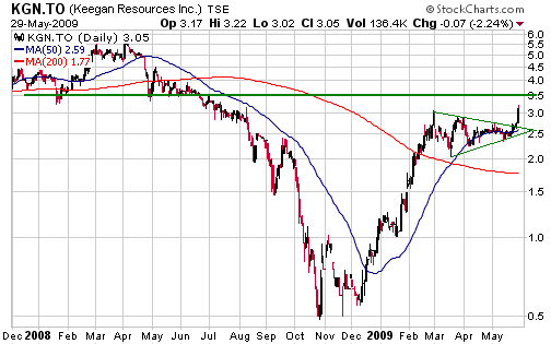
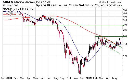
Keegan Resources (TSX and AMEX: KGN) and Andina Minerals (TSXV: ADM)
have either just completed (in KGN's case) or will soon complete (in
ADM's case) equity financings that will leave the companies fully
funded for at least the next 12 months. Neither company found it
necessary to issue warrants to encourage participation in the
placements, which is a good sign. Both companies are likely takeover
candidates, but we hope that the inevitable takeover bids will not
arrive until after the stock prices have reached much higher levels.
Of the two companies, KGN will probably have the more exciting (from
the market's perspective) news flow over the remainder of this year
because it is in the "sweet spot"*. However, its stock price is more
extended and closer to intermediate-term resistance, thanks to a 500%
rise from the Q4-2008 low.
ADM is a candidate for new buying near its current price (C$1.70) and especially if it pulls back to the C$1.50s.
*From
the mine development risk profile included in the 2nd February 2009
Weekly Update: "Post-discovery exploration / pre-feasibility (Stage 2)
is what we think of as the 'sweet spot'. In this stage the company has
proven that it has an attractive deposit on its hands; it's just a
question of how big. Companies that are in Stage 2 tend to issue
drilling results on a regular basis and each set of results tends to be
good. At the same time there is minimal scope for negative surprises
such as cost increases and delays."
Chart Sources
Charts appearing in today's commentary
are courtesy of:
http://stockcharts.com/index.html
http://www.futuresource.com/
http://www.decisionpoint.com/

|