|
-- Weekly Market Update for the Week Commencing 3rd May 2010
Big Picture
View
Here is a summary of our big picture
view of the markets. Note that our short-term views may differ from our
big picture view.
In nominal dollar terms, the BULL market in US Treasury Bonds
that began in the early 1980s will end by mid-2010. In real (gold)
terms, bonds commenced a secular BEAR market in 2001 that will continue
until 2014-2020. (Last
update: 09 February 2009)
The stock market, as represented by the S&P500 Index, commenced
a secular BEAR market during the first quarter of 2000, where "secular
bear market" is defined as a long-term downward trend in valuations
(P/E ratios, etc.) and gold-denominated prices. This secular trend will bottom sometime between 2014 and 2020. (Last update: 22 October 2007)
A secular BEAR market in the Dollar
began during the final quarter of 2000 and ended in July of 2008. This
secular bear market will be followed by a multi-year period of range
trading. (Last
update: 09 February 2009)
Gold commenced a
secular bull market relative to all fiat currencies, the CRB Index,
bonds and most stock market indices during 1999-2001. This secular trend will peak sometime between 2014 and 2020. (Last update: 22 October 2007)
Commodities,
as represented by the Continuous Commodity Index (CCI), commenced a
secular BULL market in 2001 in nominal dollar terms. The first major
upward leg in this bull market ended during the first half of 2008, but
a long-term peak won't occur until 2014-2020. In real (gold) terms,
commodities commenced a secular BEAR market in 2001 that will continue
until 2014-2020. (Last
update: 09 February 2009)
Copyright
Reminder
The commentaries that appear at TSI
may not be distributed, in full or in part, without our written permission.
In particular, please note that the posting of extracts from TSI commentaries
at other web sites or providing links to TSI commentaries at other web
sites (for example, at discussion boards) without our written permission
is prohibited.
We reserve the right to immediately
terminate the subscription of any TSI subscriber who distributes the TSI
commentaries without our written permission.
Outlook Summary
Market
|
Short-Term
(0-3 month)
|
Intermediate-Term
(3-12 month)
|
Long-Term
(1-5 Year)
|
Gold
|
Bullish
(12-Apr-10)
|
Bullish
(12-May-08)
|
Bullish
|
US$ (Dollar Index)
|
Neutral
(20-Jan-10)
| Bullish
(02-Nov-09)
|
Neutral
(19-Sep-07)
|
Bonds (US T-Bond)
|
Bearish
(05-Apr-10)
|
Bearish
(14-Dec-09)
|
Bearish
|
Stock Market (S&P500)
|
Bearish
(08-Mar-10)
|
Bearish
(11-May-09)
|
Bearish
|
Gold Stocks (HUI)
|
Neutral
(19-Apr-10)
|
Neutral
(16-Sep-09)
|
Bullish
|
| Oil | Neutral
(28-Oct-09)
| Bearish
(01-Mar-10)
| Bullish
|
Industrial Metals (GYX)
| Bearish
(21-Sep-09)
| Bearish
(25-May-09)
| Neutral
(11-Jan-10)
|
Notes:
1. In those cases where we have been able to identify the commentary in
which the most recent outlook change occurred we've put the date of the
commentary below the current outlook.
2. "Neutral", in the above table, means that we either don't have a
firm opinion or that we think risk and reward are roughly in balance with respect to the timeframe in question.
3. Long-term views are determined almost completely by fundamentals,
intermediate-term views by giving an approximately equal weighting to
fundamental and technical factors, and short-term views almost
completely by technicals.
Temporary change to TSI format
We will be traveling over the
next two weeks and will therefore be unable to post the usual TSI
reports. We will, however, keep subscribers updated regarding our
thoughts on the financial markets by posting comments in a "blog"
format at http://www.speculative-investor.com/new/weekly100510.asp.
This page will probably be updated every 2-3 days, although the actual
frequency of updates will depend on market action and whether we have
anything meaningful to say. We will notify subscribers by email
whenever new comments are posted.
The next regular commentary will be the Weekly Market Update on 16th May.
Falling Debt Productivity
The 20th March article entitled "The Most Important Chart of the Century"
argues that the US has reached "debt saturation", which is defined as
the stage where adding more debt to the economy results in GDP
contraction because total income can no longer support total debt. Here
is the chart that purports to show the falling productivity of debt and
the recent shift into the "debt saturation" zone:
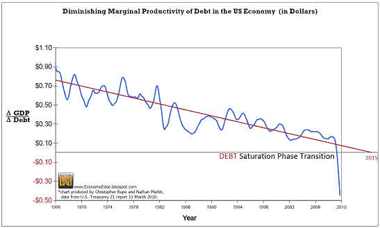
In general, it is dangerous to base conclusions about the strength of
the economy on the GDP growth numbers reported by the government,
because these numbers can be positive even while wealth is being
destroyed. The reason is that GDP measures the quantity of money spent
but does not take into account how the money is spent. Consequently,
the government can create strongly positive GDP growth numbers by
simply borrowing a lot of new money into existence and then spending
the money. Regardless of how unproductively the money is spent, if the
government injects enough new money into the economy then the result
will be a healthy looking GDP report.
A classic example of what we are talking about occurred during the
Second World War. Wealth was destroyed at a rapid rate during the War,
but the US government was able to report rapid GDP growth. The fact
that the GDP growth was solely due to massive government spending on
stuff that was destined to be blown-up didn't matter as far as the
economic statistics were concerned.
Apart from making the mistake of trying to prove a point using
statistics that can be manipulated to paint a false picture, the
article fails to properly account for the nature of today's money. In
particular, the current monetary system makes it possible for so-called
"debt saturation" to be postponed indefinitely. This is because there
is no limit to how much new money the government can borrow into
existence. The reality is that a government with a captive central bank
can never become insolvent with regard to obligations denominated in
its own currency, because the central bank will always be ready,
willing and able to monetise government debt irrespective of the
government's ability to repay the debt. It could certainly be argued
that at some future time it will become politically expedient to end
the inflation, but that's a different issue.
We therefore disagree that "debt saturation" has occurred in the US,
but we do agree that a major problem is reflected by the relentless
increase over the past few decades in the total quantity of debt
relative to the total size of the economy. It should be understood,
though, that the debt growth is a symptom, rather than the root cause,
of the overarching problem. The monetary system itself is the root
cause.
Today's system enables the supply of money to be boosted at will by the
government, the central bank and the commercial banks, resulting in the
government being able to spend whatever amount politicians want it to
spend and banks being able to run loan books that are orders of
magnitude greater than their capital. It should also be understood that
by discouraging saving and changing the structure of the economy in
ways that result in the inefficient use of resources, monetary
inflation leads to a less productive economy even in the absence of
excessive debt growth.
The Stock
Market
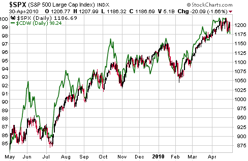
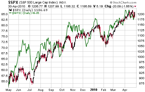
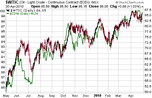
Strong Positive Correlations
The following three charts compare the S&P500 Index (SPX) and the
Canadian dollar (C$), the SPX and the oil price, and the oil price and
the C$. These charts make the point that the US stock market, the
Canadian dollar and the oil market have moved in lockstep over the past
year. The implication is that unless you have a good reason to expect
the strong inter-market relationship of the past year to end in the
near future, you should not be bullish on any one of these markets
without also being bullish on the other two.
Current Market Situation
Important short-term support for the SPX lies at 1180. Clear evidence
of a downward trend reversal requires a daily close below this support.
The SPX held above 1180 over the final two trading days of last week
and thus failed to provide clear evidence of a trend change, but last
week's price action can still be categorised as bearish. This is
because the SPX made a new 52-week high at the beginning of the week
and then traded below the low of the preceding week. The situation is
illustrated by the following weekly chart.
A routine correction would take the SPX down to the vicinity of its
40-week moving average (the blue line on the chart), but we expect that
the next decline will prove to be more severe than a routine correction.

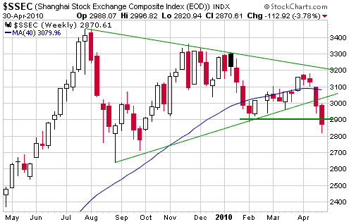
The Shanghai stock
market is breaking out to the downside. As depicted below, the market
breached lateral support at 2900 last week and made a new low for the
year. Consequently, the divergence continues to build between the
"future looks bright" message being transmitted by the US stock market
and the much less optimistic message being transmitted by some other
important markets.
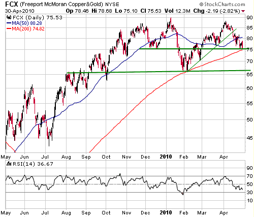
The following daily
chart shows the performance of FCX, a proxy for the copper mining
sector of the stock market. FCX's April high was below its January
high, and it has now given back all of its March-April gains. It ended
last week near the intersection of lateral support and the 200-day
moving average, so it wouldn't be surprising if some sort of rebound
started from near the current level. However, the stock has been
diverging bearishly from the broad market and is shaping up to be a
leader to the downside over the months ahead.
As mentioned in
previous commentaries, the stocks and stock indices that failed to
exceed their November-January highs over the past several weeks are the
best candidates for bearish speculations or hedges.
This week's
important US economic events
| Date |
Description |
Monday May 03
| ISM Manufacturing Index
Personal Income and Spending
Construction Spending
| | Tuesday May 04 | Factory Orders
Pending Home Sales Index
| | Wednesday May 05
| ISM Non-Manufacturing Index
| | Thursday May 06
| Q1 Productivity and Costs
| | Friday May 07
| Monthly Employment Report
Consumer Credit
|
Gold and
the Dollar
Gold
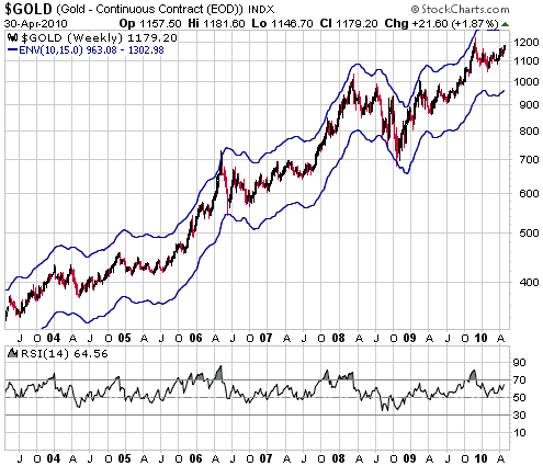
Displayed below is a weekly gold chart with a moving average envelope
(the 10-week moving average +/- 15%) and a Relative Strength Index
(RSI). This chart shows that gold is not close to being 'overbought'.
To be more specific, it shows that significant highs in the gold market
over the past 7 years have always coincided with the weekly RSI moving
above 70 (versus the current level of 64) and/or the gold price being
near the top of its MA envelope. The top of the envelope is presently
at $1303.
We aren't forecasting a quick move up to $1300, although it wouldn't
surprise us if the gold price traded as high as $1300 within the next
month. It also wouldn't surprise us if gold spent the next few months
'horsing around' between $1100 and $1200. The point we are getting
around to is that there won't be substantial downside risk in gold
until the market has again become 'overbought', and to become
'overbought' the price will have to move well above the December peak.
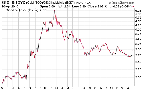
Relative to the
industrial metals, gold trended lower during February-August of last
year and has since drifted sideways. The situation is illustrated by
the following chart of the gold/GYX ratio.
After the US stock market peaks we should see another major advance in
gold relative to the industrial metals. It's obviously early days, but
perhaps last week's up-tick in gold/GYX will prove to be the start of
something big.
Gold Stocks
The HUI moved up to important resistance in the 470s during the early
going on Friday. Also of note is that its daily RSI has reached a level
that tends to mark peaks during counter-trend rebounds.
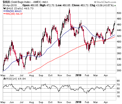
When the HUI spiked
up to the 470s in early January we downgraded our short-term outlook to
"bearish", but the situation is now different. In early January the
gold market was just beginning to 'correct' after having reached an
'overbought' extreme in December, but the gold market has since
completed its correction (as far as we can tell) and now appears to be
gathering strength. Therefore, while it is certainly possible that the
HUI has just made a short-term peak, a reasonable case can be made for
a more bullish outcome. Our short-term HUI outlook therefore remains
"neutral".
Currency Market Update
Greece and the Euro
European finance ministers are apparently going to be meeting on 2nd
May to approve their share of a 120-billion-euro loan package for
Greece. It will be interesting to see the details of whatever package
is approved. In particular, it will be interesting to see the
conditions (budget cuts, etc.) to which the government of Greece will
have to agree in order to get the loans, and how the new loans rank
against Greece's existing government debt. For example, if the new
loans are "junior" to the existing loans then the so-called bailout of
Greece will be another in a long line of bondholder bailouts, but if
the new loans are "senior" to the existing loans then at least some
bondholders will be forced to take substantial "haircuts".
Assuming the above-mentioned loan package is approved, it won't solve
anything. At best it will 'kick the can a little further down the
road', but Greece will still be in the situation of needing to either
default on its debt or make politically impossible spending cuts. And
Greece's predicament is only slightly worse than the predicaments of
Portugal, Spain, Ireland and Italy.
Also of importance will be the political backlash against the European
leaders of the countries that are agreeing to provide the bailout funds
for Greece's bondholders. Perhaps they can weather the current storm by
assuring voters that a crisis will be averted, but what are they going
to say after they have used tens of billions of euros of their own
taxpayers money to mitigate the losses of Greece's bondholders and the
crisis continues to grow? Will they be prepared to commit political
suicide by suggesting that even more of their own country's wealth be
sent to Greece? Or Portugal? Or Spain?
In our opinion, the euro's best chance of surviving the government debt
crisis as a viable currency will be if the most heavily indebted
European countries either default of their obligations or leave the
monetary union. To put it another way, we doubt that the euro will
survive this crisis unless senior European policymakers make a
180-degree turn.
Current Market Situation
The Dollar Index dropped back from 82 to 80 between late March and
early April, but then returned to its March high in response to the
worsening of Greece's debt crisis. The following daily chart shows that
it hasn't yet broken above resistance defined by its March high, which
means that the April rally could be a counter-trend rebound within an
on-going correction.
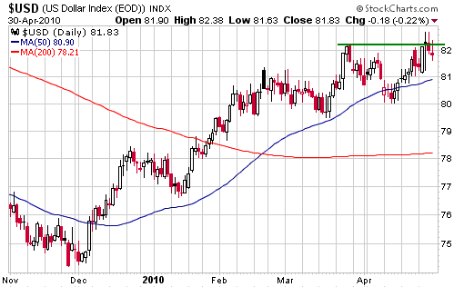
On a short-term basis
we remain "neutral" on the Dollar Index. Our favoured outcome still
involves a decline to 78-79 prior to a resumption of the
intermediate-term upward trend, but more bad news out of Europe could
easily push the dollar above resistance and up to the mid-80s.
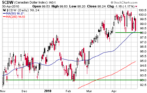
The Canadian dollar (C$) has gone nowhere over the past few weeks, but
it has done so in a very interesting way. With reference to the
following daily chart, notice that the C$ has recently made 4 unusually
large daily moves (indicated on the chart by long candlesticks), three
to the downside and one to the upside. This reflects a fierce battle
between C$ bears and C$ bulls. Moreover, the fact that the majority of
these large daily moves were to the downside suggests that the bears
are beginning to get the upper hand.
Anyhow, important short-term support for the C$ lies at 98. Harking
back to the strong positive correlation between the S&P500 Index
and the C$ mentioned earlier in today's report, support at 98 for the
C$ is equivalent to and related to support at 1180 for the S&P500.
We think it is likely that if one of these markets breaches short-term
support, then so will the other.
If support at 98 is decisively breached then we will begin to anticipate a decline to intermediate-term support at 93.
Update
on Stock Selections
(Notes: 1) To review the complete list of current TSI stock selections, logon at http://www.speculative-investor.com/new/market_logon.asp
and then click on "Stock Selections" in the menu. When at the Stock
Selections page, click on a stock's symbol to bring-up an archive of
our comments on the stock in question. 2) The Small Stock Watch List is
located at http://www.speculative-investor.com/new/smallstockwatch.html)
 Comments on two laggards Comments on two laggards
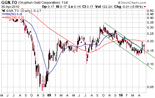
Gold-Ore Resources (TSXV: GOZ) is a microcap gold miner with current
production of 40K ounces/year from a mine in Sweden. Gryphon Gold (TSX:
GGN) is a microcap gold miner with the potential to become a
small-scale producer within the coming 12 months. The stocks of both
companies have performed poorly over the past year.
Of the gold and silver producers we track, GOZ has by far the lowest
market capitalisation per ounce of annual production. In the current
market, 200K-500K oz/yr gold producers are typically being valued at
$2500-$4000 per ounce of production and sub-200K oz/yr producers are
typically being valued at $2000-$3500 per ounce of production. However,
at Friday's closing price of C$0.45/share the market was valuing GOZ's
production at only $850/oz.
In our opinion, the main reasons for the low valuation are
higher-than-expected production costs and lower-than-expected
production growth. Due to its high production cost GOZ is only
generating a small amount of cash despite the high gold price, while
the lack of production growth prevents speculators from becoming
enthusiastic about the stock.
GOZ's management is taking steps to address the cost issue, but we
doubt that there will be any company-specific developments to generate
speculative interest over the next few months. However, as an unhedged
producer GOZ will benefit directly and immediately from any increase in
the gold price.
GGN is developing the Borealis project in Nevada in a 50/50 JV with
Sage Gold (TSXV: SGX). Borealis has a small near-surface oxide gold
resource and a deeper (and larger) sulfide gold resource. The plan is
to mine the oxide resource at the rate of around 50K ounces per year
and to use the cash flow generated by the oxide mine to develop the
sulfide resource.
According to last Thursday's press release, the GGN-SGX JV has changed
tack. Rather than immediately beginning to construct the oxide mine,
the JV is going to do more engineering and drilling of the oxide
resource over the next 6 months. Further resource definition and adding
ounces to the mine plan would increase the annual rate of production
and/or the mine life, potentially making the mine construction easier
to finance. This change suggests that a cost-efficient financing
package could not be negotiated based on the current mine plan and the
low market capitalisations of the companies involved.
At their current share prices both GOZ and GGN appear to have
relatively low risk (as far as microcap resource stocks go), but it
doesn't look like there will be any company-specific developments over
the next several months capable of generating speculative interest in
these stocks. Consequently, despite their low valuations neither of
them would be near the top of our shopping list at this time.
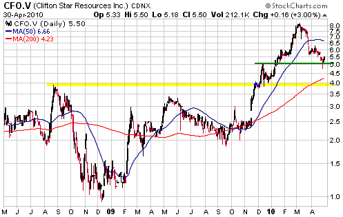
Clifton Star Resources (TSXV: CFO). Shares: 25M issued, 38M fully diluted. Recent price: C$5.50
In terms of market-moving news and speculative catalysts, GOZ and GGN
are at one end of the spectrum and CFO is at the other. Ten drilling
rigs are presently in operation at the Quebec gold projects that form
the CFO-Osisko joint venture. The plan is to drill about 120,000m prior
to year-end, all of which will be funded by Osisko as part of its
earn-in agreement. This will lead to a steady stream of drilling
results over the months ahead.
There is, of course, no guarantee that the drilling results will be
positive, but the stock's recent sharp correction has eliminated the
'froth' that was present earlier this year and reduced the risk.
In the 19th April Weekly Update we mentioned support at around C$5.00
as a likely target for a correction low and said that support at
C$3.80-C$4.00 probably defined the maximum realistic downside
potential. CFO subsequently spiked down to, and through, C$5.00, thus
creating a good opportunity for new buying. It has since rebounded, but
remains at a level where new buying could be appropriate.
For speculators who can handle the volatility in exploration-stage gold
mining stocks and do not currently own any CFO shares, a reasonable
accumulation plan would involve taking an initial position in the
C$5.30-C$5.50 range.
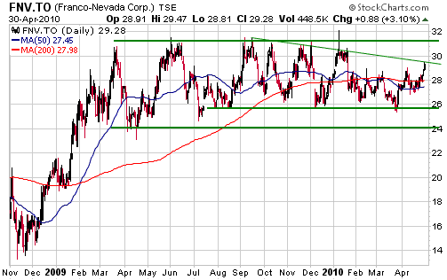
The stock price of gold royalty company Franco Nevada (TSX: FNV) has
been oscillating within a horizontal range since the first quarter of
last year. There is a high probability that the eventual breakout from
this range will be to the upside, but there is no telling when the
breakout will occur. In the mean time and as mentioned in previous
commentaries, it makes sense to scale into the stock (or the C$32
warrants - FNV.WT) following pullbacks to near the bottom of the range.
The top of the range is about $2 above Friday's closing price, although trend-line resistance was reached on Friday.
Chart Sources
Charts appearing in today's commentary
are courtesy of:
http://stockcharts.com/index.html

|