|
-- Weekly Market Update for the Week Commencing
4th February 2013
Big Picture
View
Here is a summary of our big picture
view of the markets. Note that our short-term views may differ from our
big picture view.
In nominal dollar terms, the BULL market in US Treasury Bonds
that began in the early 1980s will end by 2013. In real (gold)
terms, bonds commenced a secular BEAR market in 2001 that will continue
until 2014-2020. (Last
update: 23 January 2012)
The stock market, as represented by the S&P500 Index,
commenced
a secular BEAR market during the first quarter of 2000, where "secular
bear market" is defined as a long-term downward trend in valuations
(P/E ratios, etc.) and gold-denominated prices. This secular trend will bottom sometime between 2014 and 2020.
(Last update: 22 October 2007)
A secular BEAR market in the Dollar
began during the final quarter of 2000 and ended in July of 2008. This
secular bear market will be followed by a multi-year period of range
trading.
(Last
update: 09 February 2009)
Gold commenced a
secular bull market relative to all fiat currencies, the CRB Index,
bonds and most stock market indices during 1999-2001.
This secular trend will peak sometime between 2014 and 2020.
(Last update: 22 October 2007)
Commodities,
as represented by the Continuous Commodity Index (CCI), commenced a
secular BULL market in 2001 in nominal dollar terms. The first major
upward leg in this bull market ended during the first half of 2008, but
a long-term peak won't occur until 2014-2020. In real (gold) terms,
commodities commenced a secular BEAR market in 2001 that will continue
until 2014-2020.
(Last
update: 09 February 2009)
Copyright
Reminder
The commentaries that appear at TSI
may not be distributed, in full or in part, without our written permission.
In particular, please note that the posting of extracts from TSI commentaries
at other web sites or providing links to TSI commentaries at other web
sites (for example, at discussion boards) without our written permission
is prohibited.
We reserve the right to immediately
terminate the subscription of any TSI subscriber who distributes the TSI
commentaries without our written permission.
Outlook Summary
Market
|
Short-Term
(1-3 month)
|
Intermediate-Term
(6-12 month)
|
Long-Term
(2-5 Year)
|
|
Gold
|
Bullish
(17-Oct-12)
|
Bullish
(26-Mar-12)
|
Bullish
|
|
US$ (Dollar Index)
|
Neutral
(24-Dec-12)
|
Neutral
(09-Jan-12)
|
Neutral
(19-Sep-07)
|
|
Bonds (US T-Bond)
|
Neutral
(12-Nov-12)
|
Neutral
(18-Jan-12)
|
Bearish |
|
Stock Market
(DJW)
|
Bearish
(30-Jul-12)
|
Bearish
(28-Nov-11)
|
Bearish
|
|
Gold Stocks
(HUI)
|
Bullish
(24-Dec-12)
|
Bullish
(23-Jun-10)
|
Bullish
|
|
Oil |
Neutral
(30-Jul-12)
|
Neutral
(31-Jan-11)
|
Bullish
|
|
Industrial Metals
(GYX)
|
Neutral
(30-Jul-12)
|
Neutral
(29-Aug-11)
|
Neutral
(11-Jan-10)
|
Notes:
1. In those cases where we have been able to identify the commentary in
which the most recent outlook change occurred we've put the date of the
commentary below the current outlook.
2. "Neutral", in the above table, means that we either don't have a
firm opinion or that we think risk and reward are roughly in balance with respect to the timeframe in question.
3. Long-term views are determined almost completely by fundamentals,
intermediate-term views by
fundamentals, sentiment and technicals, and short-term views by sentiment and
technicals.
The ever-changing
'yardstick'
To illustrate the difficulty of measuring
performance in terms of the US dollar, today we are presenting three
inflation-adjusted (IA) gold charts. Our method of inflation adjustment was
outlined in the December-2010 article posted
HERE.
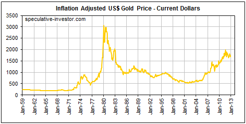
First, we present the long-term monthly chart that we normally use to show
gold's 'real' performance. This chart puts historical prices into current (in
this case, December-2012) dollar terms, which means that prices from past times
are adjusted upward to reflect the estimated decline in the dollar's purchasing
power from the past time to the present. For example, we calculate that the
January-1980 gold price of $722 is the equivalent of around $3100 in current
dollar terms. This means that by our calculations it takes more than four
dollars today to buy what one dollar would have bought in January-1980, or, to
put it another way, the US$ has lost more than 75% of its purchasing power since
January of 1980.
Note that our chart uses monthly closing prices for gold. For example, the 1980
high of around $3100/oz shown on the chart is the current-dollar equivalent of
$722, the monthly close in January of that year. Had we used intra-day prices
then our chart would show a 1980 high of around $3600, since $3600 is roughly
the current-dollar equivalent of the January-1980 intra-day high of $850.
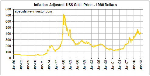
Next, here's the long-term monthly gold chart in terms of January-1980 dollars.
In January-1980 dollars, today's gold price is around $400/oz.
Last, here's the long-term monthly gold chart in terms of 1959 dollars. In terms
of a 1959 dollar, today's gold price would be around $250/oz. That the gold
price in current dollar terms is about $1650/oz means that it now takes about
$6.60 to buy what $1 would have bought in 1959.

The above charts look identical. The only difference is the scale on the Y-axis.
This illustrates the problem of measuring performance in terms of a 'yardstick'
that is constantly changing (shrinking).
A related point worth explaining is that if there hadn't been any depreciation
of the US$ from 1959 through to today, that is, if the dollar had the same
purchasing power today as it had in 1959, then the gold price would not now be
$250/oz (our calculation of the current gold price in 1959 dollar terms). It
would probably still be around $35/oz. The increase from the $35/oz price of
1959 to today's price in 1959 dollar terms of $250/oz constitutes a large real
gain. This real gain stems mainly from the long-term economy-weakening costs of
currency depreciation.
As we've argued many times in the past, if all that happened due to monetary
inflation was a reduction in the purchasing power of the currency then monetary
inflation wouldn't be a big deal. Who cares if all prices rise uniformly across
the economy? Everyone will have to spend more money, but they will also have
more money to spend.
The problem isn't so much that prices rise in response to monetary inflation.
The problem is that due to the way money makes its way into the economy and due
to the distorting effect that the money-creation process has on interest rates,
prices rise non-uniformly and investment booms occur. Each large-scale
investment boom, in turn, leads to a vast wastage of resources and eventually an
economy-wide bust. In short, monetary inflation causes the boom-bust cycle.
As the economy oscillates between boom and bust, a long-term effect is that
capital gets allocated less efficiently and the rate of economic progress slows.
In addition, the more aggressive the efforts of the central planners to
alleviate the pain caused by the bursting of an inflation-fueled boom by
creating even more inflation, the greater the economic oscillations and the
slower the long-term rate of real economic progress are apt to become. There is
no doubt that the central monetary planners became far more aggressive in their
efforts to manipulate the economy after the monetary system was 'cut loose' from
its golden anchor in 1971, the result being booms and busts of greater magnitude
and a pronounced slowdown in the rate of real economic progress.
The long-term decline in the rate of economic progress stemming from the more
aggressive and more regular use of the monetary inflation policy-tool has had
important side effects. One of these side effects is an increasing propensity to
save in terms of something with money-like attributes that can't be debased by
the policy-makers. That's why gold is in a very long-term upward trend in REAL
terms. It's also why analysts who try to calculate a fair value for gold by only
considering changes in the supply of money and the supply of gold tend to be too
pessimistic about gold's prospects.
Economic Numbers Update
The negative print for US GDP growth published
last Wednesday garnered a lot of attention, but as briefly discussed in last
week's Interim Update the GDP calculation is almost irrelevant aside from its
effect on sentiment at the Federal Reserve. A far more useful indicator of
economic performance was published last Friday. We are referring to the ISM
report on US manufacturing.
Both the Headline ISM index and the New Orders index moved up from just below 50
in December to around 53 in January. We pay more attention to the New Orders
than the Headline, because the New Orders component tends to lead the overall
index at major turning points. Here is a chart of the New Orders index:
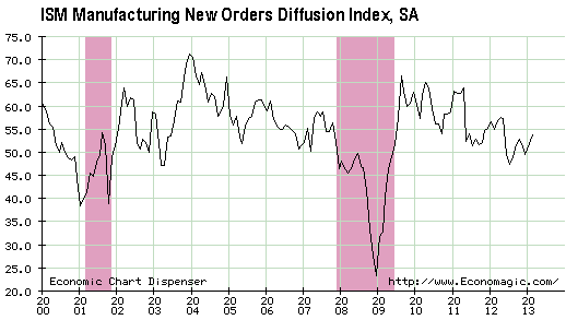
The shaded regions on the above chart show the periods when the US economy was
officially in recession. Note that a recession usually isn't officially
confirmed until about one year after it begins. For example, the recession that
got underway in late-2007 wasn't officially recognised by the NBER (National
Bureau of Economic Research) until late-2008.
The New Orders number reported last week doesn't show much strength, but it is
significant due to the fact that it doesn't show weakness. Our thinking has been
that the US economy was in recession for the final three quarters of last year,
which may or may not be true. We've also thought that the NBER would eventually
recognise mid-2012 as the starting point of a recession, but for this to be the
case the ISM numbers would now have to be a lot lower than they are.
That many US stock indices have achieved new multi-year highs since the
beginning of this year also indicates that a recession didn't officially begin
last year. These new stock-index highs tell us nothing about the future, because
it is not uncommon for the stock market and the economy to peak at around the
same time. For example, the S&P500 and NASDAQ100 indices made new multi-year
highs during the final quarter of 2007 -- at around the same time that the US
economy was commencing its worst recession in decades. However, the recent new
stock-index highs tell us something about the past, because it would be
unprecedented for the stock market to make new multi-year highs several months
after an official recession had begun.
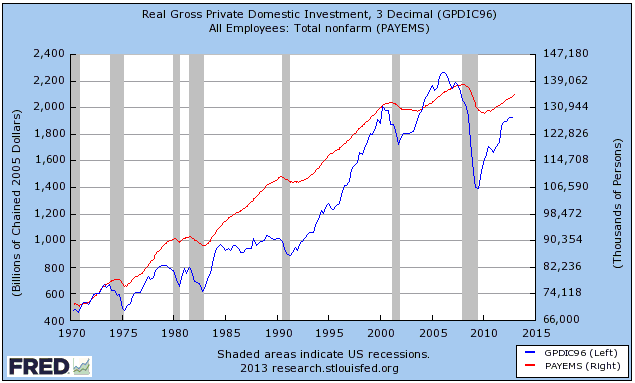
While most of the reliable leading economic indicators moved in a way that
suggested recession over the final three quarters of last year, one notable
exception was "Real Gross Private Domestic Investment" (the blue line on the
following chart). Unlike employment (the red line on the following chart), which
usually doesn't turn down until well after a recession has begun, there was a
pronounced downward reversal in Real Gross Private Domestic Investment prior to
the official start of every US recession of the past 40 years. Such a reversal
hasn't yet occurred during the current cycle.
Indicators that normally work have not worked over the past several months. This
is probably because the Fed is doing things that it has never done before, such
as ramping up the money pumps at a time when the stock market is strong and
inflation expectations are in the top quartile of their 5-year range.The Stock
Market
Over the past four months the NASDAQ100
Index (NDX) has diverged bearishly from the S&P500 and most of the other
important US stock indices. The NDX remains well below its September-2012 high
and failed to make a new high for the year last week.
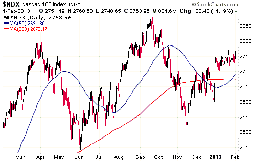
We don't know if the NDX's recent relative weakness is important for the overall
market. It could be a warning, or it could be nothing more than a reflection of
Apple's decline.
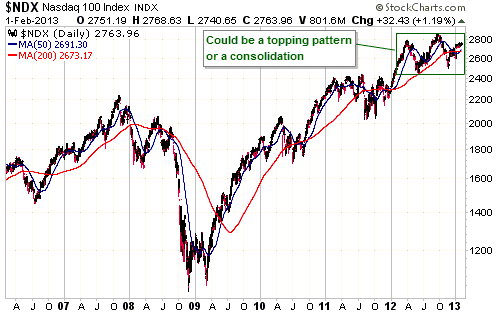
While the NDX has underperformed over the past few months, it has outperformed
by a wide margin since the end of the 2007-2008 financial crisis. Thanks to its
recent gains the S&P500 Index is now only a few percent below its 2007 peak, but
the NDX broke above its 2007 peak way back in 2011 and is now more than 20%
above it.
The NDX's good long-term performance is reflected in the following chart, but
notice that the more recent relative weakness has potentially created the right
shoulder of a "head and shoulders" topping pattern. Potential "head and
shoulders" patterns regularly appear in the financial markets, but the patterns
often don't complete and if they do complete the follow-through to the upside or
the downside isn't as great as predicted by the technical analysts. We don't
know if the NDX is about to complete a "head and shoulders" top, as the pattern
could just as easily be a consolidation within an upward trend. This is just
something to be aware of.
We are obviously going out of our way to consider what could go wrong. A lot
could go wrong, although a major stock market decline is very unlikely within
the next few months. What is likely is a correction of sufficient magnitude to
turn sentiment from complacent to fearful. When that correction happens we'll
re-assess our bearish stance, but it makes no sense to become less bearish as
the market becomes increasingly 'overbought'.
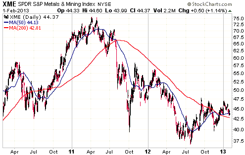
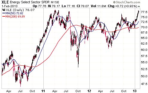
We'll now take a look at two ETF charts that together paint an interesting
picture. The first chart shows that the Metals and Mining ETF (XME) has largely
been left out of the 'bull run'. This ETF is up by around 20% from its Mid-2012
low, but is still about 40% below its early-2011 top. The second chart shows
that the Energy ETF (XLE) has fared much better over the past two years and is
now testing its 2011 peak.
In our opinion, the dramatic underperformance of XME over the past two years
creates the potential for equally dramatic outperformance beginning within the
next few months.
This week's
important US economic events
| Date |
Description |
| Monday Feb 04 |
Factory Orders
| | Tuesday Feb 05 |
ISM Non-Manufacturing | | Wednesday
Feb 06 |
No important events scheduled | | Thursday
Feb 07 |
Q4 Productivity and Costs
Consumer Credit
|
| Friday Feb 08 |
International Trade Balance
|
Gold and
the Dollar
Gold
The US$ gold price keeps moving up to its 50-day moving average and then
dropping back. Consecutive daily closes above this moving average will therefore
signal that the gold bulls are getting the upper hand. After the 50-day moving
average and the channel top at around $1700, the next resistance of significance
is at $1800.
$1800 will be a logical short-term objective once $1700 is breached.
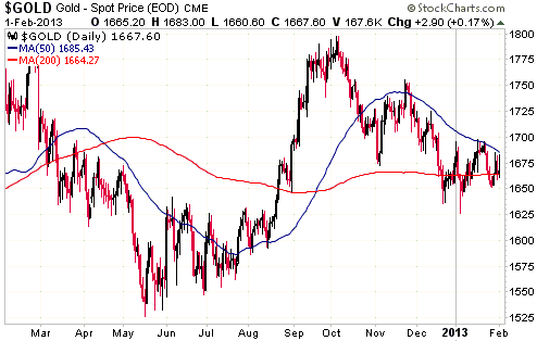
With the speculative net-long position in COMEX gold futures dropping sharply
last week and Market Vane's bullish percentage in the high-50s, sentiment in the
gold market remains constructive.
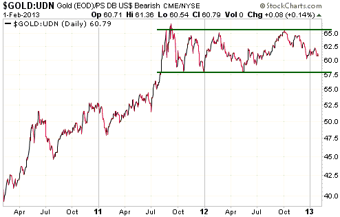
The following chart is one way of illustrating how gold has performed in non-US$
terms over the past three years. The reason is that by dividing the US$ gold
price by UDN (a US$ bear fund), we effectively take changes in the Dollar Index
out of the equation.
In non-US$ terms, gold has spent the past 18 months oscillating within a
horizontal range. This looks nothing like how we'd expect a major gold market
top to look. This price action is consistent with our fundamentals-based view
that gold is experiencing a mid-trend consolidation.
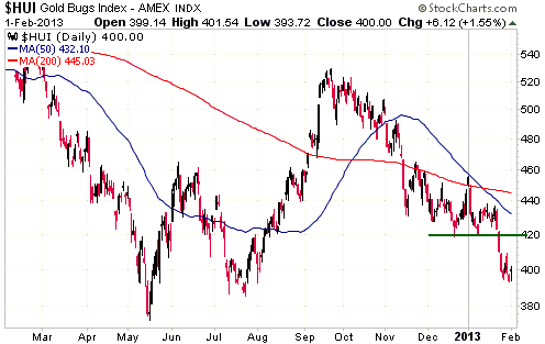
Gold Stocks
The HUI rebounded on Friday, but it hasn't yet done anything to indicate that a
short-term bottom is in place. As previously noted, a daily close above 409
would be preliminary evidence and a daily close above 420 would be conclusive
evidence that a short-term bottom was in place.
As also previously noted, we think that if the HUI tests its 2012 bottom
(375-385) as part of the current short-term decline then the early-February low
will turn out to be the low for the year; otherwise, a test of the 2012 bottom
will probably happen a few months from now.
Currency Market Update
Below is a weekly chart of the Yen. Based on the RSI shown at the bottom of the
chart and the distance between the current price and the 70-week moving average
(the blue line on the chart), the Yen is now at its most 'oversold' level in
more than 20 years. We are in uncharted territory.
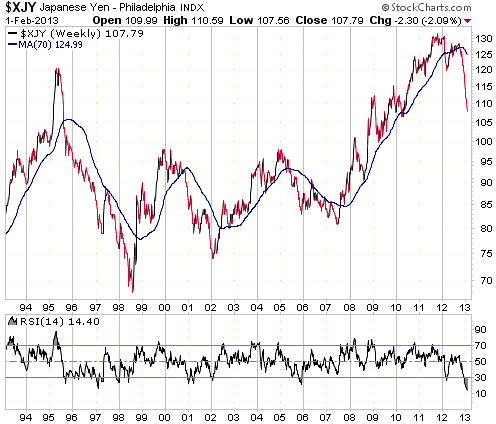
The Yen's waterfall decline is more than a little strange considering that there
has been no fundamental change. Of particular relevance, the BOJ has not only
taken no additional steps to weaken the Yen, it has stated that it plans to take
no additional Yen-weakening steps until at least 2014. The entire Yen decline is
therefore based on anticipation of something that may never happen.
The strangeness doesn't end with the lack of a fundamental basis for the Yen's
decline, though. What's even more strange is that while the Yen has sold off in
dramatic fashion in response to the idea that it will eventually be inflated to
oblivion, the yield on Japanese Government Bonds has barely moved. The current
yield on the 10-year JGB is only 7 basis points (seven one-hundredths of one
percent) above the multi-year low reached in December!
Even if the Yen's bear market isn't complete (it probably isn't), the next
rebound is likely to be substantial. A return to the 70-week moving average is
possible.
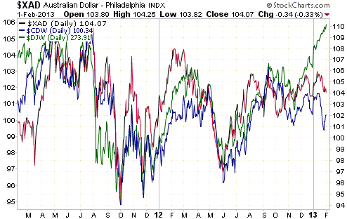
There are so many weird and wonderful things happening in the financial markets
right now that it's difficult to know what to mention in these commentaries and
what to leave out. Another one of these things that we'll mention is the
divergence, since late last year, between the global stock market (as
represented by the Dow Jones World Index - DJW) and the major commodity
currencies (the A$ and the C$). As evidenced by the following chart, the major
commodity currencies and the DJW had consistently moved in synch until
mid-December. At that time the commodity currencies began downward corrections
while the DJW (the green line on the chart) continued along a steeply-sloped
upward path.
This divergence will probably close over the next month or so, via the C$ and A$
rallying strongly or a sharp downward correction in the stock market. We expect
the latter.
Update
on Stock Selections
Notes: 1) To review the complete list of current TSI stock selections, logon at
http://www.speculative-investor.com/new/market_logon.asp
and then click on "Stock Selections" in the menu. When at the Stock
Selections page, click on a stock's symbol to bring-up an archive of
our comments on the stock in question. 2) The Small Stock Watch List is
located at http://www.speculative-investor.com/new/smallstockwatch.html
 Company
news/developments for the week ended Friday 1st February 2013: Company
news/developments for the week ended Friday 1st February 2013:
[Note: FS = Feasibility Study, IRR = Internal Rate of Return, MD&A =
Management Discussion and Analysis, M&I = Measured and Indicated,
NAV = Net Asset Value, NPV(X%) = Net Present Value using a discount
rate of X%, P&P = Proven and Probable, PEA = Preliminary Economic
Assessment, PFS = Pre-Feasibility Study]
*Batero Gold (BAT.V) issued its mandatory reports for the 3-month
period ended 30th November 2012. The financial statements showed
that BAT had working capital of only $1.2M at 30th November, but due
to a subsequent equity financing the company now has about $18M in
the bank and should be fully funded for the next 12 months. BAT will
also have access to a $2M loan from its major shareholder if needed.
*Dragon Mining (DRA.AX) issued its quarterly report for the
quarter ended 31st December.
At 13.6K ounces, production was almost 3K ounces higher than the
previous quarter. This is a good result. However, at $1219, the
per-ounce cash cost of production was $350 higher than the previous
quarter. This is a very poor result. With the increase in production
we would have expected the company to be strongly cash-flow positive
during the latest quarter, but due to the high cost of production it
actually burned through $8.4M of cash. As a result, working capital
fell to around $14M. Excluding a $4M deposit lodged with a Swedish
authority as a rehabilitation bond, working capital is now down to
around $10M.
There are reasons to expect that the first quarter of this year will
be a lot better from a cash-flow perspective than the final quarter
of last year, but it is beginning to look like DRA will need a large
rise in the gold price to become consistently profitable. This is
not what we want. What we want are gold producers that will benefit
greatly from a higher gold price but don't need a higher gold price
to be profitable.
Despite its low valuation, DRA is not an ideal candidate for new
buying at this time.
*Some interesting information about the progress of Elgin Mining (ELG.TO)
was posted at the company's
Stockhouse.com message board last week. The information comes
from ELG's investor relations manager.
The main point is the difficulty (near-impossibility) of small
mining companies getting financing to build new mines in the current
market environment. Due to the inability to obtain reasonable-cost
financing, the estimated production start-up date for ELG's Lupin
project in Nunavut has been pushed out to 2015.
Fortunately for ELG, it has a healthy balance sheet and a producing
cash-flow-positive mine. It can therefore afford to wait-out the
difficult period.
*Evolution Mining (EVN.AX) reported that flooding in Queensland
had affected production at one of its gold mines, but at this stage
it doesn't look like the effect will be significant. The company
still expects to meet its 2013 production guidance.
Also, EVN issued its quarterly activities report for the December
quarter. Production for the quarter was 102K ounces at an average
"cash cost" of A$764/oz. This was 12K ounces above the upper end of
previous guidance and is therefore a very good result.
EVN's operations generated about $74M of cash during the quarter,
but all of this and more was consumed via capital expenditure.
Consequently, EVN went from a net cash (cash minus debt) position of
$42M at the end of September to a net cash position of -$33M at the
end of December. That is, its net cash position deteriorated by $75M
during the quarter. It is still in good financial shape, though,
because it has undrawn credit of about $120M and should see a large
decline in capital expenditure over the next two quarters.
The biggest contributor to the deterioration in the net cash
position was investment in the Mt Carlton project. Mt Carlton
entered the commissioning phase in December and should soon stop
being a drain on the company's financial resources. We expect that
it will become a significant cash producer for EVN during the June
quarter of this year.
Following the nascent industry-wide change in the way costs are
reported, EVN reported an "all-in cash cost" of A$1,127/oz. In
addition to the direct mining cost, the "all-in" cost includes
royalties, sustaining capital expenditure, exploration and G&A. It
is a more realistic assessment of the cost of producing an ounce of
gold.
Due to the completion of the Mt Carlton mine construction and
reduced capital spending at its other mines, EVN expects to begin
adding cash to its balance sheet in the June quarter of this year.
We continue to view A$2.50 as a reasonable intermediate-term target
for EVN's stock price.
*Golden Predator (GPD.TO) announced that it, along with the other
members of the "Predator Group", had signed an exploration agreement
with the Kaska Nation to "promote a cooperative and mutually
respectful relationship in respect of ...exploration projects
located within the Kaska Nation's traditional territory". The Kaska
Nation includes five First Nation communities in the southeast Yukon
and northern British Columbia.
This sort of news is never going to move a stock, but it is
important nonetheless. It indicates that GPD's management is taking
the right steps to mitigate the risk of encountering permitting
problems and coming into conflict with local communities in the
future.
Past
and possibly future TSI Stock Selection: Chesapeake Gold (TSXV: CKG). Shares:
44M. Recent price: C$9.45
CKG is a former TSI Stock that we still follow from afar.
Last Friday CKG reported the results of the PFS for its Metates gold-silver-zinc
project in Mexico. Metates contains a very large, low-grade mineral deposit with
the potential to be developed into a mine with average annual production of
around 1M gold-equivalent (gold + silver) ounces.
The PFS indicates favourable economics. For example, the after-tax NPV(5%) and
the IRR are estimated to be $5.7B and 19.4%, respectively, assuming a gold price
of $1487/oz and a silver price of $28.80/oz. However, the initial capex is
estimated to be around $4.4B, which would likely represent an insurmountable
hurdle in the current market environment. Only a major gold miner like Barrick,
Goldcorp or Newmont would be capable of financing the construction of such a
mine, but these companies are now shying away from low-grade projects with huge
initial capex requirements.
That being said, the market conditions of today are not going to exist forever.
At some point in the future the large low-grade gold deposits with good
economics will come back into favour, leading to much higher valuations for
stocks like CKG. We will therefore continue to keep an eye on CKG's progress.
Chart Sources
Charts appearing in today's commentary
are courtesy of:
http://stockcharts.com/index.html
http://www.economagic.com/
http://research.stlouisfed.org/

|
