|
-- Weekly Market Update for the Week Commencing 4th June 2012
Big Picture
View
Here is a summary of our big picture
view of the markets. Note that our short-term views may differ from our
big picture view.
In nominal dollar terms, the BULL market in US Treasury Bonds
that began in the early 1980s will end by 2013. In real (gold)
terms, bonds commenced a secular BEAR market in 2001 that will continue
until 2014-2020. (Last
update: 23 January 2012)
The stock market, as represented by the S&P500 Index, commenced
a secular BEAR market during the first quarter of 2000, where "secular
bear market" is defined as a long-term downward trend in valuations
(P/E ratios, etc.) and gold-denominated prices. This secular trend will bottom sometime between 2014 and 2020. (Last update: 22 October 2007)
A secular BEAR market in the Dollar
began during the final quarter of 2000 and ended in July of 2008. This
secular bear market will be followed by a multi-year period of range
trading. (Last
update: 09 February 2009)
Gold commenced a
secular bull market relative to all fiat currencies, the CRB Index,
bonds and most stock market indices during 1999-2001. This secular trend will peak sometime between 2014 and 2020. (Last update: 22 October 2007)
Commodities,
as represented by the Continuous Commodity Index (CCI), commenced a
secular BULL market in 2001 in nominal dollar terms. The first major
upward leg in this bull market ended during the first half of 2008, but
a long-term peak won't occur until 2014-2020. In real (gold) terms,
commodities commenced a secular BEAR market in 2001 that will continue
until 2014-2020. (Last
update: 09 February 2009)
Copyright
Reminder
The commentaries that appear at TSI
may not be distributed, in full or in part, without our written permission.
In particular, please note that the posting of extracts from TSI commentaries
at other web sites or providing links to TSI commentaries at other web
sites (for example, at discussion boards) without our written permission
is prohibited.
We reserve the right to immediately
terminate the subscription of any TSI subscriber who distributes the TSI
commentaries without our written permission.
Outlook Summary
Market
|
Short-Term
(0-3 month)
|
Intermediate-Term
(3-12 month)
|
Long-Term
(1-5 Year)
|
| Gold
|
Bullish
(26-Mar-12)
|
Bullish
(26-Mar-12)
|
Bullish
|
| US$ (Dollar Index)
|
Neutral
(28-May-12)
| Neutral
(09-Jan-12)
|
Neutral
(19-Sep-07)
|
| Bonds (US T-Bond)
|
Neutral
(11-Apr-12)
|
Neutral
(18-Jan-12)
|
Bearish
|
| Stock Market
(DJW)
|
Neutral
(25-Apr-12)
|
Bearish
(28-Nov-11)
|
Bearish
|
| Gold Stocks
(HUI)
|
Bullish
(26-Mar-12)
|
Bullish
(23-Jun-10)
|
Bullish
|
| Oil | Neutral
(31-Jan-11) | Neutral
(31-Jan-11)
| Bullish
|
| Industrial Metals
(GYX)
| Neutral
(22-Nov-11)
| Neutral
(29-Aug-11)
| Neutral
(11-Jan-10)
|
Notes:
1. In those cases where we have been able to identify the commentary in
which the most recent outlook change occurred we've put the date of the
commentary below the current outlook.
2. "Neutral", in the above table, means that we either don't have a
firm opinion or that we think risk and reward are roughly in balance with respect to the timeframe in question.
3. Long-term views are determined almost completely by fundamentals,
intermediate-term views by giving an approximately equal weighting to
fundamental and technical factors, and short-term views almost
completely by technicals.
Betting on an end to the
T-Bond's upside blow-off
Near-vertical upward moves such as the one in the silver market during March-April of last year and the one now in progress in the T-Bond market are usually followed by near-vertical downward moves. From a practical speculation viewpoint, the problem presented by such situations is that while we can confidently predict how they are going to end, we can't confidently predict exactly when they are going to end. This is a problem because when a market is in upside blow-off mode it can be very costly to be a few weeks early in placing a bearish bet. One way around this problem is to analyse previous upside blow-offs to see if there was something that consistently happened when the price was close to the top and that didn't happen well before the top. If it existed, such an event could be considered a reversal signal and a prompt to initiate a bearish speculation.
Fortunately, such a signal does exist in the T-Bond market. As we mentioned in the 21st May Weekly Update, based on what happened during the three previous T-Bond surges of the past 4 years a daily close below the 20-day moving average (MA) could be taken as evidence that an intermediate-term peak is in place. Looking back further, a daily close below the 20-day MA actually provided reliable and timely confirmation of an intermediate-term reversal at the conclusions of all upside T-Bond blow-offs over the past 10 years. The reason is that once the T-Bond was in 'blow-off mode' it remained above its 20-day MA until just after hitting an intermediate-term peak.
One caveat is that upside blow-offs are not common, which means that our sample size is small. Not counting the latest episode, in the T-Bond market over the past 10 years our sample size is five. In other words, there have only been five multi-month surges that unequivocally qualify as upside blow-offs.
The tops of the previous five upside blow-offs are labeled 1 through 5 on the following weekly T-Bond chart. To qualify as a blow-off, an up-move must be sustained for long enough to push the weekly RSI(14) above 70 and must be steep enough to push the 12-week rate of change (ROC) to at least 10%.
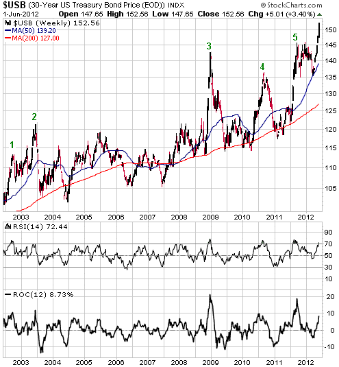
Note that two of the previous five upside T-Bond blow-offs were uncharacteristically followed by 6-month consolidations rather than large declines. Significantly, these were the ones that ended in October of 2002 and October of 2011. This is significant because it makes the current situation look remarkably like the situation exactly nine years ago -- just prior to the blow-off top in June of 2003. To illustrate what we are talking about we created the following chart comparison in which the early-October top of 2011 is lined up with the early-October top of 2002. The blue line on each chart is the 20-day MA.
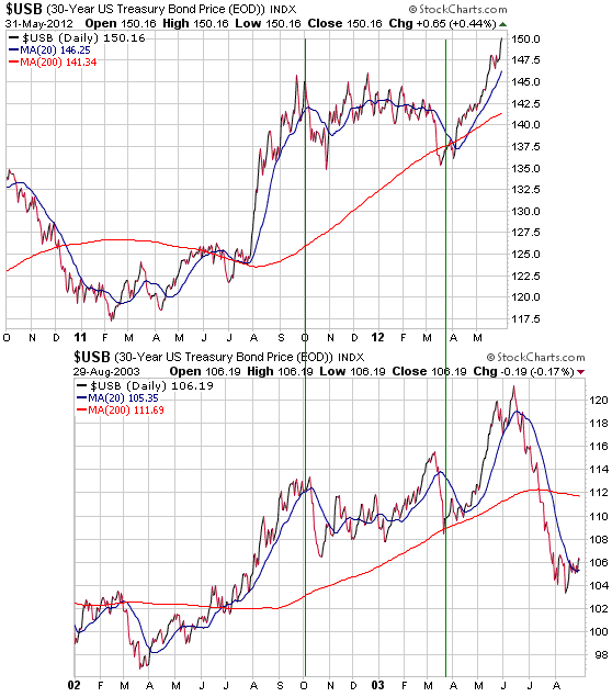
The similarities between the bond market's 2002-2003 price action and its price action over the past year are interesting, but our main point is that a good opportunity to speculate on a large decline in the T-Bond price -- via, for example, TBT (a leveraged fund that moves inversely to the T-Bond price) or TBT call options -- will be signaled by a breach of the T-Bond's 20-day MA. There is a risk that it will be different this time and that the T-Bond's next breach of its 20-day MA won't signal an intermediate-term reversal, but using a signal that has consistently worked in the past is better than relying on blind luck.
Economic numbers update
The latest US employment and manufacturing data
The latest US monthly employment data were much weaker than the expectations of most prognosticators. Prior to the release of the data last Friday the consensus was that the US economy had added 150K jobs in May. The actual number turned out to be only 69K. Also, the April jobs growth figure was revised downward from 115K to 77K. This means that the April and May employment figures point to an economy that is either in recession or is in the process of sliding into recession.
However, the latest ISM numbers, which were also reported on Friday, do not point to an economy that is either in recession or is in the process of sliding into recession. While the headline ISM Index was slightly lower at 53.5, the New Orders Index rose to 60.
We don't know what to make of the strength in the ISM New Orders Index, because it looks so out-of-place. It doesn't mesh with the results of US regional manufacturing surveys, the results of international manufacturing surveys, and the clear-cut weakening trend in most US economic data that began in February.
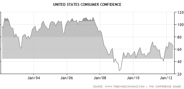
Consumer confidence
As an indicator of where the economy is headed, consumer confidence is useless. The reason is that it is either a lagging or a coincident indicator. It is most definitely not a leading indicator.
However, like most measurements of the public's sentiment, consumer confidence surveys are contrary indicators at extremes. In other words, in the same way that bullish stock market sentiment tends to reach its high near the top of an upward trend in the market and reach its low near the bottom of a downward trend in the market, consumer confidence tends to peak and trough with the economy. For example, the following chart shows that US consumer confidence reached a major peak just prior to the start of the 2007-2009 recession and reached a major bottom just after the end of the recession.
Since late 2009 consumer confidence has oscillated within the bottom half of its 10-year range. The most recent short-term peak was in February of this year, after which it began to slide in synch with the general souring of economic data and the decline in the stock market.
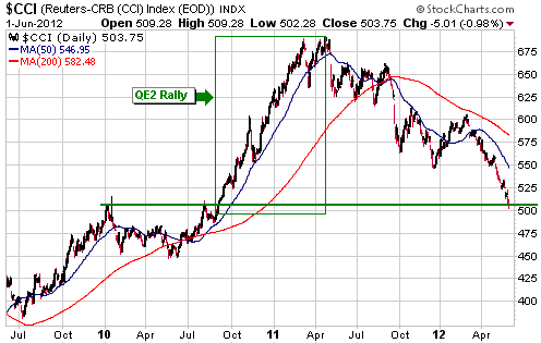
General Commodities Update
The following chart shows that the Continuous Commodity Index (CCI) has dropped back to major support. The CCI is also back to where it was in August of 2010, which means that it has now retraced its entire "QE2" rally.
The money created by the Fed's "QE2" program still exists, so the fact that the CCI is back at August-2010 levels in nominal dollar terms means that in real terms it is now much lower than where it was in August-2010. The implication is that the price of the average commodity is getting cheap.
We suspect that an intermediate-term bottom for the CCI is not far away in terms of both price and time. However, with a small number of exceptions we will probably steer clear of bullish non-gold/silver commodity speculations until after the senior central banks introduce their next inflation-promoting programs.
The Stock
Market
The US stock indices made new multi-month lows on Friday, but we don't think this signals the start of a new leg down. Instead, last week's break to new lows will probably turn out to be a brief extension of the initial decline from the March-April peak. It is, however, evidence that an intermediate-term peak is in place and that the next multi-week rally will do no better than test this year's high.
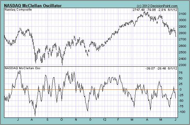
Friday's break to new lows by the US stock indices was accompanied by three significant bullish non-confirmations/divergences. First, the RUT/SPX ratio didn't confirm the new lows. Second, despite Friday's new low in the NASDAQ Composite Index the number of individual NASDAQ-listed stocks making new lows was a lot less on Friday than at the previous low two weeks earlier. Third, the following chart shows the continuing development of a bullish divergence between the NASDAQ Composite Index and the NASDAQ's McClellan Oscillator (declining lows in the index have been accompanied by rising lows in the index's McClellan Oscillator).
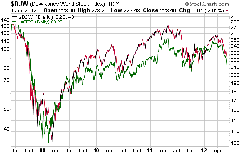
The following chart shows the high positive correlation over the past four years between the global stock market (DJW) and the oil market. The only way that these markets are likely to diverge over the next several months is if a war-related oil-supply shock causes the oil price to surge and the stock market to tank. As a result of this possibility, the oil market's intermediate-term risk/reward is more bullish than the stock market's.
This week's
important US economic events
| Date |
Description |
| Monday Jun 04 | Factory
Orders
| | Tuesday Jun 05 | ISM
Non-Manufacturing Index
| | Wednesday Jun 06 | Fed's
Beige Book
Q1 Productivity and Costs (revised) | | Thursday
Jun 07 |
Consumer Credit
|
| Friday Jun 08 | International
Trade Balance
|
Gold and
the Dollar
Gold
Gold starts to benefit from the fear
In the 28th May Weekly Update we wrote:
"If...fear and uncertainty [regarding a partial euro-zone breakup] ...continue to build over the weeks immediately ahead then we will probably see simultaneous strength in the Dollar Index and the gold market, with gold rising in US$ terms even as the US$ rises against the euro. This would be similar to what happened in January-February of 2009, April-May of 2010, and during parts of the second and third quarters of last year. In other words, it wouldn't be unprecedented."
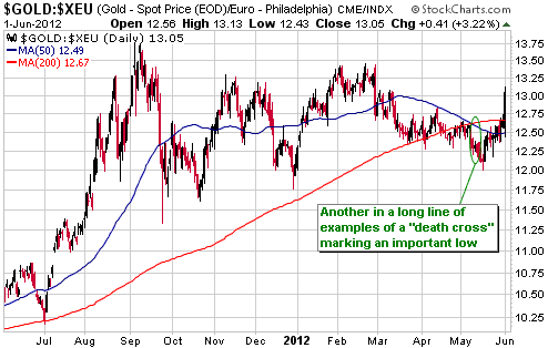
Signs of what we were talking about are now emerging, with the Dollar Index rising from 82.41 to 82.91 last week while the US$ gold price rose from $1573 to $1623. This led to a significant gain in the euro-denominated gold price (as illustrated by the following daily chart) and very likely means that a "death cross" has again marked an important low.
The mainstream financial press typically tries to explain the market action in terms of the news. According to the average reporter, if a market decline follows a news event then the news event must have caused the price decline and, by extension, news of this type must be fundamentally bearish for the market in question. That's why the same type of news is often portrayed as bullish one day and bearish the next.
Most financial-market reporters wouldn't know a true fundamental if it walked up and smacked them over the head with a piece of two-by-four. Furthermore, there's no need for them to know. They aren't paid to know, they are paid to come up with interesting explanations for price action when, in reality, the day-to-day price movements in any market defy explanation. After all, a price change in a major financial market is the net result of millions of individual decisions, many of which are based on personal considerations that have nothing to do with the market's fundamental drivers.
This is how the problems in the euro-zone can get portrayed as bearish for gold. If the gold price happens to fall in the hours following news that the euro-zone's sovereign debt problem has become more serious then many articles will contain the completely wrong conclusion that these problems are bearish for gold. The fact is that a collapse of the euro would be the second most bullish thing that could happen to the gold market, with only a collapse of the US$ being more bullish.
That being said, the euro isn't going to collapse any time soon. As the problems facing Europe's monetary union take on ever-larger proportions and as it becomes apparent that the US economy has fallen back into recession, the central banks will again ride to the rescue. "Ride to the rescue" here means add to the long-term damage they've already done by cranking out a lot more dollar notes and euros.
The actions that central banks will eventually take in their totally misguided efforts to fix the problems that are becoming increasingly evident will set the stage for the next big (>50%) advance in the gold price, but this advance probably hasn't begun. It probably hasn't begun because the central banks haven't yet embarked on another round of aggressive debt monetisation. The historical record indicates that the gold market usually doesn't make big moves in anticipation of such central bank action. Usually, gold will begin a big up-move shortly after the central banks capitulate and dispense with any inflation-fighting pretense.
It is therefore prudent to view Friday's sharp rise in the gold price as a rebound within a continuing correction. There's a good chance that the correction low is in place, but the start of a new intermediate-term upward trend in the US$-denominated gold price is probably still at least a few months into the future.
Current Market Situation
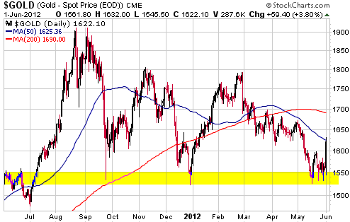
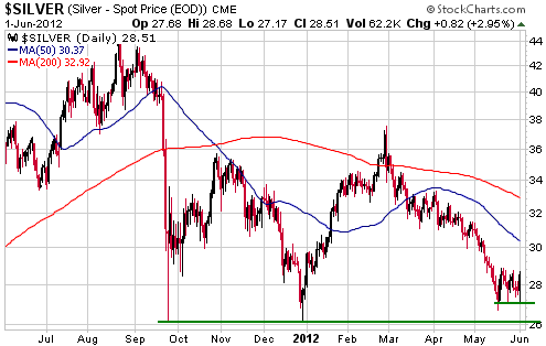
Daily charts of gold and silver are displayed below.
On Friday 1st June gold moved directly from strong support at $1525-$1550 to its 50-day moving average in the $1620s. Some additional gains are likely over the weeks ahead and it is reasonable to assume that a short-term bottom was put in place last month, but as discussed above a new major upward leg probably hasn't begun.
Silver benefits to a lesser extent than gold from fear of government debt default, which is why silver's recent price action has been weaker than gold's.
Silver should recover in dollar terms and relative to gold during the stock market's next multi-week rebound, but if we are correct to assume that the stock market will make new lows over the months ahead then the risk of silver breaking below support at $26-$27 is higher than the risk of gold breaking below equivalent support at $1525-$1550.
Gold Stocks
It is usually at least a few months after the event that it becomes possible to state with certainty that an intermediate-term extreme is in place. Therefore, we probably won't know for sure if the HUI's May-2012 low was the intermediate-term variety for quite some time. That being said, if an intermediate-term low was put in place last month then evidence of such a low should mount as the weeks go by. Last Friday's close above the 50-day moving average added another piece of evidence.
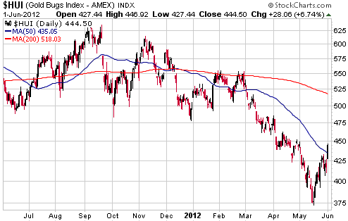
Although Friday's price action increased the probability that an intermediate-term bottom is in place, it clouded the near-term picture. This is because it is not clear to us if the pullback that occurred prior to last Friday's surge was large enough and/or long enough to be the correction that typically occurs between the end of the initial rally from the low and the start of the next rally. We suspect that it wasn't and that the HUI will complete its initial rally within the next few days.
The correction between the first and second rallies could retrace anywhere from 30% to 70% of the initial rally.
Currency Market Update
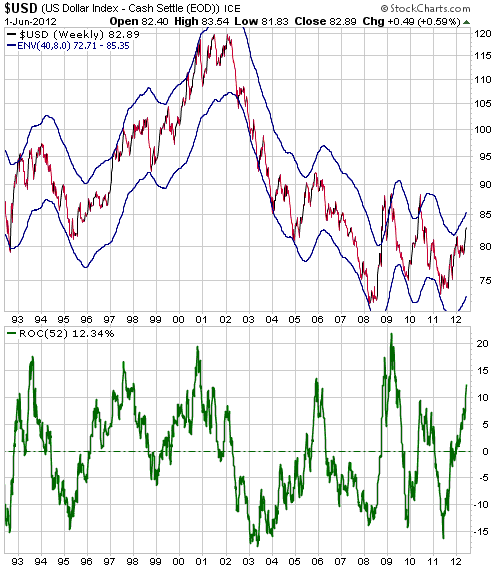
The following weekly chart of the Dollar Index includes the 40/8 moving average (MA) envelope (an 8% envelope around the 40-week MA) and the 52-week rate of change (ROC). This is one of our favourite charts, but we don't show it very often because it only becomes useful near intermediate-term extremes. In early May of last year we used it to make the case that the Dollar Index was at or near an intermediate-term bottom. We are now using it to make the case that the Dollar Index is approaching the opposite intermediate-term extreme (a high, that is).
The Dollar Index is always close to an intermediate-term high when it is at the top of its MA envelope and its 52-week ROC is greater than 13%. At least, it is always close to an intermediate-term high in terms of time. In terms of price, spikes above what normally constitutes an extreme occurred near the peak of the global financial crisis in 2008 and during the first phase of the euro-zone debt crisis in 2010. With another phase of the euro-zone crisis seemingly headed towards a crescendo within the next two months we should allow for the possibility of a brief Dollar Index spike through the top of its envelope. If this is going to happen there will likely be a 2-3 week consolidation followed by a final US$ surge.
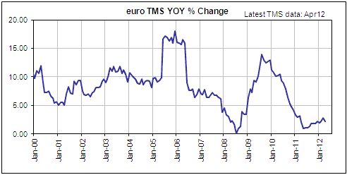
Displayed below is a chart of the year-over-year rate of change in the euro-zone's money supply (euro TMS), updated with the April numbers that were released last week. At the end of April the year-over-year growth rate was only 2.2%. Moreover, the euro supply was 28B lower at the end of April than at the end of December, meaning that there has been a very slight monetary deflation in the euro-zone since the beginning of this year.
The money-supply situation would be very bullish for the euro's long-term performance relative to the US$ if not for the fact that slow growth in the euro supply increases the risk of Europe's monetary union breaking apart. Given that Europe's political and monetary leadership is committed to keeping the monetary union together, we expect the ECB to engineer a large increase in euro supply before year-end. If/when this happens it will be very bullish for the euro on both a short- and intermediate-term basis because it will take away the dollar's safe-haven bid and prompt the exiting of bearish euro speculations.
Update
on Stock Selections
Notes: 1) To review the complete list of current TSI stock selections, logon at
http://www.speculative-investor.com/new/market_logon.asp
and then click on "Stock Selections" in the menu. When at the Stock
Selections page, click on a stock's symbol to bring-up an archive of
our comments on the stock in question. 2) The Small Stock Watch List is
located at http://www.speculative-investor.com/new/smallstockwatch.html
 Mansfield Resources (TSXV: MDR). Shares: 51M issued, 54M fully diluted. Recent price: C$0.53 Mansfield Resources (TSXV: MDR). Shares: 51M issued, 54M fully diluted. Recent price: C$0.53
MDR owns the feasibility-stage 3M-oz Lindero gold project in Argentina. Considering the low technical risk associated with this project (the close-to-the-surface oxide gold deposit lends itself to a simple open-pit mining plan) and the fact that the main permit required for mine construction is in hand, at its current low market capitalisation MDR would be one of the most clear-cut buys in the gold mining sector if not for the risk posed by Argentina's central government.
There is almost no risk of MDR's project being nationalised. The risk, for MDR, is that regulations put in place by Argentina's government will prevent it from economically financing the construction of a mine or attracting a lucrative takeover bid. We are referring to regulations that make it difficult to get money out of Argentina (all mining-related export revenue must be repatriated to Argentina and converted to Pesos, after which it can hopefully (with government approval) be converted back to a foreign currency and sent out of the country), and to regulations that make it difficult to import the equipment needed for mining (anyone wanting to import mining equipment must now go through a lengthy government approval process).
A lesser, but still significant, risk is that MDR will have to do an equity financing in the near future.
Due to a) the quality of MDR's project, b) the Salta provincial government's support for the project and c) the stock's extremely low valuation, we are going to persevere with MDR despite the risk posed by Argentina's central government. It wouldn't be near the top of our shopping list at this time, but if lower-risk exploration-stage gold miners such as SBB.TO, KGN, THM, PVG and VTR.TO become short-term 'overbought' over the weeks ahead it could be worth shifting some money across to the higher-risk
MDR.
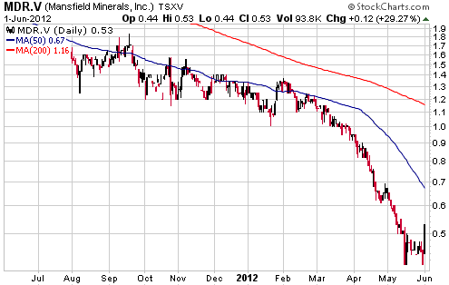
Chart Sources
Charts appearing in today's commentary
are courtesy of:
http://stockcharts.com/index.html
http://www.decisionpoint.com/
http://www.tradingeconomics.com

|
