|
-- Weekly Market Update for the Week Commencing
6th October 2014
Big Picture
View
Here is a summary of our big picture
view of the markets. Note that our short-term views may differ from our
big picture view.
In nominal dollar terms, the BULL market in US Treasury Bonds
that began in the early 1980s ended in 2012. In real (gold)
terms, bonds commenced a secular BEAR market in 2001 that will continue
until 2018-2020. (Last
update: 20 January 2014)
The stock market, as represented by the S&P500 Index,
commenced
a secular BEAR market during the first quarter of 2000, where "secular
bear market" is defined as a long-term downward trend in valuations
(P/E ratios, etc.) and gold-denominated prices. This secular trend will bottom sometime between 2014 and 2020.
(Last update: 22 October 2007)
A secular BEAR market in the Dollar
began during the final quarter of 2000 and ended in July of 2008. This
secular bear market will be followed by a multi-year period of range
trading.
(Last
update: 09 February 2009)
Gold commenced a
secular bull market relative to all fiat currencies, the CRB Index,
bonds and most stock market indices during 1999-2001.
This secular trend will peak sometime between 2014 and 2020.
(Last update: 22 October 2007)
Commodities,
as represented by the Continuous Commodity Index (CCI), commenced a
secular BULL market in 2001 in nominal dollar terms. The first major
upward leg in this bull market ended during the first half of 2008, but
a long-term peak won't occur until 2014-2020. In real (gold) terms,
commodities commenced a secular BEAR market in 2001 that will continue
until 2014-2020.
(Last
update: 09 February 2009)
Copyright
Reminder
The commentaries that appear at TSI
may not be distributed, in full or in part, without our written permission.
In particular, please note that the posting of extracts from TSI commentaries
at other web sites or providing links to TSI commentaries at other web
sites (for example, at discussion boards) without our written permission
is prohibited.
We reserve the right to immediately
terminate the subscription of any TSI subscriber who distributes the TSI
commentaries without our written permission.
Outlook Summary
Market
|
Short-Term
(1-3 month)
|
Intermediate-Term
(6-12 month)
|
Long-Term
(2-5 Year)
|
|
Gold
|
Neutral
(03-Oct-14) |
Bullish
(26-Mar-12) |
Bullish
|
|
US$ (Dollar Index)
|
Bearish
(27-Aug-14) |
Neutral
(29-Sep-14) |
Neutral
(19-Sep-07) |
|
US Treasury Bonds (TLT)
|
Neutral
(18-Aug-14)
|
Neutral
(18-Jan-12)
|
Bearish |
|
Stock Market
(DJW)
|
Bearish
(07-Apr-14) |
Bearish
(28-Nov-11) |
Bearish
|
|
Gold Stocks
(HUI)
|
Neutral
(30-Sep-14) |
Bullish
(23-Jun-10) |
Bullish
|
|
Oil |
Neutral
(02-Jun-14) |
Neutral
(31-Jan-11) |
Bullish
|
|
Industrial Metals
(GYX)
|
Neutral
(17-Feb-14) |
Neutral
(15-Sep-14) |
Bullish
(28-Apr-14) |
Notes:
1. The date shown below the current outlook is when the most recent outlook change occurred.
2. "Neutral", in the above table, means that we either don't have a
firm opinion or that we think risk and reward are roughly in balance with respect to the timeframe in question.
3. Long-term views are determined almost completely by fundamentals,
intermediate-term views by
fundamentals, sentiment and technicals, and short-term views by sentiment and
technicals.
Why the
US$ is rallying
As long as a market is in a strong rising trend almost any
bullish argument could appear to have a ring of truth about it, even
a completely baseless one. A case in point is the deluge of
baseless, bullish-slanted US$ analyses prompted by the strong rise
of the past few months in the Dollar Index.
Many of the fundamental reasons put forward for the US dollar's
strength could seem valid at first glance simply because they match
the price action, but many of these reasons are irrelevant or wrong.
For example, considering its financial effect relative to the
volumes of foreign exchange trading and international investment
flows, there is no way that the US "shale revolution" and the
associated move towards energy independence* could be a primary
reason for a US$ bull market. For another example, the belief in
some quarters that the US$ has been manipulated higher by the Fed is
ridiculous, because the Fed wants a stable or a moderately weak
dollar; it absolutely does not want a strong dollar. The reality is
that speculators have ramped the US dollar's exchange rate upward
contrary to the wishes and best efforts of the Fed. For a third
example, the popular notion that the euro is being pushed downward
against the US$ due to the potential for much greater monetary
stimulus in the euro-zone is not just off the mark, it is
diametrically opposite to what's actually going on. We'll now
explain why.
To understand why the anticipation of greater monetary stimulus in
the euro-zone could not have been the driving force behind the
euro's recent sharp decline (and the resultant sharp rise in the
Dollar Index**), the following points must first be understood:
1) As long as inflation expectations are low and stable, the stock
market will usually be one of the earliest and greatest
beneficiaries of monetary stimulus. Belief that the ECB was going to
crank-up the money pumps would therefore almost certainly lead to
substantial strength in European equities, especially with European
equities not being particularly expensive. Furthermore, given that
the Fed is known to be nearing the completion of its money-pumping,
widespread anticipation of greater monetary accommodation from the
ECB would almost certainly cause European equities to become strong
relative to US equities.
2) The performance of European equities relative to US equities
explains every important euro/US$ trend over the past 10 years. As
evidence we have included, below, a chart comparing the VGK/SPX
ratio (the blue line) with the euro (the green line). VGK is an ETF
that provides broad exposure to European equities.
On a side note, we have previously used the STOX5E/SPX ratio as a
measure of how European equities were performing relative to US
equities, but this was a mistake because it involved putting a
euro-denominated index up against a US$-denominated index. For such
a ratio to be valid, both parts of the ratio must be denominated in
the same currency. Otherwise, changes in currency exchange rate will
distort the signal we are trying to obtain.
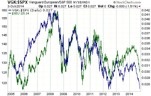
The point we've been working around to is that IF the financial
markets really had been anticipating greater monetary stimulus from
the ECB, then European equities would have been strengthening
relative to US equities over the past few months and the euro would
NOT have declined. Instead, European equities have fallen sharply
relative to US equities over the past few months, pushing the euro
downward. This means that rather than the main cause of the euro's
recent weakness -- and the Dollar Index's associated recent strength
-- being the fear that the ECB is going to stimulate (meaning:
inflate the money supply) more aggressively, the main cause has been
the fear that the ECB will be unable to stimulate aggressively
enough.
In conclusion, we aren't arguing that the perceptions and realities
of the ECB's performance are the only causes of the euro's plunge
and the related rally in the Dollar Index. There have been other
contributing factors, one being the US-initiated economic sanctions
against Russia that the EU stupidly went along with. These sanctions
have prompted Russia's government and private sector to establish
closer trade ties with South America and China, which means that the
sanctions could lead to the permanent loss of business for some EU
industries. We are, however, arguing that the perceptions and
realities of the ECB's performance are by far the most important
causes. In particular, from mid-2012 through to mid-2014 the markets
were comfortable that the ECB would make good on Mario Draghi's
promise to "do whatever it takes", but about three months ago the
markets started to doubt the ECB's ability to follow through. The
ECB is now being asked to deliver more than words, and the response,
to date, has been two programs that aren't expected to provide the
desired inflationary impetus.
*Note that energy independence is not, in and of itself, a
worthwhile goal. It is also not necessarily an economic plus. It
only makes sense to produce energy locally, rather than import it,
if the risk-adjusted cost of local production is lower than the
risk-adjusted cost of importation.
**The USD/EUR exchange rate is about 60% of the Dollar Index,
so the Dollar Index almost always trends in the opposite direction
to the euro.
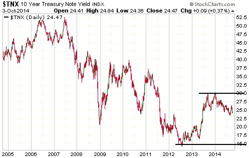
T-Bonds are following the
traditional long-term topping pattern
In our 2013 Yearly Forecast and again in our 2014
Yearly Forecast we wrote that the performance of the US Treasury market during
the 1940s-1950s and the performance of the Japanese Government Bond (JGB) market
since 2003 suggested that the end of the 1980s-2000s secular bull market in US
government bonds would be followed by several years of horizontal range-trading.
The following paragraphs essentially repeat what we wrote back in January of
2013.
The JGB yield made its ultimate low in mid-2003 and has since been bouncing
along near its long-term bottom. The basing pattern is now into its 12th year,
with the yield roughly the same today as it was at the mid-2003 trough.
Furthermore, this is similar to how the secular US interest-rate decline of the
1920s-1940s came to an end. Yields on low-risk bonds reached their ultimate
bottom in the early-1940s, but a major upward trend didn't get underway until
the late-1940s. That is, the historical record suggests that secular bond bull
markets tend to end with a whimper rather than a bang.
That long-term bond bull markets have tended to end gradually rather than with
spectacular reversals is probably related to the nature of the market.
Government bonds are subject to speculative buying and selling like any other
investment, but first and foremost they are purchased with the aim of earning
interest income. As the price of a bond advances its yield-to-maturity declines,
and if the price of a bond rises far enough then its yield-to-maturity will fall
to zero. This places a virtual lid on the price of a bond that doesn't exist for
commodities, equities or real estate. This virtual lid limits the speed at which
a long-in-the-tooth bond bull market can rise and the magnitude by which it can
rise, so rather than the bull market ending with a huge upside blow-off followed
by a definitive downward reversal (as per a long-term gold bull market), it just
peters out over a decade or even longer.
The upshot is that although a secular price peak (yield bottom) was probably put
in place during 2012, a very gradual rolling over of long-dated Treasury prices
(a gradual turning up of yields on long-dated Treasury notes and bonds) lasting
many years is the most likely outcome. More specifically, it's likely that the
2012 bottom (1.5%) and the 2013 top (3.0%) for the 10-year T-Note yield
established the extremes of a range that will remain intact for many more years
(refer to the chart displayed below). Therefore, a major rise in US government
bond yields could be NEXT decade's big story.
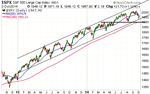
 The Stock
Market
Traders of S&P500 (SPX) futures have been
well trained over the past two years to buy every dip of a few percent. This
training came to the fore during the second half of last week, when a decline to
the SPX's channel bottom was treated as a buying opportunity.
It's possible that the SPX is in the process of rolling over into a major
decline, but if this is the case then something different from the many other
routine 'corrections' of the past two years will have to happen over the weeks
ahead. Specifically, the SPX will have to close below its channel bottom and
lateral support at 1900.
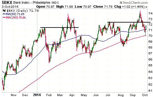
The Bank Index (BKX) has provided more evidence that, similar to what happened
in March, it reached a multi-month peak in September soon after breaking out to
the upside.
A relatively low-risk way betting on a major decline in the US stock market is
to accumulate shares of BEARX and/or HDGE during market rallies. These are
unleveraged, actively-managed bear funds.
This week's
significant US economic events
(The most important events are shown
in bold)
| Date |
Description |
| Monday Oct 06 |
No important events scheduled | | Tuesday
Oct 07 |
Consumer Credit | | Wednesday
Oct 08 |
FOMC Minutes | | Thursday
Oct 09 |
No important events scheduled
|
| Friday Oct 10 |
Treasury Budget
Import and Export Prices |
Gold and
the Dollar
Gold
Gold to $660?
A few days ago we saw a headline predicting a decline in the gold price to
$660/oz. This prediction was based on gold experiencing the same decline from
its 2011 peak as it experienced from its 1980 peak.
It's all well and good to claim that IF gold matches its decline from the 1980
peak it will eventually trade at $660/oz. The problem with this line of thinking
is that a comparison with the early-1980s has no basis in reality. At that time
the T-Bond yield had just begun to fall from a secular peak of around 18%, the
S&P500 Index was just about to commence a secular bull market from a single
digit P/E, government and private-sector debt levels were much lower, and there
was a lot less buffoonery at the Fed.
We are having trouble finding relevant historical parallels for the current
market situation. As a result of the US dollar's recent surge and the US stock
market's extremely high valuation, in some respects the present looks similar to
the late-1990s. However, there are enough differences between now and then to
invalidate such a comparison.
Current Market Situation
At each step along the way over the past two months, the most bearish but
still-plausible short-term scenarios that we could come up with for gold and
gold-mining stocks have happened. For example, a week ago we wrote:
"If gold does the unexpected and closes below $1206 after 30th September it
will suggest that last year's low of around $1180 is going to be tested.
Considering that the $1180 level has already been probed twice, another test
would probably fail and lead to a quick spike down to the mid-$1100s."
And:
"If we are wrong to interpret the GDXJ/GDX ratio's recent performance as a
bullish omen then there could be a quick GDXJ price decline of around 10% to a
traditional October low."
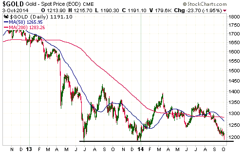
Gold finally buckled under the pressure last Friday and broke below $1206,
ending the week in the low-$1190s. This caused gold-mining stocks to plunge and
eliminated the GDXJ/GDX bullish divergence that had, until then, been pointing
to an upward reversal.
There will probably be some follow-through to the downside early this week due
to margin-related selling, so a quick decline in the gold price to the
mid-$1100s is certainly possible. This would potentially be the final
shakeout/capitulation. However, considering the extent to which the gold market
and many related markets are now stretched, it's also possible that support
defined by last year's low will hold for now. In this case a break below the
aforementioned support would likely be delayed until the first half of next
year, with a strong intervening rebound. Either way, triple bottoms are rare, so
it now looks like last year's lows will have to be taken out prior to a final
low.
By the way, Friday's US employment numbers weren't significant. Stronger numbers
earlier this year didn't provoke significant strength in the US$ or weakness in
gold. It's just that speculators are currently milking the US dollar's upward
trend for all it's worth and are latching onto any positives, even minor ones,
as reasons to buy.
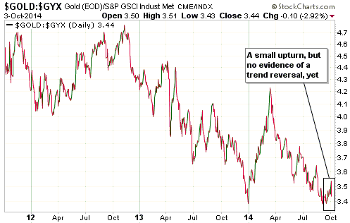
Checking the boom/bust indicator
Some analysts use the gold/silver ratio as an indicator of the general
perception of risk or as an economic confidence indicator. For the past 15 years
we have also used the gold/silver ratio in this way, although we think that the
gold/GYX ratio (gold relative to the Industrial Metals Index) is more reliable.
The message of the gold/silver ratio can be either diluted or distorted by the
fact that silver and gold are often bought and sold for the same reasons and by
the fact that the silver price sometimes changes rapidly for reasons that are
unrelated to economic confidence and general risk aversion. The gold/GYX ratio,
on the other hand, considers gold relative to a basket of metals that, as a
group, can be relied upon to trend higher relative to gold during periods of
rising confidence and lower relative to gold during periods of falling
confidence.
The following chart shows that the gold/GYX ratio turned higher from the
vicinity of a multi-year low last month, but the upturn is not yet big enough to
signal a transition from boom to bust.
Platinum
Although we don't have any exposure to platinum, this is the third commentary in
a row in which we've discussed it. The reason for our recent interest is that
platinum has become the 'poster child' for what's going on in the commodity
world.
The top section of the following daily chart shows that the platinum price fell
by almost 20% over the past three months and ended last week at its lowest level
in more than 5 years. The bottom section of the chart shows that the
platinum/gold ratio ended last week at its lowest level since the first half of
2013.
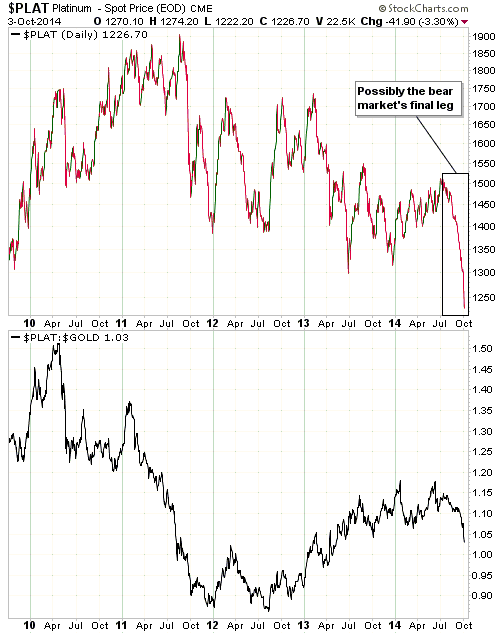
There will almost certainly be a sharp bounce in the platinum price from
whatever low is made during the first half of October, but at this time we
aren't tempted to buy. This is because platinum is currently not cheap enough
relative to gold. We will probably be interested in adding some exposure to
platinum (the metal, not the mining stocks) if it drops to a 5%-10% discount to
gold.
Gold Stocks
Last Friday's break below $1200 in the gold market pushed the HUI down to
support defined by its December-2013 bottom and eliminated the bullish
divergence between the HUI and the GDXJ/GDX ratio that began to develop a month
ago (the GDXJ/GDX ratio closed below its September low on Friday).
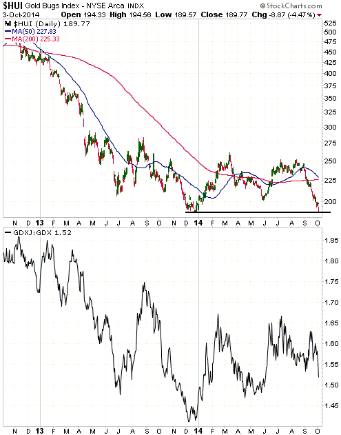
The HUI is in the same position as gold bullion. Margin-related selling will
probably result in some follow-through to the downside early this week, pushing
the price below last year's low. This could create a traditional
intermediate-term October turning point for the gold-mining sector.
The price action over the next two trading days will be informative.
The Currency Market
Overview
We began the year with an expectation that the Dollar Index would work its way
down to the low-70s over the ensuing year or so to complete its long-term basing
pattern. This expectation was primarily based on the associated expectation that
European equities would strengthen relative to US equities, due to their more
attractive valuations and the likelihood that the ECB would conduct easier
monetary policy than the Fed. Also, it was consistent with, and lent support to,
our related view that gold's cyclical bear market had ended and that the
cyclical decline in commodities was close to an end.
These expectations received plenty of corroboration during the first half of
this year, in that although the Dollar Index essentially traded sideways within
a narrow range, European stocks were gradually gaining relative strength, gold
looked like it was completing its basing pattern, the commodity currencies
reversed upward and the commodity markets began to rally. Additionally,
emerging-market equities showed relative strength from late in the first
quarter, which was consistent with the commodity-recovery theme. Even the T-Bond
was cooperating, in that its predictable rebound from the oversold extreme
reached in December of 2013 led to a downward trend in real US interest rates.
This is why we were slow to adjust when the Dollar Index suddenly 'took off'
during July-August.
Although the overall financial-market situation began to deviate from our global
view in July, it wasn't until August that the deviation became pronounced. Since
then, we've been as far out-of-synch with the markets as we've ever been. This
is due primarily to the near-vertical rally in the Dollar Index, which, as
discussed earlier in today's report, has been driven by a plunge in European
equities relative to US equities. As also discussed earlier in today's report,
this plunge in European equities relative to US equities appears to be an effect
of general concern that the ECB won't be able to inflate enough to sustain bull
markets in stocks and bonds.
Current Market Situation
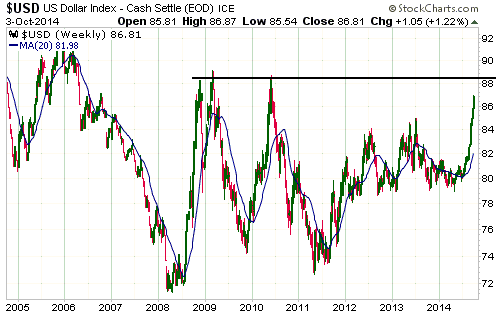
Having come this far, the Dollar Index appears to be set for a test of its 2008,
2009 and 2010 highs, which are clustered a little more than one point above last
Friday's close. This resistance is drawn on the first of the following weekly
charts.
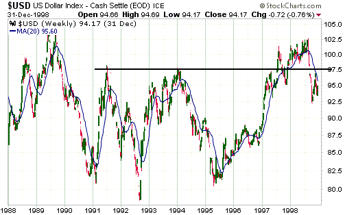
The second of the following weekly charts shows that the Dollar Index rocketed
up to just below a similar resistance level in early-1997. It then quickly
dropped to its 20-week MA (the blue line on the chart).
Note: We do not believe that the Dollar Index's performance during the
late-1990s is the right model for the next few years. However, it has worked
over the past few months and stands a reasonable chance of working over the next
few months. It suggests a near-term peak at 87.5-88.0 followed by a pullback to
84-85.
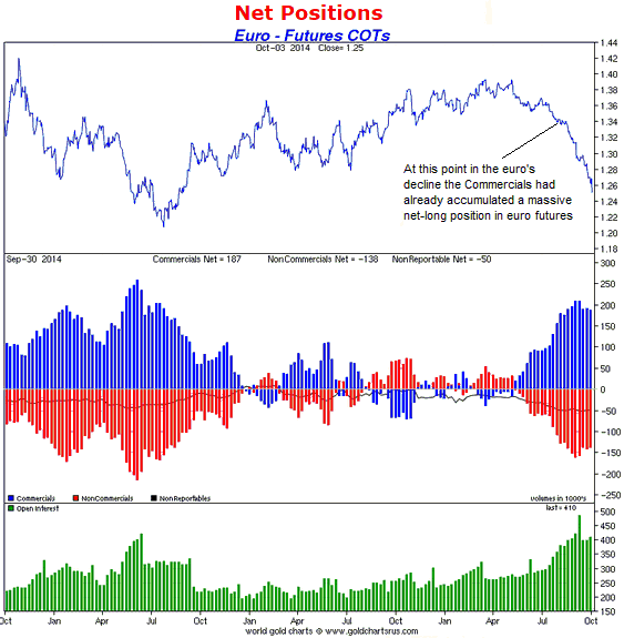
Thoughts on the euro's Commitments of Traders (COT) data
In June of 2012, when there appeared to be a serious threat that Europe's
monetary union would unravel, the Speculative net-short position and the
offsetting Commercial net-long position in euro futures reached an all-time
high. The following chart from Sharelynx.com
shows that over the past two months the Speculative net-short and Commercial
net-long positions got almost as high as their 2012 extremes, despite the
absence of an existential threat to the euro.
The COT situation tells us that euro-related sentiment is 'in the toilet' and
that there is a lot of speculative-short-covering fuel to power a euro rally.
However, the main reason for including this chart is to show that the
Speculative net-short and the Commercial net-long positions had already reached
unusually high levels in August when the euro was trading at 1.34. This means
that the bulk of the euro's decline occurred AFTER the Commercials became
massively net-long in the futures market. The question is: How could the
Commercials be so dumb in the currency market and at the same time be so smart
in the gold market?
The answer is that the Commercials are neither dumb in the currency market nor
smart in the gold market. As we've explained in the past, the Commercial
net-position in the futures market is simply a mathematical offset of the
Speculative net-position, with Speculators being the driving force behind
short-term price trends. The Commercials only appear to have been wrong based on
their recent positioning in euro futures and right based on their recent
positioning in gold futures because euro speculators (as a group) have recently
been right and gold speculators (as a group) have recently been wrong.
It is also worth reiterating that the Commercial position in the futures market
does not generally reflect the overall Commercial position. For example, a
Commercial that is net-short in the futures market could be either flat or
net-long when all positions are taken into account. In fact, a Commercial that
establishes a large net-short position in the futures market is probably doing
so BECAUSE it has a large net-long position to hedge in the cash market.
When the euro's short-term trend reverses upward, the Speculators will be on the
wrong side of the market and the Commercials will start to look right.
Updates
on Stock Selections
Notes: 1) To review the complete list of current TSI stock selections, logon at
http://www.speculative-investor.com/new/market_logon.asp
and then click on "Stock Selections" in the menu. When at the Stock
Selections page, click on a stock's symbol to bring-up an archive of
our comments on the stock in question. 2) The Small Stock Watch List is
located at http://www.speculative-investor.com/new/smallstockwatch.html
 Company
news/developments for the week ended Friday 3rd October 2014: Company
news/developments for the week ended Friday 3rd October 2014:
[Note: AISC = All-In Sustaining Cost, FS = Feasibility Study, IRR = Internal
Rate of Return, MD&A = Management Discussion and Analysis, M&I = Measured and
Indicated, NAV = Net Asset Value, NPV(X%) = Net Present Value using a discount
rate of X%, P&P = Proven and Probable, PEA = Preliminary Economic Assessment,
PFS = Pre-Feasibility Study]
*Ramelius Resources (RMS.AX) announced that it produced 22.3K
ounces of gold during the quarter ended 30th September. This was slightly above
the midpoint of its guidance range.
RMS's main problem is that it's a relatively high-cost producer. The full
quarterly results that are scheduled to be released later this month should show
that its costs were lower during the September quarter than during the June
quarter, but at the average gold price of the past three months it would almost
certainly have been cashflow negative.
Fortunately for RMS and other gold producers operating in Australia, the recent
sharp decline in the A$ has counteracted the decline in the gold price.
List of candidates for new buying
From within the ranks of TSI stock selections, the best candidates
for new buying at this time are:
1) AAU (last Friday's closing price: US$1.25).
2) EDV.TO (last Friday's closing price: C$0.59).
3) PVG (last Friday's closing price: US$4.98).
4) TGD (last Friday's closing price: US$1.19).
Chart Sources
Charts appearing in today's commentary
are courtesy of:
http://stockcharts.com/index.html

|
