|
-- Weekly Market Update for the Week Commencing 8th August 2011
Big Picture
View
Here is a summary of our big picture
view of the markets. Note that our short-term views may differ from our
big picture view.
In nominal dollar terms, the BULL market in US Treasury Bonds
that began in the early 1980s ended in December of 2008. In real (gold)
terms, bonds commenced a secular BEAR market in 2001 that will continue
until 2014-2020. (Last
update: 4 April 2011)
The stock market, as represented by the S&P500 Index, commenced
a secular BEAR market during the first quarter of 2000, where "secular
bear market" is defined as a long-term downward trend in valuations
(P/E ratios, etc.) and gold-denominated prices. This secular trend will bottom sometime between 2014 and 2020. (Last update: 22 October 2007)
A secular BEAR market in the Dollar
began during the final quarter of 2000 and ended in July of 2008. This
secular bear market will be followed by a multi-year period of range
trading. (Last
update: 09 February 2009)
Gold commenced a
secular bull market relative to all fiat currencies, the CRB Index,
bonds and most stock market indices during 1999-2001. This secular trend will peak sometime between 2014 and 2020. (Last update: 22 October 2007)
Commodities,
as represented by the Continuous Commodity Index (CCI), commenced a
secular BULL market in 2001 in nominal dollar terms. The first major
upward leg in this bull market ended during the first half of 2008, but
a long-term peak won't occur until 2014-2020. In real (gold) terms,
commodities commenced a secular BEAR market in 2001 that will continue
until 2014-2020. (Last
update: 09 February 2009)
Copyright
Reminder
The commentaries that appear at TSI
may not be distributed, in full or in part, without our written permission.
In particular, please note that the posting of extracts from TSI commentaries
at other web sites or providing links to TSI commentaries at other web
sites (for example, at discussion boards) without our written permission
is prohibited.
We reserve the right to immediately
terminate the subscription of any TSI subscriber who distributes the TSI
commentaries without our written permission.
Outlook Summary
Market
|
Short-Term
(0-3 month)
|
Intermediate-Term
(3-12 month)
|
Long-Term
(1-5 Year)
|
| Gold
|
Neutral
(19-Apr-11)
|
Neutral
(24-Jan-11)
|
Bullish
|
| US$ (Dollar Index)
|
Bullish
(13-Jul-11) | Bullish
(02-May-11)
|
Neutral
(19-Sep-07)
|
| Bonds (US T-Bond)
|
Neutral
(20-Sep-10)
|
Neutral
(01-Aug-11)
|
Bearish
|
| Stock Market (S&P500)
|
Neutral
(08-Aug-11)
|
Bearish
(11-Oct-10)
|
Bearish
|
| Gold Stocks
(HUI)
|
Neutral
(13-Jul-11)
|
Bullish
(23-Jun-10)
|
Bullish
|
| Oil | Neutral
(31-Jan-11)
| Neutral
(31-Jan-11)
| Bullish
|
| Industrial Metals
(GYX)
| Bearish
(03-Jan-11)
| Bearish
(25-May-09)
| Neutral
(11-Jan-10)
|
Notes:
1. In those cases where we have been able to identify the commentary in
which the most recent outlook change occurred we've put the date of the
commentary below the current outlook.
2. "Neutral", in the above table, means that we either don't have a
firm opinion or that we think risk and reward are roughly in balance with respect to the timeframe in question.
3. Long-term views are determined almost completely by fundamentals,
intermediate-term views by giving an approximately equal weighting to
fundamental and technical factors, and short-term views almost
completely by technicals.
Does the Fed simply follow
the market?
If you look at a multi-decade chart comparing the yield on a 3-month Treasury Bill with either the Fed Funds Rate (FFR) or the Discount Rate, you will see that the short-term interest rate set by the Fed almost always follows the short-term "risk free" interest rate set by the market. Therefore, if this chart is all you have to go on you will probably conclude that the market sets interest rates and the Fed does little more than tag along behind the market, which is exactly the conclusion reached by the author of the article posted
HERE. However, when assessing the Fed's role we have a lot more to go on than a simplistic chart comparison of the T-Bill yield and the Discount Rate.
In the 98 years since the birth of the Fed, the US$ has lost at least 97% of its purchasing power. In the 98 years prior to the birth of the Fed, the US$ lost approximately none of its purchasing power. Unless you are going to argue that the Fed had nothing to do with the dollar's loss of purchasing power or that currency depreciation doesn't affect interest rates, this, alone, tells you that the Fed has a big effect on interest rates.
The dollar's substantial loss of purchasing power is a consequence of substantial growth in the US money supply, which the Fed has played a big part in. To be more accurate, the Fed has played two parts. First, it created a lot of new money via its "Quantitative Easing" (QE) programs over the past few years. Second, although most new money was created (loaned into existence) by the commercial banking sector prior to 2008, the Fed's 'backstopping' of the commercial banking sector was critical. The Fed always stands ready, willing and able to provide whatever reserves the banking system needs, which ensures that the private banks never run short of reserves regardless of how much new deposit money they create.
Importantly, the growth in the money supply that the Fed brings about directly (via QE) or indirectly (by 'backstopping' the private banks) doesn't only lead to a fall in the purchasing power of the currency (a rise in the so-called "general price level"). As per the work of Mises, Rothbard et al, it also leads to changes in relative prices, which result in the widespread mal-investment that forms the basis of the debilitating boom/bust cycle.
Getting back to the lead-lag relationship between the T-Bill yield and the interest rate set by the Fed, it's important to understand that the markets are constantly trying to anticipate the Fed. In this regard, the Fed is helpful. First, the Fed generally goes out of its way not to surprise the markets, which means that it hints at policy changes well before these changes are implemented. QE2 is a classic example, with Bernanke dropping clear hints to the markets in August of 2010 that another round of QE would get underway a few months later. Second, while it is difficult to predict what the markets are going to do, by analysing how the Fed has reacted in the past it is relatively easy to predict how it will react to future changes in the financial markets and/or the economic data. So, if a credit-market speculator foresees a set of conditions that typically provokes a cut in the Fed Funds rate, the speculator will probably get positioned for lower short-term interest rates even if he believes that higher short-term interest rates are appropriate. In other words, market interest rates are strongly influenced by what market participants expect the Fed to do. Take the Fed out of the equation and market interest rates would likely be very different.
Unfortunately, the Fed's effect on interest rates is so pervasive that it isn't possible to determine where interest rates would be in the absence of the Fed. The Fed is constantly trying not to surprise the markets and the markets are constantly trying to anticipate the Fed. What we end up with are interest rates that usually do not signal what they are supposed to signal -- interest rates that bear no resemblance to the economy-wide balance between saving and consuming. No wonder the economy is in a downward spiral.
The bottom line is that the Fed doesn't control the markets, but it has a lot of control over the "risk free" short-term interest rate. Furthermore, its actions distort the prices of everything, not just the price of short-term credit. These price distortions are often unintended, such as when the attempts to prop-up the bad investments of one bubble cause a bubble to form somewhere else.
More fodder for the bond
bears
There were three news events during March-April of this year that were supposedly going to precipitate a large decline in the Treasury Bond market. First, there was Japan's earthquake, which some pundits thought would result in the selling of Japan's official Treasury holdings to pay for earthquake reconstruction. We argued at the time that based on the way Japanese policy-makers had acted over the preceding decade it was extremely unlikely that Japan's accumulation of T-Bonds would be interrupted anytime soon. Second, there was the news that PIMCO had exited 100% of its Treasury holdings. We argued at the time that if PIMCO had already sold then the effects of its bearish outlook were already reflected in current market prices. Third, there was the news in April that Standard and Poors (S&P) had put US government debt on watch for a possible future downgrade. Our argument at the time was that it doesn't matter, because large T-Bond investors would already be well aware of the US government's financial situation and would not base major portfolio changes on the analysis of the ratings agencies. Any credibility that the ratings agencies ever had 'went out the window' during 2007-2008.
As we see it, the price trend in the T-Bond market is dominated by changes in inflation expectations. Specifically, T-Bonds trend (on an intermediate-term basis) in the opposite direction to inflation expectations, regardless of news events. This means that a bearish T-Bond view should be solely predicated on rising inflation expectations and a bullish T-Bond view should be solely predicated on falling inflation expectations. It's that simple.
The reason for reiterating the above is that S&P has just downgraded the US federal government's credit rating from "AAA" to "AA+". This is fodder for the T-Bond bears, but is unimportant because it doesn't alter the dominant driver of the T-Bond price trend. It is also unimportant for the same reason that April's negative outlook change by S&P was unimportant (who cares what S&P thinks?).
While the S&P ratings change is trivial in the grand scheme of things, its timing could prove to be fortuitous. This is because last week's mini upside blow-off in the T-Bond market has set the stage for a significant correction. There is also a chance that last week's T-Bond high will turn out to be the intermediate-term variety. It is only an outside chance, though, because an intermediate-term T-Bond high would almost certainly require an intermediate-term stock market bottom, and the US stock market does not appear to be close to an intermediate-term bottom.
This week's meeting of the
price fixers
The Fed meets this Tuesday to decide on the appropriate course for US monetary policy. One thing we know for sure is that whatever course they decide upon, it won't be appropriate.
Due to the recent sharp decline in equities and Friday's downgrade of US government debt, many investors and speculators will be waiting with bated breath to see if the monetary policy statement issued after the FOMC meeting contains any hints about "QE3". Our guess is that the stock market and/or the backward-looking economic data will have to get weaker before Bernanke and Friends start signaling another round of aggressive money-pumping, but we could be wrong. Despite the blatant failure of "QE2", there are plenty of people braying loudly for more money and there is no doubt that Bernanke labours under the ridiculous notion that creating money out of nothing helps the economy.
The Stock
Market
Current Market Situation
In last week's Interim Update we said that a counter-trend stock market rebound was likely to happen over the next 1-2 weeks, but ended our stock market discussion with the following warning:
"Although a rebound is the most likely outcome as far as the next two weeks are concerned, the combination of general nervousness and the stock indices hovering just above important support levels means that there is a risk of a rapid decline. In other words, don't attempt to trade a near-term bounce."
As it turned out, important support levels were breached almost immediately and a rapid decline ensued. The result is that after ending Wednesday's session at 1260, the S&P500 Index traded as low as 1168 on Friday. That's almost 100 points (a bit more than 7%) down in a little more than a day. Furthermore, the S&P500's peak-to-trough decline over the past two weeks amounted to almost 200 points (around 13%).
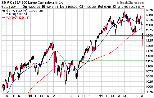
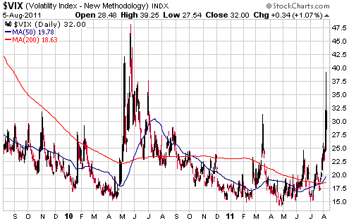
The decline of the past 2 weeks qualifies as a mini crash. We have no idea if there will be some additional panic on Monday, but what we do know is that the 'rubber band' is now stretched to the downside. The extent to which it is stretched is indicated by the extremes in various oscillators reached late last week. It is also indicated by Friday's spike in the Volatility Index (VIX) to just below 40.
The recent action suggests that the US stock market will work its way lower into the October-November timeframe and provides us with some evidence that a cyclical bear market has begun. At the same time, the short-term risk has been meaningfully reduced. It's possible that there will be some follow-through to the downside early this week, but it's very unlikely that the S&P500 will do any worse than drop to support at 1125 during the next several weeks. Going the other way, former support at 1250 should now offer stiff resistance and probably defines the upside potential over the weeks ahead. With about 75 points of short-term downside risk and about 50 points of rebound potential, risk and reward are now close to being in balance. We have therefore upgraded our short-term stock market outlook from "bearish" to "neutral".
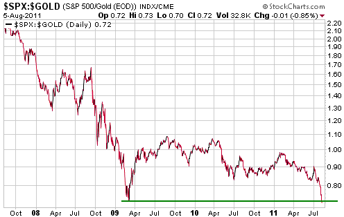
The US stock market at a 20-year low
In US$ terms, the S&P500 Index has just begun to roll over to the downside after making a multi-year top about two months ago. In gold terms, however, it is now testing the 20-year low reached in the first quarter of 2009.
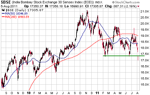
India's stock market makes a new 52-week low
The following daily chart shows that the Bombay Stock Exchange Index (BSE) broke below support to a new 52-week low on Friday, although it ended the day well off its lows. Like most stock markets it is now very 'oversold' on a short-term basis, but the overall appearance of the chart is bearish.
This week's
important US economic events
| Date |
Description |
| Monday Aug 08 | No important events
scheduled
| | Tuesday
Aug 09 | FOMC Meeting
Q2 Productivity and Costs | | Wednesday
Aug 10 | Treasury Budget | | Thursday
Aug 11 | International Trade
Balance
| | Friday
Aug 12 | Retail Sales
Consumer Sentiment |
Gold and
the Dollar
Gold and Silver
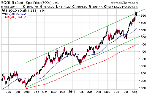
The following daily chart shows that the US$ gold price hit the top of its intermediate-term channel over the past week. It's certainly possible that the US debt downgrade news and/or the FOMC announcement will cause the gold price to spike above the top of its channel during the first half of this week, but the rise to the channel top increases the probability that the gold market is nearing a short-term peak.
The chart also shows that the 50-day moving average has moved up to around $1560. As noted in previous commentaries, the next correction will probably take the US$ gold price down to this moving average or lower. Based on Ross Clark's study of July breakouts, this correction is likely to begin by mid August.
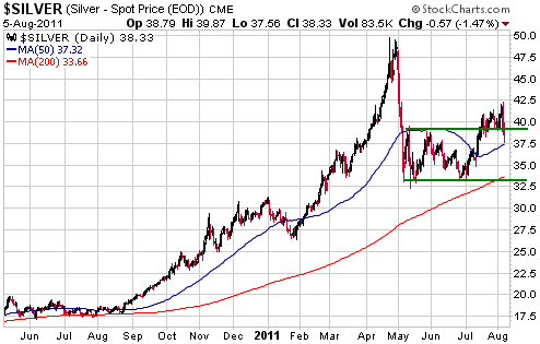
The next chart shows that the US$ silver price is in a very different position to the US$ gold price.
Silver has been in 'consolidation mode' since early May. It broke above the top of its trading range in mid July, but fell back into this range last week. Furthermore, silver has already pulled back to near its 50-day moving average. This suggests to us that a gold market correction that takes the US$ gold price down to its 50-day moving average will be accompanied by a decline in the silver price to well below this moving average -- probably to important support at around $33.
Although the probability of it happening has been reduced by gold's break to new highs, there is still a realistic possibility of the silver price dropping into the $20s (as low as $22) before its intermediate-term correction comes to an end. Therefore, if silver rebounds to $40-$42 within the coming week or so it should be viewed as another opportunity to hedge.
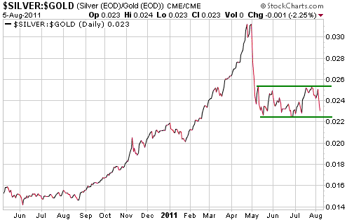
Due to last week's market action, the silver/gold ratio has moved back to centre stage. As illustrated below, this ratio has traded within a narrow horizontal range since plunging during the first week of May. Last week's strength in gold relative to silver, a typical response to financial-market turmoil, has pushed the ratio down to near the bottom of its 3-month range.
A decisive break in the silver/gold ratio to new multi-month lows would be a clear warning that the market-wide shift away from risk was accelerating.
Our last chart in this section shows that the A$-denominated gold price (gold/A$) has broken out to the upside from its lengthy consolidation pattern. This has been a long time coming -- much longer than we expected.
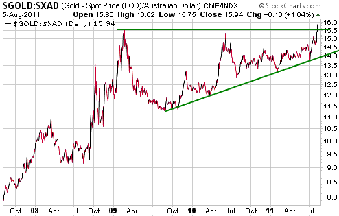
Assuming, as we do, that there will be some follow-through to the upside over the months ahead, gold/A$'s breakout will prove to be a very positive development for gold miners that produce most of their gold in Australia. This is because it will boost their profit margins. Substantially higher profit margins will eventually result in substantially higher stock prices, but the short-term response of stock prices won't necessarily be positive. The reason is that short-term trends are primarily driven by sentiment, which sometimes results in market prices trending counter to the fundamentals.
Gold Stocks
The top section of the following chart shows the HUI and the bottom section the HUI/gold ratio.
Over the final two trading days of last week, the HUI cut through its 50-day moving average like a sharp knife through soft butter and the HUI/gold ratio broke to a new multi-year low. It's fair to say, then, that last week's price action supported the "head and shoulders top" interpretation of the HUI's chart.
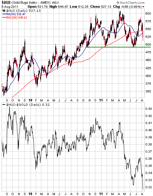
This year's weakness in gold stocks relative to gold bullion has been remarkable, but if gold continues to trend upward relative to most industrial commodities then gold mining stocks WILL eventually move to much higher prices to account for their vastly improved profit margins (or profit potential in the case of non-producers). In the mean time, however, we should be careful not to under-estimate how far stock prices could move counter to the fundamentals before they come back into line with the fundamentals.
Providing more support to the "head and shoulders top" idea was GDXJ's spike to a new low for the year on Friday.
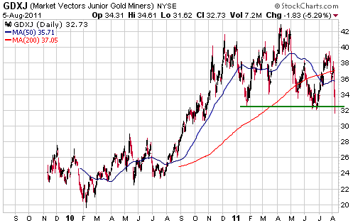
It is always important to keep in mind that charts tell you what has happened, not what's going to happen. It isn't uncommon, for example, for a chart to look bearish just prior to the start of a large rally or for a chart to look bullish just prior to the start of a large decline. The "head and shoulders" topping patterns evident on the above HUI and GDXJ charts therefore don't necessarily mean that there is going to be a lot of additional downside. They simply suggest that this is a time to be cautious.
If you have plenty of cash then you should be looking for opportunities to put some of this cash to work as stock prices decline. Don't make the mistake of trying to time the bottom, but also don't make the mistake of buying too much too soon.
Currency Market Update
Last Thursday's 500-point decline in the Dow Industrials Index prompted a 1-point rise in the Dollar Index. When the stock market stabilised on Friday the Dollar Index gave back about half of the preceding day's gain.
Despite last week's extreme volatility in other markets, the Dollar Index ended the week only slightly above where it began the week. This effectively leaves the Dollar Index in 'no man's land'.
If the price action of the past three months is part of a bottoming process (our view), then at some point over the next few weeks the Dollar Index should signal the start of a substantial rally by closing above resistance at 76.5. Note that the "bottoming process" hypothesis would be invalidated by a daily close below the May low.
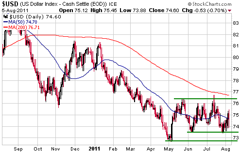
If the Dollar Index were to break below its May low, indicating that the back-and-forth price action of the past few months was a consolidation rather than a bottoming pattern, it would probably mean that the currency market had begun to discount another round of aggressive Fed money-pumping. This would make the current situation similar to the second half of 2007, when a sharp stock market decline in August led to the anticipation of Fed-sponsored monetary inflation and a decline to new lows in the Dollar Index. The Fed-sponsored monetary inflation didn't actually happen until more than 12 months later, but the market's incorrect anticipation extended the dollar's downward trend by about 6 months.
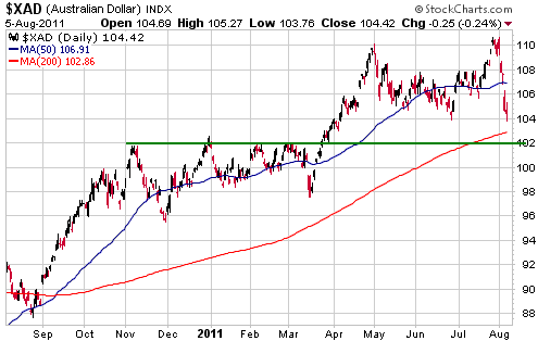
Last week's action provided us with a good example of how the fortunes of the Australian Dollar and the stock market are linked. As illustrated by the following daily chart, the A$ has quickly dropped back to its lows of the past four months.
Update
on Stock Selections
Notes: 1) To review the complete list of current TSI stock selections, logon at
http://www.speculative-investor.com/new/market_logon.asp
and then click on "Stock Selections" in the menu. When at the Stock
Selections page, click on a stock's symbol to bring-up an archive of
our comments on the stock in question. 2) The Small Stock Watch List is
located at http://www.speculative-investor.com/new/smallstockwatch.html
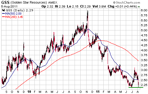
 Golden Star Resources (NYSE: GSS, TSX: GSC). Shares: 259M issued, 265M fully diluted. Recent price: US$2.29 Golden Star Resources (NYSE: GSS, TSX: GSC). Shares: 259M issued, 265M fully diluted. Recent price: US$2.29
The market has obviously paid a lot of attention to GSS's missed production forecasts and rising costs, but appears to be turning a blind eye to the effects of the rising gold price on profit margins. Even with its poor operational performance, GSS's profit margin should now be higher than it was when the stock traded at US$4.00 early this year.
GSS was the only stock we bought last week. We increased our position at US$2.25, but it traded as low as US$2.15 before rebounding a little. Last week's low was a test of the June low -- a test that we thought had very little chance of happening just two weeks ago. We have no idea whether the test will prove to be successful.
A few other gold stocks came close to our under-the-market buy orders last week. One of more of these orders will probably be filled this week.
Potential future TSI stock selection
Dragon Mining trades in Australia under the symbol DRA. It isn't, however, an Australian miner, in that its operations are located in Finland and Sweden. It has 74M shares outstanding, so the market cap at Friday's closing price of A$1.20 was A$89M.
DRA's operations are expected to produce gold at the annual rate of 65K ounces during the second half of this year. According to the company's forecasts, the annual production rate is expected to rise to 75K ounces in 2012, 90K ounces in 2013 and 155K ounces in 2014. There is a risk that these forecasts won't be met, but a margin of safety is provided by the fact that none of this growth is factored into the current stock price. The current production rate of 65K ounces could justify a 50% higher stock price if the company's cost forecasts are achieved.
The main risks are that the company won't execute its growth plan and will experience operational problems with its existing mines. The hedge book also constitutes a risk, although only 43K ounces have been forward sold so it isn't a big deal.
At only 1.1M ounces (0.6M M&I plus 0.5M Inferred), current in-ground resources are less than we'd like. However, the exploration results that the company has reported suggest a high probability of resource expansion.
We'll say more about DRA if we add it to the TSI List. We will add it if it trades at A$1.05 or lower within the next four weeks.
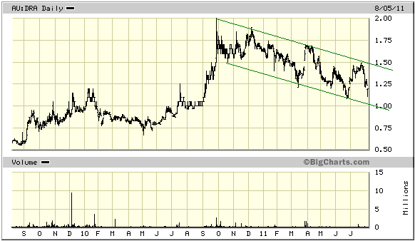
Chart Sources
Charts appearing in today's commentary
are courtesy of:
http://stockcharts.com/index.html

|
