|
-- Weekly Market Update for the Week Commencing 9th May 2011
Big Picture
View
Here is a summary of our big picture
view of the markets. Note that our short-term views may differ from our
big picture view.
In nominal dollar terms, the BULL market in US Treasury Bonds
that began in the early 1980s ended in December of 2008. In real (gold)
terms, bonds commenced a secular BEAR market in 2001 that will continue
until 2014-2020. (Last
update: 4 April 2011)
The stock market, as represented by the S&P500 Index, commenced
a secular BEAR market during the first quarter of 2000, where "secular
bear market" is defined as a long-term downward trend in valuations
(P/E ratios, etc.) and gold-denominated prices. This secular trend will bottom sometime between 2014 and 2020. (Last update: 22 October 2007)
A secular BEAR market in the Dollar
began during the final quarter of 2000 and ended in July of 2008. This
secular bear market will be followed by a multi-year period of range
trading. (Last
update: 09 February 2009)
Gold commenced a
secular bull market relative to all fiat currencies, the CRB Index,
bonds and most stock market indices during 1999-2001. This secular trend will peak sometime between 2014 and 2020. (Last update: 22 October 2007)
Commodities,
as represented by the Continuous Commodity Index (CCI), commenced a
secular BULL market in 2001 in nominal dollar terms. The first major
upward leg in this bull market ended during the first half of 2008, but
a long-term peak won't occur until 2014-2020. In real (gold) terms,
commodities commenced a secular BEAR market in 2001 that will continue
until 2014-2020. (Last
update: 09 February 2009)
Copyright
Reminder
The commentaries that appear at TSI
may not be distributed, in full or in part, without our written permission.
In particular, please note that the posting of extracts from TSI commentaries
at other web sites or providing links to TSI commentaries at other web
sites (for example, at discussion boards) without our written permission
is prohibited.
We reserve the right to immediately
terminate the subscription of any TSI subscriber who distributes the TSI
commentaries without our written permission.
Outlook Summary
Market
|
Short-Term
(0-3 month)
|
Intermediate-Term
(3-12 month)
|
Long-Term
(1-5 Year)
|
Gold
|
Neutral
(19-Apr-11)
|
Neutral
(24-Jan-11)
|
Bullish
|
US$ (Dollar Index)
|
Neutral
(07-Mar-11)
| Bullish
(02-May-11)
|
Neutral
(19-Sep-07)
|
Bonds (US T-Bond)
|
Neutral
(20-Sep-10)
|
Bearish
(21-Mar-11)
|
Bearish
|
Stock Market (S&P500)
|
Bearish
(09-May-11)
|
Bearish
(11-Oct-10)
|
Bearish
|
Gold Stocks (HUI)
|
Neutral
(24-Apr-11)
|
Bullish
(23-Jun-10)
|
Bullish
|
| Oil | Neutral
(31-Jan-11)
| Neutral
(31-Jan-11)
| Bullish
|
Industrial Metals (GYX)
| Bearish
(03-Jan-11)
| Bearish
(25-May-09)
| Neutral
(11-Jan-10)
|
Notes:
1. In those cases where we have been able to identify the commentary in
which the most recent outlook change occurred we've put the date of the
commentary below the current outlook.
2. "Neutral", in the above table, means that we either don't have a
firm opinion or that we think risk and reward are roughly in balance with respect to the timeframe in question.
3. Long-term views are determined almost completely by fundamentals,
intermediate-term views by giving an approximately equal weighting to
fundamental and technical factors, and short-term views almost
completely by technicals.
Grantham channels Malthus, and gets the big issues completely wrong
When Jeremy Grantham argued
in his Q3-2010 Letter that gold was essentially useless because it paid
no dividend, could not be eaten and for the most part sat idly and
expensively in bank vaults, we thought that his analysis of monetary
and macro-economic matters couldn't get any worse. We were wrong,
because his April-2011 Letter
is much worse. His latest piece of analysis, which is titled "Days of
Abundant Resources and Falling Prices Are Over Forever", is
extraordinary for the large number of major-league errors and bad ideas
that are crammed into it. The error that we will zoom in on has to do
with the supposed price-related evidence that a change in the long-term
commodity trend has occurred, but before we do so here are some of the
other logical problems.
First, he attributes the dramatic increase in wealth and scientific
progress during the 19th and 20th Centuries to the 'lucky' discovery,
near the beginning of the 19th Century, that hydrocarbons could be
tapped for energy. Nowhere in the entire piece does he mention
increasing economic freedom or the spread of Capitalism.
Second, he argues that continued economic growth will cause food,
energy and other natural resources to become exhausted, and that we are
close to reaching the limit. His argument is largely based on the
assertion that all compound growth is unsustainable, but he makes the
mistake of equating real economic growth with the greater
consumption/accumulation of physical resources. This is clearly evident
in his hypothetical example of Ancient Egypt, in which he shows that it
would have been impossible for the ancient Egyptians to have increased
the size of their physical possessions at a compound annual growth rate
of 4.5% for thousands of years. However, real economic progress is
about doing more with less, not the accumulation of more physical
stuff. For example, some of today's handheld computers are more
powerful than the room-sized mainframe computers of 40 years ago.
Third, having decided that a shortage of resources is about to become a
permanent feature of our lives, he concludes that the solution is for
the government to address the shortage. So, let's get this straight:
the same government that a) can't run a monopoly post office
profitably, b) spent 10 years and trillions of dollars and hundreds of
thousands of lives in an effort to kill one terrorist, c) blatantly
lied in order to justify the invasion of Iraq, and d) makes a mess of
almost everything it touches, will be our saviour. Free markets, on the
other hand, don't even warrant a mention.
Fourth, as per the rallying call of President Carter and all other
socialists throughout history, he claims that we need to sacrifice for
the greater good and the good of generations to come.
Fifth, he states that we should focus on "qualitative", not
"quantitative", growth. He also says that we should redesign lifestyles
to emphasise quality of life. Given that every rational individual is
already focused on improving the quality of his/her life, we get the
impression that he is again talking about the government taking on a
bigger role. Apparently, we need the government, or perhaps a committee
of experts, to tell us what does and doesn't add to the quality of our
lives, and to then enforce this well-intentioned advice via new laws.
Sixth, according to Grantham we should practice "income redistribution"
in order to get everyone out of poverty. After all, forced income
redistribution worked so well to combat poverty in Soviet Russia,
Communist China, and everywhere else it has been tried.
Seventh, he correctly points out that technological progress led to
declining real prices for commodities, which, in turn, helped to boost
real wealth. But he then makes the absurd claim that this was just an
historical accident. Blind luck.
Eighth, he applies the label "monetary maniac" to anyone who attributes
the past decade's rapid increase in prices to monetary factors. As
explained below, the "monetary maniacs" are right.
Ninth, he claims that the commodity markets are less subject to
irrational speculation than, say, the equity markets, because
"commodities are made and bought by serious professionals" with
realistic supply and demand being the main influence. Therefore,
whereas we should treat extremely high valuations in other markets as
temporary aberrations, we should treat extremely high valuations in
commodity markets as evidence of permanent changes in real supply
versus demand. This seems like the sort of logic that spawned the "Dow
36000" book at the peak of the tech-stock bubble, but in any case the
current real prices of commodities are not beyond normal extremes when
a proper adjustment is made for the effects of inflation. Grantham only
thinks they are beyond normal extremes because his data use official
price indices to do the inflation adjustment.
Following on from our last comment above, Grantham's epiphany regarding
the coming permanent shortage of resources was prompted by the
misinterpretation of price data. Specifically, he has been drawing
conclusions based on data that have not been properly adjusted for the
effects of inflation. He doesn't explain how his inflation adjustment
has been done, but we assume that he has used one of the official price
indices. This would substantially reduce the calculated effect of
inflation over the past 15 years and substantially increase the
calculated 'real' price increase over the same period.
Before we show a couple of our own inflation-adjusted charts to make
the point that there is no evidence of a "paradigm shift" in commodity
supply versus demand, we'll note that monetary inflation, due to the
non-uniform way in which it works, causes much greater price rises in
some goods, services and assets than in others. This is known as the
"Cantillon Effect", and explains why monetary inflation leads to large
gains in REAL prices in some parts of the economy. This, in essence, is
why fractional reserve banking combined with central bank manipulation
of money results in the boom/bust cycle.
The large gains in real prices in some parts of the economy that stem
from monetary inflation always prove to be temporary, which is why
commodity prices periodically experience massive inflation-fueled price
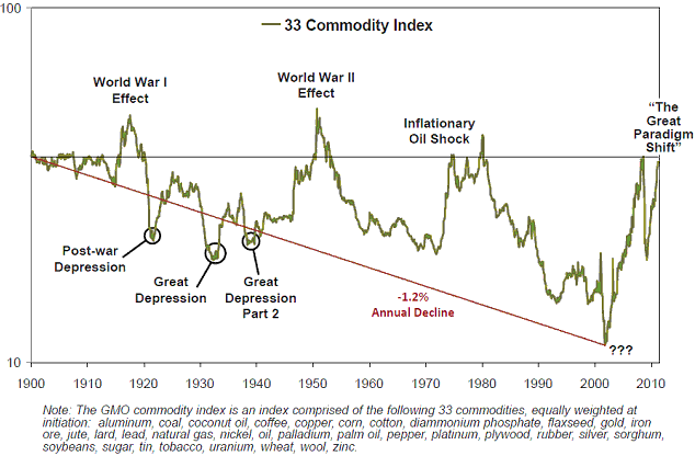
increases and then lose all of their gains in real terms. For example,
despite the way the chart has been labeled, the first three bull
markets shown on the long-term inflation-adjusted commodity chart
included in Grantham's letter (for ease of reference, a copy is
included below) had monetary roots, which is why the massive gains were
always retraced in full. The fourth bull market (the current one) has
similar roots and is bound to end the same way.
Let's now take a look
at two charts that better reflect the true situation. Note that in our
charts, the adjustment for the effects of inflation on currency
purchasing power is done as described in our 15th December 2010 article.
Our first chart shows the inflation-adjusted (IA) oil price since 1959.
The IA oil price momentarily spiked above its 1980 high in 2008, but
then collapsed.
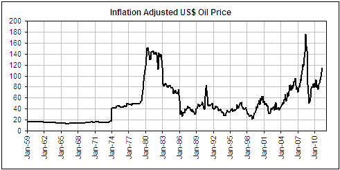
There is a paradigm
shift evident on the above chart, but it isn't the one that Grantham
perceives. Rather, it relates to the dramatic increase in price
volatility that began shortly after the US government removed the
official link between the US dollar and gold. There are those monetary
roots again!
What, then, would have happened to the US$ oil price if the dollar had
remained linked to gold at the $35/oz rate that applied at the
beginning of the 1970s, and, by implication, if the Fed had run a
monetary policy that enabled the $35/oz exchange rate to be maintained?
It's impossible to say for certain, because removing the link between
the dollar and gold led to a dramatic increase in the volatility of
everything, including the gold/oil ratio. It's interesting, though,
that when measured in terms of gold, oil is a little cheaper today than
it was in 1970. This is counter to Grantham's theory, because there has
never been and there never will be any shortage of gold. It is,
however, consistent with our theory that we are seeing waves of boom
and bust driven by monetary mischief.
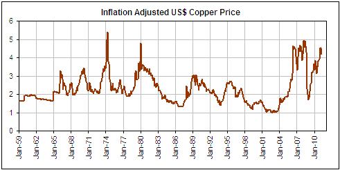
Our second chart shows that the 2008 peak in the IA price of copper was
just below its 1974 peak and just above its 1980 peak. It now appears
to be rolling over after testing its 2008 peak earlier this year.
The huge swings shown on this chart are evidence of monetary instability, not a major change in real supply versus real demand.
The final point is
that even in the extremely unlikely event that Grantham is right and
the world is reaching some sort of commodity-production limit, the
optimum solution is NOT for the government to take on an expanded role.
That would almost certainly make things worse. Part of the optimum
solution would be for the government to get out of the way and let the
markets do what they do best: respond to price signals.
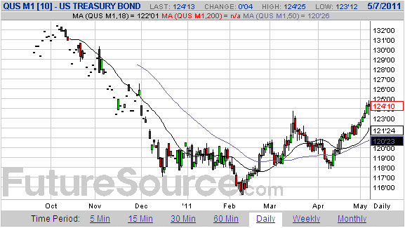
Quick T-Bond Update
As
we warned at the time, the US Treasury Bond futures market was
sufficiently 'oversold' in early February of this year to prompt a
multi-month rebound. In response to a deluge of bearish T-Bond
commentary, we subsequently explained -- during March -- that Japan's
earthquake and PIMCO's exit from its T-Bond position were not
significant negatives for this market going forward.
After an interruption between mid March and early April, the T-Bond
rebound that began in February has continued. At the end of last week
the market was 'overbought' on a very short-term basis, perhaps paving
the way for a 1-2 week consolidation, but we don't think that it makes
sense to bet against the T-Bond at this time. Next month's completion
of "QE2" will reduce one source of T-Bond demand, but with the
commodity markets showing signs of having turned down on an
intermediate-term basis there's a distinct possibility that the
reduction in the Fed's demand will be more than offset by increasing
safe-haven-related demand. The result could be a significant extension
to the overall rebound.
The Stock
Market
The following chart compares
the S&P500 Index (SPX) with the HYG/TLT ratio. The HYG/TLT ratio
indicates what's happening with credit spreads, in that the ratio rises
when credit spreads contract (bullish for the stock market) and falls
when credit spreads widen (bearish for the stock market).
Since early April the SPX has pulled back and then risen to a new
multi-year high while the HYG/TLT ratio has drifted downward. This
constitutes a bearish divergence.
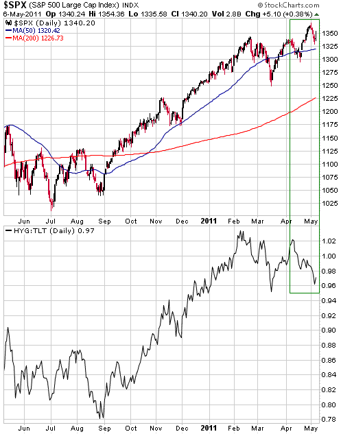
Based solely on the
SPX's price action, the most likely outcome is that the US stock market
will make a new high for the year before the end of this month.
However, last week's definitive downward reversal in the silver/gold
ratio means that the stock market's short-term downside risk now trumps
any additional upside potential (the implications of this ratio's
reversal go well beyond the precious metals sector). Also of concern
are the widening of credit spreads noted above, the fact that the most
recent Investors Intelligence survey indicated that 83.5% of advisors
were bullish (54.9% were outright bullish, while another 28.6% were
bullish but expected a short-term pullback), and the on-going bearish
put/call situation. We have therefore downgraded our short-term stock
market outlook to "bearish".
This week's
important US economic events
| Date |
Description |
Monday May 09
| No important events scheduled
| | Tuesday May 10 | Import and Export Prices
| | Wednesday May 11
| International Trade Balance
Treasury Budget
| | Thursday May 12
| PPI
Retail Sales
| | Friday May 13
| CPI
Consumer Sentiment
|
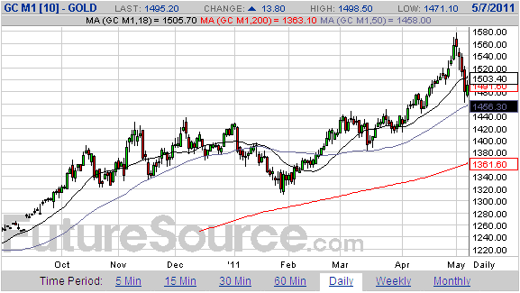
Gold and
the Dollar
Gold and Silver
Current Market Situation
Here, again, are the two short-term scenarios we outlined in the email
sent to subscribers following the 2nd May trading session:
1. Gold and silver will make lows this week. Both will then strengthen
for 2-4 weeks, with gold moving well above this week's high and silver
doing no better than testing its high. This price action will result in
a bearish divergence between gold and the silver/gold ratio (new highs
in gold accompanied by lower highs in silver/gold) and will be followed
by declines in the prices of both metals to their 200-day moving
averages within the ensuing two months.
2. Gold and silver have just made intermediate-term peaks and will
trend lower to the vicinities of their respective 200-day moving
averages over the next two months.
In the 4th May Interim Update we said that Scenario 2 had become the
more likely, and that Scenario 1 would be eliminated from contention if
"the gold price were to close below this week's low within the next two
weeks."
The following daily chart shows that last week's low for June gold was
just above $1460, so it would take a daily close below $1460 to
completely rule out Scenario 1. It is fair to say, though, that
Scenario 2 now has by far the higher probability.
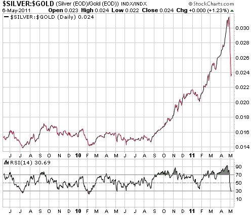
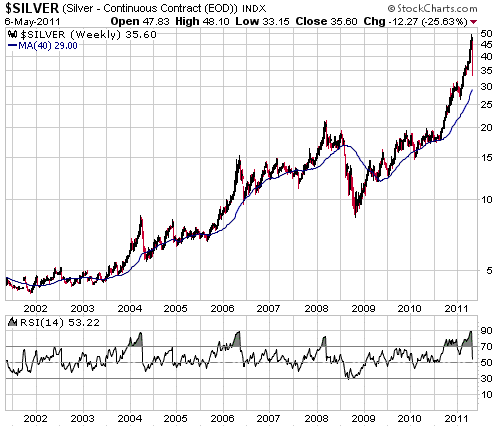
Last week's dramatic
price action in the silver market certainly warrants some discussion.
It is important to remember that silver NEVER declines slowly after
reaching an intermediate-term peak. It always plunges in spectacular
fashion. However, last week's decline was unusually steep even by the
silver market's standards. By way of comparison, after reaching
intermediate-term peaks in April of 2004 and May of 2006, the silver
price fell around 35% within the space of 5 weeks. This time around it
achieved a similar peak-to-trough decline in less than two weeks, with
almost all the decline happening last week.
Don't bother trying to come up with news-related explanations for last
week's silver collapse; it is, in our opinion, primarily a reflection
of just how irrationally exuberant the market had become during the
weeks leading up to the collapse. It was a similar story throughout the
commodity world, but silver had been the focal point of the speculation
and therefore took by far the biggest hit.
So, is the decline already complete? If not, when and at what price is it likely to end?
It's very unlikely that a sustainable price low was reached last week,
but there is a reasonable chance that a 1-2 week low is in place. The
fact that the silver/gold ratio's RSI (refer to the bottom section of
the following chart) moved below 30 last Thursday means that the ratio
is now 'oversold' enough for a temporary bottom to have been reached.
Rather than marking
the end of the overall correction, it's more likely that Friday's
silver-price reversal from around $33 marked the end of the first
downward leg of a correction that will play out over 1-2 months. It
would certainly be unusual for a correction of this magnitude to end
before the market had traded at or below its 200-day moving average.
Also, the following weekly chart shows that intermediate-term silver
corrections typically end with the weekly RSI at around 40, versus the
current level of 53.
The bottom line is that any rebound over the days ahead will likely be followed by a decline to new correction lows.
We mentioned in last
week's Interim Update that we took profits on 20% of our SLV put-option
position on Wednesday 4th May. We took profits on another 40% of these
puts on Thursday 5th May, so we have now exited about 60% of our
precious metals insurance position. Regardless of what happens with the
balance, the options served their purpose admirably.
We will consider buying some more SLV put options if the silver price
rebounds to around $40 during the coming week or so, but we probably
won't do it. Silver has already crashed, but other markets have the
potential to crash during the next 6 months and we'd prefer to buy
insurance to protect ourselves against the potential future crashes.
The Australian Dollar is one market with the potential to crash during
the next 6 months.
ETF Premiums
As we've discussed in TSI commentaries over the years, the
premiums/discounts to net asset value (NAV) at which gold and silver
bullion ETFs (CEF, GTU, PHYS and PSLV) trade can be used as sentiment
indicators. However, be aware that when the market price is volatile,
as it has been recently in the silver market, the reported daily NAV
premiums/discounts are sometimes very inaccurate. The reason is that
the metal price used in the calculation of the NAV is sometimes very
different to the metal price that prevailed at the time the ETF
finished trading. CEF, for instance, uses the London fixes for gold and
silver when calculating the NAV that gets reported daily at its web
site, but this NAV calculation is compared to a market price for the
fund several hours later -- at the close of trading in New York. For
example, the calculation done for Friday assumes a silver price of
$34.20 (the London fix), but silver closed in New York at $35.60.
If you are capable of doing your own accurate comparisons of ETF prices
and NAVs, and you notice that an ETF is trading at a large discount to
its NAV or that one ETF is trading at a large discount to another ETF
with similar assets, then you could attempt to take advantage by
purchasing the under-valued ETF. Based on current prices and NAVs, for
example, if you owned Sprott Silver ETF (PSLV) it would make sense to
sell it and use the proceeds to buy CEF (due to PSLV's much higher
premium).
Canadian billionaire Eric Sprott led the charging silver bulls over the
past several months and in the process generated a lot of enthusiasm
for his silver bullion fund (PSLV). Therefore, when it comes to
indicating market sentiment PSLV is probably the most useful of the
bullion funds at this time. PSLV ended Friday at a premium of 15%
(http://www.sprottphysicalsilvertrust.com/NetAssetValue.aspx). A
decline in the premium to less than 5% would suggest that sentiment was
consistent with a sustainable price low.
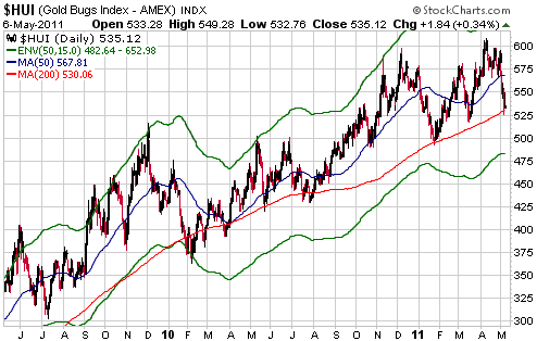
Gold Stocks
The short-term potential for the HUI to break above 600 and move up to
670-700 has, for all intents and purposes, been eliminated by last
week's market action. Short-term upside potential is probably now
limited by former support (now resistance) in the 570s.
There is a lot of support in the 500-525 range. The top of this range
was touched last week, opening up the possibility that the correction
is close to an end in terms of price. The problem is that the
associated metal markets are probably just one week into
intermediate-term corrections. Is it possible that the correction in
the mining stocks could be close to an end while the corrections in the
associated metals are just beginning?
It's possible, but unlikely. We suspect that the stocks will hold up
relatively well as the metals work their way lower over the next 1-2
months, but it is reasonable to assume that the gold-stock indices will
trade significantly lower than last week's lows before the correction
ends. The bottom of the 500-525 range is a plausible target, but given
the speed of last week's decline it won't surprise us if the HUI trades
as low as 475 before the next intermediate-term advance gets underway.
We think that 475 is a realistic downside target because it is just
below the bottom of the moving average envelope shown on the following
daily chart. With the exception of the 2008 decline, every
intermediate-term gold-stock decline of the past 10 years ended with
the HUI trading at or slightly below the bottom of this MA envelope
(the 2008 decline took the HUI a long way below the bottom of the
envelope).
In any case, the
future is always uncertain and the big money is not made by trying to
guess the likely directions and magnitudes of short-term moves. The big
money is made via steady accumulation into substantial weakness and
steady profit-taking into substantial strength. With the HUI in the
520s or lower, steady accumulation of gold stocks would be warranted.
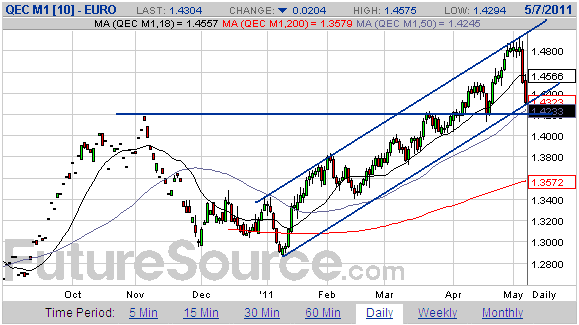
Currency Market Update
The euro's weakness was exacerbated late last week by a story in
Germany's Der Spiegel newspaper that Greece was considering leaving the
euro zone and re-establishing its own currency. On the surface, a Greek
exit from the euro would seem to strengthen the 'euro chain' by
removing the chain's weakest link, but few things in the world of
international econo-politics are what they superficially seem. Of
particular relevance, all the so-called austerity measures and
financial support programs adopted within the euro zone have absolutely
nothing to do with helping the economically weak members of the
monetary union (the economically weak members will almost certainly
become even weaker as a result of these measures and programs). Rather,
it has all been about helping banks and bank bondholders. If Greece
leaves the euro zone then banks and bondholders will be forced to take
large losses on their investments, which apparently must be avoided
regardless of the cost to the rest of the economy.
The best solution for Greece would be for the country to a) retain the
euro, b) dramatically reduce its government spending, and c)
immediately default on the bulk of its government debt. Unfortunately,
it probably won't be permitted to do both a) and c). The most likely
short-term outcome is that a way will be found to prolong the agony via
some more stopgap measures that do nothing to address the underlying
reality that the Greek government is bankrupt.
Given that it occurred in the wake of a downward reversal in the
silver/gold ratio, last week's euro decline could be the start of a new
intermediate-term trend. However, the following daily chart shows that
at this stage the euro has simply moved from the top to the bottom of
its short-term upward-sloping channel.
A daily close below 1.42 would be initial confirmation that an important trend change had occurred.
Update
on Stock Selections
(Notes: 1) To review the complete list of current TSI stock selections, logon at http://www.speculative-investor.com/new/market_logon.asp
and then click on "Stock Selections" in the menu. When at the Stock
Selections page, click on a stock's symbol to bring-up an archive of
our comments on the stock in question. 2) The Small Stock Watch List is
located at http://www.speculative-investor.com/new/smallstockwatch.html)
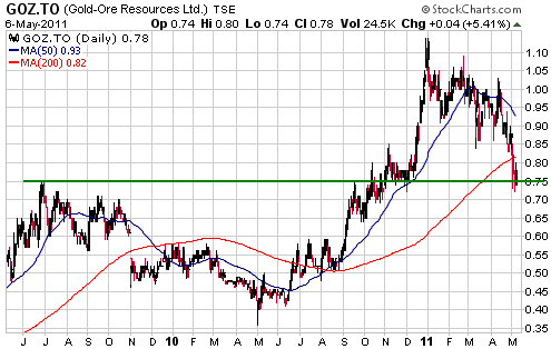
 Gold-Ore Resources (TSX: GOZ). Shares: 83M issued, 89M fully diluted. Recent price: C$0.78 Gold-Ore Resources (TSX: GOZ). Shares: 83M issued, 89M fully diluted. Recent price: C$0.78
In the 6th April Interim Update we wrote that strong support at
C$0.75-C$0.80 probably defined the short-term downside risk for GOZ, a
profitable 45K-oz/year gold producer based in Sweden. Last week's sharp
sector-wide decline caused the stock to momentarily trade a couple of
cents below this support range, but the support held on a weekly
closing basis.
GOZ is a reasonable candidate for new buying near its current price. As
previously advised, C$1.50 is our intermediate-term target for the
stock.
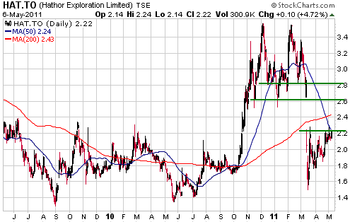
Hathor Exploration (TSX: HAT). Shares: 107M issued, 117M fully diluted. Recent price: C$2.22
HAT is the highest quality and lowest risk exploration-stage uranium
stock that we know of. The high grade of its Saskatchewan-based
Roughrider deposit means that the deposit will likely be attractive to
larger mining companies even in the unlikely event that the uranium
price fails to recover from the hit it took in response to Japan's
recent "nuclear emergency".
HAT is presently bumping up against resistance in the low-C$2.20s.
Breaking through this resistance would create a short-term chart-based
target of C$2.60-C$2.80, where those who bought following the
Japan-related March crash in the uranium sector could consider taking
partial profits.
We think the stock is a reasonable candidate for accumulation below C$2.20 and a strong buy below C$2.00.
Chart Sources
Charts appearing in today's commentary
are courtesy of:
http://stockcharts.com/index.html
http://www.futuresource.com/

|