|
-- Weekly Market Update for the Week Commencing 9th June 2008
Big Picture
View
Here is a summary of our big picture
view of the markets. Note that our short-term views may differ from our
big picture view.
Bonds commenced a secular BEAR market in
June of 2003. (Last
update: 22 August 2005)
The stock market, as represented by the S&P500 Index, commenced
a secular BEAR market during the first quarter of 2000, where "secular
bear market" is defined as a long-term downward trend in valuations
(P/E ratios, etc.) and gold-denominated prices. This secular trend will bottom sometime between 2014 and 2020. (Last update: 22 October 2007)
The Dollar commenced a secular BEAR market during the final quarter of 2000. The
first major downward leg in this bear market ended during the first
quarter of 2005, but a long-term bottom won't occur until 2008-2010. (Last update: 28 March 2005)
Gold commenced a
secular bull market relative to all fiat currencies, the CRB Index,
bonds and most stock market indices during 1999-2001. This secular trend will peak sometime between 2014 and 2020. (Last update: 22 October 2007)
Commodities, as
represented
by the CRB Index, commenced a secular BULL market in 2001. The first
major upward leg in this bull market ended during the second quarter of
2006, but a long-term
peak won't occur until at least 2008-2010. (Last update: 08 January 2007)
Copyright
Reminder
The commentaries that appear at TSI
may not be distributed, in full or in part, without our written permission.
In particular, please note that the posting of extracts from TSI commentaries
at other web sites or providing links to TSI commentaries at other web
sites (for example, at discussion boards) without our written permission
is prohibited.
We reserve the right to immediately
terminate the subscription of any TSI subscriber who distributes the TSI
commentaries without our written permission.
Outlook Summary
Market
|
Short-Term
(0-3 month)
|
Intermediate-Term
(3-12 month)
|
Long-Term
(1-5 Year)
|
Gold
|
Neutral
(02-Jun-08)
|
Bullish
(12-May-08)
|
Bullish
|
US$ (Dollar Index)
|
Neutral
(09-Jun-08)
| Bullish
(31-May-04)
|
Neutral
(19-Sep-07)
|
Bonds (US T-Bond)
|
Neutral
(03-Mar-08)
|
Neutral
(19-May-08)
|
Bearish
|
Stock Market (S&P500)
|
Neutral
(02-Jun-08)
|
Bearish
(12-May-08)
|
Bearish
|
Gold Stocks (HUI)
|
Neutral
(02-Jun-08)
|
Bullish
(12-May-08)
|
Bullish
|
| Oil | Neutral
(09-Jun-08)
| Bearish
(22-Oct-07)
| Bullish
|
Industrial Metals (GYX)
| Bearish
(05-May-08)
| Bearish
(09-Jul-07)
| Bullish
|
Notes:
1. In those cases where we have been able to identify the commentary in
which the most recent outlook change occurred we've put the date of the
commentary below the current outlook.
2. "Neutral", in the above table, means that we either don't have a
firm opinion or that we think risk and reward are roughly in balance with respect to the timeframe in question.
3. Long-term views are determined almost completely by fundamentals,
intermediate-term views by giving an approximately equal weighting to
fundmental and technical factors, and short-term views almost
completely by technicals.
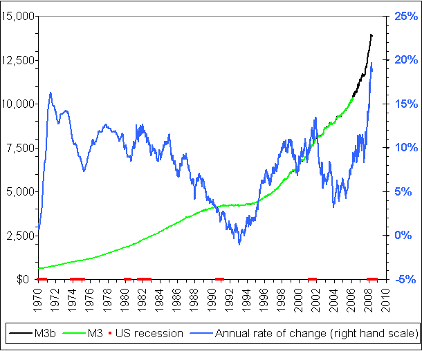
TMS or M3? A reply to Paul van Eeden
A few weeks ago Paul van
Eeden (PVE) posted an extremely bearish outlook on bonds that he
justified, in large part, by the rapid expansion of M3 money supply. We
responded that while we are long-term bearish on bonds (we expect bond
yields to move much higher over the coming 5 years), we thought that
PVE's premise was wrong. Our reasoning: M3 is a poor indicator of
monetary inflation, whereas a vastly superior monetary aggregate,
namely the True Money Supply (TMS) developed by Murray Rothbard and
Joseph Salerno, reveals a relatively slow rate of monetary inflation.
PVE has since responded
to our response, and in doing so has raised some good points that we'll
address in today's report. Before we do, though, it's worth noting that
we never mean any disrespect when we critique another analyst's work.
In fact, we usually won't take the time to read, let alone comment on,
articles by analysts we don't respect. Furthermore, we have absolutely
no problem being taken to task by others who consider our analysis to
be off the mark, as long as the 'taking to task' is done in an
objective manner. And we certainly aren't averse to changing our
opinion when the evidence suggests that a change is appropriate. For
example, we considered M3 to be a reasonable indicator of monetary
inflation until early this year, at which time the large divergences
between different monetary aggregates prompted us to delve much more
deeply into what should, and should not, be counted in the money
supply. The research we did during the first few months of this year
convinced us that a) flaws in the compositions of M3 and MZM were
causing these broad measures of money supply to generate 'major league'
false signals, and b) TMS, while perhaps not ideal, was a much better
measure of money supply.
Turning our attention to the above-linked PVE article, the first thing
that deserves to be clarified is that TMS is NOT suggesting deflation.
There cannot be deflation as long as the money supply is expanding and
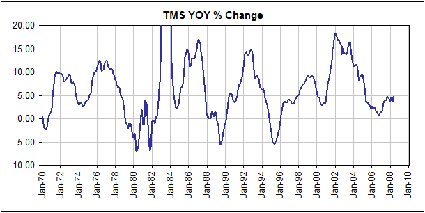
TMS has increased by 4.8% over the past 12 months. Also, TMS's current
12-month rate of change is the highest since April of 2005, so TMS is
increasing AND its rate of change appears to be in the early stages of
a new upward trend.
To make sure there's no doubt as to where we stand on this issue we
reiterate that we are strongly of the view -- a view consistent with
the performance of TMS -- that the US will experience inflation at
varying rates for many years to come. The current difference between M3
and TMS is not the difference between inflation and deflation; it's the
difference between extremely high monetary inflation and moderate
monetary inflation.
Next, PVE acknowledges that TMS is a better measure of MONEY supply than M3 when he states: "TMS
was constructed with the intention of defining a true monetary
aggregate that could tell us something about the true nature and extent
of Americaís money supply. M3, on the other hand, includes
components of the banking system, such as money market mutual funds,
that are clearly not money and which make M3, strictly speaking, not a
true "monetary" aggregate." So, despite the to and fro it seems
that we are in agreement regarding TMS's superiority as a measure of
total US money supply.
After acknowledging that TMS is the better measure of money supply, PVE
goes on to explain why he will continue to use M3. In a nutshell: he
will continue to use it because it is a better predictor of events
within the real economy and the markets.
We disagree that M3 has been the better predictor and will soon explain
why, but in any case this is a separate issue. To say that TMS is the
better measure of money supply and that M3 is the better
predictor/indicator of the economy and the financial markets is to say
that changes in the supply of money aren't the only things that affect
the economy and the markets. This, of course, is true.
We'll now deal with the contention that M3 has been a more useful economic/market indicator.
A lot of PVE's analysis relies on long-term comparisons between
money-supply growth rates and changes in money purchasing power, with
changes in money purchasing power represented by year-over-year changes
in the Consumer Price Index (CPI) calculated by John Williams at
shadowstats.com. It is quite likely that this version of the CPI comes
closer to reflecting reality than the CPI reported by the government,
but even an honest attempt to come up with a single number that
represents the economy-wide average price level will necessarily fail
because the whole concept of an economy-wide average price is
nonsensical. We've explained why in several prior reports/articles,
including the one posted HERE. Unfortunately, not everything worth measuring can actually be measured.
Because PVE's comparisons of different monetary measures and the CPI
are based on the false premise that it is possible to determine a
single number that consistently/accurately reflects changes in the
purchasing power of money, there's no need for us to specifically
address the conclusions he draws from these comparisons.
This could be a case of beauty being in the eye of the beholder, but
when we look at long-term charts showing year-over-year changes in TMS
and M3 we arrive at the conclusion that TMS has generally been a better
predictor than M3 of various economic and market-related trends. With
reference to the following charts showing the year-over-year percentage
changes of TMS and M3, here's why:
1. During 1978-1979 the TMS growth rate plunged from +8% to -5%. This
suggested that the commodity boom was close to an end, which proved to
be the case. M3's growth rate pulled back during this period, but
remained fairly high and therefore failed to signal an end to the 1970s
commodity boom.
2. TMS's growth rate exploded upward between November of 1981 and July
of 1983, peaking at an extraordinary rate of around 50%. This suggested
that a new inflation-fueled boom was beginning, which again proved to
be on the mark (the stock market boom began during the second half of
1982). At the same time, there was nothing in M3's performance to
indicate that monetary conditions had gone from 'tight' to 'easy'.
By the way, to answer a question posed by PVE near the end of his
article: the explosive growth in TMS during the early 1980s was driven
to a large extent by the shifting of money from time deposits (not
included in TMS) to savings deposits (included in TMS), which was, in
turn, related to the realisation that interest rates had peaked.
3. M3's growth rate fell steadily during the first three years of the
1990s, prompting some analysts to warn of deflation and to become very
bearish on the stock market. At the same time, TMS's powerful growth
suggested that the monetary backdrop was becoming easier and that the
monetary stage was being set for a strong stock market. TMS proved to
be correct.
4. TMS's downturn during 1993-1994 'predicted' the equity bear market of 1994.
5. There was strong growth in both TMS and M3 during 1998-2003, leading
to the inflation-fueled booms in commodities, real estate, mortgage
lending, debt securitisation, and the emerging markets.
6. The sharp decline in TMS's growth rate during 2004-2006 suggested
that the most vulnerable of the above-mentioned inflation-fueled booms
would burst. TMS's performance is therefore consistent with what
actually happened to the real estate and credit markets. On the other
hand, M3's acceleration suggested that the real estate and
mortgage-lending markets were not going to run into major difficulties.
Again, TMS transmitted the more correct message.
7. As PVE notes, TMS is much more volatile than M3. This, however, is
not a weakness of TMS because in this respect TMS is simply reflecting
reality. The sad truth is that under the current monetary system the
supply of money not only increases way too fast over the long-term, it
does so in a very haphazard and volatile way.
8. The relationship between interest rates and money-supply growth is
complex because major changes in long-term interest rates are not
directly determined by monetary inflation; they are determined by
inflation expectations. For example, there was plenty of monetary
inflation during the 1980s and 1990s, but during these two decades the
main beneficiary of the inflation was the stock market and rising stock
prices are never perceived to be indicative of an inflation problem.
As noted above, the
downturn in TMS's growth rate during 2004-2006 and its relatively minor
rebound over the past 18 months pointed to problems for the housing
industry and over-extended credit providers. These problems are likely
to continue. There's also a significant risk that the reduced rate of
money-supply growth will be the catalyst for a sizeable downturn in
commodity prices over the coming months, although the commodities
market, being the international variety, is influenced by changes in
GLOBAL monetary inflation. Unfortunately, at this stage we don't have a
global equivalent of TMS.
Commodities
Oil and the Euro
After an event happens in the financial markets will usually not be
difficult to invent a story that explains why it happened, even if the
event was totally unexpected. Although the story would have seemed
farfetched had it been told prior to the event, after the event it will
appear to make sense simply because it meshes with the price action.
The following chart shows that there has been a strong positive
correlation between the euro and the oil price over the past year, so
based on this history it is not surprising that a big up-move in the
euro last Thursday was immediately followed by a big gain in the oil
price. However, the euro's gain was in response to evidence that the
ECB will soon hike its targeted interest rate, meaning, in effect, that
the oil price surged in response to the threat of tighter European
monetary policy. Does it really make sense that signs of tighter
monetary policy in Europe should lead to a higher oil price given that
tighter monetary conditions would likely reduce the demand for oil?
The easily explainable with the benefit of hindsight, but otherwise
illogical, price action persisted on Friday in that evidence of a
weakening US economy gave the oil price another large boost. Slower US
economic growth should lead to less demand for oil and should therefore
not cause the oil price to rise, but the story is that a weaker US
economy will lead to easier monetary policy in the US and,
consequently, to a lower US dollar relative to the euro. All that is
then required to explain why the oil price rose in the wake of the bad
US employment data is to point to the relationship that has been
established between the euro and oil over the past year (see below).
The oil price was also given a hefty boost on Friday when the Israeli
Transport Minister said that an attack against Iran would be
"unavoidable" if Tehran continued to push forward with its nuclear
program. However, unless part of his job description entails making
transport more expensive it is difficult to fathom why the Transport
Minister, of all people, would make such a comment.
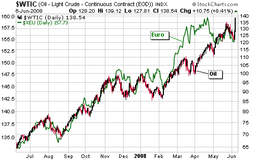
We continue to believe that USO put options with at least 4 months of
time before expiry are a reasonable speculation, but we would certainly
not want to be short oil futures in the current environment.
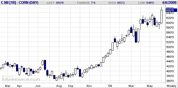
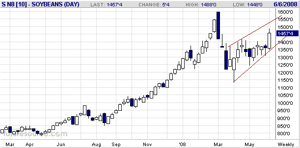
The Grains
Weekly charts of corn and soybean futures are presented below.
More rain than usual in the main corn-growing region of the US delayed
the planting of corn and will probably lead to lower US corn production
than had been anticipated a few weeks ago. As a result, the price of
corn has just surged to a new all-time high. Regardless of how high the
price goes, the US Government's energy policies will ensure that there
is huge demand for corn from ethanol producers. In fact, if the weather
causes a marked reduction in the size of the current corn crop then
it's possible that almost half the crop will be consumed in the
production of ethanol. The idiocy continues.
Delays in the planting of corn should lead to the planting of more
soybeans, which partly explains why soybean futures are still about 10%
below their March-2008 peak. Also, with reference to the following
chart notice that the soybean price has rebounded over the past several
weeks much more slowly than it fell during March. This suggests that
the post-March rebound is what 'Elliott Wavers' would call the B-Wave
of an A-B-C decline.
We are long-term bullish on grains, but as far as the coming year is
concerned we are much more bullish on meat (cattle and hog futures).
The Stock
Market
Current Market Situation
The US stock market was pummeled on Friday in response to a huge rise
in the oil price and continuing problems within the banking system. As
a result, the S&P500 Index broke below support at 1375 and the Dow
Industrials Index extended the decline that began early last month. The
Dow has now retraced about two-thirds of the gains made since the
March-2008 bottom. Moreover, the Bank Index (BKX) ended the week at its
lowest level since March of 2003. This means that the banking sector of
the market has now given back all the gains made during the 2003-2007
bull market!
Having said that, when we look beyond the Dow and the BKX the picture we see isn't anywhere near as bearish. For example:
1. Both the S&P400 Mid-Cap Index and the S&P600 Small-Cap Index made new highs for the year last Thursday.
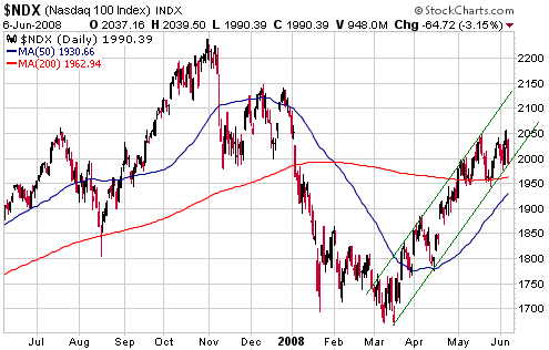
2. As illustrated by the following chart, the NASDAQ100 Index (NDX)
made a new recovery high on Thursday and then pulled back on Friday to
near the bottom of the upward-sloping channel that has defined its
progress since March. In other words, Friday's 'devastating' decline
did no technical damage whatsoever to the NDX.
By the way, the NDX's strength relative to the Dow Industrials Index
since the March-2008 bottom has resulted in the NDX/Dow ratio moving to
a 6-year high. For many years we considered the NDX/Dow ratio to be the
most reliable leading indicator of the US stock market's
intermediate-term trend, but we began to question its usefulness in
this regard last year. This is because problems within the financial
sector had changed the way market participants perceived the large-cap
tech stocks that dominate the NDX. In effect, these stocks went from
being plays on growth to being safe havens, meaning that a rising
NDX/Dow ratio no longer signaled a general shift towards risk.
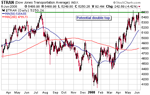
3. The Dow
Transportation Average (TRAN), a chart of which is included below,
tested its all-time high last Thursday. It's possible that the TRAN is
in the process of completing a major 'double top', but it won't show
even the first sign of weakness until it closes below 5100.
4. Credit spreads and the yield curve haven't yet signaled an end to the stock market's rebound.
The bottom line is that the financial sector looks terrible, but the
market, as a whole, is in reasonable shape despite all the obvious
problems.
We remain intermediate-term bearish because we expect the problems in
the financial sector to eventually take their toll on the overall
market and because we don't think the market has yet come close to
discounting the effects of the recession that began last year. At the
same time, we remain short-term neutral and probably won't have a
strong opinion regarding short-term risk/reward until one or more of
the following things happen:
a) Sentiment reaches an extreme
b) Credit/yield spreads reverse their current short-term trends
c) We see evidence that the downward corrections in gold and the gold-stock indices have ended
This week's
important US economic events
| Date |
Description |
Monday Jun 09
| No important events scheduled
|
Tuesday Jun 10
| Trade Balance
| | Wednesday Jun 11
| Fed's Beige Book
| | Thursday Jun 12
| Retail Sales
Import and Export Prices
| | Friday Jun 13
| CPI
|
Gold and
the Dollar
Gold
It would take more imagination than we have at our disposal to come up
with a PLAUSIBLE story that explains why oil has taken over from gold
as the primary anti-US$ speculation. Gold certainly rebounded strongly
on Friday in response to weakness in the US$, the US stock market and
the US banking system, but it remains entrenched within the
'corrective' pattern that began almost three months ago.
A daily close above the May high in the nearest gold futures contract
($940 in the June contract) would leave little room for doubt that the
correction had ended.
Gold Stocks
Even though the gold sector of the stock market has been trending
inversely to the broad stock market over the past year it is unusual
for the gold sector to strengthen on a day when the Dow Industrials
Index falls by more than 300 points. Friday's rebound in the HUI in the
face of a 394-point decline in the Dow was therefore quite impressive,
although it wasn't enough to signal an end to the correction.
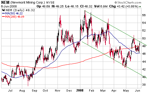
Like gold-stock indices such as the HUI and the XAU, many of the senior
gold stocks have been moving back and forth within downward-sloping
channels since mid March. Two examples are presented below.
The first of the following charts shows that Newmont Mining (NEM)
touched its channel top on Friday. In this case, a daily close above
US$50 would signal an upward trend reversal because it would clearly
break the stock above its channel and also break the sequence of
declining tops. NEM would be worth buying for a trade following either
a daily close above $50 or, preferably, a drop back to near the channel
bottom (the low-$40s) because a) it is unhedged, b) its valuation is
relatively low, and c) it is about to start growing again following a
few years of stagnation/contraction. However, due to political risk
considerations we will probably go with GDX once we decide to initiate
a short-term trading position.
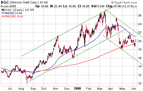
The second of the following charts shows that Kinross Gold (KGC) isn't
yet threatening to break out. In this case, a daily close above US$22
would signal an upward reversal.
With the US$ now on
the verge of breaking out to the downside relative to the euro and the
Swiss Franc it is quite conceivable that a strong rally is about to get
underway in the gold sector. However, we wouldn't buy now in
anticipation of short-term gains because other indicators still suggest
the potential for a final sharp decline to end the gold sector's
correction.
Due to the mixed signals from various indicators and the current
neutrality of gold sentiment/momentum measures we continue to believe
that the best approach is to steadily and systematically build-up
exposure to junior gold/silver stocks. If we were building a
gold/silver stock portfolio from scratch then we'd start with the
following (listed in alphabetical order):
Andina Minerals (TSXV: ADM)
First Majestic Silver (TSX: FR)
Fortuna Silver (TSXV: FVI)
Great Basin Gold (AMEX: GBN)
Keegan Resources (TSXV: KGN)
Minefinders Corp. (AMEX: MFN)
Metallica Resources (AMEX: MRB)
Northgate Minerals (AMEX: NXG)
Resolute Mining (ASX: RSG)
Western Goldfields (AMEX: WGW)
Currency Market Update
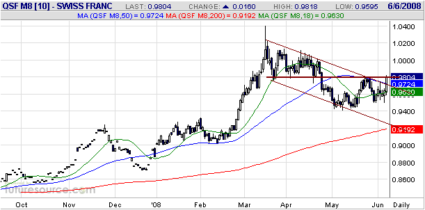
The Canadian Dollar is threatening to break out to the downside to a
new 8-month low, the Yen is in a short-term downward trend, and the
British Pound is near its lows of the past year. At the same time, the
euro and the Swiss Franc are very close to signaling upside breakouts
in that the euro ended last week at the 1.58 resistance level and the
SF ended at the 98 resistance level. In fact, although the June SF
futures contract has yet to surmount lateral resistance at 98 the
following daily chart shows that it was strong enough on Friday to
break above its channel top.
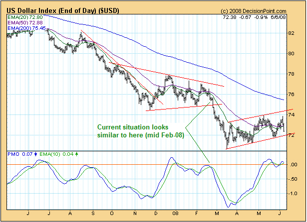
The Decisionpoint.com
chart displayed below shows the current situation for the Dollar Index
and the Dollar Index's Price Momentum Oscillator (PMO). The euro/US$
exchange rate is such a large component of the Dollar Index that a
chart of the Dollar Index will generally look like an upside-down euro
futures chart, almost regardless of what is happening with other
currencies. So, with the euro rallying 'big time' during the final two
days of last week and getting close to an upside breakout it is not
surprising that the Dollar Index's chart has just taken on a more
bearish tinge. As we've noted on the following chart, the current
situation looks similar to mid February of 2008 -- just prior to the
start of a quick 4-point decline.
The catalyst for last
week's upward reversal in the euro and associated downward reversal in
the Dollar Index was a speech by Jean Claude Trichet, the head of the
ECB, delivered on Thursday morning. In this speech Mr. Trichet made it
clear that the European Central Bank was seriously considering a rate
hike and that there was a reasonable chance of this rate hike occurring
next month. This was contrary to what the markets -- and we -- were
expecting. Prior to this speech the euro looked like it was getting
ready to break out to the downside, but by the end of trading on Friday
an upside resolution looked more likely.
Europe's banks are experiencing many of the same troubles as US banks
and the economies of some euro-zone countries are in bad shape, so
prior to last Thursday a near-term ECB rate hike appeared to be a
long-shot. Perhaps the ECB President was just 'jawboning' in an effort
to reduce inflation expectations and a rate hike won't actually occur,
but Trichet's words left so little room for interpretation that unless
something dramatic happens over the next few weeks -- a $30 fall in the
price of oil, for example -- it will be difficult for the ECB not to
follow through.
With the euro now perilously close to an upside breakout and the Dollar
Index's rebound from its March low now looking more like a
consolidation within a downward trend than the start of a new upward
trend, we are stepping away from the short-term bullish outlook for the
US$ initiated on 10th March. We will return to the bullish side of the
fence if the Dollar Index closes above 74.
With regard to our intermediate-term currency market outlook, we caught
the entire decline in the US$ from the 120s to the low-80s and missed
the entire decline from the low-80s to the low-70s. Due to the US
dollar's substantial under-valuation relative to the euro our
intermediate-term US$ outlook can't be any more negative than
"neutral", but with the ECB now clearly signaling a move in the
OPPOSITE direction to what we were expecting we are close to changing
our intermediate-term US$ view from "bullish" to "neutral".
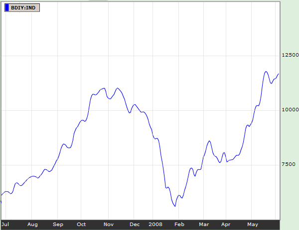
In addition to the price action in the currency and various other
financial markets, our US$ outlook is influenced by the performance of
the Baltic Dry Index (BDI). The performance of the BDI, an index of
international ocean-going freight rates, is relevant because
intermediate-term turning points in the BDI usually coincide with
intermediate-term turning points in the currency market. Specifically,
BDI highs generally coincide with US$ lows and BDI lows generally
coincide with US$ highs.
The following Bloomberg.com chart shows that the BDI plunged between
early November of last year and late January of this year. We took this
as a signal that an intermediate-term US$ bottom was put in place last
November, which proved to be the case relative to the Canadian Dollar
and British Pound but not relative to other major currencies. The BDI
has since moved back to and slightly beyond its November-2007 peak,
perhaps driven by the demand for oil tankers. However, if it turns down
from near its current level then the BDI's recent performance will look
very similar to its performance last October-November.
Update
on Stock Selections
(Note: To review the complete list of current TSI stock selections, logon at http://www.speculative-investor.com/new/market_logon.asp
and then click on "Stock Selections" in the menu. When at the Stock
Selections page, click on a stock's symbol to bring-up an archive of our comments on the stock in question)
Chart Sources
Charts appearing in today's commentary
are courtesy of:
http://stockcharts.com/index.html
http://www.futuresource.com/
http://www.decisionpoint.com/

|