|
-- Weekly Market Update for the Week Commencing 9th August 2010
Big Picture
View
Here is a summary of our big picture
view of the markets. Note that our short-term views may differ from our
big picture view.
In nominal dollar terms, the BULL market in US Treasury Bonds
that began in the early 1980s will end by mid-2010. In real (gold)
terms, bonds commenced a secular BEAR market in 2001 that will continue
until 2014-2020. (Last
update: 09 February 2009)
The stock market, as represented by the S&P500 Index, commenced
a secular BEAR market during the first quarter of 2000, where "secular
bear market" is defined as a long-term downward trend in valuations
(P/E ratios, etc.) and gold-denominated prices. This secular trend will bottom sometime between 2014 and 2020. (Last update: 22 October 2007)
A secular BEAR market in the Dollar
began during the final quarter of 2000 and ended in July of 2008. This
secular bear market will be followed by a multi-year period of range
trading. (Last
update: 09 February 2009)
Gold commenced a
secular bull market relative to all fiat currencies, the CRB Index,
bonds and most stock market indices during 1999-2001. This secular trend will peak sometime between 2014 and 2020. (Last update: 22 October 2007)
Commodities,
as represented by the Continuous Commodity Index (CCI), commenced a
secular BULL market in 2001 in nominal dollar terms. The first major
upward leg in this bull market ended during the first half of 2008, but
a long-term peak won't occur until 2014-2020. In real (gold) terms,
commodities commenced a secular BEAR market in 2001 that will continue
until 2014-2020. (Last
update: 09 February 2009)
Copyright
Reminder
The commentaries that appear at TSI
may not be distributed, in full or in part, without our written permission.
In particular, please note that the posting of extracts from TSI commentaries
at other web sites or providing links to TSI commentaries at other web
sites (for example, at discussion boards) without our written permission
is prohibited.
We reserve the right to immediately
terminate the subscription of any TSI subscriber who distributes the TSI
commentaries without our written permission.
Outlook Summary
Market
|
Short-Term
(0-3 month)
|
Intermediate-Term
(3-12 month)
|
Long-Term
(1-5 Year)
|
Gold
|
Neutral
(04-Jul-10)
|
Bullish
(12-May-08)
|
Bullish
|
US$ (Dollar Index)
|
Bullish
(14-Jul-10)
| Bullish
(02-Nov-09)
|
Neutral
(19-Sep-07)
|
Bonds (US T-Bond)
|
Neutral
(17-May-10)
|
Bearish
(14-Dec-09)
|
Bearish
|
Stock Market (S&P500)
|
Bearish
(16-Jun-10)
|
Bearish
(11-May-09)
|
Bearish
|
Gold Stocks (HUI)
|
Neutral
(07-Jun-10)
|
Bullish
(23-Jun-10)
|
Bullish
|
| Oil | Bearish
(19-Jul-10)
| Bearish
(01-Mar-10)
| Bullish
|
Industrial Metals (GYX)
| Bearish
(21-Sep-09)
| Bearish
(25-May-09)
| Neutral
(11-Jan-10)
|
Notes:
1. In those cases where we have been able to identify the commentary in
which the most recent outlook change occurred we've put the date of the
commentary below the current outlook.
2. "Neutral", in the above table, means that we either don't have a
firm opinion or that we think risk and reward are roughly in balance with respect to the timeframe in question.
3. Long-term views are determined almost completely by fundamentals,
intermediate-term views by giving an approximately equal weighting to
fundamental and technical factors, and short-term views almost
completely by technicals.
A massive mortgage bailout coming soon?
Posted by James Pethokaukis (the Money & Politics columnist for Reuters Breakingviews) at his blog on 5th August:
"Main Street may be about
to get its own gigantic bailout. Rumors are running wild from
Washington to Wall Street that the Obama administration is about to
order government-controlled lenders Fannie Mae and Freddie Mac to
forgive a portion of the mortgage debt of millions of Americans who owe
more than what their homes are worth. An estimated 15 million U.S.
mortgages -- one in five -- are underwater with negative equity of some
$800 billion. Recall that on Christmas Eve 2009, the Treasury
Department waived a $400 billion limit on financial assistance to
Fannie and Freddie, pledging unlimited help. The actual vehicle for the
bailout could be the Bush-era Home Affordable Refinance Program, or
HARP, a sister program to Obamaís loan modification effort. HARP
was just extended through June 30, 2011.
The move, if it happens,
would be a stunning political and economic bombshell less than 100 days
before a midterm election in which Democrats are currently expected to
suffer massive, if not historic losses. The key date to watch is August
17 when the Treasury Department holds a much-hyped meeting on the
future of Fannie and Freddie."
The rumoured mortgage bailout mentioned above has already been
officially denied once. If it gets denied two more times then it is
probably going to happen.
We have no idea whether the Obama Administration is about to effect the
transfer of hundreds of billions of dollars to homeowners with negative
equity, but if the employment situation fails to improve (a virtual
certainty), the housing market continues to deteriorate (another
virtual certainty) and the stock market resumes its long-term decline
(very likely) then it's a good bet that within the next 12 months
something along these lines will be tried. If/when it happens it will
prevent prices from falling to their correct levels and further distort
the price signals that the market uses to allocate resources. It will
therefore place another large obstacle in front of a genuine recovery,
but this won't be a concern for senior policy-makers because the
overarching goal of such schemes is always to rob Peter to pay Paul and
thus obtain the support of Paul. If there are more 'Pauls' than
'Peters', or if the 'Peters' don't realise they are being robbed (as is
often the case when wealth 'redistribution' is effected via monetary
inflation), then the scheme could simultaneously be an economic
disaster and a political success.
If a massive mortgage bailout were put into effect within the next few
weeks it could cause the stock market to deviate from the Presidential
Cycle Model we've been using. Specifically, it could cause the stock
market to be a lot stronger from mid August through to mid October than
we are currently expecting. It could also have short-term bullish
implications for most commodities (including gold) and short-term
bearish implications for the US$. Having said that, we note that the
September-2008 decision to use hundreds of billions of taxpayer dollars
to shore-up the balance sheets of commercial banks (the Troubled Asset
Relief program, or TARP for short) and the unprecedented explosion in
the Fed's balance sheet during September-October of 2008 caused only a
momentary interruption to the stock market's downward trend. In 2008,
the attempts to support prices seemed to increase the stock market's
volatility without altering its ultimate short-term destination.
It's all just rumour at this stage and may not happen this year.
Actually, we will be surprised if another large bailout of any
description happens this year due to the risk of it backfiring in
spectacular fashion at the November elections (it could backfire
because it would so obviously be a pre-election political stunt and
because it would be viewed with disgust by every person who continues
to take responsibility for his own financial situation). But the fact
that this rumour has been floated at all and has an air of credibility
about it suggests that in the realm of policy-making there remains a
strong desire to seek an inflationary 'solution'. Was there ever any
doubt?
Interesting quote or fact of the week
'Tip of the hat' to Bob Hoye of www.institutionaladvisors.com for the following:
Last year:
"Krugman Says World Avoided Second Great Depression"
-A P, August 10, 2009.
This Year:
"We are now in the early stages of a third depression."
-Paul Krugman, The New York Times, June 27, 2010.
In Krugman's world view, the cause of the depression will be insufficient government spending.
And, from our own library of quotable quotes, here's what the famous
Paul Krugman said back in August of 2002 (in the midst of an earlier
recession):
"To fight this recession
the Fed needs...soaring household spending to offset moribund business
investment. [So] Alan Greenspan needs to create a housing bubble to
replace the Nasdaq bubble."
Unfortunately, policy-makers are still listening to the likes of Paul Krugman.
The Stock
Market
The most important chart in the financial world, updated
We show the following chart once or twice per year, every year. We
don't show it more often than that because it presents a very long-term
picture that doesn't usually change significantly from month to month
or even from year to year, but we like to show it at least once per
year because it is, in our opinion, the most important chart in the
world for long-term equity investors. The importance of this chart is
that it takes currency fluctuations out of the equation and reveals the
US stock market's REAL long-term trend.
As explained in the 16th February 2009 Weekly Update: "The
stock market's real long-term trend can be defined by its performance
in gold terms or, just as appropriately, by the trend in its average
valuation (price/earnings ratio, dividend yield, etc.). It doesn't
matter which of these two measures is used because, as evidenced by our
chart, the long-term trends in the stock market's performance relative
to gold (as measured by the Dow/Gold ratio) and the S&P500's
valuation (as measured by the price/peak-earnings ratio developed by
John Hussman) are always in synch with each other."
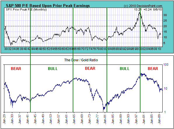
Based on the "Hussman
P/E" (the top section of our chart), the S&P500 Index briefly
dipped into under-valued territory in early 2009. However, John Hussman
has pointed out in his commentaries that the low level of the
price/peak-earnings ratio in early 2009 was partly due to the
extraordinarily high profit margins of 2007, and that the S&P500's
early-2009 valuation looks much less attractive if earnings are
normalised to account for 2007's extremely elevated profit margins. To
put it another way, the "peak earnings" that go into the calculation of
the P/E ratio used in the above chart have been inflated by 'bubble'
profit margins that may never be seen again, causing the valuation to
appear lower than is really the case.
Notice that in the previous two secular bears, the market spent years
in 'under-valued territory' before the long-term trend turned upward.
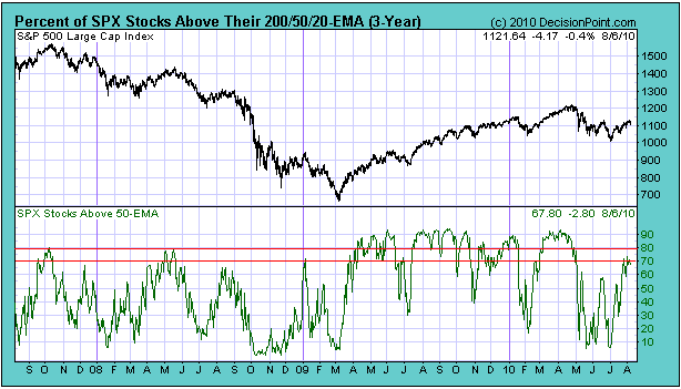
Current Market Situation
Is the US stock market now 'overbought'?
The answer depends on whether we are correct to assume that an
intermediate-term downward trend is still in progress. By way of
explanation, we include, below, a chart showing the percentage of
S&P500 stocks trading above their respective 50-day moving
averages. During an intermediate-term upward trend this indicator will
often move above 90 before a downward correction gets underway, but
upward corrections within intermediate-term downward trends typically
end after the indicator moves into the 70-80 range. The indicator
briefly moved into the 70-80 range last week, so if we are correct to
assume that an intermediate-term downward trend is still in progress
then the market is now sufficiently 'overbought' for the next
meaningful decline to begin.
Below is another look at the S&P500's "rising wedge". Friday's price action further defined the bottom of this wedge.
A daily close below 1100 would be a definitive downside breakout from
the wedge pattern and suggest that the S&P500 was on its way to new
lows for the year, while the S&P500 could move up to the 1140s over
the coming 1-2 weeks and still remain within its potentially bearish
wedge pattern.
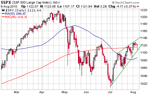
The US stock market
is entering a critical two-week period. The rebound from the early-July
low is consistent with the Presidential Cycle Model that the market has
been tracking since the beginning of the year, but in order to avoid a
significant deviation from the Model the market must reach a short-term
peak by the third week of August at the latest. In other words, a new
multi-month high after the end of next week (20th August) would be a
clear sign that the market was no longer following the Presidential
Cycle Model.
The "jobless recovery"
We just wanted to point out that there cannot be any such thing as a
"jobless recovery". In a genuine recovery a lot more private-sector
jobs will be created than lost, while a failure to make a sizeable dent
in the overall level of joblessness will mean that no genuine recovery
is occurring.
This week's
important US economic events
| Date |
Description |
Monday Aug 09
| No important events scheduled
| | Tuesday Aug 10 | FOMC Meeting Announcement
Q2 Productivity and Costs
| | Wednesday Aug 11
| Internattional Trade Balance
| | Thursday Aug 12
| Import and Export Prices
| | Friday Aug 13
| CPI
Retail Sales
Consumer Sentiment
|
Gold and
the Dollar
Gold and Silver
The gold price has just risen for 8 days in succession, which is an
unusually long winning streak. It is potentially significant that it
has managed to string together such a large number of consecutive
up-days without rising above its 50-day moving average or lateral
resistance at $1220-$1230.
We continue to anticipate an October-November correction low at
somewhere between the mid-$1000s and the mid-$1100s. We therefore
aren't anticipating a lot of weakness, although there could be
sufficient weakness to test the bulls' resolve.

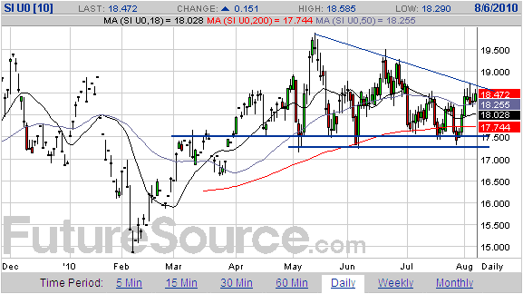
As has been the case
throughout much of the past two years, silver's price chart (see below)
looks more precarious than gold's. The recent rebound has taken the
September silver futures contract back to resistance, but note that
resistance extends from the current price up to $20. In other words,
even if silver were to show some 'surprising' strength over the next
couple of weeks and break above resistance at $18.50-$18.75, it
wouldn't be 'out of the woods'.
Due to silver's greater downside risk we continue to believe that it is
reasonable to use silver put options as a partial hedge for gold-heavy
portfolios.
By the way, there's a big difference between hedging against a
potential decline and speculating on a potential decline. The
difference can be explained using a housing insurance analogy. You
don't buy fire insurance because you want or expect your house to burn
down; you buy it just in case it burns down.
Gold Stocks
Current Market Situation
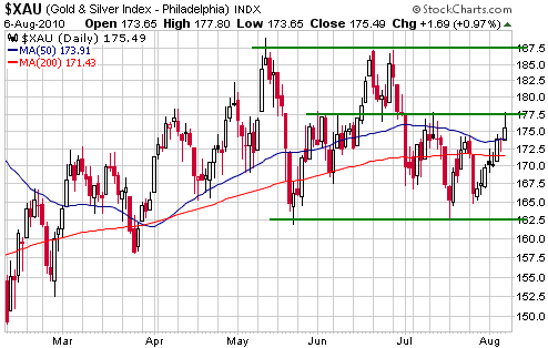
In last week's Interim Update we noted that the XAU had closed
Wednesday's trading session at its 50-day moving average, and that the
preceding two rebounds had ended shortly after reaching this moving
average. The following chart shows that by moving sideways on Thursday
and rallying on Friday the XAU has managed to break above its 50-day
moving average and rise to lateral resistance at 177.5.
Although the break above the moving average is a minor sign of
strength, the price action in both the gold bullion market and the gold
mining sector of the stock market continues to look very much like the
counter-trend-rebound variety. In particular, we note that gold and the
gold-stock indices have recently strung together a lot of up-days, but
that the overall upside progress has not been substantial and gold
bullion has yet to even test lateral resistance at $1220. We therefore
view the recent strength as another opportunity to build up cash or do
some hedging, as opposed to evidence that a correction low is in place.
Friday's intra-day high in the XAU was within 7% of its May high.
Realistically, if the XAU continues to move upward from here it will
take a decisive close above the May high to convince us that a new
intermediate-term advance has begun. A more likely outcome involves a
downward reversal within the next few days followed by a multi-week
decline to a correction low in the vicinity of the February low (150
for the XAU, 370 for the HUI).
It isn't only governments that attempt to re-write history
We don't want to comment on Ron Rosen's article at http://www.kitco.com/ind/rosen/aug032010.html,
but we feel that we really must. The article contains a forecast that
the HUI is about to embark on a decline that will take it back to its
October-2008 bottom of 150.
At any given time there will be a huge range of opinions about the
likely future performance of any market. In fact, differences in
opinion are what make a market. Right now, for example, some people are
expecting a deflationary collapse or deflation scare that will cause
the prices of gold and gold mining stocks to crash (as per 2008); some
people (us, for example) are expecting relatively minor declines or
rises within the contexts of on-going cyclical bull markets; and some
people believe that gold and gold stocks are about to 'go parabolic' in
response to a hyper-inflationary blow-off.
We think the first and the last of the aforementioned
short-to-intermediate-term outcomes are the outliers (the outcomes that
have the lowest probabilities). Mr. Rosen's opinion obviously falls
into the first category, and while we strongly disagree with it -- as
far as we can tell, there is NO historical precedent for the broad
stock market or the gold sector of the stock market experiencing two
massive crashes within the space of two years -- we certainly don't
hold it against him. There is a small chance that he could be right,
which is a reason why the hedges we've previously suggested should
remain in place. What we have a problem with is the following paragraph:
"There is one chart in
the precious metals complex that has been true, honest, and faithful
right from the beginning of its bull market. You will see a white
square on this chart that says DEC 2007 DANGER!!! This was a
magnificent and totally up front and obvious clue that the tide was
about to turn bearish for the HUI. Between November 2000 and December
2007 the HUI did not at any time retreat below a previous monthly high.
Horizontal lines have been drawn to show you this continuously bullish
pattern. For the first time in seven years the HUI closed below a
previous monthly peak in December 2007. I wrote about this in several
REPORTS and told subscribers to sell. The HUI continued moving up for
three months and then began a Flat Correction. The HUI has not exceeded
the March 2008 high of 519.68 for the last 29 months."
Someone reading the above would get the impression that Mr. Rosen
turned bearish near the HUI's 2007-2008 peak (thanks to "a magnificent
and totally up front and obvious clue" in the HUI's monthly chart) and
then stayed bearish, thus helping his subscribers avoid the H2-2008
crash. What he fails to mention is that some time before the 2008 crash
he returned to the bullish side. As evidence we cite the article at http://www.gold-eagle.com/editorials_08/rosen071908.html,
which was published on 19th July 2008 (just prior to the start of a
massive decline in the gold sector). The article includes the following
comments:
"The monthly chart of the
HUI is a thing of beauty. It continues to climb ever higher with a few
patience-trying corrections. It is close in time to beginning an
explosive move up."
"...you are close to entering a rip roaring bull move in the precious metals complex."
We have certainly made our share of bad forecasts, and, as we said
above, we have no problem with Mr. Rosen's current ultra-bearish
opinion. What we have a problem with is his brazen attempt to re-write
history. He doesn't appear to have said anything in his recent article
that isn't true, but by leaving out some relevant information he has
attempted to paint an unreasonably positive impression of his own
performance.
Currency Market Update
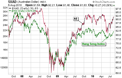
The two charts displayed below explain a lot. The first chart shows
that the Australian Dollar (A$) has a strong positive correlation to
global equities (as represented in this instance by Hong Kong's Hang
Seng Index), which suggests that the A$ will be a relatively strong
currency as long as the global stock market rebound is intact and will
become relatively weak during the next meaningful stock market decline.
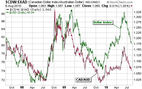
The second chart shows that there is a strong positive correlation
between the C$/A$ ratio and the Dollar Index, meaning that the C$
usually trends higher relative to the A$ when the Dollar Index is
strengthening and lower relative to the A$ when the Dollar Index is
weakening. This chart explains why the C$ has weakened considerably
against the A$ over the past two months and why it should begin to
outperform the A$ once the broad stock market resumes its downward
trend (since the Dollar Index is trending inversely to the stock
market).
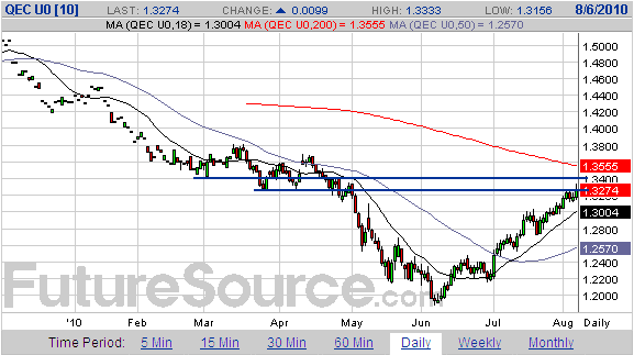
The following chart
shows that the September euro has risen to resistance at 1.33-1.34.
This is a likely range for a reversal, but only if there's a
corresponding reversal in the stock market. Alternatively, some
additional upside in the stock market over the coming 1-2 weeks could
push the euro up to its 200-day moving average (presently at 1.355).
Update
on Stock Selections
(Notes: 1) To review the complete list of current TSI stock selections, logon at http://www.speculative-investor.com/new/market_logon.asp
and then click on "Stock Selections" in the menu. When at the Stock
Selections page, click on a stock's symbol to bring-up an archive of
our comments on the stock in question. 2) The Small Stock Watch List is
located at http://www.speculative-investor.com/new/smallstockwatch.html)
 Agriculture ETF (NYSE: DBA). Recent price: US$25.68 Agriculture ETF (NYSE: DBA). Recent price: US$25.68
Over the past few weeks there has been an interesting up-move in the
grains, with wheat leading the way. The recent sharp rise in the wheat
price was a response to drought-related damage to wheat crops in Russia
and Central Asia, and the related decision by the Russian government to
suspend wheat exports.
The wheat 'supply shock' and resultant sharp rise in its price have
implications for the two other major grain markets (corn and soybeans).
For example, if wheat prices rally further and it becomes apparent that
they are going to remain relatively high for some time, then farmers
in, say, the US will have a strong incentive to plant more wheat and
less corn in the future. This will result in a higher corn price than
would otherwise have been the case. Also, substantially
lower-than-forecast production in one of the world's important
grain-growing regions makes the global grain market more vulnerable to
future weather-related problems.
The wheat price was "limit down" on Friday, so the upward pressure on
prices appears to have momentarily abated. It's a good bet, though,
that the recent market action will prove to be more than just a
short-lived spike, because considering the extent of the reduction in
the wheat crop it is very unlikely that a one-month bounce in price
could bring supply and demand back into balance on a sustained basis.
Accumulating exposure to the grains -- preferably on weakness --
therefore makes even more sense to us today than it did a few weeks
ago.
Unfortunately, there is no ideal vehicle for the aforementioned grain
exposure. We have chosen to go with DBA, but DBA has the disadvantage
(from our perspective) of holding sugar futures in addition to wheat,
corn and soybean futures. We would much prefer a pure play on the trio
of wheat, corn and soybeans. JJG is such a play, but it is an ETN
rather than an ETF. This means that JJG is a credit instrument issued
by a financial institution (Barclays), and, therefore, that the buyers
of JJG are taking credit risk.
Andina Minerals (TSXV: ADM). Shares: 108M issued, 129M fully diluted. Recent price: C$1.23
Buyers of ADM at the current price get Measured-and-Indicated (M&I)
gold resources for less than US$20/ounce, which is extremely cheap
considering the size (7M ounces) and location (Chile) of the deposit.
The main reason it's so cheap is the risk that it will not be possible
to economically mine the deposit at the current gold price. The extent
of the risk won't be known until the company completes its
re-engineering and the associated Preliminary Economic Assessment
(PEA), which probably won't be until early next year.
If the PEA reveals favourable economics at a gold price of $1000/oz or
lower then ADM should recoup all the ground it lost earlier this year
and make a sustained break above C$2.00, but if the PEA indicates that
a much higher gold price will be needed to make the project viable then
ADM will probably remain a lowly-valued option on the gold price.
Turning to the price chart (see below), ADM has been 'chopping' back
and forth between C$1.05 and C$1.25 since we last mentioned it on 26th
April. It appears to be building a base, with the top of the base being
defined by resistance at C$1.40. A break above C$1.40 would probably be
followed by a rise to C$1.70-$1.80, where a lot of supply would
undoubtedly 'come out of the woodwork'. Good news relating to the PEA
will probably be needed to get the stock above C$1.80.
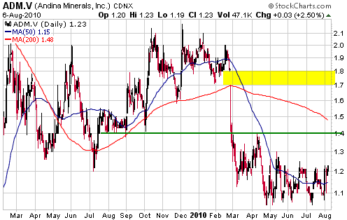
Risk-tolerant
speculators who currently have no exposure to ADM should consider
building a position below C$1.20. The company has a strong balance
sheet (almost $40M in cash) and the stock could be viewed as an option
on a higher gold price and/or successful re-working of the mine plan.
Chart Sources
Charts appearing in today's commentary
are courtesy of:
http://stockcharts.com/index.html
http://www.futuresource.com/
http://www.decisionpoint.com/

|