|
-- Weekly Market Update for the Week Commencing 11th June 2012
Big Picture
View
Here is a summary of our big picture
view of the markets. Note that our short-term views may differ from our
big picture view.
In nominal dollar terms, the BULL market in US Treasury Bonds
that began in the early 1980s will end by 2013. In real (gold)
terms, bonds commenced a secular BEAR market in 2001 that will continue
until 2014-2020. (Last
update: 23 January 2012)
The stock market, as represented by the S&P500 Index, commenced
a secular BEAR market during the first quarter of 2000, where "secular
bear market" is defined as a long-term downward trend in valuations
(P/E ratios, etc.) and gold-denominated prices. This secular trend will bottom sometime between 2014 and 2020. (Last update: 22 October 2007)
A secular BEAR market in the Dollar
began during the final quarter of 2000 and ended in July of 2008. This
secular bear market will be followed by a multi-year period of range
trading. (Last
update: 09 February 2009)
Gold commenced a
secular bull market relative to all fiat currencies, the CRB Index,
bonds and most stock market indices during 1999-2001. This secular trend will peak sometime between 2014 and 2020. (Last update: 22 October 2007)
Commodities,
as represented by the Continuous Commodity Index (CCI), commenced a
secular BULL market in 2001 in nominal dollar terms. The first major
upward leg in this bull market ended during the first half of 2008, but
a long-term peak won't occur until 2014-2020. In real (gold) terms,
commodities commenced a secular BEAR market in 2001 that will continue
until 2014-2020. (Last
update: 09 February 2009)
Copyright
Reminder
The commentaries that appear at TSI
may not be distributed, in full or in part, without our written permission.
In particular, please note that the posting of extracts from TSI commentaries
at other web sites or providing links to TSI commentaries at other web
sites (for example, at discussion boards) without our written permission
is prohibited.
We reserve the right to immediately
terminate the subscription of any TSI subscriber who distributes the TSI
commentaries without our written permission.
Outlook Summary
Market
|
Short-Term
(0-3 month)
|
Intermediate-Term
(3-12 month)
|
Long-Term
(1-5 Year)
|
| Gold
|
Bullish
(26-Mar-12)
|
Bullish
(26-Mar-12)
|
Bullish
|
| US$ (Dollar Index)
|
Neutral
(28-May-12)
| Neutral
(09-Jan-12)
|
Neutral
(19-Sep-07)
|
| Bonds (US T-Bond)
|
Neutral
(11-Apr-12)
|
Neutral
(18-Jan-12)
|
Bearish
|
| Stock Market
(DJW)
|
Neutral
(25-Apr-12)
|
Bearish
(28-Nov-11)
|
Bearish
|
| Gold Stocks
(HUI)
|
Bullish
(26-Mar-12)
|
Bullish
(23-Jun-10)
|
Bullish
|
| Oil | Neutral
(31-Jan-11) | Neutral
(31-Jan-11)
| Bullish
|
| Industrial Metals
(GYX)
| Neutral
(22-Nov-11)
| Neutral
(29-Aug-11)
| Neutral
(11-Jan-10)
|
Notes:
1. In those cases where we have been able to identify the commentary in
which the most recent outlook change occurred we've put the date of the
commentary below the current outlook.
2. "Neutral", in the above table, means that we either don't have a
firm opinion or that we think risk and reward are roughly in balance with respect to the timeframe in question.
3. Long-term views are determined almost completely by fundamentals,
intermediate-term views by giving an approximately equal weighting to
fundamental and technical factors, and short-term views almost
completely by technicals.
Inflation-Adjusted Prices
To paraphrase Einstein, not everything worth measuring is measurable and not everything measurable is worth measuring. The purchasing power of money falls into the former category. It is worth measuring, in that it would be useful to have a single number that consistently reflected the economy-wide purchasing power of money. However, such a number doesn't exist.
Such a number doesn't exist because a sensible result cannot be arrived at by summing or averaging the prices of disparate items. For example, it makes no sense to average the prices of a car, a haircut, an apple, a dental checkup, a gallon of gasoline and an airline ticket. And yet, that is effectively what the government does -- in a complicated way designed to make the end result lower than it would otherwise be -- when it determines the CPI.
The government concocts economic statistics for propaganda purposes, but our point here is that even the most honest and rigorous attempt to use price data to determine a single number that consistently paints an accurate picture of money purchasing power will fail. It will necessarily fail because it is an attempt to do the impossible.
The goal of determining real (inflation-adjusted) performance is not completely hopeless, though, because we know what causes long-term changes in money purchasing power and we can roughly estimate the long-term effects of these causes. In particular, we know that the purchasing power of money falls due to increased money supply and rises due to increased population and productivity. By using the known rates of increase in the money supply and the population and a 'guesstimate' of the rate of increase in labour productivity we can arrive at a theoretical rate of change for the purchasing power of money. This theoretical rate of purchasing-power change will tend to be inaccurate over periods of a year or less but should approximate the actual rate of purchasing-power change over periods of five years or more.
We've been using the theoretical rate of purchasing power change, calculated as outlined above, to construct long-term inflation-adjusted (IA) charts for almost two years now. Here are the updated versions of some of these charts, based on data as at the end of May.
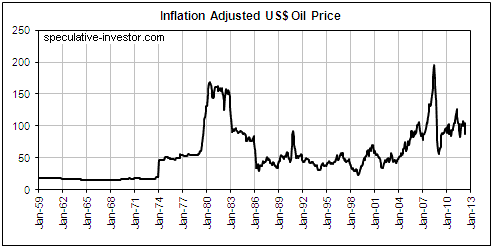
1. In current dollar terms, the oil price peaked at just under $200/barrel in 2008 and at around $170/barrel in 1980. It is now only slightly above its 40-year average.
We doubt that oil will ever again trade below $50/barrel in nominal dollar terms. Also, the 2008 peak was almost certainly the secular variety, so we probably won't see the IA oil price trade above its 2008 peak any time this decade. If oil does make a new high in IA terms within the next few years it will be because of a major Middle East conflagration that greatly reduces the global supply of oil, not because of rising demand or geological limitations on supply.
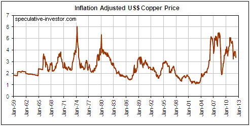
2. As is the case with oil, in IA terms the copper price probably made a secular peak in 2008. As is also the case with oil, the IA copper price is now only slightly above its 40-year average.
Falling demand due to a global recession over the next 12 months could cause the copper price to drop back to $2.00, but we doubt that it would stay that low for long because economic weakness always prompts central banks to boost the money supply. However, future rounds of QE (or whatever other name they give to the money pumping) probably won't do anywhere near as much for the IA copper price as the earlier rounds did. Another way of saying this is that copper probably won't be one of the main beneficiaries of future monetary inflation. One reason is that China's construction boom is turning to bust. Another is that the high prices of the past six years have increased the current and future supplies of this metal.
In 2012 dollar terms we think a copper price in the $2.50-$3.50 range is about right. We would therefore steer clear of copper mining projects that required a copper price of much above $3.00/pound to be economically robust and we would be wary of low-grade copper projects with unknown economics.
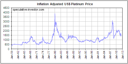
3. In early 2008, the combination of fear that electrical power shortages in South Africa would severely disrupt the global platinum supply and fear of Fed-sponsored dollar depreciation drove the IA platinum price above $3000/oz (about $2300/oz at the time, which is the equivalent of just over $3000/oz in terms of today's dollar). This will probably turn out to be a secular peak for the IA platinum price, although platinum stands a better chance than either oil or copper of exceeding its 2008 peak in IA dollars. There are two reasons for this. First, platinum supply is more concentrated and therefore more vulnerable to disruption than oil or copper supply. Second, we expect that platinum will benefit from the continuing upward trend in the IA gold price.
We may be interested in buying platinum if it drops to $1200/oz.
4. The IA gold price continued its long-term upward trend following a normal intermediate-term correction during the 2008 crisis. It is yet to experience a major upside blow-off like it did in the lead-up to its January-1980 peak and like the oil, copper and platinum markets did leading up to their 2008 peaks.

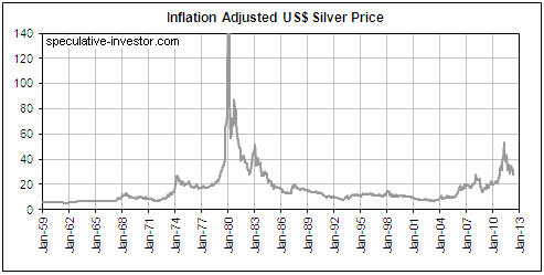
5. In nominal dollar terms, silver's April-2011 peak was a test of its January-1980 peak. In IA terms, however, silver's highest price in April of 2011 was only slightly more than one-third of its 1980 peak.
Silver's January-1980 peak was so extraordinary that it will possibly never be exceeded or even seriously challenged in IA terms, but there's a high probability that silver will handily exceed last year's peak in IA terms before its long-term bull market comes to an end. This is largely because although industrial demand plays a much bigger role in the silver market than in the gold market, investment demand is still the primary driver of silver's long-term bull market. Furthermore, the same factors that should continue to boost the investment demand for gold (government and central bank stupidity in all its forms) are likely to do the same for silver.
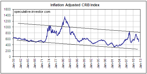
6. Because the official "inflation" indices chronically understate the reduction in currency purchasing power, using these indices to calculate inflation-adjusted performance overstates the performance. That's why Malthusians such as Jeremy Grantham are able to use CPI-adjusted charts of the CRB Index to support their theories that the world is about to run short of valuable agricultural and industrial commodities. These CPI-adjusted charts suggest that the ultra-long-term downward trend in "real" commodity prices has ended, an implication being that commodity supply is now in a long-term downward trend relative to real commodity demand.
The picture is very different if our preferred method is used to adjust for the effects of inflation. As illustrated by the following chart, the IA CRB Index made a new all-time low in 2001 and then peaked in 2008 at well below its 1974 and 1980 highs. There is no evidence that its long-term downward trend has ended.
The Stock
Market
With the stock market in the midst of a multi-week counter-trend rebound, this is a good time to step back and consider the longer-term trend.
What is the longer-term stock market trend? Is the cyclical bull market that began in March of 2009 intact, or has a cyclical bear market begun?
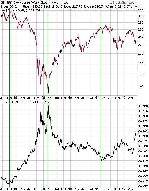
We can't definitively answer the above question, but our best guess is that a cyclical bear market has begun. We also think that although some US stock indices made new multi-year highs during the first quarter of this year, the start of the cyclical bear market dates back to the first quarter of last year. The first quarter of last year was when gold resumed its long-term upward trend relative to commodities (as represented by the CCI). It was also when the WMT/SPX ratio (the stock price of Wal-Mart relative to the S&P500 Index) reversed direction and commenced an upward trend that has lasted 15 months to date.
Over the past 5 years the WMT/SPX ratio has been an infallible indicator of the stock market's major trend. As illustrated by the following chart, WMT/SPX reversed upward at the October-2007 major peak in the broad stock market (as represented here by the Dow Jones World Index - DJW). It then reversed downward at the March-2009 major bottom and moved steadily lower until February of 2011, when, as mentioned above, it reversed upward.
The WMT/SPX ratio works the way it does because WMT is the ultimate safety stock. When big-money investors become concerned about downside risk in the broad stock market and/or the economy but don't want to eliminate their equity exposure, WMT is one of the stocks they shift into.
This week's
important US economic events
| Date |
Description |
| Monday Jun 11 | No
important events scheduled
| | Tuesday Jun 12 | Import
and Export Prices
Treasury Budget
| | Wednesday Jun 13 | PPI
Retail Sales
Business Inventories | | Thursday
Jun 14 |
CPI
Current Account Balance
|
| Friday Jun 15 | TIC
Report
Industrial Production
Consumer Sentiment
Empire State Manufacturing Survey
|
Gold and
the Dollar
Gold
Central Bank Gold Buying
Although a big deal has been made in some quarters of the gold accumulation by central banks that has occurred over the past few years and continues to occur, at this stage it is actually a very small deal. For the same reason that the relentless 'dishoarding' of 400-500 tonnes per year of gold had no noticeable effect on gold's price trend during the first half of gold's long-term bull market, the accumulation by central banks of a few hundred tonnes of gold per year has had, and will continue to have, no noticeable effect on gold's price trend.
The analysts who overplay the importance of central bank (CB) gold buying usually make the mistake of comparing the total quantity of gold purchased by the CBs during a year with annual mine supply, as if the small addition to the total aboveground gold supply made each year by the mining industry was actually the total supply. For example, if CBs increase their collective gold reserve by 500 tonnes in one year and the gold mining industry produces 2500 tonnes during the same year, then an analyst who mistakenly believes that new mine supply equals total supply will mistakenly conclude that the CBs have bought 20% of the gold supply. The reality, however, is that the total aboveground supply of gold is 150,000 tonnes (+/- 20,000 tonnes), which means that at any given time the total demand for gold is also around 150,000 tonnes and that a cumulative CB purchase of 500 tonnes equates to an increase in demand of only 0.3%. An increase of 0.3% isn't totally irrelevant, but we think it makes more sense to focus on the remaining 99.7%.
To further explain what we mean, consider the hypothetical case in which the total US money supply is 10 trillion dollars and, due to tight Fed monetary policy or deflationary forces, the increase during one year is only $10,000. In this same year Joe Bloggs increases his cash reserve by $2,000. Would it make sense to say that Joe Bloggs' increased demand for US dollars accounted for 20% of the dollar supply? Of course it wouldn't, because the dollar supply is 10 trillion not 10 thousand.
Are we implying that gold should be analysed like a currency rather than a commodity?
Yes!
Current Market Situation
The gold price dropped about $90 from last Wednesday's high to last Friday's low. The fact that the bulk of this decline happened during the hours following a speech in which Fed Chairman Bernanke failed to lend support to the idea that more QE is imminent suggests that hopes for near-term QE were partly responsible for the early-June surge in the gold price.
The closer we get to the November presidential election the more difficult it will be for the Fed to provide monetary support to asset prices. There was massive Fed monetisation during the two months prior to the last presidential election, but at that time all the major US commercial and investment banks were teetering on the verge of collapse. The financial backdrop won't have to become as dire as it was in September-October of 2008 to prompt the next round of money pumping, but there will almost certainly have to be a lot more weakness in the stock market and the economy than is evident today. In the absence of such blatant weakness it is reasonable to expect the Fed to do no more than provide general assurances that it will act if deemed necessary.
With or without unjustified hopes for the immediate resumption of Fed QE, gold's rebound from its May low will probably continue over the weeks ahead. Friday's quick recovery from the $1550s to the $1590s supports this view, as does the gold market's 'oversold' status and the euro-zone's unstoppable march towards a major shake-up.
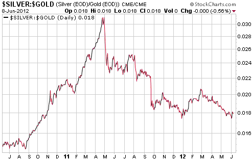
The end of the most recent short-term "risk on" trend was in late February. This was also when the silver/gold ratio commenced its most recent short-term decline. However, unlike the silver/gold declines that happened during the second and third quarters of last year, the latest one has been slow and steady.
There's a significant risk that the silver/gold ratio will end up retracing its entire QE2 rally (meaning: drop back to its levels of July-August 2010) before commencing its next major advance, but it is currently 'oversold' and stands a good chance of rebounding over the weeks immediately ahead.
Gold Stocks
In last week's Interim Update we said that 420-430 was a reasonable target for the HUI's next downward correction. 420-430 is the price range just below the 50-day moving average and a pullback to this range would constitute a normal correction within a short-term upward trend.
The HUI reached the top of the aforementioned price range on Friday before recovering to end the day with a small gain.
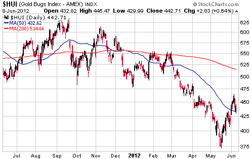
We have no opinion on whether or not a correction low is already in place. It could be, but a further decline to 420 or perhaps even a bit lower wouldn't be surprising.
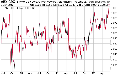
In a strange move, Barrick Gold's board of directors announced last week that it had fired Aaron Regent, the company's CEO, due to the poor performance of the company's stock. This was a strange move because although Barrick (ABX) has performed poorly relative to gold bullion, almost every other gold mining company is in the same boat. Moreover, ABX hasn't performed poorly relative to other large-cap gold mining stocks. As evidence we cite the following chart of the ABX/GDX ratio (ABX relative to an ETF comprising large- and mid-tier gold producers) covering the period from mid 2009 to the present. We chose mid 2009 as the starting point because Regent was appointed CEO in early 2009 and it would have taken at least two quarters for his strategic decisions to have an effect.
Prior to the news of the firing, ABX was up by a few percent relative to GDX over the period in question. Also, the ABX/GDX ratio began to trend upward in September of 2011 and had made a new 3-year high just prior to the firing.
If Aaron Regent lost his job as Barrick CEO due to poor stock performance, then why does Tye Burt still have his job as Kinross (KGC) CEO? Burt's strategic blunders are responsible for KGC having lost about two-thirds of its value relative to GDX over the past three years.
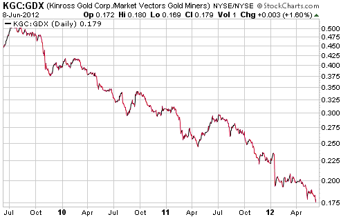
Looking ahead, the market's reactions to the major errors made by Tye Burt over the past few years have driven KGC's valuation to such a low level that relative strength is likely over the next 1-2 years. This assumes that additional large-scale value-destroying errors are avoided.
Currency Market Update
Today we are going to put aside worries about the 17th June elections in Greece and whether or not the
$125B lifeline
that has just been offered to Spain's banking industry will have a lasting effect (hint: why should replacing old debt with new debt have a lasting effect?), because the same old news out of Europe is being analysed to death in every other financial publication. Instead, we will take another look at the Australian Dollar (A$).
Over the past four years the A$'s performance has had very little to do with what's been happening in Australia and a lot to do with the performance of the global stock market. This point is clearly made by the following chart showing the A$ and the Dow Jones World Index (DJW). The A$ has not only consistently trended in the same direction as the DJW, it has also mimicked almost every small fluctuation in the
DJW.
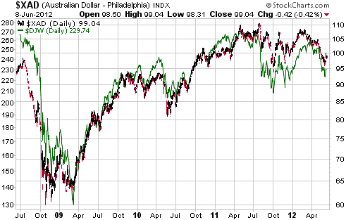
Both the A$ and the DJW have just begun to rebound. These rebounds will probably continue for a while, but new 52-week lows are likely before year-end. At least, we can confidently predict that if the DJW breaks to a new 52-week low then the A$ will do the same.
Update
on Stock Selections
Notes: 1) To review the complete list of current TSI stock selections, logon at
http://www.speculative-investor.com/new/market_logon.asp
and then click on "Stock Selections" in the menu. When at the Stock
Selections page, click on a stock's symbol to bring-up an archive of
our comments on the stock in question. 2) The Small Stock Watch List is
located at http://www.speculative-investor.com/new/smallstockwatch.html
 Sandspring Resources (TSXV: SSP). Shares: 131M issued, 143M fully diluted. Recent price: C$0.80 Sandspring Resources (TSXV: SSP). Shares: 131M issued, 143M fully diluted. Recent price: C$0.80
Last November SSP signed a Mineral Agreement with the government of Guyana that set royalty rates and the rate of income tax that would be applicable once its Toroparu gold project was put into production. Under this agreement there were two preconditions to the issuance of a mining licence for Toroparu, one being issuance of an environmental authorisation by the Guyana Environmental Protection Agency and the other being delivery of a feasibility study to the government of Guyana. SSP announced last Friday that the first of these preconditions (receipt of the environmental permit) had been met. This means that it should be possible for SSP to make a construction decision almost immediately upon completion of a positive feasibility study. Project risk has therefore been reduced a little further.
SSP has the potential to trade at 5-10 times its current price, but a lot will depend on the overall market for gold mining shares and the timing of future equity financings. Having completed a sizeable financing two months ago there shouldn't be any need for SSP to raise money over the next few months, although it is reasonable to expect that the next financing will happen before year-end.
SSP's shares have rebounded along with most gold shares over the past couple of weeks; however, its valuation is still low on both an absolute and relative basis.
A realistic short-term target is former support (now resistance) at around C$1.20. A much higher share price is possible within the next 12 months, but as we said above a lot will depend on the overall market.
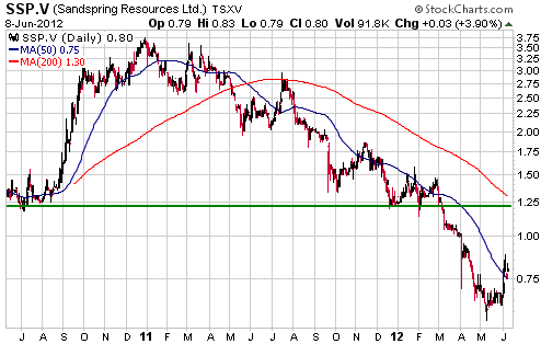
Chart Sources
Charts appearing in today's commentary
are courtesy of:
http://stockcharts.com/index.html

|
