|
-- Weekly Market Update for the Week Commencing 13th December 2010
Big Picture
View
Here is a summary of our big picture
view of the markets. Note that our short-term views may differ from our
big picture view.
In nominal dollar terms, the BULL market in US Treasury Bonds
that began in the early 1980s will end by mid-2010. In real (gold)
terms, bonds commenced a secular BEAR market in 2001 that will continue
until 2014-2020. (Last
update: 09 February 2009)
The stock market, as represented by the S&P500 Index, commenced
a secular BEAR market during the first quarter of 2000, where "secular
bear market" is defined as a long-term downward trend in valuations
(P/E ratios, etc.) and gold-denominated prices. This secular trend will bottom sometime between 2014 and 2020. (Last update: 22 October 2007)
A secular BEAR market in the Dollar
began during the final quarter of 2000 and ended in July of 2008. This
secular bear market will be followed by a multi-year period of range
trading. (Last
update: 09 February 2009)
Gold commenced a
secular bull market relative to all fiat currencies, the CRB Index,
bonds and most stock market indices during 1999-2001. This secular trend will peak sometime between 2014 and 2020. (Last update: 22 October 2007)
Commodities,
as represented by the Continuous Commodity Index (CCI), commenced a
secular BULL market in 2001 in nominal dollar terms. The first major
upward leg in this bull market ended during the first half of 2008, but
a long-term peak won't occur until 2014-2020. In real (gold) terms,
commodities commenced a secular BEAR market in 2001 that will continue
until 2014-2020. (Last
update: 09 February 2009)
Copyright
Reminder
The commentaries that appear at TSI
may not be distributed, in full or in part, without our written permission.
In particular, please note that the posting of extracts from TSI commentaries
at other web sites or providing links to TSI commentaries at other web
sites (for example, at discussion boards) without our written permission
is prohibited.
We reserve the right to immediately
terminate the subscription of any TSI subscriber who distributes the TSI
commentaries without our written permission.
Outlook Summary
Market
|
Short-Term
(0-3 month)
|
Intermediate-Term
(3-12 month)
|
Long-Term
(1-5 Year)
|
Gold
|
Bullish
(27-Oct-10)
|
Bullish
(12-May-08)
|
Bullish
|
US$ (Dollar Index)
|
Neutral
(01-Sep-10)
| Neutral
(27-Sep-10)
|
Neutral
(19-Sep-07)
|
Bonds (US T-Bond)
|
Neutral
(20-Sep-10)
|
Bearish
(14-Dec-09)
|
Bearish
|
Stock Market (S&P500)
|
Neutral
(1-Dec-10)
|
Bearish
(11-Oct-10)
|
Bearish
|
Gold Stocks (HUI)
|
Bullish
(01-Sep-10)
|
Bullish
(23-Jun-10)
|
Bullish
|
| Oil | Neutral
(1-Dec-10)
| Bearish
(01-Mar-10)
| Bullish
|
Industrial Metals (GYX)
| Neutral
(1-Dec-10)
| Bearish
(25-May-09)
| Neutral
(11-Jan-10)
|
Notes:
1. In those cases where we have been able to identify the commentary in
which the most recent outlook change occurred we've put the date of the
commentary below the current outlook.
2. "Neutral", in the above table, means that we either don't have a
firm opinion or that we think risk and reward are roughly in balance with respect to the timeframe in question.
3. Long-term views are determined almost completely by fundamentals,
intermediate-term views by giving an approximately equal weighting to
fundamental and technical factors, and short-term views almost
completely by technicals.
A major trend change has occurred, but which trend has changed?
On the following chart of the
TYX/FVX ratio (the 30-year/5-year yield spread) we've labeled each
intermediate-term turning point with a letter.
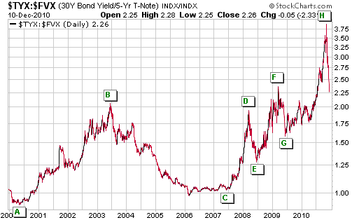
Over the past
11 years, the intermediate-term turning points in the 30-year/5-year
yield spread have always marked important trend changes in other
markets and/or the economy. Specifically:
- Turning Point A marked the end of a secular bull market in US equities
- Turning Point B marked an intermediate-term top for the US
T-Bond market, a long-term top for the Japanese Government Bond market,
and the start of an economic boom
- Turning Point C marked the beginning of a debt crisis
- Turning Point D marked a major peak for platinum and intermediate-term peaks for gold and silver
- Turning Point E marked major tops for oil and the euro, and
the start of a global collapse in equity and commodity prices
- Turning Point F marked a multi-year high in the gold/commodity
ratio, an intermediate-term peak for the Dollar Index and a major
bottom for the S&P500 Index
- Turning Point G marked an intermediate-term low for the T-Bond
market and the start of a global economic rebound (a mini boom)
The latest turning point occurred during the first half of last month,
but what it marked isn't yet known. Based on what has happened over the
past month, here are the best candidates:
1) An intermediate-term top for the euro and bottom for the Dollar Index
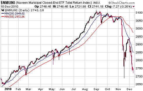
2) A major downward trend reversal in the US municipal debt market (as illustrated by the chart displayed below)
3) A major top for US 10-year, 5-year and 2-year Treasury notes
4) An intermediate-term top for the Hong Kong stock market
There is a high probability that at least one of the above, and a
realistic possibility that all of the above, occurred in early November.
Inflation and the "Commodity Supercycle"
Our
view is, and has always been, that the rapid economic growth occurring
in countries such as China and India is NOT the primary driver of the
long-term bull market in commodities that is often referred to as the
"commodity supercycle". Instead, we see the bull market as mostly an
effect of inflation, where inflation is defined as an expansion of the
money supply. One of the consequences of inflation is a reduction in
the value of money relative to some of the things that money can buy.
We'll endeavour to support our view using some inflation-adjusted
charts, but before doing so we should explain the method we've used to
adjust for the EFFECTS of inflation. We emphasised "effects" in the
preceding sentence because what we want to adjust for is the loss of
purchasing power (PP) that eventually results from monetary inflation,
not the monetary inflation itself.
Of course, the most popular way of adjusting for the effects of
inflation is to use official price indices such as the CPI or the PPI.
However, this way of doing the adjustment is all but guaranteed to
arrive at a bogus result, and not just because the government does its
best to understate the currency's loss of PP. We would also end up with
a bogus result if we were to use the price indices calculated by Shadow Government Statistics.
The reason is that all such indices are based on a false concept, which
is that you can come up with a single number that represents the
average economy-wide price level by adding together, once per month,
the prices of a "representative sample" of the things that are traded
within the economy. The reality is that disparate items* cannot be
added together in a way that produces a sensible result. Furthermore,
it isn't possible to come up with a representative sample that will
consistently reflect what's happening to prices across the entire
economy.
Although price data cannot be used to determine a number that
consistently paints an accurate picture of the change in a currency's
PP, the situation isn't hopeless. This is because we can apply economic
theory to deduce an estimated change in PP that stands a good chance of
being roughly correct over the long term.
The theory that we will apply can be summarised as follows: The
percentage reduction in a currency's purchasing power should, over the
long-term, be roughly equal to the percentage increase in its supply
minus the percentage increase in the combination of population and
productivity. For the purpose of this exercise, we will assume that the
average annual increase in the combination of US population and
productivity has been 3% over the past 50 years (population growth has
averaged 1.1%/year over this period, so we are making the assumption
that productivity growth has averaged 1.9%/year), which amounts to an
average of 0.25%/month. Based on this assumption we can deduce a
monthly inflation adjustment by subtracting 0.25% from the
month-to-month percentage increase in TMS (True Money Supply). During
any given month or any given year the inflation adjustment estimated
using this method will likely be wrong (due mostly to the long and
variable delays from a change in money supply to the associated change
in PP), but it should be approximately correct over periods of 7 years
or more. It is therefore a big improvement over the price index
approach, which is all but guaranteed to be totally wrong over the
long-term.
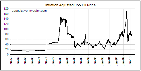
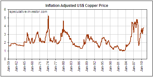
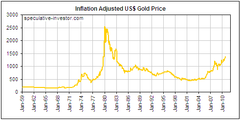
We now turn to the charts mentioned in the second paragraph. These
charts show the real performances, in current US$ terms, of oil, copper
and gold since 1959, with adjustments for inflation having been made
using the method described above.
Here's what the charts tell us:
1. In real terms, the 1973-1980 and 2001-2008 rises in the oil price
were similar. The inflation-adjusted (IA) oil price exceeded its 1980
high in 2008, but not by much and not for long. As things currently
stand, the IA oil price is near its average of the past 35 years, which
contradicts the notion that the combination of "Peak Oil" and
"Chindia's" growth is behind oil's upward re-rating.
The main reason that gold has continued to make real progress since mid
2008 is that the bulk of the world's gold supply is held for
store-of-value purposes, with only a tiny fraction being consumed in
industrial processes. A consequence is that the demand for gold rises
as other perceived stores of value are discredited. When the
credibility of central banks and the currencies they manage began to
shrink at an accelerated pace during 2008, a sizeable increase in the
total demand for gold was a natural consequence.
If our economic outlook is in the right ballpark then gold will
continue to make new multi-decade highs in real (inflation-adjusted)
terms over the years ahead, whereas secular peaks were probably put in
place for the inflation-adjusted prices of oil and copper in 2008.
*Because all the
items involved in the calculation are prices it could appear as if they
are not disparate. The problem can be quickly seen, however, if we
attempt to take an average of what a dollar buys in different
transactions, rather than an average of how many dollars are used in
different transactions. For example, consider three transactions. In
the first, one dollar is paid for a potato. In the second, an amount of
two hundred dollars is paid for a medical examination. And in the
third, a forty-thousand-dollar payment is made for a new car. What we
can say, then, is that in the first transaction one dollar buys 1
potato, and in the second and third transactions it buys 1/200th of a
medical exam and 1/40,000th of a car. What is the average of 1 potato,
1/200th of a visit to the doctor and 1/40,000th of a car? The
statisticians that calculate consumer price indices claim to know the
answer.
WikiLeaks, Truth and Government
Politicians that normally don't agree on anything are united in their
condemnation of WikiLeaks. The united front stems from the fact that
WikiLeaks is shining a light on the way government operates, and almost
all political entities have a vested interest in ensuring that the
ethical standards to which private individuals are held are not applied
to governments and their operatives. So, governments around the world,
in a desperate effort to turn off the light, are now doing what they
can to hamstring the radical journalistic organisation. For example,
steps have been taken to prevent WikiLeaks from receiving the money it
needs to fund its activities, and legislation that would render these
activities illegal is being contemplated. However, there's a good
chance that governments are trying to make the stable door more secure
after the horse has already escaped.
The reason that governments could be fighting a lost cause is that
WikiLeaks has shown what's possible and has therefore paved the way for
countless others. Consequently, shutting down WikiLeaks probably won't
stop the internet from being used to reveal the ugly truth. Instead,
there's a distinct possibility that a self-reinforcing, unstoppable
trend has been set in motion, and that a flood of WikiLeaks-lookalikes
will overwhelm the attempts of governments to keep us in the dark. Such
a trend towards greater disclosure would have long-term bullish
implications for freedom and the economy.
One of the main obstacles, we think, is that faith in government is
high. It has always been high and it always will be until the human
species progresses further along the evolutionary path. The masses
periodically lose confidence in the people who happen to be in power at
the time, but the problem is generally perceived to lie with the people
who currently have power rather than with the underlying concept of a
powerful government. To put it another way, there appears to be
widespread belief that a powerful government that provides
cradle-to-grave security would be a good thing, if only the right
people were in charge. Therefore, when governments introduce draconian
measures that are touted as being in the interests of public safety,
national security or the health of the planet, including measures
designed to limit the freedom of the press, the average person tends to
go along with them.
The Stock
Market
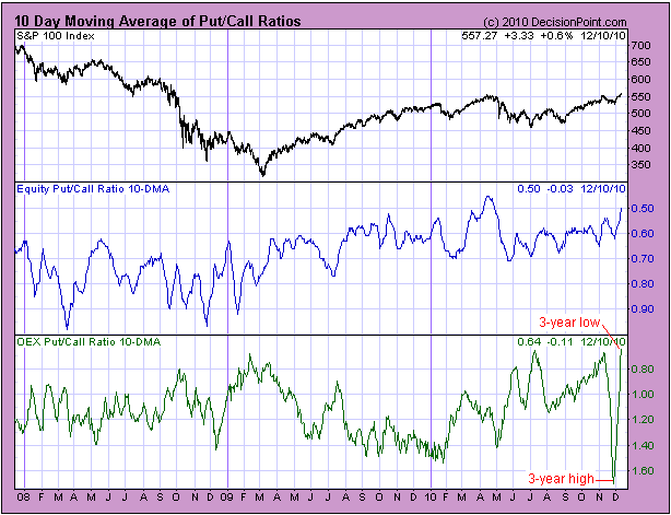
Two weeks ago we mentioned
that the 10-day moving average of the OEX (S&P100 Index) put/call
ratio had moved up to a 3-year high. Considering that the 10-day moving
average of the EQUITY put/call ratio was in the bottom quartile of its
3-year range at the time, this was a clear-cut bearish signal (a high
in the OEX put/call combined with a low in the equity put/call is
considered by us to be bearish, because the trading of OEX options is
dominated by the pros and the trading of equity options is dominated by
the public).
The bottom section of the following DecisionPoint.com chart shows that
since then, the 10-day moving average of the OEX put/call has
completely changed its position and is now at a 3-year low (note: the
chart has an inverted scale, so a rising line on the chart indicates a
falling put/call ratio). In fact, at the end of trading last week the
10-day moving average of the OEX put/call ratio was at its lowest level
since 1989, which is as far back as the record at DecisionPoint.com's
web site goes.
The 10-day moving average of the equity put/call ratio remains close to
a 3-year low, so the current put/call situation should not be construed
as bullish. However, is it reasonable to say that the bearish put/call
signal of two weeks ago has been negated?
We don't know, because such a dramatic change in the 10-day moving
average of the OEX put/call ratio (a 3-year high to a 3-year low within
the space of two weeks) has never happened before. Perhaps we should
just take it as a sign of a market gone crazy.
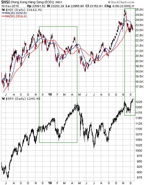
The following chart
compares Hong Kong's Hang Seng Index (HSI) with the S&P500 Index
(SPX). It looks like the HSI has begun to diverge bearishly from the
SPX, just like it did between November of 2009 and April of 2010.
The odds are in
favour of the US stock market's rally continuing into January, but we
certainly wouldn't be comfortable being 'long' this market.
This week's
important US economic events
| Date |
Description |
Monday Dec 13
| No important events scheduled
| | Tuesday Dec 14 | FOMC Announcement
Retail Sales
PPI
| | Wednesday Dec 15
| CPI
Treasury International Capital (TIC)
Industrial Production
Housing Market Index
| | Thursday Dec 16
| Housing Starts
Q3 Current Account Balance
Philadelphia Fed Survey
| | Friday Dec 17
| Leading Economic Indicators
|
Gold and
the Dollar
Gold and Silver
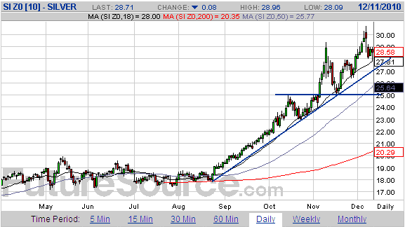
A daily chart of December silver futures is displayed below.
To provide definitive evidence of a downward trend reversal, silver
would have to close below lateral support at $25. Unfortunately, for
most traders this support is too far below the current price to be
effectively employed as a demarcation level (silver would have to fall
by more than 13% from its current price to signal a trend change if the
signal required a daily close below $25).
A daily close below the upward-sloping line drawn on the following
chart could potentially be used as a more timely indicator of a trend
change. This trend line has remained intact despite the substantial
increase in volatility that has occurred over the past two months.
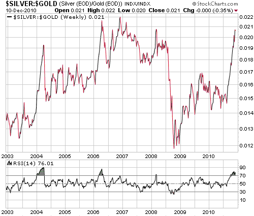
But almost regardless
of what happens to the individual prices of gold and silver over the
weeks ahead, the most reliable indication of an important trend change
should come from the silver/gold ratio. In particular, it will be
reasonable to assume that the gold and silver rallies are still in
progress until/unless a) there is a clear-cut downward reversal on the
following weekly chart of the silver/gold ratio, or b) new price highs
in gold are not confirmed by new 52-week highs in silver/gold.
It is clear that the
Fed has lost a lot of credibility in the eyes of the US public and that
QE2 has been a public relations disaster. Attempts by Bernanke to
explain what he is trying to do and inspire confidence in the Fed have
backfired to the extent that the Fed chairman has become the butt of
jokes. This is all very appropriate because the Fed and its chairman
deserve contempt, but, paradoxically, it could prove to be bullish for
the US$ and bearish for gold during the first half of next year. The
reason is that the Fed is unlikely to introduce new inflation programs
or expand its existing programs while it is under the sort of public
scrutiny to which it is now being subjected.
The anti-inflation pressure that is being brought to bear on the Fed is
consistent with our suspicion that intermediate-term peaks will be put
in place for gold and silver within the next several weeks.
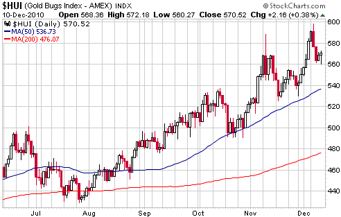
Gold Stocks
The HUI rose for the 6th day in succession last Monday and spiked up to
just below 'round number' resistance at 600 at the start of trading on
Tuesday. It then, predictably, began to 'correct'. Friday's downward
spike to 560 tested Wednesday's low and possibly completed the
correction, although some additional downside over the coming week
wouldn't be a surprise.
We suspect that if a pullback low wasn't put in place last Friday, it
will be put in place some time this week. This pullback should pave the
way for a rally into January that will likely be led by the junior
stocks.
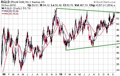
The stock of gold
royalty company Royal Gold (RGLD) has been consolidating for the past
12 months. The following chart shows that it ended last week at the top
of its consolidation pattern, which could mean that it is finally about
to break out and confirm the HUI's earlier move into new-high territory.
Currency Market Update
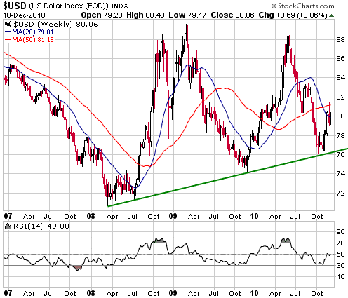
The following weekly chart shows that the Dollar Index spiked up to its
50-week moving average during the week before last and then began to
consolidate. The consolidation could continue for a few more weeks and
result in a test of the early-November low, but we suspect that the
Dollar Index has turned higher on an intermediate-term basis. This
effectively means that the US$ has, in our opinion, made an
intermediate-term bottom against the euro, because the Dollar Index is
dominated by the USD/EUR exchange rate.
To remove most of the
remaining doubt that an intermediate-term bottom was put in place in
early November, the Dollar Index will have to close above its 30th
November intra-day high (around 81.5).
Update
on Stock Selections
(Notes: 1) To review the complete list of current TSI stock selections, logon at http://www.speculative-investor.com/new/market_logon.asp
and then click on "Stock Selections" in the menu. When at the Stock
Selections page, click on a stock's symbol to bring-up an archive of
our comments on the stock in question. 2) The Small Stock Watch List is
located at http://www.speculative-investor.com/new/smallstockwatch.html)
Chart Sources
Charts appearing in today's commentary
are courtesy of:
http://stockcharts.com/index.html
http://www.futuresource.com/
http://www.decisionpoint.com/

|