|
-- Weekly Market Update for the Week Commencing 15th July 2013
Big Picture
View
Here is a summary of our big picture
view of the markets. Note that our short-term views may differ from our
big picture view.
In nominal dollar terms, the BULL market in US Treasury Bonds
that began in the early 1980s will end by 2013. In real (gold)
terms, bonds commenced a secular BEAR market in 2001 that will continue
until 2014-2020. (Last
update: 23 January 2012)
The stock market, as represented by the S&P500 Index,
commenced
a secular BEAR market during the first quarter of 2000, where "secular
bear market" is defined as a long-term downward trend in valuations
(P/E ratios, etc.) and gold-denominated prices. This secular trend will bottom sometime between 2014 and 2020.
(Last update: 22 October 2007)
A secular BEAR market in the Dollar
began during the final quarter of 2000 and ended in July of 2008. This
secular bear market will be followed by a multi-year period of range
trading.
(Last
update: 09 February 2009)
Gold commenced a
secular bull market relative to all fiat currencies, the CRB Index,
bonds and most stock market indices during 1999-2001.
This secular trend will peak sometime between 2014 and 2020.
(Last update: 22 October 2007)
Commodities,
as represented by the Continuous Commodity Index (CCI), commenced a
secular BULL market in 2001 in nominal dollar terms. The first major
upward leg in this bull market ended during the first half of 2008, but
a long-term peak won't occur until 2014-2020. In real (gold) terms,
commodities commenced a secular BEAR market in 2001 that will continue
until 2014-2020.
(Last
update: 09 February 2009)
Copyright
Reminder
The commentaries that appear at TSI
may not be distributed, in full or in part, without our written permission.
In particular, please note that the posting of extracts from TSI commentaries
at other web sites or providing links to TSI commentaries at other web
sites (for example, at discussion boards) without our written permission
is prohibited.
We reserve the right to immediately
terminate the subscription of any TSI subscriber who distributes the TSI
commentaries without our written permission.
Outlook Summary
Market
|
Short-Term
(1-3 month)
|
Intermediate-Term
(6-12 month)
|
Long-Term
(2-5 Year)
|
|
Gold
|
Bullish
(17-Oct-12)
|
Bullish
(26-Mar-12)
|
Bullish
|
|
US$ (Dollar Index)
|
Neutral
(24-Dec-12)
|
Bullish
(01-May-13)
|
Neutral
(19-Sep-07)
|
|
Bonds (US T-Bond)
|
Bullish
(24-Jun-13)
|
Neutral
(18-Jan-12)
|
Bearish |
|
Stock Market
(DJW)
|
Bearish
(15-Jul-13)
|
Bearish
(28-Nov-11)
|
Bearish
|
|
Gold Stocks
(HUI)
|
Bullish
(24-Dec-12)
|
Bullish
(23-Jun-10)
|
Bullish
|
|
Oil |
Neutral
(30-Jul-12)
|
Neutral
(31-Jan-11)
|
Bullish
|
|
Industrial Metals
(GYX)
|
Neutral
(30-Jul-12)
|
Neutral
(29-Aug-11)
|
Neutral
(11-Jan-10)
|
Notes:
1. In those cases where we have been able to identify the commentary in
which the most recent outlook change occurred we've put the date of the
commentary below the current outlook.
2. "Neutral", in the above table, means that we either don't have a
firm opinion or that we think risk and reward are roughly in balance with respect to the timeframe in question.
3. Long-term views are determined almost completely by fundamentals,
intermediate-term views by
fundamentals, sentiment and technicals, and short-term views by sentiment and
technicals.
Monetary Inflation Update
The US
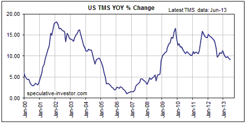
The first of the following charts shows that while the year-over-year (YOY) rate
of growth in US True Money Supply (TMS) is still around 9%, which is high
relative to the long-term average, it has been trending lower since late 2011
and is now at its lowest level since December-2008. With commercial bank credit
having expanded by only 2.8% over the past 12 months, the bulk of the past
year's growth in the US money supply is due to the Fed's monetisation of
Treasury and Mortgage-Backed securities.
The second of the following charts shows that the annualised 3-month rate of
change in US TMS has plummeted since its 2011 peak, but has rebounded a little
since bottoming in March of this year.
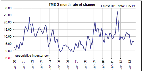
The decline in the rate of US monetary inflation since the second half of 2011
has two main causes. First and foremost, the Fed did not directly make any net
addition to the US money supply from the end of "QE2" in June-2011 to the start
of "QE3" in October-2012. The only monetary inflation during this period was the
result of commercial bank money creation. Second, since the resumption of the
Fed's money-pumping in October of 2012 the rate at which the commercial banks
create new money has slowed considerably.
Even if the rate of commercial bank money creation continues to trend downward,
the overall rate of US monetary inflation is unlikely to move much lower over
the next few months. This is because the Fed is directly creating enough new
money to ensure a monetary inflation rate of 9%-10% per year.
It goes without saying that at some point the Fed will have to reduce the rate
at which it provides monetary 'stimulus'. Bear in mind, however, that even
though the gold market and all the other financial markets continue to react in
a big way to new evidence regarding the Fed's intentions, gold's
intermediate-term and long-term prospects do not depend in any way on the
extension of the current stimulus program. Almost regardless of what the Fed
does from now on, the monetary inflation that has already happened has set the
stage for a major multi-year rally in the gold price.
Japan
As illustrated by the first of the following charts, the YOY rate of growth in
Japan's M2 money supply has risen to its highest level in many years. However,
the growth rate is still only 3.8%. While being high in the Japanese context,
this is a low compared to what's happening almost everywhere else. Furthermore,
the annualised 3-month rate of change in Japan's M2 money supply does not yet
reveal a deviation from the pattern of the past 10 years. Specifically, there
has been a strong tendency for the 3-month rate-of-change in Japan's M2 to peak
in either April or May (usually May) and then plunge to a low during September
or October (usually October). We note that the 3-month rate of change in Japan's
M2 ticked downward in June in line with the seasonal pattern.
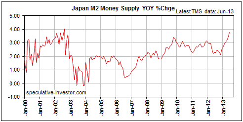
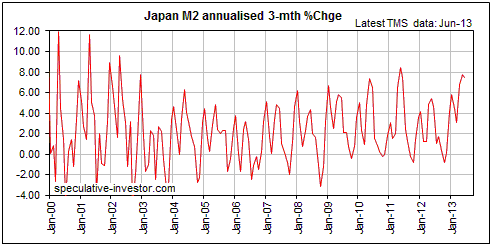
The next two months should be decisive. If the 3-month rate of change in Japan's
M2 moves to a new high for the year in July or August it will be a clear sign
that the Abe-BOJ inflation scheme is 'working', whereas more of the same would
be indicated by a sharp decline in the 3-month M2 growth rate.
The Stock
Market
On a daily closing basis the S&P500 Index
(SPX) ended last week at a new all-time high, but on an intra-day basis last
week's high was slightly below the 22nd May high.
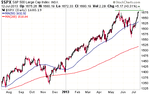
However, the NASDAQ100 Index (NDX) clearly broke above its 22nd May high last
week on both a closing and an intra-day basis.
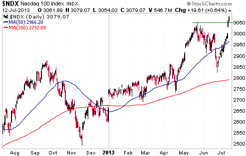
In our opinion it would have been more bullish if both the SPX and the NDX had
commenced 1-2 week consolidations before moving all the way up to (in the SPX's
case) or through (in the NDX's case) their 2013 highs. That they have broken out
to the upside or almost broken out to the upside at this time increases the risk
that the breakouts will fail, leading to significant multi-week declines.
The problem (the reason for the increased downside risk) is that the senior
stock indices are now very extended to the upside by virtue of having risen in
almost straight-line fashion. We note, for example, that the SPX has just risen
for 7 days in a row and that the NDX has just risen for an extraordinary 13 days
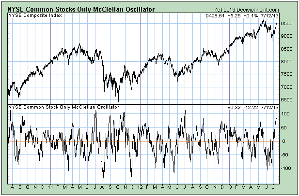
in a row. We also point out that the NYSE McClellan Oscillator (MO) hit a
12-month high of 92 last Thursday and is well into 'overbought' territory (see
chart below). Extreme highs in the NYSE MO are reliable signals that either a
multi-week period of sideways consolidation or a significant multi-week decline
is about to begin when -- as is the case right now -- they are accompanied by
other evidence that price is extended to the upside.
With regard to the next 2-3 months, the most likely outcome is that the US stock
market and many other stock markets around the world will essentially trade
sideways as they work on completing major topping patterns. However, our outlook
for any market is dictated by our opinion of risk versus reward, not our opinion
of the most likely price direction. With last week's price action having
increased the short-term risk of a significant (10%+) decline and reduced the
potential for additional short-term gains, our short-term stock market outlook
has shifted back to "bearish".
This week's
important US economic events
| Date |
Description |
| Monday Jul 15 |
Retail Sales
Empire State Mfg Survey
Business Inventories | | Tuesday
Jul 16 |
CPI
TIC Report
Industrial Production
Housing Market Index | | Wednesday
Jul 17 |
Housing Starts
Fed's Beige Book | | Thursday
Jul 18 |
Philadelphia Fed Survey
Leading Economic Indicators
|
| Friday Jul 19 |
No important events scheduled |
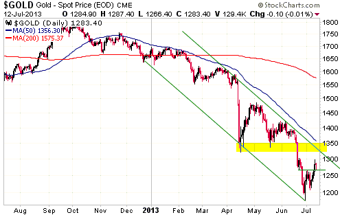
Gold and
the Dollar
Gold
In last week's Interim Update we wrote: "The gold price needs to close above
resistance in the $1320s to conclusively establish that a short-term bottom is
in place. However, a daily close above $1270 would be an early warning."
Gold gave an early warning of a short-term bottom last Thursday and held most of
Thursday's gains on Friday.
The following daily chart shows that there is now a confluence of resistance in
the $1320-$1350 range. This range currently contains lateral resistance defined
by the April and May lows as well as channel resistance, and will soon contain
the 50-day moving average (the 50-day MA is falling and will move below $1350
within the next week or so). Consequently, a solid break above $1350 -- meaning,
consecutive daily closes or a weekly close above $1350 -- would be significant.
If gold manages to break above $1350 at some point over the next few weeks it
won't alter our view that a sustained turn to the upside will probably wait
until October-November, but it will indicate that the October-November low is
more likely to be a test of the June low than a decisive new low.
Gold Stocks
The Big Picture
The following weekly chart compares the performance of the HUI from its
September-2011 peak (the blue line) with the performance of the Barrons Gold
Mining Index (BGMI) from its August-1974 peak (the green line). The 2-year
downturn in the gold mining sector that began in August of 1974 was the second
and the largest of the major (primary) corrections that occurred during the
long-term bull market that extended from the early-1960s through to 1980.
Although the short-term moves during the 2011-2013 decline have regularly
differed from the short-term moves of the 1974-1976 decline, when we step back
and take a wide-angle view the decline from the 2011 peak looks similar to the
decline from the 1974 peak.
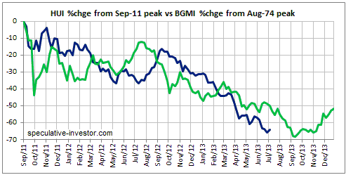
As advised in previous commentaries, once the HUI breached its May-2013 low it
became likely that a sustained turn to the upside would wait until
October-November. Therefore, given that it points to a sustained turn to the
upside between September and November of this year, the comparison charted above
does not prompt any adjustment to our expectations. What it does is provide some
additional evidence in support of the idea that the next multi-year rally will
begin before the end of this year.
The above chart would have been more useful if we had realised late last year
that something along the lines of the 1974-1976 major correction was in
progress. The reasons we didn't come to this realisation in a more timely manner
were:
1) With a major correction having happened in 2008, it would be strange for
another major correction to have begun as early as 2011. During the 1960s-1970s,
for example, there were gaps of around 6 years from the start of one major
correction to the start of the next major correction.
2) Monetary conditions appeared to be ill-suited to a major correction.
3) The price action during the first 12 months of the 2011-2013 correction was
sufficiently different from the price action during the first 12 months of the
1974-1976 correction to disguise the fact that the big picture was unfolding in
a similar way.
This assumption may or may not be valid, but one way to answer the question of
how/why there could be two major gold-sector corrections so close together is to
assume that the 2008 decline was not, in fact, a major gold-sector correction.
The reasoning behind this assumption is that while it was certainly large enough
to qualify as a major correction, it wasn't long enough (the entire
peak-to-trough decline lasted only 7.5 months). Also, in 2008 the gold sector
was taken down by a broad-based financial-world panic into cash rather than by
sector-specific factors.
If we assume that the 2008 decline was a very steep intermediate-term
correction, then a) the rapidity of the recovery from the 2008 bottom makes more
sense (it only took the HUI 12 months to recoup all the losses suffered in the
2008 debacle), and b) the 2011-2013 downturn is the FIRST major (primary)
correction of the long-term bull market that began in November of 2000.
Continuing along the same vein, if the 2011-2013 correction is really the
current bull market's first major correction then it probably makes more sense
to compare it to the correction of 1968-1970 than the correction of 1974-1976.
That's what we've done in the following weekly chart, and, lo and behold, it is
a neater fit.
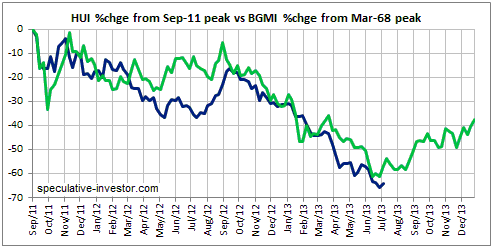
A literal interpretation of the above chart would lead to the conclusion that a
major bottom has just been put in place, but there won't be significant upside
until the second half of August. However, historical chart comparisons such as
this should never be interpreted so literally. It is just another piece of
evidence that we are at or close to the ultimate bottom and that the next few
years are likely to be very bullish for the gold mining survivors.
Current Market Situation
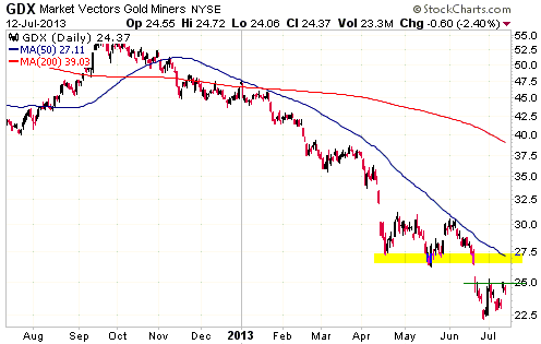
Gold broke above minor resistance in the $1260s last week and therefore gave the
first sign that a short-term bottom is in place, but the gold-stock indices and
ETFs weren't able to do the same.
For GDX (see chart below), a solid break above $25 will be the first sign that a
bottom is in place. More important resistance lies at $27.00-$27.50.
Currency Market Update
Current Market Situation
The Dollar Index pulled back sharply last Wednesday-Thursday after reaching a
new multi-year high earlier in the week. The pullback took the index from a high
of 85 to a low of 82.5.
In last week's Interim Update we said that a routine correction would take the
Dollar Index down to around 82.5, so the 2-day pullback has already done as much
as a routine correction should do. This could mean that what was expected to be
a multi-week period of corrective activity lasted only two days, but it more
likely means one of the following:
a) The correction is essentially complete in terms of price, but not in terms of
time. In this scenario there would be a few weeks of choppy sideways price
movement prior to the US$ resuming its intermediate-term advance.
b) The correction will be larger than we originally expected.
Longer-term possibilities
The performance of the Dollar Index over the past 11 years looks similar to its
performance during 1985-1995. First there was a large decline lasting several
years and then there was a several-year period during which the index oscillated
within a wide range.
Two charts of the Dollar Index are displayed below, with turning points during
the long periods of range trading labeled to highlight the similarities between
1988-1995 and the past several years. The first chart assumes that the recent
period of range trading commenced in 2005. In this interpretation the 2011 low
is equivalent to the 1995 low and the Dollar Index is set to trend upward over
the next couple of years. The second chart assumes that the recent period of
range trading commenced in 2008. In this interpretation the 2011 low is
equivalent to the 1992 low and the Dollar Index is set to trend downward for at
least a year from whatever high it makes over the next few months.

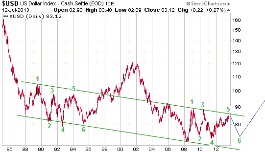
In both of the charts displayed above the assumption is made that a major bottom
is in place for the Dollar Index. The difference is that in the first chart we
assume that the base-building period is over whereas in the second chart we
assume that there will be one more decline to the vicinity of the 2008-2011 lows
(72-74) to complete the base. A weekly close above 87 would be evidence that the
base-building is over.
A popular refrain within the "hard money camp", of which we are card-carrying
members, is that the US dollar's bearish fundamentals make a substantial rally
in the Dollar Index extremely improbable. Our response to this is: hogwash! The
euro's fundamentals are much more bearish than those of the US$; the Yen's
fundamentals are currently more bullish than those of the US$, but will turn
more bearish if the BOJ is willing and able to fulfill Shinzo Abe's inflationary
promises; the fundamentals of the A$ and the C$ are more bearish than those of
the US$; and the British Pound's fundamentals are roughly in line with those of
the US$. In any case, how the major currencies perform relative to each other
over the coming 12 months will largely be determined by which central bank
inspires the most confidence.
The US central bank is run by a bunch of buffoons, but central bankers in other
countries are capable of making these buffoons look smart. Furthermore, whether
or not they are deserving of greater respect than their US counterparts,
political pressure and developments on the economic front could force the
euro-zone's central bankers to make a series of increasingly desperate and
stupid policy moves.
There's a high probability that increasingly desperate and stupid policy moves
will emanate from the ECB over the years ahead as every effort is made to
sustain the fatally-flawed monetary experiment known as the euro. That, in a
nutshell, is why the Dollar Index has probably completed a major basing pattern
or is one final decline to the low-70s away from doing so. The less likely
alternative is that Germany, Greece, France, Italy, Spain, Portugal, Finland and
the other members of the Monetary Union will stumble upon a one-size-fits-all
monetary policy that works economically and politically, enabling the euro to
move well above its 2008 high.
Update
on Stock Selections
Notes: 1) To review the complete list of current TSI stock selections, logon at
http://www.speculative-investor.com/new/market_logon.asp
and then click on "Stock Selections" in the menu. When at the Stock
Selections page, click on a stock's symbol to bring-up an archive of
our comments on the stock in question. 2) The Small Stock Watch List is
located at http://www.speculative-investor.com/new/smallstockwatch.html
 Company
news/developments for the week ended Friday 12th July 2013: Company
news/developments for the week ended Friday 12th July 2013:
[Note: FS = Feasibility Study, IRR = Internal Rate of Return, MD&A =
Management Discussion and Analysis, M&I = Measured and Indicated,
NAV = Net Asset Value, NPV(X%) = Net Present Value using a discount
rate of X%, P&P = Proven and Probable, PEA = Preliminary Economic
Assessment, PFS = Pre-Feasibility Study]
*Americas Bullion Royalty (AMB.TO) issued its MD&A and financial
statements for the 3-month period ending 31st May 2013.
Based on the financial statements and subsequent events, AMB
probably now has about $3M of working capital. This will only be
enough to fund the business for a few more months, meaning that AMB
will have to do another equity financing within the next few months
or find some other way of raising money. AMB will probably be able
to rely on its existing investors for financial support, but funding
the company by issuing more shares will substantially reduce the
company's per-share value while the share price remains at a very
depressed level. Selling assets and taking on debt are ways that the
company could raise money without diluting the stock.
There was no new information in the MD&A about the dispute between
AMB and its credit provider (Red Kite). This is the biggest
company-specific threat to AMB's prospects.
*Golden Star Resources (GSS) reported that it sold 85K ounces of
gold during the June quarter and 166K ounces of gold during the
first half of 2013. The company expects this year's total production
to be around 300K ounces, meaning that the production result during
the second half of the year is forecast to be about 20% less than
the first half's result. This is in line with information provided
by the company in earlier press releases.
GSS's main problem/risk is its high cost of gold production. The
company's plan to tackle the cost problem and conserve cash was
outlined last month.
*Pilot Gold (PLG.TO) announced in early April that a 30,000m
drilling program had commenced at its TV Tower project (Turkey). The
plan was for half the drilling to continue testing the KCD target,
which is where all of the past year's great results were achieved,
and for the remaining 15,000m to test two new targets called Kayali
and Columbaz.
PLG announced last week that it has commenced a 7,500m drilling
program at the Kayali target. This target is about 8km from the KCD
target and contains a near-surface oxide gold system. The company's
hypothesis, based on initial drilling in 2010, is that the system is
large enough, continuous enough and high enough in grade to enable
it to be developed into a profitable open-pit/heap-leach mine. The
assay results that will be published over the next few months will
go part of the way towards validating or invalidating this
hypothesis.
*Ramelius Resources (RMS.AX) reported total production of 19K
ounces of gold during the June quarter, including 17.1K ounces from
its Mt Magnet operation. The Mt Magnet production was about 0.9K
ounces less than we were anticipating, but the June-quarter result
was a substantial improvement over the 14.5K ounces produced during
the March quarter.
The cost of production is more important than the amount of
production. The cost of RMS's production during the recently
completed quarter won't be known by the market until the company
publishes its quarterly financial results later this month, but it's
likely that the Mt Magnet operation is still not cash-flow positive.
That's why last week's press release mentions that the company has
undertaken a review of capital and operational costs to ensure that
the project is cash-flow positive in the current gold price
environment.
In its efforts to become cash-flow positive RMS will be helped over
the next 6 months by the contributions to production that will be
made by the Western Queen South and Coogee projects beginning in
September-2013 and November-2013, respectively.
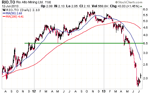
*Rio Alto Mining (RIO.TO) announced that it produced and sold
48.4K ounces of gold during the June quarter. This was 4.8K more
than the company's guidance. The production cost won't be known
until RIO publishes its quarterly financial results on 13th August,
but it's a good bet that the company was strongly cash-flow
positive.
2013 production guidance of 190K-210K ounces was reiterated. With
the first half's production coming in 6K ounces ahead of guidance,
the full-year result will probably be a lot closer to 210K than
190K.
RIO has the right attributes to be a long-term holding, but it was
recently inserted into the TSI Stocks List as a short-term position.
The thinking was that with the stock price at around C$2.00 or lower
the stock was well positioned to benefit from good production
results and a 1-3 month rebound in the gold sector from its
'oversold' extreme.
Our goal is to take profits in the C$3.00-C$3.50 range. New buying
would be appropriate at around C$2.00.
*Volta Resources (VTR.TO) announced that it is delaying the
completion of the FS for its 5M-ounce Kiaka gold project (Burkina
Faso) in order to change the mine plan. The FS was originally
scheduled to be completed during the current quarter and was based
on a mine plan that would yield a profitable operation with a gold
price of at least $1350/oz. With gold now trading in the $1200s the
company will be investigating a mine plan based on a smaller,
scalable operation that would be economically viable at a
significantly lower gold price. According to the company, this is
probably achievable because the Kiaka Project lends itself to being
selectively mined and processed. This is due to the presence of
clearly defined higher grade zones that exhibit excellent continuity
occurring within the broad zone of mineralization.
In our opinion, VTR's management has been acting like 'dumb money'
over the past year and continues to do so. Last year we criticised
the management for spending money on exploration programs as if new
financing would always be readily available. We thought that the
company should have been conserving its cash by only spending money
on tasks essential to the Kiaka FS. Now, with the gold price most
likely close to a major bottom, VTR's management is re-working its
plans to account for the possibility of a more bearish market. This
is a version of "buy high, sell low".
Despite the poor timing of its management, VTR remains an
interesting speculation. This is because the Kiaka project stands a
good chance of eventually being developed into a gold mine, and
because at VTR's current stock price the market is effectively
valuing the project at zero.
Ideas
for new buying
In alphabetical order, here are the best candidates for new buying at this time
from among the TSI stock selections:
- EDV.TO/EVR.AX near C$0.55/A$0.57
- EVN.AX near A$0.60
- LYD.TO near C$1.20
- PG.TO at around C$1.80
- PVG, if it pulls back to around US$6.50
- RIO.TO near C$2.00
- SBB.TO near C$1.00
If you don't want to go to the trouble of understanding the stories behind and
tracking the progress of individual companies, you should stick with ETFs such
as GDX (for exposure to senior gold miners) and GDXJ (for exposure to junior
gold miners). Resistance for GDXJ lies at $42-$45.
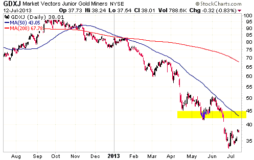
Chart Sources
Charts appearing in today's commentary
are courtesy of:
http://stockcharts.com/index.html
http://www.decisionpoint.com/

|
