|
-- Weekly Market Update for the Week Commencing 15th September 2008
Big Picture
View
Here is a summary of our big picture
view of the markets. Note that our short-term views may differ from our
big picture view.
Bonds commenced a secular BEAR market in
June of 2003. (Last
update: 22 August 2005)
The stock market, as represented by the S&P500 Index, commenced
a secular BEAR market during the first quarter of 2000, where "secular
bear market" is defined as a long-term downward trend in valuations
(P/E ratios, etc.) and gold-denominated prices. This secular trend will bottom sometime between 2014 and 2020. (Last update: 22 October 2007)
The Dollar commenced a secular BEAR market during the final quarter of 2000. The
first major downward leg in this bear market ended during the first
quarter of 2005, but a long-term bottom won't occur until 2008-2010. (Last update: 28 March 2005)
Gold commenced a
secular bull market relative to all fiat currencies, the CRB Index,
bonds and most stock market indices during 1999-2001. This secular trend will peak sometime between 2014 and 2020. (Last update: 22 October 2007)
Commodities, as
represented
by the CRB Index, commenced a secular BULL market in 2001. The first
major upward leg in this bull market ended during the second quarter of
2006, but a long-term
peak won't occur until at least 2008-2010. (Last update: 08 January 2007)
Copyright
Reminder
The commentaries that appear at TSI
may not be distributed, in full or in part, without our written permission.
In particular, please note that the posting of extracts from TSI commentaries
at other web sites or providing links to TSI commentaries at other web
sites (for example, at discussion boards) without our written permission
is prohibited.
We reserve the right to immediately
terminate the subscription of any TSI subscriber who distributes the TSI
commentaries without our written permission.
Outlook Summary
Market
|
Short-Term
(0-3 month)
|
Intermediate-Term
(3-12 month)
|
Long-Term
(1-5 Year)
|
Gold
|
Bullish
(30-Jun-08)
|
Bullish
(12-May-08)
|
Bullish
|
US$ (Dollar Index)
|
Neutral
(10-Sep-08)
| Bullish
(31-May-04)
|
Neutral
(19-Sep-07)
|
Bonds (US T-Bond)
|
Neutral
(14-Jul-08)
|
Neutral
(19-May-08)
|
Bearish
|
Stock Market (S&P500)
|
Neutral
(02-Jun-08)
|
Bearish
(12-May-08)
|
Bearish
|
Gold Stocks (HUI)
|
Bullish
(30-Jun-08)
|
Bullish
(12-May-08)
|
Bullish
|
| Oil | Neutral
(03-Sep-08)
| Bearish
(22-Oct-07)
| Bullish
|
Industrial Metals (GYX)
| Neutral
(18-Jun-08)
| Bearish
(09-Jul-07)
| Bullish
|
Notes:
1. In those cases where we have been able to identify the commentary in
which the most recent outlook change occurred we've put the date of the
commentary below the current outlook.
2. "Neutral", in the above table, means that we either don't have a
firm opinion or that we think risk and reward are roughly in balance with respect to the timeframe in question.
3. Long-term views are determined almost completely by fundamentals,
intermediate-term views by giving an approximately equal weighting to
fundmental and technical factors, and short-term views almost
completely by technicals.
Burst Bubble Comparison
The chart comparison
displayed below includes, from top to bottom, a chart of the NASDAQ100
Index (NDX) covering the period from 12 months prior to its March-2000
bubble peak to 31 months after its bubble peak, a chart of the Dow
Jones US Home Building Index (DJUSHB) covering the period from 12
months prior to its August-2005 bubble peak to 31 months after its
bubble peak, a chart of the Shanghai Stock Exchange Composite Index
(SSEC), and a chart of oil. The four charts have been positioned such
that their peaks are aligned, with projections being drawn on the SSEC
and oil charts to very roughly show the future trends of these markets
assuming that the 31-month periods beginning with the bursting of their
respective bubbles continue to follow the examples set by the NDX and
the DJUSHB.
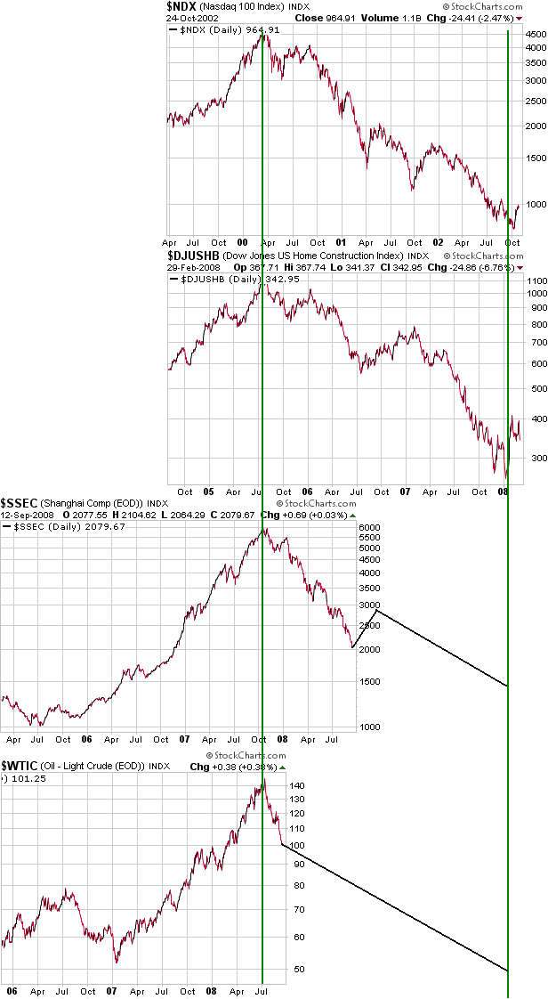
It could be argued
that the oil market never moved into 'bubble territory' because the
rise in the oil price was supported by supply/demand fundamentals, in
which case there is no reason to expect oil to go the way of the other
burst bubbles. However, all investment bubbles are supported by
supply/demand fundamentals. What differentiates a bubble from something
more sustainable is the role played by inflation (growth in the supply
of money) on the demand side of the equation, but it's often difficult
in real time to tell the difference between inflation-fueled demand
(demand that will evaporate sometime after the rate of monetary
inflation begins to slow) and a sustainable increase in demand. The
relevant question, then, is: how much of oil's price rise was due to
inflation? Before attempting to answer this question we will make some
general comments about inflation-fueled booms.
Most people, including almost all central bankers and politicians,
dwell under the misapprehension that inflation isn't a problem unless
the prices of everyday items are rising sharply. However, inflation is
actually far more destructive when it causes an investment bubble to
develop than when it boosts the cost of living, the reason being that
investment bubbles lead to the misallocation of resources on a grand
scale.
Resources get misallocated because it is often not possible to
distinguish between inflation-fueled price gains and price gains
resulting from sustainable changes in supply/demand fundamentals. For
example, the CEOs of the major US homebuilding companies are not
stupid. They know their industry well and during the first half of this
decade responded to what they perceived to be genuine/sustainable
increases in the demand for housing relative to the supply of housing,
and yet their companies ended up in dire straits because they created
way too much supply relative to real underlying demand.
Like all great booms, the real estate boom in the US was fueled by the
rampant creation of money "out of thin air". To most of the people
involved in the industry the price gains seemed to be supported by
sustainable supply/demand trends, but after the rate of monetary
expansion began to slow the actual basis for the boom became apparent.
Also like all great booms, the US real estate boom did substantial
damage to the overall economy because it sucked real savings/resources
away from other -- potentially more productive -- uses and thus
depleted what Frank Shostak refers to as the "pool of real savings".
The depletion of real savings, not the cost-of-living increases that
the average central banker tends to fret over, is the main problem
caused by inflation.
Shifting back to oil, a popular view is that oil's price rise was
underpinned by "Hubbert's Peak". It seems to us that Hubbert's theory
is valid, but it was just as valid in January of 2007 with oil at
$50/barrel as it was in July of 2008 with oil at $145/barrel. This
theory does not come remotely close to explaining the 200% rise in the
oil price over the 18-month period leading up to the July-2008 top.
In our opinion, bubble-like behaviour commenced in the oil market in
August of 2007 when the price was about $70/barrel. During the 11-month
period between mid-August of 2007 and mid-July of 2008 the underlying
demand appeared to be tapering off in response, firstly, to slowing
growth in the US and later to slowing growth in other major
oil-consuming economies. Over the same period OPEC increased the rate
at which it was supplying oil to the market, and yet the price kept
powering upward. The price action indicated that additional demand was
coming from somewhere, but this additional demand could not be
adequately explained by non-monetary factors.
As we stated a number of times in TSI commentaries during the course of
the incredible 11-month oil-price surge that culminated in July of this
year, the primary driver of the price action appeared to be US$
weakness against the euro, which was, in turn, driven by the
anticipation of massive additional money-supply growth courtesy of
"Helicopter Ben". Throughout this spectacular upward trend in the oil
price almost nothing seemed to matter except the currency market. As
long as the US$ kept to its downward path the oil market was prepared
to ignore significant bearish developments, including OPEC supply hikes
and plummeting US gasoline usage, and to latch onto the most trivial
bullish developments. But as soon as the US$ reversed upward the oil
game changed completely. We are now two months into a US$ recovery and
the oil market seems to need a barrage of good news just to prevent the
price from falling.
Further to the above, we think a good case can be made that the oil
market was in 'bubble territory' at its July top. In particular, at its
price top oil was very expensive relative to just about everything and
it is clear that monetary factors had been the primary propellants of
the rise to such an over-valued level. Having said that, the oil bubble
of 2007-2008 was nowhere near as big as the preceding real estate or
NASDAQ bubbles, so its unraveling could take less time and should
result in a much smaller peak-to-trough price decline (our guess is
that the ultimate price low will be in the $70s). In other words, we
view the projection drawn on the above oil chart as the worst case
rather than the most likely case.
Commodities
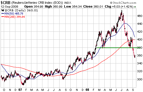
The CRB Index
The CRB Index's break below support at 380 (see chart below) confirms
that an intermediate-term downward trend is underway. However, there
are such huge differences between the situations of the individual
commodities that comprise the CRB Index that this index is of little
value from a practical investment perspective. For example, the CRB
Index exploded upward between August of 2007 and June of this year, but
this performance masked the fact that some important commodities have
been in bear markets since 2006.
We suspect that the CRB will rebound over the coming weeks in parallel
with a US$ pullback, but won't reach its ultimate correction low until
some time next year.
Below is a chart of the Baltic Dry Index (BDI), an index of freight rates on international shipping routes.
The BDI represents the cost of transporting large amounts of stuff
between countries via ocean-going vessels. Considering that it is not
subject to speculative buying or selling, its volatility has been quite
remarkable. If you owned a shipping company and were trying to figure
out whether to expand your capacity, how would you know what freight
rate to factor into your plans? After all, over just the past 15 months
the BDI has gone from 5500 up to 11000, and then back down to 5500, and
then up to 11700, and then down to 4800.
We suspect that the BDI's extreme volatility reflects the attempts of
governments -- most notably China's Government -- to control the
volumes of commodity imports and exports. For example, when China's
Government acts to restrict the exporting of coal, or Argentina's
Government slaps punitive taxes on agricultural exports, there is a
sudden change in the volume of 'stuff' being shipped.
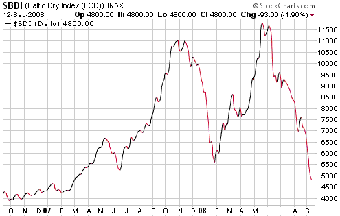
As well as being an indicator of global trade, the BDI is a currency
market indicator in that intermediate-term turning points in the BDI
often coincide with intermediate-term turning points in the Dollar
Index (BDI highs tend to occur at roughly the same time as US$ lows,
and BDI lows tend to occur at roughly the same time as US$ highs).
The Stock
Market
It would be farcical if it weren't so serious
As we write, US Treasury and Federal Reserve officials are apparently
working with large Wall Street firms to cobble together some sort of rescue package for Lehman Brothers.
If this latest operation to save the world follows the pattern of
earlier operations (Bear Stearns, Fannie and Freddie), bondholders will
be bailed out and equity holders will be left with almost nothing.
These bailouts are being sold to the public as necessary evils to avert
a total financial and economic collapse, but since when did socialising
bad investment decisions and preventing insolvent companies from going
bust ever do anything except weaken the economy? Furthermore, why would
the broad economy be damaged by the collapse of highly leveraged
financial firms that have no business being in business? Would
Microsoft stop selling software if Lehman collapsed? Would Intel stop
selling computer chips? Would Exxon Mobil stop selling oil? Would
people stop shopping at Walmart? Would farmers stop buying fertiliser
from Potash Corp. and tractors from John Deere?
The main point to understand is that the damage has already been done.
Creating even more inflation and leverage in an effort to paper over
the problems caused by previous inflation and leverage is only going to
push an even bigger problem into the future.
But creating more inflation in an effort to 'fix' the problems caused
by prior inflation is exactly what's happening and what will almost
certainly keep happening regardless of who wins the US Presidential
election. It's a totally nonsensical strategy, but one that almost
everyone, regardless of where they happen to reside along the political
spectrum, has bought into.
Current Market Situation
The Dow Industrials Index is sill a few hundred points above its 15th
July low, but, as evidenced by the top section of the following chart,
the NASDAQ100 Index (NDX) broke below its July low last week. This
caused the NDX/Dow ratio, depicted by the middle section of the
following chart, to hit its lowest level in more than three months.
Prior to the past 12 months we would have viewed the sort of weakness
in the NDX relative to the Dow that has occurred over the past few
weeks as an important bearish divergence, but since the beginning of
the credit crisis the relative strength of the Bank Index (BKX) has
been far more important than the relative strength of the NDX. And the
bottom section of the following chart shows that the BKX/Dow ratio
broke out to the UPSIDE during the first half of this month.
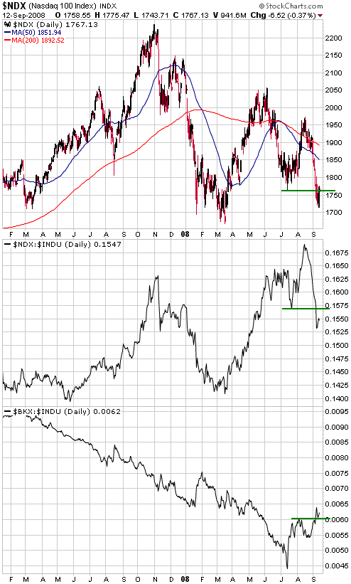
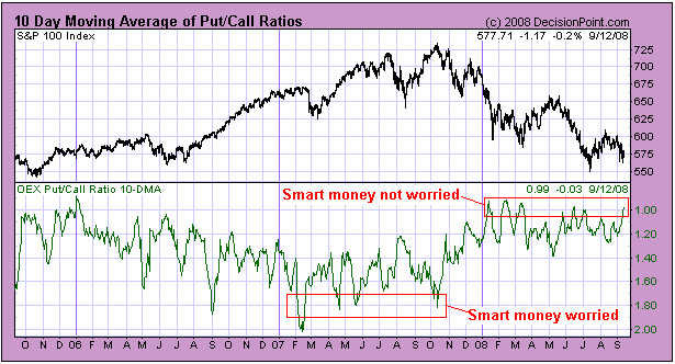
The BKX's recent
relative strength suggests that there is little chance of a major
decline over the coming weeks, as does the 10-day moving average of the
OEX (S&P100) put/call ratio charted below. Unlike the equity
put/call ratio, the OEX put/call ratio is not a contrary indicator.
Whereas the trading of equity options is dominated by the general
public, OEX options are most often used by professional money managers
for hedging purposes. Therefore, relatively low levels for the OEX
put/call ratio suggest a relatively low level of concern about downside
risk on the part of the smart money, whereas relatively high levels for
the OEX put/call ratio suggest the opposite.
The following chart shows that over the past 18 months OEX option
traders have generally been worried about downside risk when the
S&P100 Index has been above 675 and relatively unconcerned about
downside risk when the S&P100 Index has been below 600 (note that
the put/call chart's scale is inverted, meaning that the line on the
chart rises as the put/call ratio falls). As at the end of last week
the 10-day moving average of the OEX put/call ratio was near its lowest
levels of the year, indicating minimal worry on the part of the smart
money.
We continue to
anticipate a stock market rebound to an October or November high, but
we don't think the upside potential is particularly interesting.
Assuming it occurs as anticipated, the above-mentioned stock market
rebound will probably be accompanied by a pullback in the bond market.
This week's
important US economic events
| Date |
Description |
Monday Sep 15
| Capacity Utilisation
Industrial Production
| | Tuesday Sep 16 | FOMC Policy Statement (no change)
CPI
Net foreign purchases of US securities
| | Wednesday Sep 17
| Housing Starts
| | Thursday Sep 18
| Leading Economic Indicators
| | Friday Sep 19
| No important events scheduled
|
Gold and
the Dollar
Gold Stocks
Following last Thursday's US trading session we issued our third market
alert email within the space of four days. In this email we said:
"...we doubt that any
professional investor would be CHOOSING to sell [gold and silver
stocks] at current levels. Rather, the selling pressure that continues
to be evident is most likely stemming from the FORCED liquidation of
positions in response to margin calls or, more generally, a need to
raise cash at any cost. However, the market for gold shares finally
appears to have reached the point where the forced selling of some
investors is being offset by the new buying of bargain-hunters.
On Thursday the
gold-stock indices dropped back to Wednesday's intra-day lows and then
rebounded. They ended the day with losses, but the net result of the
past two days is small gains in the gold-stock indices combined with a
$35 fall in the spot gold price. This is a positive divergence. For its
part, gold is testing important support at $725-$735.
For those with the
financial capacity to do so this is a very good time to be buying gold
bullion and gold stocks, either as trades or for long-term investment
purposes. As noted in Thursday's Interim Update, traders taking
positions in gold-stock ETFs or highly liquid major/mid-tier gold
stocks (the only ones suitable for short-term trading) should place
protective stops just below this week's lows."
The trading strategy mentioned above remains applicable. In fact, risk
management is now more straightforward because Friday's rise in the
gold sector puts significant space between current prices and
Wednesday's lows, thus reducing the risk of being 'whipsawed' by normal
intra-day fluctuations. In other words, there is now a large-enough gap
between the lows reached earlier in the week and current prices that
protective stops placed just below the lows will not be hit in response
to normal intra-day volatility.
As discussed in last week's Interim Update, the bear market signal
generated by the HUI's break below support at 275-285 could have
occurred at the END of the bear market and almost certainly occurred
just prior to the start of a multi-month rebound. That is, a
multi-month rally has probably begun regardless of whether or not the
bear market is over. A reasonable expectation is that the first leg of
this rally will take the HUI up to near its 50-day moving average
(currently at 367 and falling).
Gold
Intermediate-term Outlook
As a result of the past two weeks' action, some of our
intermediate-term gold market indicators have turned negative. In
particular:
1. Gold made a marginal new 8-month low last week relative to the S&P500 Index
2. Gold dropped to its lowest level in more than 2 months relative to the Industrial Metals Index (GYX)
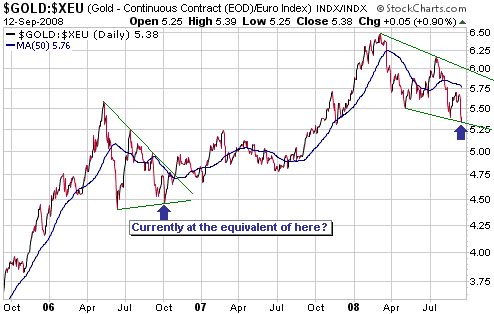
3. After looking like it was beginning to strengthen against the euro
prior to last week, the good work was quickly undone thanks to a drop
to a new multi-month low in the euro-denominated gold price. The
following chart depicts the current situation. Note, though, that it's
still possible -- and likely, in our opinion -- that gold/euro is
experiencing a routine correction similar to the one that occurred
during 2006.
4. Bank stocks have
extended their recovery relative to the broad stock market, showing
that confidence in the financial system is 'on the mend'.
However, like the HUI's plunge below support at 275-285 the
deterioration that has just occurred amongst our intermediate-term
bullion indicators could prove to be an overshoot resulting from the
forced unwinding of leveraged trades, and could mark the END of the
downturn. Moreover, last week's low or whatever new low is made this
week will likely be followed by a tradable rebound regardless of
whether or not the longer-term outlook has just turned bearish.
Our intention is to monitor the performances of all our
intermediate-term indicators during the coming rebound to ascertain if
the intermediate-term outlook has actually turned negative, or if, as
we currently suspect, the action of the past 1-2 weeks was an
overshoot. If we are correct to maintain our intermediate-term bullish
stance then this rebound should be accompanied by a 'steepening' of the
US yield curve and by significant strength in gold relative to the
broad stock market, industrial metals, oil, and the euro.
Current Market Situation
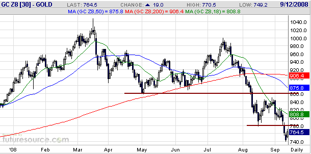
Unlike the gold-stock indices, gold bullion has not yet done enough to
confirm that a low is in place. Also, last week's price decline stopped
slightly short of a full test of intermediate-term support at $725-$735
(spot gold reversed upward from near the top of this range). Traders
should therefore allow for the possibility that gold bullion will spike
down to a new low this week before beginning to trend upward, but under
no circumstances should such a spike to a new low in the bullion market
be accompanied by a new low in the gold sector of the stock market.
Below is a daily chart of December gold. There is some resistance at
$780 and more important resistance at $860. Resistance at $860 is, we
think, a reasonable target as far as the coming 1-2 months are
concerned.
Currency Market Update
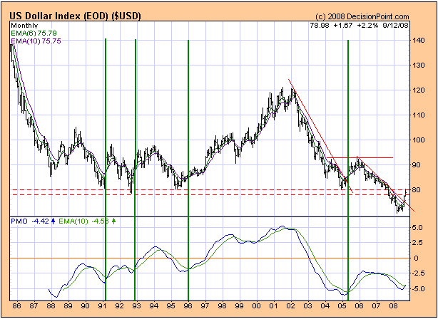
Below is a monthly Decisionpoint.com chart of the Dollar Index. The
bottom section of this chart shows the monthly Price Momentum
Oscillator (PMO).
The monthly PMO has just crossed from below to above its 10-month
moving average (the blue line on the chart has moved above the green
line). This isn't a buy signal; it's belated confirmation that an
intermediate-term trend reversal has occurred.
The previous monthly PMO crossovers that have occurred from oversold
levels are identified on the chart with vertical green lines. These
crossovers have generally happened near the halfway point of an
intermediate-term US$ rally, although the 1995-1996 crossover happened
during the early stage of a major US$ bull market.
If we make the reasonable assumption that a major US$ bull market has
not begun then the PMO's recent crossover suggests that the dollar is
immersed in an intermediate-term rally that's now about half complete.
This is consistent with our currency market outlook.
In last Thursday's
Interim Update we downgraded our short-term US$ view from "bullish" to
"neutral" because the risk of a multi-week counter-trend move (down in
the US$, up in the euro) had become high. Last Friday's market action
indicates that counter-trend moves have begun.
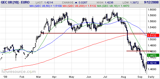
With reference to the following daily chart, the euro has resistance at
1.45-1.46 and then at 1.52. At a minimum we expect that the first of
these resistance levels will be tested over the coming weeks.
Update
on Stock Selections
(Note: To review the complete list of current TSI stock selections, logon at http://www.speculative-investor.com/new/market_logon.asp
and then click on "Stock Selections" in the menu. When at the Stock
Selections page, click on a stock's symbol to bring-up an archive of our comments on the stock in question)
 New Gold (AMEX: NGD, TSX: NGD) Shares: 235M issued, 313M fully diluted. Recent price: US$4.00 New Gold (AMEX: NGD, TSX: NGD) Shares: 235M issued, 313M fully diluted. Recent price: US$4.00
Due to its asset portfolio, growth potential, management team and
balance sheet, we think NGD deserves to be a core holding. Near the
current price it also has an attractive short-term risk/reward ratio
because its recent sell-off has been so severe that even a routine 50%
retracing of the decline -- a fairly typical counter-trend move --
would lead to a large percentage gain in the stock price (a 50%
retracing of the recent decline would take the stock price back to the
US$6.50-$7.00 area). In other words, regardless of whether or not NGD's
overall decline has bottomed (we suspect that it has), the potential
exists for the stock to make sizeable gains over the coming months.
Also of note is that Seymour Schulich, a savvy investor and the
co-founder of the former Franco Nevada, purchased 5M shares of NGD in
August at well above the current price, bringing his total investment
in the company to 25M shares. Pierre Lassonde, the other co-founder of
the former Franco Nevada and the chairman of the current Franco Nevada,
also has a substantial personal stake in NGD.
Energy Fuels Inc. (TSX: EFR). Shares: 52M issued, 63M fully diluted. Recent price: C$0.61
In Friday's email alert (Market Alert #186) we mentioned that uranium
junior EFR had announced very positive news on Thursday. There was no
market reaction to the news on Thursday, but the stock bounced on good
volume on Friday.
We commented on Friday that EFR "now has two fully-permitted uranium
mines in the US and is poised to move into production." Our
understanding is that EFR will begin producing ore at its Whirlwind
Mine within the next couple of months and will begin producing ore at
its Energy Queen mine next year. Most of the infrastructure to enable
this production to commence is already in place and we don't expect
that any additional financing will be needed to make it happen. Note,
though, that unless EFR can negotiate a toll milling arrangement with
another uranium miner it will not be able to generate any cash flow
from its mines over the next two years; rather, it will stockpile ore
in readiness for the company's own uranium mill (the Pinon Ridge mill),
which is currently scheduled to be complete in early 2011. We expect
that the construction of this mill will be debt-financed.
In other words, if EFR can negotiate a toll milling agreement then it
could begin generating cash flow from its Whirlwind mine in the near
future, but otherwise it should become a profitable uranium miner by
2011. As far as we know, this puts it way ahead of any other
exploration/development-stage uranium junior.
Chart Sources
Charts appearing in today's commentary
are courtesy of:
http://stockcharts.com/index.html
http://www.futuresource.com/
http://www.decisionpoint.com/

|