|
-- Weekly Market Update for the Week Commencing 16th March 2009
Big Picture
View
Here is a summary of our big picture
view of the markets. Note that our short-term views may differ from our
big picture view.
In nominal dollar terms, the BULL market in US Treasury Bonds
that began in the early 1980s will end by mid-2010. In real (gold)
terms, bonds commenced a secular BEAR market in 2001 that will continue
until 2014-2020. (Last
update: 09 February 2009)
The stock market, as represented by the S&P500 Index, commenced
a secular BEAR market during the first quarter of 2000, where "secular
bear market" is defined as a long-term downward trend in valuations
(P/E ratios, etc.) and gold-denominated prices. This secular trend will bottom sometime between 2014 and 2020. (Last update: 22 October 2007)
A secular BEAR market in the Dollar
began during the final quarter of 2000 and ended in July of 2008. This
secular bear market will be followed by a multi-year period of range
trading. (Last
update: 09 February 2009)
Gold commenced a
secular bull market relative to all fiat currencies, the CRB Index,
bonds and most stock market indices during 1999-2001. This secular trend will peak sometime between 2014 and 2020. (Last update: 22 October 2007)
Commodities,
as represented by the Continuous Commodity Index (CCI), commenced a
secular BULL market in 2001 in nominal dollar terms. The first major
upward leg in this bull market ended during the first half of 2008, but
a long-term peak won't occur until 2014-2020. In real (gold) terms,
commodities commenced a secular BEAR market in 2001 that will continue
until 2014-2020. (Last
update: 09 February 2009)
Copyright
Reminder
The commentaries that appear at TSI
may not be distributed, in full or in part, without our written permission.
In particular, please note that the posting of extracts from TSI commentaries
at other web sites or providing links to TSI commentaries at other web
sites (for example, at discussion boards) without our written permission
is prohibited.
We reserve the right to immediately
terminate the subscription of any TSI subscriber who distributes the TSI
commentaries without our written permission.
Outlook Summary
Market
|
Short-Term
(0-3 month)
|
Intermediate-Term
(3-12 month)
|
Long-Term
(1-5 Year)
|
Gold
|
Neutral
(17-Dec-08)
|
Bullish
(12-May-08)
|
Bullish
|
US$ (Dollar Index)
|
Bearish
(21-Jan-09)
| Neutral
(16-Feb-09)
|
Neutral
(19-Sep-07)
|
Bonds (US T-Bond)
|
Bearish
(21-Nov-08)
|
Bearish
(22-Sep-08)
|
Bearish
|
Stock Market (S&P500)
|
Bullish
(11-Mar-09)
|
Neutral
(02-Feb-09)
|
Bearish
|
Gold Stocks (HUI)
|
Bullish
(12-Jan-09)
|
Bullish
(12-May-08)
|
Bullish
|
| Oil | Bullish
(17-Nov-08)
| Neutral
(22-Sep-08)
| Bullish
|
Industrial Metals (GYX)
| Bullish
(26-Nov-08)
| Neutral
(22-Sep-08)
| Bullish
|
Notes:
1. In those cases where we have been able to identify the commentary in
which the most recent outlook change occurred we've put the date of the
commentary below the current outlook.
2. "Neutral", in the above table, means that we either don't have a
firm opinion or that we think risk and reward are roughly in balance with respect to the timeframe in question.
3. Long-term views are determined almost completely by fundamentals,
intermediate-term views by giving an approximately equal weighting to
fundmental and technical factors, and short-term views almost
completely by technicals.
Market Value, Money and Credit
One of the arguments
regularly made to support the claim that deflation is underway goes
like this: "While the supply of money is expanding rapidly, the amount
of additional money created is miniscule compared to the reduction in
the market value of assets." In our opinion, this is not a valid
argument.
The amount of new money created over the past year is certainly dwarfed
by the reductions in market values, but a rise in market value does not
constitute inflation and a fall in market value does not constitute
deflation. Rises and falls in market value can be effects of inflation
and deflation, but only in those cases when they are rising/falling in
response to changes in the total supply of money. In particular, if
asset prices are plunging and the money supply is rising at an
accelerating pace then we know that something other than deflation is
causing the price change.
Just to be clear, even though the money supply is inflating we accept
that the current situation looks and feels as if deflation were
occurring. A situation such as this, which is characterised by rapid
monetary inflation in parallel with the superficial appearance of
deflation and rising fear of deflation, is what we refer to as a
"deflation scare". Under the current monetary/political system
deflation scares happen periodically because the combination of falling
asset prices and economic weakness prompts the government and the
central bank to implement counter-measures, including the borrowing
into existence of a lot more money.
Are we just splitting hairs? After all, if it looks and feels like
deflation shouldn't we just say that deflation is occurring and have
done with it?
Well, if your investment timeframe is 12 months or less then any
difference between genuine deflation and a deflation scare will
probably be immaterial, but if your goal is to understand the
longer-term risk/reward balances for the various investment
alternatives then the difference isn't just academic. The reason is
that every large and sustained money-supply increase in history has led
to significantly higher prices somewhere in the economy. At least, we
aren't aware of any exceptions. Even during the Great Depression of the
1930s prices stopped falling and began to rise after the money supply
started to trend upward in 1933, despite the fact that there were no
meaningful increases in private sector debt and bank lending (the total
amount of private sector credit fell during the early 1930s and was
then essentially stagnant until 1945). As is the case today, banks
during the 1930s accumulated reserves but did not loan these additional
reserves into the economy. And as is also the case today, the
government from 1932 onwards borrowed so much new money into existence
that prices began to rise even though private sector credit was
stagnant.
Another way of stating the above is that a motivated government will
always be able to reduce the purchasing power of a paper currency
because the government's ability to create additional currency supply
is, for all intents and purposes, unlimited. And no one can accuse
today's US Government -- and most other governments, for that matter --
of not being "motivated". (Side bar: Japanese officialdom didn't
increase the broad supply of Yen to a meaningful extent during the
years following the bursting of Japan's credit bubble, which is why
Yen-denominated prices maintained their downward drift).
On a related matter, the main problem today isn't that asset prices
have plunged; it is that governments are attempting to counteract these
price plunges by, amongst other things, increasing the money supply.
Falling asset prices aren't a problem for the overall economy. The
problem is that asset prices were boosted to absurd levels in response
to the artificially low interest rates and rapid money-supply growth of
2001-2004, whereas the price decline of the past 1-2 years is a
necessary correction of the preceding over-valuation. Governments are
now trying to prevent the corrective process from running its course
and in doing so will certainly create an even bigger dilemma.
On another related matter, we feel the need to address some comments made by Mike "Mish" Shedlock in a discussion posted at his web site
a few weeks ago, because these comments do not accurately represent our
views. In the article of ours that Mish was commenting on we said "a
lot of confusion on the inflation/deflation issue is caused by the
lengthy and variable time delays between changes in the monetary trend
and changes in prices." Mish responded: "Another
way of phrasing Saville's theory is that growth in credit (and prices)
follows the creation of money, with a lag. This is the money multiplier
model." By drawing from an essay written by Steve Keen titled "The Roving Cavaliers of Credit"
Mish then goes on to explain that increases in "base money" (the fiat
currency created by the Fed) generally follow, rather than lead,
increases in credit money.
That's all well and good, except that we were NOT referring to the
"money multiplier model". Furthermore, when we talk about time delays
between changes in the monetary trend and changes in price we are not
talking about "base money". We showed a chart of the monetary base in
the article that Mish was commenting on, but only to make the point
that the Fed's response to last year's asset price crash was very
different from its response to the 1929 crash.
Our preferred measure of money supply is TMS (True Money Supply), a
monetary aggregate developed by Murray Rothbard and Joseph Salerno. TMS
includes currency in circulation, demand deposits and savings deposits.
It does not include money held in reserve at the Fed, or, for that
matter, time deposits and money-market funds.
According to the money multiplier model, "base money" is created by the
central bank and then multiplied, through fractional reserve lending,
by commercial banks. We are in agreement with Steve Keen that this is
not the way today's system usually operates. Rather, the private banks
usually create additional credit money (savings deposits, primarily)
and the central bank later responds by adjusting base money to maintain
a targeted short-term interest rate. This is why, when analysing the
monetary situation, we don't automatically assume that bank reserves
will be loaned into the economy. It is a virtual certainty that excess
reserves will eventually be loaned into the economy, but there is no
telling how long it will take for that to happen. We therefore don't
count bank reserves as part of the money supply.
The point we were trying to make, as opposed to the point that Mish
argued against, is that major financial-market and economic trend
changes can often be explained by the preceding major trend changes in
TMS. For example, the major upward trend in TMS that extended from the
mid 1990s through to around 2004 explains the tech/internet boom and
the housing market boom that followed it (TMS's 'correction' during
1999-2000 preceded the end of the first of these booms), while the
downward trend in TMS that extended from 2004 through to 2007 explains
the housing-market bust and its knock-on effects. Due to the lengthy
and variable time delays involved, as well as the impossibility of
knowing in advance exactly how changes in the monetary trend will
affect different markets and economic sectors, the relationship between
the monetary trend and prices is not the "Holy Grail" of the investment
world. However, it is certainly possible to understand what's going on
right now without kidding yourself that deflation is happening.
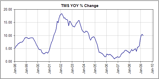
The following chart shows that TMS is currently about 10% higher than
it was at this time last year. In other words, there is about 10% more
money in the US economy today than there was 12 months ago (EXCLUDING
the huge build-up of reserves at the Fed). Interestingly, the latest
"Flow of Funds" report produced by the US Federal Reserve shows that
the total supply of credit within the US economy is also still
expanding, or at least was expanding as of Q4-2008 (refer to Doug
Noland's latest Credit Bubble Bulletin
for analysis of the Q4-2008 "Flow of Funds" report). In other words,
the total supplies of both money and credit are expanding.
The supply of money has grown rapidly over the past 12 months and the
supply of credit has continued its expansion despite what has happened
to the banking system and private borrowers, for the same reason as in
1933: increased borrowing by government and government-sponsored
agencies. In a horribly
misguided attempt to stimulate the economy the government is now
borrowing new money into existence at a fast enough pace to more than
offset the retrenchment in the private sector. The private sector
credit bubble has burst, but it is being replaced by a public sector
credit bubble.
It can, of course, be argued that the total supply of money and credit
is falling if the value of all outstanding credit is marked to market.
This is an argument that can be neither proved nor disproved because
the total market value of all outstanding credit is unknown. Moreover,
we don't see a good reason to invent new and imaginative ways of
defining inflation/deflation when the classic definition (a rise/fall
in the total supply of money) continues to serve its purpose. As an
aside, the reason that some analysts wrongly thought that an inflation
problem was imminent during the first half of last year is that they
were, in most cases, using M3 as their preferred measure of money
supply. M3 has a history of giving 'major league' false signals at
important monetary turning points.
The bottom line is that unless this time proves to be different from
every other time throughout history when the money supply rose rapidly
over an extended period, an inflation problem is in the works. Due to
the typical delays between changes in money supply and changes in
prices we doubt that the inflation problem will bubble to the surface
this year, but it will probably begin to make its presence felt during
2010.
Liquefied Natural Gas (LNG)
We
recently saw an article in which the writer argued that the supply of
natural gas in the US would increase substantially due to LNG imports
from the Middle East. By our logic this would only be the case if the
NG price were at least as high in the US market as in other markets
capable of importing LNG, because there would be no good reason to ship
LNG to the US and sell it at, say, US$3.50/MMBtu if it could be shipped
to Europe or Japan and sold for US$6.00/MMBtu. Early last year, for
instance, there was an expectation that a large quantity of LNG would
hit the US market over the coming 12 months, but it never did because
it was far more profitable to ship the LNG elsewhere.
Unfortunately, we haven't yet been able to locate a good internet
source for global LNG pricing. Any help in this matter would be
appreciated.
It also occurs to us that making NG more of a global market, which is
what an increase in LNG trading would accomplish, would likely have the
effect of keeping the NG price closer to its energy-equivalent oil
price. It takes roughly 6 mcf (thousand cubic feet) of gas to provide
the energy equivalent of one barrel of oil, so an oil price of
$46/barrel (the current price) would equate to a natural gas price of
$7.60 per mcf (90% above the current price).
Lastly, given the general concern of US policymakers that their country
is over-reliant on the Middle East for its oil needs we wonder about
the political feasibility of making the US more reliant on that region
for its natural gas needs.
Bond Market Update
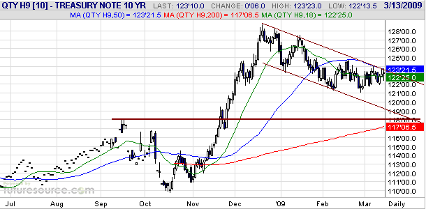
It is possible that a
major top was put in place for the US Treasury Bond market last
December, but 'shorting' this market holds no appeal to us. The two
mains reason are the Fed's promise to buy long-dated Treasuries if/as
needed to keep long-term interest rates low and the likelihood that the
deflation scare has not yet run its course. Also of significance is
that the decline in the 10-year T-Note from its December-2008 peak
looks more like a consolidation than a major trend reversal. Refer to
the following daily chart of the March T-Note futures contract for
details.
If the March T-Note closes above 124 or the June T-Note closes above
123 at some point within the coming fortnight then our short-term bond
market outlook will immediately shift from "bearish" to "neutral". This
is because such a development would suggest that T-Note futures were,
at a minimum, going to test their December peak.
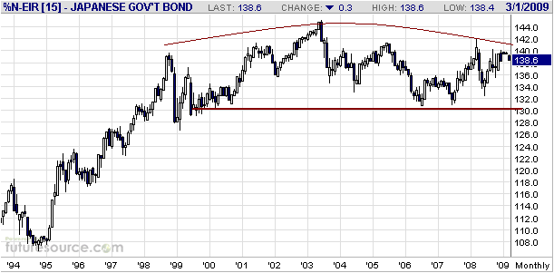
The JGB market also looks like a better 'short' from a technical
perspective. As evidenced by the following monthly chart, the JGB
market appears to be completing a massive rounded top that has been 10
years in the making.
As far as we know, the only way to bet against the JGB market is to short JGB futures.
The Stock
Market
Even though the S&P500
Index dropped well below its November-2008 nadir over the past few
weeks, fear indicators such as the equity put/call ratio and the
Volatility Index (VIX) did not come close to the heights reached during
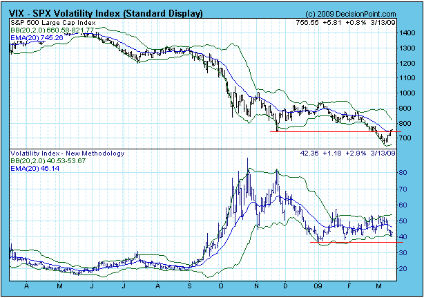
October-November of last year. For example, the following decisionpoint.com
chart shows that the S&P500's decline over the past two months has
been accompanied by the VIX moving sideways at well below its 2008
peak. By historical standards the VIX's current level is still very
high, but it appears to be on its way to lower levels.
We don't think the
reduced level of fear/panic in the stock market in response to this
year's breakdown is a bearish divergence. Rather, it is just a
reflection of the fact that no market can remain in a state of panic
for long. Many long-term holders of stocks are yet to capitulate, but
even if the bear market continues for several more years we may never
again see as much fear as we saw late last year.
What we probably will see in the future, and what we've witnessed over
the past few weeks, is more despondency. Over the past few weeks the
increasing despondency has been reflected in sentiment surveys.
Last week's stock market action was bullish, especially the performance
of the NASDAQ100 Index (NDX). The NDX not only held comfortably above
its November-2008 low, it managed an outside reversal to the upside and
ended the week above resistance at 1150. Refer to the following weekly
chart for details.

The US stock market's
reversal following last Monday's weakness was impressive and included
two 90% up-days (days when up-volume was at least 90% of total volume).
This signals that the long-awaited multi-month rebound has most likely
begun, although it would not be surprising if last week's surge to the
upside was followed by a week of consolidation.
This week's
important US economic events
| Date |
Description |
Monday Mar 16
| Treasury International Capital (TIC) report
Industrial Production
Housing Market Index
| Tuesday Mar 17
| Housing Starts
Producer Price Index
| | Wednesday Mar 18
| FOMC Policy Statement
Consumer Price Index
Q4-2008 Current Account
| | Thursday Mar 19
| Leading Economic Indicators
| | Friday Mar 20
| Expiry of equity options
|
Gold and
the Dollar
Gold
The fundamental underpinnings of the gold bull market continue to
become more solid by the week, with the latest addition to the long
list of gold-bullish factors being last week's decision by the Swiss
National Bank (SNB) to pursue an aggressively easy monetary policy with
the specific goal of weakening its currency. However, we continue to
expect that gold will consolidate below $1000 for as long as it takes
to work off the excitement generated by the quick-fire $200 price
increase that occurred earlier this year.
The correction that began in late February hasn't, as yet, put much of
a dent in bullish gold sentiment. For example, the total speculative
net-long position in COMEX gold futures has only dropped by 23K
contracts from its February high, the Canadian-based bullion funds CEF
and GTU are still trading at very high premiums to their net asset
values, and Market Vane's bullish percentage is only about 10% below
its recent peak. As noted in last week's Interim Update, bullish
sentiment has probably remained at an elevated level despite the price
decline of the past few weeks because the gold price held at short-term
trend-line support.
The sentiment situation certainly doesn't guarantee that gold won't
soon break above its February peak and rocket to much higher prices. It
just means that additional corrective activity is the most likely
near-term outcome.
Gold Stocks
If the HUI is going to follow its tradition of reaching a short-term
top or bottom during the first half of March then its correction ended
last Monday at just below 260.
Our guess is that the correction did end last week, but at this stage
there isn't any technical evidence to support this guess. As was the
case during the previous week, last week's HUI rebound culminated at
the 50-day moving average. To signal an end to the correction the HUI
will have to close above both its 50-day moving average and its 6th
March intra-day high. A daily close above 295 would accomplish this.
Could the HUI rise to a new multi-month high if the bullion market remains in correction mode?
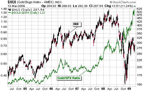
We think the answer is yes, largely because last year's huge divergence
between gold and gold stocks is not yet close to being eliminated. The
following chart comparison of the HUI and the gold/SPX ratio (gold
relative to the broad US stock market) illustrates what we mean. The
chart shows that the HUI and gold/SPX have trended together for many
years, with the notable exception of August-October of last year when
gold/SPX moved sharply higher while the HUI crashed. It also shows that
despite the HUI's strong rebound from its October-2008 low it still has
a lot of catching up to do.
Currency Market Update
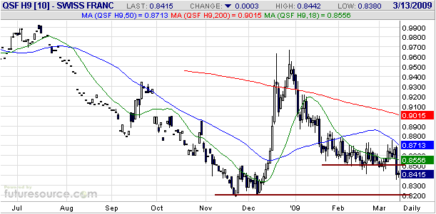
The Swiss Franc (SF) has just pulled ahead in the currency race to the
bottom, thanks to direct intervention in the currency market by the SNB
and promises to substantially inflate the SF supply. The effect of the
intervention and the promise of more rapid monetary inflation is
clearly evident on the following daily chart of the March SF futures
contract. The Swiss not only managed to push their currency well below
an important support level against the US$ last Thursday, they did so
while the euro was strengthening enough to signal the start of a
short-term rally against the US$. Quite an achievement!
Perhaps the most
ridiculous thing about all the money-pumping going on around the world
is that these actions are being justified on the basis that there is no
other choice; that failing to take such steps will increase the risk of
further economic deterioration. But where is the logical argument that
explains how creating new money out of nothing (a.k.a. counterfeiting)
helps support the economy? If it really does help then let's take some
of the load off the over-worked public servants at the central bank by
giving money-printing machines to everyone.
As one central banker after another confirms their commitment to
something they call "quantitative easing" and we call "inflating as if
there were no tomorrow", it is becoming increasingly difficult to be
bearish on the US$. At this time we are only short-term bearish on the
US$ in anticipation of a euro rebound to the mid-1.30s.
Update
on Stock Selections
(Note: To review the complete list of current TSI stock selections, logon at http://www.speculative-investor.com/new/market_logon.asp
and then click on "Stock Selections" in the menu. When at the Stock
Selections page, click on a stock's symbol to bring-up an archive of our comments on the stock in question)
 Capital Gold Corporation (OTC: CGLD, TSX: CGC). Shares: 193M issued, 198M fully diluted. Recent price: US$0.66 Capital Gold Corporation (OTC: CGLD, TSX: CGC). Shares: 193M issued, 198M fully diluted. Recent price: US$0.66
CGLD's management has agreed to an all-stock takeover offer from Gammon
Gold (AMEX: GRS). The offer is 0.1028 GRS shares for every CGLD share.
The proposed GRS-CGLD merger is similar to the NGD-WGW merger announced
a week earlier in that it looks like a better deal for the company
doing the buying (GRS) than for the company being bought (CGLD). From
our perspective, GRS will be getting a steady stream of cash flow at a
significant discount to fair value.
We will now look for an opportunity to exit CGLD, but we aren't going
to exit immediately because at Friday's closing prices CGLD was trading
at a 10% discount to the value of GRS's offer (at Friday's closing
price of US$7.14 for GRS the implied value of the GRS offer for CGLD
was US$0.73/share). We will, instead, exit CGLD if it trades at
US$0.75, which is roughly the value of the GRS offer at the time the
deal was announced.
While we aren't enthused about the GRS offer for CGLD, we welcome the
opportunity to reduce our exposure to Mexico (CGLD's gold mine is
located in Mexico). We aren't concerned about the increasing
drug-related violence in Mexico as we don't think this presents a
significant risk to the mining industry, but we are concerned that
increasing weakness in the Mexican economy over the next two years will
lead to political upheaval. We have no desire to eliminate our exposure
to Mexico, but that country's political risk appears greater today than
it was 12 months ago.
Takeover Candidates
Two TSI gold/silver stocks have been recipients of takeover bids in the
past two weeks. Of the remainder, the ones that we think are the most
likely takeover candidates are Minefinders (AMEX: MFN), Andina Minerals
(TSXV: ADM), and Keegan Resources (AMEX and TSX: KGN).
MFN looks like the prime candidate for a takeover bid because its mine
is essentially complete and has just become cash flow positive, but we
hope that a bid is NOT forthcoming in the near future as a standard
20-30% takeover premium over the current price would not be
particularly enticing. Ideally, MFN will double from its current price
before the buyout offer comes.
With regard to ADM-V and KGN, if all goes according to plan then these
stocks could easily triple in price over the coming 18 months, so a
20-30% takeover premium at this time would be very unattractive indeed.
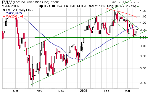
Fortuna Silver (TSXV: FVI). Shares: 92M issued, 110M fully diluted. Recent price: C$0.90
We continue to think that FVI represents an attractive opportunity. It
has an operating mine (the Caylloma project in Peru), it is financially
strong (no debt and about $40M of cash in the bank), it has an
undeveloped gold/silver project with huge upside potential (the San
Jose project in Mexico), and it is very under-valued. The next
important company-specific event of note is expected to be an updated
resource estimate for the San Jose project in June.
The following chart shows that the stock recently re-tested support at
C$0.80. We think it is a good buy at C$0.85-C$0.90, but those who are
prepared to trade some upside potential for greater assurance that the
correction has ended should consider buying following a daily close
above C$1.00.
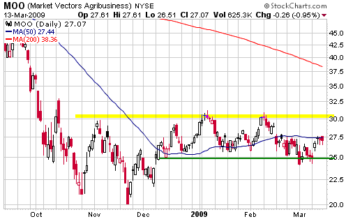
Potential trade: MOO
The Agribusiness ETF (NYSE: MOO) was unmercifully hammered along with
almost every other commodity-related investment during the second half
of last year, but since November it has demonstrated significant
relative strength. In particular, whereas the January-March stock
market decline resulted in most sectors either dropping back to their
November lows or breaking out to new multi-year lows, MOO only gave
back about half of its November-January gain.
MOO looks like a reasonable long-side trade at its current price and
would look very interesting if it were to pull back to around $26 over
the coming week. We will therefore add a trading position in MOO to the
TSI Stocks list if it becomes available at US$26.20 this week. If this
trade is initiated the initial stop would be a daily close below $24.10.
Chart Sources
Charts appearing in today's commentary
are courtesy of:
http://stockcharts.com/index.html
http://www.futuresource.com/
http://www.decisionpoint.com/

|