|
-- Weekly Market Update for the Week Commencing 18th June 2007
Big Picture
View
Here is a summary of our big picture
view of the markets. Note that our short-term views may differ from our
big picture view.
Bonds commenced a secular BEAR market in
June of 2003. (Last
update: 22 August 2005)
The stock market, as represented by the S&P500 Index, commenced a secular BEAR market during the first quarter of 2000. The rally
that
began in October of 2002 will end during the first half of 2007. The ultimate bottom of
the secular bear market won't occur until the next decade. (Last update: 02 October 2006)
The Dollar commenced a secular BEAR market during the final quarter of 2000. The
first major downward leg in this bear market ended during the first
quarter of 2005, but a long-term bottom won't occur until 2008-2010. (Last update: 28 March 2005)
Gold commenced a
secular bull market relative to all fiat currencies, the CRB Index,
bonds and most stock market indices during 1999-2001. The first major
upward leg in this secular bull market ended in December of 2003, but a
long-term peak won't occur until at least 2008-2010. (Last update: 13
February 2006)
Commodities, as
represented
by the CRB Index, commenced a secular BULL market in 2001. The first
major upward leg in this bull market ended during the second quarter of
2006, but a long-term
peak won't occur until at least 2008-2010. (Last update: 08 January 2007)
Copyright
Reminder
The commentaries that appear at TSI
may not be distributed, in full or in part, without our written permission.
In particular, please note that the posting of extracts from TSI commentaries
at other web sites or providing links to TSI commentaries at other web
sites (for example, at discussion boards) without our written permission
is prohibited.
We reserve the right to immediately
terminate the subscription of any TSI subscriber who distributes the TSI
commentaries without our written permission.
Outlook Summary
Market
|
Short-Term
(0-3 month)
|
Intermediate-Term
(3-12 month)
|
Long-Term
(1-5 Year)
|
Gold
|
Neutral
(16-May-07)
|
Bearish
(21-May-07)
|
Bullish
|
US$ (Dollar Index)
|
Bullish
(11-Jun-07)
| Bullish
(31-May-04)
|
Bearish
|
Bonds (US T-Bond)
|
Neutral
(26-Mar-07)
|
Bearish
(26-Mar-07)
|
Bearish
|
Stock Market (S&P500)
|
Neutral
(13-Jun-07)
|
Neutral
(26-Mar-07)
|
Bearish
|
Gold Stocks (HUI)
|
Neutral
(16-May-07)
|
Bearish
(21-May-07)
|
Bullish
|
| Oil | Neutral
(12-Mar-07)
| Neutral
(25-Sep-06)
| Bullish
|
Industrial Metals (GYX)
| Bearish
(11-Jun-07)
| Neutral
(26-Mar-07)
| Bullish
|
Notes:
1. In those cases where we have been able to identify the commentary in
which the most recent outlook change occurred we've put the date of the
commentary below the current outlook.
2. "Neutral", in the above table, means that we either don't have a
firm opinion on which way the market will move or that we expect the
market to be trendless during the timeframe in question.
3. Long-term views are determined almost completely by fundamentals,
intermediate-term views by giving an approximately equal weighting to
fundmental and technical factors, and short-term views almost
completely by technicals.
Cutting Through the Bull
...whichever
way we look at it we see that US equities are presently about 7 years
into a secular bear market. ...Capitalism lays the foundation for
strong REAL growth whereas rapid across-the-board gains in asset prices
are generally the result of inflation.
Equities are claims on real assets and the cash flows that these assets
generate. As a result, the nominal prices of equities can be, and often
are, boosted when excessive growth in the supply of money (inflation)
causes the currency to lose purchasing power. To avoid being hoodwinked
by the effects of inflation we therefore need to find ways to monitor
the stock market's REAL trend (the trend after the effects of inflation
are properly accounted for). After all, if the nominal price of an
investment rises by 10% during a period when the value of the currency
in which the investment is priced falls by 20%, then despite the
nominal price gain the owner of this investment will suffer a reduction
in real wealth.
As we've explained many times over the years, one of the best ways to
see what's really happening to the stock market is to look at long-term
valuation trends. In particular, we can effectively remove the
distorting effects of inflation from our interpretation of the stock
market's long-term trend by defining a secular bull market as a
generational (15-25 year) trend toward higher valuations and defining a
secular bear market as a generational trend toward lower valuations.
One reason is that lower valuations (lower multiples of earnings,
sales, book value and dividends) are invariably assigned to stocks
during periods when a large chunk of corporate profit growth is
perceived by the investment community to be the result of inflation.
With the above definitions of the secular trend in hand, a look at what
has happened to the US stock market's average valuation over the past
80 years will reveal that: a secular bear market commenced in 1929; a
secular bull market commenced in the mid-1940s; a secular bear market
commenced in the mid-1960s; a secular bull market commenced in the
early-1980s; and a secular bear market commenced during 1999-2001.
Interestingly, but not surprisingly for anyone who understands the
nature of gold, when the US stock market's performance is measured in
gold terms its long-term trends roughly line-up with the aforementioned
long-term valuation trends. Therefore, secular trends in the US stock
market can also be seen by looking at long-term charts of the Dow/gold
ratio.
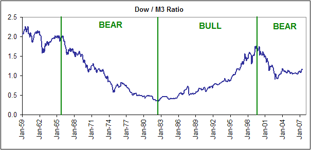
Now, in previous commentaries we've used charts to illustrate the links
between long-term valuation trends, trends in the Dow/gold ratio, and
secular bull/bear markets. Such charts are, in essence, ways of viewing
the stock market's real (inflation-adjusted) performance over the
long-term*. It recently occurred to us, however, that an important
long-term chart that we have never looked at in the TSI commentaries is
the Dow Industrials Index adjusted for changes in the total supply of
money. In other words, it occurred to us that we've shown surrogates
for the inflation-adjusted Dow on many occasions but have never shown
the actual inflation-adjusted Dow. We are about to remedy this omission.
Below is a chart of the Dow/M3 ratio (the Dow Industrials Index divided
by the total US money supply). Unfortunately, we don't have M3 data
prior to 1959, but the data we do have is enough to tell us that
long-term trends in the inflation-adjusted Dow mesh quite well with the
valuation and Dow/gold trends discussed above.
The bottom line is that whichever way we look at it we see that US
equities are presently about 7 years into a secular bear market.
Before leaving the
subject of how money-supply growth can create the appearance of a bull
market where no bull market exists it is appropriate to address a
related issue: the general misconception about the relationship between
capitalism and rising asset prices.
It has been mentioned in several quarters that the global rise in
equity prices indicates the spread of capitalism. The implication,
here, is that capitalism leads to higher asset prices. Well, we've come
across a lot of analytical hogwash in our time but this comes close to
'taking the cake'.
Capitalism has many characteristics, but at the end of the day it is
really just an economic system based on the total and consistent
application of property rights. The main driver of the upward trend in
nominal prices, on the other hand, is government-sponsored inflation;
and government-sponsored inflation is a gross VIOLATION of property
rights (inflation is a form of theft because it reduces peoples' real
monetary savings just as effectively as if a portion of these savings
were being physically stolen). Furthermore, when we look at what has
happened to the stock markets of various countries around the world we
can actually observe an INVERSE correlation between stock market gains
and the extent to which property rights are upheld. Zimbabwe is the
most blatant example of this inverse correlation, but China and Russia
-- two countries that have provided equity market investors with
phenomenal gains over the past few years -- are also good examples. On
a superficial level it may appear as if capitalism is thriving in China
and Russia, but a property right that's likely to vanish the moment you
utter a word against the government is not a genuine right at all.
Capitalism lays the foundation for strong REAL growth whereas rapid
across-the-board gains in asset prices are generally the result of
inflation. Don't confuse one with the other.
*Note that when
creating an inflation-adjusted picture it makes absolutely no sense to
use the price indices reported by the government because these price
indices are meaningless.
The Stock
Market
Did a real cyclical bull market start last year?
It is our view that US equities are immersed in a secular bear market
as defined by long-term downward trends in stock market valuations and
the Dow/gold (or S&P500/gold) ratio. However, within the context of
this secular bear market there has been a cyclical bull market since
March of 2003. Up until May of last year this cyclical bull market was
primarily driven by the US dollar's fall in value, meaning that it was
being fueled primarily by inflation rather than real progress. As a
consequence, the upward trend in the S&P500's nominal price was
accompanied by a downward trend in the S&P500/gold ratio. We must
seriously consider the possibility that a REAL cyclical bull market
commenced in May of 2006, though, because the S&P500/gold ratio
reversed upward at that time and may be about to make a higher high on
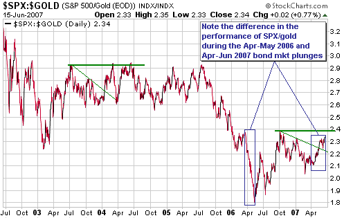
an intermediate-term basis.
With reference to the following chart, notice that the S&P500/gold
ratio rallied strongly from May-2006 into October-2006. It then
appeared to resume its long-term decline -- at least, that's what we
thought it was doing -- but an upward move over the past three months
has taken it back to near its October-2006 peak. Clearly, it wouldn't
take much additional strength from here in the S&P500 Index
relative to gold to push the ratio to a new 18-month high.
If S&P500/gold makes a sustained break above its October-2006 peak
it would simply mean that the US stock market, when measured in terms
of gold, was experiencing its first major rebound of the past six
years. Note, though, that it is far from being a foregone conclusion
that such a feat (a sustained upside breakout) will actually be
accomplished. It occurs to us, for instance, that S&P500/gold's
performance between May-2006 and the present day looks similar to its
performance between March-2003 and February-2004 (S&P500/gold edged
above its July-2003 peak in February of 2004 and again in June of 2004,
but in each case there was no follow-through).
In addition to showing how close the US stock market is to an upside
breakout in terms of hard money, we will also use the S&P500/gold
chart included herewith to back-up a comment we made when discussing
the bond market in last week's commentary.
Last week we said that the recent sharp rise in bond yields had NOT
been driven by rising inflation expectations and cited the performance
of the "Expected CPI" (the difference between the yield on a 10-year
T-Note and the yield on an inflation-protected 10-year T-Note) in
support of this statement. We are well aware, of course, that there
will always be a significant risk of the Expected CPI giving a false
indication because many market participants share our belief that the
US Government's price indices are bogus. We would therefore not want to
base any conclusion solely on the performance of the Expected CPI.
Fortunately, in this case we can also use the S&P500/gold ratio to
support our view that the recent carnage in the bond market was driven
by something other than a substantial rise in inflation fears.
Referring to the following chart, notice the stark difference between
S&P500/gold's performance during March-June of this year and its
performance during March-May of last year. During both of these periods
the T-Bond yield rose quickly from 4.6% to 5.3%, but whereas the 2006
yield-surge was accompanied by substantial strength in gold relative to
the S&P500 (a sharp decline in the S&P500/gold ratio) the 2007
yield-surge was accompanied by weakness in gold relative to the
S&P500.
A sharp rise in bond yields driven primarily by a rise in inflation
expectations should occur alongside strength in gold relative to the
broad stock market, as was the case during March-May of last year and
as was not the case during March-June of this year. That is, the
performance of the S&P500/gold ratio confirms the message of the
Expected CPI.
Current Market Situation
The stock market section of the "Outlook Summary" table included near
the top of every Weekly Market Update is based on how we view the
S&P500's risk/reward over various timeframes, but right now our
"neutral" view on the S&P500 does not apply to equities in general
because we are bullish on some sectors/markets and bearish on others.
We are, for example, bearish on interest-rate sensitive stocks because
although bonds probably made a short-term bottom last week we suspect
that the bond market will manage nothing more than an 'oversold bounce'
before resuming its decline. We therefore perceive more downside risk
than upside potential in interest-rate sensitive stocks over the short
and intermediate terms. At the same time, we are bullish on some
sectors of the US stock market and some non-US stock markets.
Of the interest rate sensitive sectors of the US market the banking
sector appears to be in the worst shape, because in addition to being
adversely affected by the upward trend in interest rates the banks are
exposed to the downturn in the residential property market.
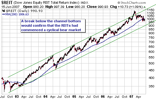
Another group of interest rate sensitive stocks that looks risky at
this time is the Real Estate Investment Trust (REIT) group. The
following chart of the Dow Jones Equity REIT Index shows that REITs
have been incredibly good performers for several years, but note that
after breaking above the top of a well-defined channel early this year
the REIT Index reversed lower and has recently moved below its 200-day
moving average for only the second time in the past 4 years. The other
move below this moving average occurred in the second quarter of 2004
and didn't end until after the channel bottom had been reached.
A test of the channel bottom over the next couple of months would
entail a decline of around 10% from the current level, but the real
risk is that after trending upward with such consistency for so long
the REITs may now be in for a larger-degree correction (a correction
that doesn't stop at the channel bottom).
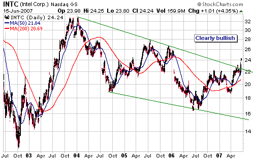
On the bullish side
of the ledger we have the semiconductor sector. In last week's Interim
Update we mentioned that the 'semis' were looking good for a trade and
featured charts of the Semiconductor Holders ETF (AMEX: SMH). Thanks to
the marginal upside breakout by SMH and the definitive upside breakout
by Intel (NASDAQ: INTC) during the final two days of last week, they
are now looking even better. The following INTC chart, for example,
suggests to us that the world's largest chipmaker has just completed a
3-year consolidation.
Also of note is that
while some of the world's stock markets look very extended to the
upside and vulnerable to sharp declines, others have been consolidating
for some time and appear to have reasonable risk/reward ratios. As far
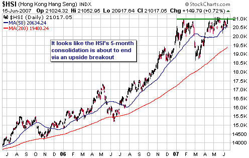
as this latter category is concerned the stock markets of Hong Kong and
Japan -- represented on the following charts by the Hang Seng Index
(HSI) and iShares Japan (NYSE: EWJ) -- spring to mind.
It is still possible that the HSI is in the process of completing a
'double top', but the market action of the past 5 months is beginning
to look more like a consolidation within an on-going upward trend than
a topping pattern.
Turning our attention to the Japanese stock market, which has been
consolidating for a little more than a year, it is our opinion that
after being very much a laggard over the past 3-4 months this market
stands a good chance of becoming a relative strength leader during the
second half of the year.
Last month we said that while it would be appropriate for an investor
to accumulate the bulk of his/her exposure to Japan during periods of
weakness, it made sense to wait for a break to new highs by EWJ before
making the final purchases (the final one-third, say). This remains the
case. A break by EWJ above its May-2006 high of US$15.44 would confirm
that a large multi-month rally was underway in Japan.
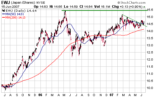
The potential for the
Yen carry trade to unwind continues to be a big risk, but note that
positions in funds that hold Japanese shares -- EWJ, JEQ and JOF, for
example -- are insulated from this risk to some extent. This is because
the prices of these funds will be given a boost when the Yen finally
rallies against the US$ and because the Japanese stock market has not
been a significant beneficiary of the Yen carry trade (all stock
markets are likely to be hit when the Yen carry trade eventually
unwinds, but carry traders generally haven't bought Japanese equities
so Japan's stock market should hold up better than most).
As we noted in last week's Interim Update, it appears as if the bond
market no longer poses an imminent threat to the stock market because
bonds have probably made a short-term bottom. The bond-related risk is
likely to return within the next few months, though.
This week's
important US economic events
| Date |
Description |
| Monday Jun 18 | No important events scheduled
|
| Tuesday Jun 19 | Housing Starts
| | Wednesday Jun 20
| No important events scheduled
| | Thursday Jun 21
| Leading Economic Indicators
| | Friday Jun 22
| No important events scheduled
|
Gold and
the Dollar
Gold and Silver
The Silver/Gold Ratio and the Stock Market
The following chart shows that the major trends in the silver/gold
ratio since 1990 have been roughly the same as the major trends in the
S&P500 Index. This relationship is not a useful trading tool
because it only works reliably over long time periods, but it could be
useful for long-term investors in gold and silver who have strong
opinions regarding the likely future direction of the US stock market.
For example, someone with a very bearish 2-5 year outlook on the US
stock market should, if he/she believes that history is anything to go
by, favour gold over silver because history suggests that the next
major downward trend in the broad stock market will be accompanied by a
major downward trend in the silver/gold ratio (substantial strength in
gold relative to silver, that is).
The main reason for re-visiting the relationship between the broad
stock market and the silver/gold ratio at this time is to point out
that a divergence has been building since April of last year;
specifically, while silver/gold is yet to exceed its April-2006 peak
("Peak B" on the chart) the S&P500 Index has continued to trend
upward. That is, over the past 14 months the financial market backdrop
has continued to favour silver relative to gold and yet the silver/gold
ratio has failed to make a new high. In this respect, silver/gold's
April-2006 peak looks similar to its January-1998 peak ("Peak A" on the
chart).
Our interpretation is that a huge amount of speculative silver buying
in late-1997 and early-1998 on the back of Warren Buffett's silver
purchases created a blow-off top of such magnitude that it was not
bettered despite the financial backdrop remaining relatively favourable
for silver until September of 2000. Had the Buffett-related speculative
blow-off not occurred then silver/gold would probably have topped with
the stock market between July of 1999 and September of 2000.
And it appears as if the frenzied buying of silver during the first 3.5
months of 2006 created a second blow-off top of such immense proportion
that it, too, has remained in place despite the persistence of
conditions conducive to strength in silver relative to gold.
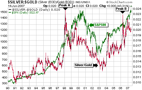
We suspect that the
April-2006 peak in the silver/gold ratio will remain unsurpassed for
years to come, but the longer the broad stock market remains in its
upward trend the greater the chance that we will be proven wrong about
this.
Current Market Situation
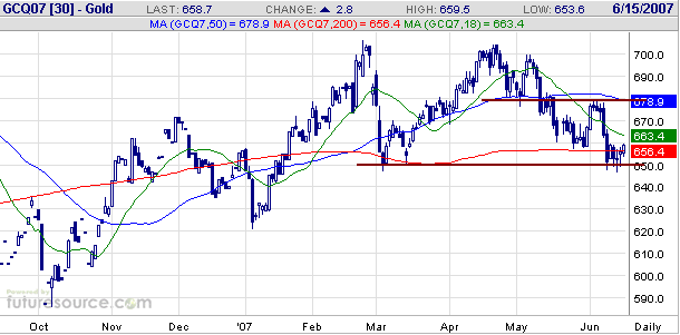
Below is a daily chart of August gold futures.
August gold is rebounding from support at $650. A routine counter-trend
rebound would retrace about 50% of the preceding decline, which, in
gold's case, would entail a move up to the 670s over the coming few
weeks. Such a rebound looks likely, especially considering that the
speculative net-long position in COMEX gold futures has just dropped to
near its lowest levels of the past 18 months (the only times it was
lower were when the gold price was bottoming in January of 2007 and
October of 2006).
We expect, however, that the current rebound will be followed by a drop to around $600.
Gold Stocks
Current Market Situation
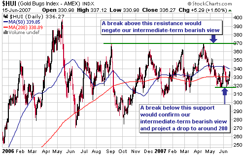
The AMEX Gold BUGS Index (HUI -- see chart below) is rebounding from
support at 317-320. This rebound/consolidation could continue for a few
more weeks, but we expect that the next move of consequence will be to
the downside.
Since the third week of April we have been advocating that investors
hold no more than a 'core' position in the gold sector due to the
deterioration of intermediate-term fundamentals. However, a move above
370 by the HUI would be such a powerful price signal that we would not
ignore it even if our assessment of these fundamentals didn't change.
In other words, it won't take much strength from here in the major gold
stocks to prove our intermediate-term bearish outlook wrong (a HUI rise
of only 10% would do it).
A point we have stressed over the past several weeks, and will
reiterate now, is that given our bearish assessment of the
intermediate-term fundamentals it makes no sense to be fully exposed to
the gold sector in ANTICIPATION of such a price signal. We do not
expect the aforementioned bullish price signal to occur, but if it does
then all we will have missed by sitting back with no more than a core
position is the first 10% of a major rally.
A question we
sometimes get is: if the intermediate-term outlook is bearish then why
do you recommend holding a sizeable core position in the gold sector?
The answer is fourfold:
1. We don't make 'all or nothing' bets based on anyone's intermediate-term forecasts, including our own
2. We don't think it is prudent to make a complete exit from
investments that have extremely attractive long-term risk/reward ratios
just because the odds appear to be skewed to the downside over the
coming 3-12 months
3. Due to the types of stocks we focus on in the gold/silver sector
(small producers and explorers) it is not feasible for us to shift
quickly between maximum exposure and zero exposure
4. Many of the stocks we own have the ability to buck a sector-wide
downtrend in response to company-specific developments such as drilling
results
Hedging
As we've said many times in the past, we think the best way to hedge
against a price decline is to hold a larger-than-normal cash reserve.
An alternative, however, is to buy insurance in the form of put options.
Those with substantial exposure to the gold sector could consider
buying some insurance in the form of GDX put options (with expiry dates
of December-2007 or later) while the HUI is trading in the 330-345
range. The idea would be to exit this insurance position within the
coming 5 months following either a move by the HUI above 370 or down to
280, whichever happens first.
Currency Market Update
Over the past few years we've occasionally shown charts comparing the
Australian Dollar and the A$-denominated gold price, with the charts
offset by 2 years. For example, below is the chart comparison we
included in a commentary posted in early February of this year. The
idea is that the A$ gold price leads the A$ (A$/US$, that is) by 2
years.
If its lead-lag relationship with the A$ gold price continues to
operate as it has done over the past 16 years then the A$ will remain a
relatively strong currency until next May (or thereabouts).

The following monthly
chart shows that the A$ has broken decisively above long-term
resistance over the past three months. This chart suggests that the A$
has embarked on a rally that will ultimately take it to par with the
US$, or perhaps even higher.
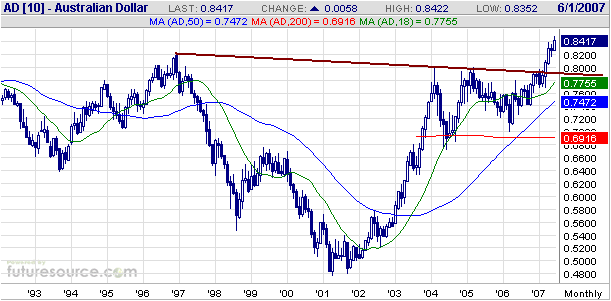
One concern we have
with the idea that the A$ will remain in a strong upward trend over the
coming year is that such an outcome is inconsistent with our
intermediate-term views on gold, the US$ and commodities (we can't
imagine the A$ continuing to trend higher for another 12 months in
parallel with substantial strength in the Dollar Index and weakness in
metal prices). Another concern is that the supply of Australian dollars
has grown at a relatively fast rate over the past few years.
As a result of these concerns we can't be anything more than intermediate-term "neutral" on the A$.
On a different matter, the speculative net-short position in Swiss
Franc futures hit an all-time high last week. This would normally be
good for a rebound of at least 5% in the Franc over the coming weeks in
response to profit taking by the 'shorts', but these are not normal
times.
The Swiss Franc is the 'other' low-interest carry trade currency,
meaning that the Franc, like the Yen, has been pressured downward as
speculators have borrowed it to finance investments denominated in
higher-yielding currencies. It is probable that the speculative
net-short position in Swiss Franc futures is just the 'tip of the
iceberg' as far as the overall short position in this currency is
concerned, but there's no telling how big the iceberg will grow before
a major trend change occurs.
Update
on Stock Selections
(Note: To review the complete list of current TSI stock selections, logon at http://www.speculative-investor.com/new/market_logon.asp
and then click on "Stock Selections" in the menu. When at the Stock
Selections page, click on a stock's symbol to bring-up an archive of our comments on the stock in question)
Chart Sources
Charts appearing in today's commentary
are courtesy of:
http://stockcharts.com/index.html
http://www.futuresource.com/

|
