|
-- Weekly Market Update for the Week Commencing 20th May 2013
Big Picture
View
Here is a summary of our big picture
view of the markets. Note that our short-term views may differ from our
big picture view.
In nominal dollar terms, the BULL market in US Treasury Bonds
that began in the early 1980s will end by 2013. In real (gold)
terms, bonds commenced a secular BEAR market in 2001 that will continue
until 2014-2020. (Last
update: 23 January 2012)
The stock market, as represented by the S&P500 Index,
commenced
a secular BEAR market during the first quarter of 2000, where "secular
bear market" is defined as a long-term downward trend in valuations
(P/E ratios, etc.) and gold-denominated prices. This secular trend will bottom sometime between 2014 and 2020.
(Last update: 22 October 2007)
A secular BEAR market in the Dollar
began during the final quarter of 2000 and ended in July of 2008. This
secular bear market will be followed by a multi-year period of range
trading.
(Last
update: 09 February 2009)
Gold commenced a
secular bull market relative to all fiat currencies, the CRB Index,
bonds and most stock market indices during 1999-2001.
This secular trend will peak sometime between 2014 and 2020.
(Last update: 22 October 2007)
Commodities,
as represented by the Continuous Commodity Index (CCI), commenced a
secular BULL market in 2001 in nominal dollar terms. The first major
upward leg in this bull market ended during the first half of 2008, but
a long-term peak won't occur until 2014-2020. In real (gold) terms,
commodities commenced a secular BEAR market in 2001 that will continue
until 2014-2020.
(Last
update: 09 February 2009)
Copyright
Reminder
The commentaries that appear at TSI
may not be distributed, in full or in part, without our written permission.
In particular, please note that the posting of extracts from TSI commentaries
at other web sites or providing links to TSI commentaries at other web
sites (for example, at discussion boards) without our written permission
is prohibited.
We reserve the right to immediately
terminate the subscription of any TSI subscriber who distributes the TSI
commentaries without our written permission.
Outlook Summary
Market
|
Short-Term
(1-3 month)
|
Intermediate-Term
(6-12 month)
|
Long-Term
(2-5 Year)
|
|
Gold
|
Bullish
(17-Oct-12)
|
Bullish
(26-Mar-12)
|
Bullish
|
|
US$ (Dollar Index)
|
Neutral
(24-Dec-12)
|
Bullish
(01-May-13)
|
Neutral
(19-Sep-07)
|
|
Bonds (US T-Bond)
|
Neutral
(12-Nov-12)
|
Neutral
(18-Jan-12)
|
Bearish |
|
Stock Market
(DJW)
|
Neutral
(06-May-13)
|
Bearish
(28-Nov-11)
|
Bearish
|
|
Gold Stocks
(HUI)
|
Bullish
(24-Dec-12)
|
Bullish
(23-Jun-10)
|
Bullish
|
|
Oil |
Neutral
(30-Jul-12)
|
Neutral
(31-Jan-11)
|
Bullish
|
|
Industrial Metals
(GYX)
|
Neutral
(30-Jul-12)
|
Neutral
(29-Aug-11)
|
Neutral
(11-Jan-10)
|
Notes:
1. In those cases where we have been able to identify the commentary in
which the most recent outlook change occurred we've put the date of the
commentary below the current outlook.
2. "Neutral", in the above table, means that we either don't have a
firm opinion or that we think risk and reward are roughly in balance with respect to the timeframe in question.
3. Long-term views are determined almost completely by fundamentals,
intermediate-term views by
fundamentals, sentiment and technicals, and short-term views by sentiment and
technicals.
Monetary Stuff
Monetary Inflation Update
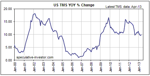
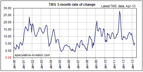
US
We've updated our US TMS (True Money Supply) charts using the monthly data for
April published by the Fed last week. The first of the following chart shows
that the year-over-year (YOY) rate of US TMS growth was roughly unchanged in
April. It is still hovering around 10%. The second chart shows that the
annualised 3-month rate of TMS growth ticked upward in April after hitting a
4-year low in March.
We suspect that the 3-month TMS growth rate made its low for the year in March.
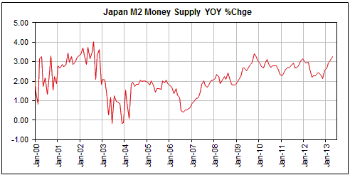
Japan
Over the past four years the YOY rate of growth in Japan's M2 money supply has
oscillated between 2.1% and 3.4%. At the end of April-2013 it was 3.25%. This is
near the top of its narrow 4-year range, but is very low relative to the rates
of money-supply growth occurring almost everywhere else.
The following chart of the annualised 3-month rate of change (ROC) in Japan's M2
money supply is interesting because of the very consistent seasonality it
reveals.
The most recent bottom in the 3-month M2 ROC occurred in October of 2012, after
which there was an advance into a January high, a brief pullback, and then an
advance to another (higher) high in April-2013. This could be viewed as evidence
that the Bank of Japan's new pro-inflation policies are starting to make a big
difference, if not for the fact that the same thing has happened every year
since 2003.
The repeating pattern in the 3-month ROC of Japan's M2 involves a
September-October (usually October) low, an advance into a January high, a
pullback, an advance into a typically higher high during April-May (usually
May), and then a plunge to the aforementioned September-October low.
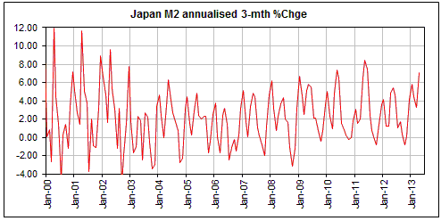
At this stage there is no evidence of a significant change in Japan's monetary
inflation backdrop. In other words, up until now the large decline in the Yen
and the associated large rise in the Nikkei have been almost 100%
sentiment-driven. This doesn't make the moves any less real; it just makes them
vulnerable to being retraced in full if the actual monetary situation fails to
merge with the perceived monetary situation.
Over the past few weeks the expectation that Japan is going to experience a lot
more inflation has finally begun to impact the Japanese Government Bond (JGB)
market, despite the BOJ's promise that it will be a huge buyer of JGBs over the
months ahead. If the JGB yield continues to increase then the Japanese
government and central bank will soon be faced with a "be careful what you wish
for" dilemma. They've wanted higher inflation expectations, but a continuing
rise in inflation expectations would bring forward the inevitable government
debt crisis. Therefore, if inflation expectations continue to rise in Japan we
will probably get a change in rhetoric, with Japanese officialdom beginning to
talk about tapering-off the monetary accommodation.
A few words on 'money velocity'
We have discussed the velocity of money more than a dozen times in TSI
commentaries over the past 10 years, each time in an effort to debunk the
concept. Here's a quick recap of our views on the magical "V".
Any reasonable discussion of money velocity has to begin with the famous
"Equation of Exchange". P*T = M*V is one way to write this equation, where "P"
is the average price level, "T" is the sum of all real expenditures
(transactions) in the economy, "M" is the supply of money and "V" is the
velocity of money. The equation is also sometimes written as Nominal GDP = M*V.
It just means that the nominal value of all transactions in the economy equals
the nominal value of all transactions in the economy. In other words, it's a
tautology. True by definition, but hardly useful.
Moving on, "V" is just a fudge factor that is whatever it needs to be to make
the right side of the aforementioned equation equal the left side. "V" doesn't
cause anything and cannot be measured. It cannot be calculated independently of
this equation. It doesn't exist outside this tautological equation.
In fact, with the exception of "M" none of the variables in the Equation of
Exchange can be measured or independently calculated. In particular, single
numbers for "P" and "T" don't exist, because it makes no sense to add together
or take the average of totally disparate items. What, for instance, would be the
sum or the average of a potato, a house, a kilowatt of electricity and a
dentist's time to extract a tooth? Government statisticians and many economists
claim to know the answer, but they are just kidding themselves.
If only economics were so easy that the relationship between economic growth,
prices and money supply could be adequately explained by a simple one-line
equation. If only.
Looking at the 'money velocity' concept from another angle, it makes no more
sense to talk about the velocity of money than it does to talk about the
velocity of houses or copper or eggs or computer chips. The reality is that
supply relative to demand determines the price of money in the same way that it
determines the price of everything else that gets traded. The only difference
between money and other goods is that money is on one side of most economic
transactions. This means that the price of any 'thing' is determined by the
supply of and the demand for that 'thing' and the supply of and the demand for
money, and that the price of money is determined by the supply of and the demand
for money and the supply of and the demand for the things for which money is
exchanged.
Having said all that, there is one way in which the velocity concept comes in
handy. It comes in handy if you want to explain why something happened to the
economy without going to the trouble of understanding why it really happened.
For example, if a large increase in the money supply isn't quickly followed by a
large increase in the so-called "general price level", you could explain it by
saying something along the lines of "the velocity of money is falling". For
another example, if the "general price level" is increasing at a much faster
pace than the money supply you could explain it by saying something along the
lines of "the velocity of money is increasing". In both cases you haven't
actually explained anything, but you will sound knowledgeable. The alternative
would be to develop an understanding of how monetary inflation affects different
prices in different ways with varying time lags, depending on factors such as
where/how new money enters the economy, the change in the level of uncertainty
and the resulting change in the desire to hold cash, and relative valuation. But
that requires a lot of effort. It might even require reading the works of good
economists such as Mises and Rothbard.
The Stock
Market
In the 13th May Weekly Update we discussed
the possibility that the US stock market was in the process of topping in
similar fashion to the way it topped in 2007. It seems to us that this is the
most likely of the countless possible outcomes.
In 2007, the market continued higher into the beginning of June and then
experienced 4-5 months of very choppy price action before commencing a cyclical
decline. This is worth bearing in mind, although we aren't forecasting an exact
replica of the 2007 pattern during 2013.
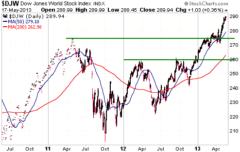
The Japanese stock market is the most 'overbought', having 'gone parabolic'
about 2.5 months ago and not yet reversing downward. However, the stock markets
of most developed countries appear to be in the midst of upside blow-offs. This
is evidenced by the following daily chart of the Dow Jones World Index (DJW),
which since mid-April has moved higher in a steeply-sloped straight line.
The upside blow-off could end immediately, but we would not be surprised if it
continued for another 1-2 weeks.
This week's
important US economic events
| Date |
Description |
| Monday May 20 |
No important events scheduled | | Tuesday
May 21 |
No important events scheduled | | Wednesday
May 22 |
Existing Home Sales
FOMC Minutes | | Thursday
May 23 |
New Home Sales
Kansas City Fed Mfg Index
|
| Friday May 24 |
Durable Goods Orders |
Gold and
the Dollar
Gold and Silver
More comments on gold demand and "paper" versus physical
When you read breathless commentary to the effect that the demand for physical
gold is rocketing upward even as the gold price declines, remember:
1. Physical demand cannot be satisfied by paper supply.
2. Everyone making the claim that the demand for physical gold is surging
relative to the supply of physical gold is fixating on one small part of the
physical gold market.
3. At any given time, the total demand for physical gold equals the total
aboveground supply of gold. This is basic economics. It has always been the case
and will always be the case.
4. The gold demand numbers and charts that are often contained in articles and
analyses, including the numbers/charts published by Gold Fields Mineral Services
(GFMS) and the World Gold Council (WGC), represent flows of gold from one part
of the market to another. These numbers/charts say nothing about overall demand
and nothing about price. For example, the Zero Hedge article posted
HERE includes a "gold demand" chart that actually provides no useful
information about gold demand, as well as some hopelessly flawed "gold demand"
analysis from the WGC.
5. If there really were widespread difficulty obtaining sufficient physical gold
to satisfy demand it would be evident in the term structure of the gold futures
market (there would be substantial and sustained "backwardation" in the futures
market).
At no time over the past month has there been any market-wide inability of
physical gold sellers to meet the demand of physical gold buyers; there has only
been a temporary inability of sellers in one part of the market to meet the
demand for certain items manufactured from gold (the coins and small bars
favoured by the retail investor). Moreover, it's very unlikely that there will
ever be a bona fide shortage of physical gold. This is because the mining
industry's contribution to total supply is so small as to be almost irrelevant
(gold mines shutting down wouldn't have a big effect on overall supply) and
because most of the world's gold is held as a store of value. It should
therefore always be possible for a change in price to bring the total demand for
physical gold into line with the aboveground supply of gold.
Now, we admit that at some point in the distant future the US dollar could
become so devalued and disliked that the existing holders of physical gold won't
sell for any amount of dollars. But in that situation it wouldn't be possible to
use dollars to buy anything of value. In other words, in that case the problem
would be an inability to use dollars to buy any useful resource, asset, good or
service, not just gold. However, it will always be possible to use something of
value to buy physical gold.
We are effectively saying that the real price of gold is what gold can be
exchanged for. The gold price could eventually become infinite in US$ terms due
to the US$ becoming worthless, but the real price of gold will never become
infinite. If it did then someone with a single ounce of gold could buy
everything in the world.
The real price of gold is likely to remain in a long-term upward trend while the
current monetary system remains in place, but it will probably never be more
than about three-times its present level. The reason is that the real price of
gold must bear some relationship to the real prices of everything else that
people want to own/consume.
Current Market Situation
In the US, the "Goldilocks" economy has apparently returned. The economy is not
too hot and not too cold. It is just right! According to the currently popular
line of thinking, the Fed is pumping enough new money into the system to enable
investors in equities and high-yield bonds to have a good time, but not enough
to cause an inflation problem. This creates a bearish backdrop for gold,
although at this stage it looks more like gold is about to complete a test of
its April low than make a sustained break to new lows.
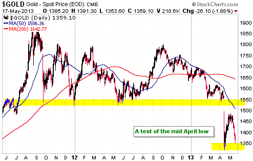
It is often the case that a successful test of an important price low will be
accompanied by greater negativity than occurred at the price low. This is the
case right now in the gold market, although we obviously don't yet know that
gold's test of its April low will be successful.
Evidence that there is greater negativity in the gold market now than there was
when the price was bottoming in mid-April is contained in the COT data (there
has been substantial shrinkage in the speculative net-long position since
mid-April) and the GLD holdings data (the amount of gold held by GLD has fallen
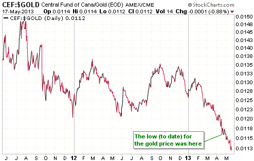
by 3.6M ounces since mid-April). It is also contained in the CEF/gold ratio,
which was discussed in last week's Interim Update and is mentioned again below.
The following chart shows that there has been a sizeable decline in CEF/gold
since mid-April, indicating that precious metals sentiment is now more
pessimistic than it was at the April price low. The only time over the past 20
years that CEF/gold was lower than it is today was during 2000-2001 -- near the
beginning of gold's long-term bull market.
Gold Stocks
With the HUI having just fallen for 7 trading days in a row to a marginal new
low for the year we have the ideal set-up for another important May reversal --
this time, obviously, a reversal from down to up.
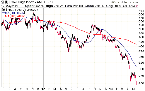
In last week's Interim Update we wrote:
"Long-term speculators should be buying this weakness provided that they have
sufficient spare financial capacity. Another way of saying this is that
long-term speculators should be buying IF they can do so while maintaining a
comfortable cash cushion. Nobody should be buying gold stocks on margin.
However, for short-term speculators and for long-term speculators who don't like
trying to catch falling knives (most people don't) it would make sense to
postpone any buying until after the HUI has its next significant (>3%) up day.
Positions could then be purchased in liquid gold-stock ETFs such as GDX, GDXJ or
GLDX with risk managed by placing initial sell-stops just below the intra-day
low to date."
Due to the extension of the gold sector's decline over the final two days of
last week, the trading tactic mentioned above (buy a trading position after the
first significant up-day and place an initial stop below the intra-day low to
date) looks even better.
Currency Market Update
The Dollar Index has broken out to the upside. As mentioned in previous
commentaries, 89 is the initial chart-based target created by this breakout.
We continue to believe that the Dollar Index stands a good chance of moving up
to the 90s within the coming 12 months and -- despite the inter-market
correlations of the past 3.5 months -- that the up-move will be fueled by global
stock market weakness and/or the resumption of the euro-zone (EZ) debt/banking
crisis.
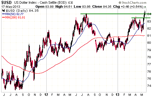
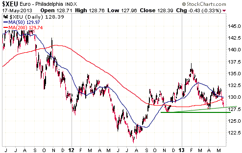
Although the Dollar Index has broken out to the upside and although the US$/euro
exchange rate is about 60% of the Dollar Index, the euro hasn't yet broken out
to the downside. A decline to below 127 would constitute a downside breakout for
the euro. Such a breakout should (in our opinion) be accompanied by pronounced
weakness in the EZ bank stocks. EZ bank stocks have recently been rallying,
which is probably why the euro has held up comparatively well of late while
almost all other major currencies have fallen sharply against the US$.
Due to its recent extreme price action the Australian Dollar (A$) is again
worthy of discussion.
The A$ has now closed lower on 10 consecutive trading days. It is very
'oversold' on a short-term basis and will probably soon rebound, but on a
longer-term basis there is a very bearish possibility to consider. We are
referring to the possibility that a major multi-year top is nearing completion.
This possibility is suggested by the following chart and by the A$'s relative
over-valuation.
'Do or die' support for the A$ lies at 95, with a break below 95 projecting an
intermediate-term target of 80.
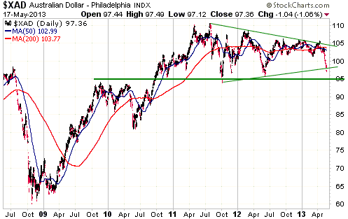
Prior to the decline of the past few weeks, all the significant A$ declines of
the past several years had happened alongside global stock market weakness.
Consequently, even though we have been well aware of the A$'s substantial
downside risk we are surprised that this downside risk has begun to materialise
in parallel with considerable stock market strength. We thought that the A$
would embark on a large decline AFTER the start of the next intermediate-term
stock market decline.
Perhaps the A$'s major topping process still has a few months to run, with a
near-term test of support in the mid-90s being followed by a 2-3 month rebound
to the low-100s prior to the start of a large decline. Price action such as this
could bring the A$ back into line with the global stock market.
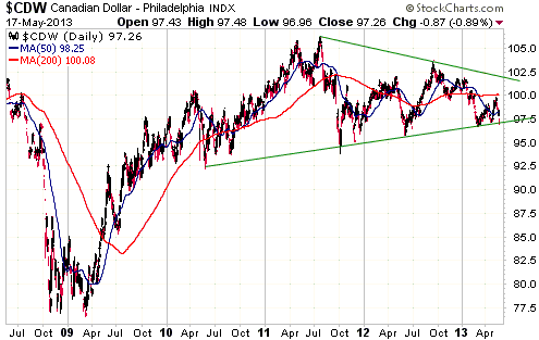
Like the A$, the C$ could be in the process of completing a major multi-year
top. We don't think that the C$ has as much downside risk as the A$, but a
decline to the mid-80s looks like a realistic possibility.
As is the case with the A$, it would make more sense to us if the C$'s topping
process continued until after the start of an intermediate-term stock market
decline.
Update
on Stock Selections
Notes: 1) To review the complete list of current TSI stock selections, logon at
http://www.speculative-investor.com/new/market_logon.asp
and then click on "Stock Selections" in the menu. When at the Stock
Selections page, click on a stock's symbol to bring-up an archive of
our comments on the stock in question. 2) The Small Stock Watch List is
located at http://www.speculative-investor.com/new/smallstockwatch.html
 Company
news/developments for the week ended Friday 17th May 2013: Company
news/developments for the week ended Friday 17th May 2013:
[Note: FS = Feasibility Study, IRR = Internal Rate of Return, MD&A =
Management Discussion and Analysis, M&I = Measured and Indicated,
NAV = Net Asset Value, NPV(X%) = Net Present Value using a discount
rate of X%, P&P = Proven and Probable, PEA = Preliminary Economic
Assessment, PFS = Pre-Feasibility Study]
*Asanko Gold (AKG) announced the results of the Esaase PFS, which
we discussed in last week's Interim Update. The company also issued
its routine quarterly reports. Of primary interest, the latest
quarterly financial statements showed that AKG had working capital
of $195M at 31st March. This equates to about $2.30/share. In other
words, at Friday's closing price of $2.30 AKG was trading at cash
value and the stock market was effectively valuing the Esaase gold
project at zero.
AKG is the best-financed exploration-stage junior we know of.
*Americas Bullion Royalty Corp. (AMB.TO) announced last Friday
that it had arranged a non-brokered equity financing priced at
C$0.15/share to raise $2.25M. This must be one of the most
poorly-timed financings in history, coming, as it did, with the gold
sector having just fallen for seven days in a row to a new 4-year
low and at its most 'oversold' level in more than 30 years.
Due to the extremely low price at which the new shares are being
issued, this equity financing will reduce AMB's per-share value by
at least 5% and potentially as much as 8%. This is not a
deal-breaker given the large gap between the stock's current market
cap and our estimate of its value, but it ensures that AMB isn't
near the top of our suggested shopping list.
By the way, the top six entries on our gold-stock shopping list at
this time (in alphabetical order) are AAU, AKG, EDV.TO, EVN.AX, PVG
and SBB.TO.
*Batero Gold (BAT.V) provided a corporate update with three main
points:
1) The PEA for the oxide portion of the Batero Quinchia gold project
(Colombia) will be complete before the end of next month.
2) The company has initiated a share buy-back program enabling up to
4.9M shares (out of the current total of 90M shares) to be
re-purchased on the stock market over the next 12 months. We
generally don't like share buy-backs, but in this case there is some
logic to it because the stock is currently trading at cash value and
because a small amount of additional demand could give the stock
price a sizeable boost.
3) The company will be looking for ways to use its $17M treasury to
capitalise on the difficult equity-market conditions. Specifically,
it will be looking for opportunities to broaden its portfolio by
acquiring undervalued advanced-stage or near-production projects in
Colombia.
Seafield Resources (SFF.V) appears to be a likely candidate for
acquisition by BAT, in that SFF is strapped for cash and owns a
2M-ounce gold project that is undergoing a feasibility study and is
close to BAT's project. However, any deal would have to be very good
to make it worth the risk.
*Clifton Star Resources (CFO.V) reported the results of the first
15 holes of the 2013 drilling program at its Duparquet project
(Quebec). There were some good intercepts, including 90.0 meters
grading 1.13 g/t Au and 51.0 meters grading 1.54 g/t Au.
The results of these 15 holes and the 54 holes drilled during the
second half of last year are not included in the current resource
estimate (2.4M ounces in the M&I category plus 1.5M ounces in the
Inferred category, giving a total resource of 3.9M ounces and a
total in-pit resource of 2.9M ounces). There should be an updated
resource estimate during the second half of this year that will form
part of the PFS, which is scheduled for completion during the first
quarter of next year.
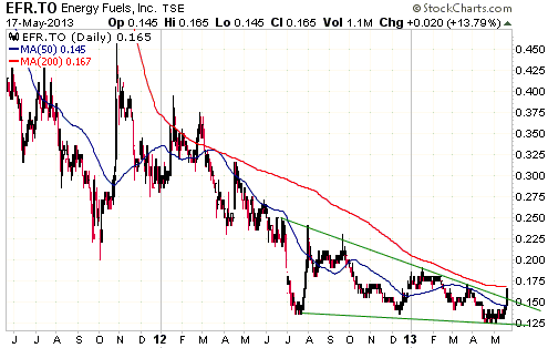
*There was interesting price action in the stock of junior uranium
producer Energy Fuels (EFR.TO) late last week. It might not
be indicative of anything important, but it came out of the blue and
drew our attention.
*Endeavour Mining (EDV.TO, EVR.AX) published its results for the
March quarter and provided a corporate update.
Production during the March quarter was 74K ounces at an "all-in"
cost of $1083/oz, creating an "all-in" margin of $39M. This was a
good result.
Working capital fell from $177M to $150M during the quarter due to
the money spent on the development of the Agbaou mine in Cote
d'Ivoire. Agbaou remains on budget and on schedule to deliver its
first gold production in Q1-2014.
EDV is maintaining its 2013 production and cost guidance of
310K-345K ounces of gold at an all-in cost of about $1100/oz. The
less-important "cash cost" is expected to be about $860/oz. These
cost figures are roughly in line with those expected to be achieved
by Agnico Eagle, Barrick and Newmont.
EDV continues to fire on all cylinders. We live in hope that one day
the stock market will notice.
*Jaguar Mining (JAG) reported quarterly results that were
surprisingly good. Of particular note, for the first time in a long
time the company's working capital position improved on a
quarter-over-quarter basis. The improvement was only $4M and there
remains a working capital deficit of $17.5M, but any improvement is
obviously a plus given the relentless deterioration of the past
several quarters.
Production during the first quarter was 25K ounces at a "cash cost"
of $826/oz. This decent quarterly production result suggests that
JAG is going to do significantly better than its 2013 guidance of
85K-95K ounces at a cash cost of $950-$1100/oz, but at this stage
the company's management is maintaining its guidance. It seemingly
wants to leave the bar at a low level just in case.
*Pilot Gold (PLG.TO) published its MD&A and financial statements
for the March quarter. The financial statements showed that the
company had about $35M in working capital at 31st March.
PLG also reported the results of the first ten holes of its 2013
drilling program at the TV Tower gold-silver project in Turkey.
There were good silver intercepts in the mix (a relatively small but
potentially lucrative silver deposit overlies the project's larger
gold deposit), including 93.0 g/t Ag over 122.7 metres and 51.5 g/t
Ag over 82.6 metres.
PLG is fully funded through at least the next 12 months and is our
favourite early-stage gold explorer. Note that we classify companies
such as AKG, PVG and SBB.TO as advanced-stage gold explorers.
*Pinetree Capital (PNP.TO), a company that has stakes in hundreds
of junior resource companies, reported that its per-share net asset
value was C$1.00 as at 30th April. Based on the performance of the
TSX Venture Exchange Composite Index since 30th April, PNP's current
net asset value is probably about C$0.96/share. This compares to
last Friday's closing price of C$0.40.
*Rio Novo Gold (RN.TO) published its MD&A and financial statements
for the quarter ended 31st March.
RN completed the FS for its Almas gold project (Brazil) last
November. The FS showed that the project is economically viable,
with an after-tax NPV(5%) of $130M ($1.14/share) at $1450/oz.
Furthermore, the NPV rises to $233M ($2.04/share) at $1700/oz.
The problem is that the company needs $150M to build the Almas mine,
but its working capital is down to only $1M and its market
capitalisation (at C$0.10/share) is only $11M. Therefore, even
though a number of corporations are interested in providing the debt
component of the required project financing, RN is currently unable
to come up with the equity component.
With RN having such a low market cap relative to the NPV of just one
of its gold projects, there is an opportunity for a financier or a
mining junior with a strong balance sheet to obtain an equity stake
in the company at a small fraction of its value.
Chart Sources
Charts appearing in today's commentary
are courtesy of:
http://stockcharts.com/index.html

|
