|
-- Weekly Market Update for the Week Commencing 21st May 2012
Big Picture
View
Here is a summary of our big picture
view of the markets. Note that our short-term views may differ from our
big picture view.
In nominal dollar terms, the BULL market in US Treasury Bonds
that began in the early 1980s will end by 2013. In real (gold)
terms, bonds commenced a secular BEAR market in 2001 that will continue
until 2014-2020. (Last
update: 23 January 2012)
The stock market, as represented by the S&P500 Index, commenced
a secular BEAR market during the first quarter of 2000, where "secular
bear market" is defined as a long-term downward trend in valuations
(P/E ratios, etc.) and gold-denominated prices. This secular trend will bottom sometime between 2014 and 2020. (Last update: 22 October 2007)
A secular BEAR market in the Dollar
began during the final quarter of 2000 and ended in July of 2008. This
secular bear market will be followed by a multi-year period of range
trading. (Last
update: 09 February 2009)
Gold commenced a
secular bull market relative to all fiat currencies, the CRB Index,
bonds and most stock market indices during 1999-2001. This secular trend will peak sometime between 2014 and 2020. (Last update: 22 October 2007)
Commodities,
as represented by the Continuous Commodity Index (CCI), commenced a
secular BULL market in 2001 in nominal dollar terms. The first major
upward leg in this bull market ended during the first half of 2008, but
a long-term peak won't occur until 2014-2020. In real (gold) terms,
commodities commenced a secular BEAR market in 2001 that will continue
until 2014-2020. (Last
update: 09 February 2009)
Copyright
Reminder
The commentaries that appear at TSI
may not be distributed, in full or in part, without our written permission.
In particular, please note that the posting of extracts from TSI commentaries
at other web sites or providing links to TSI commentaries at other web
sites (for example, at discussion boards) without our written permission
is prohibited.
We reserve the right to immediately
terminate the subscription of any TSI subscriber who distributes the TSI
commentaries without our written permission.
Outlook Summary
Market
|
Short-Term
(0-3 month)
|
Intermediate-Term
(3-12 month)
|
Long-Term
(1-5 Year)
|
| Gold
|
Bullish
(26-Mar-12)
|
Bullish
(26-Mar-12)
|
Bullish
|
| US$ (Dollar Index)
|
Bearish
(16-May-12)
| Neutral
(09-Jan-12)
|
Neutral
(19-Sep-07)
|
| Bonds (US T-Bond)
|
Neutral
(11-Apr-12)
|
Neutral
(18-Jan-12)
|
Bearish
|
| Stock Market
(DJW)
|
Neutral
(25-Apr-12)
|
Bearish
(28-Nov-11)
|
Bearish
|
| Gold Stocks
(HUI)
|
Bullish
(26-Mar-12)
|
Bullish
(23-Jun-10)
|
Bullish
|
| Oil | Neutral
(31-Jan-11) | Neutral
(31-Jan-11)
| Bullish
|
| Industrial Metals
(GYX)
| Neutral
(22-Nov-11)
| Neutral
(29-Aug-11)
| Neutral
(11-Jan-10)
|
Notes:
1. In those cases where we have been able to identify the commentary in
which the most recent outlook change occurred we've put the date of the
commentary below the current outlook.
2. "Neutral", in the above table, means that we either don't have a
firm opinion or that we think risk and reward are roughly in balance with respect to the timeframe in question.
3. Long-term views are determined almost completely by fundamentals,
intermediate-term views by giving an approximately equal weighting to
fundamental and technical factors, and short-term views almost
completely by technicals.
10 reasons to be a bear in
a China shop
There is a lot of lopsidedly-bullish analysis on China in the mainstream press and in the "blogosphere". Less so today than two years ago, but still enough to suggest that China's problems are not generally understood. To do our bit to counter-balance the aforementioned bullish analysis, here is a list of 10 reasons to be a China bear:
1) We regularly read that China's economy is growing at 8%/year or 9%/year or at some other impressive-sounding rate. These are simply numbers that China's government concocts for public consumption; they don't reflect what's really happening. It's possible that right now China's economy is not growing at all and it's certain that a significant part of the growth of the past several years is a monetary illusion rather than something sustainable.
2) China is now paying the price for its government's attempts to grow the economy through currency devaluation.
In a recent commentary we explained why currency devaluation generally makes an economy less, not more, competitive. The gist is that a sustained reduction in a currency's foreign exchange value must be linked to a sustained reduction in that currency's domestic purchasing power, meaning that any trade advantage achieved through lowering the exchange rate will be offset by higher local prices.
This applies where a currency's exchange rate is 'free floating', but China pegs its currency to the US$. Moreover, about 8 years ago the Chinese government reduced the Yuan's fixed foreign exchange rate to a level that massively under-valued the Yuan relative to the US$. This gave China a trade advantage, but it also meant that the Yuan supply had to be inflated relatively quickly to offset the upward pressure on the exchange rate stemming from the artificially low peg. This seemed to work well for many years, but eventually the monetary inflation brought about a large reduction in the purchasing power of the Yuan. The Yuan's reduced purchasing power combined with baby-step increases in the pegged exchange rate have eliminated the Yuan's under-valuation against the US$. More importantly, the whole process has left China in a position where investment bubbles wrought by the monetary inflation are bursting at the same time as the cost of living is rising at an uncomfortably fast pace.
3) Due to China's $1T-$2T "shadow banking system" (informal lending that happens outside the banking system), there is a lot more debt-related leverage in China's economy than indicated by official figures.
4) The Chinese manufacturing sector's most important customer (the euro-zone) is in recession and its second most important customer (the US) is either in recession or soon will be.
5) Over the past decade China has experienced unprecedented mal-investment in property and infrastructure. There are now millions of vacant apartments, huge shopping centres with almost no tenants, many empty commercial buildings, spectacular airport terminals with almost no traffic, and magnificent roads and bridges in the middle of nowhere.
6) In general, China's provincial governments are in similar financial situations to the government of Greece.
7) China's obvious "inflation" problem (its rapidly rising cost of living) is limiting the government's ability to use more monetary stimulus to 'kick the can down the road'.
8) The cost of labour in China has been in a steep upward trend (in response to many years of fast money-supply growth), which means that China is becoming a relatively expensive place for a foreign company to locate a factory.
9) China's policymakers exhibit the same short-term approach as their Western counterparts. For example, the massive stimulus of 2008-2009 succeeded to the extent that it made things look better in the short term, but it has ultimately left the economy in a much weaker state.
10) China's major banks are insolvent and are totally reliant on life support provided by the central government. This life support is bound to continue, which will add to the inflation problem.
The good news for those who are looking for an opportunity to exit investments that rely on strong economic growth in China is that despite the "inflation" problem, the Communist Party's power transition scheduled for late this year could result in policies that postpone a collapse until next year.
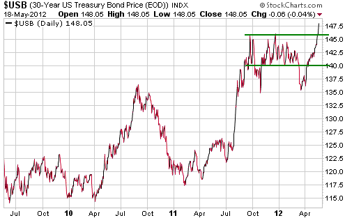
T-Bond Update
In early March we said it was a good bet that volatility was about to increase in the T-Bond market. At the time we thought that the T-Bond was more likely to break out of its narrow range to the downside than the upside, but we were more confident in the size than the direction of the move.
Volatility ended up increasing as expected, but a downside breakout from the narrow multi-month range proved to be a huge 'head fake'.
Following March's downside breakout we speculated in these pages that the T-Bond market would make an intermediate-term low during the second quarter. However, the abrupt late-March turnaround and ensuing price surge mean that if there is going to be an intermediate-term extreme during the second quarter of this year it will have to be a high.
Based on what happened during the three previous T-Bond surges of the past 4 years, a daily close below the 20-day moving average could be taken as evidence that an intermediate-term peak is in place.
The Stock
Market
Who has been more right -- the bulls or the bears?
The correct answer to the above question depends on the measuring stick. If your chosen measuring stick is one of the senior US stock indices (the SPX, the Dow or the NDX), then the correct answer is: the bulls. But the senior US stock indices often don't do a good job of representing equities on a global basis. In fact, over the past year they haven't even done a particularly good job of representing US equities.
Looking around the world, stock market performance has generally not been good over any period from one month to 26 months. For example, the following chart shows that France's CAC40 Index is near its lows of the past three years.
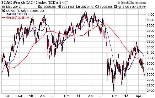
Europe has many well-known region-specific problems, so it is to be expected that charts of European stock markets will reveal poor performance (the Italian and Spanish stock markets made 8-year lows last week). Therefore, let's take a look at the charts of markets that aren't being weighed down by a sovereign debt crisis.
First, here's what the Hong Kong stock market has done:
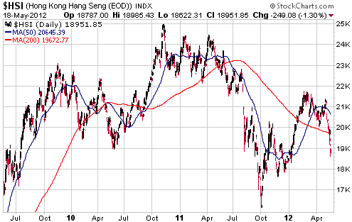
Hong Kong's Hang Seng Index was no higher at the end of last week than it was in July of 2009. Over this period there was strong growth in Hong Kong's money supply and most prices in Hong Kong rose sharply, so in real terms the performance of the HK stock market has been terrible over the past three years.
Second, here's what the Australian stock market has done:
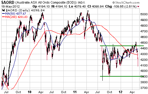
The Australian stock market has performed no better than the HK stock market in both nominal and real terms (like the HK$, the A$ has lost a lot of purchasing power over the past few years in response to monetary inflation).
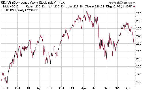
The Dow Jones World Index (DJW) has done better than the individual markets charted above, but it has essentially gone nowhere over the past two years and is a lot closer to a 2-year low than a 2-year high. Considering the increase in global money supply over the past two years, this represents poor real performance.
The bottom line is that the bears appear to have been more right than the bulls, but this doesn't mean that they will continue to be so. The senior US stock indices have substantial intermediate-term downside risk due to high valuations and the likelihood of recession, but there is good value elsewhere. The Australian stock market, for example, now has an average dividend yield of almost 5% and an average price/earnings ratio (based on 12-month trailing earnings) of about 12.
Current US stock market situation
The following chart shows that the 10-day moving average of the equity put/call ratio has just reached 0.88, which happens to be its second-highest level of the past three years. Outside of the financial-crisis period spanning 2008 and the first quarter of 2009, such an extreme for the equity put/call has always set the stage for a multi-week rally.
After the equity put/call reached an equivalent extreme in June of last year the stock indices rebounded by enough to test their highs and then embarked on declines to new lows for the year. We won't be surprised if something similar happens this year.

This week's
important US economic events
| Date |
Description |
| Monday May 21 | No
important events scheduled
| | Tuesday May 22 | Existing
Home Sales
Richmond Fed Manufacturing Index
| | Wednesday May 23 | New
Home Sales | | Thursday
May 24 |
Durable Goods Orders
|
| Friday May 25 | Consumer
Sentiment
|
Gold and
the Dollar
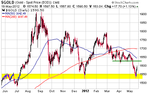
Gold
Gold bullion bounced from intermediate-term support last week. There is no evidence in the price action that last week's upward reversal will prove to be sustainable, but the odds that a sustainable upward reversal has just occurred are shortened by the fact that when gold was bottoming last week the speculative net-long position in COMEX gold futures and Market Vane's bullish percentage were at their lowest levels since Q4-2008.
Gold Stocks
The Big Picture
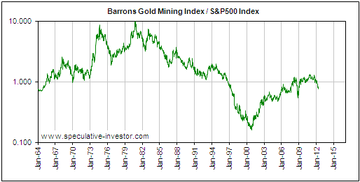
It's time to update our long-term weekly charts showing how the gold sector, as represented by the Barrons Gold Mining Index (BGMI), has performed in US$ terms, gold bullion terms and S&P500 (SPX) terms.
The first of our long-term charts shows the BGMI since 1964 and includes a 200-week moving average (the red line). The peaks of the three major rallies that composed the 1960s-1970s bull market are labeled "1", "2" and "3". A visual comparison of the current bull market and the bull market of the 1960s-1970s suggests that the early-2008 peak is equivalent to the early-1968 peak. Consequently, the early-2008 peak has also been labeled "1".
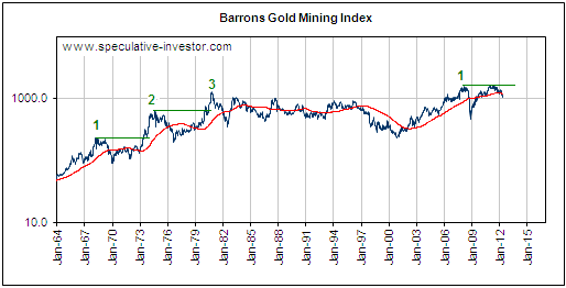
From the above chart we observe that the distance between major peaks during the bull market of the 1960s-1970s was 6.0-6.5 years, and that following a major peak at least 5 years went by before the BGMI broke decisively into new high ground. If the current bull market follows a similar pattern then the next major peak will occur in 2014 and a decisive break to new highs won't occur until the first half of 2013.
The second of our long-term charts shows the BGMI/gold ratio over the same period.
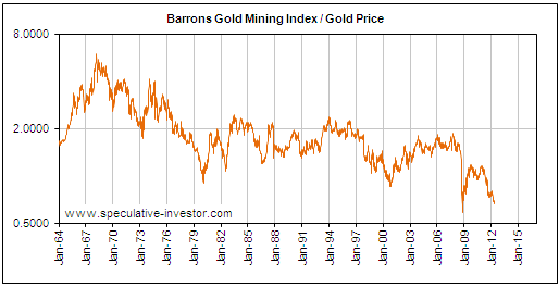
Relative to gold, the BGMI was in a major bear market from early 1968 through to January of 1980 (the bottom for the BGMI/gold ratio exactly coincided with the peak for gold bullion). The only significant interruption to this bear market was during 1973-1974, which, by the way, was a period of substantial weakness in the broad stock market. In other words, there is historical precedence for gold stocks trending upward in nominal terms and relative to gold bullion while the broad stock market trends downward.
Bear in mind that the BGMI is a proxy for senior gold mining stocks. Its performance relative to gold therefore shows that the senior gold mining stocks generally underperform the bullion during the course of a long-term gold bull market. This is a point we have made numerous times in TSI commentaries over the years. It is why we have had no direct exposure to senior gold mining stocks since early 2004 and why we are not interested in such stocks today (other than as short-term trades).
We are interested in junior gold and silver mining stocks (producers and explorers) and we are interested in the metals themselves, but we aren't interested in anything in between. If we want additional leverage to the bullion we'll buy the juniors; if we want additional non-leveraged exposure to the bullion we'll buy the bullion.
Obviously, our concentration on the junior end of the market hasn't worked well of late. As far as we know, everyone who has concentrated on the juniors has done poorly over the past 12 months and especially over the past 8 months. It has been an unusually difficult period for these types of stocks. However, our concentration on the junior end of the market has served us very well over the past 10 years and is likely to serve us well over the remainder of gold's long-term bull market.
The last of our long-term charts deals with the BGMI/SPX ratio (the gold sector's performance relative to the broad stock market).
The decline in the BGMI/SPX ratio over the past year doesn't look like much on our long-term chart and is small relative to some of the declines that occurred during the 1960s-1970s bull market, but it resulted in the weekly RSI (an intermediate-term momentum indicator) hitting a 10-year low.
Current Market Situation
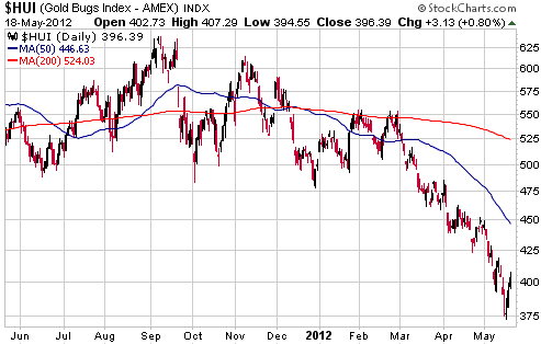
The HUI rebounded strongly from Thursday's low to Friday's high, but note that there were a few good 2-3 day rebounds as the HUI worked its way down from the 470s about 7 weeks ago to last week's trough in the 370s.
The latest rebound began with gold bullion and gold stocks at their most 'oversold' extremes since 2008, so it stands a better than average chance of being sustainable. However, to conclude that a bottom is in place we will need to see something different (a change in the pattern of the past several weeks). "Something different" would be either a multi-day continuation of the rebound that began last Thursday or a pullback to a higher low followed by a move to above the peak of the initial rebound (Friday's intra-day high of 407 is currently the peak of the initial rebound).
Currency Market Update
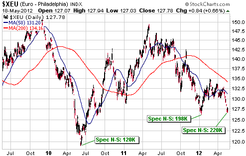
We have a new all-time high in the speculative euro short position.
In January of this year, the speculative net-short position in euro futures peaked at 198K contracts. At the time, this was an all-time high by a wide margin. Last week, with the euro trading above its January low, the total speculative net-short position in euro futures reached 220K contracts. To put this into perspective, when the euro was bottoming at around 1.20 in May-June of 2010 the total speculative net-short position in euro futures was 'only' about 120K contracts.
This doesn't guarantee that the euro is at a bottom. What it means is that there is now a huge amount of short-covering fuel available to drive a euro rebound. Our expectation is that this short-covering fuel will start being used when the stock market reverses upward.
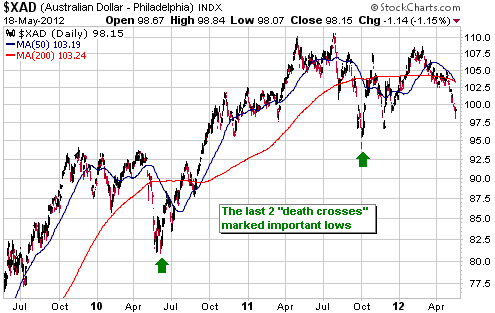
Of the major currencies, the Australian Dollar (A$) has the strongest correlation with the global stock market. The correlation is positive, so it is not surprising that the recent stock market weakness has coincided with A$ weakness. With the stock market probably at or within a few days of a short-term bottom, the A$ is probably also close to a short-term bottom.
The following daily chart shows that the A$'s 50-day moving average (MA) has just crossed from above to below its 200-day MA. This type of MA crossover is often referred to as a "death cross" and could be the world's most misunderstood technical indicator. Rather than being bearish (as per the conventional view), a so-called "death cross" is a reliable BULLISH signal. More often than not, a "death cross" will occur near an intermediate-term correction low in a bull market and near a short-term low in a bear market. We are therefore not surprised that the A$'s last two "death crosses" marked important lows.
Update
on Stock Selections
Notes: 1) To review the complete list of current TSI stock selections, logon at
http://www.speculative-investor.com/new/market_logon.asp
and then click on "Stock Selections" in the menu. When at the Stock
Selections page, click on a stock's symbol to bring-up an archive of
our comments on the stock in question. 2) The Small Stock Watch List is
located at http://www.speculative-investor.com/new/smallstockwatch.html
 Uranium Stocks Uranium Stocks
With the notable exception of gold mining, uranium mining is probably the most beaten-down sector of the stock market. This is despite the fact that the price of uranium has traded sideways over the past 8 months.
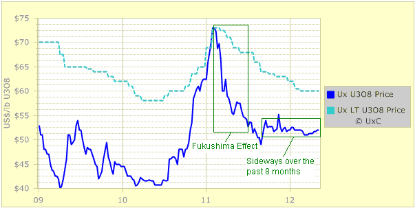
Chart Source: www.uxc.com
In the TSI List there is exposure to uranium via Energy Fuels (TSX: EFR) and UEX Corp. (TSX: UEX). We think that both of these stocks are buys near their current prices of C$0.25 and C$0.52, respectively.
Both of our uranium mining plays are highly leveraged to changes in the uranium price, which means that they are likely to perform very well over the next two years IF the uranium price trends upward. This also means that they will likely either perform very poorly or be 'dead money' if the uranium price trends downward or continues to drift sideways.
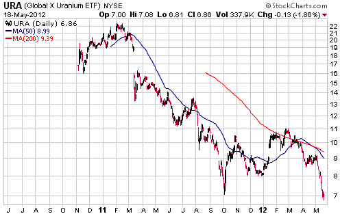
The Global X Uranium ETF (NYSE: URA) is another way to gain exposure to uranium mining. This fund holds an array of uranium mining stocks, from large-cap producers to small-cap explorers. It doesn't have anywhere near as much upside potential as the two small-cap stocks mentioned above, but near the current depressed price there is still plenty of upside. And the downside risk is relatively small.
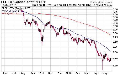
Fairborne Energy (TSX: FEL). Shares: 102M issued, 109M fully diluted. Recent price: C$1.75
Mid-tier natural gas producer FEL is worth another look at this time. The stock is an interesting speculation for two reasons. First, the company has put itself up for sale, which doesn't guarantee that there will be a sale but certainly increases the probability of such an event. Second, there is a realistic chance that the natural gas price made a major bottom last month. FEL is highly leveraged to the natgas price, which is why it has been so weak over the past year and why it could rebound very strongly if a general belief begins to take hold that the natgas bear market is over.
If the natgas bear market is not over and no takeover bid materialises, then FEL could go bust. However, going bust is not a short-term threat.
Golden Star Resources (NYSE: GSS, TSX: GSC). Shares: 259M issued, 265M fully diluted. Recent price: US$1.13
After the close of trading last Thursday GSS announced that it had entered into an agreement to exchange $74.5M of its existing convertible debt due for repayment on 30th November this year for $77.5M of new convertible debt due for repayment in June of 2017. The existing notes bear interest at 4.00% and have a conversion price of $5.00, whereas the new notes bear interest at 5.00% and have a conversion price of $1.65.
This deal boosts the company's total debt by $3M, but has the advantage of improving the company's working capital by $74M (from negative $27M to positive $47M). It therefore strengthens the balance sheet. However, the additional balance sheet strength comes at the cost of significant share dilution in that if GSS's stock price is above $1.65/share then repayment of the debt will most likely be via the issuing of 47M new shares (an 18% addition to the total share count).
It makes sense for GSS to exchange short-term debt for long-term debt, but the timing could not have been worse. By doing this deal after the stock price had just fallen to its lowest level in more than three years, GSS's management ensured that the cost of the new debt was as high as it could possibly be. It feels like this management team is working against us (the shareholders).
We have a small GSS position in our account. It used to be a medium-sized position, but the combination of the decline in the stock price and no new buying on our part has transformed the position from medium to small. After reading the debt swap news our knee-jerk reaction was to dump this loser, but after giving the news some calm consideration we decided that the reduction of the balance-sheet risk combined with the further reduction in the stock price means that we should probably be buying rather than selling.
We don't intend to buy any more GSS shares in the immediate future, but this could be a good stock to average down on soon after evidence emerges of a bottom for the
HUI.
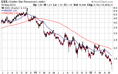
Chart Sources
Charts appearing in today's commentary
are courtesy of:
http://stockcharts.com/index.html
http://www.decisionpoint.com/

|
