|
-- Weekly Market Update for the Week Commencing 22nd April 2013
Big Picture
View
Here is a summary of our big picture
view of the markets. Note that our short-term views may differ from our
big picture view.
In nominal dollar terms, the BULL market in US Treasury Bonds
that began in the early 1980s will end by 2013. In real (gold)
terms, bonds commenced a secular BEAR market in 2001 that will continue
until 2014-2020. (Last
update: 23 January 2012)
The stock market, as represented by the S&P500 Index,
commenced
a secular BEAR market during the first quarter of 2000, where "secular
bear market" is defined as a long-term downward trend in valuations
(P/E ratios, etc.) and gold-denominated prices. This secular trend will bottom sometime between 2014 and 2020.
(Last update: 22 October 2007)
A secular BEAR market in the Dollar
began during the final quarter of 2000 and ended in July of 2008. This
secular bear market will be followed by a multi-year period of range
trading.
(Last
update: 09 February 2009)
Gold commenced a
secular bull market relative to all fiat currencies, the CRB Index,
bonds and most stock market indices during 1999-2001.
This secular trend will peak sometime between 2014 and 2020.
(Last update: 22 October 2007)
Commodities,
as represented by the Continuous Commodity Index (CCI), commenced a
secular BULL market in 2001 in nominal dollar terms. The first major
upward leg in this bull market ended during the first half of 2008, but
a long-term peak won't occur until 2014-2020. In real (gold) terms,
commodities commenced a secular BEAR market in 2001 that will continue
until 2014-2020.
(Last
update: 09 February 2009)
Copyright
Reminder
The commentaries that appear at TSI
may not be distributed, in full or in part, without our written permission.
In particular, please note that the posting of extracts from TSI commentaries
at other web sites or providing links to TSI commentaries at other web
sites (for example, at discussion boards) without our written permission
is prohibited.
We reserve the right to immediately
terminate the subscription of any TSI subscriber who distributes the TSI
commentaries without our written permission.
Outlook Summary
Market
|
Short-Term
(1-3 month)
|
Intermediate-Term
(6-12 month)
|
Long-Term
(2-5 Year)
|
|
Gold
|
Bullish
(17-Oct-12)
|
Bullish
(26-Mar-12)
|
Bullish
|
|
US$ (Dollar Index)
|
Neutral
(24-Dec-12)
|
Neutral
(09-Jan-12)
|
Neutral
(19-Sep-07)
|
|
Bonds (US T-Bond)
|
Neutral
(12-Nov-12)
|
Neutral
(18-Jan-12)
|
Bearish |
|
Stock Market
(DJW)
|
Bearish
(30-Jul-12)
|
Bearish
(28-Nov-11)
|
Bearish
|
|
Gold Stocks
(HUI)
|
Bullish
(24-Dec-12)
|
Bullish
(23-Jun-10)
|
Bullish
|
|
Oil |
Neutral
(30-Jul-12)
|
Neutral
(31-Jan-11)
|
Bullish
|
|
Industrial Metals
(GYX)
|
Neutral
(30-Jul-12)
|
Neutral
(29-Aug-11)
|
Neutral
(11-Jan-10)
|
Notes:
1. In those cases where we have been able to identify the commentary in
which the most recent outlook change occurred we've put the date of the
commentary below the current outlook.
2. "Neutral", in the above table, means that we either don't have a
firm opinion or that we think risk and reward are roughly in balance with respect to the timeframe in question.
3. Long-term views are determined almost completely by fundamentals,
intermediate-term views by
fundamentals, sentiment and technicals, and short-term views by sentiment and
technicals.
Money Matters
There's a lot of confusion about money and
about what does and does not form part of the money supply. Our goal in this
short discussion is to reduce the confusion.
We were prompted to revisit this issue in today's report by the first few
paragraphs of John Hussman's
15th April missive.
Although there aren't any glaring errors in Hussman's money-supply comments,
they add to the confusion by failing to properly distinguish between bank
reserves, electronic money ("bits and bytes") in bank checking and savings
accounts, and physical currency (notes and coins) in circulation. For the
purposes of this discussion we'll refer to electronic money in bank accounts as
deposit currency.
The first point to be understood is that in the US economy only about 10% of the
economy-wide money supply, as determined by the True Money Supply (TMS)
calculation, is in the form of physical notes and coins. The rest is deposit
currency. Consequently, if percentages remained the same then there would
usually be about 9 dollars of deposit currency added to the money supply for
every new dollar of physical currency. For example, with the amount of physical
currency in circulation having increased by $320B dollars since the Fed
commenced its "quantitative easing" in September of 2008, it would be normal for
the amount of deposit currency to have increased by about $2.9T over the same
period to give a total TMS gain of about $3.2T. We calculate that TMS actually
increased by $3.7T over the period in question, which is in the right ballpark
and close to what we would expect considering that the public's need for
physical currency would not have kept pace with the Fed's electronic printing
press.
The second point to be understood is that bank reserves should not be counted in
the money supply (they are not available to be spent within the economy) and are
therefore not included in the TMS calculation. (Note: bank reserves are also not
included in the M1, M2, M3 and MZM calculations). An implication is that the
"bits and bytes" held in the accounts of bank customers (which do count in the
money supply) are different to the "bits and bytes" held in reserve by the
commercial banks. It's important not to confuse the two.
The third point to be understood is that when the Fed monetises assets under its
"QE" programs it does not only add to bank reserves; it adds to bank reserves
AND deposit currency in equal dollar amounts. For example, when a Primary Dealer
sells $100M of bonds to the Fed, the Fed adds $100M to the bank account of the
Dealer and $100M to the reserves of the Dealer's bank.
The fourth point to understand is that the inflationary effect of a dollar added
to deposit currency is the same as the inflationary effect of a dollar added to
physical currency. In fact, deposit currency is subject to conversion on demand
to physical currency. There is presently a lot more deposit currency than
physical currency in existence, but the Fed stands ready to make up any
difference between the amount of physical currency held by the banks and the
amount of physical currency demanded by bank customers.
Above are the main points we wanted to make/reiterate, but here are some
additional points to bear in mind:
a) Money Market Funds (MMFs) are not money, they are investments in
income-paying securities.
b) Time deposits are not money, they are loans to banks.
c) It could be argued that savings deposits are not money for the same reason
that time deposits are not money, but the critical difference between these two
types of deposit is that money in a savings account is available on demand at
par whereas putting money into a time deposit involves giving up the ability to
use that money for a certain period. Savings deposits are therefore counted in
the money supply.
d) The money supply cannot be affected by money going into or coming out of the
stock or bond markets, because money never goes into or comes out of any market.
For every transaction there is always a buyer and a seller, so asset purchases
involve transfers between bank accounts as opposed to money going into or coming
out of an asset. Another way to say this is that cash levels on an economy-wide
basis cannot shrink or expand as a result of rising or falling asset prices.
e) All the cash in the economy must always be held by someone, so an increase in
the amount of cash being held does not reflect an increase in the general desire
to hold cash. It simply reflects an increase in the money supply. For example,
if 1 trillion dollars is added to the US money supply over the next 12 months,
then the sum of all cash holdings in the US will have to increase by 1 trillion
dollars over the next 12 months regardless of whether the average
person/corporation wants to hold more cash. For another example, much has been
made of the increase in cash on the balance sheets of US corporations, but the
fact is that someone has to hold all the additional cash that has been created.
If not the corporations, then the general public.
f) In modern, developed economies such as that of the US, the money supply can
only increase via central bank asset monetisation and/or the expansion of
commercial bank credit, and the money supply can only decrease via central bank
asset sales and/or the contraction of commercial bank credit and/or deposits
being wiped out due to banks going bust.
g) Although uninsured deposit currency could be wiped out when a bank goes bust,
in the US this usually won't happen for two reasons. First, the sum of the
equity and debt of the large US banks is, on average, about 30% of total assets,
which means that the banks would have to suffer declines in assets of at least
30% before uninsured depositors would start to become vulnerable. Second, the
Fed appears to be willing to underwrite everything using its ability to create
an unlimited amount of new money.
Gold and the Real Interest
Rate
A real interest rate of less than zero indicates
that the central bank is punishing anyone who attempts to save in terms of the
official money. This is bullish for gold, because savers faced with inevitable
purchasing-power losses on their cash holdings will be encouraged to seek an
alternative means of saving, and gold is often considered to be a good
alternative. As far as we can tell, the real interest rate remains well below
zero in the US.
In the above sentence we say "as far as we can tell", because the real interest
rate can't be accurately quantified. Even if it were technically possible to
determine a single number that reflected the change in the purchasing power of
money (it isn't) and even if the CPI were this number, it wouldn't make sense to
calculate the real interest rate by subtracting the preceding period's change in
the CPI from the current nominal interest rate (which is how most people
mistakenly do the calculation). The reason is that what matters to investors and
savers today is how the purchasing power of money will change in the future, not
how it changed in the past. Therefore, the real interest rate is correctly
defined as the nominal interest rate minus the EXPECTED rate of purchasing power
loss. There are ways to roughly assess the markets' expectations, but anyone who
thinks they know the average amount of currency depreciation expected by
millions of market participants is kidding themselves.
The yield difference between the 10-year T-Note and the 10-year
TIPS
is a simple and reasonable way to roughly assess the expected rate of US$
depreciation. It is appropriate to view this yield difference as the MINIMUM
amount of US$ depreciation expected by market participants over the next few
years, because almost everyone knows that the official "inflation" statistics
understate the true rate of "price inflation" (the official "inflation" stats
determine the TIPS payout).
The following chart shows that the aforementioned yield difference dropped from
about 2.6% to about 2.3% over the past few weeks, pointing to a small --
although not insignificant -- decline in "inflation expectations".
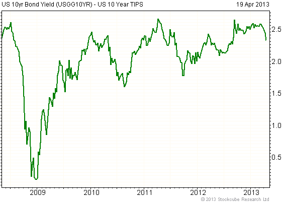
Chart Source: www.fullermoney.com
Given that the Fed Funds Rate (FFR) has been pegged at around zero for the past
several years, putting a minus sign in front of the yield difference charted
above effectively gives you the real FFR. The chart therefore tells us that the
maximum* real FFR has ranged from -1.5% to -2.7% over the past four years and is
presently about -2.3%, having risen from about -2.6% a few weeks ago.
It isn't realistic to claim that a small rise in the real interest rate from one
number that's well below zero to another number that's still well below zero
will create a bearish environment for gold. The relationship between the gold
price and the real interest rate just doesn't operate that way. The upshot,
then, is that the recent sharp decline in the US$ gold price has nothing to do
with a change in the real interest rate.
The real interest rate remains unequivocally gold-bullish. This is one good
reason to believe that the gold bull market has a long way to go.
*Since we are calculating the real interest rate using a
quantity that reflects the minimum amount of expected currency depreciation, the
result of our calculation is essentially the maximum real interest rate. In
other words, the actual real interest rate is probably lower than our calculated
value.
The Stock
Market
Does gold's recent plunge have
implications for the stock market?
The answer to the above question is: maybe. Gold's lacklustre performance over
the 8-month period prior to the past few weeks was bullish for the stock market
because it pointed to increasing economic confidence, but, as discussed later in
today's report, the extreme weakness in gold over the past 1-2 weeks does not
seem to be related to an accelerated shift away from safe havens towards risk. A
more likely explanation is that it relates to liquidity issues for banks and
other large speculators. If so, then something along the lines of what just
happened to gold could happen to the senior stock indices within the coming
month.
Current Market Situation
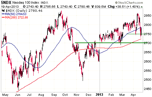
A couple of weeks ago the NASDAQ100 Index (NDX) broke decisively above
short-term resistance, and then immediately reversed direction. Late last week
it edged below short-term support at 2750, only to immediately reverse direction
and end the week above this support. It is therefore in technical 'no-man's
land'. It continues to look vulnerable to a sharp decline, but it hasn't yet
broken down.
As has been the case for the past four months, the NDX needs to achieve
consecutive daily closes below 2700 to clearly signal that an important top is
in place.
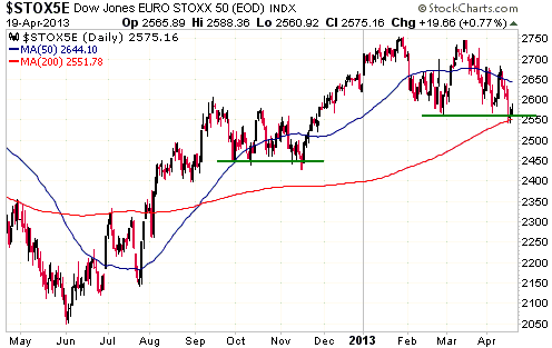
Like the NDX, the SX5E (see chart below), the euro-zone's version of the US Dow
Industrials Index, managed to hold above support by the slimmest of margins last
week.
Right now the SX5E's situation looks similar to its situation at the end of the
correction that unfolded during September-November last year. Consecutive daily
closes below 2550 would eliminate the similarity and suggest that a more serious
downturn was in progress.
This week's
important US economic events
| Date |
Description |
| Monday Apr 22 |
Existing Home Sales | | Tuesday
Apr 23 |
New Home Sales
Richmond Fed Mfg Index | | Wednesday
Apr 24 |
Durable Goods Orders | | Thursday
Apr 25 |
Kansas City Mfg Index
|
| Friday Apr 26 |
Q1 GDP (prelim)
Consumer Sentiment |
Gold and
the Dollar
Gold
Explaining the gold crash of 2013
We don't think there is one simple explanation for the gold crash of the past
two weeks. It wasn't a shift away from safe havens (gold being one of the main
safe havens) and towards risk, as the markets have generally been shifting away
from risk for more than a month. As evidence we point out that: a) the T-Bond
has been rallying since early March, b) credit spreads have been widening since
early March, c) small-cap stocks have been weakening relative to large-cap
stocks since mid March, d) US bank stocks have been declining relative to the
broad US stock market since mid March, e) euro-zone bank stocks have been
trending lower since late January, f) the Hong Kong stock market has been
trending lower since early February, and g) emerging-market equities have been
trending lower since the beginning of this year.
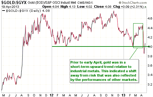
From a fundamental perspective it would actually have made more sense if the
gold crash had happened a few months ago, because over the past two months the
financial/economic backdrop has clearly been getting more gold-bullish. Prior to
early April this increasingly-bullish market/economic environment for gold was
reflected by the strengthening of the gold/GYX ratio (gold versus industrial
metals) identified on the following chart.
Here are the possible/plausible fundamental reasons we can come up with for the
recent weakness in the gold market:
1) General weakness in commodities. Unlike us, many of the people who were
short- and intermediate-term bullish on gold just prior to the crash were also
short- and intermediate-term bullish on commodities in general. Commodities in
general have had a downward bias since the second quarter of 2011, so one
possibility is that long-term commodity bulls finally 'threw in the towel' on
all of their favourites, including gold.
2) A decline in rate of US money-supply growth. Despite the Fed's asset
monetisation, the rate of US monetary inflation has fallen over the past few
months. This is clearly evident on the following chart of the annualised 3-month
rate of TMS growth. The 3-month rate of TMS growth has recently plunged and is
now at its lowest level since October-2008.
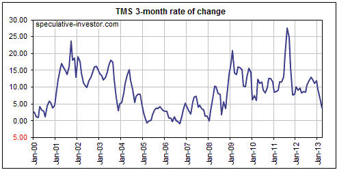
While the above chart appears to be consistent with gold's breakdown, gold
doesn't usually react anywhere near this quickly to adverse changes in the rate
of monetary inflation. For example, the annualised 3-month rate of TMS growth
turned gold-bearish in early 2005, but the gold market didn't discount the
bearish monetary backdrop until 2008.
3) Gold selling by commercial and investment banks to mitigate short-term
liquidity problems. Despite popular gold-bug opinion to the contrary, the global
banking industry is probably net-long gold. With new signs of stress having
emerged within the banking industry over the past two months it is possible that
banks have recently begun selling gold in an urgent effort to raise money.
Something similar happened in 2008.
4) The beginning of another 'deflation scare'. This one is only barely
plausible, because if a deflation scare really were in its infancy then credit
spreads should have widened a lot more and broad stock indices should have
fallen a lot more than they have. In fact, a deflation scare would be far more
problematic for the broad stock market and high-yield bonds than for gold.
5) Central bank selling. There probably hasn't yet been meaningful central-bank
selling and there probably won't be, but fear that some euro-zone central banks
will dump their gold onto the market probably made speculators quicker to exit
long positions than they otherwise would have been.
Of the above possible explanations, 1), 3) and 5) are the most plausible.
In any case, while it is possible to come up with reasonable fundamental
explanations for some weakness in the gold market, fundamentals cannot possibly
explain the severity of the decline. The incredible speed of gold's large price
decline could only have been caused by panicked liquidation on the part of
leveraged and/or under-capitalised traders reacting in knee-jerk fashion to the
price breaking below long-term support.
It is worth noting that panic selling of gold wasn't limited to the futures
market. There was also panicked liquidation of GLD (SPDR Gold Trust) shares, as
evidenced by the 80-tonne reduction in GLD's physical gold holding between 9th
and 19th of April. 80 tonnes is roughly 8 times the amount of gold that Cyprus's
central bank will likely sell, although it is actually not a lot of gold in the
grand scheme of things. What must be appreciated, however, is that GLD does not
have to reduce its holding of gold bullion in response to a decline in the gold
price; it only reduces the amount of physical gold it holds if the market price
of GLD falls faster than -- or rises slower than -- the market price of gold.
The fact that GLD was forced to sell 80-tonnes of gold during the recent crash
therefore means that GLD's price was plummeting even faster than the gold
futures price. In other words, there was even more panic in the GLD market than
in the gold futures market.
Current Market Situation
We mentioned in last week's Interim Update that the president of the St Louis
Fed had worried out loud that there wasn't enough "inflation" in the US and,
therefore, that the Fed might have to ramp up its asset monetisation. A short
time later, the president of the Minneapolis Fed said something along similar
lines, but even more bluntly. As noted in the article posted
HERE, he admitted that even though the Federal Reserve is responsible for
creating financial instability and possibly brewing the next toxic asset bubble,
they have to do more to stimulate the economy because inflation is too low. So
much for tapering off the monetary accommodation or implementing any sort of
exit strategy.
The following weekly chart from Decisionpoint.com shows gold's current position.
Former strong support at $1525-$1550 will obviously now be resistance, but even
getting back to this resistance will require a significant rally. Silver has
equivalent resistance at $26-$27.
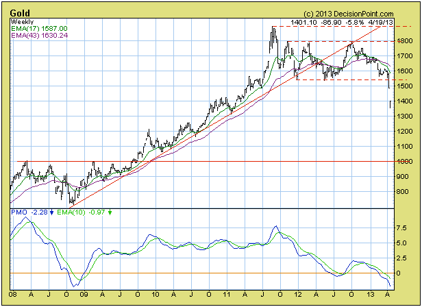
The biggest short-term positive is that the record-breaking liquidation of the
past two weeks sets the stage for a significant rebound -- a big-enough rebound
to at least challenge the resistance mentioned above. However, before such a
rebound gets underway it would be typical for last week's low to be tested.
As to whether last week's low or any marginal new low made over the coming three
weeks will turn out to be the ultimate bottom of the downturn that began way
back in August of 2011, we don't know. The gold market was clearly not as
structurally sound as we thought it was, meaning that traders on the long side
of the market were clearly employing a lot more debt-related leverage than we
thought. The events of the past six trading days have hopefully/probably made
the market much less fragile, but there is no way of knowing for sure.
Due to the cyclical tendencies of gold and gold mining stocks, here is one
scenario worth contemplating: A short-term low has either just been put in place
or will be put in place during the first half of May (for gold bullion, silver
bullion, and the gold-mining sector of the stock market), after which there will
be a 2-4 month rally and then a decline to a final low in October-November.
Gold Stocks
The small up-moves in the gold-stock indices on Thursday and Friday of last week
unfortunately did nothing to indicate that a bottom is in place. With the HUI's
weekly RSI having dropped to an extraordinary 16 (refer to the following weekly
chart for details), a momentum low is almost certainly in place. However, until
there is a large weekly rise there will be significant risk of a decline to new
lows. As noted above and also in last week's Interim Update, it looks like we
are going to get another May turning point in the gold sector.
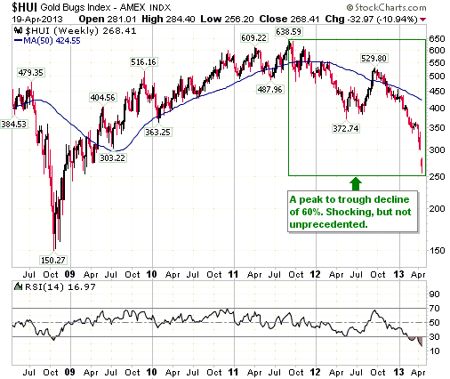
The note on the above weekly chart points out that the HUI's peak-to-trough
decline has reached 60%, which is shocking but not unprecedented. To show that
it is not unprecedented and to put the recent price action into perspective, we
present, below, a long-term weekly chart of the Barrons Gold Mining Index (BGMI).
The green numbers on the BGMI chart indicate previous >60% declines that
occurred during long-term gold-stock bull markets. There was a 61% decline from
the 1968 peak to the 1970 trough, a 68% decline from the 1974 peak to the 1976
trough, and a 70% decline during 2008.
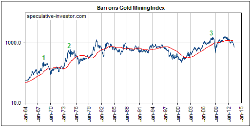
We are not making light of the recent price collapse; we are simply showing that
this type of price action happens within long-term gold-stock bull markets. The
price action is not proof that the bull market is over.
Ideally, we would have anticipated the large decline. The three main reasons we
didn't anticipate it are: 1) it happened too soon after the 2008 crash (during
the bull market of the 1960s-1970s there were about 6 years between the major
downturns), 2) it happened while monetary policy was extremely 'accommodative',
and 3) it happened with momentum and sentiment indicators already stretched to
the downside.
Currency Market Update
As noted in earlier TSI commentaries, the performance of the euro on the foreign
exchange market appears to be tied to the performance of euro-zone bank stocks
as represented by the EURO STOXX Banks Index (SX7E). The relationship is charted
below, with FXE used as a proxy for the euro.
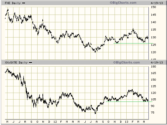
The implications of the above chart are:
1) If the SX7E makes a sustained break below support at 100 then the euro is
probably going to break below equivalent support at 1.26 and begin making its
way down to 1.20.
2) If, by some miracle, SX7E resumes the upward trend that began last July then
the euro's next 10-point move will probably be to the upside.
3) If you are bullish on the euro then you are, in effect, bullish on euro-zone
bank stocks.
Our view is that the euro's next 10-point move is more likely to be to the
downside than the upside, but sentiment indicators suggest that there will be
more consolidation before the trends that began in February of this year (up for
the Dollar Index, down for the euro) resume.
Update
on Stock Selections
Notes: 1) To review the complete list of current TSI stock selections, logon at
http://www.speculative-investor.com/new/market_logon.asp
and then click on "Stock Selections" in the menu. When at the Stock
Selections page, click on a stock's symbol to bring-up an archive of
our comments on the stock in question. 2) The Small Stock Watch List is
located at http://www.speculative-investor.com/new/smallstockwatch.html
 Company
news/developments for the week ended Friday 19th April 2013: Company
news/developments for the week ended Friday 19th April 2013:
[Note: FS = Feasibility Study, IRR = Internal Rate of Return, MD&A =
Management Discussion and Analysis, M&I = Measured and Indicated,
NAV = Net Asset Value, NPV(X%) = Net Present Value using a discount
rate of X%, P&P = Proven and Probable, PEA = Preliminary Economic
Assessment, PFS = Pre-Feasibility Study]
*Pinetree Capital (PNP.TO) advised that its per-share NAV was
C$1.20 at the end of March. The TSX Venture Exchange Composite Index
has since fallen by about 15%, so PNP's current per-share NAV is
probably around C$1.00 (versus PNP's current per-share market price
of C$0.40).
*Sandspring Resources (SSP.V) announced that it had signed a
Memorandum of Understanding ("MOU") with the Government of Guyana
granting it the exclusive right to develop a hydroelectric power
plant on the Kurupung River, approximately 30 miles from SSP's
Toroparu gold project.
This creates a long-term opportunity for SSP, but doesn't have
short-term or intermediate-term significance. The critical question
for SSP to address is: how will the construction of the Toroparu
mine and the company's working capital requirements be funded?
From the perspective of SSP shareholders, we think the best answer
to the above question would be: via a joint venture agreement with a
financially strong partner.
*UEX Corp. (UEX.TO) reported an updated resource estimate for the
Shea Creek uranium project in Canada's Athabasca Basin. The Shea
Creek project is the largest undeveloped uranium project in the
Athabasca Basin and is a JV between UEX and Areva (UEX's share is
49%).
The new resource estimate, using a cut-off grade of 0.30%, is: 67.66
million pounds of U3O8 in the Indicated category at an average grade
of 1.48% plus 28.19 million pounds of U3O8 in the Inferred category
at an average grade of 1.01%. This constitutes an increase in the
Indicated and Inferred categories of 6% and 15%, respectively,
compared with the previous (2010) estimate.
This is good news, because although there hasn't been a big increase
in the overall resource the quality of the resource is now much
higher due to the use of more stringent assumptions. The robustness
of the resource is evidenced by the fact that increasing the cut-off
grade by more than 200%, from 0.3% to 1.0%, only reduces the overall
resource by about 20%.
As far as the stock market is concerned, however, this sort of good
news is not going to matter until after the uranium price begins to
trend upward. Last week the uranium price dropped back to near its
low of the past 4 years ($40/pound).
New
buying in the gold sector
For anyone who hasn't yet reached his/her financial limit, the one positive
stemming from the recent carnage in the gold sector is that stocks have often
been sold down regardless of quality. In other words, in many cases the
relatively high-quality explorers and producers and have been clobbered to the
same degree as their lower-quality/higher-risk brethren. New buying should
obviously be focused on the former.
With regard to the stocks covered at TSI, this means focusing new buying on
Endeavour (EDV.TO, EVR.AX) and Evolution (EVN.AX) in the producer space and
Almaden (AAU), Asanko (AKG), Pretium (PVG) and Sabina (SBB.TO) in the explorer
space.
Chart Sources
Charts appearing in today's commentary
are courtesy of:
http://stockcharts.com/index.html
http://www.decisionpoint.com/
http://bigcharts.marketwatch.com/
http://www.fullermoney.com/

|
